Creamy by Sherwin Williams Paint Color Review
Looking for a warm and comforting light neutral to lend some coziness to your space? Creamy is one of Sherwin Williams’ Top 50 Best Selling Colors, and with good reason.
As neutrals trend warmer, Creamy is the perfect choice to bring in that popular toastiness without getting too overpowering. It does have some yellow undertones you have to watch out for, but its balanced blend and light touch offer the versatility you need for many home projects.
Let’s dive in to the luscious color that is Creamy!
What Color is Creamy?
Creamy is a toasty blend of beige and yellow that looks just like you’d expect cream to look. This light warm neutral color is part of the off-white family too.
LRV of 81
Creamy has a light reflectance value (LRV) of 81. Light reflectance value is a scale designed to measure how bright a color is, and ranges from absolute black at 0 to sheer white at 100. The higher the number, the lighter the color.
Off-white colors typically range from about 73 to 82, with numbers above 82 being true whites. At 81, Creamy is an off-white with enough color to prevent it from looking like a true white in most circumstances.
What Undertones Does Creamy Have?
Creamy has yellow and beige undertones that are noticeable under most circumstances. It’s not shockingly yellow, though–its blend is gentle enough to tame that down.
Is Creamy a Warm Color or a Cool Color?
Creamy is a warm color, just like you’d expect from its name. Those yellow and beige undertones keep it nice and toasty.
Interestingly enough, Sherwin Williams lists Creamy as both a “Warm White” and a “Cool Neutral”. Some of those beige undertones do cool Creamy down a bit, and maybe that’s why you see the shared categories.
But you won’t be able to ignore that yellow undertone no matter what the circumstances, which is why I’ve listed it as a warm.
Where Can You Use Creamy?
Creamy is a light enough color to use in any room, but it’s a little too yellow to be truly neutral. Keep Creamy’s warmth and undertones in mind when you’re placing it. It’s not really the best choice as a trim color.
Creamy is a good choice to brighten up a room and make it feel warm and comforting. It’s a great color for rooms where you want to settle in like bedrooms or living rooms.
It’s also a great choice for rooms that are dark or small. It will brighten them up and help them feel more spacious. Consider Creamy for a laundry room, hallway, or staircase.
Creamy’s touch of color helps it hold up under brighter lighting than colors with this high of a LRV can normally handle. This makes Creamy a good choice for a home exterior. It stands out with a darker trim color like a black, dark gray, or deep brown.
Let’s take a look at Creamy in action and gather inspiration for using it in home spaces.
Living Room
Creamy complements the array of neutral textiles in this relaxed living room.
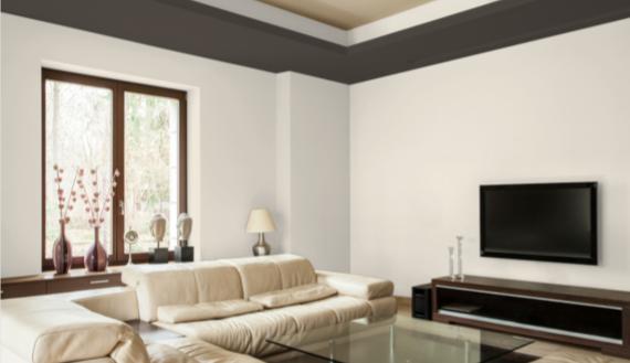
The warm tones of Black Fox trim bring out the warmth and richness of Creamy walls in this cozy and comfortable living room.
Kitchen
Creamy cabinets partner with Revere Pewter walls in this farmhouse kitchen.
You don’t have to make all your kitchen cabinets the same color! In this kitchen, the top level cabinets are Creamy, and the lower level are in Coastal Plain.
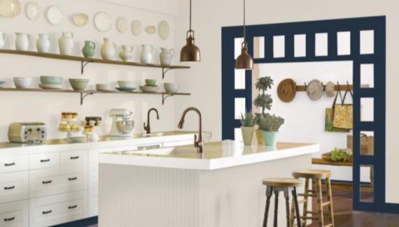
The deep, inky blue of In the Navy brings out a cooler side of Creamy in this country kitchen.
Bedroom
Creamy is the star of this bedroom transformation, literally glowing up the space.
Warm, soft Creamy walls make this bedroom feel cozy and natural.
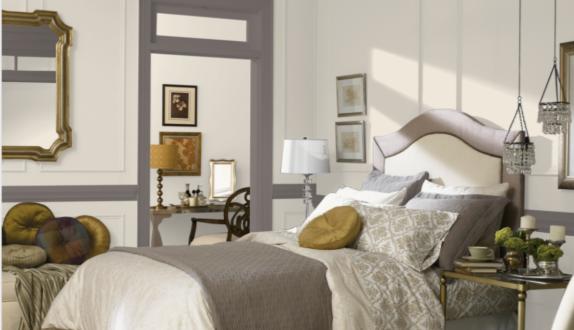
Creamy takes an elegant turn in this luxurious bedroom, mixing neutrals with jewel tones to create depth and contrast.
Staircase
Creamy brightens up this dark staircase and partners beautifully with the natural wood stairs.
Home Office
Bright Creamy furniture stands out against greige walls in this comfortable home office.
Laundry Room
Creamy is just the thing for a space where you want things to feel clean and uplifting, like this bright and cheerful laundry room.
This laundry room takes a rustic theme, with warm wooden cabinets, Creamy walls, and country style touches in the decor.
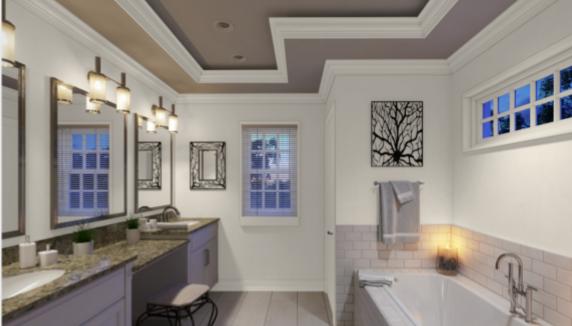
Bathroom
Using an understated farmhouse style, this bathroom makeover uses Creamy to brighten and expand the space.
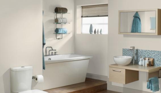
An array of blues and browns are perfect partners for Creamy walls and Fawn trim in this spa-like retreat.
Exterior
A Creamy exterior with a gray tile roof offers a handsome warm and cool contrast on this home exterior.
Flooded with bright sunlight, this Creamy exterior looks almost white.
Entryway
A black door makes a classic combination with Creamy in this entryway.
Creamy Coordinating Colors
While Creamy is warm rather than neutral, it still has a lot of possibilities for coordinating colors. Those beige and yellow tones work well with a lot of colors.
Some of the most lovely companions for Creamy are shades of brown. This includes natural wood tones as well.
Blues are a beautiful contrast for Creamy, and this includes everything from rich navy blues to light delicate blues.
Herbal green colors are fresh natural shades that are harmonious friends with Creamy. Shades of sage and evergreen complement Creamy well.
Favorite neutrals are always an option too. Consider greiges, especially darker greiges, black, and slate or charcoal grays.
Need some coordinating color inspiration for Creamy? Here are some ideas to get you started.
- Black Fox by Sherwin Williams
- Fawn Brindle by Sherwin Williams
- Mink by Sherwin Williams
- In the Navy by Sherwin Williams
- Underseas by Sherwin Williams
- Dovetail by Sherwin Williams
- Sea Salt by Sherwin Williams
- Hazel by Sherwin Williams
- Evergreen Fog by Sherwin Williams
- Tricorn Black by Sherwin Williams
- Hale Navy by Benjamin Moore
- Chelsea Gray by Benjamin Moore
- October Mist by Benjamin Moore
- Sanctuary by Benjamin Moore
- Palladian Blue by Benjamin Moore
How Does Creamy Compare with Other Colors?
Creamy vs Alabaster by Sherwin Williams
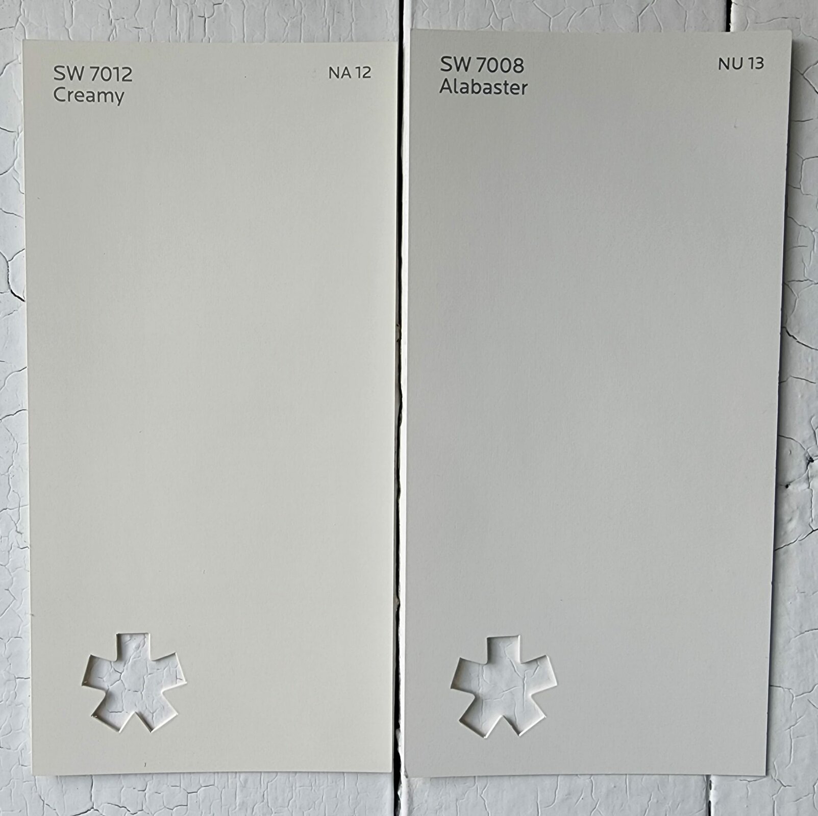
Although Alabaster is known for having a warm glow, it doesn’t share Creamy’s yellow undertones, which makes Creamy the warmer color. They’re comparable in brightness. Alabaster has a LRV of 82 to Creamy’s 81.
Creamy vs Dover White by Sherwin Williams
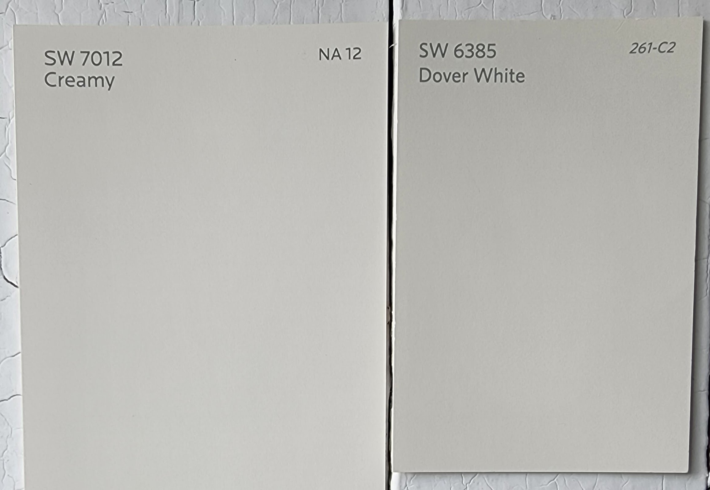
Creamy and Dover White are really close colors. Dover White comes across as a little more beige, and warmer. It’s also a little brighter, with a LRV of 83.
Creamy vs White Duck by Sherwin Williams
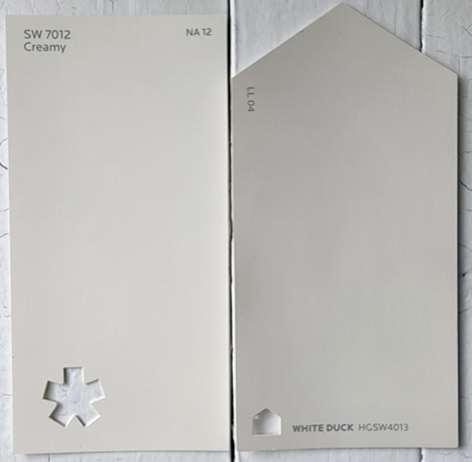
White Duck has more greige undertones versus Creamy’s yellows. It’s noticeably darker than Creamy, with a LRV of 74 that puts it in the lower end of the off-white range.
Creamy vs White Dove by Benjamin Moore
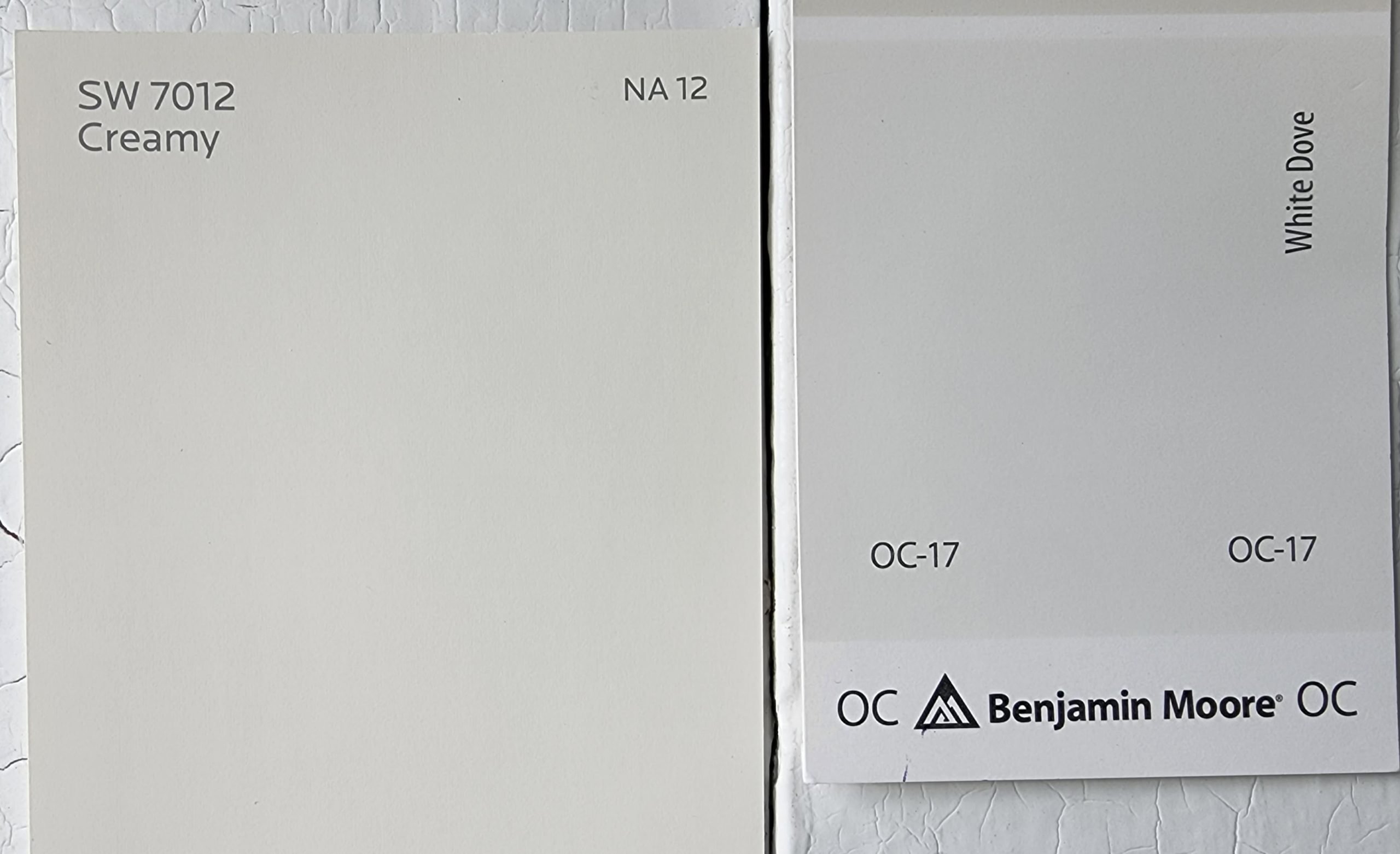
White Dove is like Alabaster in that it’s well-known for a soft, luminous quality, but it lacks that yellow undertone that makes Creamy, well, creamy! It’s a bit brighter than Creamy and definitely a true white, if a slightly warm one. Creamy is the warmer of the two. White Dove has a LRV of 85.38.
Final Thoughts
Creamy: light, warm, and on-trend, this toasty neutral with a delicate touch is a total crowd-pleaser. When you’re using it, watch out for that yellow undertone, and stay away from using this color as a trim. There’s still plenty of color companions to choose from, and Creamy is adaptable to nearly any style. It’s practically a mainstay of farmhouse and rustic styles. Will you be cozying up to Creamy in your next project?