Pure White by Sherwin Williams Paint Color Review
You would think that a white paint, especially one called Pure White, would be simple enough to talk about. It turns out that this bestselling white paint actually stirs up quite a bit of controversy!
If you read different reviews on Pure White, you’re going to get a lot of different opinions. Everyone seems to see different undertones in this paint. Paint reviewers can’t even agree on whether Pure White is warm or cool!
I’m hoping to shed some light on why this simple color can seem so complicated, and help prepare you to use it in your home. Don’t worry–it’s not as difficult as it might seem!
Let’s break down the components that make up Pure White.
What Color is Pure White?
Pure White is exactly what it sounds like: a clean, bright white. If you really put it to the test, it does have a slight silver gray shading, but it’s bright enough to wash that out in most lighting situations.
LRV of 84
Pure White has a light reflectance value (LRV) of 84. Light reflectance value is a scale designed to measure how bright a color is, and ranges from absolute black at 0 to sheer white at 100. The higher the number, the lighter the color.
Off-white colors typically range from about 73 to 82, with numbers above 82 being true whites. At 84, Pure White is a true white paint color.
What Undertones Does Pure White Have?
Pure White has very slight silver gray undertones. Aside from that, it’s a clean white, and will appear that way under most lighting conditions.
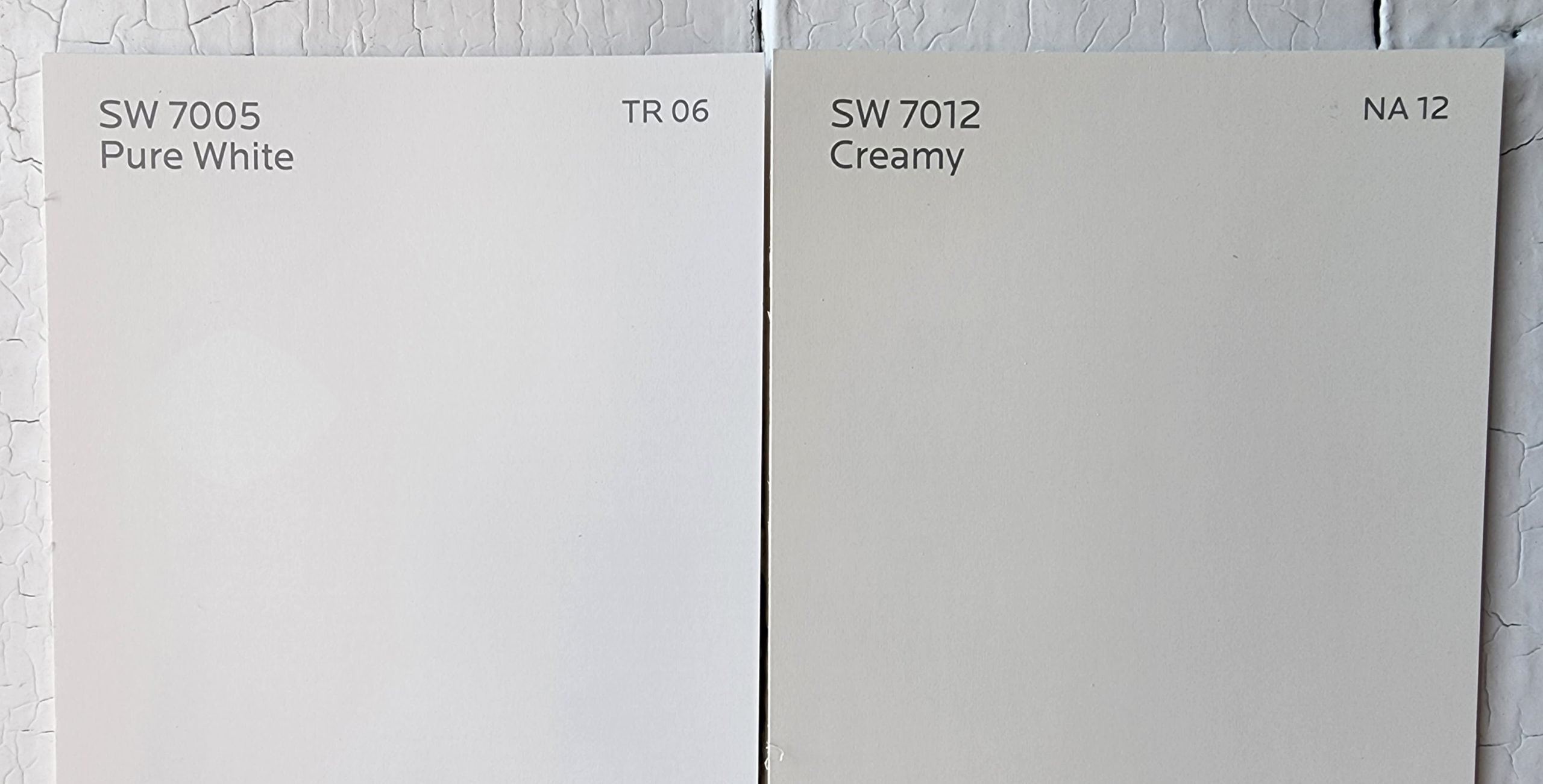
I’ve seen reviews claiming yellow undertones, but I’m going to have to respectfully disagree with my colleagues-in-paint on this point. If you compare Pure White side-by-side with a warm white that does have those yellows, such as Creamy, you’ll quickly see that Pure White does not have them.
Is Pure White a Warm Color or a Cool Color?
For most purposes, Pure White is a neutral white. If you were to really force it to choose, that gray undertone makes Pure White slightly cool. But this is not the same as cool-leaning whites that show blue or blue-gray undertones, because Pure White does not have those.
Insider tip: it’s likely the reason you’ll see so much disagreement on whether Pure White is warm or cool is because people are seeing lighting or nearby colors reflected onto Pure White, rather than the white itself.
Where Can You Use Pure White?
Pure White is a bright, clean white that you can use anywhere in the home. It doesn’t have any undertones to make lighting or compass directions complicated.
Do remember when you’re covering large areas with Pure White that any white can reflect back other colors that are nearby. This includes other paints, furniture, the color of your lighting, and even colors bouncing in through your windows, such as the green of your lawn.
Sample a large enough area under different lighting conditions throughout the day to make sure that you like the effect you’re getting before you decide to cover the walls in Pure White.
Pure White can make a room feel airy and spacious. It’s great for brightening up areas that are too dark or small. Consider using Pure White to make tight floor plans feel more comfortable.
Conversely if your space feels too open, you might want to limit Pure White to accents and trim. It will offer a clean and crisp contrast to just about any color.
Let’s take a look at this incredibly popular white paint in action to see what all the buzz is about!
Living Room
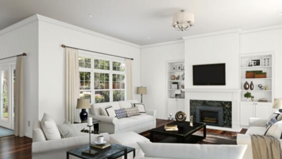
The low light in this living room brings out Pure White’s cool side against an array of warm neutrals.
Pure White brightens and expands this small living room, while warm, soft fabrics add coziness.
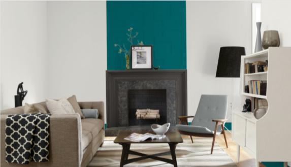
Pure White and Really Teal partner in this sleek, modern living room to give cool, relaxing vibes.
Hallway
Pure White combines with extra bright lighting and a mirror to give this hallway the illusion of more space.
Staircase
This elegant staircase makes use of the timeless combination of black and white.
Pure White provides a bright and clean backdrop for this staircase that can be easily updated with seasonal decor.
Exterior
Pure White evokes beach breezes on this monochrome exterior.
This modern farmhouse exterior went with a painted brick in Pure White, and trim in black to match the roof.
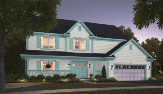
Pure White looks crisp and refreshing against cool Blithe Blue trim on this home exterior.
Entryway
This comfortable, vintage styled entryway takes advantage of Pure White’s ability to complement natural materials like wood, wicker, and wool.
Pure White provides a cool and elegant backdrop to the subtle winter decor in this entryway.
Kitchen
https://www.instagram.com/p/Cgc3y2Evlrf/
Pure White is a crisp and bright choice for the cabinets in this navy blue and gray kitchen.
Warm olive green cabinets give a natural, herbal vibe to this Pure White kitchen and dining room.
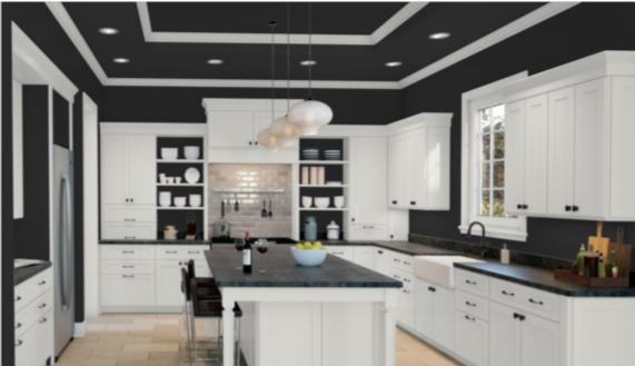
Dramatic and sophisticated, Tricorn Black and Pure White are a timeless pairing in this kitchen.
Dining Room
Pure White cabinets with gold hardware shimmer in this elegant but understated bathroom.
Cheerful sky blue board and batten complements Pure White cabinets in a dining room that feels both modern and retro.
Home Office
Pure White sets the stage for a breezy and stress-free home office.
Bathroom
Pure White glows against the warmth of the wooden vanity and gold hardware in this modern bathroom.
The soft gray-blue vanity in this elegant bathroom complements Pure White’s cool undertones.
Special Events
Pure White sets the stage for this elegant baby shower, suggesting the theme of white flowers against lush greenery.
Bedroom
Soft neutral furnishings coordinate with Pure White walls to give this bedroom a grounded, restful vibe.
Pure White on the walls brings an airy, light feeling into this bedroom.
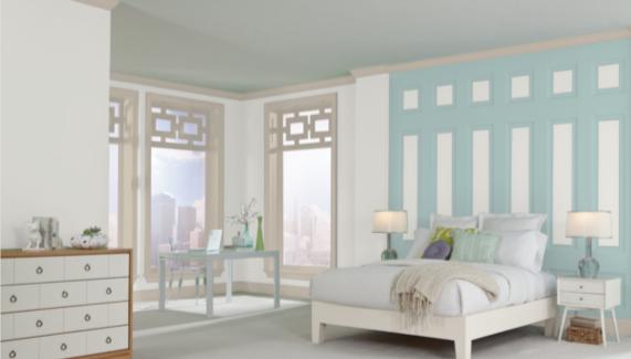
Pure White with an accent wall in Watery and trim in Accessible Beige, turns this bedroom into a coastal retreat.
Coordinating Colors for Pure White
Pure White is just that: white. That means your imagination is the limit when it comes to choosing coordinating colors.
Want to build a palette around your favorites? Go for it! Want to pair Pure White with something really exotic? Go wild! Prefer something more neutral? Pure White is up for that too.
Best-selling favorites like navy blue and greige are just as comfy with Pure White as coastal colors like beach glass and driftwood, or playful colors like teals and pinks.
A timeless and sophisticated combination with any white color is to pair it with your favorite black paint. Up the luxe factor by adding metalwork touches in gold or silver. Going minimalist or Scandinavian? A light or mid-tone gray will work beautifully as your third color. Want to make it playful or feminine? Choose a blush pink.
Your hardest task in building a color palette for Pure White will be narrowing down the possibilities! Here are some coordinating color ideas to help you get started.
- Sea Salt by Sherwin Williams
- Hazel by Sherwin Williams
- Naval by Sherwin Williams
- Tricorn Black by Sherwin Williams
- Mindful Gray by Sherwin Williams
- Iron Ore by Sherwin Williams
- Agreeable Gray by Sherwin Williams
- Accessible Beige by Sherwin Williams
- Edgecomb Gray by Benjamin Moore
- Aegean Teal by Benjamin Moore
- Palladian Blue by Benjamin Moore
- Sanctuary by Benjamin Moore
- Beach Glass by Benjamin Moore
- Woodlawn Blue by Benjamin Moore
- Hollingsworth Green by Benjamin Moore
- Proposal by Benjamin Moore
How Does Pure White Compare with Other Colors?
Pure White vs Snowbound by Sherwin Williams
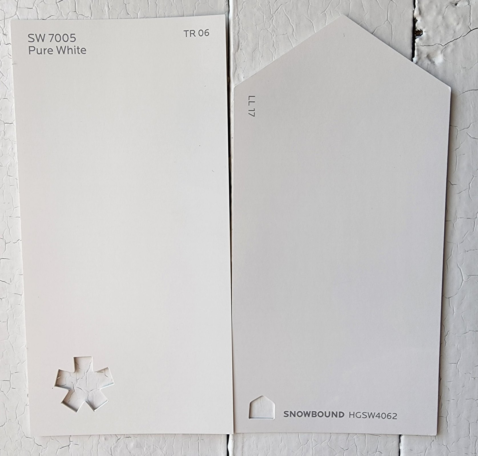
Snowbound is a white that looks pretty clean on its own. Compared to Pure White, it’s visibly cooler and slightly shaded. These two are comparable in brightness. Snowbound has a LRV of 83.
Pure White vs Extra White by Sherwin Williams
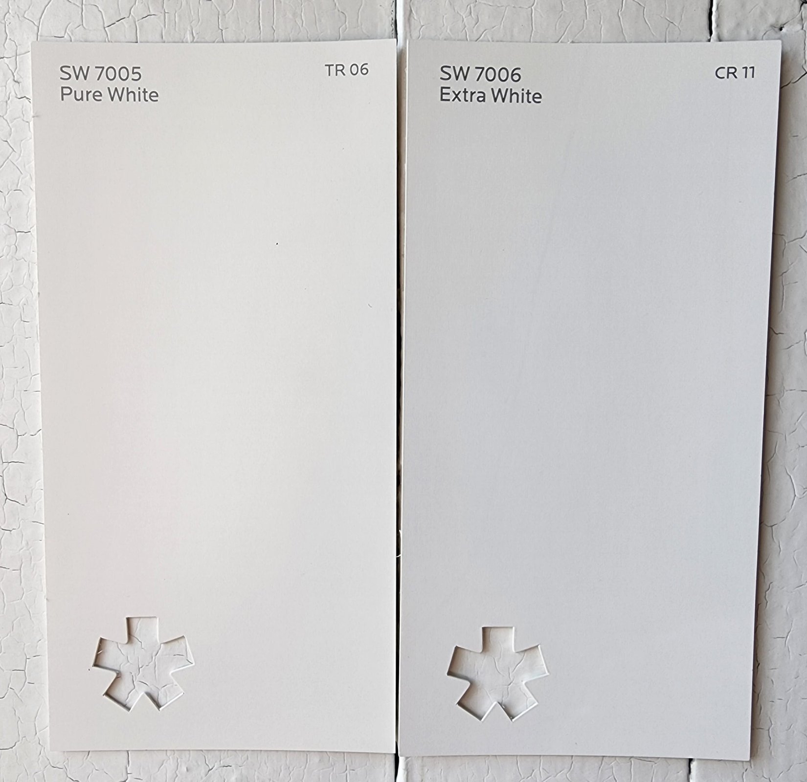
Extra White, true to its name, comes out looking brighter and cleaner than Pure White. Even though there’s only two points on the LRV scale between them, it makes a difference here. Extra White has a LRV of 86 to Pure White’s 84.
Pure White vs Alabaster by Sherwin Williams
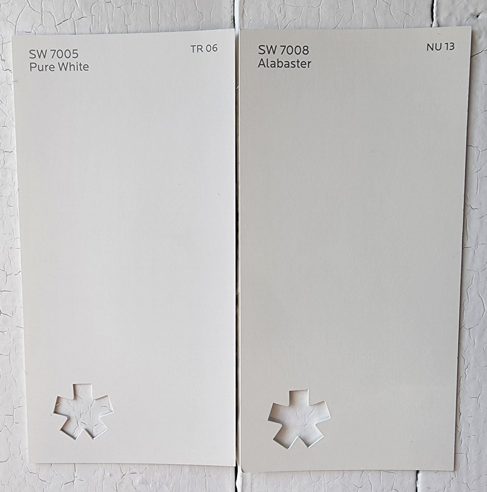
Alabaster is the well-loved luminous white with a little something extra that keeps it from looking stark. Next to Pure White, it’s warmer and has a creamy appearance. Pure White is brighter. Alabaster has a LRV of 82.
Pure White vs Simply White by Benjamin Moore
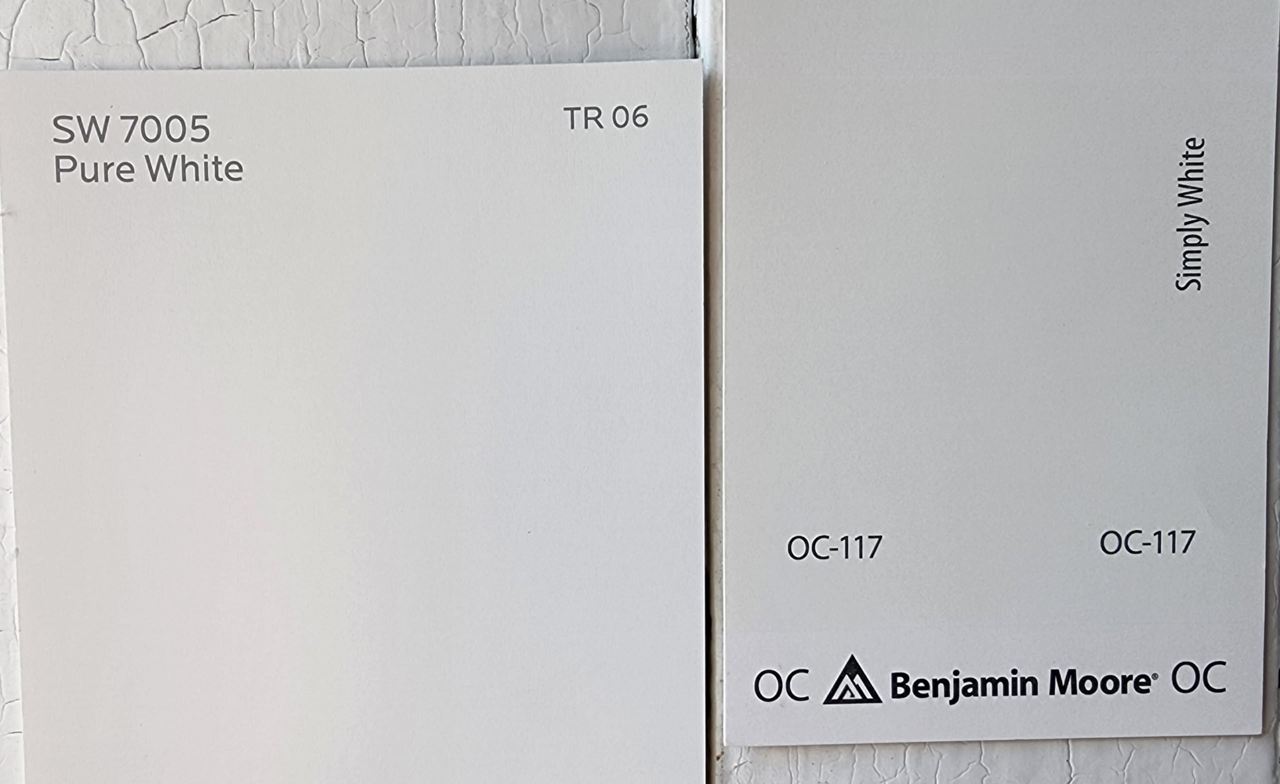
Despite the name, Simply White looks warmer and creamier next to Pure White’s cleaner, brighter appearance. But Simply White is significantly brighter, with a squeaky-high LRV of 91.7. When you get into this realm of brightness, things do wash out.
Pure White vs Chantilly Lace by Benjamin Moore
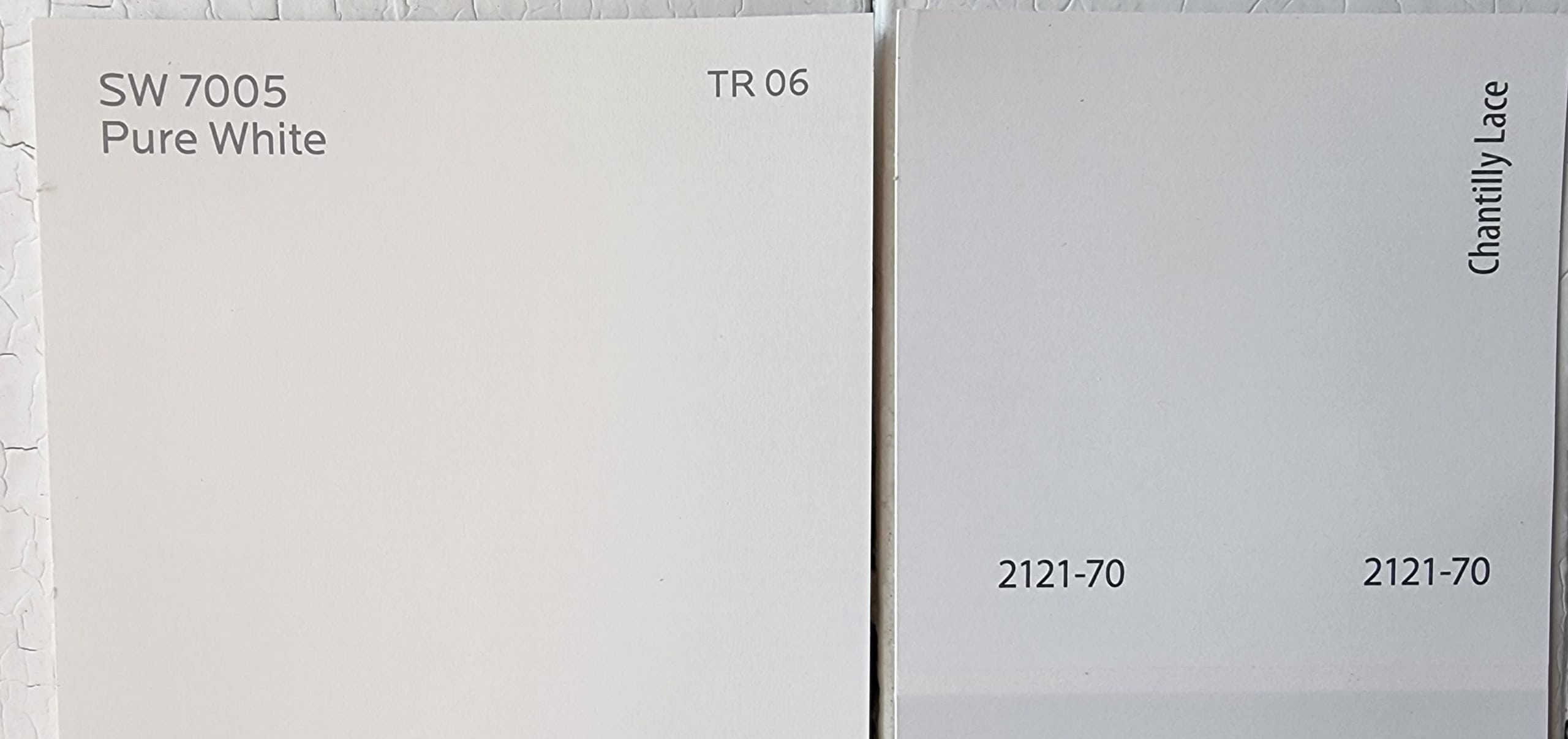
Chantilly Lace, the king of the white glove test, with a sky-high LRV of 92.2, manages to make even Pure White look gray by comparison. If you’ve got to have the brightest white, Chantilly Lace has the highest LRV of any paint I’ve reviewed. But Pure White’s slight gray undertone might keep it from being as stark under direct light.
Final Thoughts
Pure White is a paint that provokes a lot of controversy. The biggest reason is probably because any large area of white will reflect back colors that are close to it. That’s an important lesson to remember any time you’re placing or lighting a white paint. Pure White will serve you as a neutral white, but it will play nice with your cool colors too. No matter the debate, you can’t argue with success: Pure White is a perennial favorite with homeowners and designers alike.