What Color Goes With Olive Green? 20 Ideas
Olive green is an exotic and organic shade of green that is quite inclined to the warmer end of the color wheel. It is a perfect blend of yellow and green in it – which makes this shade of green equally calm, tranquilizing, serene, and poise. Associating itself to nature, introducing the shades of olive green is a great way to make your space feel composed and peaceful.
Apart from aesthetics, the olive green color in the interior design industry is also majorly responsible for calming anxiety and stress and fostering a sense of balance and harmony. However, when creating color palettes, you have to be extra careful with this warm tone of green. So, are you wondering what colors can match the olive green? Well, take a sneak-peek at these 20 color ideas below!
White
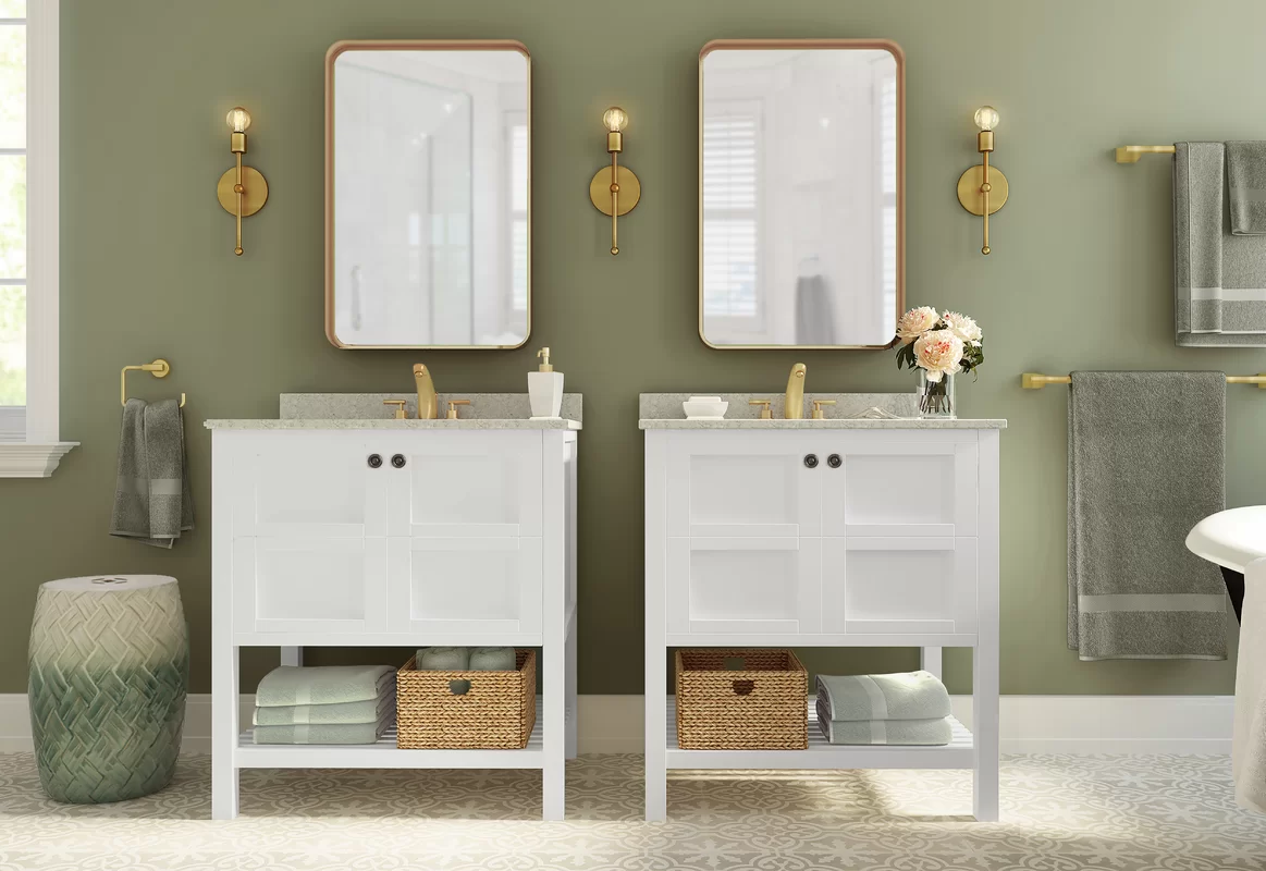
It’s time to exhibit a sense of refreshing and rejuvenating vibe indoors! With a crisp and clean white color, the olive green is bound to further protrude out and make the space feel its true character. Hence, you can consider painting the walls in the olive color and further picking the white for the cabinets, trims, ceiling, and even molding.
To further complete the palette, you might want to add tinges of gold and natural textures like rattan or wicker for textural detail.
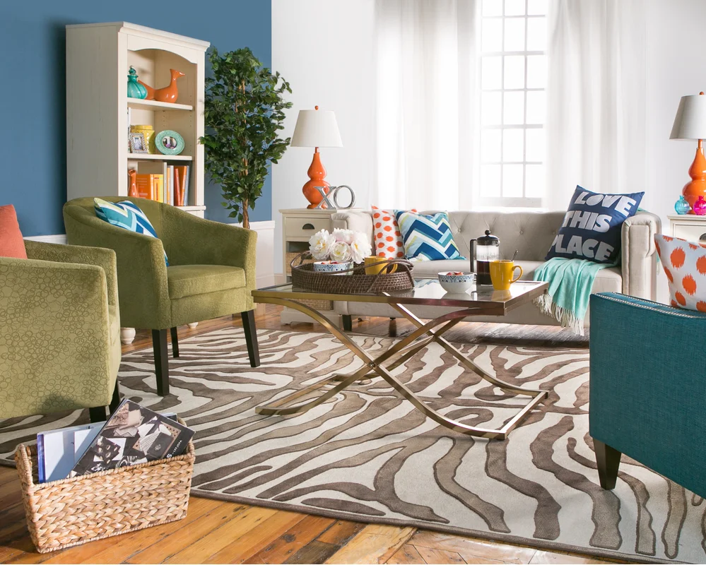
Navy Blue
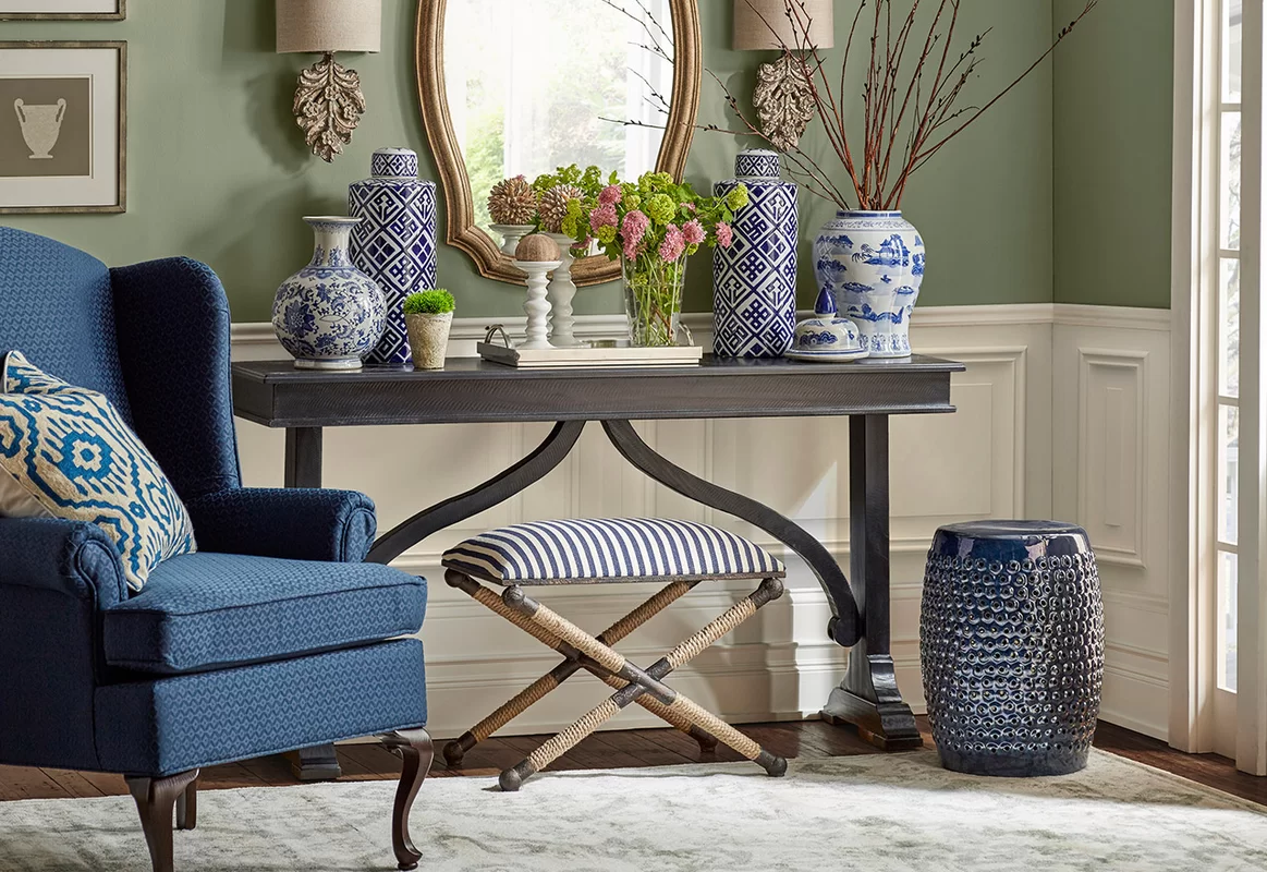
When decorating the olive green palette, you can almost pair any shade of blue. But in general, navy blue works the best! These two bold colors work wonderfully together – especially if you’re particularly letting the patterns and textures dominate.
Well, have a look at this traditional living room setup. Aren’t you admired by the playful use of blue and white ceramics in contrast to the olive green accent wall? Note that if you’re looking for a cool and calm color palette – this duo plays the best!
Magenta Pink
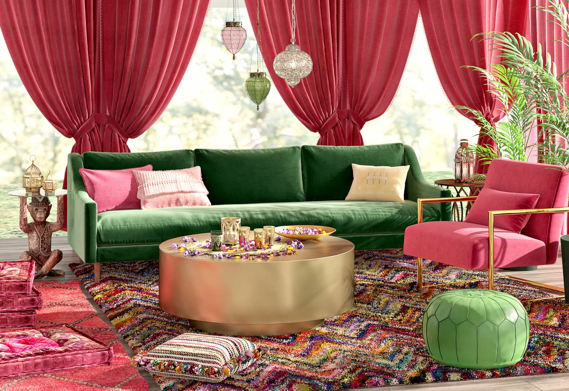
This is quite a surprising color choice to pair with olive green – but at the same time, it’s quirky, eclectic, and eccentric. So, if you admire the feel of bold and loud backdrops – you simply can’t hold back from the combination of olive green and magenta pink. However, you have to play smart here!
Balancing the proportion of these two dominant colors could be a challenge. So, remember to pick one for the furniture and the other for accessories to foster balance!
Dark Gray
For an industrial, dark, and daring look – the fusion of olive green and gray would absolutely play fruitful and effective. Especially if the gray is slightly rugged and textured – the overall palette would further enhance and give a stark look. For instance, the dark gray on the walls and olive green on the focal furniture are what you must have an eye on!
You can also choose vice versa and let the furniture play subtly in dark gray.
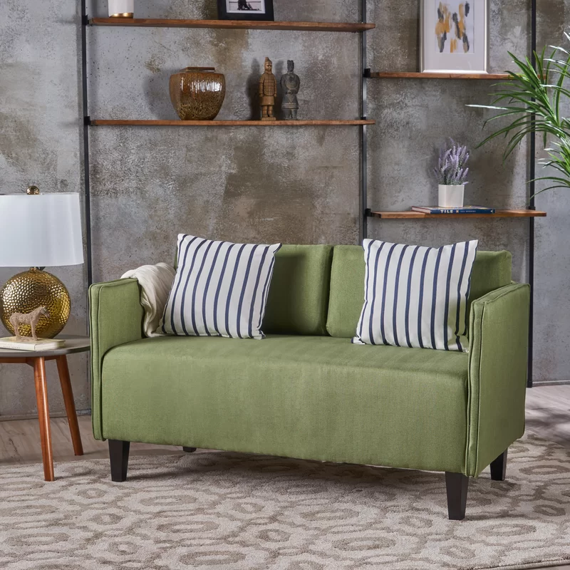
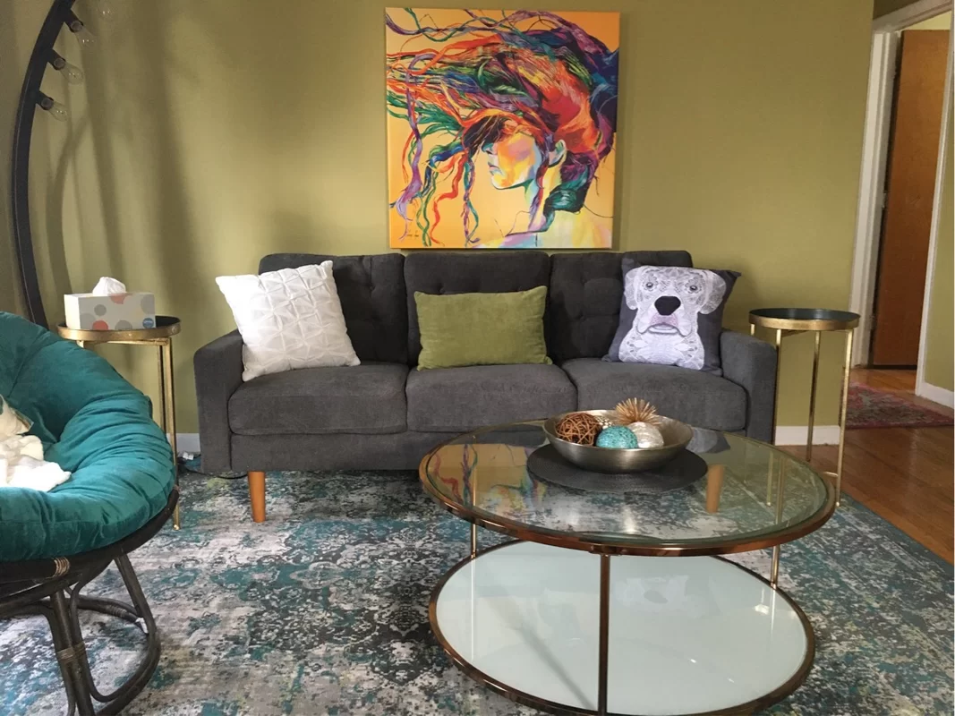
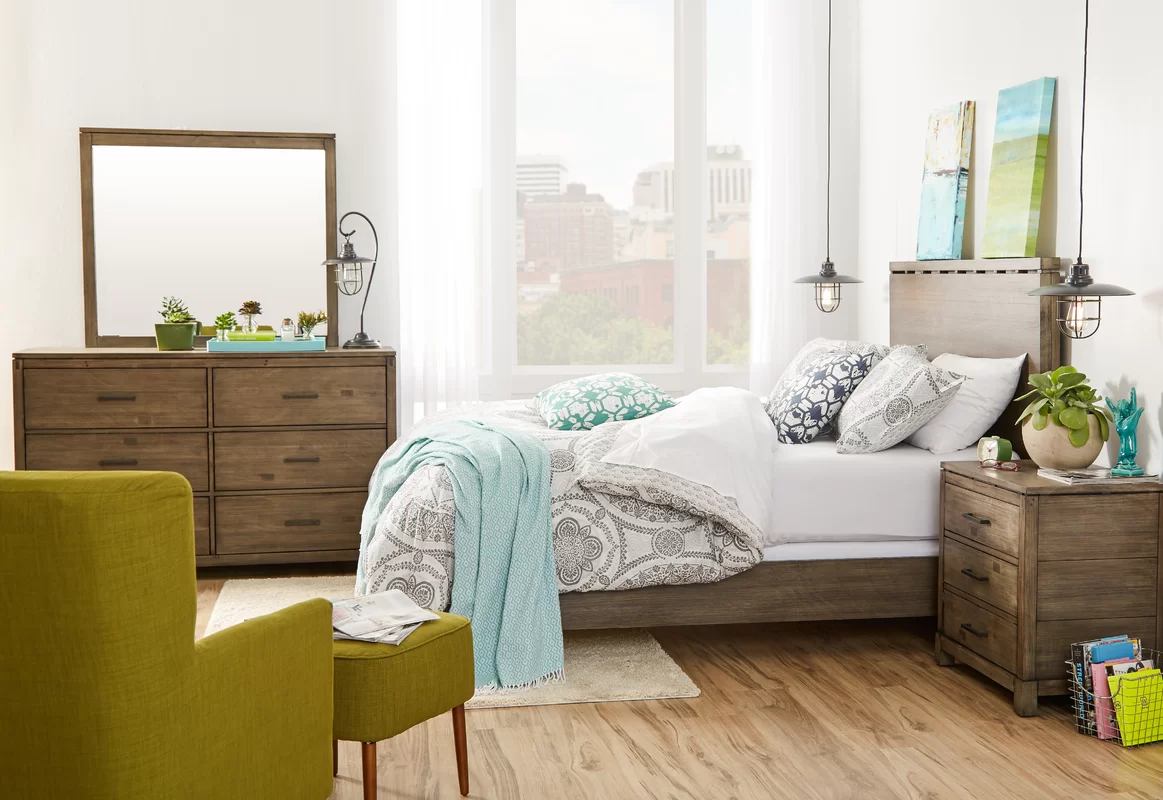
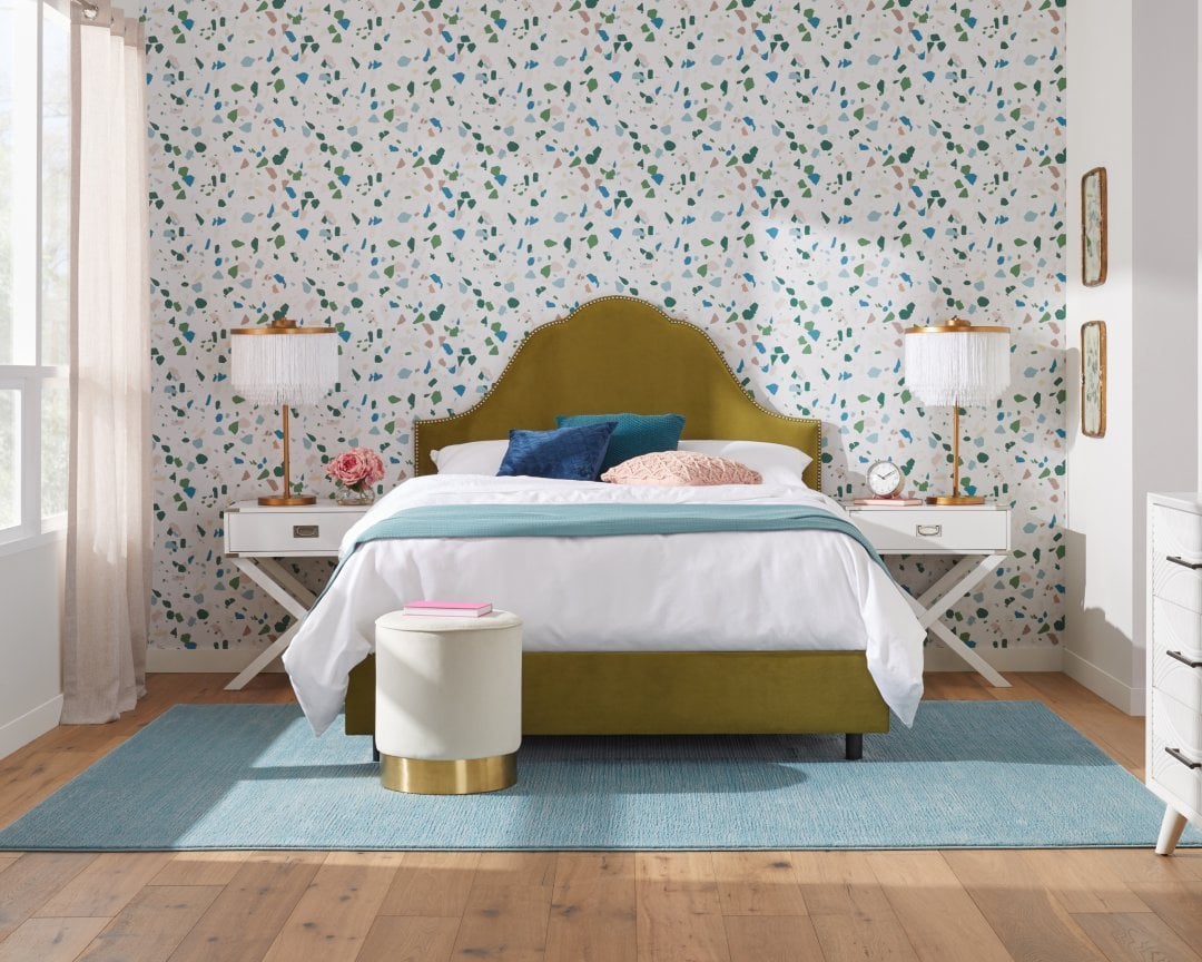
Light Green
Who says the light and minty greens don’t complement the olive greens? Well, have a look at this glam-style bedroom where the amalgamation of olive green on the headboard and light green on the wall plays flawlessly.
Especially for a monochromatic vibe – this bedroom is definitely something to take inspiration from. You can also further infuse shades of turquoise blue and gold as an accent to play eye-catchy.
Taupe
The pair of taupe and olive green is truly made in heaven. Well, you’re quite likely to find this heavenly duo in nature – like Earth and Plantations. So, there’s definitely no way you wouldn’t like this fusion. This contrasting palette will bring a sense of subtleness to your space, and simultaneously, make it feel lively and homely.
It’s generally best to add a tinge of taupe (whether light or dark) on the walls and further, let the green play a superpower. And the wooden textures could too play a tone of taupe.
Yellow
As discussed, the hue of olive green takes a lot of inspiration from the yellows. And that’s why the combination of olive green and yellow will always complement each other, seamlessly. However, you might need a third hue to balance both the warm-toned colors.
Something like cherry red or turquoise blue would play a great third wheel here. And note that this overall palette is ideal for traditional, Victorian, and Eclectic interior design styles.
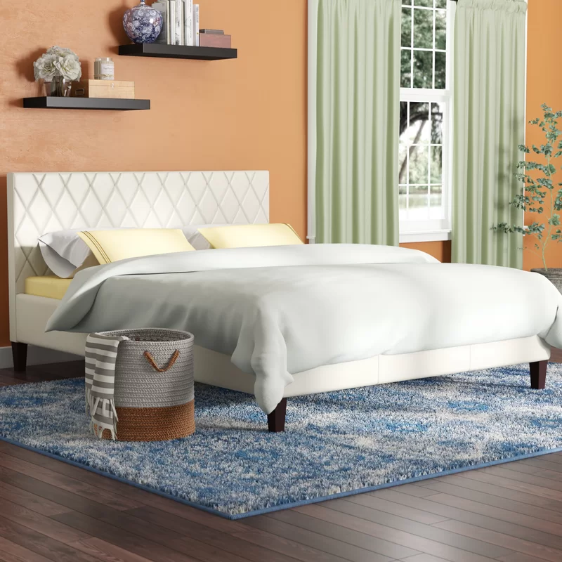
Light Gray
If you’re fascinated with the feel of olive green and gray – but looking to avoid the sense of boldness, you might as well pick a tone of light gray to go. This serene and blissful combination feels quite refreshing and rejuvenating – thus, also a great way to make your space appear larger and airier.
With this backdrop, don’t forget to style some fresh indoor plants and flowers to further streamline the palette.
Tangerine
Tangerine (orange) and olive green are contrasting – and which is why they make a fun-loving and playful palette. They add just the right amount of warmth and coolness to embrace the sense of balance and harmony in a room.
Depending upon the size, you can either pick an olive green paint color to make the room feel dominantly cooler or tangerine for a warm and welcoming vibe. Moreover, this duo is great for a retro backdrop!
Tan
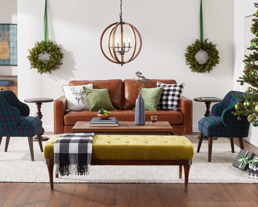
The olive green in your living room can easily complement the shades of tan on that authentic leather couch. Especially for Eclectic and traditional-style backdrops, this palette is truly going to take you a long way.
Secondly, you must add some buffalo plaid patterns on the accent chair and throw pillows to play focal and fundamental. So, are you also looking to decorate a bachelor’s pad-style loft – if yes, this is the palette to look forward to!
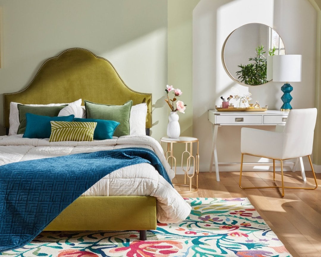
Turquoise Blue
Turquoise is a calm and chilly blue that juxtaposes the warm olive green to create an utmost striking and eye-catchy appeal. It makes the blue stand out in quite a unique way – thus, if you’re looking to give your room a perfect sense of a chic character, this combo is something to look forward to!
It’s generally ideal to pick olive green paint for the walls and turquoise for the furniture upholstery and decor accessories. The vice versa may not be an enchanting one!
Chrome
Just like the color on the walls and furniture fabrics – it’s important to pay attention to the details like metallic accents. Generally, with olive green, it’s ideal to choose a chrome finish metallic tint that subtly adds a base to the frames without stealing too much attention.
Furthermore, this finish makes a great statement in any modern, contemporary, and Eclectic setup. In some cases, you can even choose a blend of chrome and matte black, or chrome and brushed brass!
Cherry Red
There’s no doubt why green and red would seamlessly work together! Hence, if you’re in search of a color palette that amuses you and at the same time, makes your space as flawless as possible – dear friend, this doable duo has got all the solutions.
You have the opportunity to mix and merge the various shades of red, peach, as well as pink to create an overall Hollywood Glam or Victorian-like look.
Sky Blue
If you don’t want the blue to be too overwhelming or stark, here’s a perfect tone for you – sky blue. This light and airy shade has the potential to do wonders – especially if you’re confined to a very small space in your loft or apartment. Well, have a look at the beautiful duo! Wouldn’t it totally make you feel calm and poised after a long day at work?
Moreover, you can further complement the palette with the help of wooden textures on the furniture frame, floors, nightstands, and artwork or mirror frames.
Spiced Walnut Wooden Textures
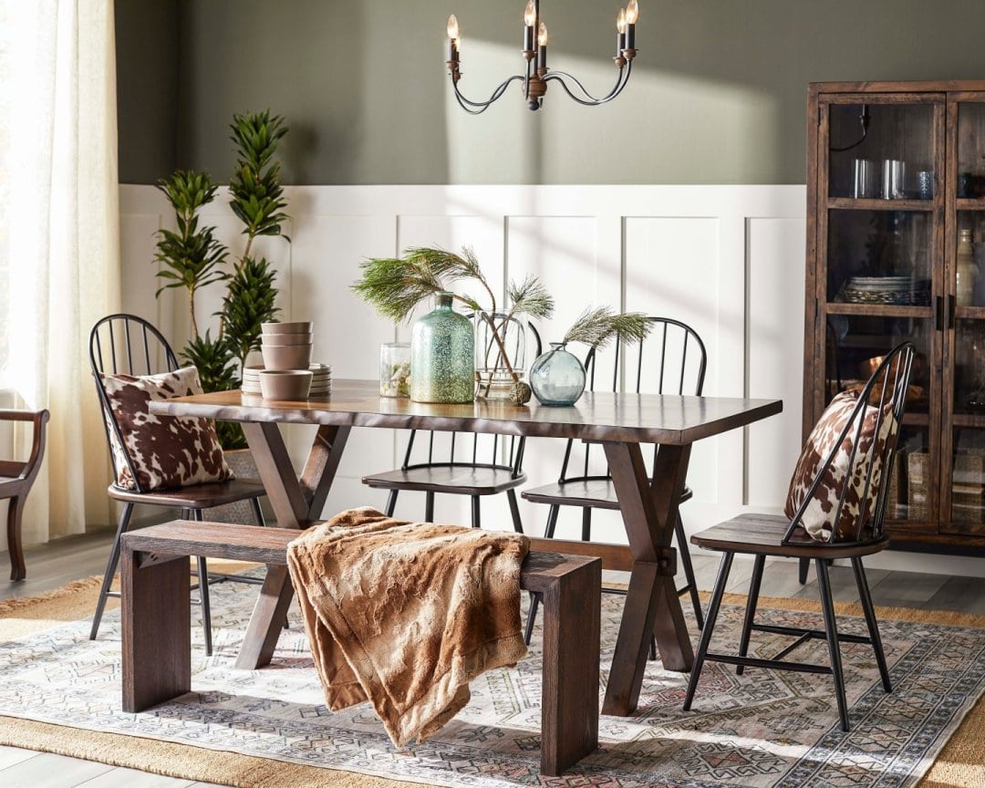
For a perfectly rich and rustic look, the spiced walnut wooden textures would play a great role. With the olive green color on the walls, it’s not necessary to always pick a contrasting color to play seamlessly. Sometimes, you can even make use of the wooden textures to help enhance the palette.
And you must definitely take inspiration from this dining room setup. An amalgamation of animal prints, faux, a couple of fresh indoor plants, and off-white ceramics will definitely take you a long way.
Gold
Do you admire a rich, high-end, and elegant look in your modern or contemporary-style home? Well, it’s time to take inspiration from a blend of gold and olive green to create a tasteful yet delightful look. And remember to always pair this duo with subtle whites and lighter grays to go!
Generally, you must invest in accessories that flaunt a beautiful texture of gold. Yes, something like chandeliers, artwork or mirror frames, coffee table trays, and candle holders.
Beige
Want to play safe? Well, don’t hold back from this beautiful and calm hue of beige that can offer your space just the right amount of soothe and serenity. It tends to make your space feel larger and enhanced with the olive green playing focal (recommended on the furniture and accessories).
Beige can either go on the walls or even the adjacent furniture. For instance, the beige on accent chairs and throw pillows would play a great role.
Exposed Brick
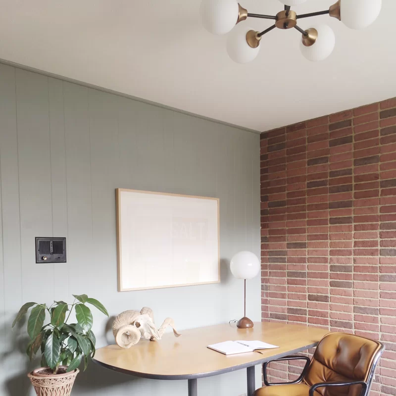
Let’s think outside the box! Apart from the colors and textures – you can even make use of the raw materials to best match with olive green. Generally, for a classical, English look – you can consider cladding the adjacent wall with the exposed brick finish to add a sense of drama and movement into the space.
This will not only make it more visually appealing but also add a perfect hue to the room. You can pick a reddish-brown shade for that focal and accent wall.
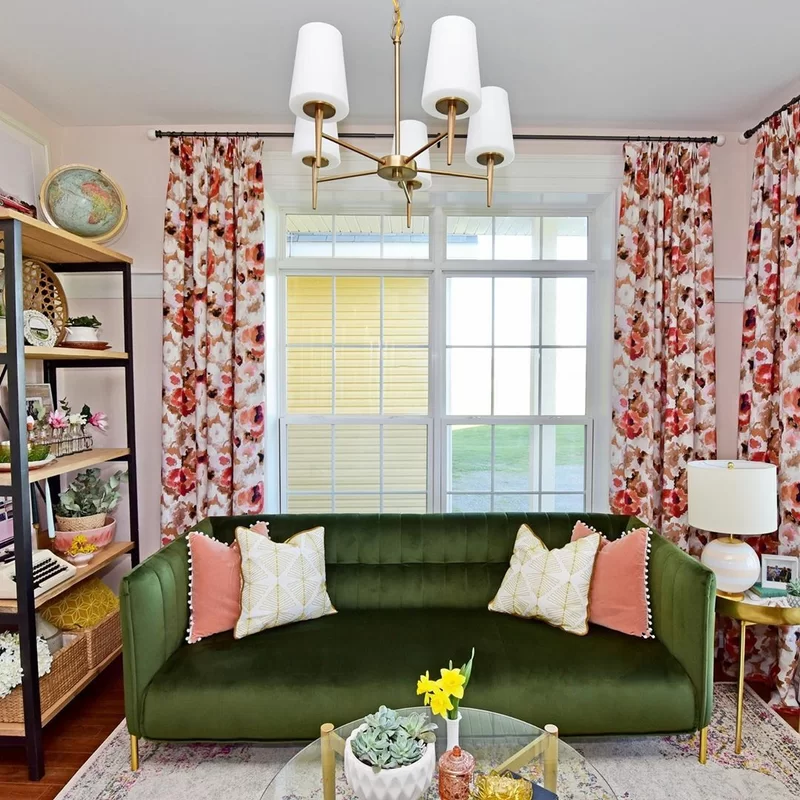
Blush Pink
For a perfect playful and fun-loving ambiance, the blush pink or peach would play absolutely complementary and stunning with the olive green. After all, they stand opposite to each other on the color wheel – hence, making a great seamless palette, overall.
You can further add whites and shades of blue as a base to neutralize and create a sense of balance and harmony in the room.
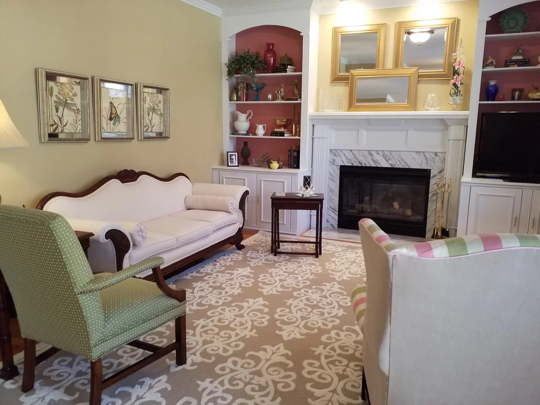
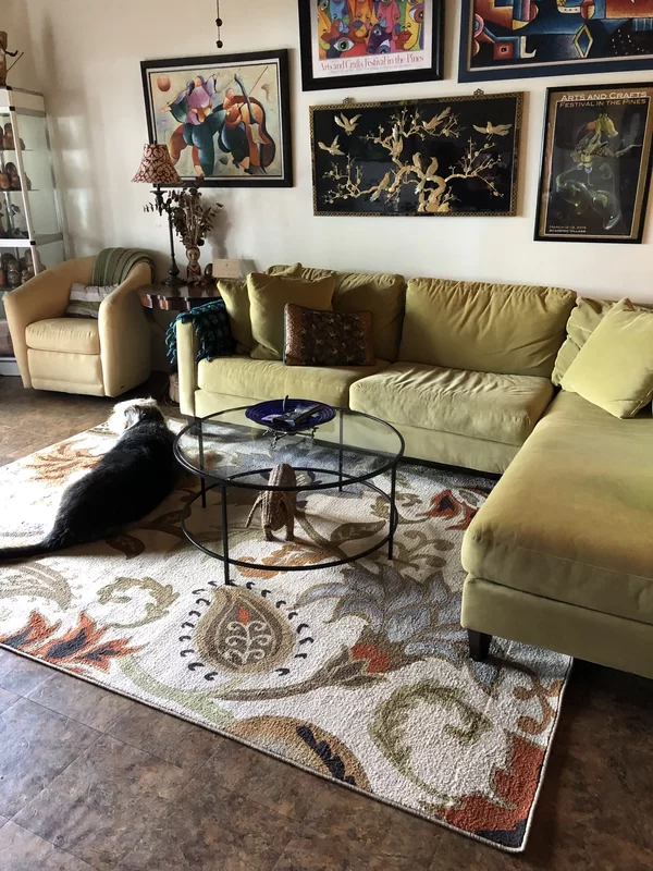
Multi-Colored Backdrop
If you’re not restricted to a specific color to compliment olive green, you have the total liberty to choose a multicolored backdrop. Generally, a blend of off-white, beige, gray, dark blue, orange, sky blue, and magenta would play flawlessly. Well, you must have a look at this traditional living room setup! Isn’t it totally eye-catchy and balanced?
Also, note that you must play and pair the various textures and materials. Styling a rattan basket wouldn’t be a bad option!
Summing It Up
With the growing admiration for shades of olive green in a space, the utmost challenge is to create that perfect palette. And believe it or not – it all boils down to the kind of vibe you’re aiming to create, along with the size and perspective of the room. So, did any of the above-mentioned olive green color combinations intrigue you? Do let me know your thoughts in the comments below!