What Color Goes With Gold?
Sharing synonyms with luxury, sophistication, and elegance – the color gold is a form of shiny yellow that brings a sense of class and grandeur to any space. It acts as a perfect accent – whether in the form of lighting fixtures, furniture frames, or wall and floor accessories. However, too much gold, on the other hand, can equally make your space feel gaudy and flashy!
So, let’s have a sneak-peek into these glamorous 20 color ideas that best complement the tone of gold. Believe it or not, they will further enhance and escalate the opulence of your room.
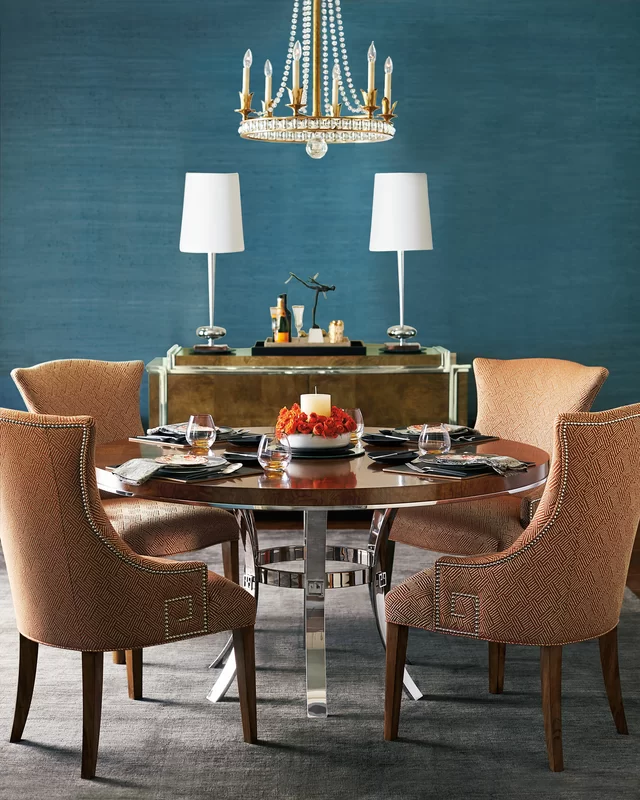
Sapphire Blue
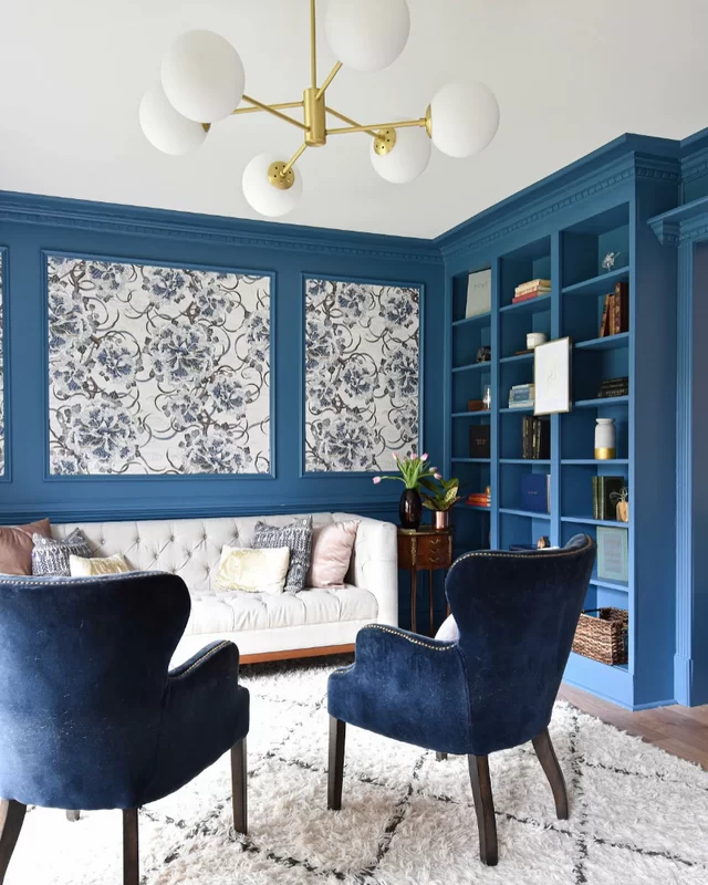
Sapphire blue and gold make a great color combination – if you crave a rich and luxurious look. And yes, this duo will never make you feel monotonous! So, to create a moody and dramatic experience, you can consider painting the walls and cabinets in this paint color and further choose tinges of gold on the lighting fixtures or furniture frame.
This is also a great way to add warmth and create an illusion of a smaller space. Hence, a must for eclectic as well as glam backdrops!
Black
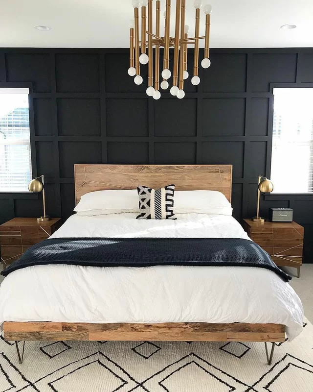
Black and gold make a classic color combination. This duo symbolizes a sense of boldness, richness, and luxury in a room. For instance, choose an eggshell finish of black paint color on the walls and paneling and further add gold on the chandelier, lighting fixtures, artwork frames, and candles.
However, you must know that this duo can be quite intimidating. Hence, add a third wheel with the help of gray and white on the throw pillows and upholstery!
Emerald Green
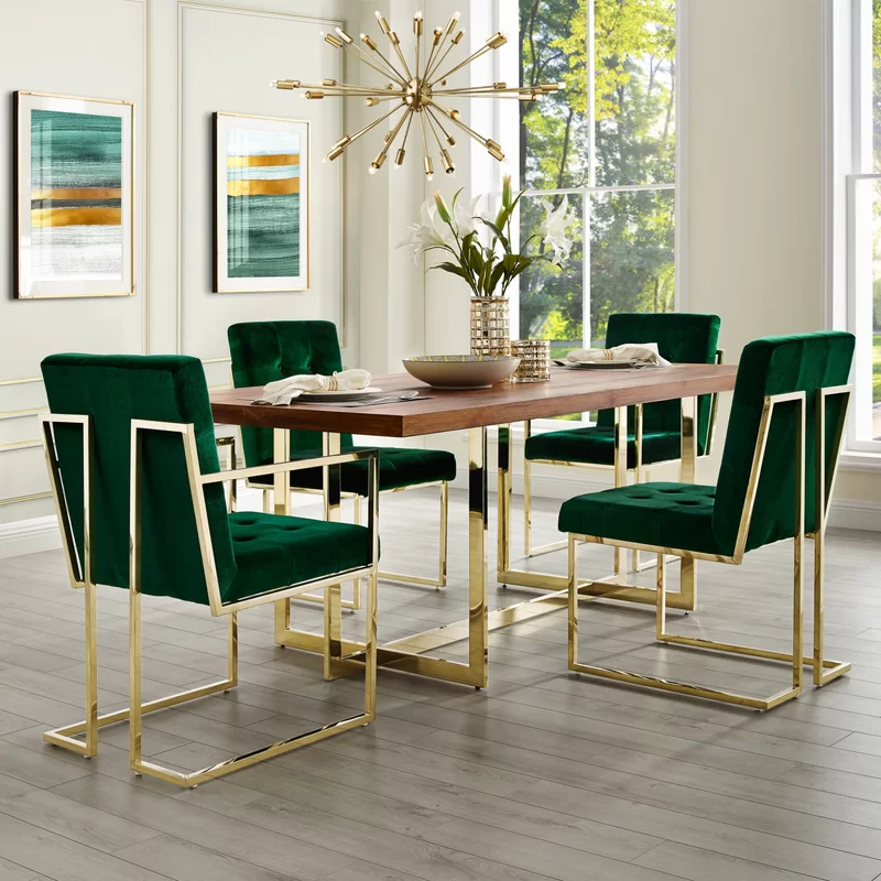
A duo of emerald green and gold is the ultimate symbol of magnificence and opulence. Not an old-school, boring, and monotonous green but the absolute legend – emerald green has the potential to do wonders! This stark tone of green can beautifully merge with the metallic tint to achieve an utmost glam look.
You can either choose to paint the walls in this dark green tone or let the furniture speak out loud!
Cherry Red
If you’re in love with the feel of Christmas and the holidays, a combination of cherry red, gold, and white will take you a long way. Hence, for a warmer color palette, you can consider infusing tones of red, burnt umber, or burgundy to create an absolute luxe and lavish backdrop.
All this while, you don’t have to necessarily choose gold for the major accents. Well, just pick up some for the furniture legs and table lamps – and you’re good to go!
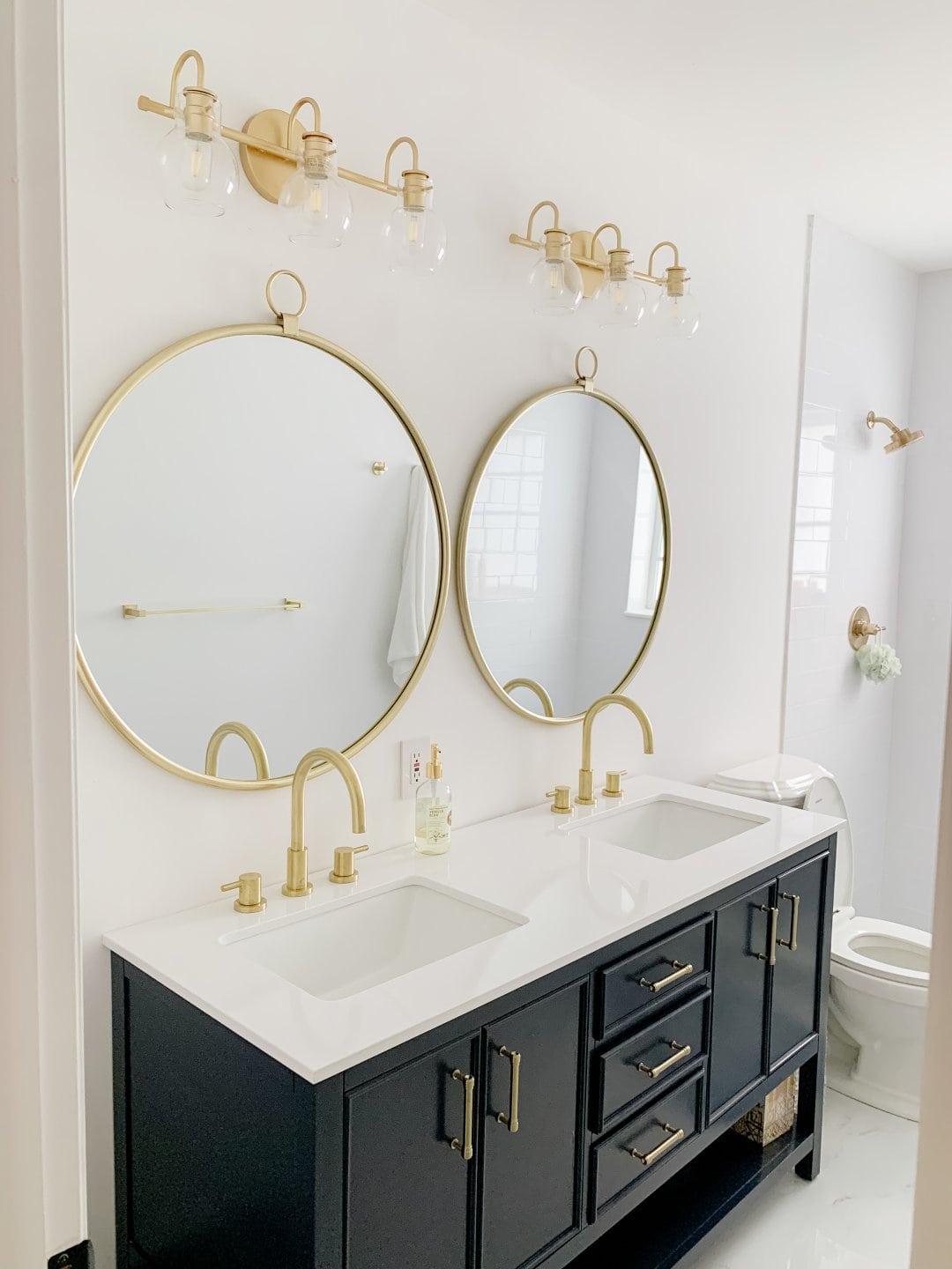
Dark Gray
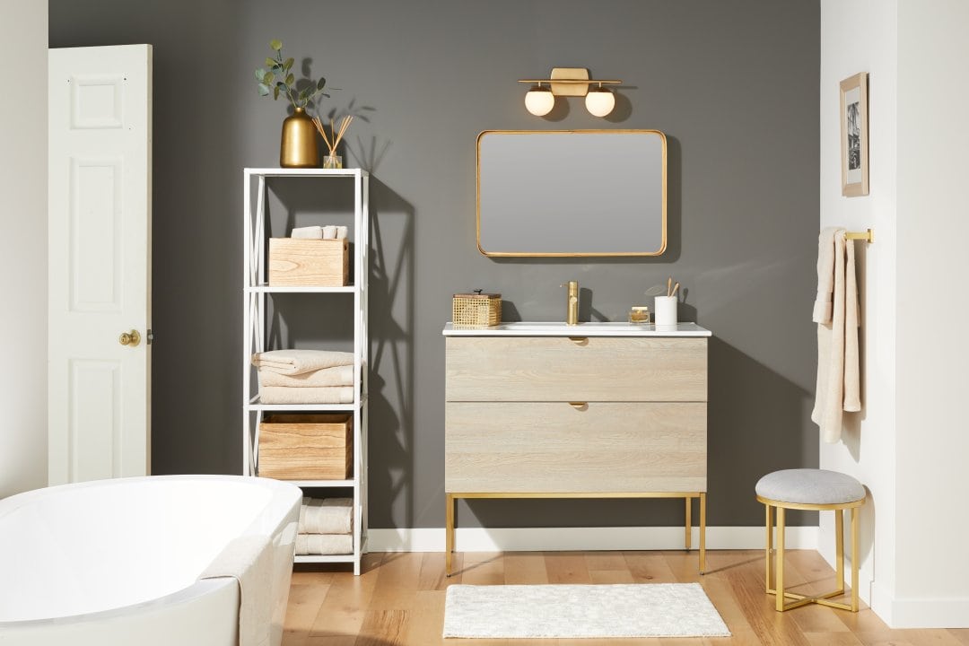
Gray and gold are guaranteed to look flabbergasting together! This neutral (whether slate gray or charcoal gray) is bound to make your space feel subtle and luxe at the same time. You can further add tinges of wood and a pure white base to make this palette overall appealing and soothing.
Have a look at this transitional-style bathroom! Isn’t the blend of gray and gold totally balanced?
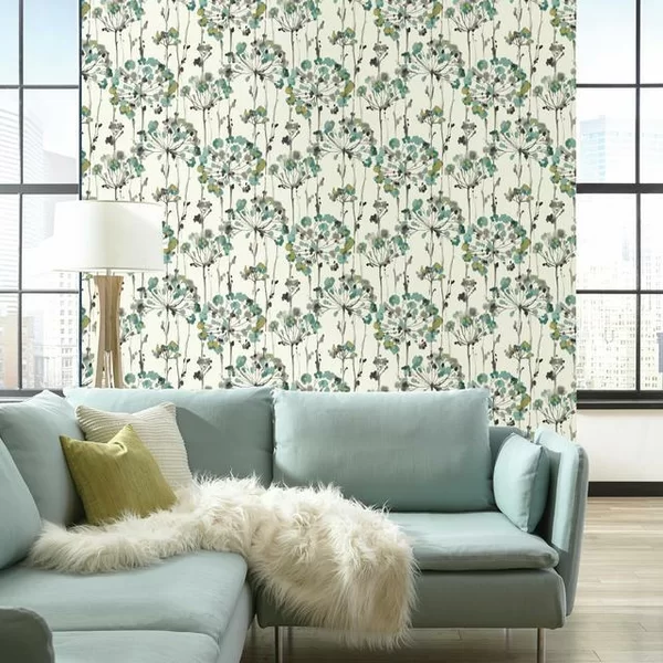
Teal
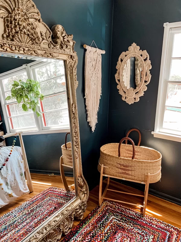
Especially for Eclectic, Bohemian, and Hollywood Glam interior design styles, the teal color can truly play a number one choice. Whether it’s inclined towards the blue or green undertones, it will undeniably make a rich and elegant statement with your gold accents.
So, have a look – this bohemian setup is absolutely breathtaking! Isn’t the incorporation of gold accents with details of macrame and rattan something to take inspiration from?
Lilac
The soft and feminine lilac has the capability to make your room appear subtle, calm, and soothing. However, if you want to add a statement of splendor and luxe – adding gold wouldn’t be a bad option. Remember, you must have an eye on the total amount of accents that you can incorporate.
For instance, the gold on lighting fixtures and mirror frames should be more than enough! But if you got a planter or two as well – don’t hold back and go ahead with the golden tinge.
Light Gray
Just like the combination of dark gray and gold is striking and adventurous – on the contrary, a combination of light gray and gold is subtle, serene, and composed. So, remember to limit the use of gold on the chandelier, furniture legs, and accessories to add the right amount of luxe and opulence to the room.
This is also a great way to make your room feel more lively, airy, and transitional-style!
Taupe
Yes, this is quite an unusual color combination – but at the same time, it best connects to a modern and contemporary setup. So, if you’re particularly admired by the soft beiges and earthy browns in your home – this tone of taupe can be used on the furniture with a fusion of gold on the legs and accessories.
On the other hand, ensure to even limit the use of taupe since too much of it can be quite intimidating!
Coral Pink
Pink is generally restricted to a kid’s bedroom or nursery. But with a tinge of gold – you can ultimately transform the vibe and make the space feel more formal and sophisticated. And yes, whether it’s the bedroom, living room, or the kitchen – this color will truly play flawlessly with a tint of gold.
For instance, in the kitchens, the coral pink will play classy with gold knobs and pull handles. Meanwhile, in the bedroom, don’t hold back from a gold-finish artwork frame.
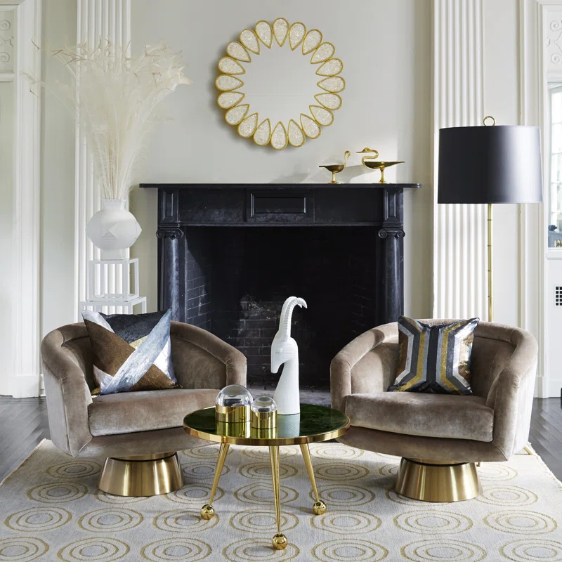
Tan
A combination of tan and gold is undeniably strong, bold, and bachelor-pad-like. Yes, a tinge of gold can be used in these masculine setups to give them a little sense of luxe and elegance. Also remember, you don’t have to incorporate too much gold on all the accessories and furniture frames.
Well, just the appropriate balance of wood, glass, and gold is what you must appreciate. So, aren’t you inspired by this living room setup?
Navy Blue
Especially for transitional and modern interior design style, never forget to try a fusion of navy blue and gold. This classic combination is truly made in heaven and is bound to give the space a correct amount of depth, drama, and sophistication.
Well, navy blue is a charming color that can look quite appealing on the kitchen cabinets, bathroom vanity, as well as the focal walls of your bedroom or living room. And once you pair it with that chic gold-finish hardware or accessories, the result would truly be breathtaking.
Beige
The combination of beige and gold is classic and will never get old or fade away. Well, the most intriguing aspect of this duo is that they share similar tones and undertones. So, if you’re particularly amazed by the feel of a monochromatic vibe, this fusion is something to have an eye on.
And you’d be surprised to know that beige will also create an illusion of a larger space and make it feel more airy and enhanced.
Electric Blue
Electric blue is a stark and saturated tone of blue that is much admired by homeowners in the interior design industry. And believe it or not, this color completes the palette when paired with gold! So, whether you have a kitchen to style or the bedroom – the illuminated gold and electric blue palette will make the space feel more energetic and dynamic.
On the other hand, to neutralize the high-spirited ambiance, use a base of clean white to play subtle and calm.
White
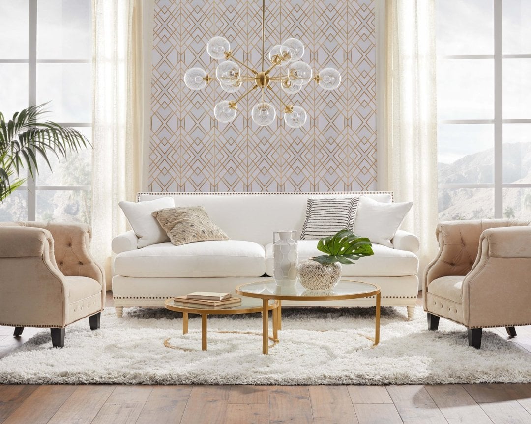
It’s time to magically transform the ambiance of that all-white room to bring a touch of glamor, sophistication, and splendor. Well, there are a ton of ways to style white and gold together! You can incorporate a tinge on the wallpaper, glittery cushions, a couple of furniture pieces, chandelier, knobs, pull handles, and even ceiling trays.
This dreamy fusion feels crisp, clean, and pure – and is also used for various wedding decorations!
Minty Green
The cool and refreshing minty green color can perfectly complement the golden tints in your room. Yes, it’s time to make that cheerful ambiance a little more sophisticated and formal! Hence, with a bold wallpaper featuring florals and motifs and utmost breezy furniture – you must not give a second thought to gold-tinted table lamps and pendant lights.
Lastly, you can also infuse a touch of sea blue to complete your palette!
Terracotta
This is a new day combination that feels quite unique and out-of-the-box. Well, just like how trendy and admired the terracotta color is, at the same time, is the fusion with gold. So, you can consider painting the accent wall in this tone and further complementing the golden tints on the chandelier and furniture legs.
This fine combination juxtaposes the organic and earthy with luxe and richness – and that’s the whole beauty of this pair.
Purple
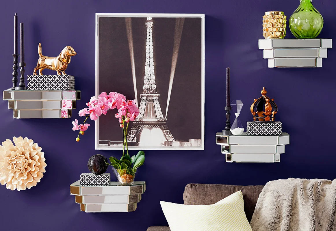
The majestic, magnificent, and regal – purple is a color that goes hand-in-hand with the gold. It’s saturated, bold, and stark, hence, a great way to create a striking appeal when paired with the gold accent color on the accessories and furniture.
Mainly, you can throw a splash of this color either on the wall or the furniture – and further complement it with shades of white, plum, and light gray to calm it all down.
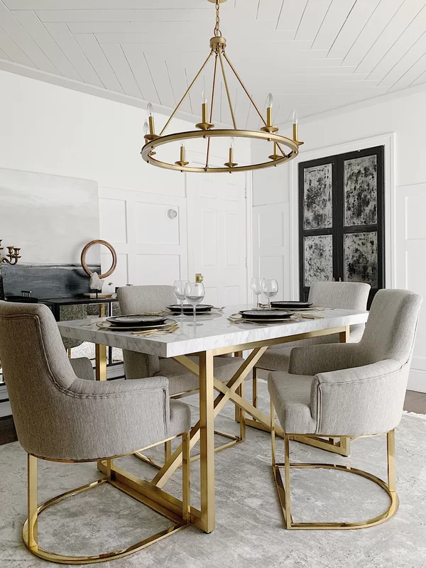
Rust Red
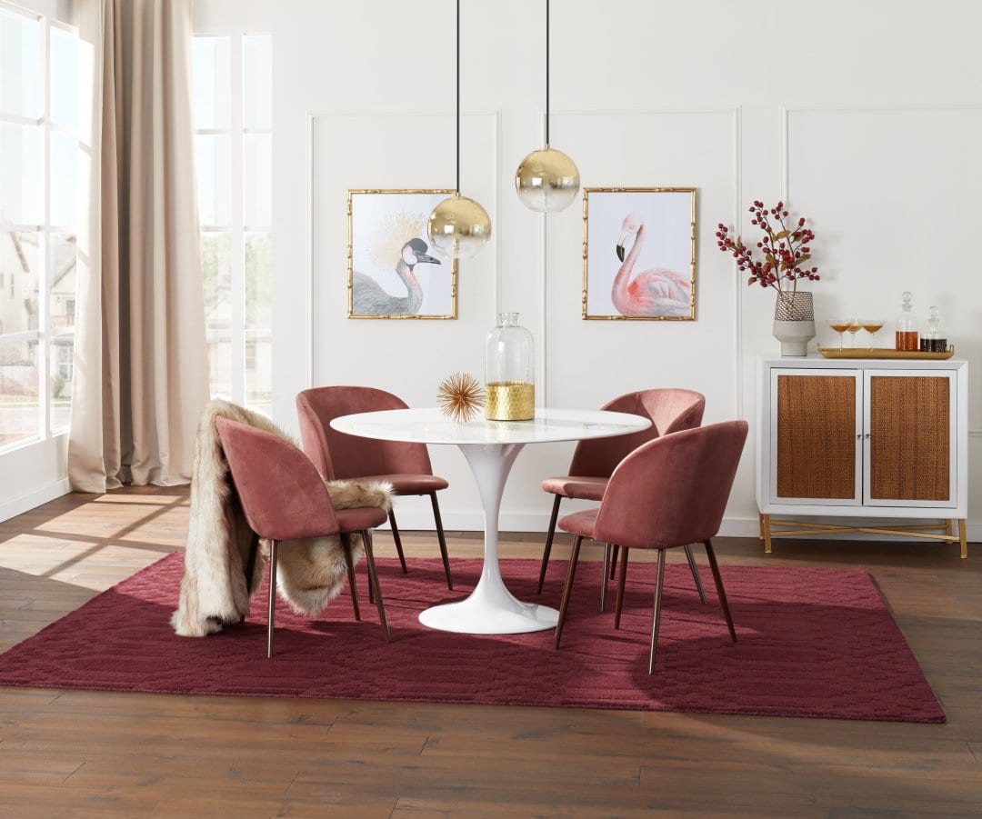
Rust red is a color that is gaining a ton of attention in recent years. Since it’s not so mainstream and bright – it is perfectly replacing the other tones of bold red in the homes. It is mainly a blend of red and gray to create a pastel, muted, and subdued shade – which when paired with gold, can do wonders.
So, have a look at this dreamy dining room setup! Isn’t it all you’ve been craving for?
Multiple Colors
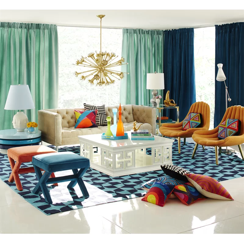
Now that we have discussed the relationship of gold with various individual colors, it’s time to have an eye on the palette that embraces the use of multiple contrasting colors. With a blend of royal blue, minty green, beige, mustard, red, and white – the gold on the lighting fixtures, artwork, throw pillows, and furniture legs are bound to look flawless.
In such eclectic setups, you can definitely consider a tinge of gold – wherever and however!
Summing It Up
Practically, the gold color can easily complement any color palette – as far as you’re aware of the amount of it you plan to use. Yes! And that’s the whole underlying challenge. So, how excited are you to play with this rich and luxurious color? Well, now that you’re acquainted with the colors that match gold – are you looking forward to incorporating any? Well, do let me know in the comments below.