Palladian Blue by Benjamin Moore
I try hard to retain my objectivity as a paint color reviewer. After all, every color is right for somebody’s project. But there are some colors that make me lose my cool, and Palladian Blue is one of them.
Except that’s not right at all, because Palladian Blue absolutely helps me find my cool. It’s such a refreshing color, with a light touch and meditative vibes.
You also might have noticed me recommending Palladian Blue as a coordinating color for, oh, just about everything. Hush, it’s not like I’m obsessed!
Besides, even if I am obsessed, I’m definitely not alone: Palladian Blue is officially one of Benjamin Moore’s best-selling colors.
Want to see what we’re all so excited about? Dive in to Palladian Blue!
What Color is Palladian Blue?
Palladian Blue is a blend of blue and green, shaded with silver gray, to create a light, refreshing color. Although its name says “blue”, Palladian Blue actually has a bit more green in its mix than blue.
LRV of 60.4
Palladian Blue has a light reflectance value (LRV) of 60.4. Light reflectance value is a scale designed to measure how bright a color is, and ranges from absolute black at 0 to sheer white at 100. The higher the number, the brighter the color.
Many designers favor an LRV range of 60-62 as their ideal. This is because paints in this range are adaptable to a wide variety of lighting situations. Palladian Blue is right in this range.
What Undertones Does Palladian Blue Have?
Palladian Blue has green undertones–if you’re thinking of it as a blue color in the first place! It also has silver gray undertones that Benjamin Moore describes as “mother of pearl”.
Is Palladian Blue a Warm Color or a Cool Color?
Palladian Blue is a cool color. Its component colors–blue, green, and gray–are all cool colors as well.
Where Can You Use Palladian Blue?
Palladian Blue sits right in that decorator’s ideal LRV range of 60 to 62, making it light enough to use in a wide range of lighting conditions. This cool and relaxing color is incredibly user-friendly!
Palladian Blue is a great choice for a wall color. You’ll also frequently see it as a kitchen cabinet color or a bathroom vanity color.
If you want to get creative with Palladian Blue, you can try it on trim. It’s also eye-catching and on-trend as a front door color. The most unique use of Palladian Blue I spotted had it as a bedroom floor color!
Use Palladian Blue anywhere you’d like to take a breath and feel refreshed.
Let’s take a look at Palladian Blue in action and gather inspiration for that next home project!
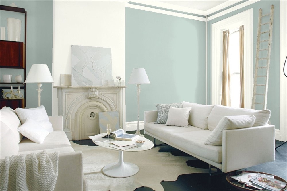
Living Room
Palladian Blue pairs with greens in the decor of this living room to bring out a lush, vibrant side.
Grays and blues in the decor of this living room mesh perfectly with Palladian Blue to create a peaceful environment, accented with neutrals.
Kitchen
Palladian Blue is a bright and eye-catching kitchen cabinet color choice.
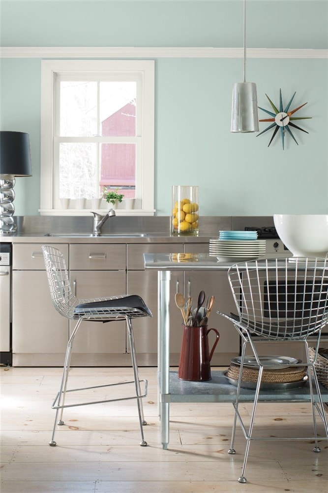
Palladian Blue’s silvery gray undertones are the perfect complement to kitchen metalwork and appliances.
Dining Room
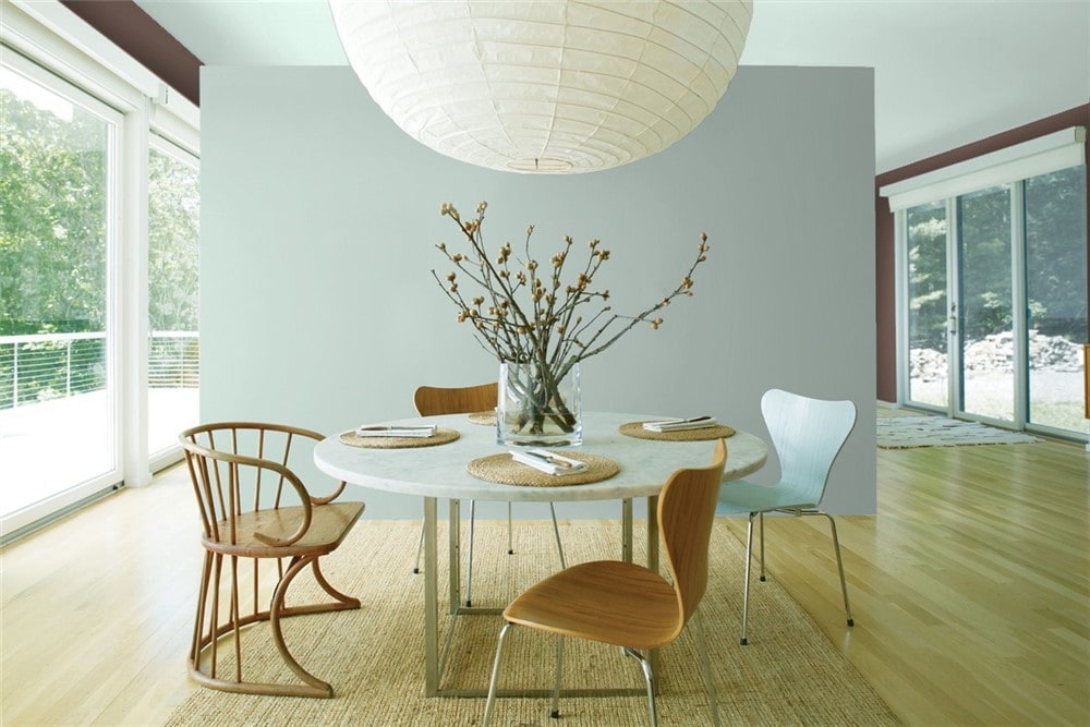
Palladian Blue and Wood Grain Brown team up to bring a natural calm to this minimalist dining room.
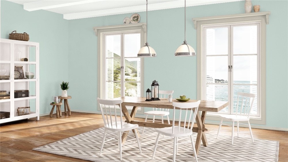
Your favorite greiges, like Revere Pewter, can make great coordinating colors for Palladian Blue, as this neutral dining room demonstrates.
Home Office
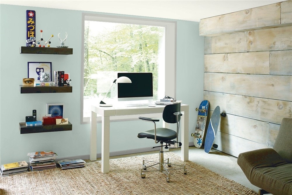
Palladian Blue picks up the gray tones in the natural wood wall of this home office.
Bedroom
Palladian Blue is an interesting choice as a floor color in this alcove bedroom, working with white walls to brighten the small space.
Touches of blue-green in the decor pick up the Palladian Blue walls in this cheerful vintage styled bedroom.
Nursery
Palladian Blue is a cheerful and soothing gender-neutral option for a nursery wall color.
Bathroom
Palladian Blue coordinates equally well with the white walls and gray tile in this modern bathroom.
Palladian Blue creates a relaxing, spa-like atmosphere in any bathroom.
Entryway/Mudroom
The wood tones in the floor are subtly echoed in the color choices for this mudroom, with Palladian Blue, white, and grays.
This entryway makes a fantastic use of Palladian Blue to transition into a mural wall.
Front Door
Palladian Blue and other blue-greens are eye-catching front door colors that add to curb appeal.
Palladian Blue partners with a greige exterior to really pop on this front door.
Exterior
Palladian Blue, white trim, and a coral pink door bring this “Mermaid Cottage” to life.
In an interesting twist, Palladian Blue is used as the accent color on this Victorian exterior, with a moody Iron Mountain main color and White Dove trim.
Palladian Blue Coordinating Colors
The easiest place to start coordinating Palladian Blue is with your favorite white. Palladian Blue can go with any type of white, including clean whites, off-whites, and creams.
Palladian Blue can happily coordinate with its fellow blue-greens. Darker and lighter versions can bring to mind a planted paradise or your favorite beach.
Palladian Blue is also easy to coordinate with colors that are simply blue or green. Darker blues, like indigo or navy, will make Palladian Blue look fresh and bright.
And even just adding green plants to your decor will amp up Palladian Blue’s green side for some organic vibrance.
Another easy place to turn for coordinating colors for Palladian Blue is the gray family. Palladian Blue’s silver gray shading helps it to naturally pair with other grays. This also includes your favorite greiges.
Dark grays, like charcoal gray, will make Palladian Blue shimmer.
Some other neutral colors that work with Palladian Blue include tans, browns, and beiges.
Here are some coordinating color ideas for Palladian Blue to help inspire you:
- White Dove by Benjamin Moore
- Cloud Cover by Benjamin Moore
- Navajo White by Benjamin Moore
- Edgecomb Gray by Benjamin Moore
- Gray Owl by Benjamin Moore
- Jamestown Blue by Benjamin Moore
- Aegean Teal by Benjamin Moore
- Persimmon by Benjamin Moore
- Wood Grain Brown by Benjamin Moore
- Benjamin Moore Apple Blossom
- Dress Blues by Sherwin Williams
- Repose Gray by Sherwin Williams
- Tricorn Black by Sherwin Williams
- Dovetail by Sherwin Williams
- Smoky Salmon by Sherwin Williams
- Fawn Brindle by Sherwin Williams
- Fragile Beauty by Sherwin Williams
How Does Palladian Blue Compare With Other Colors?
Palladian Blue vs Wythe Blue by Benjamin Moore
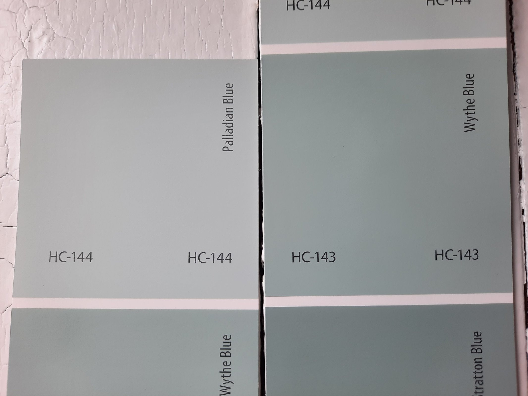
Wythe Blue is Palladian Blue’s closest neighbor on the paint chip, so these two have a lot in common. Essentially, they’re lighter and darker versions of the same color. Wythe Blue is the darker one, with a LRV of 48.11.
Palladian Blue vs Woodlawn Blue by Benjamin Moore
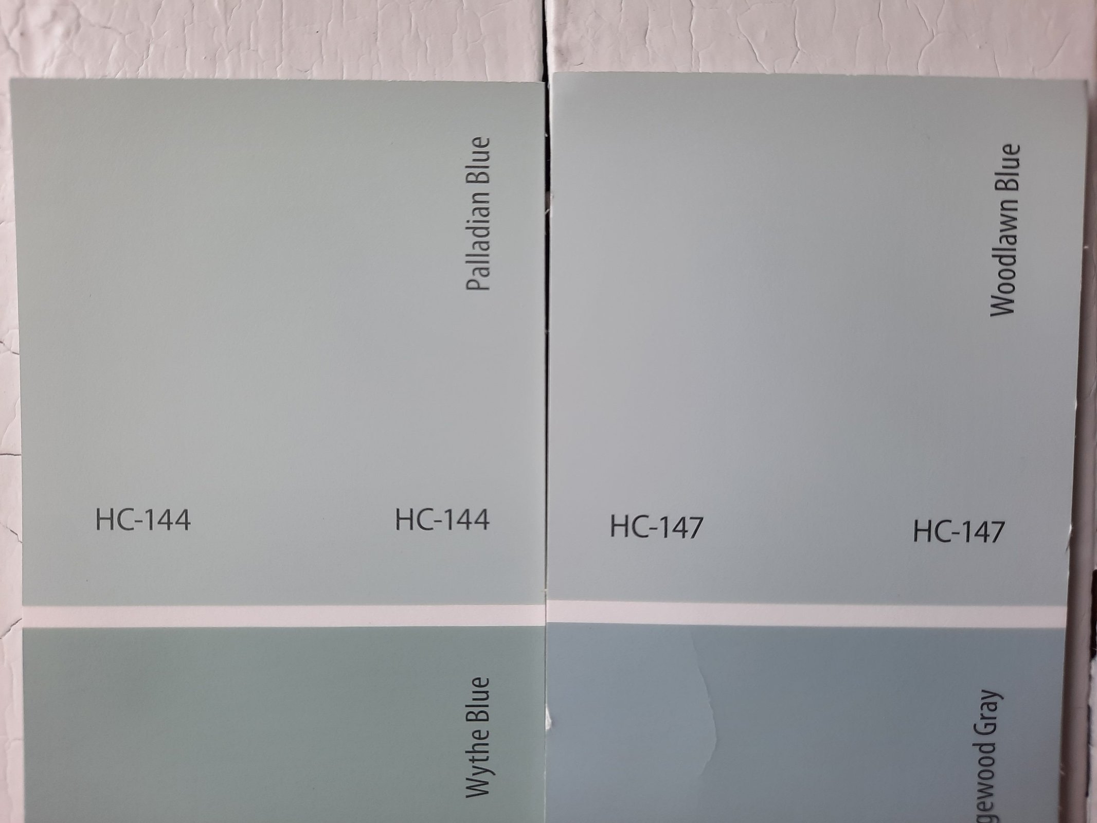
Woodlawn Blue is also a close neighbor of Palladian Blue, just a few paint chip spots away. These two are identically light, with Woodlawn Blue sitting at 60.65 on the LRV scale. But Woodlawn Blue is an actual blue, showing notably less green than Palladian Blue.
Palladian Blue vs Yarmouth Blue by Benjamin Moore
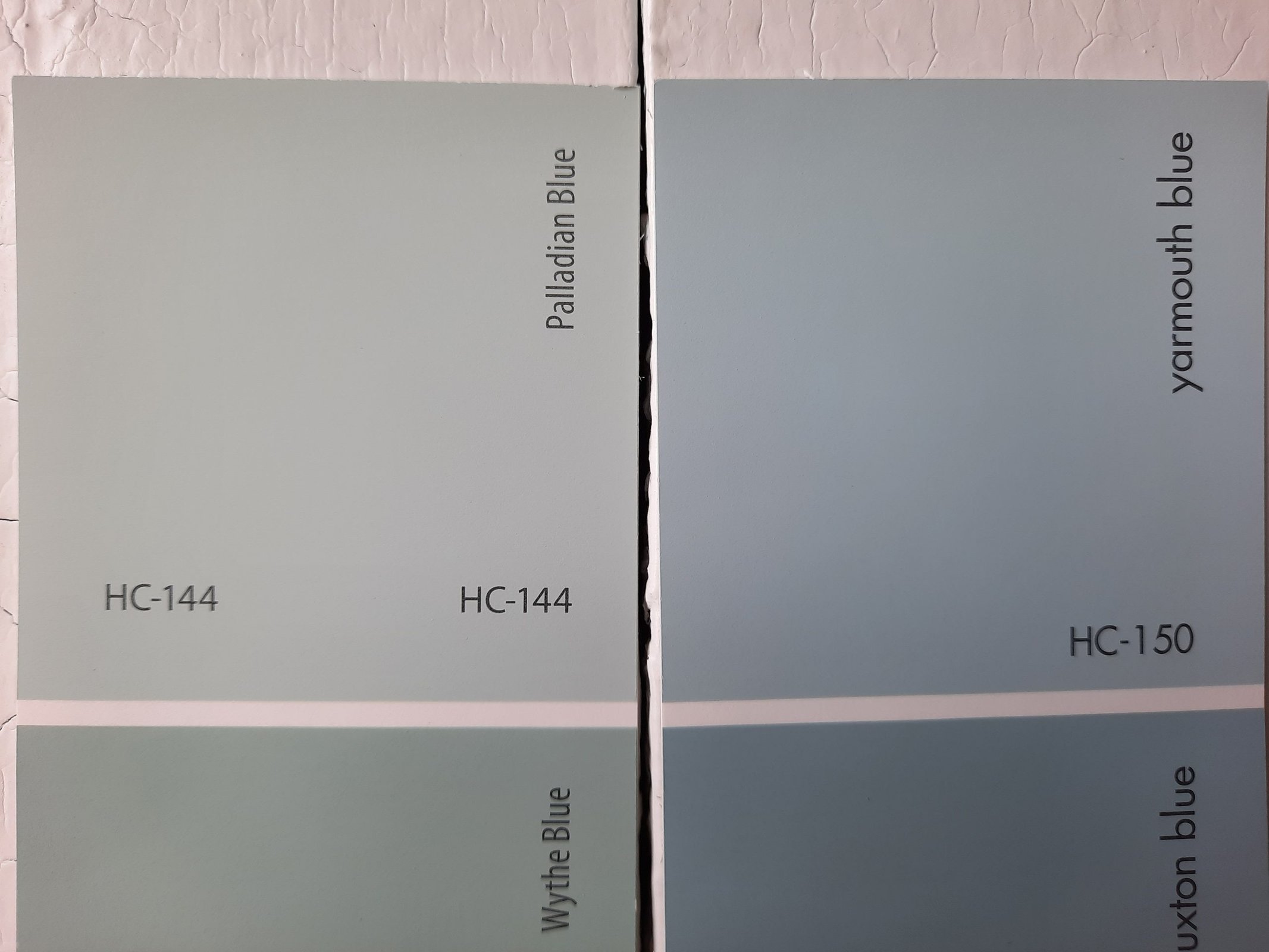
Yarmouth Blue is a true blue with no green side to speak of. It’s just a few chips further from Palladian Blue than Woodlawn Blue is. It’s a few notches darker than Palladian Blue, with a LRV of 55.82.
Palladian Blue vs Sea Salt by Sherwin Williams
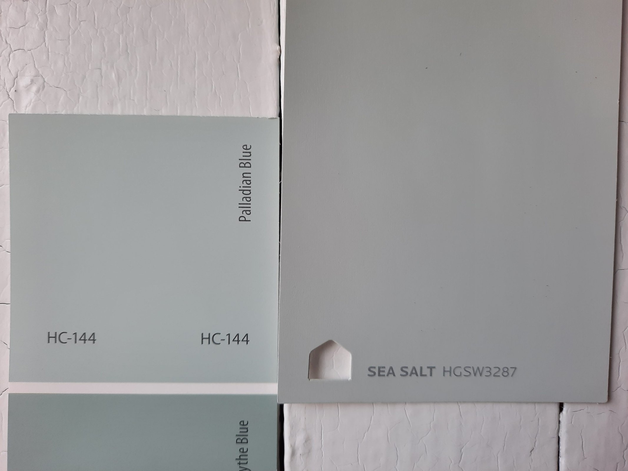
Sea Salt is a soft green-gray blend that’s just a touch lighter than Palladian Blue. Where some of the other comparisons we’ve looked at lack a green side, Sea Salt is pretty much just green and gray without the blue. Its LRV is 63.
Final Thoughts
It’s hard to find a palette–or a project–that wouldn’t be improved with a little Palladian Blue. This is a color with personality that has all the versatility of a neutral. Use it for a relaxing, refreshing feeling in any space. Will this popular paint color become one of your favorites?