Sherwin Williams Snowbound Paint Color Review
For a bright and refreshing space that lets the decor take center stage, there’s really nothing that fits the bill like a white paint. The white I’m going to introduce to you today has just a touch of gray shading to it for softness. But under most conditions it will look like the newly-fallen snow its name calls to mind: Snowbound, by Sherwin Williams.
Part of Sherwin Williams’ Minimalist collection, Snowbound is a bright white with little to distract from its glow. Let’s take a look at this simple but effective color together.
What Color is Snowbound?
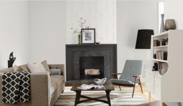
Snowbound is an extremely light pastel gray. It can also be described as a white with a tint of gray in it. Due to this color’s brightness, it will generally look white until you compare it with other colors.
LRV of 83
Snowbound has a light reflectance value (LRV) of 83. It’s a very bright color, inching just past the edge of the off-white scale, which tops off at about 82. Whites that are this bright can readily make a small or dark room look larger and more open.
What Undertones Does Snowbound Have?
Snowbound has gray undertones, which give it just the slightest sense of being off-white. Under extremely bright light you may notice some pink undertones. Overall, though, any undertones are slight, and this color primarily reads as white.
Is Snowbound a Warm Color or a Cool Color?
Snowbound is a cool color, thanks to the touch of gray in its blend. But talking about warm versus cool for a white at this level of brightness, where we start to leave the off-white family behind, is a much less noticeable factor than it otherwise would be. Sherwin Williams considers Snowbound to be one of its “Timeless Whites”, which are neither particularly warm nor cool.
Where Can You Use Snowbound?
Snowbound is a bright white, so it can be used anywhere in the home without the usual worries about creating caverns or claustrophobic feelings. Its gray tint gives it just a hint of body that helps it stand up to bright lighting as well.
It’s up to your personal preferences whether you want to make Snowbound your main all-over color or a supporting character when you’re casting your palette. Areas with lots of white are going to feel light and refreshing, but infusing some other colors can give spaces depth and personality.
Exterior
This exterior partners Snowbound with a popular Sherwin Williams black, Tricorn Black.
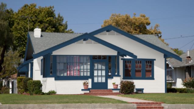
Here’s another take on an exterior with Snowbound and Salty Dog for the trim.
Entryway
“Less is more” was the philosophy for this all-Snowbound entryway.
This entryway has another black and white partnership with Snowbound, but takes it in a farmhouse style direction.
Living Room
Snowbound brightens this living room and still contrasts with the light beige mantle.
Sleek lines and a black and white color scheme make this living room look minimalist and sophisticated.
A black accent wall is a bold design choice in this living room, where it’s balanced by the Snowbound walls and ceiling, and the light neutrals in the furniture.
Kitchen/Dining Room
Snowbound cabinetry in this kitchen looks bright and fresh against the grey tile.
You don’t have to paint all your cabinets the same color! This kitchen creates interest by switching up white oak with Snowbound.
Snowbound in this dining room provides a neutral canvas to change up the decor with the changing seasons.
Bedroom
Snowbound in this bedroom looks refreshing and calm next to the array of gray shades.
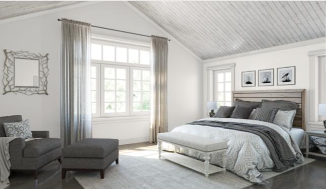
Snowbound uplifts this bedroom and makes it feel open and airy. It coordinates well with the array of grays in the decor. The gray ceiling is a grounding influence that keeps things from floating away entirely.
Bathroom
Brass is another great metal to partner with Snowbound, such as these brass lighting fixtures.
This farmhouse bathroom keeps it simple, using Snowbound as an accent color for its greige walls.
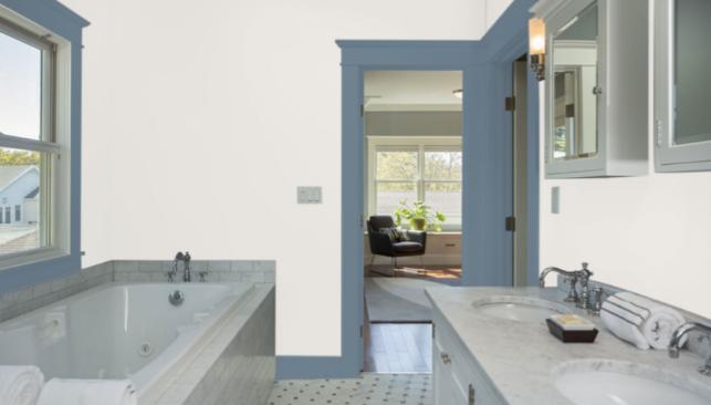
Snowbound looks almost creamy and glowing in this bathroom, with trim in Bracing Blue.
Snowbound Coordinating Colors
The world’s your oyster when you’re dealing with neutrals, because they can pair with anything. And Snowbound is your pearl: a shimmering white that can be part of any color palette your heart desires.
Lots of popular decor styles start with a white as their central palette choice, and then build on with neutrals like greiges, grays, beiges, and browns.
You can also pair Snowbound with a cool gray and a black for a sophisticated look that adds drama. Add a splash of gold or red if you’re feeling adventurous!
But really, Snowbound’s best quality is that it goes with anything. So what are your favorite colors? What would you really love to see in your home?
Here are some coordinating color ideas for Snowbound to get you started:
- Urbane Bronze by Sherwin Williams
- Anew Gray by Sherwin Williams
- Silverpointe by Sherwin Williams
- Folkstone by Sherwin Williams
- Colonnade Gray by Sherwin Williams
- Autumn Orchid by Sherwin Williams
- Slate Violet by Sherwin Williams
- Salty Dog by Sherwin Williams
- Tricorn Black by Sherwin Williams
- Black Magic by Sherwin Williams
- Revere Pewter by Benjamin Moore
- Wish by Benjamin Moore
- Gray Owl by Benjamin Moore
- Palladian Blue by Benjamin Moore
- Aegean Teal by Benjamin Moore
How Does Snowbound Compare to Other Colors?
Snowbound vs Alabaster by Sherwin Williams
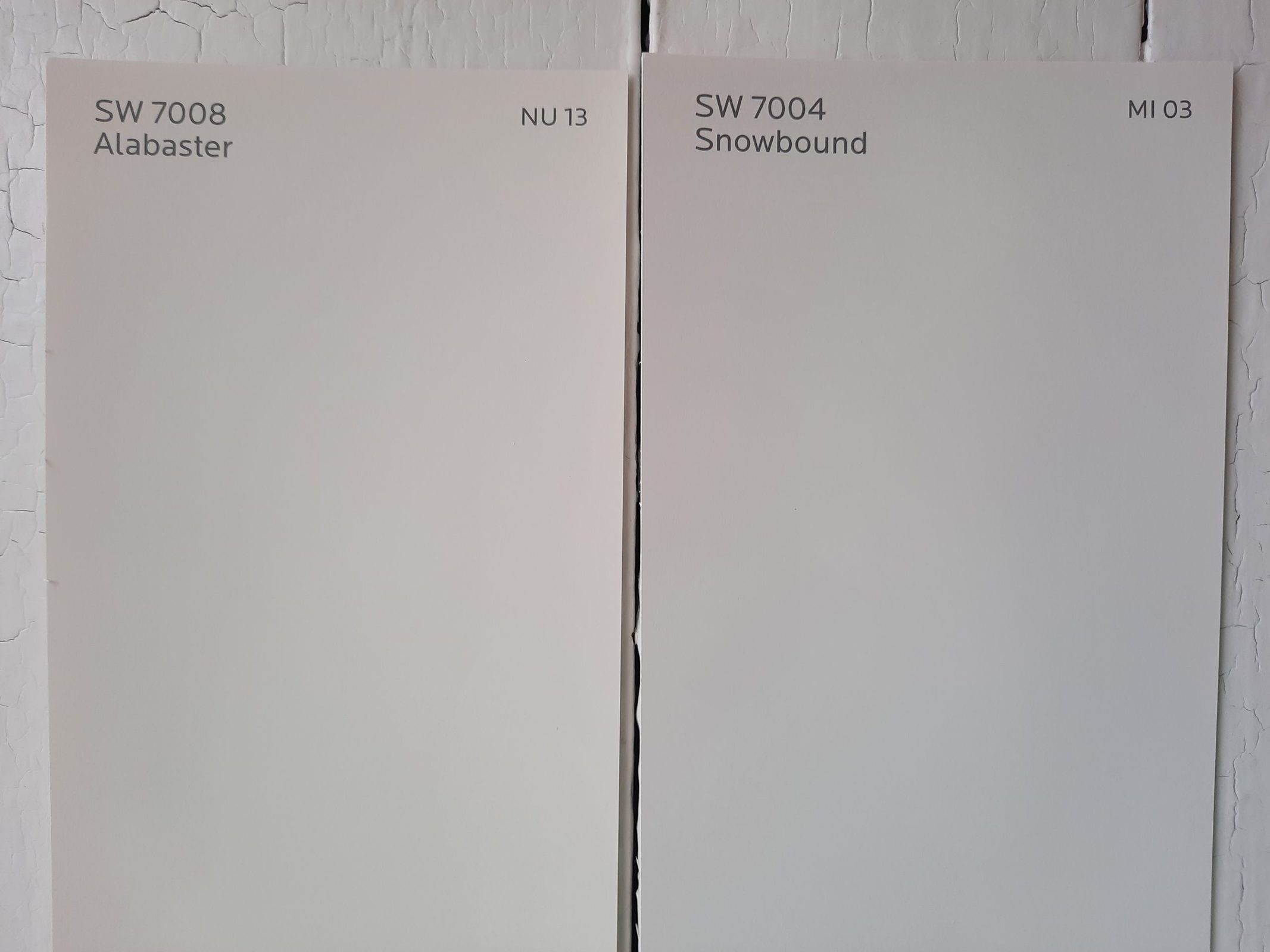
If Snowbound is a little too stark for your project, you might prefer Alabaster. Alabaster has a creamy, beige glow to it, but it doesn’t have troublesome yellow undertones. It’s warmer than Snowbound, and has a comparable LRV of 82.
Snowbound vs Pure White by Sherwin Williams
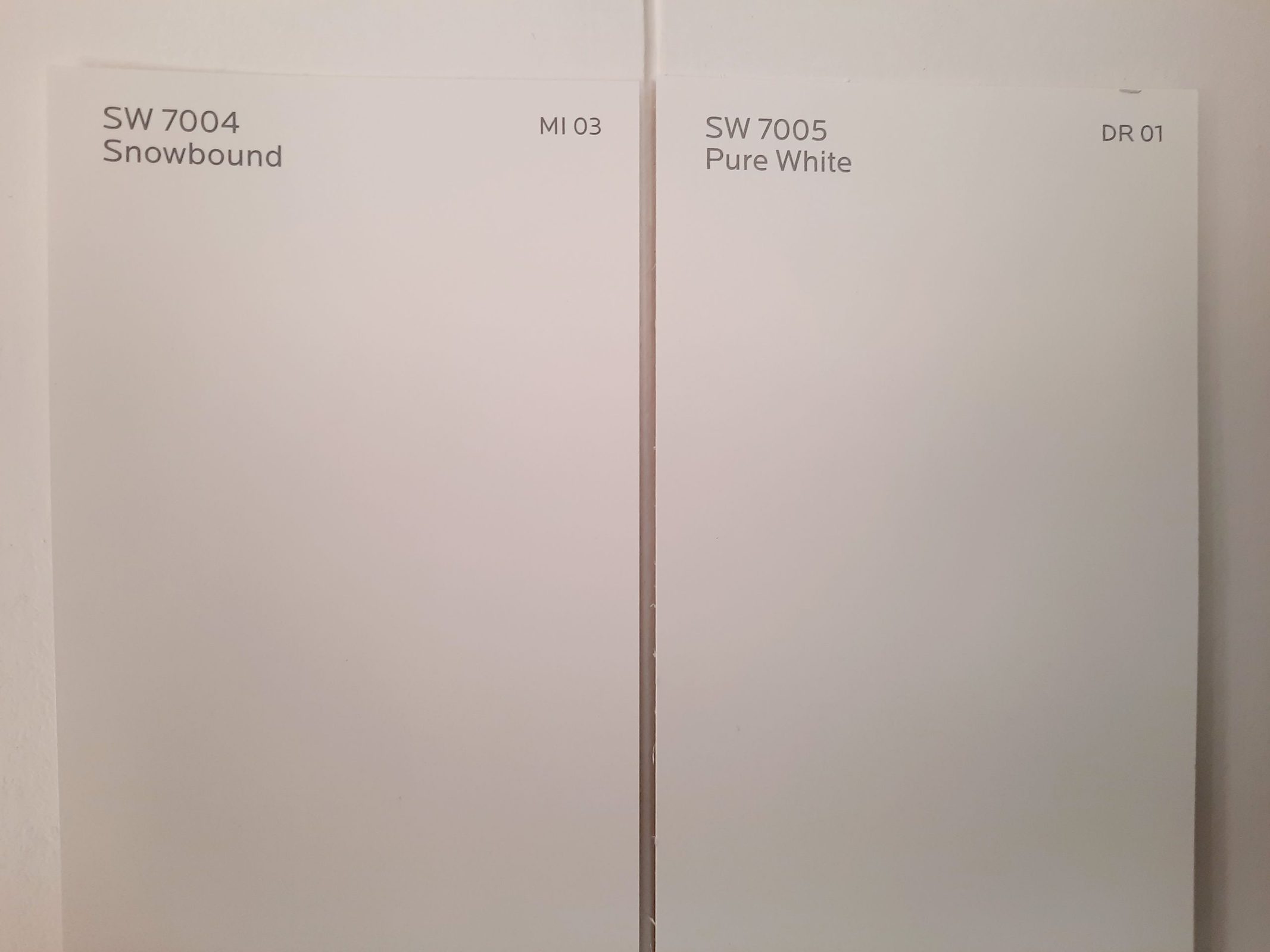
Pure White offers a whiter paint than Snowbound or Alabaster, with a comparable LRV of 84. As you’d expect, it’s not tinted or shaded. However, it’s not quite as white as our next comparison, Extra White.
Snowbound vs Extra White by Sherwin Williams
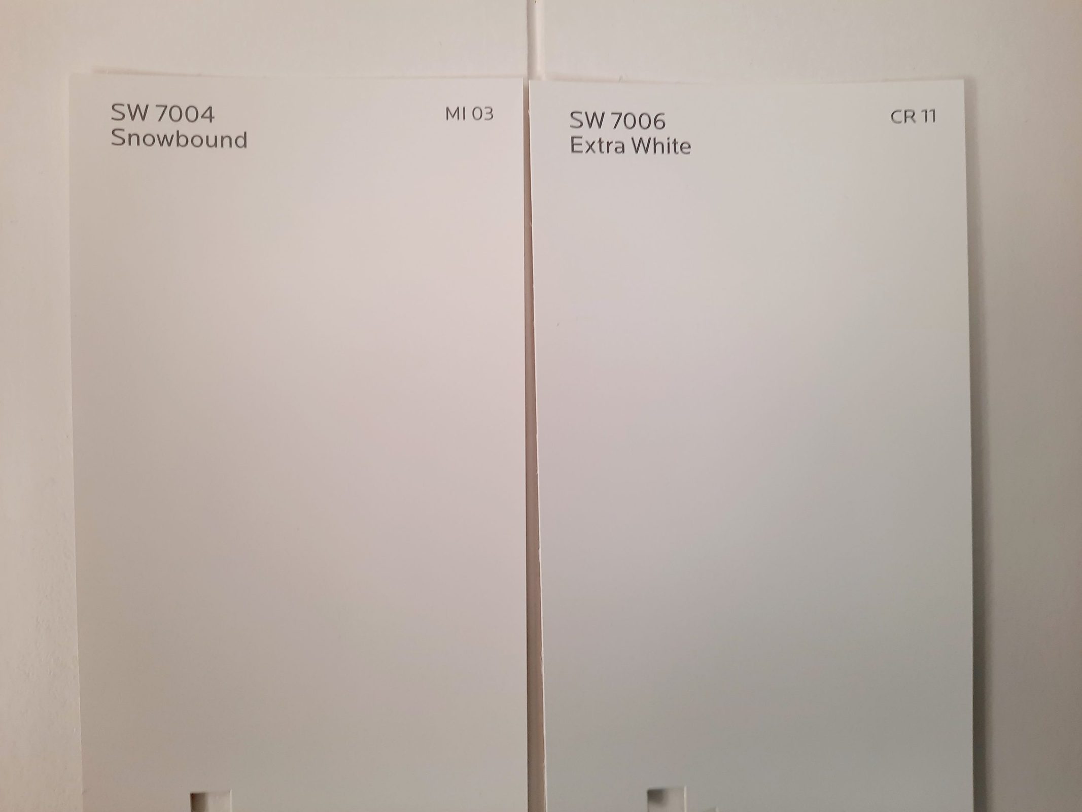
Extra White is, rather intuitively, really, really white. Its LRV of 86 is a bit brighter than Snowbound, and it hasn’t got any sort of creaminess or tint to it whatsoever. If Snowbound just isn’t white enough for your paint job, then Extra White should be your choice.
Snowbound vs Cloud White by Benjamin Moore
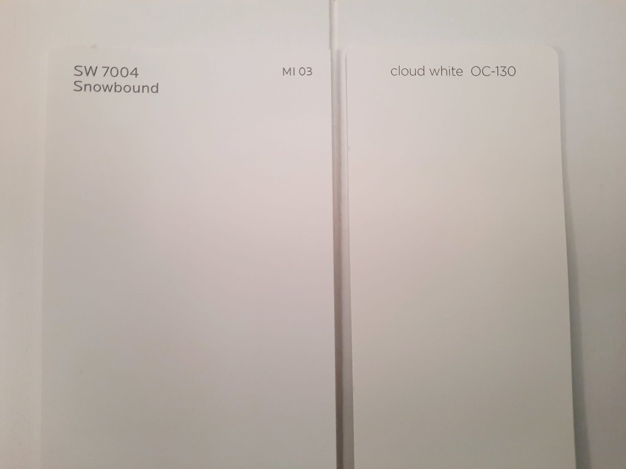
Cloud White is a warm white from Benjamin Moore with a super-bright LRV of 87.35. It’s a few notches brighter than Snowbound, and has more of a cream tint as opposed to Snowbound’s gray tint.
Final Thoughts
Snowbound is a great multipurpose white that can be readily used as an all-over color in your home. This “Timeless White” doesn’t have distracting undertones, and isn’t too warm or cool to be included in whatever project you have in mind. It has the slightest soft gray shading to keep it from being too harsh. Whether it’s the backbone of your palette or just the trim, you’ll find Snowbound to be adaptable to your needs.