Sherwin Williams Alabaster Paint Color Review
Whether you’re looking for a neutral canvas to let your more colorful decorating ideas dazzle the eye, or you’re looking for a soothing, minimalist vibe, chances are you’re going to need a white paint color in your palette.
Alabaster, a neutral white intended to convey a fresh start and a calm atmosphere, was Sherwin Williams’ 2016 color of the year. With a soft glow that feels warm and luminous without actually being a warm white, Alabaster can be a great start to any palette. In this review I’ll cover everything you need to know to use Alabaster with confidence.
What Color is Alabaster?
Alabaster is a very light pastel beige, or bright off-white. It’s a slightly creamy color, but it doesn’t look yellow. Alabaster is soft and luminous.
LRV of 82
Alabaster has a light reflectance value (LRV) of 82. This makes it a very bright off-white, as the off-white scale runs from about 73 to 82. But it still isn’t quite a pure white; Alabaster has a noticeable color.
What Undertones Does Alabaster Have?
Alabaster has noticeably creamy beige undertones, but they are neutral, rather than distractingly yellow. It should be noted that Alabaster’s undertones are very slight, and under bright lighting, they’re basically invisible.
Is Alabaster a Warm Color or a Cool Color?
Sherwin Williams considers Alabaster to be one of its “Timeless Whites”, that is neither warm nor cool. When compared to other whites, you can see a slight warmth to Alabaster that helps it to lend a gentle glow to a space.
Where Can You Use Alabaster?
Alabaster can be used in any room of the home. It can be your all-over color or adapt to a supporting role for things like accents and trim.
Used widely, Alabaster will brighten up a space, making rooms feel bigger and loftier. Coordinated with pastels, Alabaster can set the stage for a dreamy, ethereal space, which can be great for a restful bedroom, family room, or reading nook.
If things are too open and breezy, you can balance Alabaster with some grounding colors, such as earthy neutrals. Warm wood and leather coordinate nicely with Alabaster’s gentle glow. This look could make for a polished and sophisticated dining room, study, or living room.
Let’s explore Alabaster in different home spaces to see some of the many directions you can take this versatile color.
Exterior
This home exterior uses Alabaster as the all-over color, with a medium gray on the shutters that strikes just the right balance in terms of contrast.
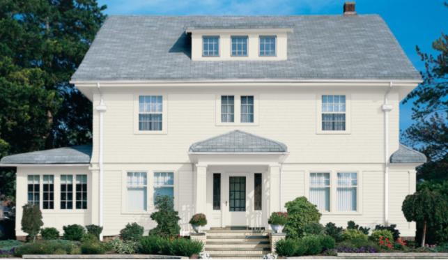
Alabaster on this exterior gives it an oh-so-slight creamy glow that’s quite charming.
Living Room
This well-loved family room keeps it simple with Alabaster walls, hardwood floors, and black and white furnishings. You can’t go wrong pairing neutrals.
Alabaster helps this living room breathe a bit, when it might otherwise feel small.
Kitchen
Cool gray tile and later-afternoon sun make Alabaster show its warm side.
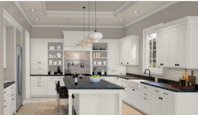
Alabaster and Anew Gray make a natural and relaxed partnership in the kitchen.
Bathroom
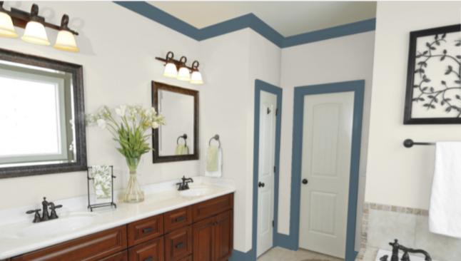
Alabaster, together with Smoky Blue trim, complements the warm wood in this bathroom.
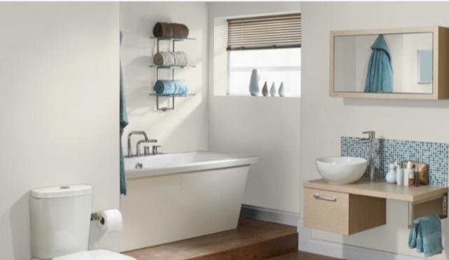
Alabaster in this low-lit bathroom is creamy and neutral rather than stark white and cold.
Nursery
This restful nursery builds its peaceful palette around Alabaster.
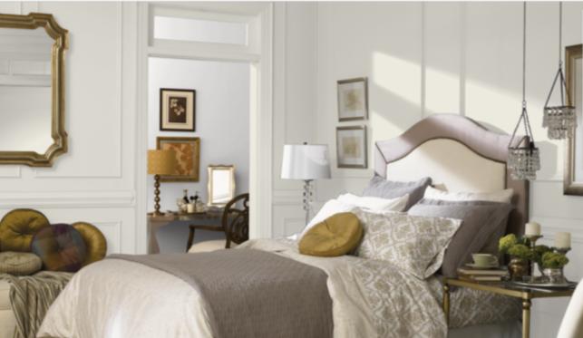
Bedroom
Black and gold make a chic and sophisticated combination with Alabaster in this bedroom.
Beiges and driftwood partner with Alabaster for a neutral and relaxing bedroom.
Alabaster Coordinating Colors
White paint colors are about as neutral as you can get, so Alabaster is wide open for coordinating color possibilities.
If you want to keep things neutral, Alabaster can coordinate with popular greige colors like Mindful Gray and Revere Pewter. It looks especially nice with tans and browns, which also means it looks great with natural woods.
If you’re looking for a chic and classic look, Alabaster can coordinate elegantly with blacks, golds, silvers, and grays.
Since Alabaster isn’t really all that warm or cool itself, you can easily coordinate it with the warm or cool colors of your choice. You could go for a coastal look with watery blues and sandy beiges. Or you could play to the warm side with barn door reds and sunflower yellows.
Here are some color ideas to explore with Alabaster:
- Mindful Gray by Sherwin Williams
- Smoky Blue by Sherwin Williams
- Antler Velvet by Sherwin Williams
- Red Barn by Sherwin Williams
- Antique Red by Sherwin Williams
- Tricorn Black by Sherwin Williams
- Black Magic by Sherwin Williams
- Iron Ore by Sherwin Williams
- Billowy Breeze by Sherwin Williams
- Retro Mint by Sherwin Williams
- Vintage Gold by Sherwin Williams
- Amulet by Benjamin Moore
- Flora by Benjamin Moore
- Chelsea Gray by Benjamin Moore
- Mt. Rainier Gray by Benjamin Moore
- Sanctuary by Benjamin Moore
- Revere Pewter by Benjamin Moore
How Does Alabaster Compare to Other Colors?
Alabaster vs Snowbound by Sherwin Williams
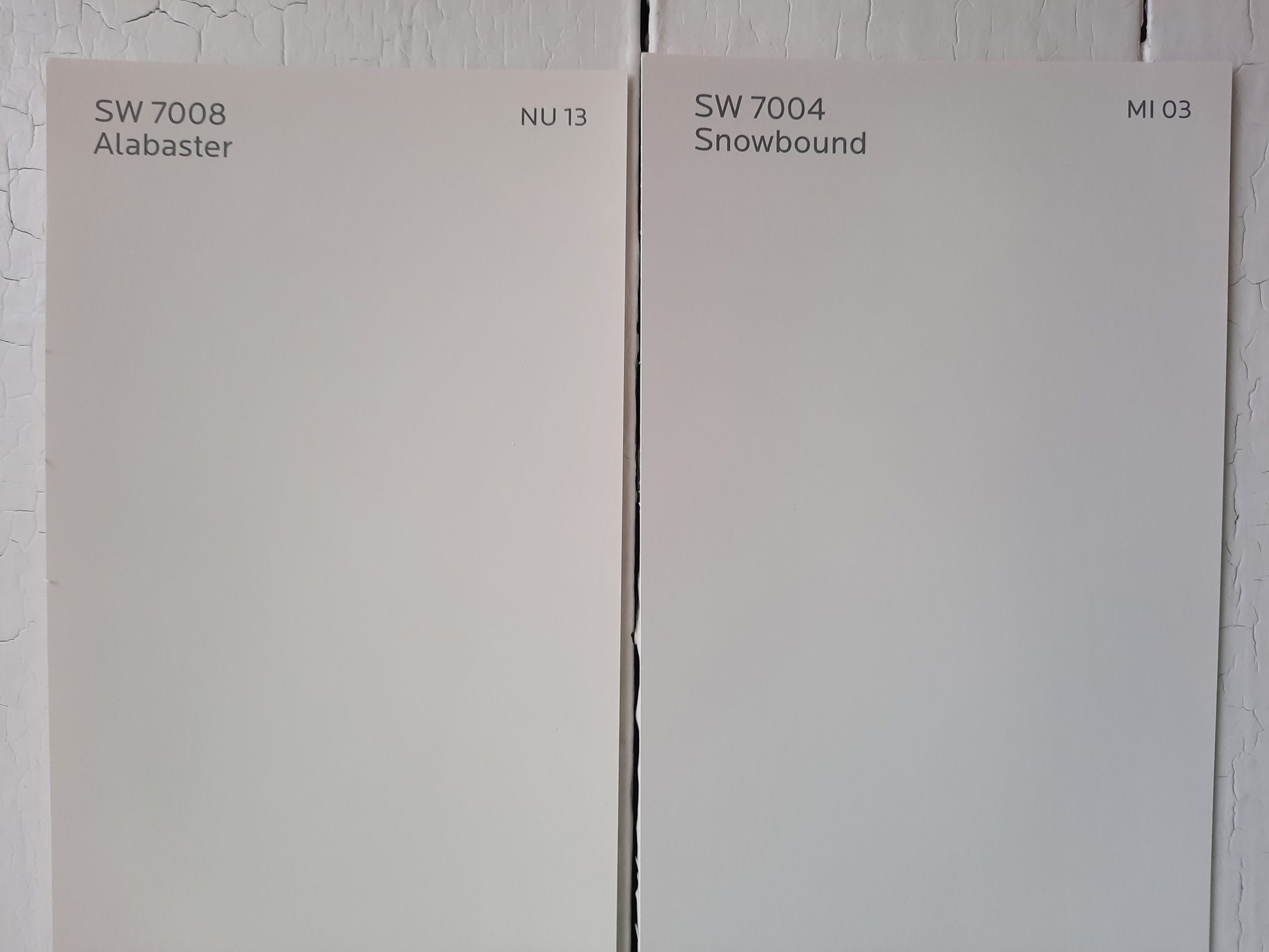
Snowbound is a white from Sherwin Williams with a comparable LRV of 83 to Alabaster’s 82. It’s whiter-looking than Alabaster, and lacks the creamy, beige component that Alabaster has. Snowbound is part of Sherwin Williams’ Minimalist collection.
Alabaster vs Shell White by Sherwin Williams
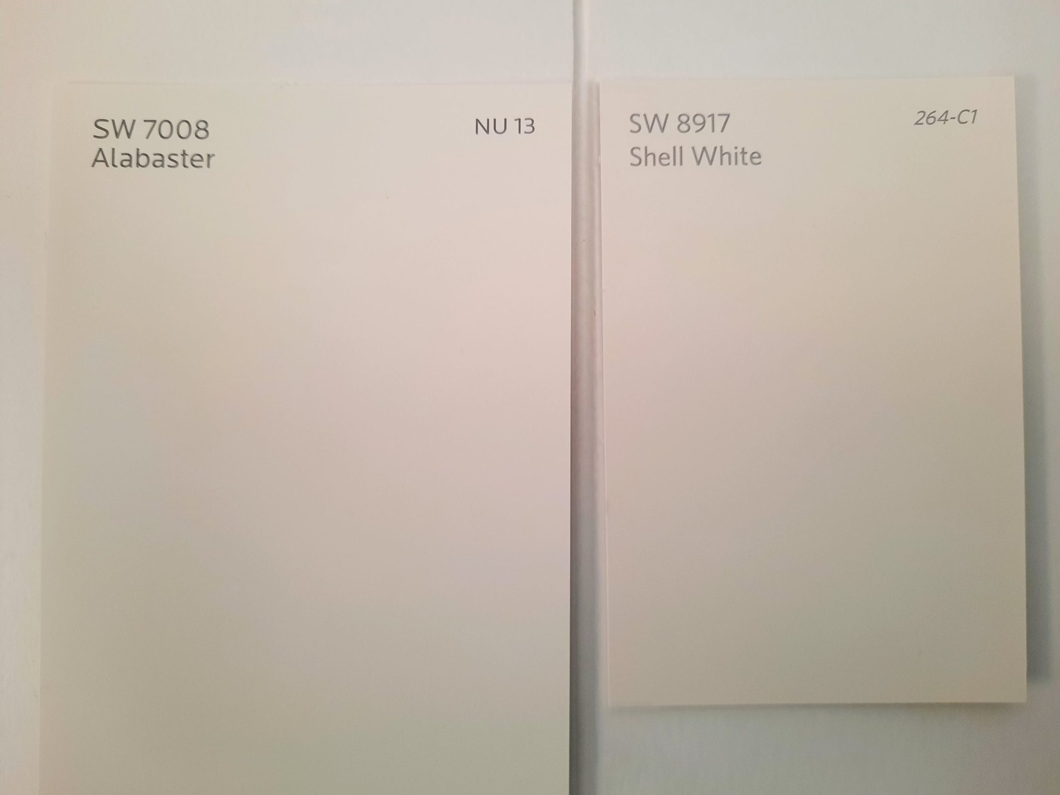
Shell White is another white with a comparable brightness to Alabaster, with a LRV of 83. While Alabaster looks ever-so-slightly creamy, Shell White looks ever-so-slightly pink.
Alabaster vs Whitetail by Sherwin Williams
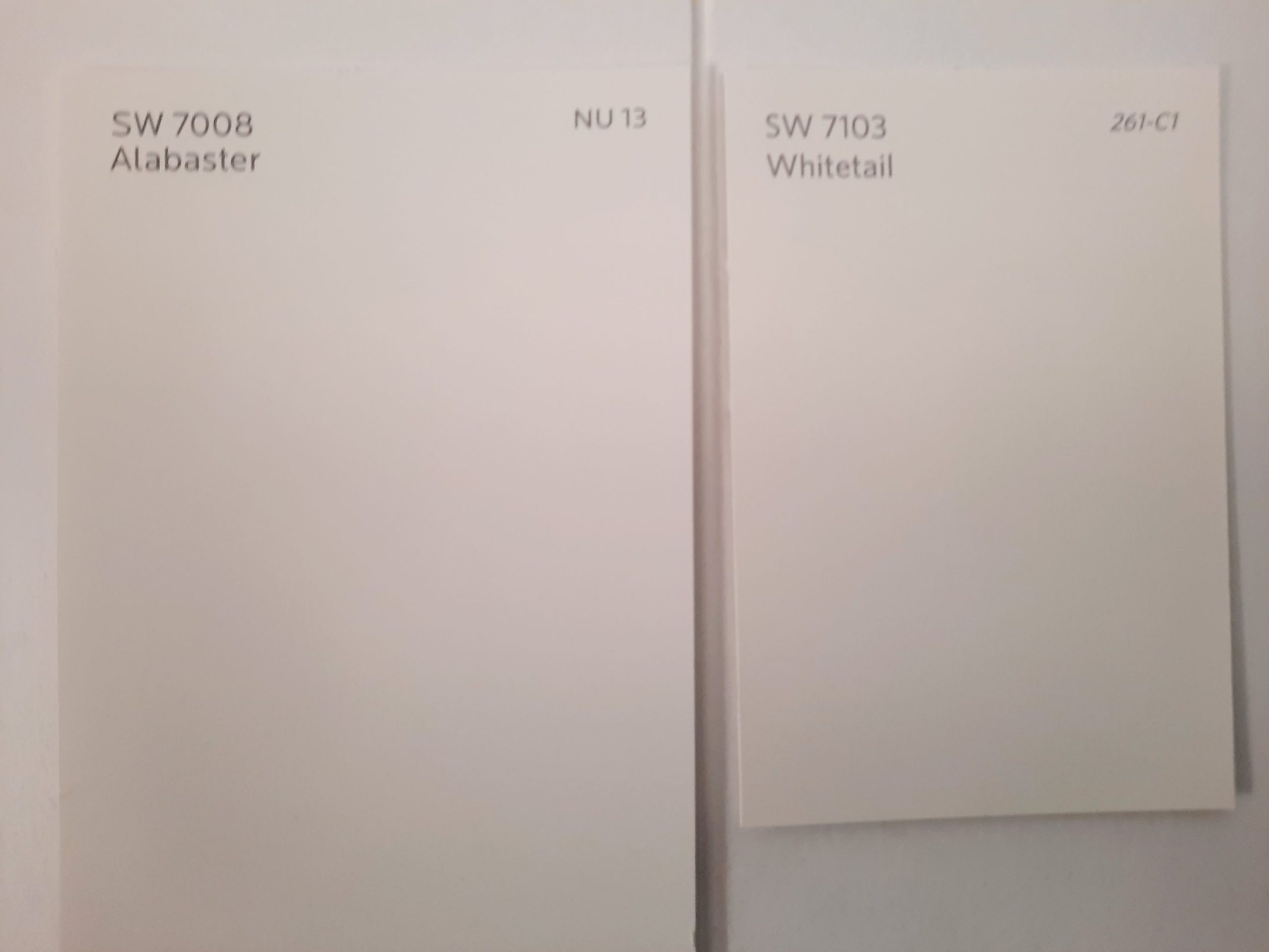
Whitetail is a white color that still retains a hint of that creaminess, but it’s a bit brighter than Alabaster, with a LRV of 86.
Alabaster vs Natural Choice
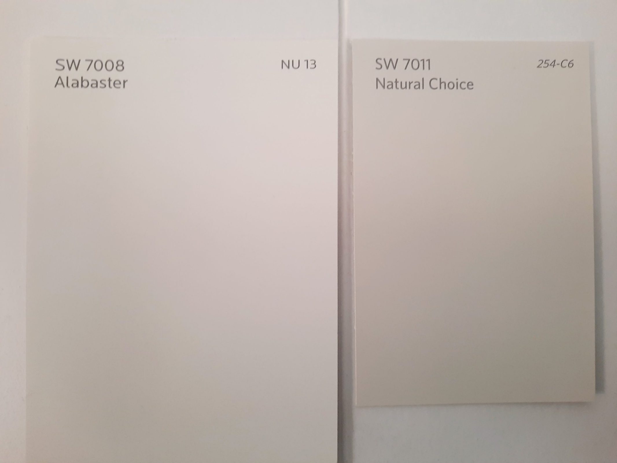
Natural Choice is a very pale color that brings to mind unbleached linen. Its LRV of 73 makes it noticeably darker than Alabaster, even though “dark” isn’t really a word anyone would apply to this color. Natural Choice is still plenty bright enough to be an off-white.
Final Thoughts
Alabaster is a nearly-warm, almost off-white, and it’s that in-between category that gives this color a soft and lovely glow that’s all its own. This versatile neutral can readily serve as the backbone of any palette, and is prepared to go in any decorating direction you have your heart set on. There are no wrong answers when coordinating with Alabaster!