Extra White Paint Color by Sherwin Williams
Spend any time looking for a white paint, and you’ll discover that there’s a lot to choosing just the right white for your home.
No matter how a white paint chip looks by itself, if you look at them side-by-side, you’ll see that there are buttery, warm whites, grayish or even blue cool whites, and neutral whites that are balanced, and don’t have undertones.
These clean, neutral white paints are incredibly popular, because they go anywhere and are super easy-to-use. Today we’re going to take a look at a celebrity from Sherwin Williams’ user-friendly neutral whites: Extra White.
What Color is Extra White?
Extra White is a bright, clean, balanced white paint. This is a popular and well-loved white thanks to its neutral balance and natural versatility. It belongs to many of Sherwin Williams’ collections, featured again and again as a fan favorite.
LRV of 86
Extra White has a light reflectance value, or LRV, of 86. Light reflectance value is a scale designed to measure how bright a color is, and ranges from absolute black at 0 to sheer white at 100. The higher the number, the lighter the color.
Off-white colors typically range from about 73 to 82, with numbers above 82 being true whites. Extra White is bright enough to be a proper white paint. However, if you must have the absolute brightest white, there are a few out there.
What Undertones Does Extra White Have?
For most intents and purposes, Extra White does not have any undertones. You may notice a touch of gray or blue peeking through, but it seems almost petty to consider them “undertones” in this instance!
Is Extra White a Warm Color or a Cool Color?
Extra White is a well-balanced, clean white paint that is officially neutral. Since it’s so bright, and doesn’t have undertones coming through, it doesn’t lean warm or cool.
Where Can You Use Extra White?
Extra White has a lot going for it when it comes to versatility. It’s light, neutral, and doesn’t have undertones. That means you can use it anywhere you like!
The one precaution you might want to take when it comes to placing your Extra White is reflections. If you’re going for large areas of this very bright white, nearby colors can bounce off of it. That includes adjacent paint or furnishings, as well as colors from outside, such as green lawns.
White paints are extremely popular as both wall and trim colors. Extra White is clean and crisp, which makes it very well-suited to be the trim for any other color.
The most popular trend for white paint has been the white kitchen, especially for farmhouse and modern farmhouse styles. Extra White is equally suited to work as a wall or cabinet color in a white or light neutral kitchen.
Extra White can brighten up dark and small spaces, making them feel more spacious and airy. You can’t go wrong using it in a cramped bathroom or hallway.
That light and airy feeling can make rooms featuring Extra White feel more relaxing.
Let’s take a look at Extra White at work in home spaces.
Kitchen
This all-white kitchen shimmers like a diamond, pairing Extra White with grays and silvers in the decor.
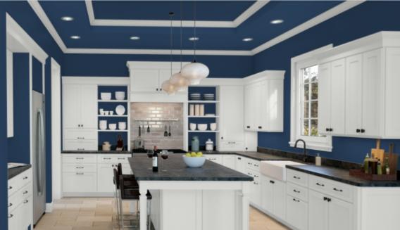
Dress Blues makes a classic pairing with Extra White in this modern kitchen.
Dining Room
Extra White and Alabaster partner in this brightly lit, elegantly neutral dining room, accented by Brazilian teak flooring.
This comfortable dining room pairs Olympus White and Extra White board and batten for a cool and subtle contrast.
Bedroom
Warm woods and gold decor touches bring out the glow in this Extra White bedroom.
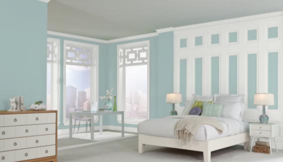
Watery and Extra White bring a soft, coastal look to this calming bedroom.
Nursery
Extra White is an excellent backdrop for your favorite colors, as it demonstrates in this cheerful nursery.
Bathroom
This Extra White bathroom looks sophisticated and chic with black metal hardware and gray marble counters.
Extra White and Priscilla meet up in this fun and cheerful bathroom.
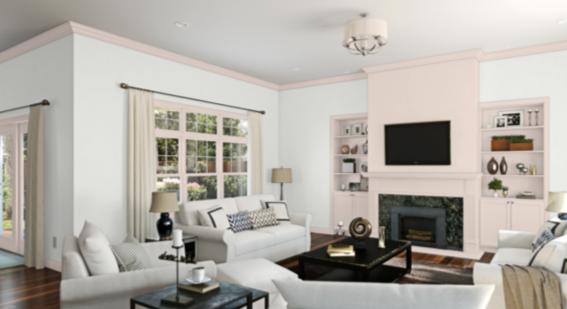
Living Room
Extra White brightens up this living room, set off by lots of natural neutrals in the decor.
A strong contrast between intense Tricorn Black walls and an Extra White accent wall combine for a dramatic statement in this modern living room.
Entryway
This bright and cheerful entryway uses Extra White as a backdrop for exploring color.
This sleek black and white entryway pairs Extra White with geometric design elements for a modern look.
Exterior
A bright Extra White exterior looks especially crisp next to black trim and cedar beams.
Deep black accents and stone set off this Extra White farmhouse exterior.
Extra White Coordinating Colors
Extra White is a well-balanced, clean, neutral white without any significant undertones. That means that you’re free to put it in any color palette your heart desires.
Even the lightest coordinating colors will show some contrast next to Extra White, so delicate color schemes are an option. You can also go for strong contrasts with deep colors like navy blue, brick red, or forest green.
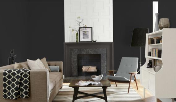
Extra White can go in a classic and elegant direction with a black and white color scheme, accented with gold or silver. For more depth, consider a moody charcoal gray instead of black. You can add a lighter gray or even a greige as a third color to either pairing.
You can easily begin a color palette for Extra White simply by placing it with two or three of your favorite colors. In fact, chances are if you’re already searching out a white paint, it’s because you’ve got some colors in mind. But just in case you haven’t, here is some coordinating color inspiration to help you get started:
- Smoky Azurite by Sherwin Williams
- Charcoal Blue by Sherwin Williams
- Poolhouse by Sherwin Williams
- Cascades by Sherwin Williams
- Caviar by Sherwin Williams
- Intellectual Gray by Sherwin Williams
- Grayish by Sherwin Williams
- Aloe by Sherwin Williams
- Dress Blues by Sherwin Williams
- Flattering Peach by Sherwin Williams
- Hale Navy by Benjamin Moore
- Balboa Mist by Benjamin Moore
- Chelsea Gray by Benjamin Moore
- Jamestown Blue by Benjamin Moore
- Aegean Teal by Benjamin Moore
- Tender Pink by Benjamin Moore
- Beacon Gray by Benjamin Moore
- Healing Aloe by Benjamin Moore
How Does Extra White Compare with Other Colors?
Extra White vs Pure White by Sherwin Williams
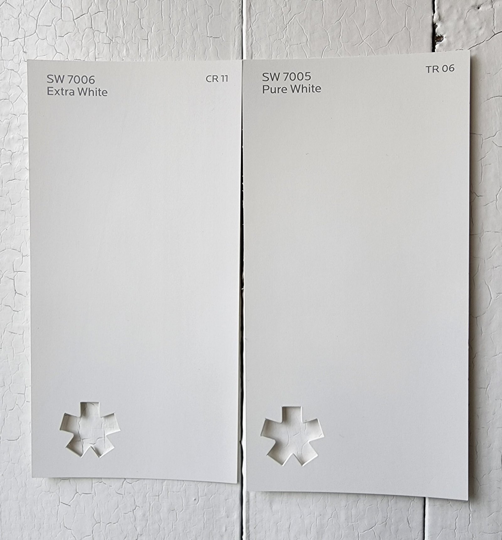
Pure White and Extra White are very similar: clean, balanced, neutral whites that are rather bright. The only meaningful difference between them is a couple points of LRV: Pure White has 84 to Extra White’s 86.
Extra White vs High Reflective White by Sherwin Williams
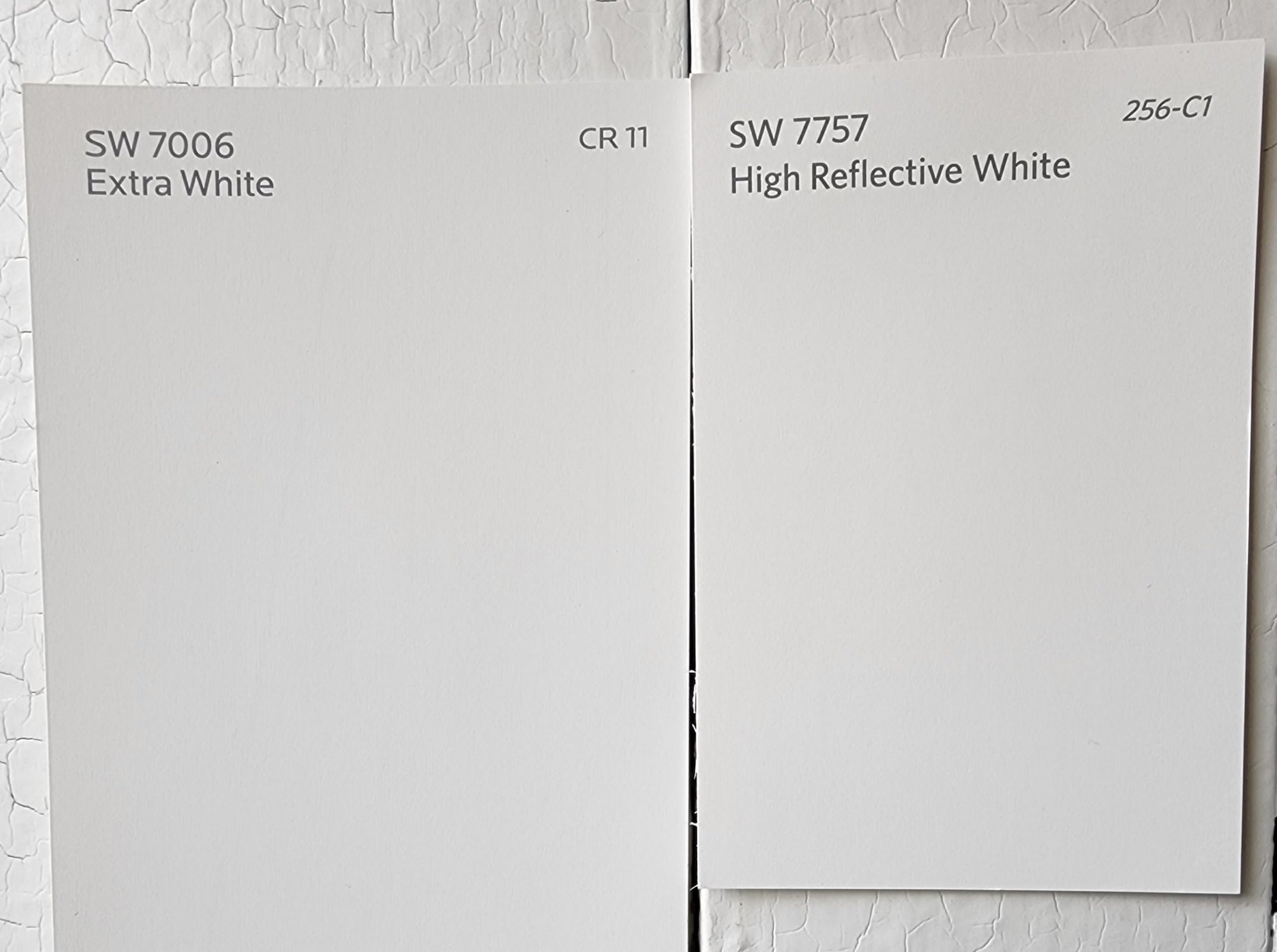
You might think that Extra White is a really bright white–until you get it next to High Reflective White! This intensely bright white can make even Extra White look almost gray. It’s another clean, no-undertones, no-nonsense neutral white. With a LRV of 93, you’ll have a hard time finding a brighter white on the market than High Reflective White.
Extra White vs Oxford White by Benjamin Moore
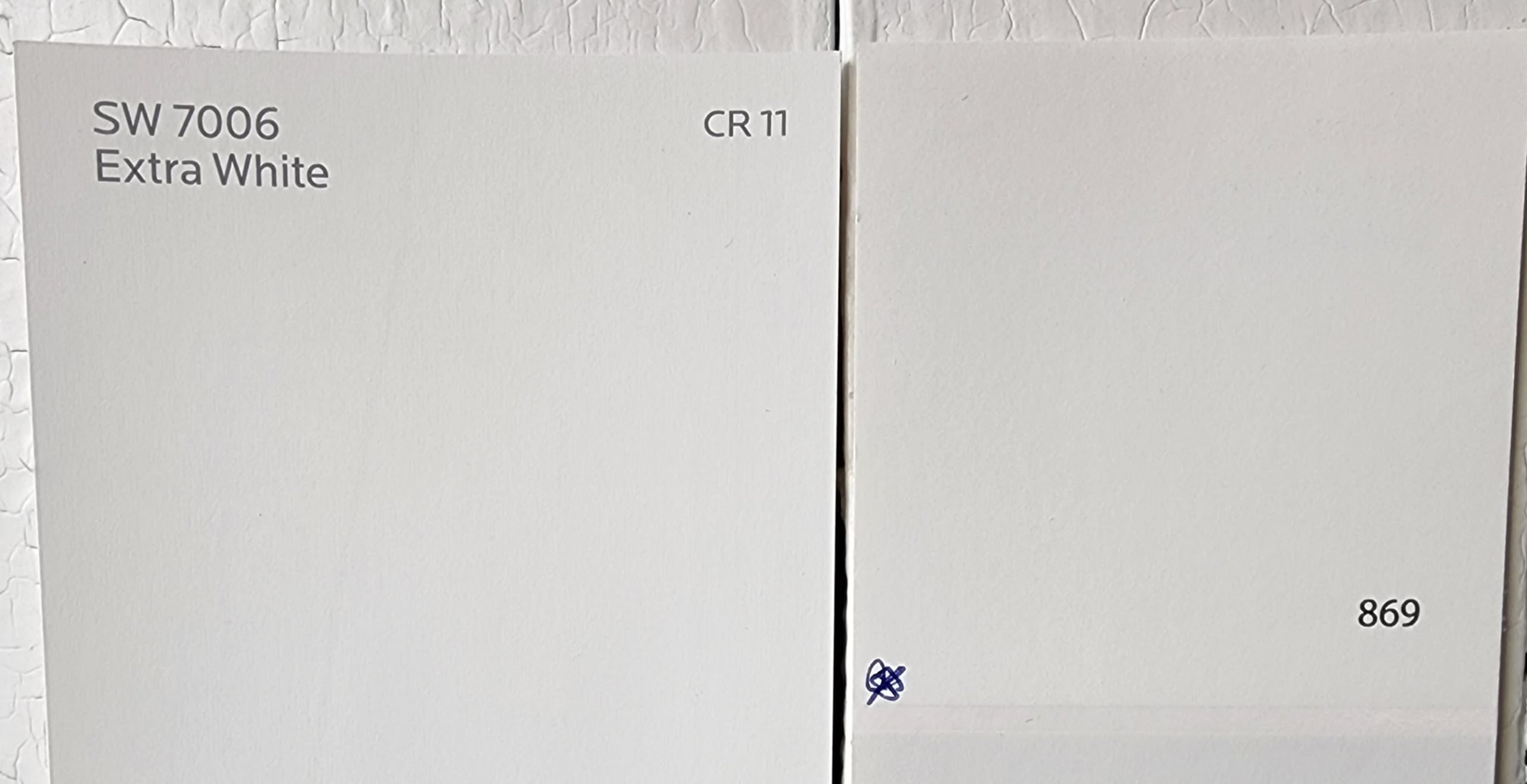
If you’re looking for a Benjamin Moore equivalent to Extra White, Oxford White is a decent candidate. It’s a balanced white that’s just a touch cool. Oxford White’s LRV of 86.69 is equivalent to Extra White.
Extra White vs Chantilly Lace by Benjamin Moore
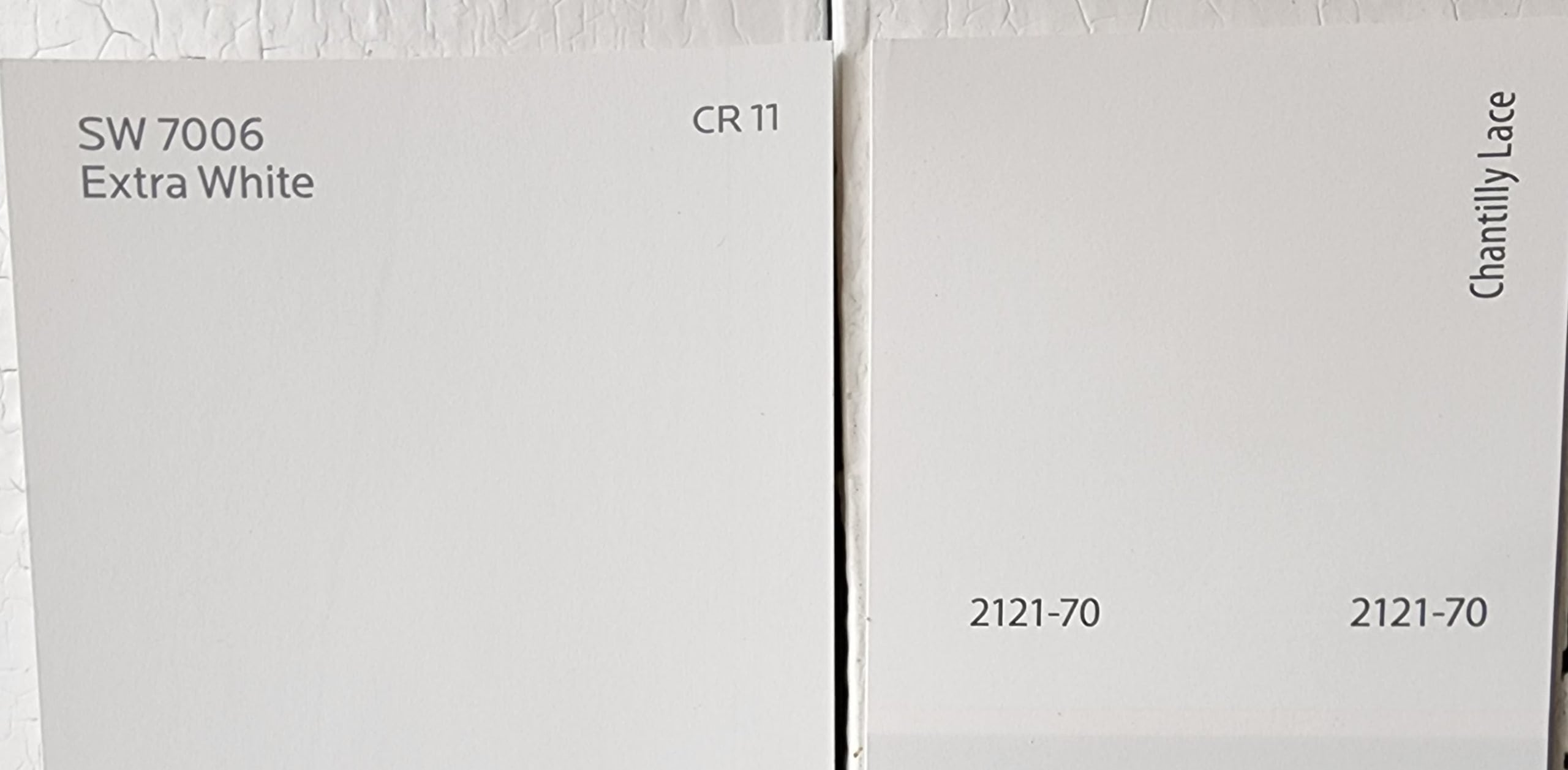
Chantilly Lace is another clean white for those seeking the absolute brightest white paints available. Its LRV of 90.04 puts it in the neighborhood of paints like High Reflective White. Chantilly Lace is a clean, balanced white that’s noticeably brighter than Extra White, but otherwise fairly similar.
Final Thoughts
It’s really hard to go wrong using Extra White. It doesn’t have undertones to clash with anything, and it’s light enough to use in even the darkest spaces. This leaves Extra White wide open to your color creativity and design direction. As one of the brighter whites available, Extra White will offer a crisp contrast to virtually any color and is excellent as a trim. Have fun painting!