What Color Cabinets Go With Alabaster Walls? 15 Ideas
White is the most popular choice of wall colors because the absolute lack of color makes it easier to pair with other color palettes.
We will look at what color cabinets with alabaster walls will give you the best nuance. Of course, it’s always easy to choose neutrals like creams, tan, or beiges, as neutrals always go well together. But you can also veer down a more colorful path with blue, yellow, or green cabinets. Plus, there are multiple gray colors that go with Alabaster.
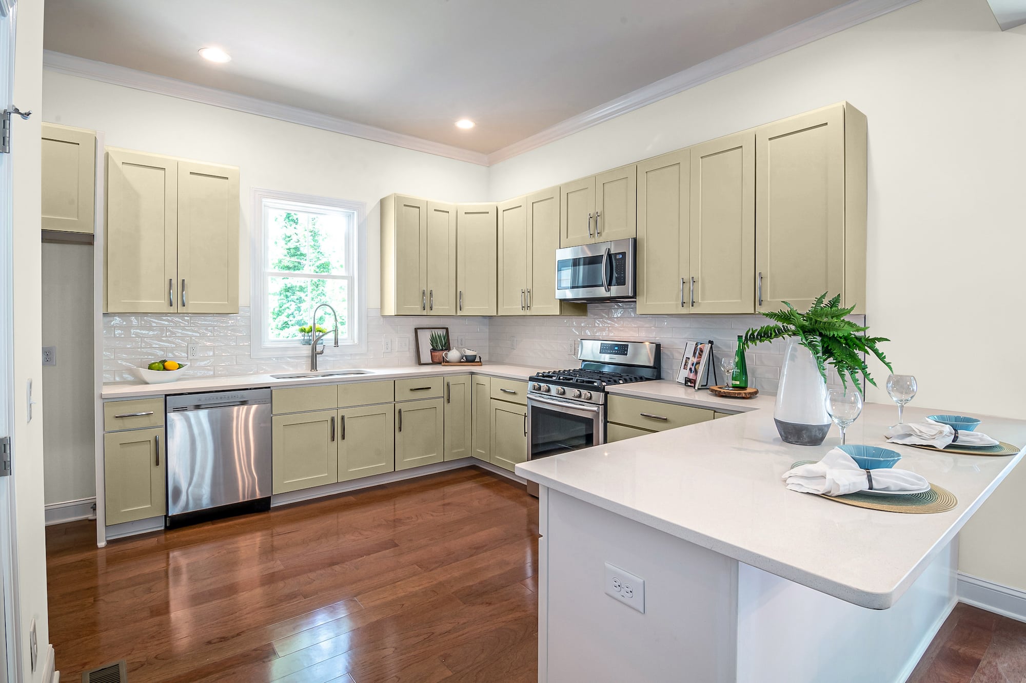
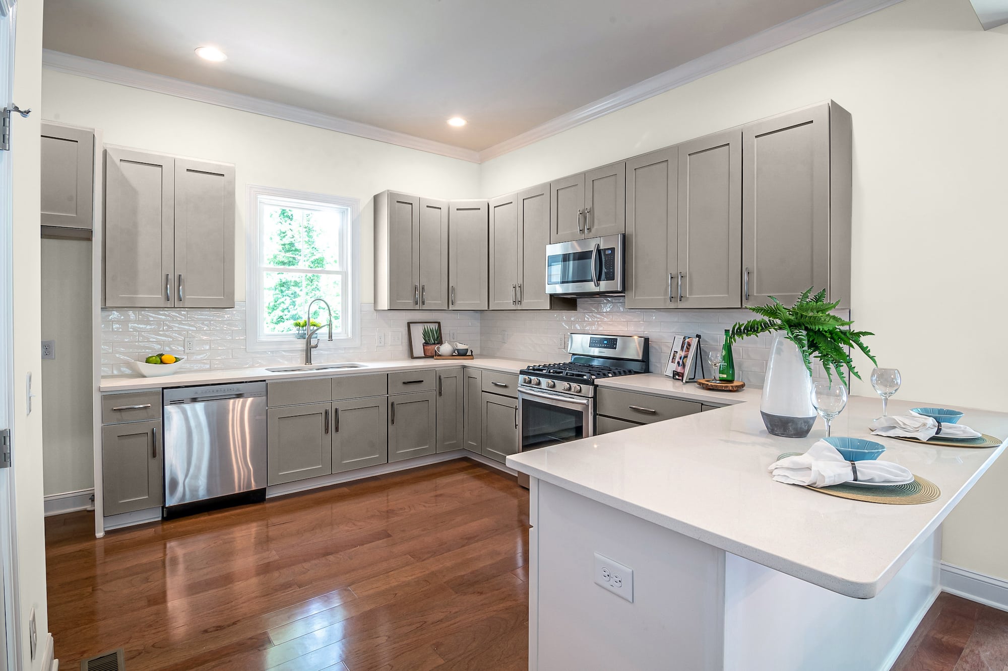
Warm Beige by Sherwin Williams
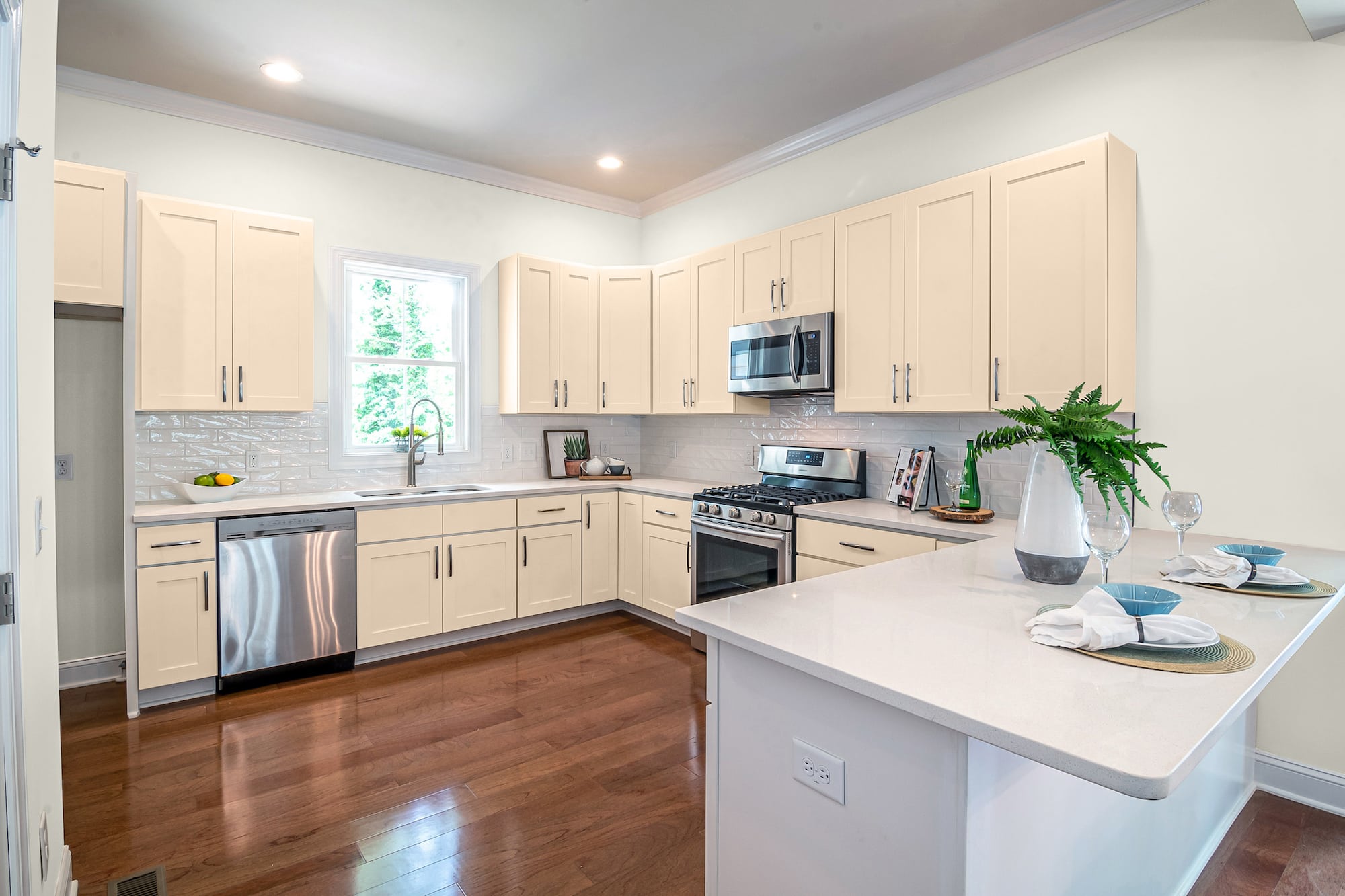
Warm Beige needs no introduction. This yellow-based neutral off-white is a versatile, pigmented tone that can add warmth to your kitchen cabinets.
When you use a bright non-tinted white like Alabaster for the walls, choosing a contrasting shade for the cabinets gives you a two-tone transition look that can make your kitchen feel homey and modern.
Crushed Ice by Sherwin Williams
Crushed Ice is a cool-toned pigmented shade of gray with a hefty punch of rich saturation that adds a touch of brown.
Resembling the color of dirty ice that’s been packed down, trampled on, and stained, this low tone shade of gray has the faintest notes of black for a deeper density gray.
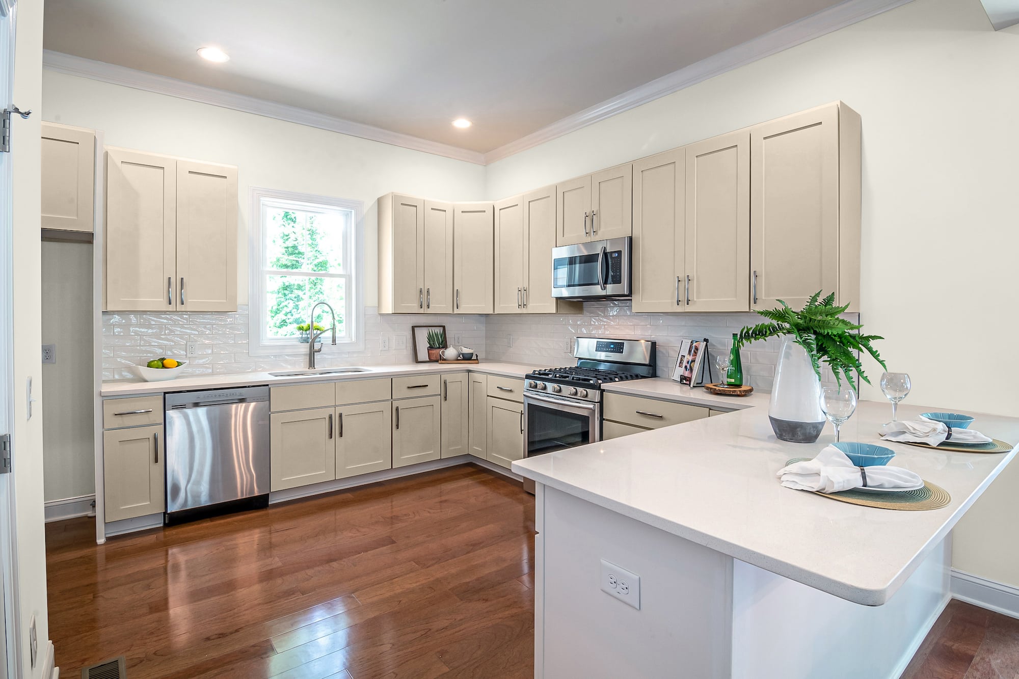
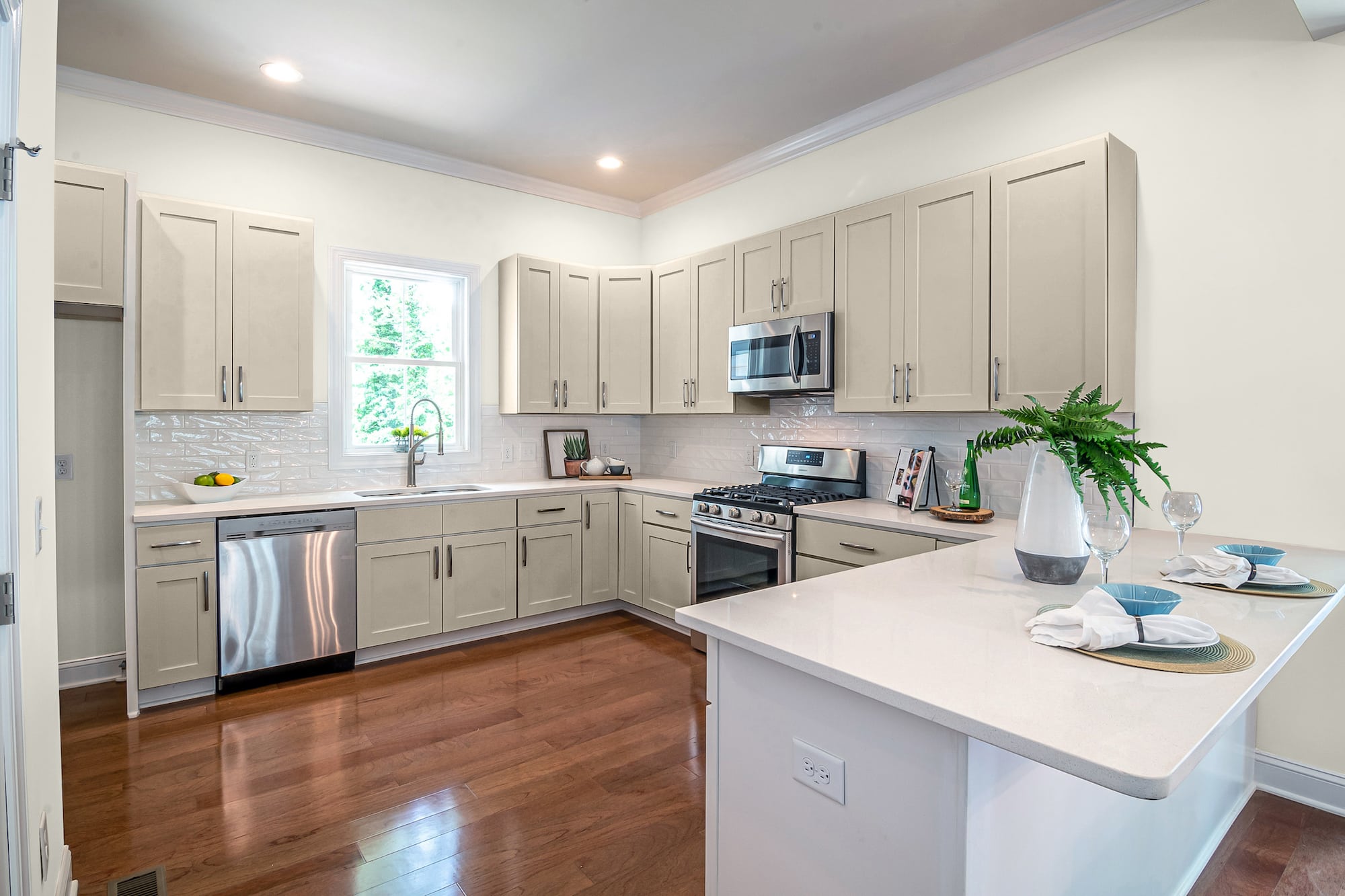
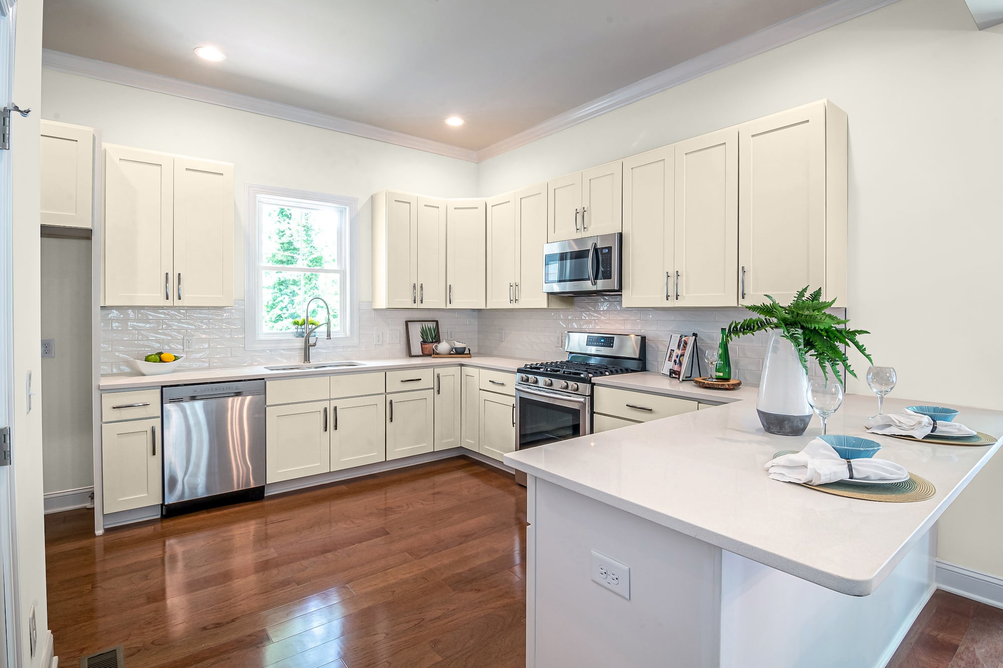
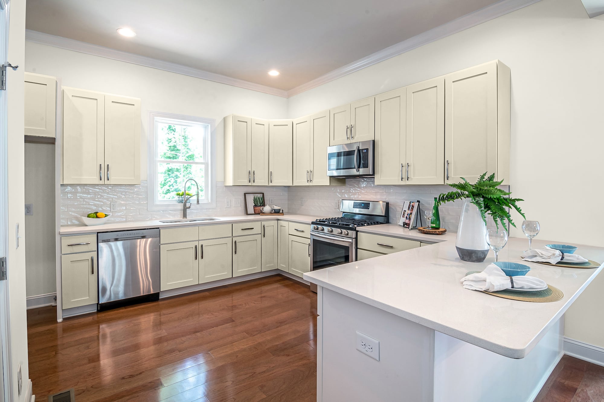
Creme by Sherwin Williams
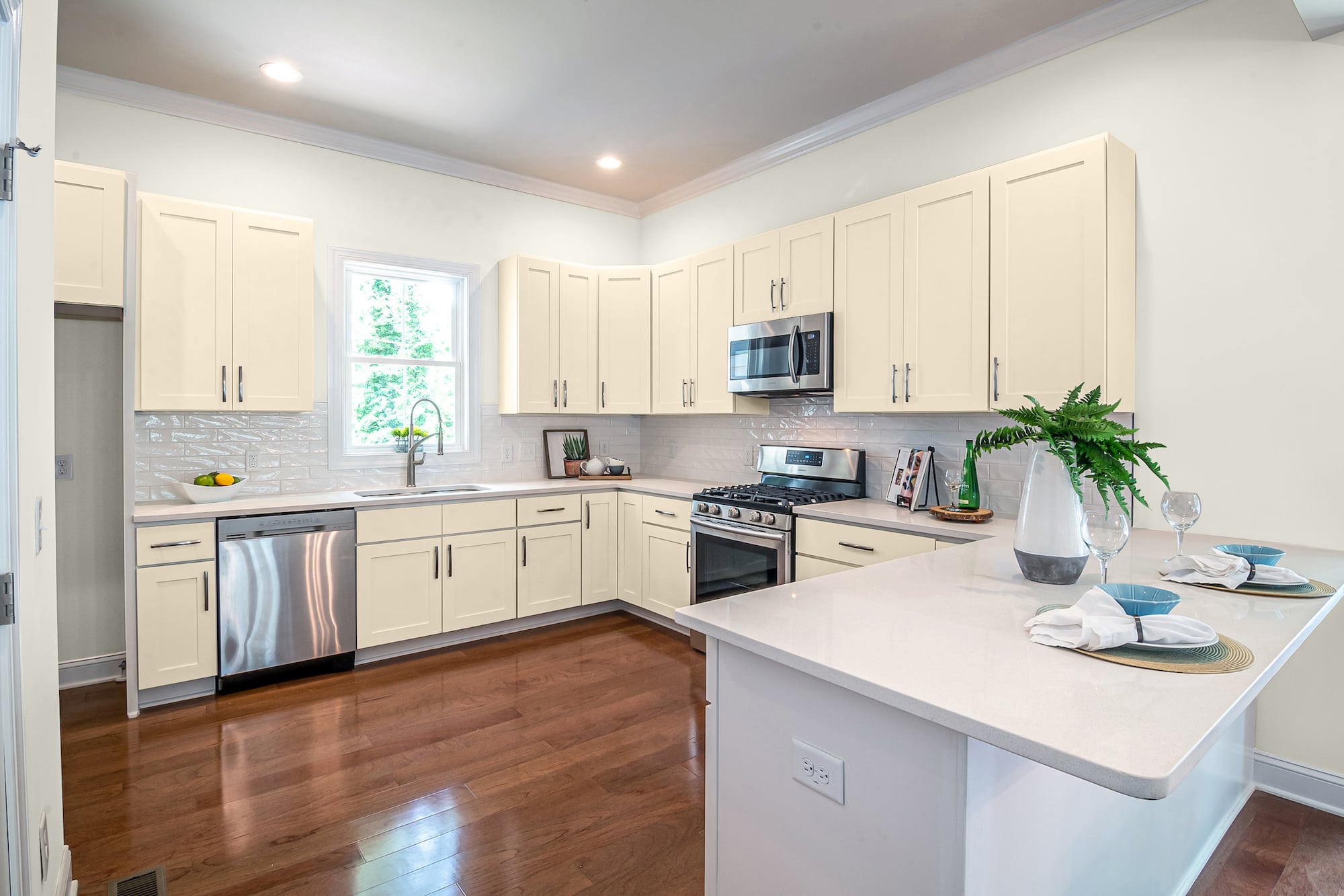
Try Creme for a more vibrant yet subtle neutral cabinet color with alabaster walls. Creme has light yellow and honey notes that turn this off-white to vintage ivory that’s darkened with age.
When you place a warm-toned color like Creme next to the cool tints of a blank Alabaster, you get a soothing, bright nuance that works from traditional to modern or any design you dream up.
Eider White by Sherwin Williams
Eider White is a gray-smoked tone of white, like your grandma’s favorite china left in the attic too long and got covered in a thin layer of soot and dust.
The coolness of the color gives your cabinets a light, refreshing feel. But the dingy gray tints also give your cabinets major personality and flare.
Friendly Yellow
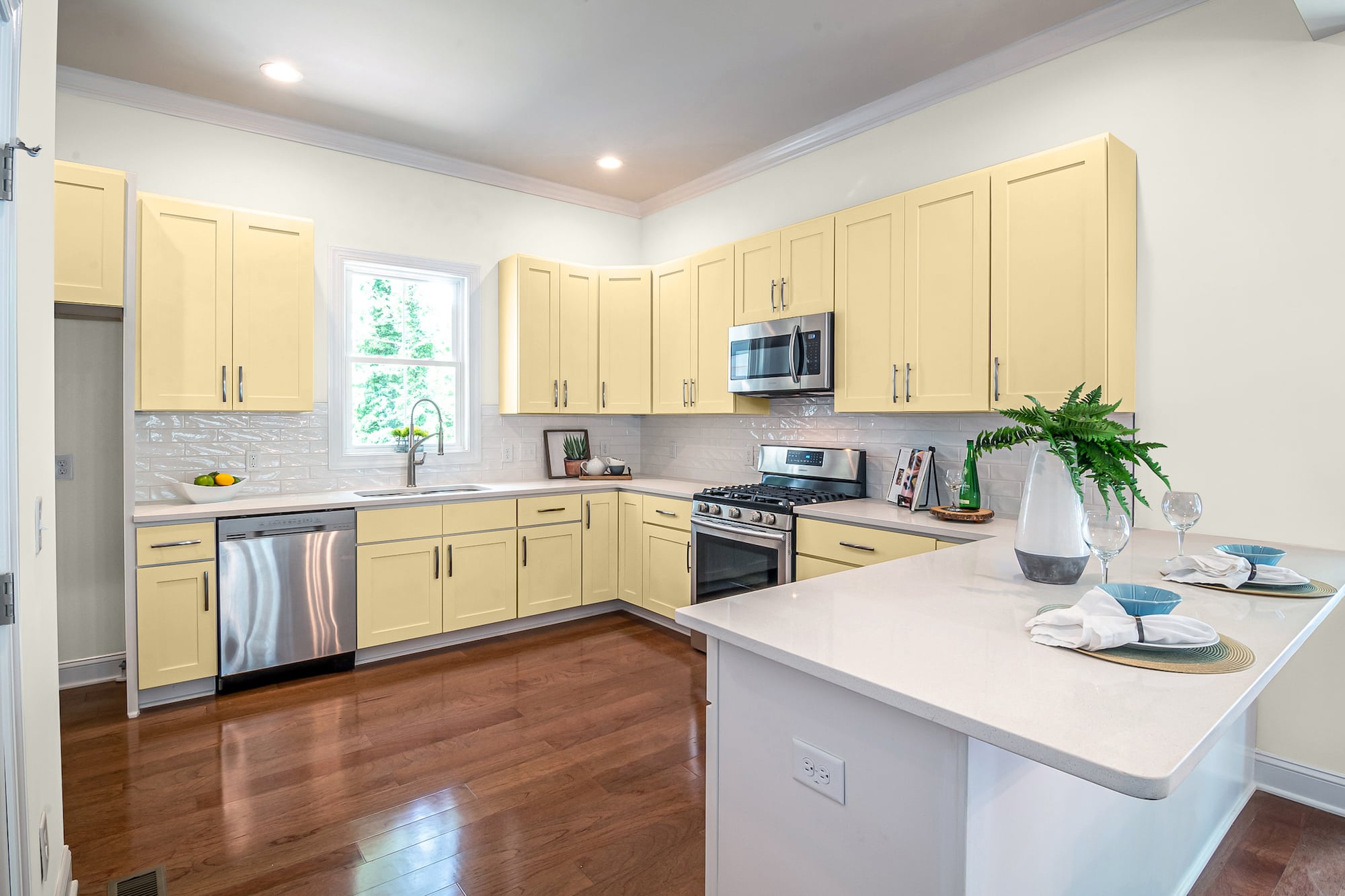
Try pairing your white Alabaster walls with kitchen cabinets in Friendly Yellow for a cheerful kitchen country vibe. But, again, you can go different ways, whether all over color for uppers and lowers.
Or, if you feel like you’re going with too much yellow, use the color sparingly for your bottoms and keep the uppers light and bright in white or gray. Another idea is to eliminate the uppers in place of open shelving.
River’s Edge by Sherwin Williams
River’s Edge is an earthy, rustic pigmentation of tan with faint peach, yellow, and orange tints. However, when placed next to the cool crispness of Alabaster walls, River’s Edge can look lighter.
And your Alabaster white will suddenly take on mysterious shadows and tints from the warmth of your cabinets. This shade is a fabulous choice for kitchens where you want things neutral and relaxed.
Old Soul by Benjamin Moore
Old Soul is a darker neutral with a major pigmented appeal that can set off the sterilized blankness of white alabaster walls.
This darker mid-tinted brown has hints of red, mauve, and gray that leaps off your cabinets for a rich focal point with minimal effort.
Sage Wisdom by Benjamin Moore
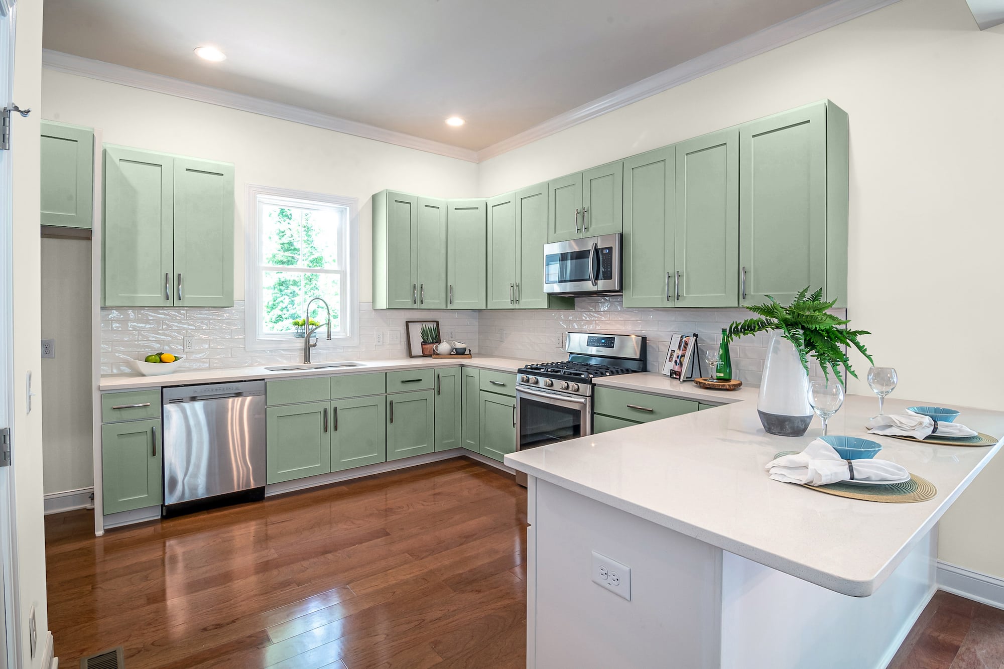
Sage Wisdom is a flat-toned greenish-brown that can create a major wow factor in your kitchen. Greens are a great way to give your room an earthy, rustic, or traditional vibe.
The dense medium darkness of this mid-toned sage casts shadowed tints on the blankness of Alabaster for a soothing, refreshing color palette.
Make Believe by Benjamin Moore
Make Believe is an understated neutral mix of brown, tan, and the faintest of green hues to create a faded, dark olive tone.
This color will hit the yellow notes in the Alabaster walls, bringing them to life. As a result, your walls will have more personality and visual appeal from casually highlighted shadows.
Castle Gate by Benjamin Moore
You can use a darker, smoky gray like Castle Gate to create a traditional, vintage, or understated elegance in your kitchen. The deep saturation of dark pigments smothers the gray base to make a cool, saturated dose of heavy brown.
When used next to Alabaster walls, you can detect more of the hidden pigmentations that lurk beneath the surface of your white paint, ready to erupt with passion.
Cake Batter by Benjamin Moore
Cake Batter is a warm-toned light tan color that can warm up the delicate yellow pigments in Alabaster walls.
Choosing an earthy neutral like this shade of off-white is the perfect balance of pigmentation to play against the pasty whiteness of Alabaster while still maximizing the color’s faint yellow notes.
Ginger Sugar by Behr
Ginger Sugar is a mid-high LRV shade of gray with the slightest notes of green and brown to give this color some spicy nuances.
When you use this neutral off-white with the white of Alabaster, you get a complimentary palette that can make your kitchen feel sophisticated and spacious.
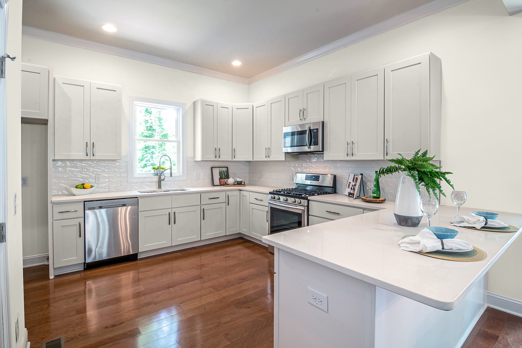
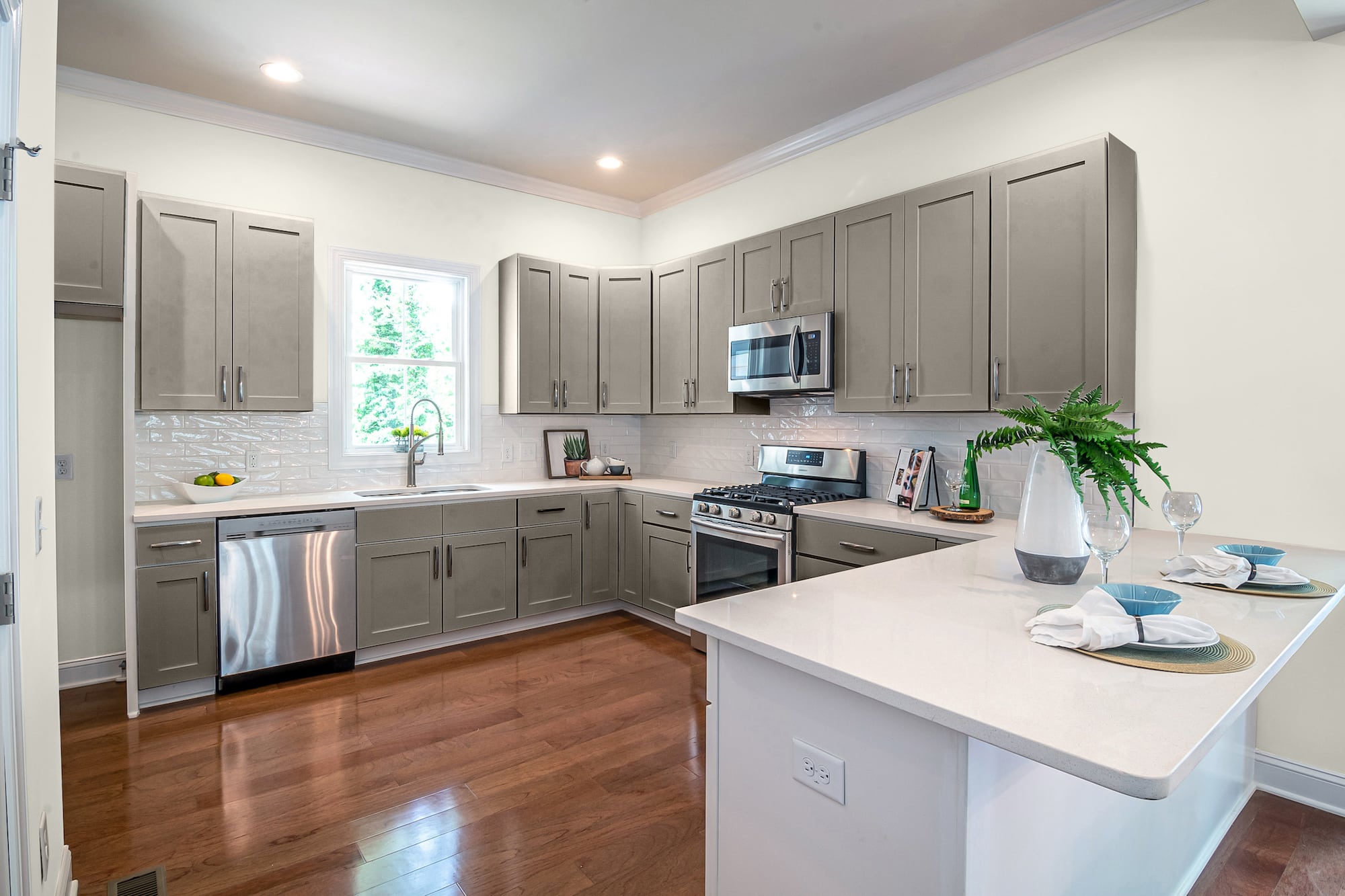
Fashion Gray by Behr
Fashion Gray is a fantastic choice if you want to play around with a darker neutral for your cabinet colors to pair with Alabaster white walls.
This mid-temperature, dense toned shade of gray has heavily saturated pigmentation that gives the color multiple personalities. As a result, you can notice some traces of brown, mauve, and even black shadows, depending on the angle and light.
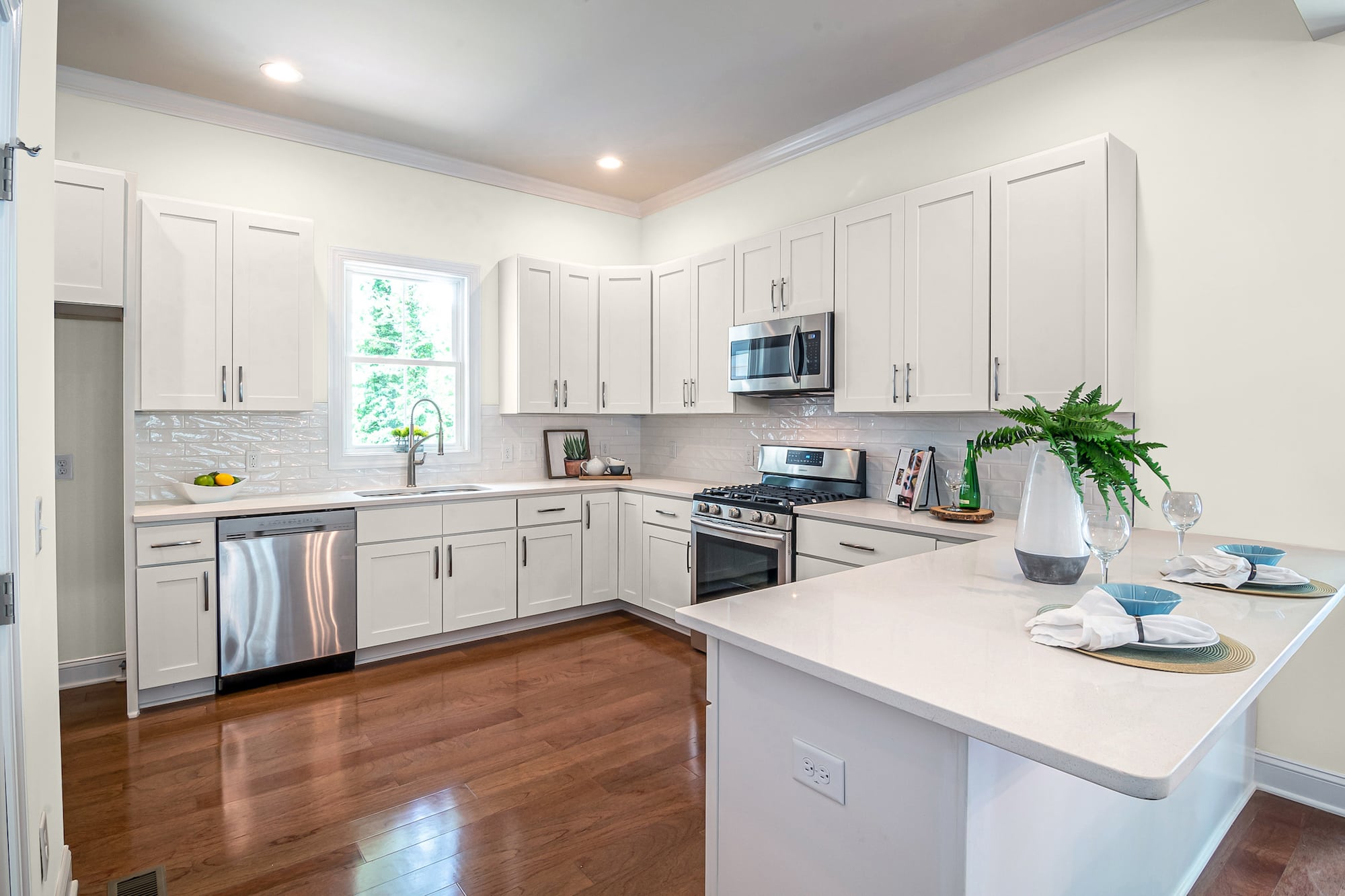
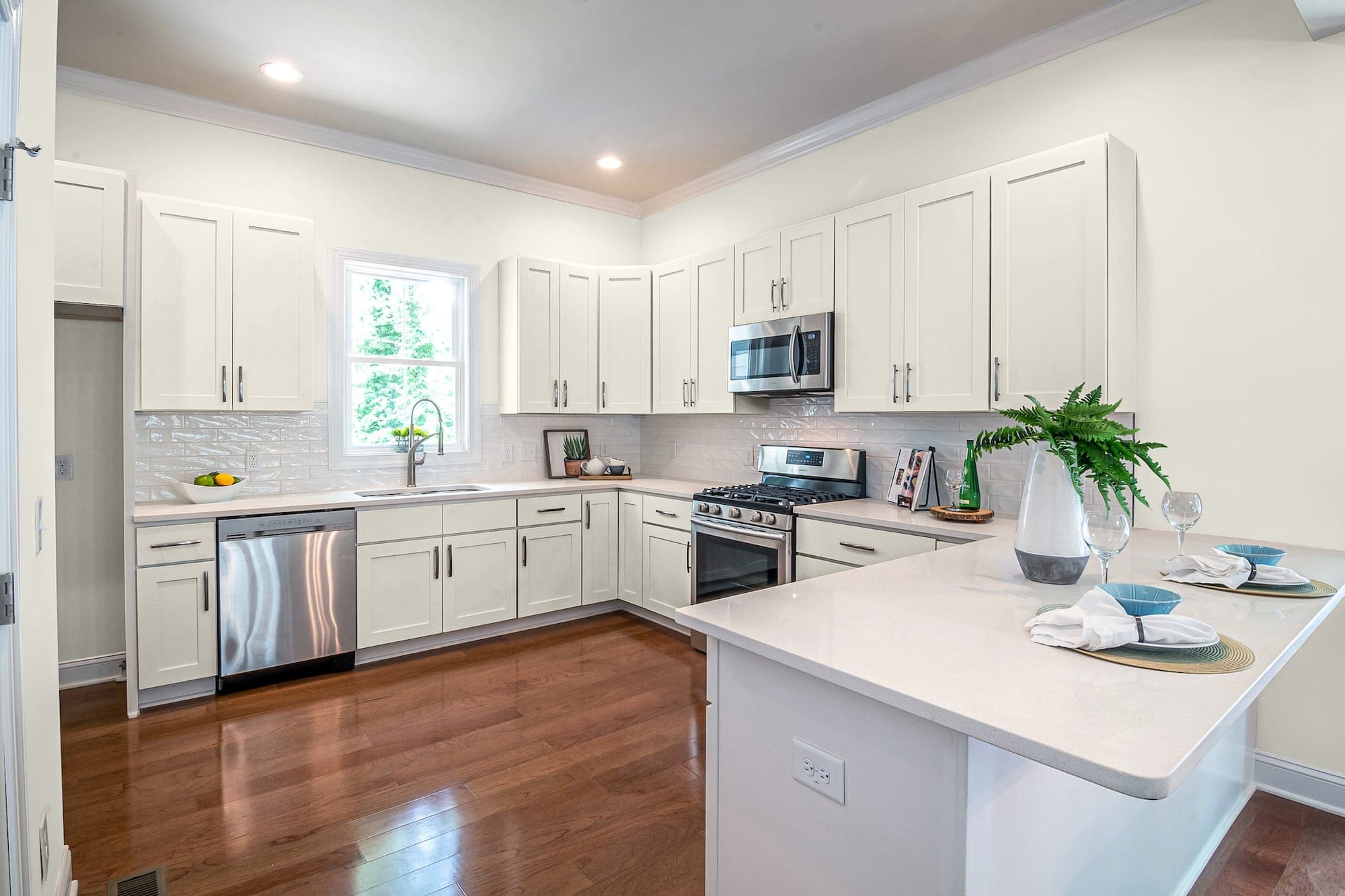
Shaded White by Farrow & Ball
Shaded White is a light-based neutral greige (gray-beige) that makes this color look like a classic white bathed in the darkest shadows.
This white isn’t a pure absence of color. Instead, it’s loaded with soft gray pigmentation that adds depth to keep this color from looking too cool and cold.
Parma Gray by Farrow & Ball
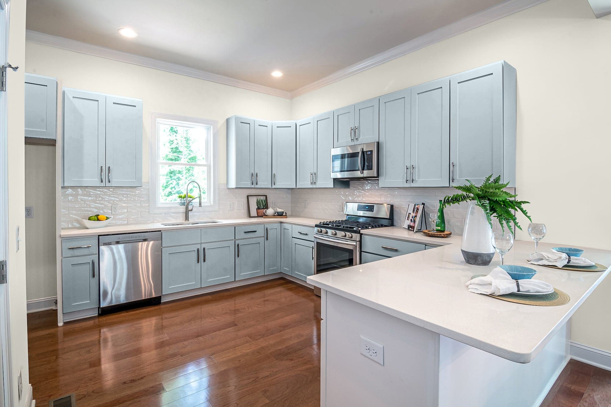
Parma Gray is the perfect blended blue-gray to give your kitchen cabinets cool, formal crispness. This lighter shade of blue has dark shadowed tints that turn almost greenish in some lighting.
When you paint your cabinets, Parma Gray, to go with kitchen walls in a cool, classic white like Alabaster, you get a versatile, timeless design that works for anything you dream up.
Final Words
This list should get you started picking the best cabinet colors to go with Alabaster walls. We chose fifteen of the best colors to create the proper look with the creamy yellow tints of this bright, beautiful white wall color.