Sherwin Williams Eider White Paint Color Review
If you’ve been looking for paint colors, you’ve probably already heard that some colors are “warm” and some are “cool”. But did you know that even white paint colors can be warm or cool? Kind of hard to imagine, right?
Outside of the world of home decor, most of us probably just think of white as the absence of color, a piece of paper before we’ve drawn anything on it. But in terms of paint, white can have many different tints added to it that take it in one direction or another.
In this review, we’re going to take a look at Eider White, one of the incredibly wide variety of possibilities for whites. I bet if you hold a sheet of white paper next to an Eider White paint chip, you’ll never think of white in quite the same way again!
What Color is Eider White?
So you’ve probably already guessed that Eider White isn’t just any plain old white. Eider White is a grayish tinted off-white from Sherwin Williams’ Coastal Cool collection. It could also be described as a light pastel gray.
LRV of 73
Eider White has a light reflectance value (LRV) of 73. This makes it a bright color, and also puts it in the range for off-white colors, which runs from about 73 to 82, with true whites having a higher (and thus brighter) LRV.
Under bright lighting conditions, Eider White looks almost entirely white, with little-to-no gray. In darker conditions, you can see its gray side.
Is Eider White a Warm or a Cool Color?
Eider White is a cool grayish off-white. Its purple to pink undertones can fool the eye into seeing some warmth when compared to other colors. But Eider White’s innate gray tones make it a cool color.
Eider White Undertones
Typically, you’ll notice that Eider White has gray undertones. These can take a purple shade in darker lighting situations–a gray color’s undertones are usually purple, blue, and green. Occasionally, Eider White looks slightly pinkish.
Where Can You Use Eider White?
Eider White is bright enough to be used as an all-over color for your home. However, its purple undertones will be stronger in areas that don’t get as much light, like hallways, closets, or basements. You should try samples to make sure that you like this effect before committing to it.
It’s clear that Eider White is a big winner for exteriors! Under direct light it looks bright and crisp, and it’s a favorite for the modern farmhouse style. There are lots of beautiful house exteriors for you to feast your eyes on in this section.
As a clean and bright color, Eider White is also a favorite for transforming old spaces with a fresh, uplifting, spacious feel.
It’s time for the eye candy! Let’s see Eider White in action!
Exterior
Beaten old brick is given fresh life with an Eider White makeover. Black and white is classic for a reason!
This beautiful farmhouse combines Eider White with natural stone.
Another take on pairing Eider White with black. Did you know you can paint your gutters?!
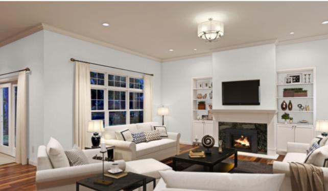
Living Room
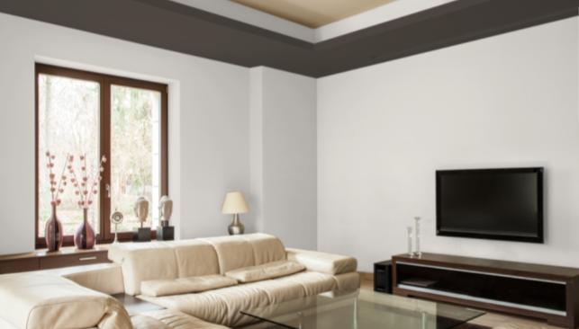
In this living room, Eider White is paired with Black Fox for an arrangement of polished neutrals.
At night, Eider White’s cooler gray side is more visible, especially contrasted against the trim and curtains.
Bathroom
Eider White walls offer just a little bit of cool contrast to this crisp white double vanity. See how the walls take on a soft, pastel gray in lower light?
Eider White is comfortable without being too cool in this modern bathroom, with gray hex tile and cabinets.
Kitchen
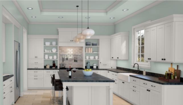
In this kitchen, Eider White cabinets and trim harmonize with Rainwashed walls for a modern space that’s cool and inviting.
This kitchen gets a fresh lease on life with an Eider White update. The new design makes great use of contrast, compared to the very monochrome “before” picture.
A kitchen and dining room transformation uses Eider White with natural wood and linen. Eider White also shows off its ability to coordinate with a strong accent wall; this one is a deep forest green in Salamander by Benjamin Moore.
Dining Room
Eider White is just the right amount of creaminess for the shiplap in this modern industrial farmhouse dining room.
White trim brings out more of the gray side of Eider White in this dining room.
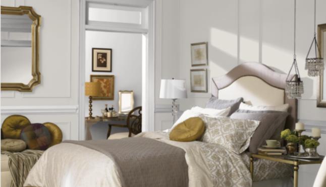
Bedroom
Eider White shows off on shiplap in this bedroom, balancing with a dark accent wall that brings bold color into the space.
Eider White is the favorite color that draws this bedroom together, threading its way through the decor.
Eider White Coordinating Colors
Eider White is a very soft pastel gray, so with only a hint of color, there’s not much to restrain your coordinating palette. Keep in mind that under bright light, Eider White is going to look more white than gray.
Eider White is part of the Coastal Cool collection from Sherwin Williams, and this cool white is a great companion to your favorite watery blues, seagrass greens, and sandy browns.
If you’re a fan of neutrals, you really can’t go wrong pairing Eider White with any of the grays, browns, beiges, and blacks. You can dress it down with more earthy, relaxed neutrals, or dress it up with cooler neutrals and more dramatic contrasts.
Eider White is an off-white, so it offers you the flexibility to contrast it with brighter whites like Alabaster, Pure White, or Extra White. Sherwin Williams recommends Snowbound as another contrasting white for this color.
Here are some Eider White coordinating color ideas to inspire you:
- Pier by Sherwin Williams
- Accessible Beige by Sherwin Williams
- Watery by Sherwin Williams
- Salty Dog by Sherwin Williams
- Rapture Blue by Sherwin Williams
- Nurture Green by Sherwin Williams
- Abalone Shell by Sherwin Williams
- Odessa Pink by Benjamin Moore
- Palladian Blue by Benjamin Moore
- Woodlawn Blue by Benjamin Moore
- Dewdrop by Benjamin Moore
- Almond Wisp by Behr
- Seaside Villa by Behr
- Euphoric Magenta by Behr
- Jojoba by Behr
- Breezeway by Behr
- Caribe by Behr
How Does Eider White Compare to Other Colors?
Eider White vs Oyster White by Sherwin Williams
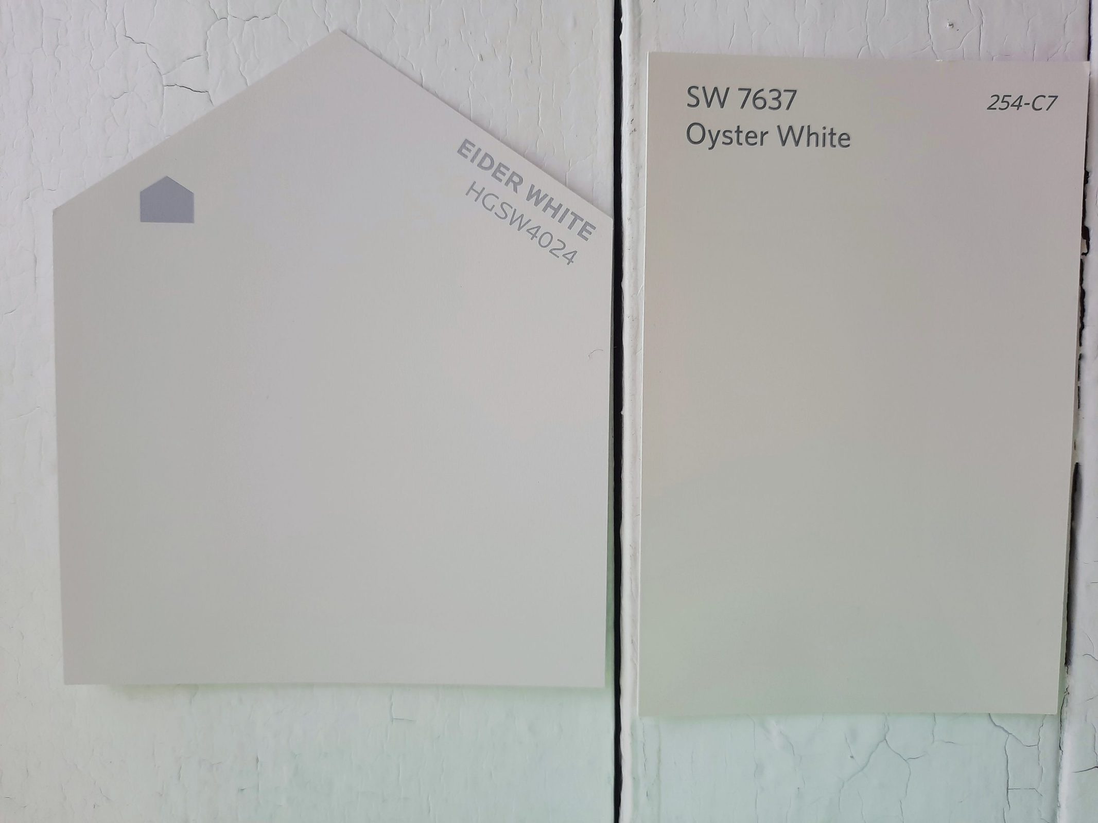
Oyster White is a light off-white with beige undertones. Its LRV of 72 is right next to Eider White’s 73, so they will behave similarly in terms of lighting. Eider White is cooler and has a gray cast.
Eider White vs Repose Gray by Sherwin Williams
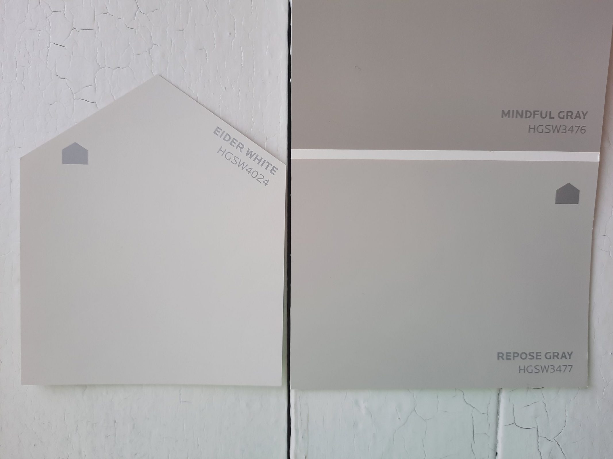
Eider White and Repose Gray are rather different colors, but they’re frequently searched for together. Repose Gray is a medium greige color, which means it’s a blend of gray and beige. Its LRV of 58 is significantly darker than Eider White’s 73. Repose Gray’s beige side makes it look warmer than Eider White.
Eider White vs Pale Oak by Benjamin Moore
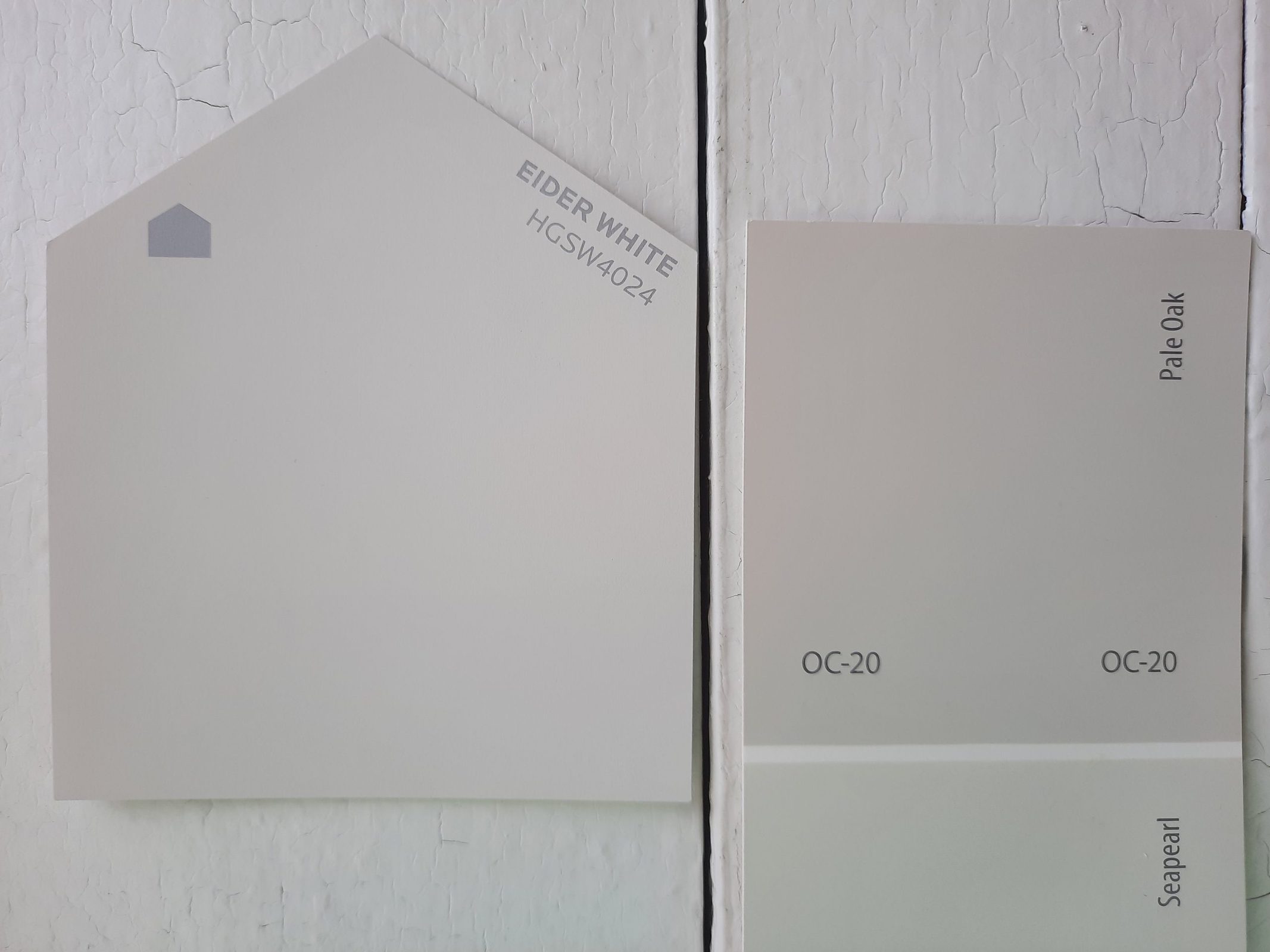
Pale Oak is a popular light warm greige from Benjamin Moore. Side-by-side with Eider White, you can definitely see its beige coloration. Under strong lighting, Eider White looks more white, while Pale Oak still holds some color. Pale Oak’s LRV is 69.89, which is fairly close to Eider White.
Eider White vs White Dove by Benjamin Moore
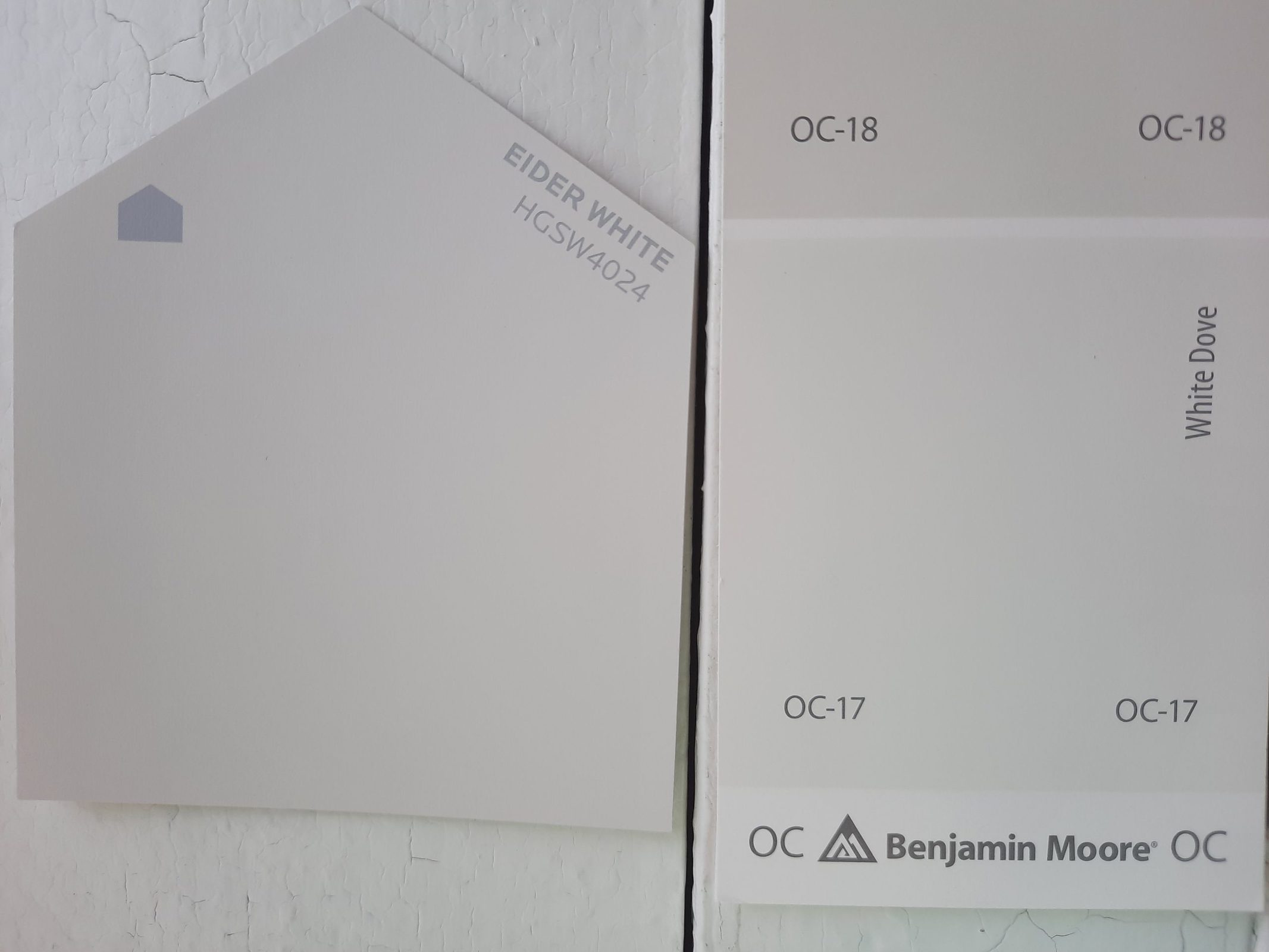
White Dove is a soft warm white. At an 85.38 LRV, it’s significantly brighter than Eider White, as it leaves the off-white range to be more of a true white. White Dove is definitely warmer than Eider White, and has creamy undertones not seen in Eider White.
Final Thoughts
Eider White is a cool off-white with just a touch of pastel gray. It’s almost endlessly versatile, and can be used in almost any project. Its one tripping point is its purple undertones, which some people do not enjoy, so sampling before you commit to this color is important.
Keeping that in mind, you can use Eider White anywhere, as an all-over house color and even as a home exterior color. Eider White is ready for when you need a color that’s just a little cooler than any old white.