15 Best Wall Paint Colors That Go Well With Cherry Cabinets
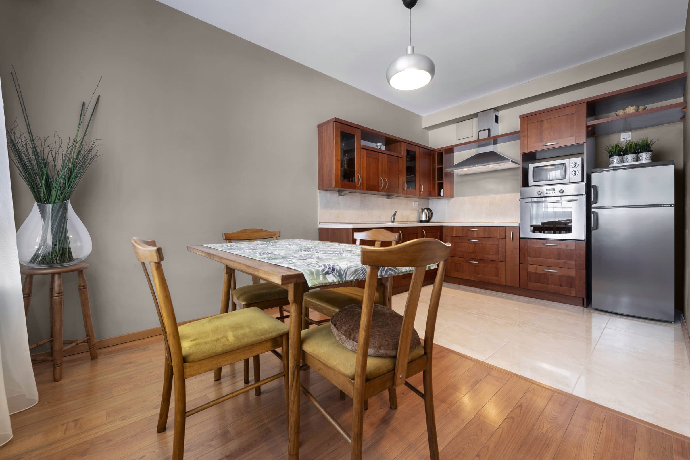
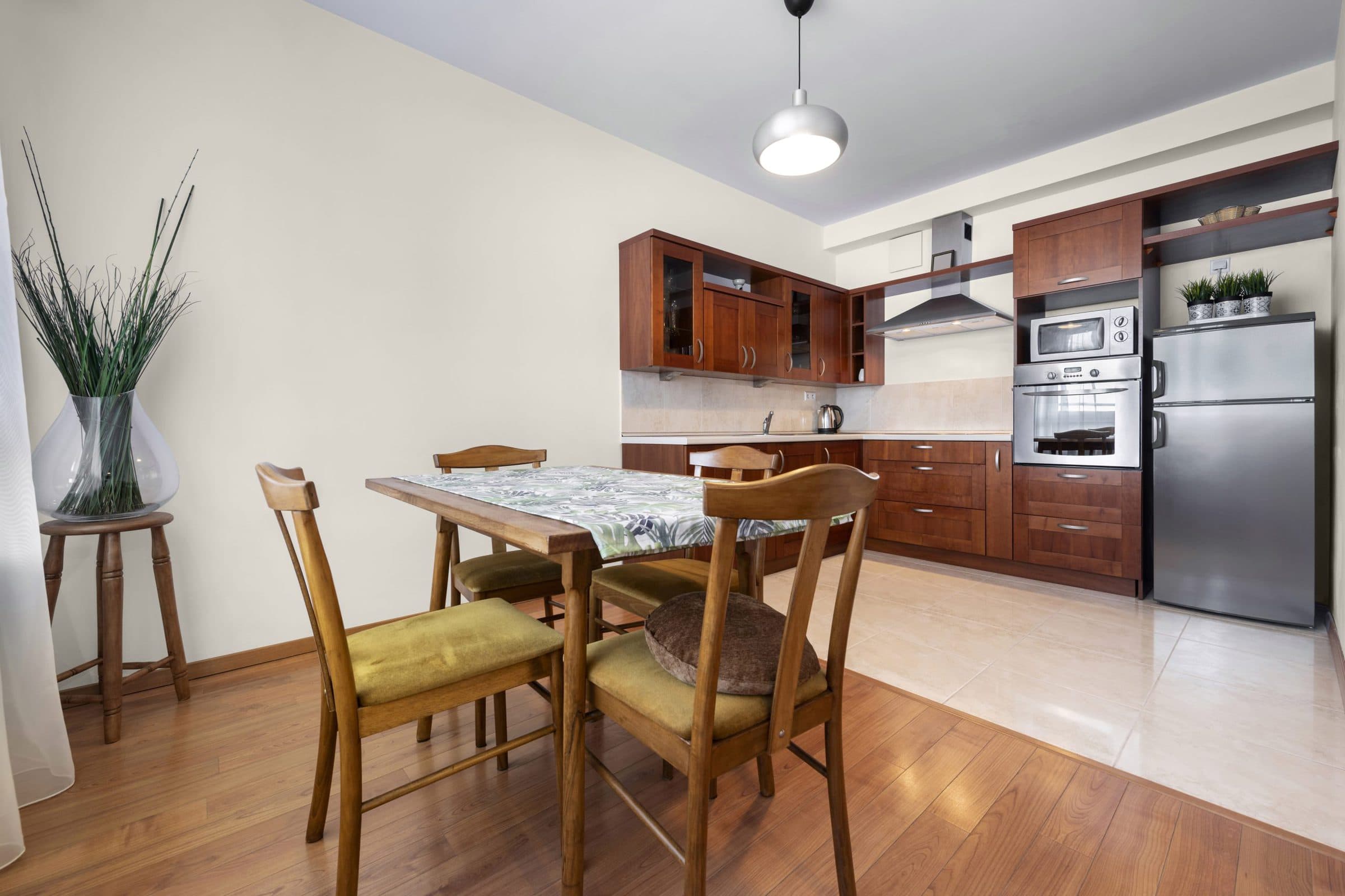
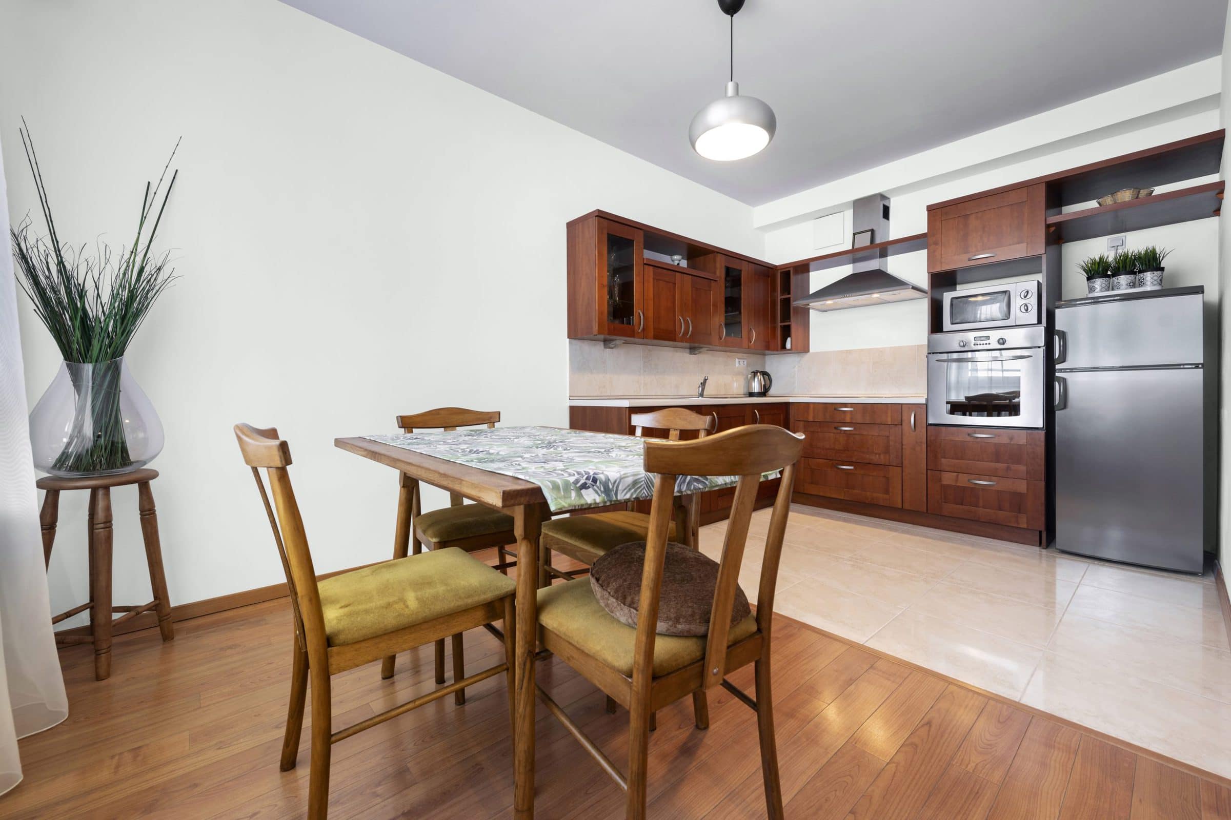
Cherry cabinets are popular for their unmatched beauty. With heavy, smooth grain and a rich, reddish-brown tone, cherry wood looks fabulous for any kitchen.
But due to the intense dark color, it can sometimes be challenging to know what kitchen color schemes with cherry cabinets look best. Of course, you don’t have to shy away from choosing paint with some color, like blue, yellow, or green. But it can also look incredible with neutrals – gray, beige, taupe, and brown.
Check out these fifteen best paint colors with cherry cabinets for creative inspiration.
Terra Brun by Sherwin Williams
Cherry wood is a dark hardwood with tones of red and brown, making it an excellent companion for brown for the wall color.
Sherwin Williams produces an amazing shade of brown that would look outstanding for cherry cabinets. Terra Brun is brown with a low LRV of 5 and a hex value of R:90 B:45 G:56 that give this shade undernotes of red and mauve.
Drift of Mist by Sherwin Williams
If a dark color scheme isn’t your thing, you can lighten things up a bit by going with a neutral gray. For example, Sherwin Williams’ Drift of Mist is a subtle shade of gray that can tone down the darkness of cherry cabinets.
This gray has a hex value of B:208 R:220 G:216 and an LRV of 69, making it a light, bright gray with slight undertones of mauve and silver.
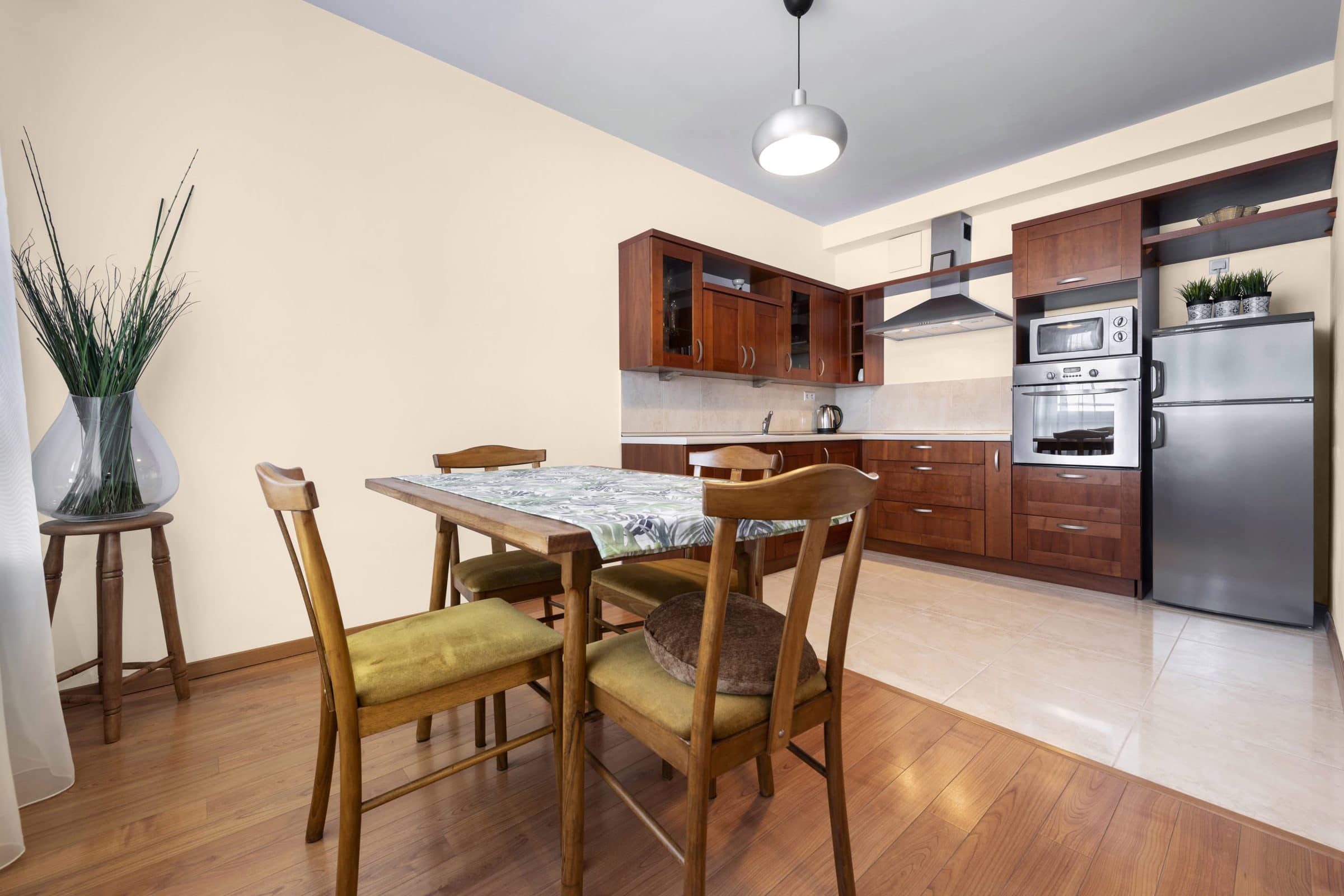
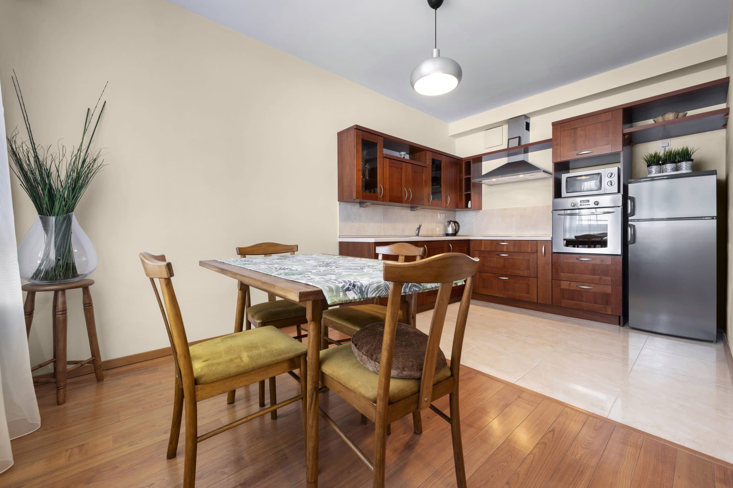
Casa Blanca by Sherwin William
Casa Blanca – brought to you by Sherwin Williams – is a fabulous neutral off-white to use with the richness of cherrywood cabinets.
This shade is a tinted non-white with soft undertones of pink, beige, and cream that give a bit of color brightened by darker cabinets.
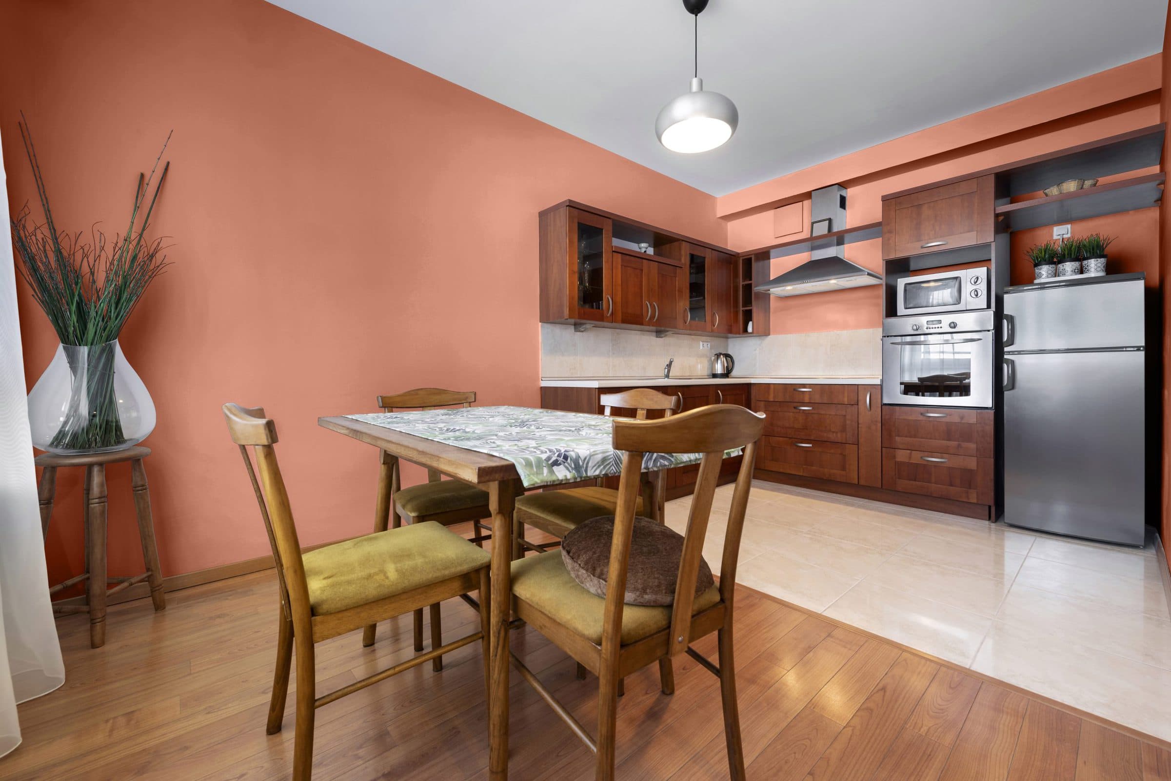
Brainstorm Bronze by Sherwin William
SW’s Brainstorm Bronze is an old-fashioned, warm color that’s part brown, part gray. A lower LRV of 14 and a hex code of R:116 B:90 G:104 give this shade a rich tone that pulls out the brown in the cherry cabinets.
Since this attractive bronze looks darker, along with the cabinets, choosing lighter colors for the accents is a great way to get some balance. Try Independent Gold (SW 6401) or the lighter, soft Cottage Cream (SW 7678).
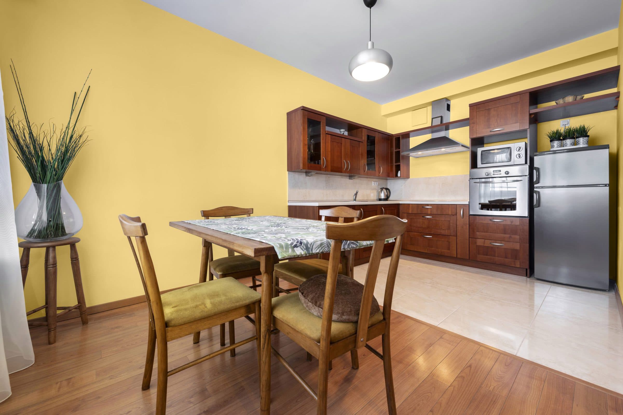
Fun Yellow by Sherwin Williams
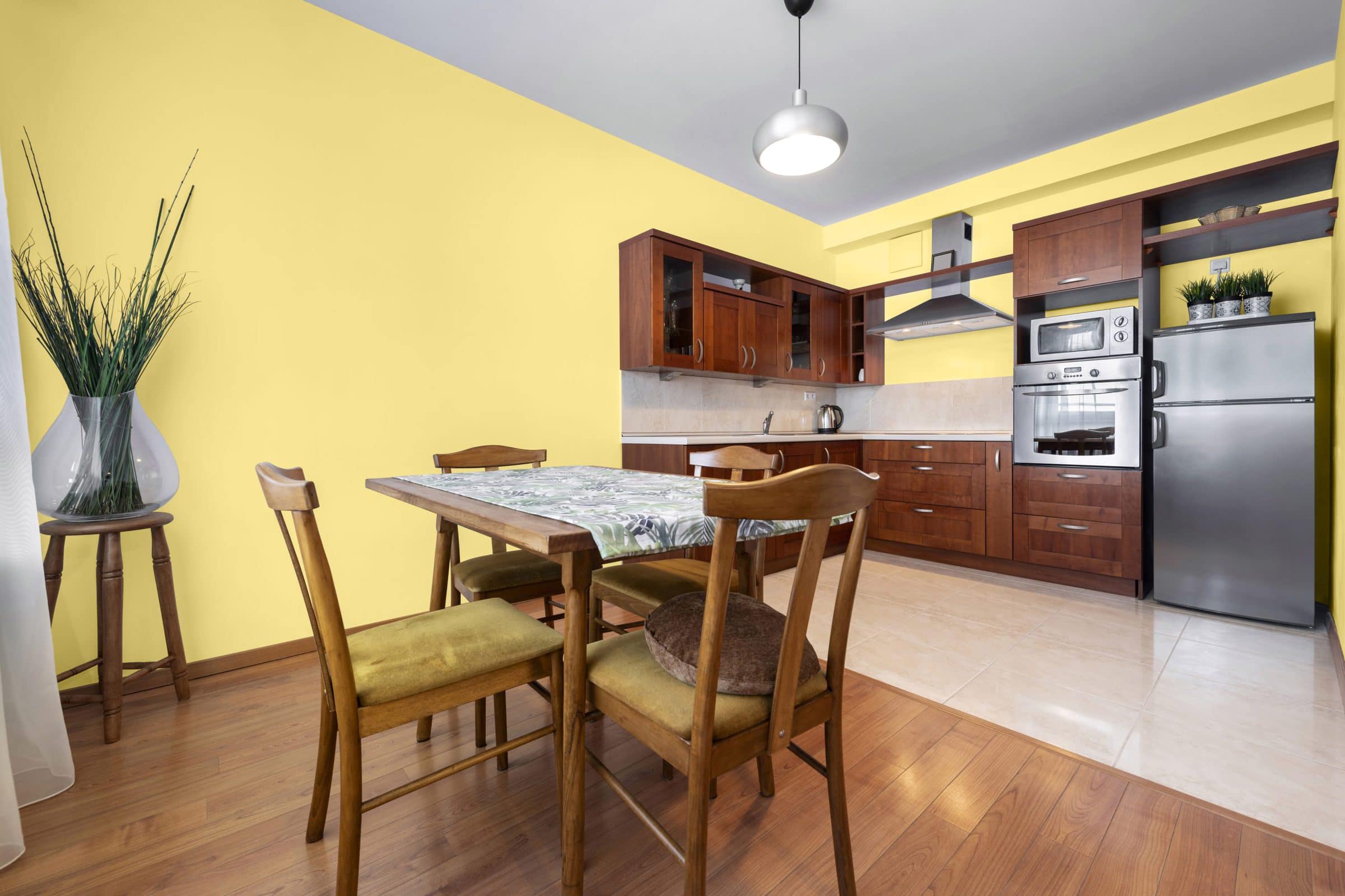
For a sunny, cheerful way to brighten up your cherry cabinets, paint your walls yellow. There are many variations from light to dark, heavily saturated or pale enough to look white.
We’re twisted over the nuance of Sherwin Williams’ Fun Yellow. This shade of yellow falls in the middle of light and dark, with a rich, buttery texture.
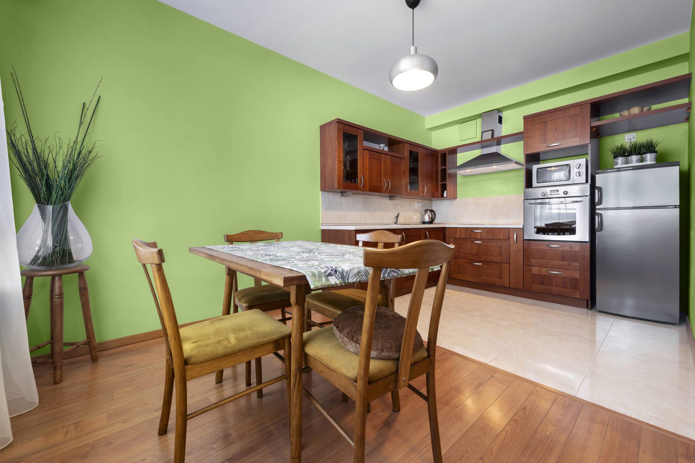
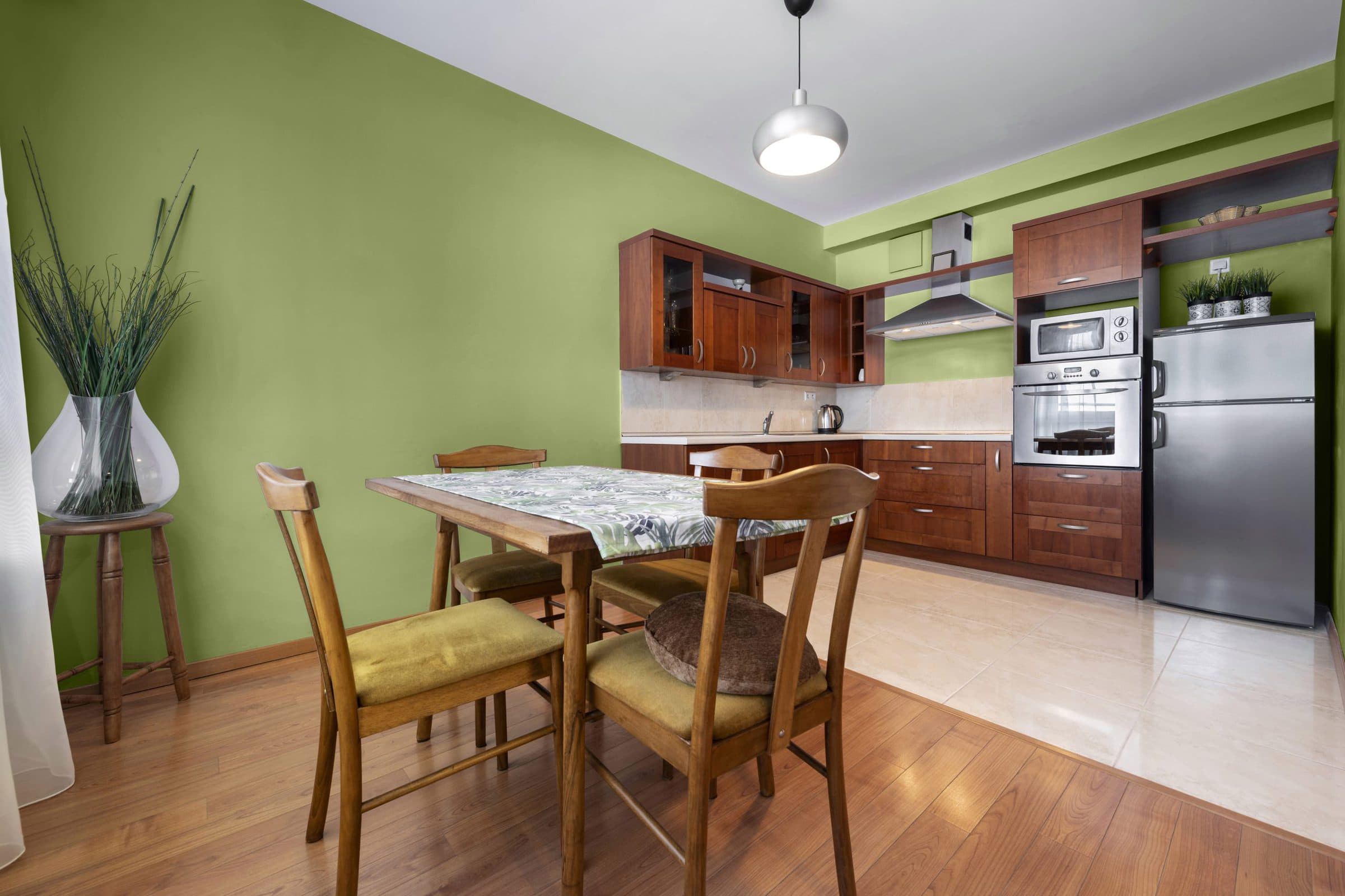
Retro Mint by Sherwin Williams
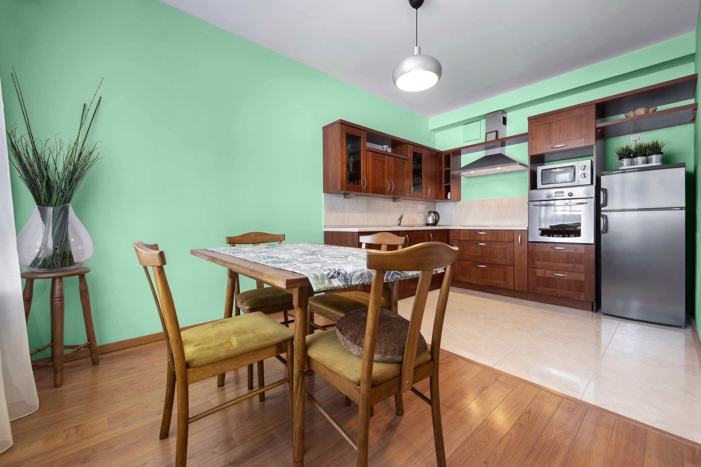
Another choice for the wall color to complement cherry cabinets is to go green. Going green is a huge trend as we grow more environmentally considerate, including interior decor.
You’ll be drunk with joy when you use Retro Mint by Sherwin Williams. This cool mint-inspired green brings to mind lazy days spent trying to cool down from the heat of summer by sipping on a Mint Jubile cocktail.
Audubon Russet by Benjamin Moore
If you’re looking for a vintage, historical color to paint your walls without detracting from the pure beauty of cherry cabinets, brown is one of the best choices.
We’re hooked on Audubon Russet, a simple and traditional shade of brown. The elegant, deep saturation gives this brown a medium warm tone with undertones of red and orange.
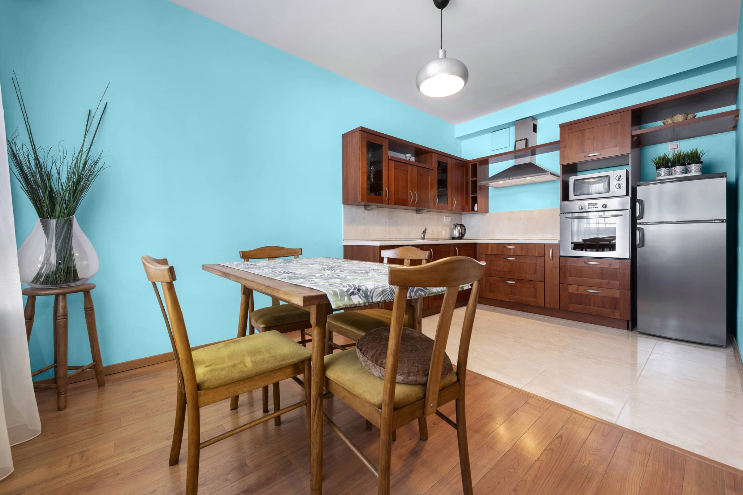
Blue Hydrangea by Benjamin Moore
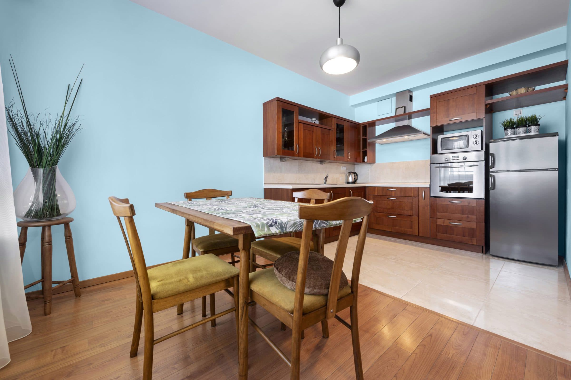
Like the large, glorious flowers that bloom into large balls of petals, the hues of this spring blue are sure to brighten up your space with the help of a higher 62.41 LRV.
Blue Hydrangea is a true blue, with a stormy, smoky tone that gives this cool shade faint green and gray undertones that’s perfect for pairing with the richness of cherry cabinets.
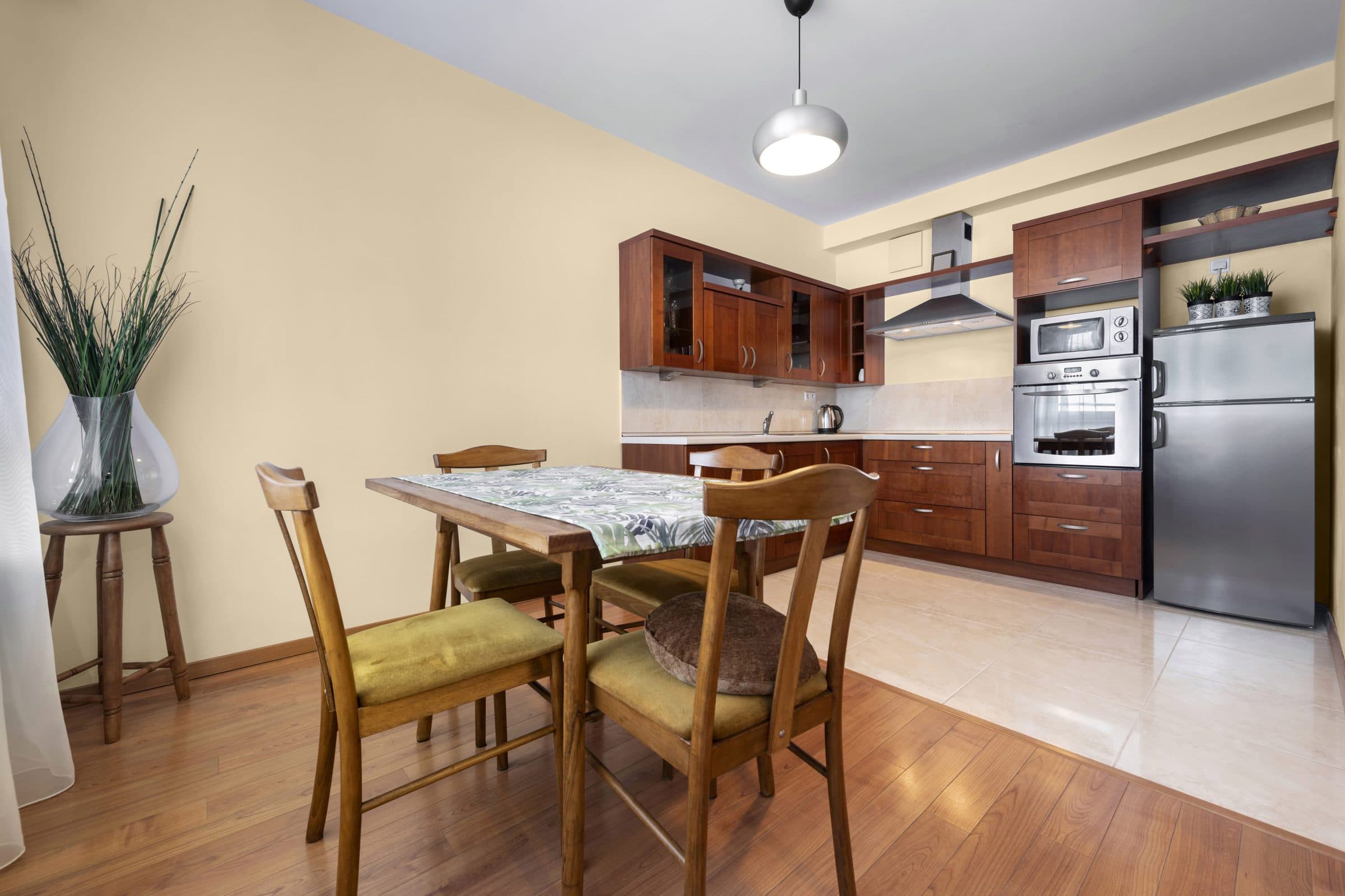
Damask Yellow by Benjamin Moore
When you’re using cherry cabinets, you may be looking for wall paint that offers slight color without dominating the room or outshining the beauty of your hardwood.
Damask Yellow by Benjamin Moore is a lighter neutral with traces of brown, tan, and beige. But this shade isn’t the same as butter or cheese; it’s more a dusty gold.
Smoky Taupe by Benjamin Moore
Taupe is a popular choice for a darker neutral paint color. BM’s Taupe can enhance the grain lines for heavier detail with similar tones to cherry cabinets.
Due to the medium 55.22 LRV, this neutral, saturated color can start to look dark in soft lighting. Add a few lighter color accents to tie everything together, like Normandy (blue), Carrington (Beige), Seattle Mist (gray), or Antique Pewter (dark gray).
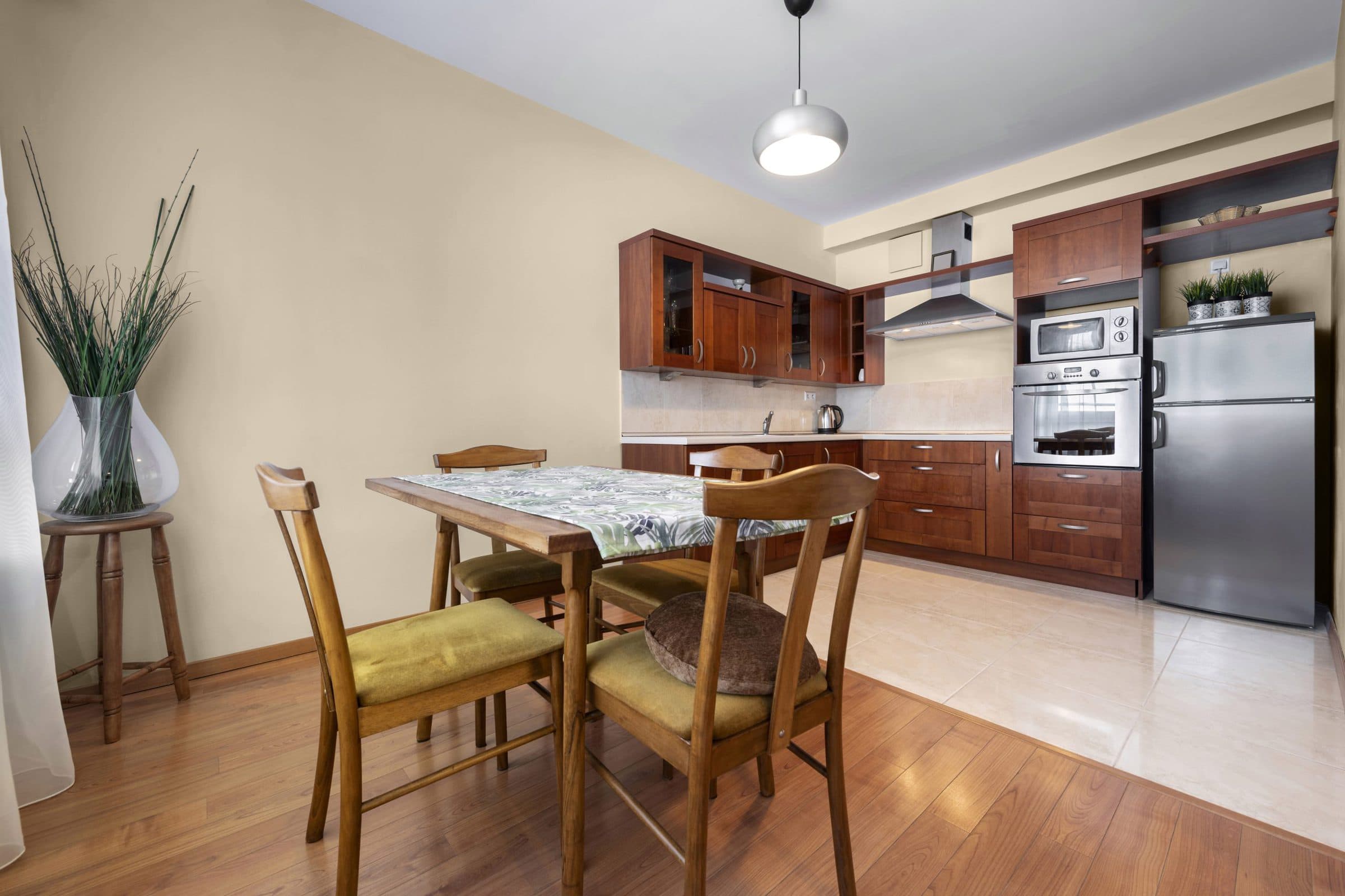
Shaker Beige by Benjamin Moore
Working with neutral paint colors has multiple benefits. First, there’s the timelessness of these light non-colors. Neutrals like beige will never go out of style and can go with any accent color.
We’re intrigued by the nuance from Shaker Beige by BM. This neutral offers a darker warm hue that gives the beige a darker brown look.
Cool Water Lake by Behr
If you prefer to give your walls some color, cherrywood cabinets are an excellent base for using paint in the blue family, like Behr’s Hidden Sea Glass.
Cool Water Lake is a jewel-toned lighter blue with a stunning essence that can brighten up any space. With an LRV of 62 and hex codes of B:229 R:155 G:217, this blue has seafoam, green, and teal notes.
Lazy Caterpillar by Behr
Lazy Caterpillar is a shade of green that many love to use with cherry wood cabinets. This green shares a brighter tint similar to olive green, with a medium LRV of 45 and hex values of B:123 R:166 G:188.
This Behr color is a lighter shade that can darken to an earthy hue when paired with the dark grain lines of cherry cabinets.
Olive by Farrow & Ball
Olive is another popular shade of dark green that looks exquisite with the dark tones of cherry cabinets. This color has an earthy base that makes it suitable for use in darker spaces, as the color will look enhanced and brighter rather than dull and boring.
The heavy pigmentation of Farrow & Ball’s Olive Green is the perfect companion for accents in lighter neutrals like Old White, Off-White, or Antique White.
Stony Ground by Farrow & Ball
Despite the unappealing sounding name, Stony Ground by Farrow & Ball is one of the best shades to use with cherry cabinets.
This is a darker neutral shade of light-toned brown named for its resemblance to stone. Faint red undernotes and a soft beige overlay give this stone a rich pigmented wallpaper look.
Final Words
When you have cherrywood cabinets, you’ll want to choose the right wall colors to enhance the natural beauty of the rich wood grain. Multiple colors can pair well with the dark red and brown grain lines, including shades of gray, green, blue, and white.
Which of our fifteen best wall paint colors with cherry cabinets is your favorite idea? Connect with us in the comments.