Best Benjamin Moore Neutral Paint Colors
Neutral paint colors are well-loved in the design world for their versatility. They’re compatible with almost any decor style, and they’re easy to coordinate with each other or with other colors. Chances are, at some point in your home decorating journey, you’re going to be in search of a good neutral or two.
In this list I’ve rounded up the very best neutrals Benjamin Moore has to offer, including both their wildly popular favorites and a few hidden gems. I won’t promise these colors are 100% fool-proof, but they’re the closest thing to it! After all, there’s a reason neutrals sell better than any other paint colors out there.
Let’s take a look at the colors that have risen to the top of the paint can to reign supreme!
Revere Pewter
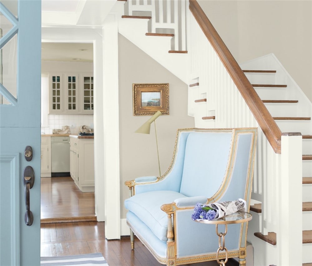
Revere Pewter is a must-see greige, and one of Benjamin Moore’s bestselling colors of all time. It brings the warm/cool balance greiges are so well-known for, and can be paired with virtually any other color.
Revere Pewter is just a few notches shy of ideal LRV, at 55.51, so it may not be the best choice for your darkest rooms.
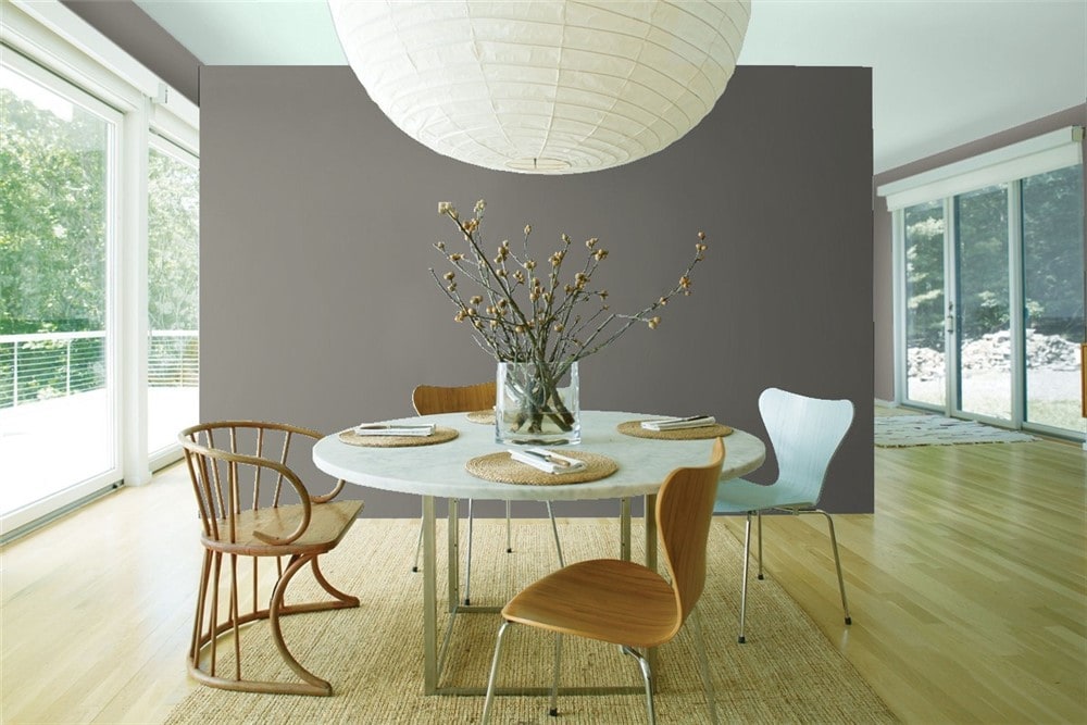
Revere Pewter is Charming in Farmhouse Kitchens
Edgecomb Gray
Looking for a greige that does everything Revere Pewter does, but a bit lighter? Now you know why Edgecomb Gray is so popular!
This well-balanced greige has an ideal LRV of 63.88, and is suitable as an all-over color. But if you scroll around on social media, you’ll see that it offers a creative array of decor possibilities.
Edgecomb Gray is a Favorite for Board and Batten
Balboa Mist
I’m sure you’ve realized by now that if you’re talking neutrals, you’ve got to talk greiges. Balboa Mist is a gentle touch in the greige family, offering a lighter 67.37 LRV.
This quality allows it to brighten and expand rooms without losing the prized balance of greige colors.
Balboa Mist Opens Up a Room
Pale Oak
Pale Oak is a greige with special talents. This color, under bright light, will read as an off-white, allowing it to pull double-duty.
Whether you’re looking to tone down your greige or beef up your white, Pale Oak gives you options. Its LRV is 69.89.
Pale Oak is Both Greige and Off-White
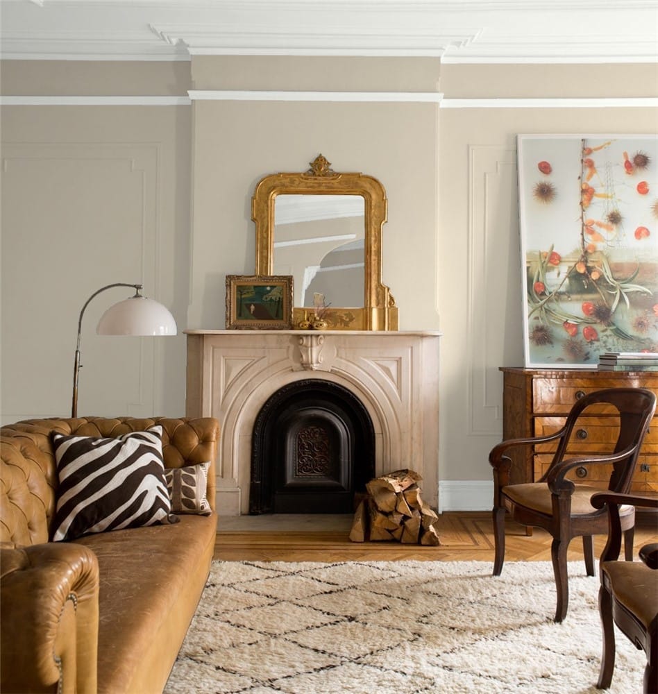
Collingwood
Collingwood is a greige that offers versatility thanks to its mix of cool and warm undertones. This mid-tone neutral can show different faces from one room to the next. Collingwood has a LRV of 62.14.
Collingwood is a Great Transitional Color
Manchester Tan
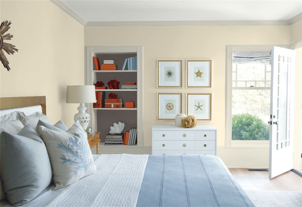
Manchester Tan is a bright khaki with an elegant feel. Just don’t call it beige, because this neutral is too sophisticated to be boring! Manchester Tan will bring a warm and cozy feeling to a room. Its LRV is 64.41.
Manchester Tan is a Warm Alternative to Beige
Pashmina
Pashmina is a member of the celebrated greige family, but you might not immediately realize it–this color is darker and warmer than most greiges out there.
Its LRV of 43.62 puts it on the deep end of the mid-tones. This is a color that excels as an accent, and you’ll frequently see it in use on cabinets.
Pashmina is a Popular Choice for Cabinets
Gray Owl
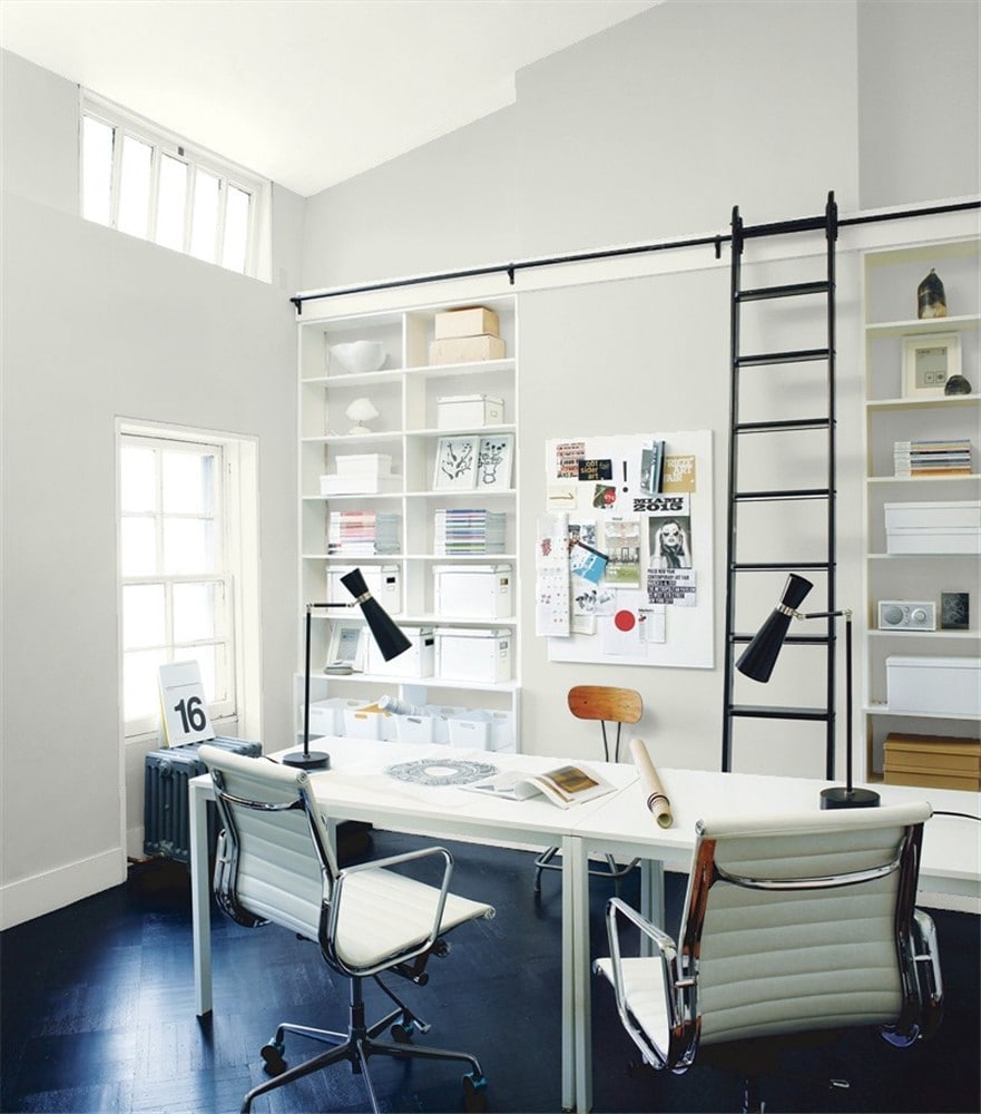
Gray Owl is a classic, light, cool gray with a wide range of uses. It’s a shoe-in for monochromatic gray palettes, but its cool side also has an affinity for blue.
Gray Owl also works well with metal and appliances. Its LRV is 65.77.
Gray Owl Partners Beautifully with Blues
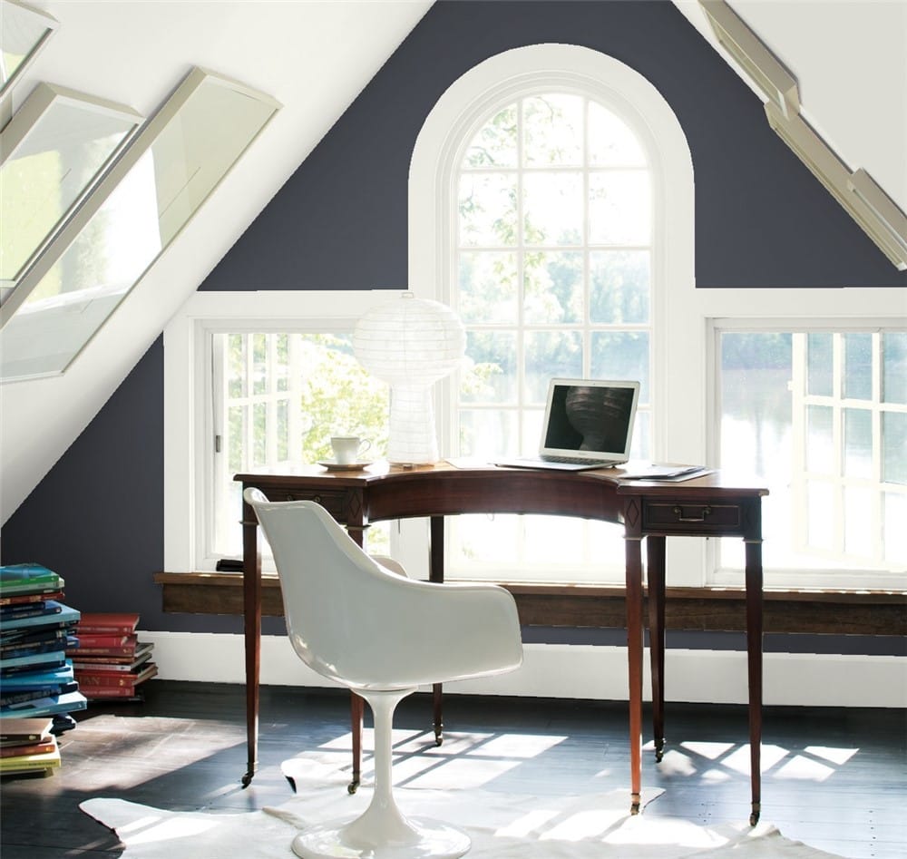
Chelsea Gray
Chelsea Gray is an attention-grabbing charcoal gray that immediately ups the sophistication factor of any room it’s in.
If you’re a fan of dark, moody rooms you can go bold with this color, but I personally think Chelsea Gray is at its best when it’s balanced with lighter colors. Either way, this color will make a statement! Chelsea Gray has a LRV of 22.16.
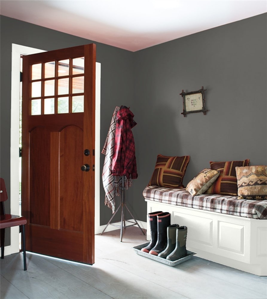
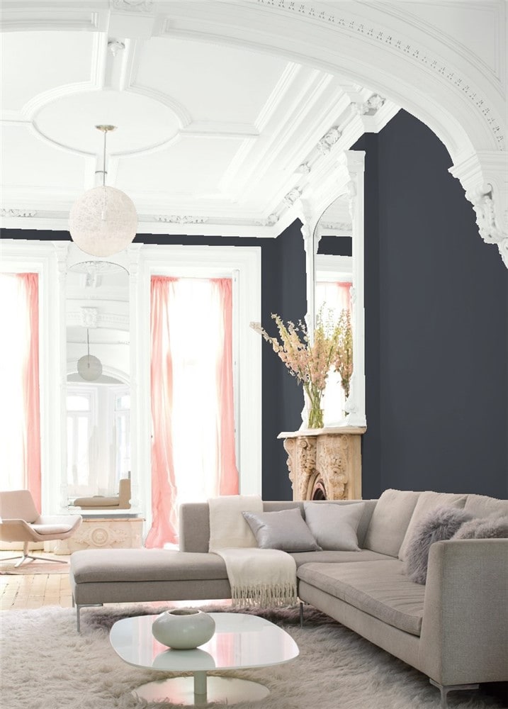
Chelsea Gray Makes a Stunning Accent Wall
Kendall Charcoal
Another charcoal gray favorite, Kendall Charcoal is rich and deep. This is a timeless color that feels fresh and modern while evoking vintage elegance.
Its contrast with gold and silver metalwork and appliances is not to be missed. Kendall Charcoal is an inky dark 12.96 on the LRV scale.
Kendall Charcoal Loves Metalwork
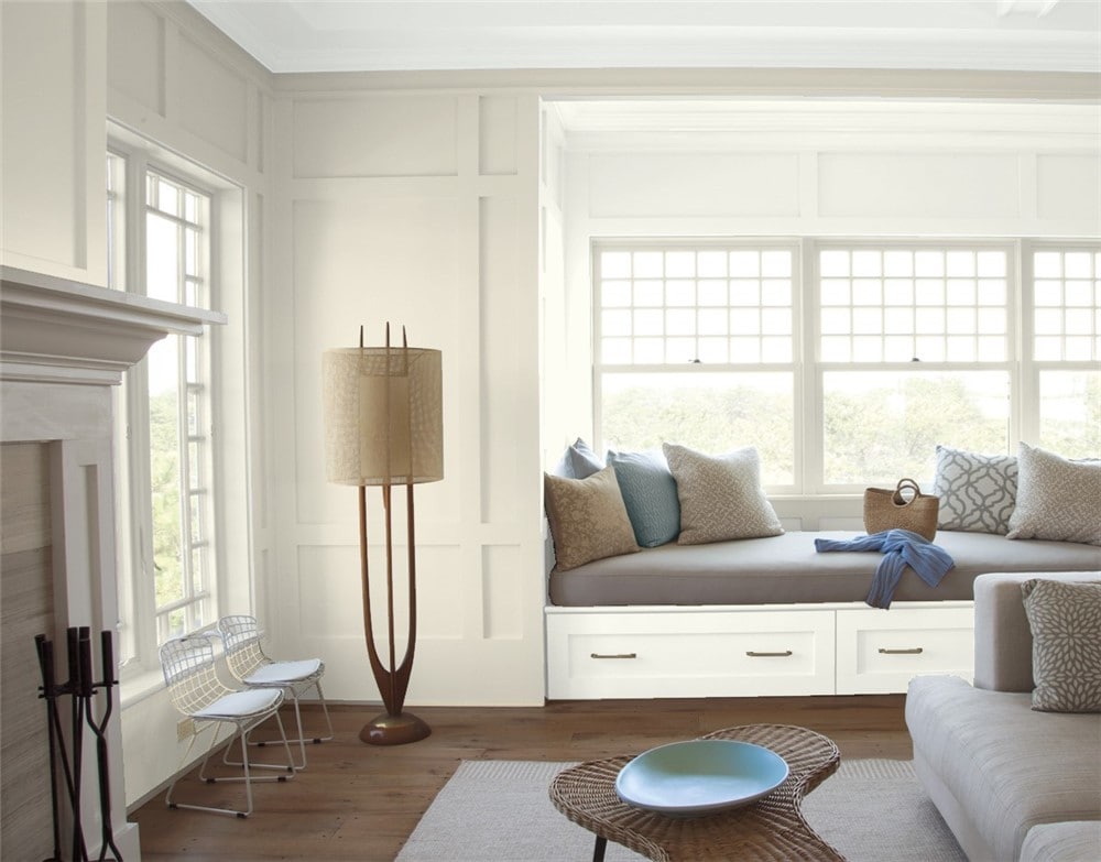
White Dove
Lest you think this is “just a white paint”, let me tell you: White Dove is magic in a can. This white has an almost inexplicable soft, warm luminescence that makes people want to paint it everywhere–and they do, which is why you see it so often as an “all-over color”.
Yet it accomplishes this warm glow without any yellow undertones: truly a magical feat. I could put a lot of white colors on this list, but let’s be honest, this is the best one. White Dove has a LRV of 85.38.
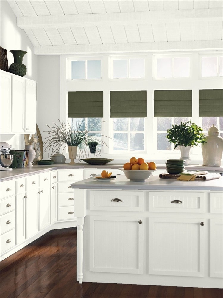
White Dove is a Popular Main Color
Baby Seal Black
Baby Seal Black is a bold, saturated black that offers high contrast to other colors. Adding black to a room is an easy way to level up the drama; a classic combination is black, white, and gray. Baby Seal Black has a LRV of 6.76.
Baby Seal Black is an Elegant Accent Color
Witching Hour
Witching Hour is an inky, intense black that makes an interesting choice for a bedroom color. Some people actually find it more restful because it reduces the amount of light in the room, making it less likely that outside light sources would disturb your sleep. Witching Hour has a LRV of 6.74.
Witching Hour is a Chic Bedroom Color
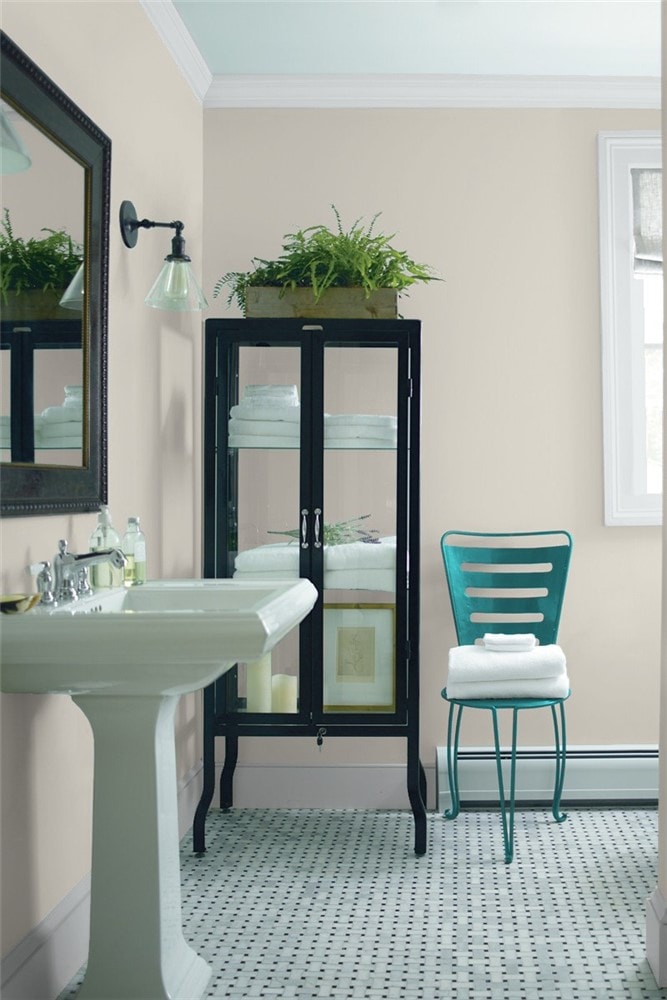
Ballet White
Ballet White isn’t actually white; it’s a subdued cream color that has enough gray to balance out any yellow. Cream colors are incredibly useful for coordinating color palettes, especially when it comes to perking up dark colors, or contrasting in situations where a pure white would be too stark.
But on a list of the best neutrals, I didn’t want to make you wrestle with undertones, and Ballet White doesn’t want you to either. Its LRV is 73.54.
Ballet White is a Truly Neutral Cream
Final Thoughts
If you’re struggling to choose the colors for your next project, neutrals are definitely your easiest path forward. Even if you just choose one or two to get you started, they’re almost certain to go with any other colors that take your fancy.
The neutrals on this list are wildly popular and sure to please, so pick your favorites and get painting!