Calm by Benjamin Moore
Calm is a word that epitomizes what many of us are trying to evoke in our homes. As a paint color, it has a lot of the qualities you might expect.
It’s an easy-going neutral, with a blend that leans just warm enough to feel cozy. It’s light enough to use anywhere in the home.
After all, what room couldn’t use a little more calm? Or maybe a lot more?
But don’t let all that ease fool you: Calm is a complex neutral, which helps to give it versatility and style.
Let’s quietly slip open that paint can and take a look at this restful color.
What Color is Calm?
Calm is a off-white color that’s tinted with a blend of very light brown and gray. This is one of those complex neutrals: it’s not exactly a greige, nor really a taupe, but you can’t treat Calm like it’s a plain white paint either.
LRV of 75.83
Calm has a light reflectance value, or LRV, of 75.83. Light reflectance value is a scale designed to measure how bright a color is, and ranges from absolute black at 0 to sheer white at 100. The higher the number, the brighter the color.
Off-white colors typically range from about 73 to 82, with numbers above 82 being true whites. This places Calm firmly within the off-white range.
What Undertones Does Calm Have?
Calm has lavender undertones that come from the warm brown and gray part of its mix. Purple undertones aren’t for everyone, so be sure to sample this color in a large area, under different lighting conditions, before committing to it.
Is Calm a Warm Color or a Cool Color?
Calm is a warm color, owing to its brown and purple undertones. It’s not a yellow or creamy warmth, but rather warm in the way that a taupe or greige color would be warm. Calm’s warmth is tempered by the cool of its gray side.
Where Can You Use Calm?
Calm is an off-white, which means it’s a light neutral, so you can readily use it anywhere in the home.
South-facing rooms could amplify its purple undertones, so keep that in mind if that’s an effect that matters to you.
Rooms that get less light can help Calm showcase its gray side, which is another placement hint to keep in mind.
Calm’s shaded effect can prevent it from being too stark, which is always a bonus in a white paint.
Let’s take a look at Calm in home settings and see how it can create a little tranquility for our own spaces.
Living Room
Calm on the walls sets the stage for this neutral living room.
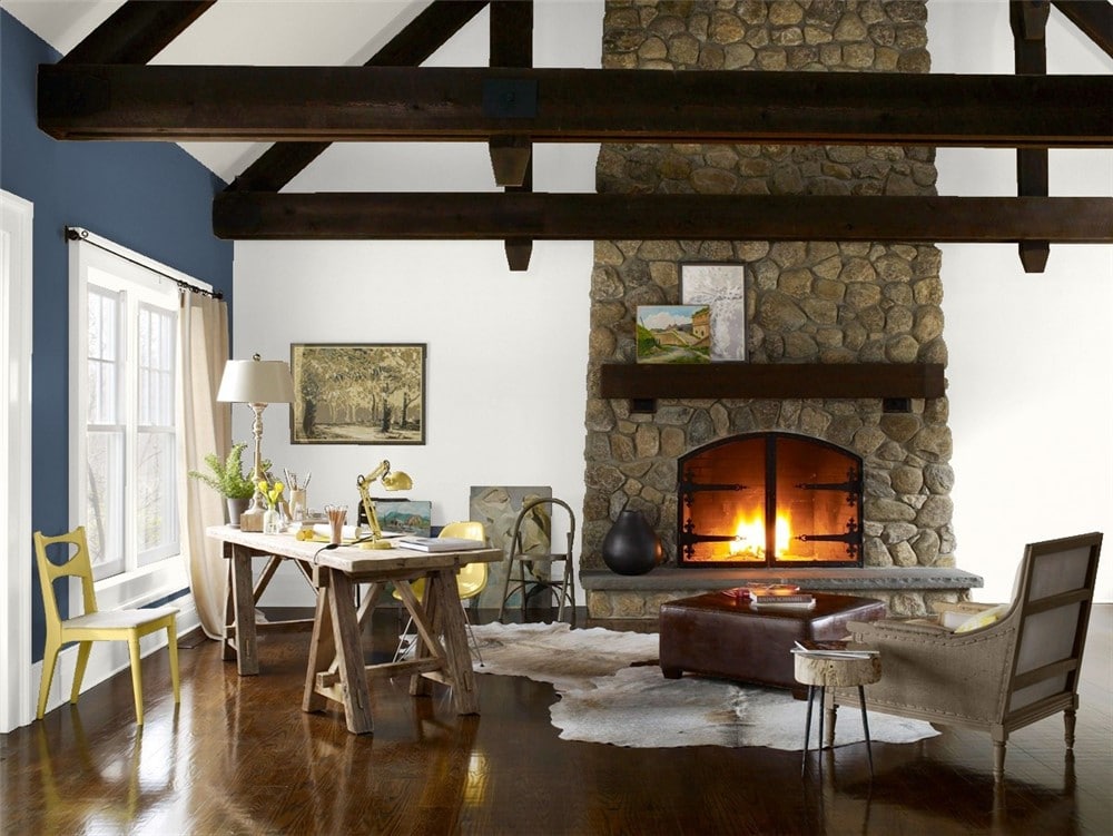
Calm teams up with Newburyport Blue in this handsome rustic living room to create a space that’s bright but balanced.
Kitchen
Calm’s shading gives it depth and makes it an elegant kitchen cabinet color.
The gray tones in Calm are a lovely complement to marble countertops.
Dining Room
Calm pairs with ultra-bright Chantilly Lace to invite sunlight into this dining room.
Calm shiplap walls were the centerpiece of this modern farmhouse dining room transformation.
Home Office
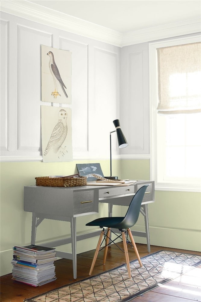
In this home office, Calm and Guilford Green create a serene, nature-inspired atmosphere.
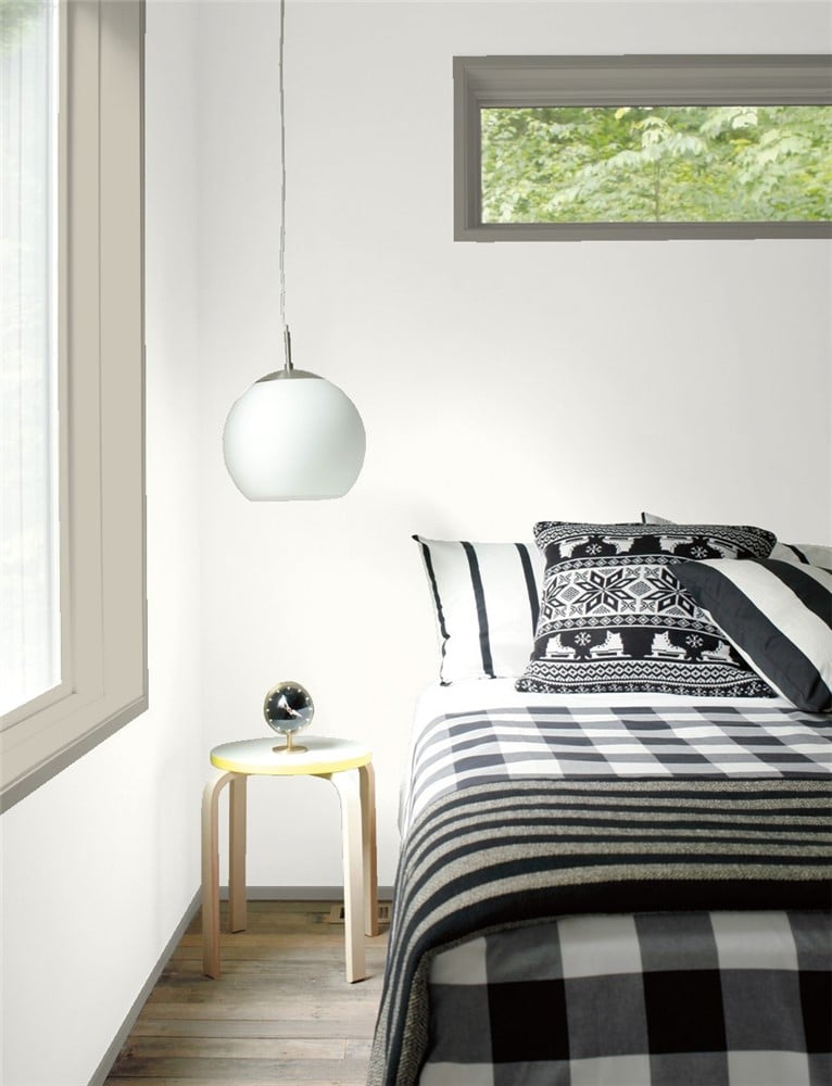
Bedroom
Hale Navy and Calm unite in this simple but effective boys’ room.
This soothing bedroom appeals to Calm’s warm side.
Nursery
A neutral nursery, on a backdrop of Calm, offers room to grow as decor and color preferences change.
Bathroom
Calm on these bathroom walls calls out the beautiful stenciling in the floor tiles.
This dark and chilly bathroom got a much-needed warm-up from Calm.
Entryway
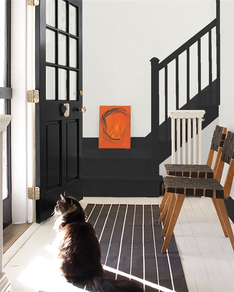
Black and white is a simple combination that always makes a statement, like Black and Calm in this entryway.
Calm Coordinating Colors
Calm is an off-white, so you have plenty of options to choose from when it comes to coordinating colors. Your only real limiting factor is Calm’s slight tint of warm purple–do you want to play that up or downplay it?
Taking a cue from its name, it’s popular to pair Calm with other soothing colors, like blues and grays. Darker greiges are a great option, as well as charcoal grays.
Greens and aqua colors are also soothing possibilities that work well with Calm. Consider natural, subdued greens that often share Calm’s gray shading.
An elegant and dramatic combination that never fails is black, gray, and white–in this case, Calm. You can use a greige, such as Revere Pewter, for a twist on this combination.
The rest of the neutral family is always a safe place to go, and Calm’s cool/warm blend is a nice balance to warm colors like browns and taupes.
Here are some coordinating color ideas to inspire your explorations with Calm:
- Nimbus Gray by Benjamin Moore
- White Opulence by Benjamin Moore
- Nightingale by Benjamin Moore
- Porcelain by Benjamin Moore
- Newburyport Blue by Benjamin Moore
- Stratton Blue by Benjamin Moore
- Collingwood by Benjamin Moore
- Head Over Heels by Benjamin Moore
- Wish by Benjamin Moore
- Chelsea Gray by Benjamin Moore
- Witching Hour by Benjamin Moore
- Urbane Bronze by Sherwin Williams
- Naval by Sherwin Williams
- Ellie Gray by Sherwin Williams
- Watery by Sherwin Wiilliams
- Evergreen Fog by Sherwin WIlliams
How Does Calm Compare With Other Colors?
Calm vs Classic Gray by Benjamin Moore
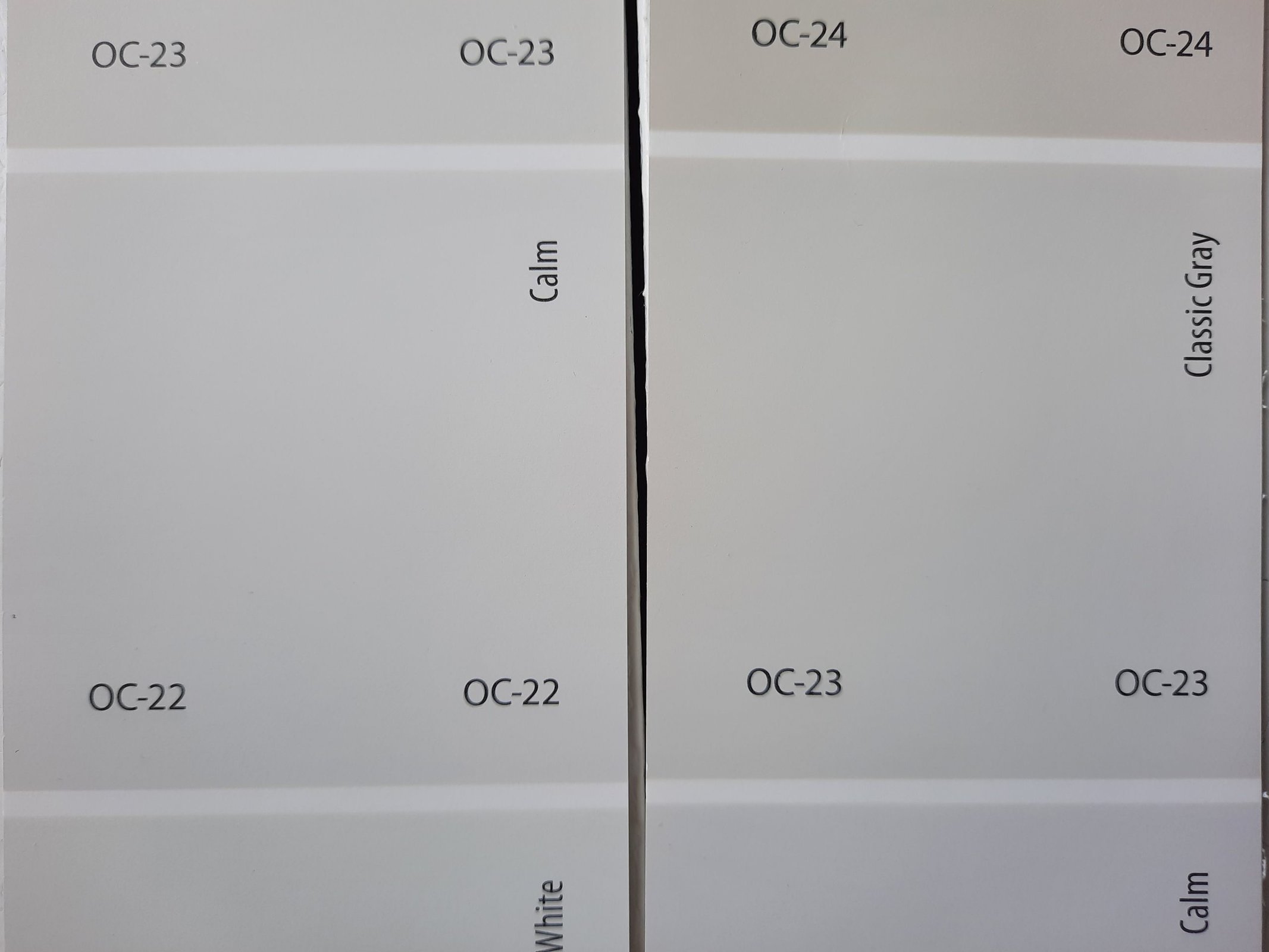
Classic Gray is a fairly similar color to Calm, and no wonder–these two are next door neighbors on the paint chip. Classic Gray is a little warmer than Calm. It has a LRV of 73.67, which is only two points off of Calm.
Calm vs Pale Oak by Benjamin Moore
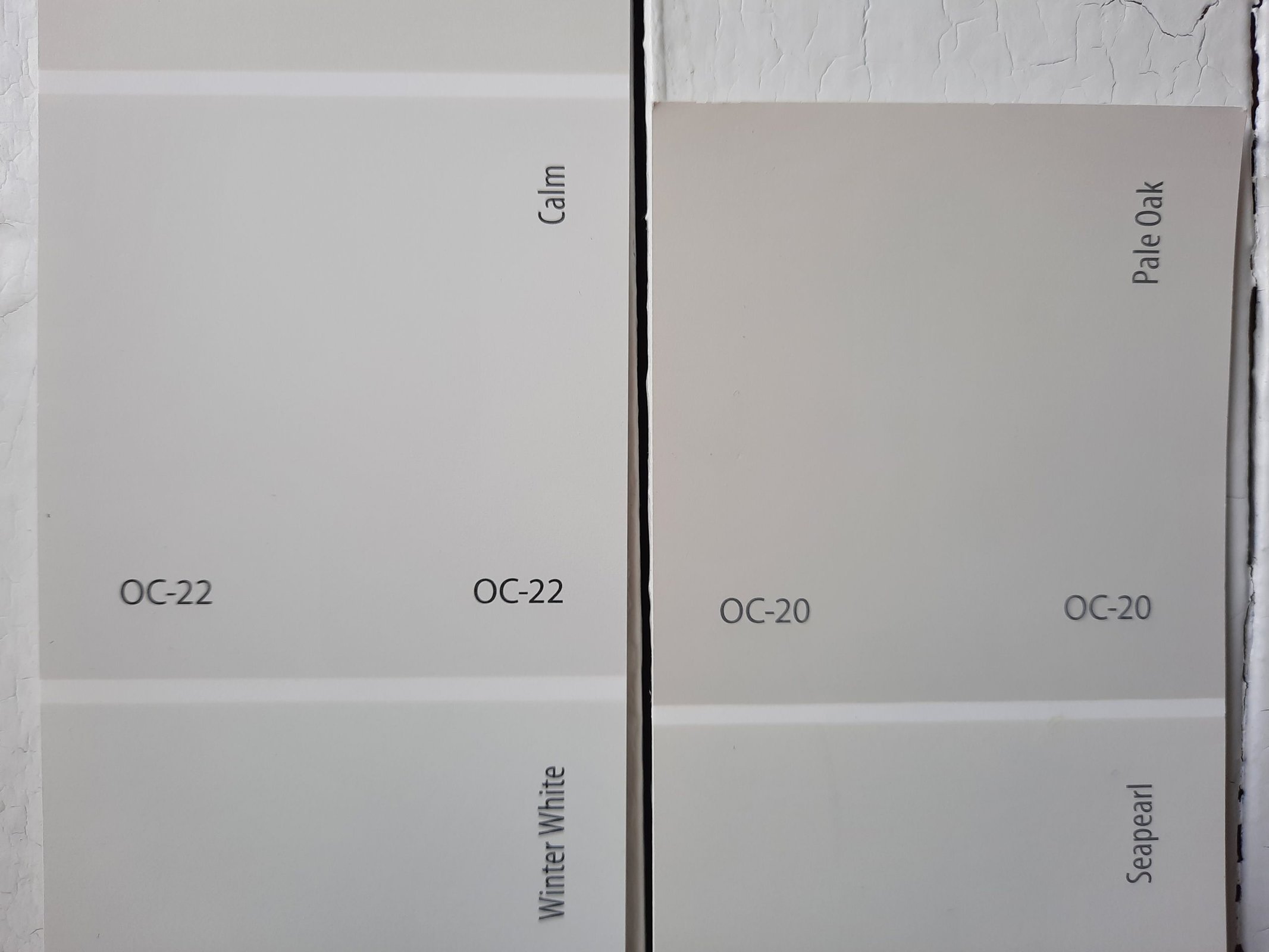
Pale Oak is a popular greige color, and it stands out by being significantly lighter than most greiges. Its beige side makes it warmer than Calm, and it’s got enough body to work as a color (although Benjamin Moore still includes it in their off-white collection). Pale Oak has a LRV of 68.64.
Calm vs Eider White by Sherwin Williams
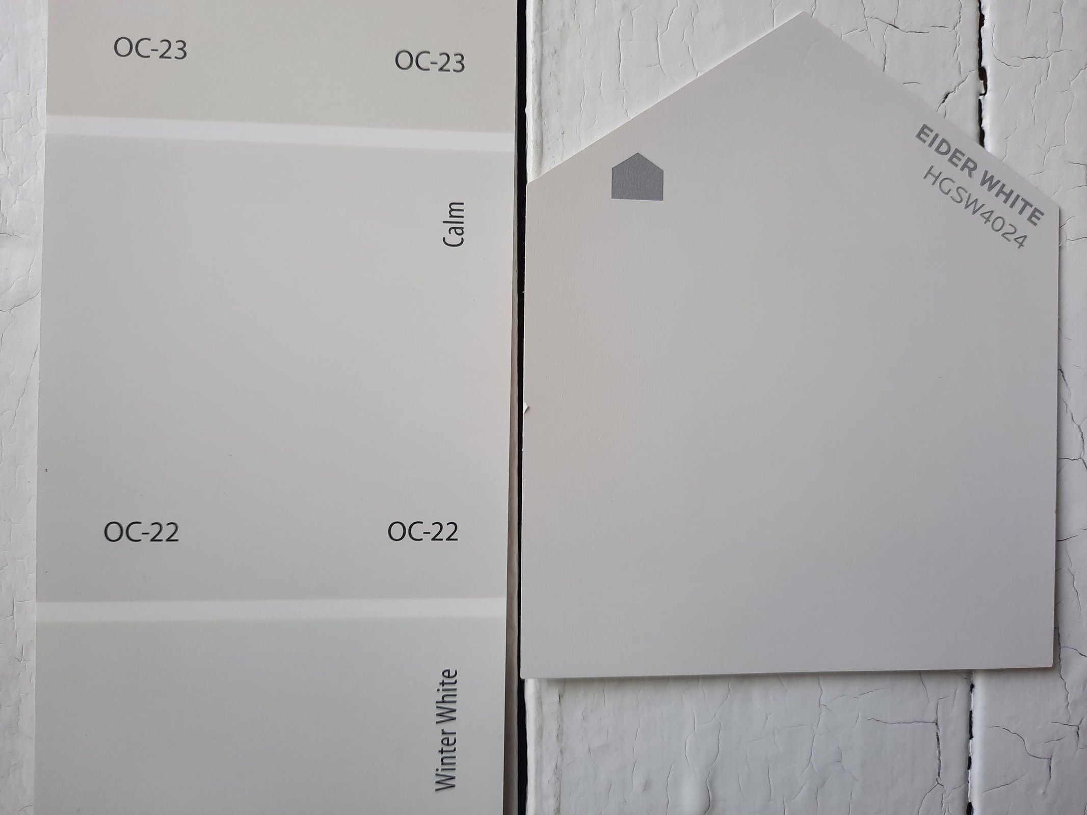
Eider White is a gray off-white that’s a pretty decent Sherwin Williams equivalent to Calm. These colors are really close, although Eider White looks a little cooler. Eider White has a LRV of 73.
Final Thoughts
If you’re looking for a neutral that offers something a little different, Calm might just be the color for you. It has all the ease and versatility of an off-white or a pastel gray, but with that lovely lavender undertone for personality. Sure, there’s plenty of clean whites, plain off-whites, and simple neutrals out there. Calm is the choice for someone who wants their neutrals to be interesting.