How to Mix and Match Picture Frames
Gallery walls have been the craze lately, for a good reason too! Putting up pictures adds life to a room as well as some dimension. A good gallery wall can immensely enhance the room it’s in, and most certainly personalize it!
But where do you start? How do you create the perfect gallery wall? And how many photos are enough? Here are the answers to all your dilemmas.
First, Consider What You’re Framing

Before we start with the frames themselves, it’s important to step aside first and consider what we’re framing. This is super important as it helps us find the most appropriate frames for our most beloved pictures.
Depending on the photo or the picture itself, you might want to consider a wooden or metal frame. Modern pieces look the best in sleek metal frames that won’t take much of your attention. So if you plan on framing abstract art or even black and white photos, you should go for a rather minimal look.
On the other hand, more traditional paintings might benefit from a more vintage-looking, ornamental gold frame that will add more depth to the picture. And of course, there are wooden frames that often feel pretty light and neutral, putting your art of choice in the spotlight.
Sometimes certain photos or pictures won’t look good in small formats, while some just feel as if they’re made for a tiny frame. If you plan on framing some photos from your camera roll, here’s how to choose the best one. Keep all this in mind when shopping for frames!
Match the Frames to the Pieces on the Wall
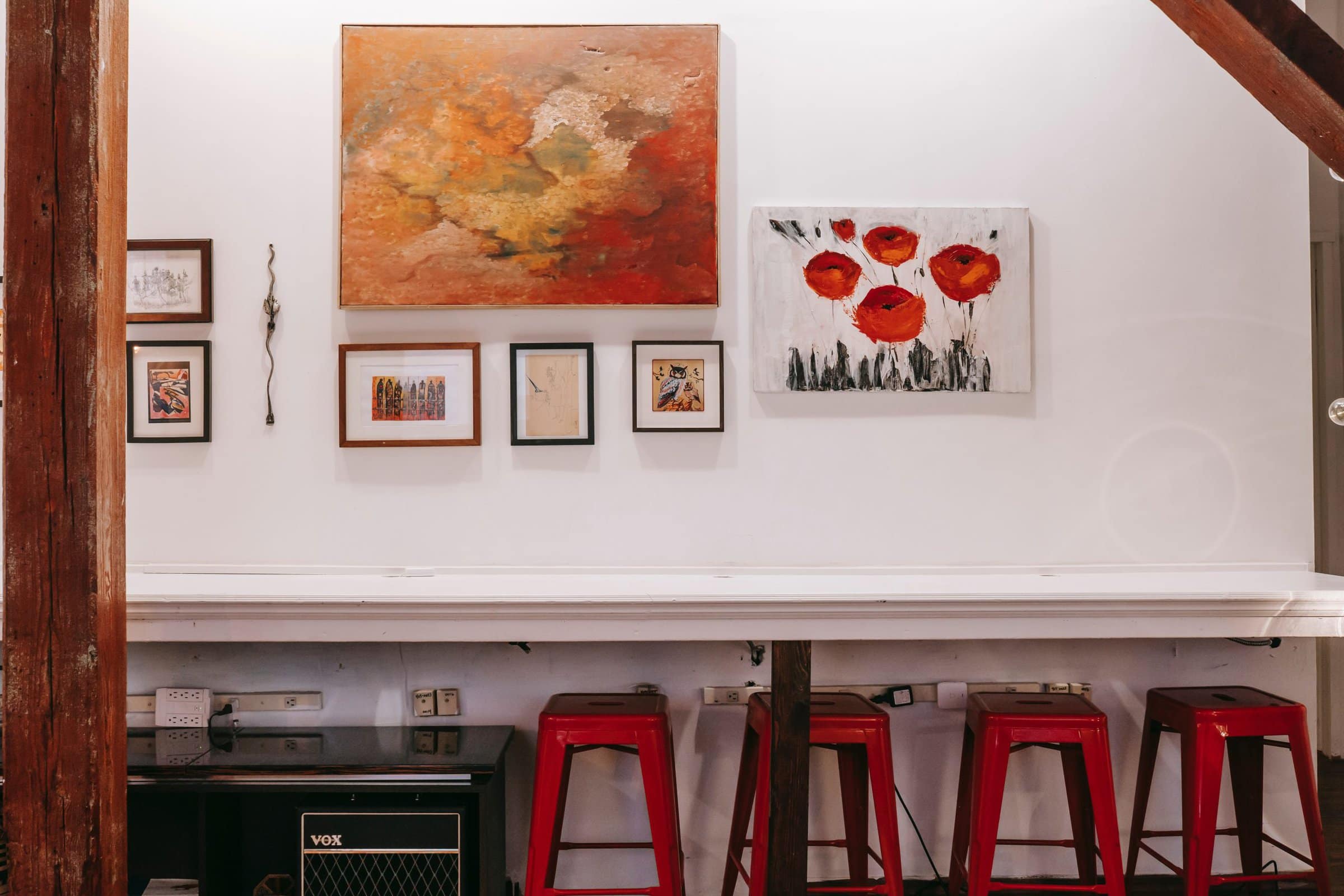
When you decide on the things you want to hang, you can easily pinpoint the frames that would fit the best. A fantastic way to decide on your frames, and showcase your art wall even better is to pick out a color or two from your paintings and buy some frames in those shades.
Here they did a fantastic job with their frames. They picked out two main paintings, leaving them without a frame, while they matched the frames of the “supporting” art pieces with the colors of the main paintings. It’s an easy and fun way to create a dashing look!
Use the Frame Colors to Emphasize Certain Pieces
If you want to emphasize certain things you decided to put up, it’s easily achievable with two or three frame colors and a couple of different sizes. It’s a phenomenal way of mixing and matching frames that ends with a unique result.
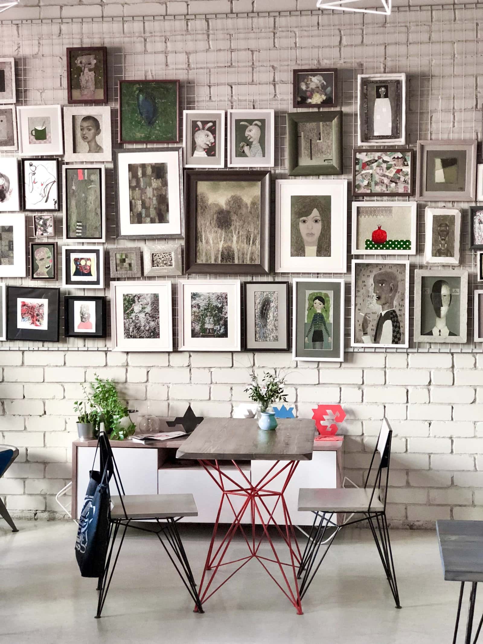
Opting for a dark or bold frame color such as black, and surrounding it with dainty frames in light colors will surely make them stand out from the rest.
Here they picked out a couple of larger prints and framed them in black, while all the smaller ones are framed in lightwood or white. This is incredibly visually interesting, making us notice the darker frames more, while the lighter ones feel like a beautiful add-on to the main prints.
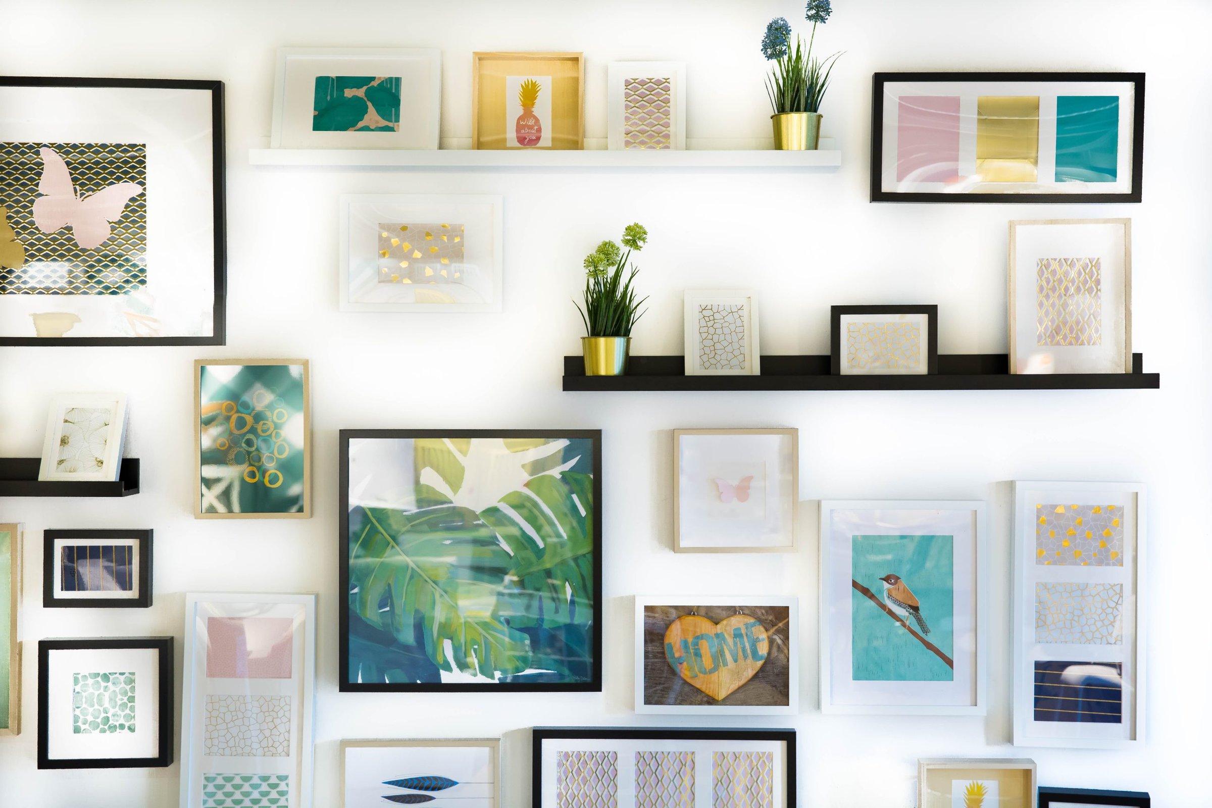
Go for Neutrally Colored Frames to Achieve a Chic Look
Picking out neutral colors for any type of interior design is always a smart choice. Simply said, they never go out of style and always look chic. So why not apply that to your frames?
Pick out an array of frames in black, white, and gray, and consider a couple of sizes. You can try alternating between the colors, or just placing them randomly! This look fits so beautifully in contemporary homes, as these frames accentuate the sharp look quite well.
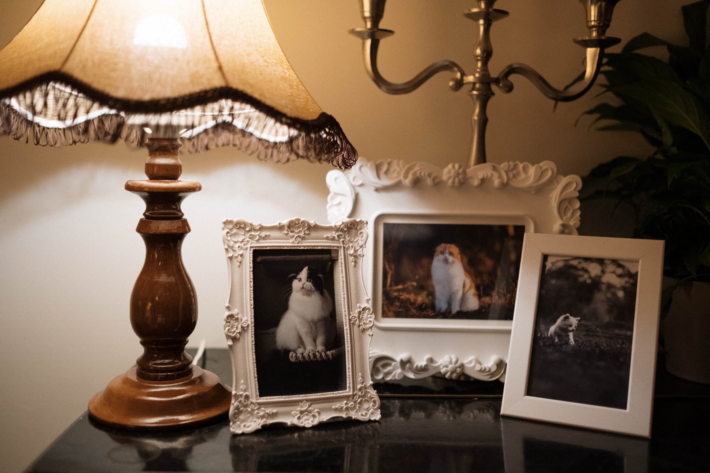
Pick Out Different Shapes and Sizes
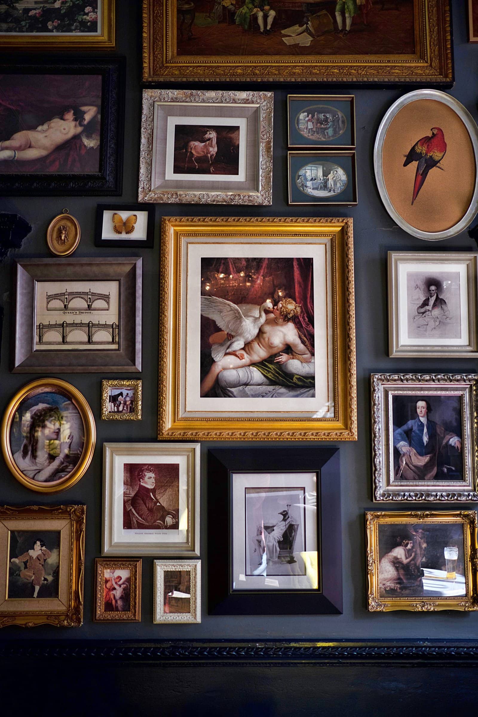
Creating visually exciting walls can be super easy! It’s all about the placement of your picture framing, and different shapes and sizes.
A lot of people tend to overlook round or oval frames completely when deciding on a frame. But that shouldn’t be the case. This fantastic framing style gives a cute vintage look to your wall, adding a unique tone to it.
After choosing a couple of main, larger frames you want to emphasize, pick out two or three round or oval frames to pair with them. You can add them at the outer corners, to create a more organic overall look.
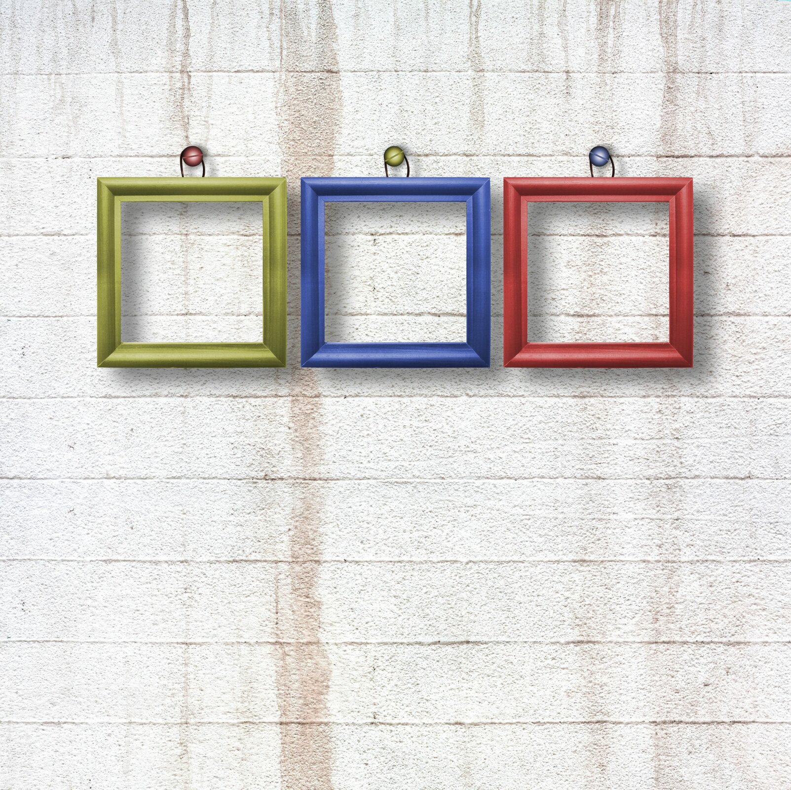
Use Color to Tie in Different Frame Styles
Another fantastic way of mixing and matching picture frames is to have them all in one color. This way, no matter if they’re round, square, simple, or have a lot of details, they can look harmonious.
Here, they opted in for white frames. White framing often looks very bright and stylish while also being versatile. Even though all three frames here are completely different style-wise, the color still makes them look unified and gorgeous.
Don’t be Afraid of Colorful Frames
Many people decide to settle for more neutral frame choices, but you don’t need to do that. Picking out some colorful framing can add so much life to your walls.
If you’re scared of implementing too much color, starting with a colored frame or two goes a long way. Combine them with neutrals or other colors. Mixing and matching colored frames can elevate your walls, but you have to make sure you’re deliberate about your color choices.
One of the best things you can do is to figure out the color scheme of the room you plan to place your frames in and then buy the frames in the main colors of that room. Suddenly, you’ll see how they become those staple decor pieces, that help tie the entire room in.
Summary
Mixing and matching frames is a lot of fun. There are tons of layouts you can pick out, and a bunch of different options. Don’t be afraid to try out different shapes, sizes, and color options.
Colors are a great way to create a cohesive space or to emphasize certain photos or art pieces. So it’s up to you to figure out which of these works the best for your home. Good luck!