Moonshine by Benjamin Moore Paint Color Review
Neutrals are easy to overlook. These workhorse colors have the often unglamorous task of serving as the backdrop for more exciting colors and decor items.
But as palettes trend warmer and taupe colors become more popular, neutrals are getting more complicated. No, not complicated to use–complicated in terms of what colors come together to create them.
The result is the chameleon effect: the ability of a paint color to change its identity in different lighting situations and next to different coordinating colors.
Moonshine is a color that’s a little bit of this and a little bit of that–but when it comes together, it’s an easy-to-use neutral that can find itself in any room of your home.
Let’s get to know this mysterious color a little better.
What Color is Moonshine?
Moonshine is a light gray color that has some warm taupe tones blended in. Benjamin Moore classifies it as an off-white, but it’s a little darker than off-whites typically are.
Does Moonshine Have Any Undertones?
Moonshine has some blue and green undertones, but they’re not obtrusive. These cool undertones are pretty typical for colors in the gray family.
Is Moonshine a Warm Color or a Cool Color?
Moonshine is a cool color, but it’s not cold. Compared to greige colors, you’ll find Moonshine to be cooler, but next to traditional grays it’s noticeably warmer.
LRV of 66.53
Moonshine has a light reflectance value (LRV) of 66.53. This makes it a lighter color. It is, however, darker than off-whites typically are. Off-whites range from about 73 to 82 on the LRV scale.
Light reflectance value is a scale designed to measure how bright a color is, and ranges from absolute black at 0 to sheer white at 100. The higher the number, the brighter the color.
Where Can You Use Moonshine?
Moonshine is a light, balanced neutral that’s suitable for use anywhere in the home. Use it to provide a restful ground for more adventurous colors in your decor, or make it the centerpiece of a neutral decorating scheme.
Moonshine brings serenity and calm to a room, making it especially well-suited to spaces like bedrooms, living rooms, and other spaces intended for relaxation.
Let’s take a look at Moonshine doing what it does best, and gather inspiration for future home refresh projects!
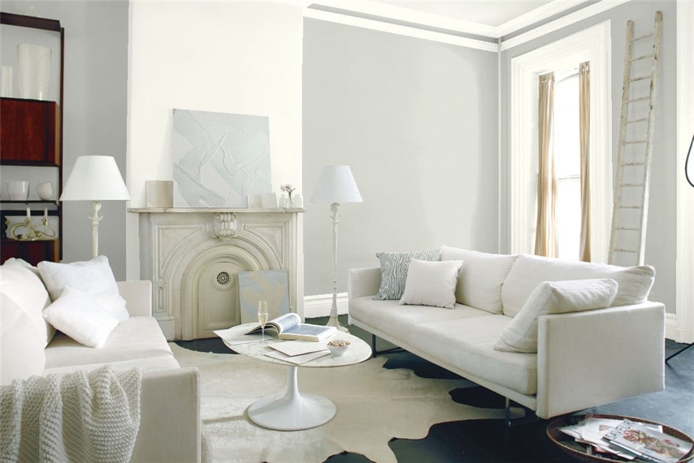
Living Room
Moonshine shows off its modern side in this living room.
Blues pull out Moonshine’s earthiness, making it a very effective neutral wall color.
Kitchen
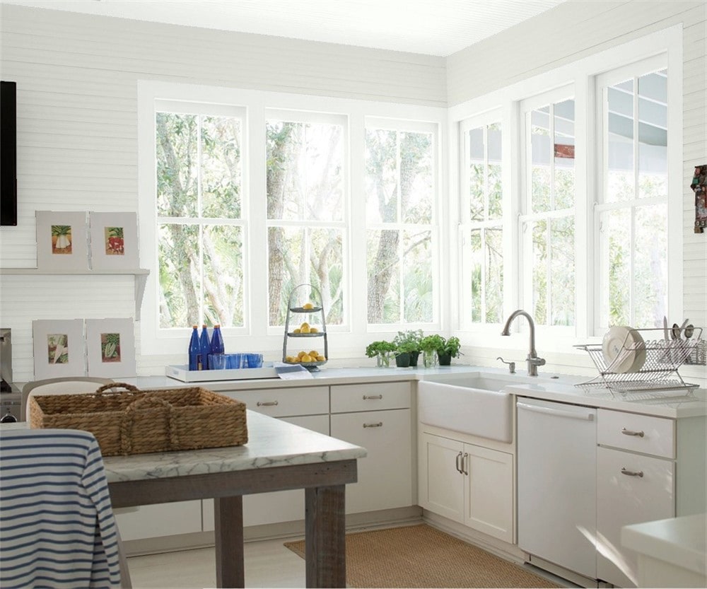
Moonshine and Chantilly Lace combine for a light and breathable kitchen.
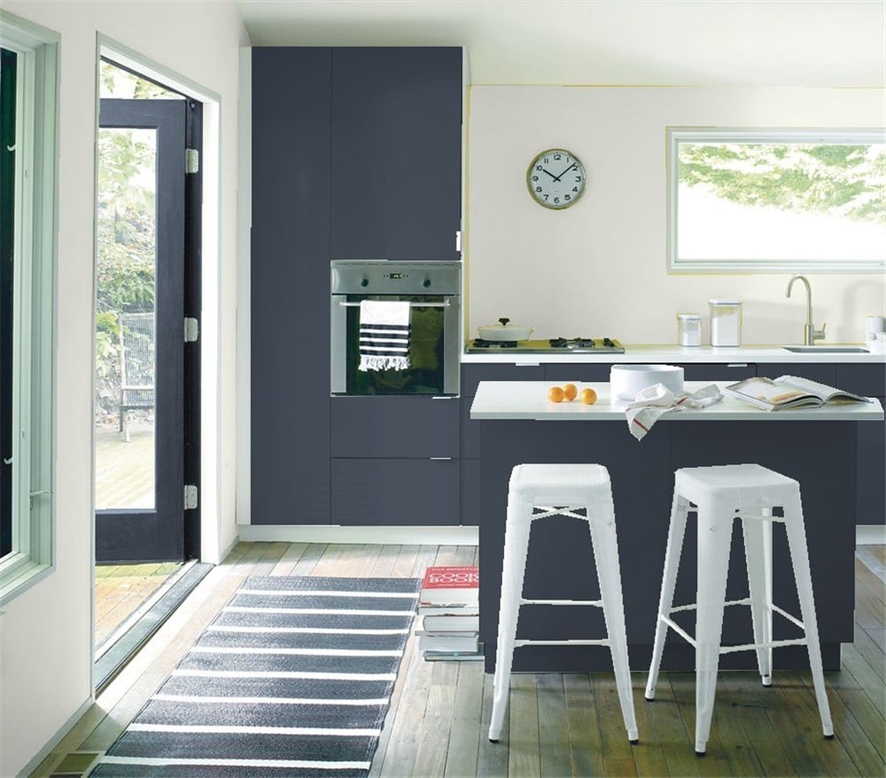
Moonshine and Hale Navy bring a subtle nautical feel to this modern kitchen.
Dining Room
A cool, minimalist dining room uses Moonshine to draw the simple elements of the space together.
Moonshine complements the rustic, natural-toned textiles in this dining room.
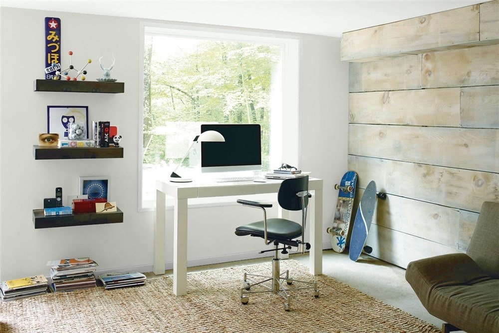
Home Office
A cooler side of Moonshine emerges next to the gold metalwork in this home office.
Moonshine complements the gray tones in materials like wood and stone, making it a good partner for natural elements.
Bedroom
Moonshine is a subtle and peaceful wall color option for coastal-inspired decor styles.
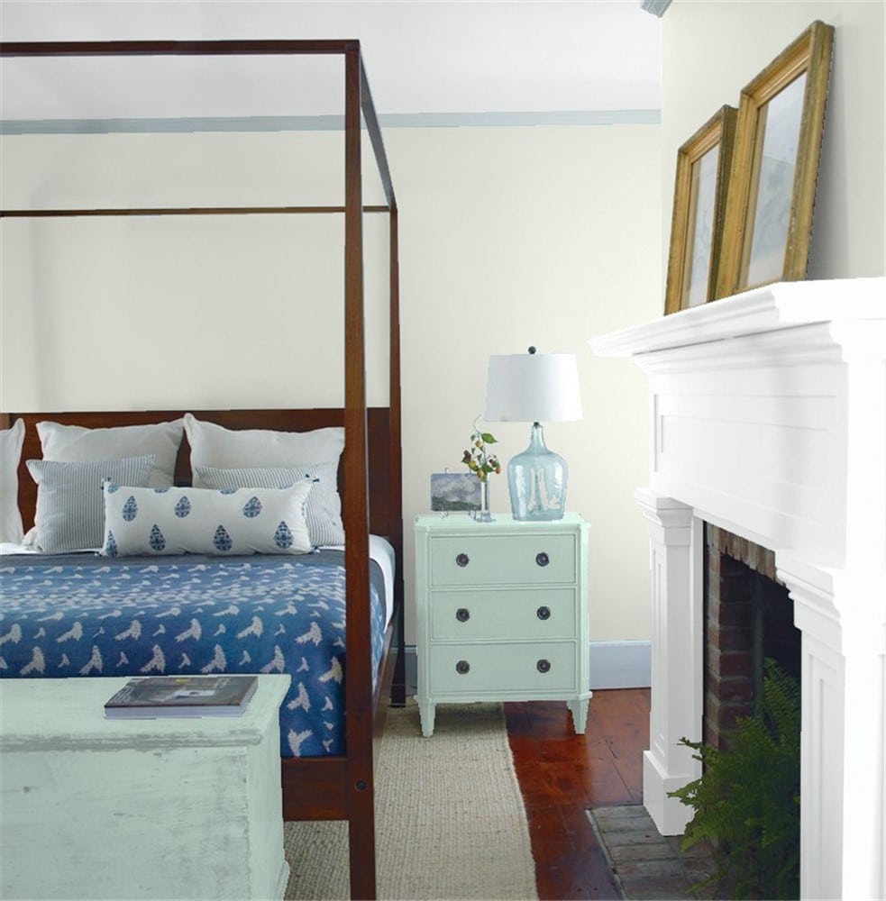
Moonshine partners well with blues of all shades, as it demonstrates in this bedroom.
Bathroom
Moonshine offers a gentle contrast for the whites in this modern farmhouse themed bathroom.
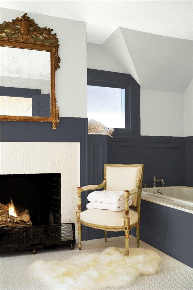
Black, white, and Moonshine make a sophisticated and dramatic combination, elevated by gold accents in this luxurious bathroom.
Entryway
Moonshine coordinates with a natural green in this entryway, accompanied by restful tones and potted succulents.
Coordinating Colors for Moonshine
Moonshine, whether you consider it a gray, a taupe, or an off-white, is above all else a light neutral color. This means that you have a lot of directions you can take for its coordinating color palette.
Keep in mind that Moonshine’s slight warm tint is going to come into play when you choose coordinating colors, and the warmth or coolness of the colors around it will play up its gray or its taupe sides.
Blues of all kinds are perfect companions for Moonshine. Navy blues will bring out a traditional, elegant side. Teals are more modern and can be playful. Softer, mid-range blues will feel more calming.
Like their fellow cool colors, greens are also a great choice for Moonshine. Subdued natural greens can highlight Moonshine’s ability to work with materials like wood and linen.
Here are some coordinating color ideas for Moonshine to inspire you:
- Hale Navy by Benjamin Moore
- Bahaman Sea Blue by Benjamin Moore
- Aberdeen Green by Benjamin Moore
- Aegean Teal by Benjamin Moore
- Mallard Green by Benjamin Moore
- White Dove by Benjamin Moore
- Chantilly Lace by Benjamin Moore
- Sanctuary by Benjamin Moore
- Black Magic by Sherwin Williams
- Pure White by Sherwin Williams
- Urbane Bronze by Sherwin Williams
- Salty Dog by Sherwin Williams
- Naval by Sherwin Williams
- Anonymous by Sherwin Williams
- Secret Cove by Sherwin Williams
- Rose Colored by Sherwin Williams
How Does Moonshine Compare With Other Colors?
Moonshine vs Gray Owl by Benjamin Moore
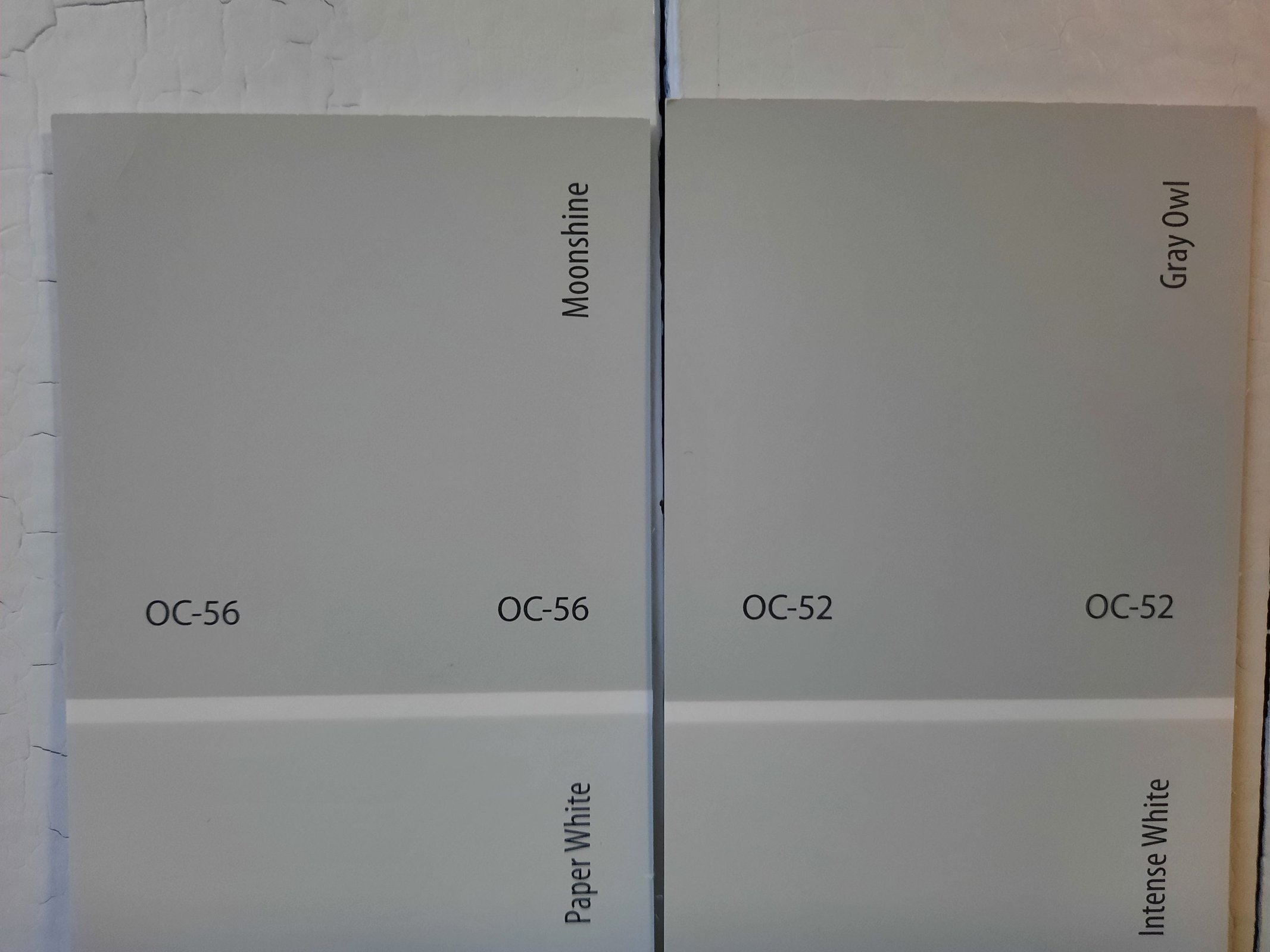
Gray Owl is Benjamin Moore’s classic cool, light gray. It’s a super-popular color with a lot of fans. Gray Owl’s 64.51 LRV is very comparable to Moonshine’s 66.53. Gray Owl is cooler than Moonshine and doesn’t have those taupe tones.
Moonshine vs Cliffside Gray by Benjamin Moore
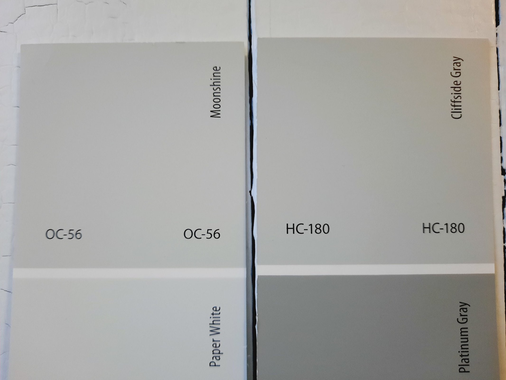
Benjamin Moore describes Cliffside Gray as the color of driftwood, and that’s not a bad description. It’s a little lighter than Moonshine, sitting at 60.56 on the LRV scale. Cliffside Gray is cooler than Moonshine as well. But both are use-anywhere light neutral grays.
Moonshine vs Silver Feather by Behr
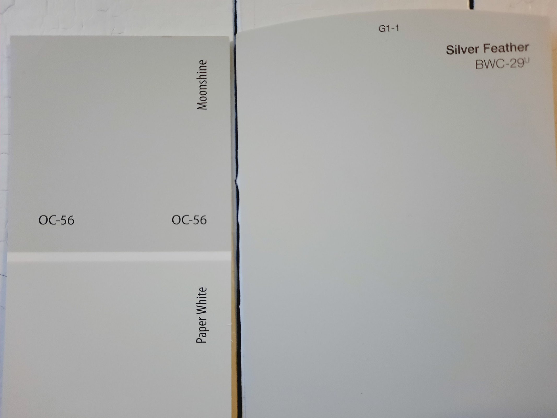
Behr’s Silver Feather is a well-balanced light gray that, like Moonshine, leans a little warm thanks to some taupe undertones. Silver Feather is noticeably the lighter of the two, with a LRV of 71 that sends it into off-white territory.
Final Thoughts
Moonshine is a light, complex neutral that can find its way into any room of the home, and nearly any color palette. Keep an eye on its taupe undertones when choosing color companions. Its unexpected earthiness can really bring out the natural feeling of a neutral palette. Will Moonshine take center stage in your next home refresh?