15 Paint Colors That Go with Wood Paneling
Wood paneling was a trademark of the American home in the 1970s before fading out of favor. But, decades later, it’s back with a vengeance, appearing in every style from vintage to modern.
The best paint colors with wood paneling are earthy and neutral shades. Try whites and off-whites, greens, grays, blues, and beiges. Working with neutrals gives you a greater range of accent colors, styles, and decor ideas.
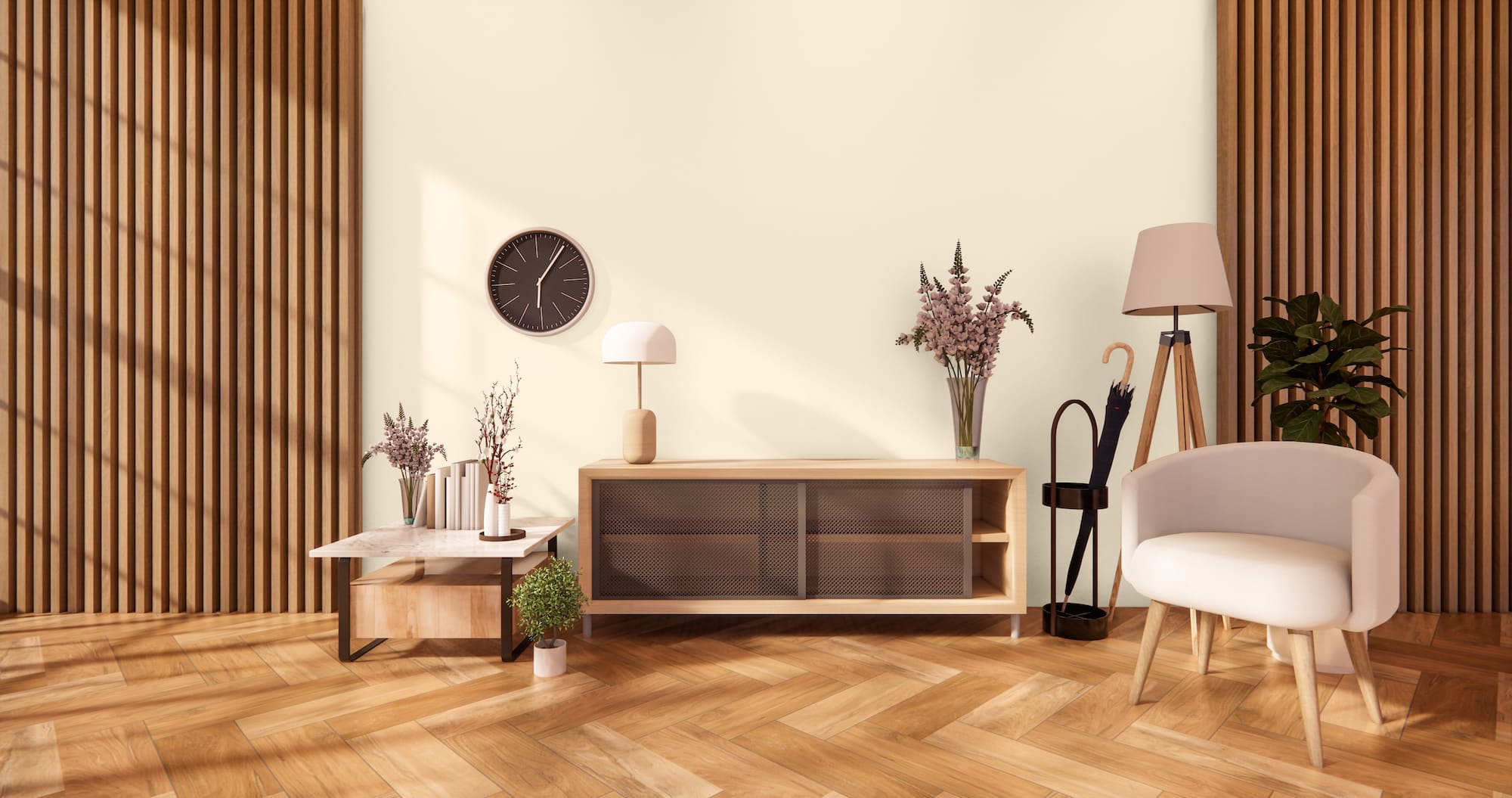
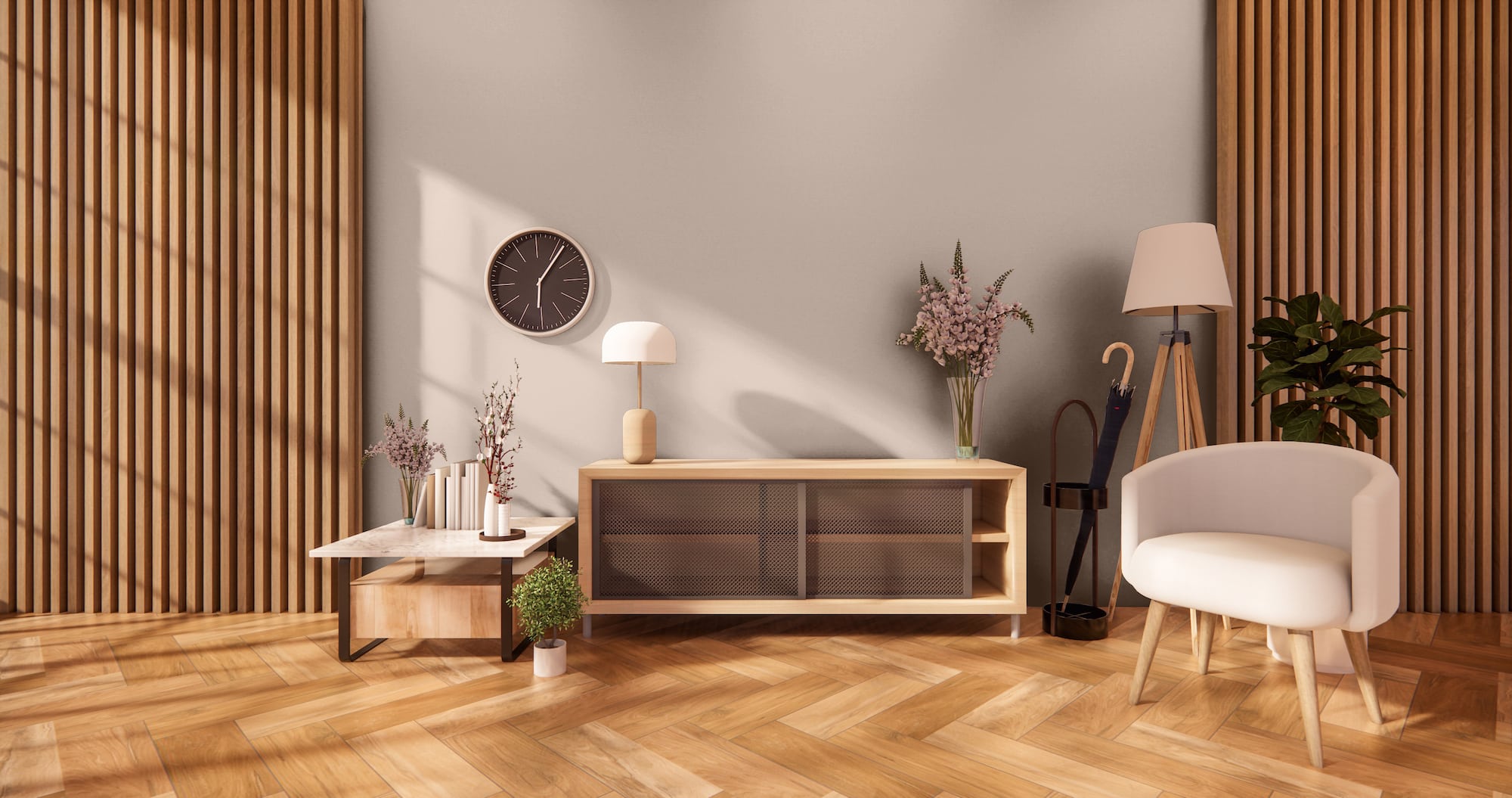
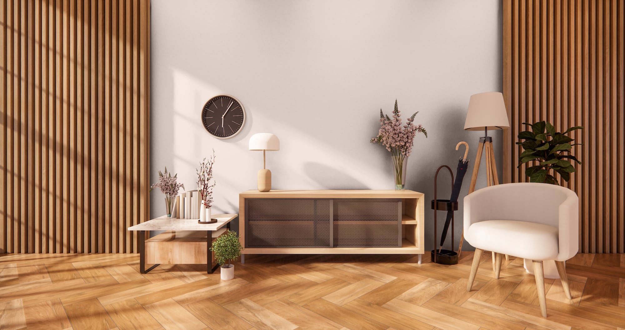
Spare White by Sherwin Williams

Spare White is a cool, crisp white with an LRV of 77. This color has slight tints of pigmentation that give this color dusty gray shadows.
Pairing this shade with wood paneling gives you a stylish and versatile look. The lighting and the tone of the wood can cause this white to look brighter or darker for an interesting flip-flop effect.
Crème by Sherwin Williams
Crème is a soft, warm shade of off-white that balances the heaviness of wood paneling so your room doesn’t feel outdated and dark.
Neutrals like this give you an advantage when you decide to redecorate, as they can go with any color scheme. For example, you can add lighter colors for a monochromatic look or go with dark or bold colors for contrast.
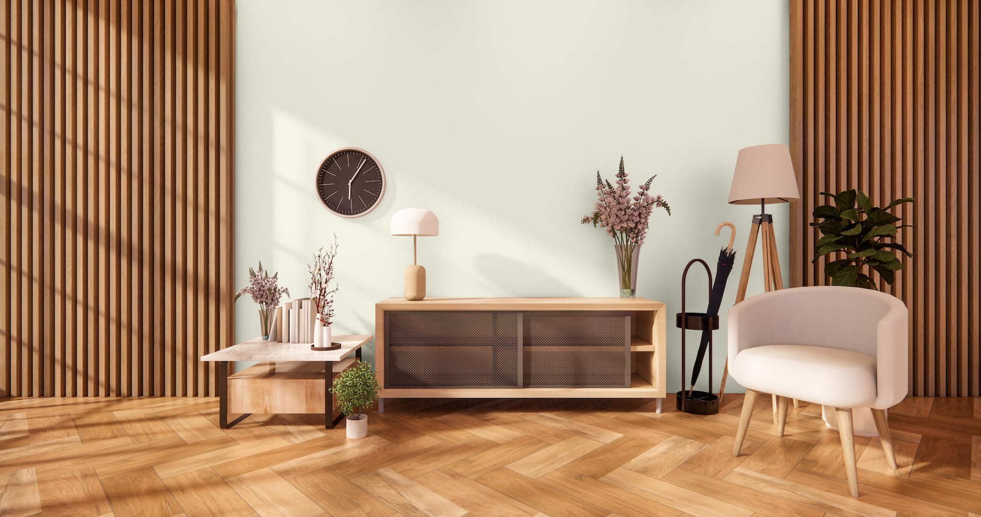
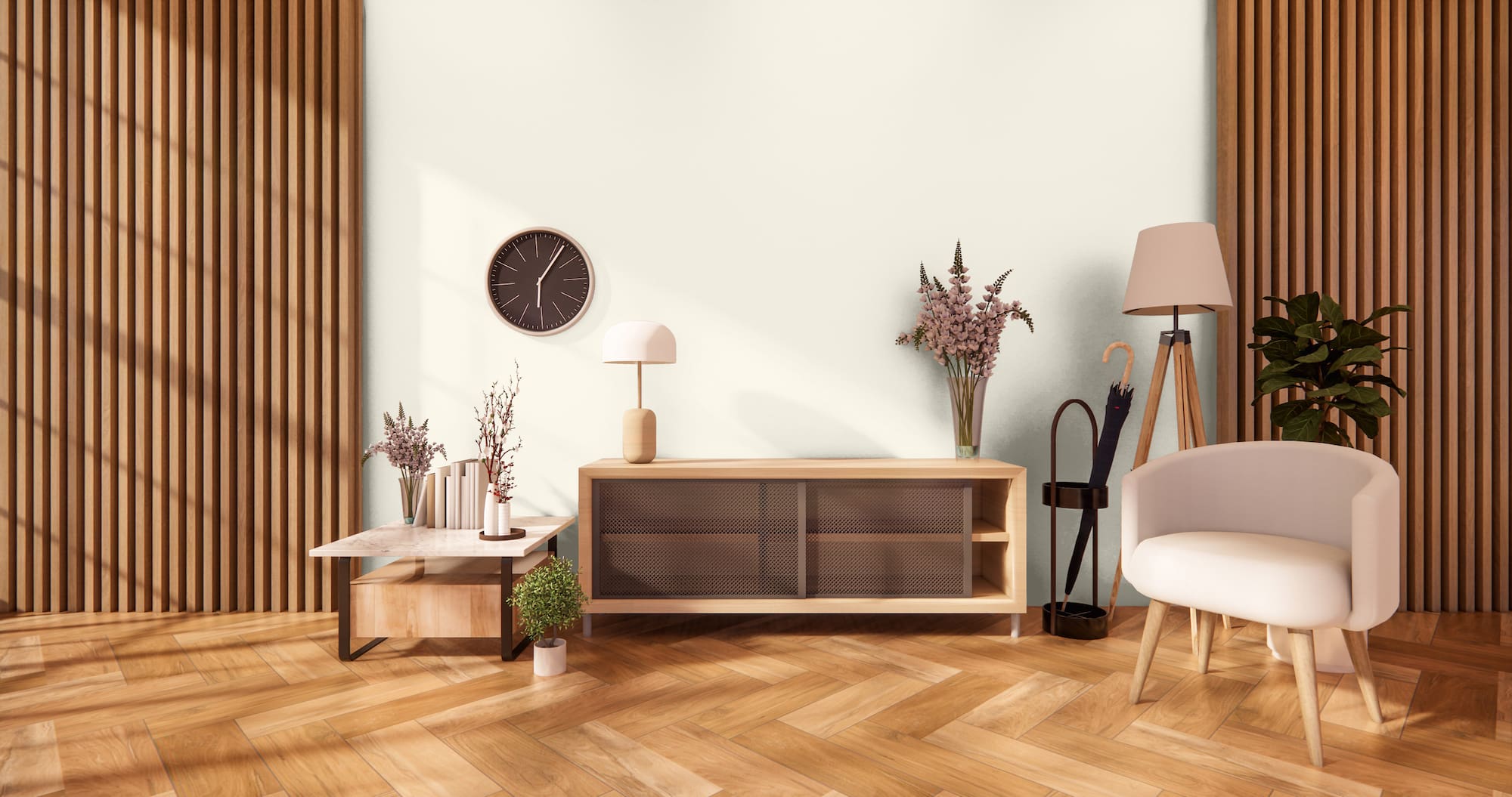
Eco Green by Sherwin Williams
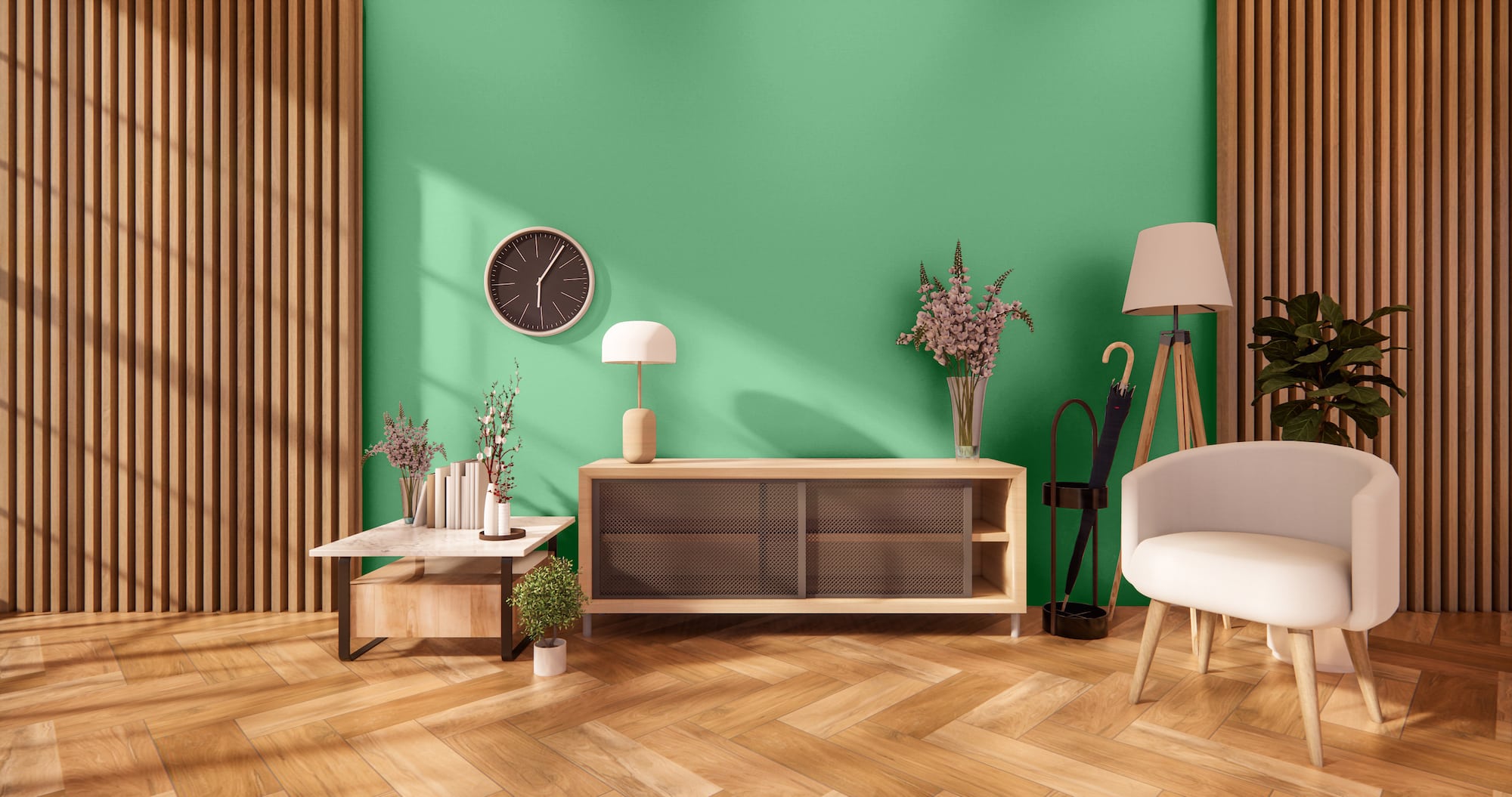
You have the footprint for a rustic or earthy theme when you have wood paneling. To enhance the nuance, try a bolder, sophisticated color like green.
Eco Green is a medium-toned green that’s an in-between of the brightness of Emerald and the richness of Forest. When used with dark wood paneling, this green gets interesting shadows. However, the lower 32 LRV does mean you’ll want to use this color in a room with lots of natural light to prevent the space from looking too dark.
Reclining Green by Sherwin Williams
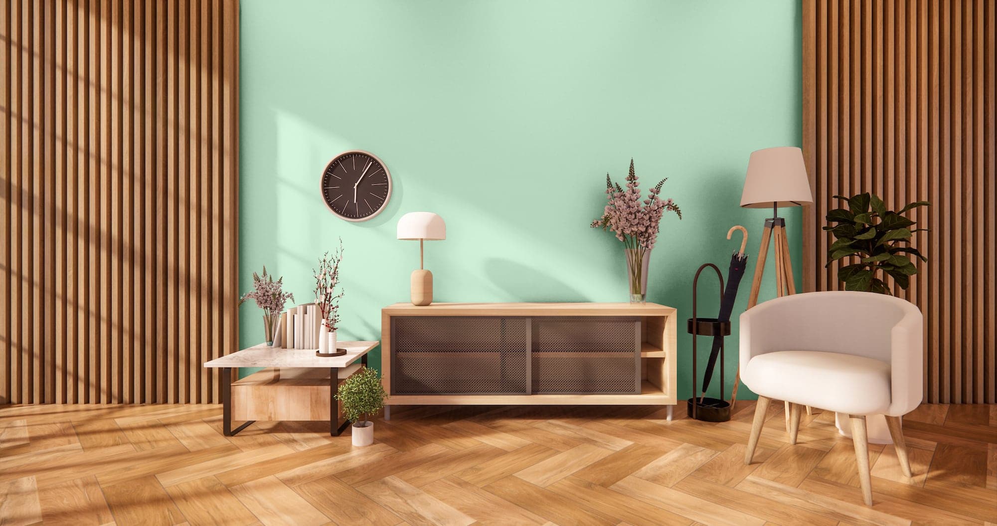
For a cooler, more refreshing green, try Reclining. This lighter green has heavy gray and brown shadows, enhanced by the warm tones of wood paneling.
You can use this color for any decor theme from traditional, historical, modern, or country chic. To brighten things up further, choose a light color like white – White Mint is lovely – for trim and accents.
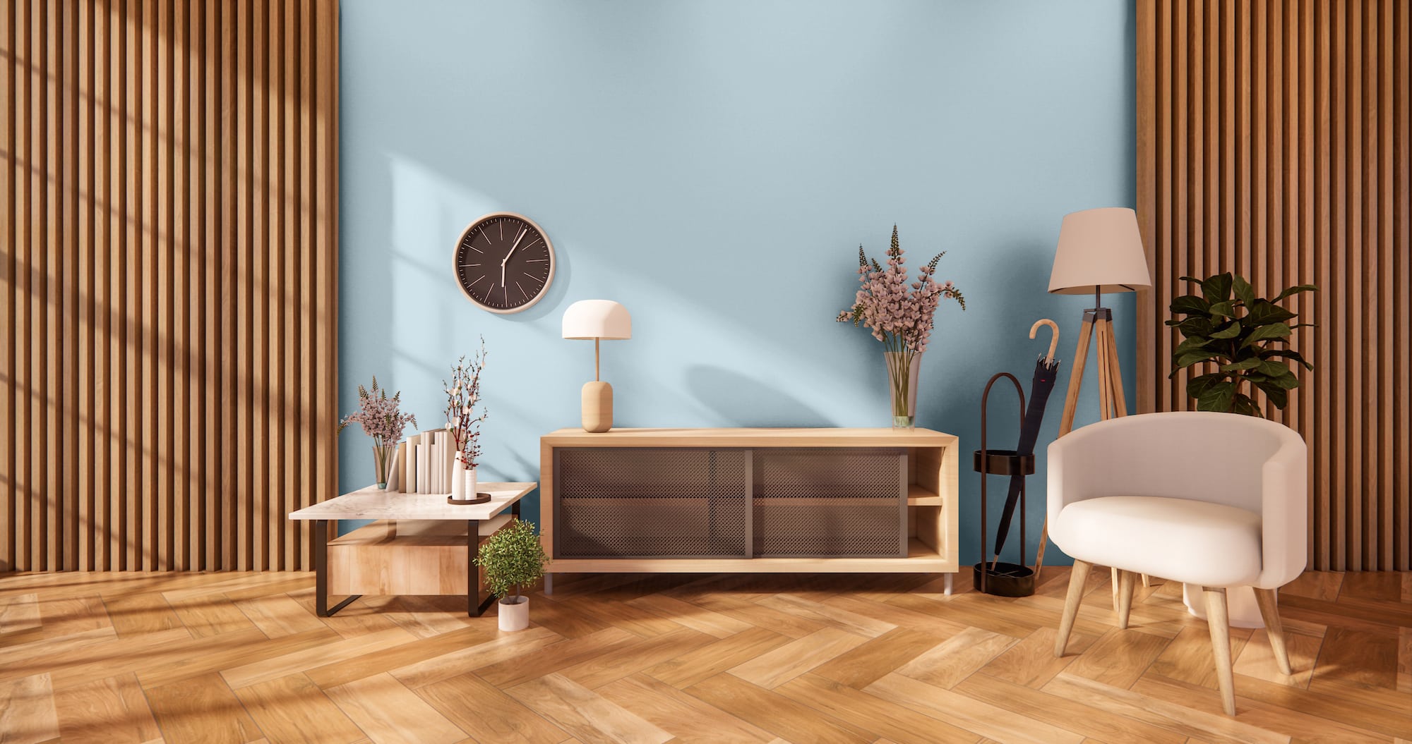
Cloudless by Sherwin Williams
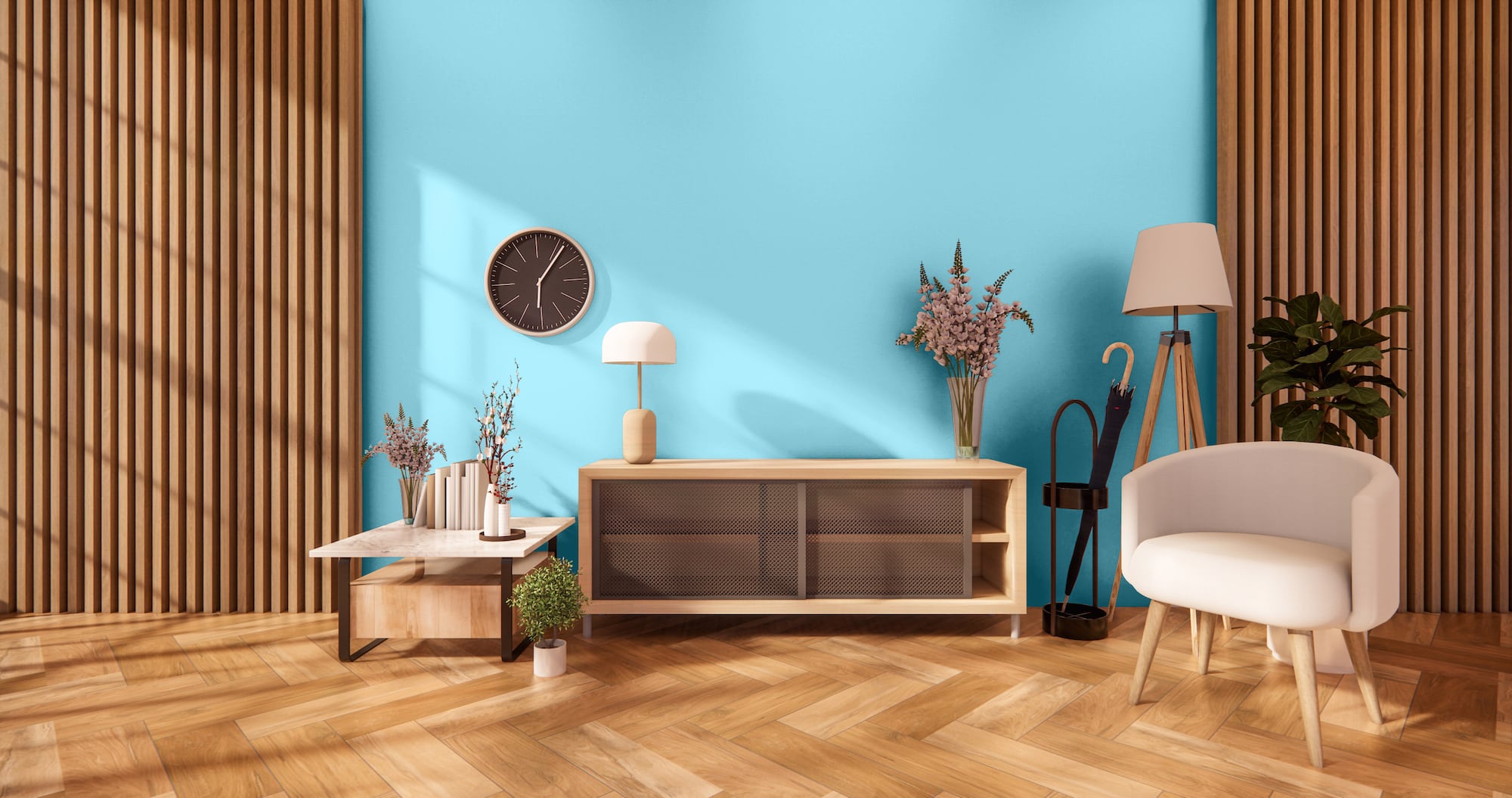
Cloudless is a soothing shade of blue that reminds you of a clear sky on a bright sunny day. Tinted undernotes add shadows that can make this blue feel tropical and energizing.
These shadows create interesting contrasts that warm up the cool tones when matched with wood paneling. You may even see faint lavender tints in some lighting.
Chelsea Mauve by Sherwin Williams
For a monochromatic look, choose a similar toned color to go with wood paneling, like Chelsea Mauve. This dark-toned neutral is a soft grayish-brown that can pull off any style.
To create a smooth transition between darker wood paneling and the creamy pigmentation of the brownish-mauve, pick an accent for the trim that’s in between the two shades. Or create contrast with a light brown or white.
Ally’s Earring by Benjamin Moore
Ally’s Earring is a warm-toned neutral with a mid-high LRV of 74.96. Using this richly tinted beige with wood paneling gives you interesting shadows and multi-tonal effects.
Lighting will play a significant role in how this color appears. In the shadows and darkness, the warmth from the paneling will pull out the brown tints, making your walls look gray. But lighting washes out the pigments, making the color look creamy off-white.
Graytint by Benjamin Moore
Graytint belongs to Benjamin Moore’s Classic Color Collection, a group of elegant and timeless colors. This mid-toned 70 LRV gray can be just the thing you need to tone down the drabness that can come with heavy wood paneling.
This cool gray has minor tinting that keeps it from being too dark. And in the right settings, you can get lavender and blue undernotes.
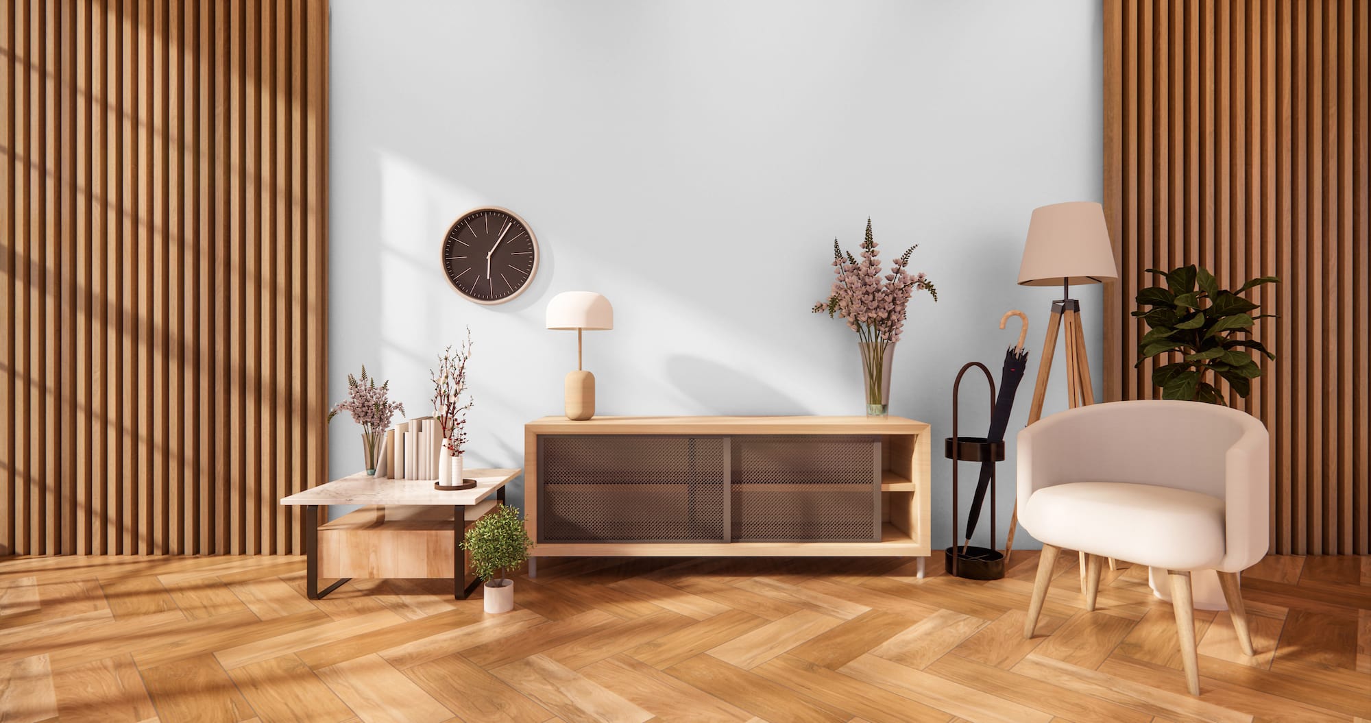
Simply White by Benjamin Moore
For a bright, blank slate, try Simply White. This high-reflective shade offers a crisp, clean white that can get yellow tints that washes out wood paneling when the sun shines in.
And in low light, this color develops shadows and tints from the wood paneling that can make your walls look gray. Add contrast by going with darker trim.
Water Drops by Benjamin Moore

Water Drops give you a refreshing coastal seafoam feel in smoky turquoise. This blend of green and blue gets warm gray tints when put next to wood paneling.
Turquoise colors are an excellent way to add personality and energy to your room. But it can put limits on your design styles, as not every color will go with these particular tinted green grays.
Soft Sand by Benjamin Moore
Soft Sand is neutral with depth and dimension. However, this shadowy beige has gray tints that make it more greige.
The warm richness of wood paneling can enhance the dusty shadows, giving you more drama. And as a neutral that goes with anything, you can accent with lights and darks.
Platinum by Behr

Platinum is a soothing cool tone of medium gray that can become lavender or blue based on lighting and accents.
We’re fascinated with the nuance of pairing this chilly shadowed shade with warm wood panels. No matter the style you prefer, this color combination can continue to change and impress.
Swiss Coffee by Behr
Swiss Coffee is an impressive neutral white with faint tints that give this color a fun yellow note. In addition, it can give your room a bright blank slate that lightens wood paneling.
But the warmth from the wood can darken the white tints to keep your walls from looking washed out. Colors like this are also fantastic for rental properties or homes you’re trying to sell.
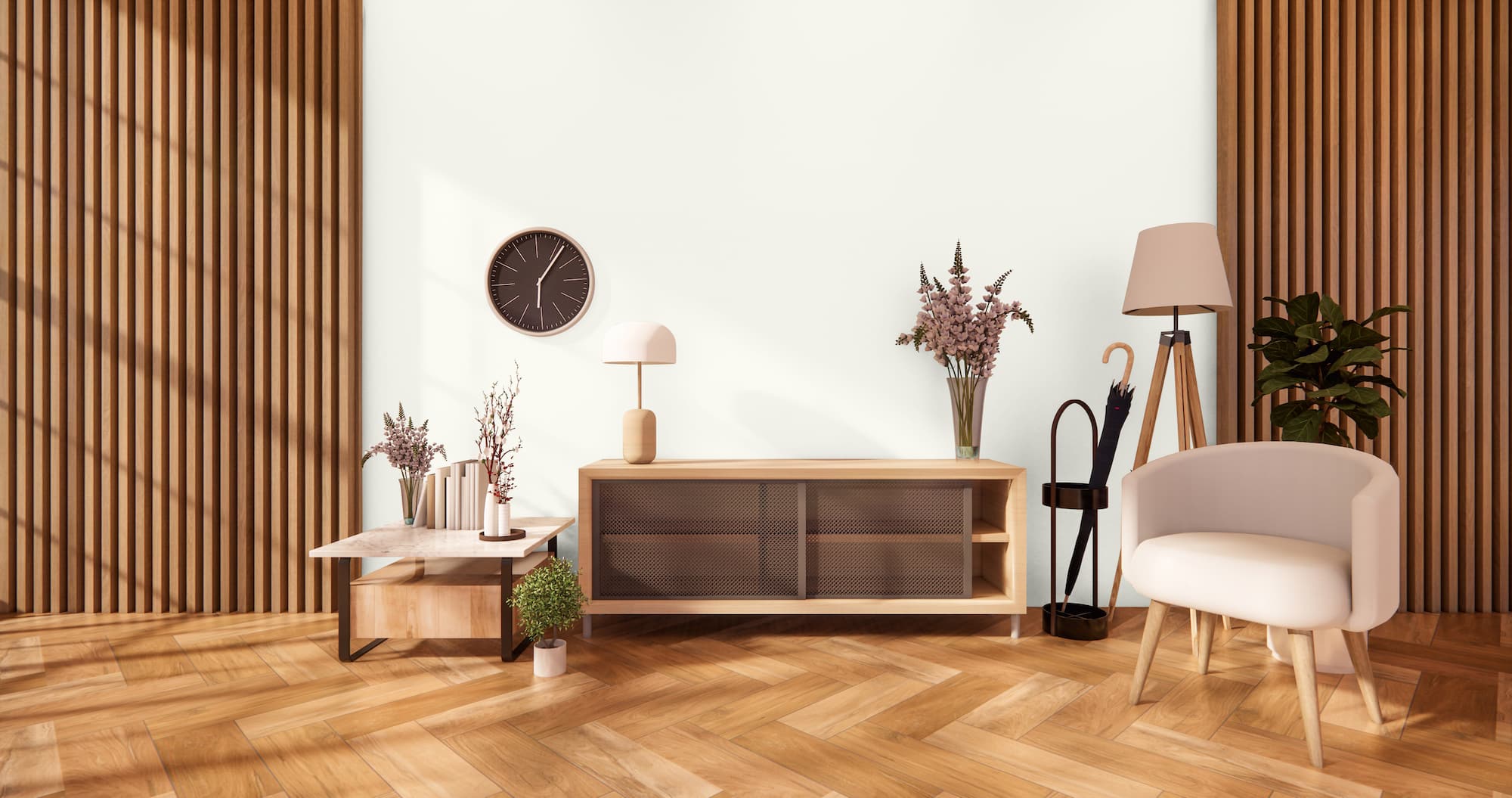
Clunch by Farrow & Ball
Clunch is another nice neutral that can go with wood paneling. This color comes from chalkstone, a building block used in East Anglian structures.
Wood paneling can bring out the buttery yellow base of this soft white for a versatile wall color. This white will leave you breathless no matter the style you want to achieve tomorrow or five years from now.
Hazy by Farrow & Ball
Hazy is a muted blend of gray and blue that invokes feelings of a fog-saturated coastline. When you paint the walls this shadowy blue, you’re getting a color that creates various effects.
Wood paneling can enhance the gray undertones to make the walls more mysterious and dimensional. A darker neutral, this transitional color can work for all styles.
Final Words
While wood usually goes with everything, having wood paneling in your space requires careful consideration when choosing paint colors. Of course, the best choices are to stick with neutrals. But just because you’re working with neutrals doesn’t mean you have to get rid of all colors.