11 Gray Green Paint Colors for 2026
When trying to pick the perfect colors for your space, many people prefer to choose trendy colors. For instance, gray has always been – and probably always will be – a recommended color due to its neutrality.
But gray also has incredible undertones that can make the color look like other shades. Gray with green undertones colors is a massive hit due to the combo’s gorgeous aesthetics. But some combos have a heavier gray look, while others have a more significant green appearance.
Grey Green Paint Colors
Green gray paint classifies as a neutral shade, despite having hints of color. This color combo consists of mixing gray paint with green to create a cool shade.
The undertones of this combination – which affect how your paint color will look once applied to a surface – might be gray with a green base, green on top of a gray base, or unrelated undernotes like blue, lavender (mauve), or yellow.
We’ve collected eleven gorgeous gray green paint colors from prominent names like Benjamin Moore, Sherwin Williams, and Behr for interior and exterior use.
Benjamin Moore Budding Green
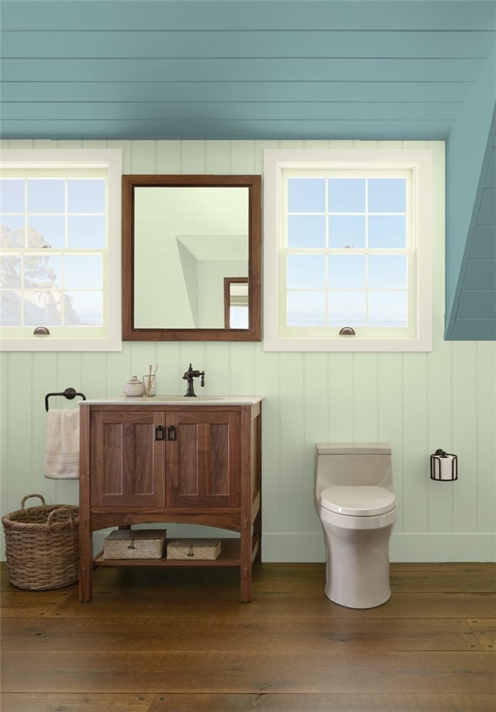
Budding Green (CSP-790) by Benjamin Moore is a light, soft shade of green with cooler tones of gray that create a cool, refreshing nuance. You may also notice undertones of yellow with some lighting.
A high LRV of 60 makes this color brighten your space with a visual temperature that changes the color’s look based on lighting. And because it’s a lighter cool color, you can pair it with darker, brighter shades.
We love the statement of a bathroom with citrusy Budding Green walls, a grayish lavender trim in Polar Frost (1506), and a ceiling in a dramatic color like Boca Raton Blue (711).
Benjamin Moore Soft Fern
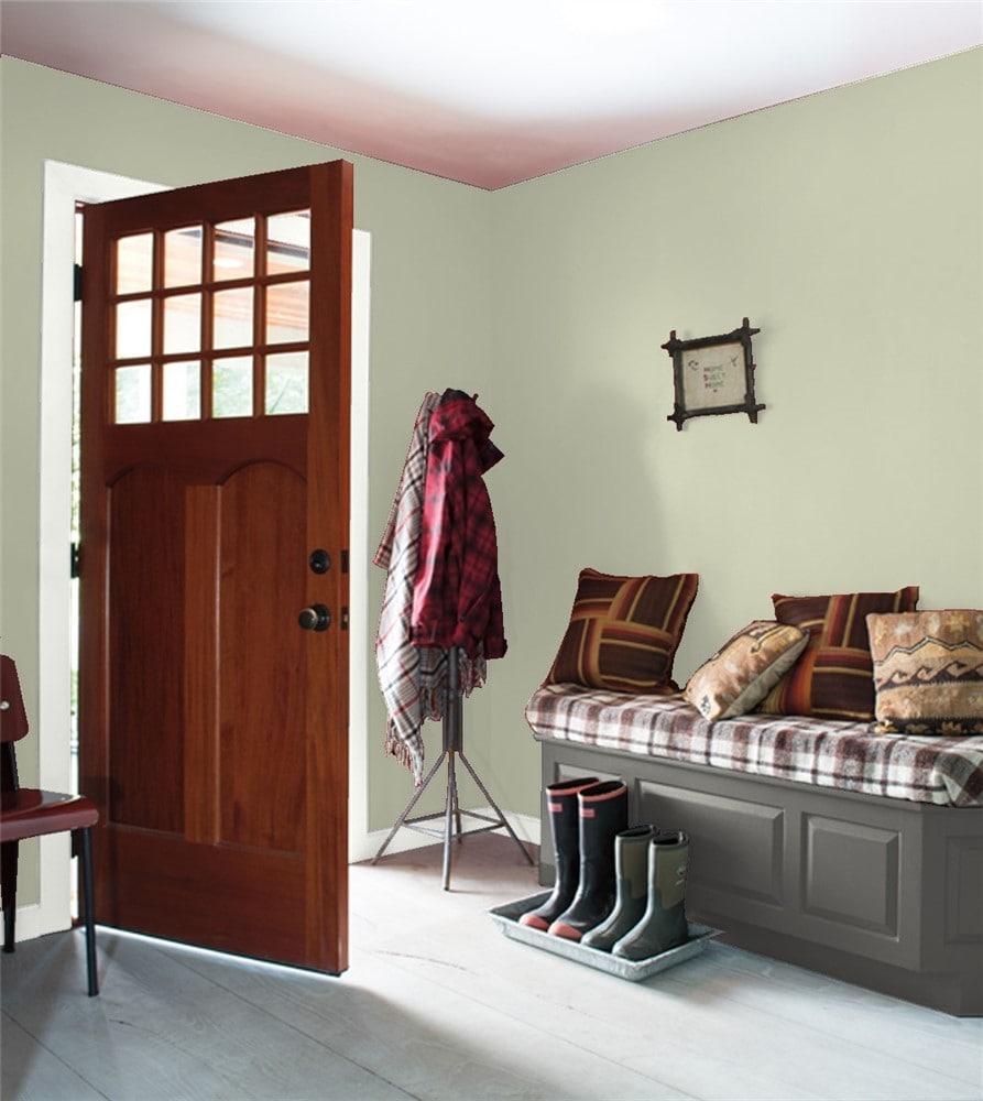
Soft Fern (2144-40) is a bit of a greige – beige and gray combination – with more color that gives this shade light green, yellow, brown, and gray undertones and a medium LRV of 57.
You can use this attractive color for calming bedrooms, colorful kitchens, or welcoming entries. And the soft neutral color looks fantastic in bright lighting (when the door is open) or in low light (if there are no windows in your entry space).
Then use a bright light trim like White Heron (OC-57) with benches or doors in a darker shade like Kendall Charcoal (HC-166).
Benjamin Moore Healing Aloe
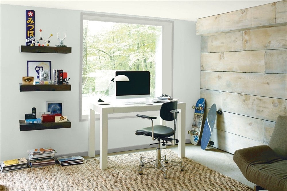
Healing Aloe (1562) is a warm gray with blue-green undertones that create a peaceful, serene aesthetic that’s perfect for use throughout the whole house.
A 69 LRV makes this color fantastic for creating a spa-centric relaxing bathroom oasis or a calm, peaceful bedroom retreat.
Or you can use this color for an office to create a calming environment that helps inspire greater productivity without being too distracting. Add Gray Owl (OC-52) for the trim and a reclaimed wall with plenty of natural light coming through the window.
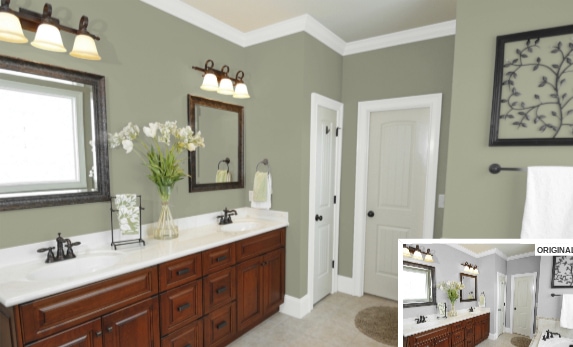
Benjamin Moore Saybrook Sage
Saybrook Sage (HC-114) is a light grayish green with a darker visual temperature and an LRV of 44 that can look like a cool pale gray when there’s lots of natural light.
This color looks fabulous as an exterior color with a darker greenish-gray High Park (467) for the trim, columns, and railings with a beautiful door in Hale Navy (HC-154) – a dark blue.
Sherwin Williams Oyster Bay
Oyster Bay is a soothing greenish-gray paint that can create a romantic, captivating aura perfect for bedrooms, bathrooms, or living spaces like the family room or kitchen. It can even look awesomely stylish in your laundry room or pantries.
OB has a 44 LRV, making this color a bolder, deeper shade than other green grays that works stunning for many designs from modern or contemporary to coastal themed.
The neutrality of this heavier grayish-green paint color pairs excellently with bold colors like Moody Blue (SW 6221), Alaea (SW 7579) – a purple mauve – or a warmer gray like Prairie Grass (SW 7546). It can also go with cools like Natural Choice (SW 7011) or Marshmallow (SW 7001).
Sherwin Williams Silvermist
Silvermist (SW 7621) by Sherwin Williams – LRV 47 – is a soothing, stylish color blend of green, gray, and blue. This grayish-green paint has a medium depth with a lovely green-blue base and gray undertones that give this shade more of an earth tone.
In some lighting (Northern), this blue-green-gray paint can favor more of a blue tint than green, but not so much that you lose the gorgeous green and gray color. But in darker rooms, the lower LRV can make this color darken the space, making it feel cramped.
This color looks fantastic when paired with off-white colors or crisp, cool whites like Pure White, Reserved White, or High Reflective White for the trim. A darker Attitude Gray makes a fantastic complementary color, as do dark, steely grays, yellows, rusts, reds, charcoal blues, and blacks.
Sherwin Williams Liveable Green
Liveable Green is a light grey-green with subtle sage undertones, making this color fantastic for spaces where you want a touch of nature indoors.
A higher LRV of 61 gives this neutral shade warmth that can look citrusy and tropical in some lighting, excellent for a Caribbean or Coastal vibe.
You’re sure to fall in love with this subtle shade for cabinetry – bathrooms, kitchens, or laundry rooms. Go with colored uppers, and central island with bright white (Shell – W 8917) lowers and walls. If you want to make a powerful impact, also use Liveable Green for the trim.
Sherwin Williams Rainwashed
Sherwin Williams’ beautiful cool gray-green with light blue undertones – Rainwashed (SW 6211) – reminds you of a warm spring shower in the tropics.
While this color – which could almost look minty in some lighting with a 59 LRV – would look elegant and welcoming for cabinetry in the kitchen or bathroom, it can also be the star for a stylish family or living room.
But we don’t want you to only think inside the box (or home) because this outdoorsy greenish-gray can also look fantastic for the trim, accent, or primary parts of your home’s exterior.
Sherwin Williams Clary Sage
Clary Sage (SW 6178) by Sherwin Williams is a much darker shade of gray-green, bordering on olive with light gray undertones.
This warm grayish-green can look great in bedrooms, living rooms, or offices. But we fell in love with the beautiful way it spruces up a bathroom.
Cool white trim and off-white doors combined with natural-colored bath tiles and a neutral shaded floor make any bathroom feel more like a luxury spa.
Shy Green by Behr
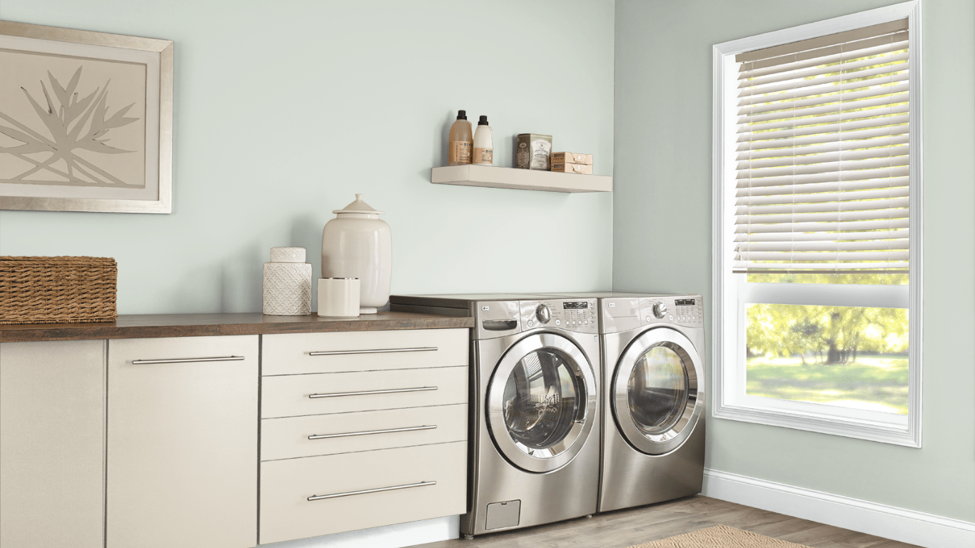
Behr’s lusciously subtle Shy Green (MQ3-48) is a fabulous color for exterior or interior use with one coat to provide coverage. And an impressive 63 LRV helps this cool tinted color look bright and popping.
In bright lighting, this temperature visual shade of gray-green can look cool and crisp. Add bright white trim and cabinetry (try Bakery Box – BL-W09), and you’ve got a laundry room that you’ll love to spend time inside.
Behr Brook Green
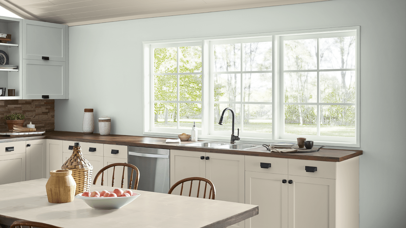
Brook Green (N410-2) is a light gray with faint hints of green undertones that can make your kitchen feel calm and cheerful while being brighter and more open due to a 68 LRV.
This color is fantastic for hiding grease while creating a happy, comfortable environment that inspires the whole family to gather, cook, laugh, and love.
Add bright, cool-toned trim, white, light gray, or subtle green accents, and a cool natural-toned backsplash to finish your modern, contemporary, or country rustic kitchen design.
Complementary Colors to Gray Green Combination Paints
- Bright red
- Natural wood tones
- White
- Greens
- Blues
- Yellows
- Beige
- Greige
- Lime
- Silver
- Aqua
- Lavender
- Orange (burnt autumn color or bright neon)
- Peach
- Blush (pinks)
Gray Green Paint – Buyer’s Guide
We’ve finished our list of eleven amazing shades of gray-green paint colors. And we’ve given you a comprehensive list of complementary colors.
Before you go on your journey to pick the best color for your space, take the time to check out this buyer’s guide, which will help you select the proper shade of gray-green.
LRV – Why It Matters to Your Room
You’ve noticed above that we listed the LRV of each paint color. Now, we’ll explain what LRV is and why it matters for your room’s appearance.
LRV stands for Light Reflective Value and refers to a color’s reflectiveness or how well a color will bounce light off rather than absorb it.
To make this easier to visualize, a standard black color has an LRV of zero while a traditional white has a 100 LRV.
The darker a color (a lower LRV), the less light the color can reflect into your space, making your room look darker and drabby.
High LRVs can reflect more light, making your space feel more open and bright, whether in natural or artificial lighting. Rooms can also feel larger when brightly lit.
Warm or Cool – What’s Your Tone?
Understanding a paint’s tone – whether it classifies as cool or warm – is another essential factor to ensure you get the proper appearance and aesthetic. A color’s tone can also affect the nuance of the room.
Colors that classify as warm can evoke feelings of positivity, energy, and cheerfulness. What are warm colors? We’re talking about colors like red, orange, and yellow, plus combinations of these shades.
On the other hand, cool colors are shades like purple, green, and blue, and any combos that consist of a mixture of these colors. These colors are better for making a relaxing, calming environment.
But you can also consider neutral colors – white or gray – which can flip-flop in nuance and tone based on undertones. Your room’s lighting, accent colors, and furnishings can all affect a color’s overall look by pulling out the color’s undertones.
Gray Green Color Selection Tips – Remember:
- Warm gray-green colors can have yellowish undertones that can make the gray look more greige (use subtle green accents)
- A cooler gray-green can turn minty-looking with the use of too many green-blue or green accents
- Cool-toned gray greens can have more of a bluish-green appearance
- Corners of your room can magnify your color choice
- Rooms facing north (and dark rooms) can deepen the green color (even in colors that aren’t green)
- Incandescent and warm artificial lighting can enhance the green tones at night
And most of all, pay attention to the furnishings and accents you use in your room. The colors of these pieces can influence the undertones in your gray-green paint, causing it to look different than the paint strip.
Sample Paint Colors like You’re Sampling Ice Cream at Baskin Robbins
Picking a paint color is much like dating. It would be best not to commit to living forever with the first color that catches your eye.
Instead, it’s a good idea to play the field – so to speak – by choosing multiple color samples to try out in your home. You’ll want to see if the color is a good fit for your family and your space.
Now, you could go through the laborious process of painting a large block of each color on your wall to see which option pops out for you.
But if you want to reduce the work while sampling paint colors smarter and more efficiently, we can’t recommend Samplize enough.
With this process, you can buy 12” x 12” color sheets with an adhesive back that allows you to stick the piece to the wall. Then, once you’re done testing the color – or you want to see how it looks in a different part of the room – pull the strip off and stick it in another area.
Because the lighting in your room can drastically affect the way a color appears, it’s always the best practice to move your Samplize sheets to different areas of the wall to see how the color changes in artificial, natural, and no lighting situations.
Pick your Samplize sheets up here!
We Love a Gray Green Combo: Do You?
This list illustrated the many different levels of a gray-green paint combination. How your color looks on your screen or in the store might not accurately represent how it would appear in your home. It’s best to test your color choices on your walls for a few days.
Which Gray Green is your favorite? Did your color make our list, or do you love a color we didn’t mention? Let us know in the comments!