Reflection by Sherwin Williams
Gray is a classic color, and there are reasons for its timeless appeal. As a neutral color, gray is the chameleon of the paint world, taking on whatever color palette or style choices you want to throw at it.
Well-balanced grays are especially useful. Like the porridge Goldilocks was looking for, they’re neither too hot nor too cold, but just right to match with your favorite colors.
Add a nice, light LRV to the mix and you’ve got a color that can do it all: wall color in any room of the home, accents, trim, exteriors, warm palettes, cool palettes, neutral palettes.
Let me introduce you to the queen of versatility: Reflection, by Sherwin Williams.
What Color is Reflection?
Reflection is a light, neutral, balanced gray. It’s a very traditional gray color, but perhaps not as blue as you might expect for this color family.
LRV of 66
Reflection has a light reflectance value, or LRV, of 66. Light reflectance value is a scale designed to measure how bright a color is, and ranges from absolute black at 0 to sheer white at 100. The higher the number, the lighter the color.
What Undertones Does Reflection Have?
Reflection is a very well-balanced color, which should help minimize the appearance of undertones. It has mild blue undertones, but they aren’t as prominent as they are in your average gray.
Is Reflection a Cool Color or a Warm Color?
Reflection is a cool color. It’s a gray color, which is a cool color family, and it has blue undertones, which are also cool. However, Reflection’s balance keeps it from being overly cold.
Where Can You Use Reflection?
Feel free to use Reflection everywhere in your home. It’s light enough for even your dark and small spaces.
Its neutral balance means that rooms with Reflection on the walls shouldn’t feel too chilly either. If your samples cool the room down too much though, you can always pair it with warmer colors. Warm neutrals are easy to match with Reflection, such as browns, beiges, greiges, and wood tones.
Reflection is especially popular in rooms where it can complement metalwork and appliances, such as bathrooms and kitchens.
Consider Reflection for spaces where you want to simplify and establish calm, such as bedrooms. It’s a natural fit for minimalist decor styles.
Let’s take a look at Reflection in home spaces to get inspired!
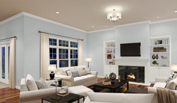
Living Room
This living room features Reflection with an accent wall of Gauntlet Gray, making a statement without making the whole room too dark.
Reflection plays with light and shadow in this ultra-modern loft.
Home Office
Charcoal gray accents bring out a cool and chic side of Reflection in this home office.
Kitchen
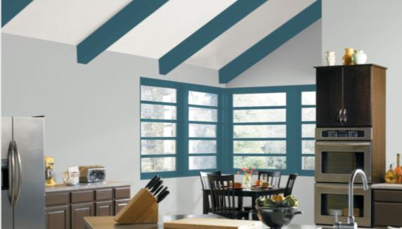
Reflection works equally well with handsome natural woods as it does with vibrant colors like Silken Peacock.
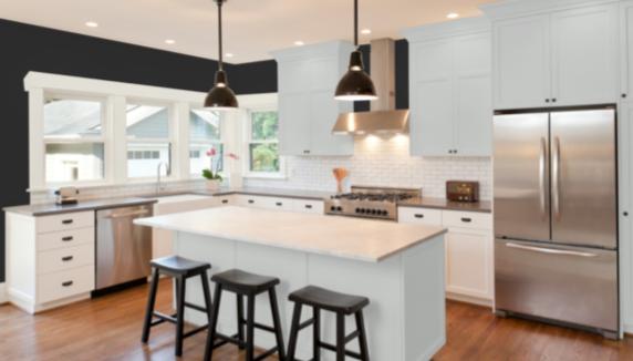
A fun twist on a white kitchen: Reflection on the island and some of the cabinets, and Tricorn Black on the wall add a sophisticated-looking contrast.
Dining Room
This mid-century modern dining room keeps things neutral with a monochrome palette built for Reflection.
This is another take on a neutral dining room, but with a wider color range and some industrial decor touches.
Bedroom
Reflection creates a cool and relaxing contrast with the wood tones in this bedroom.
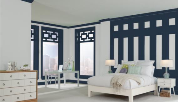
Navy Blue colors have slate gray undertones that make them perfect partners for Reflection.
Nursery
Reflection trim accents this black and white nursery for an airy, modern, and gender-neutral look.
Bathroom
Reflection tones down this bathtub with subtle, neutral color to allow the bathroom’s stunning glasswork to take center stage.
Reflection walls are the element that ties this simple and comfortable bathroom together.
Exterior
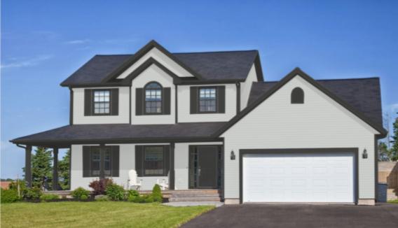
Reflection has enough body to work as an exterior color, especially when paired with rich and moody Iron Ore as a trim.
Coordinating Colors for Reflection
Reflection is a well-balanced neutral gray, so the door is wide open to place it with any coordinating colors you desire.
An easy place to start is with other grays. Reflection is fairly light, so putting it next to a moody charcoal gray makes a handsome contrast.
Blues of all kinds are excellent companions for gray colors, and since Reflection is well-balanced, you don’t have to worry about it looking overly cold or blue next to them. When considering blues, don’t forget teals and aquas, which are also beautiful options.
Black, white, and gray is a chic and dramatic combination that never goes out of style. Pick a clean or cool white and your favorite black paint and pair them with Reflection for instant sophistication. Gold or silver will dress this look up; pink will take it to a playful place.
Looking for some coordinating color inspiration for Reflection? Here are some ideas to help you get started:
- Riverway by Sherwin Williams
- Tricorn Black by Sherwin Williams
- Alabaster by Sherwin Williams
- Snowbound by Sherwin Williams
- Naval by Sherwin Williams
- Breezy by Sherwin Williams
- Reflecting Pool by Sherwin Williams
- Festoon Aqua by Sherwin Williams
- Natural Choice by Sherwin Williams
- Network Gray by Sherwin Williams
- Fading Rose by Sherwin Williams
- Kendall Charcoal by Benjamin Moore
- Chelsea Gray by Benjamin Moore
- Hudson Bay by Benjamin Moore
- Hale Navy by Benjamin Moore
- Aegean Teal by Benjamin Moore
- Revere Pewter by Benjamin Moore
How Does Reflection Compare with Other Colors?
Reflection vs Passive by Sherwin Williams
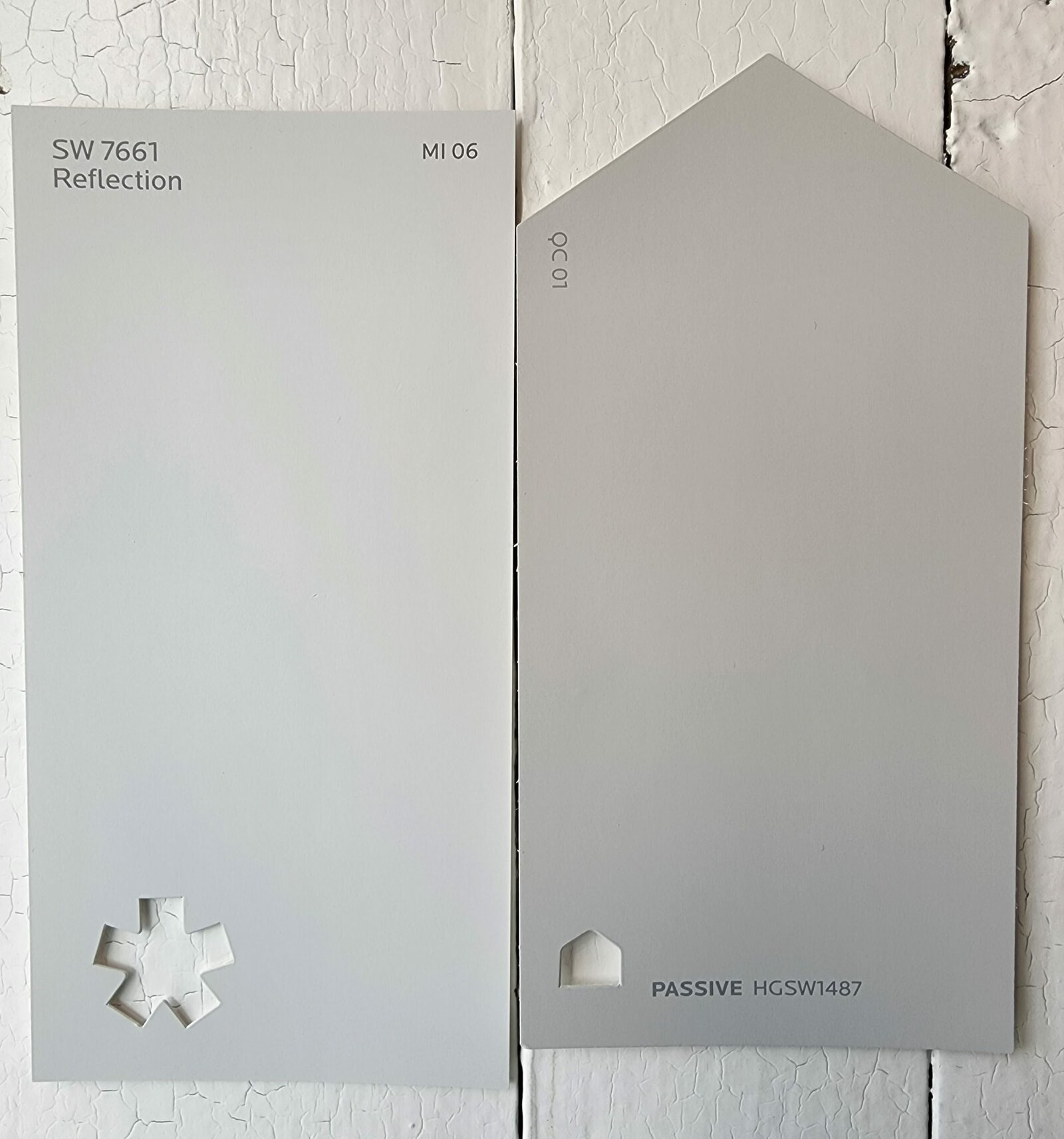
Reflection and Passive both have a lot in common as light neutral gray colors. Both are well-balanced and don’t especially lean warm or cold. Passive is a little darker than Reflection, with a LRV of 60.
Reflection vs Olympus White by Sherwin Williams
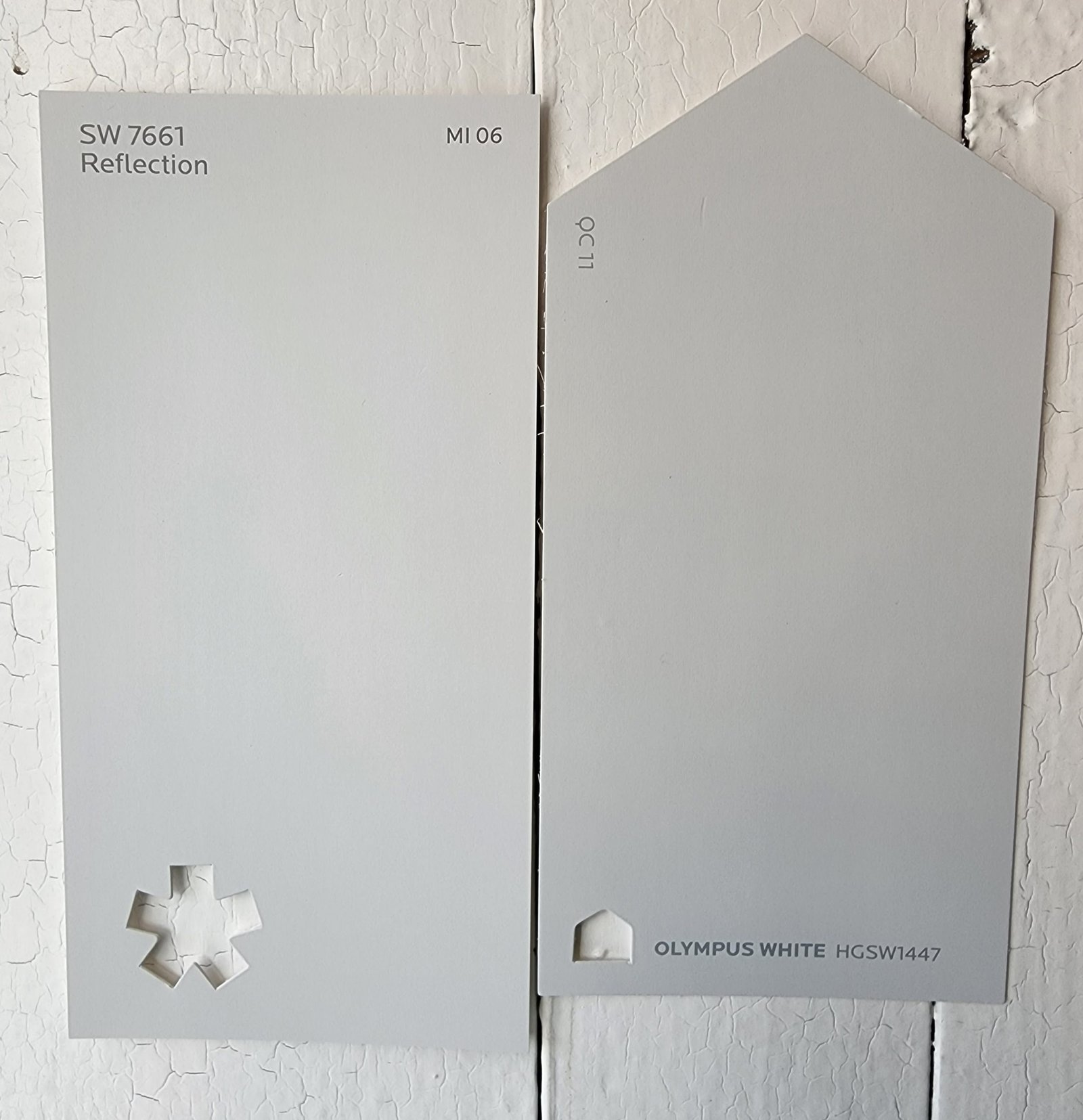
Despite the name, Olympus White is actually a light, cool gray color. It’s still fairly balanced, but a touch cooler than Reflection. These colors are comparably bright. Olympus White has a LRV of 68.
Reflection vs Evening Shadow by Sherwin Williams
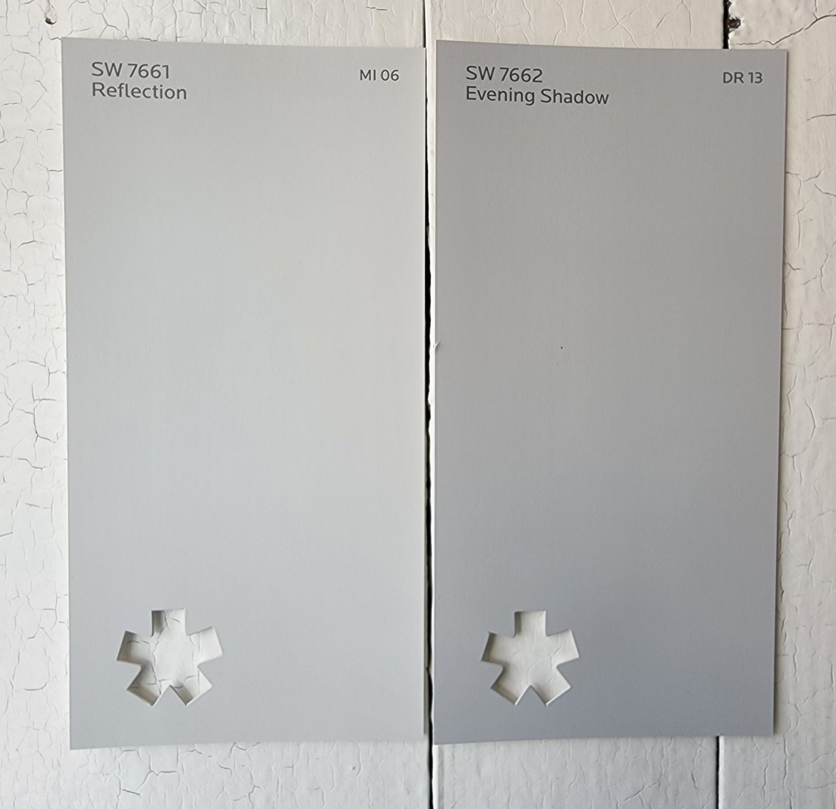
Evening Shadow is a light, cool gray color with a nice neutral balance. It’s a little darker than Reflection, with a LRV of 60. Otherwise, these colors are pretty similar.
Reflection vs Silverpointe by Sherwin Williams
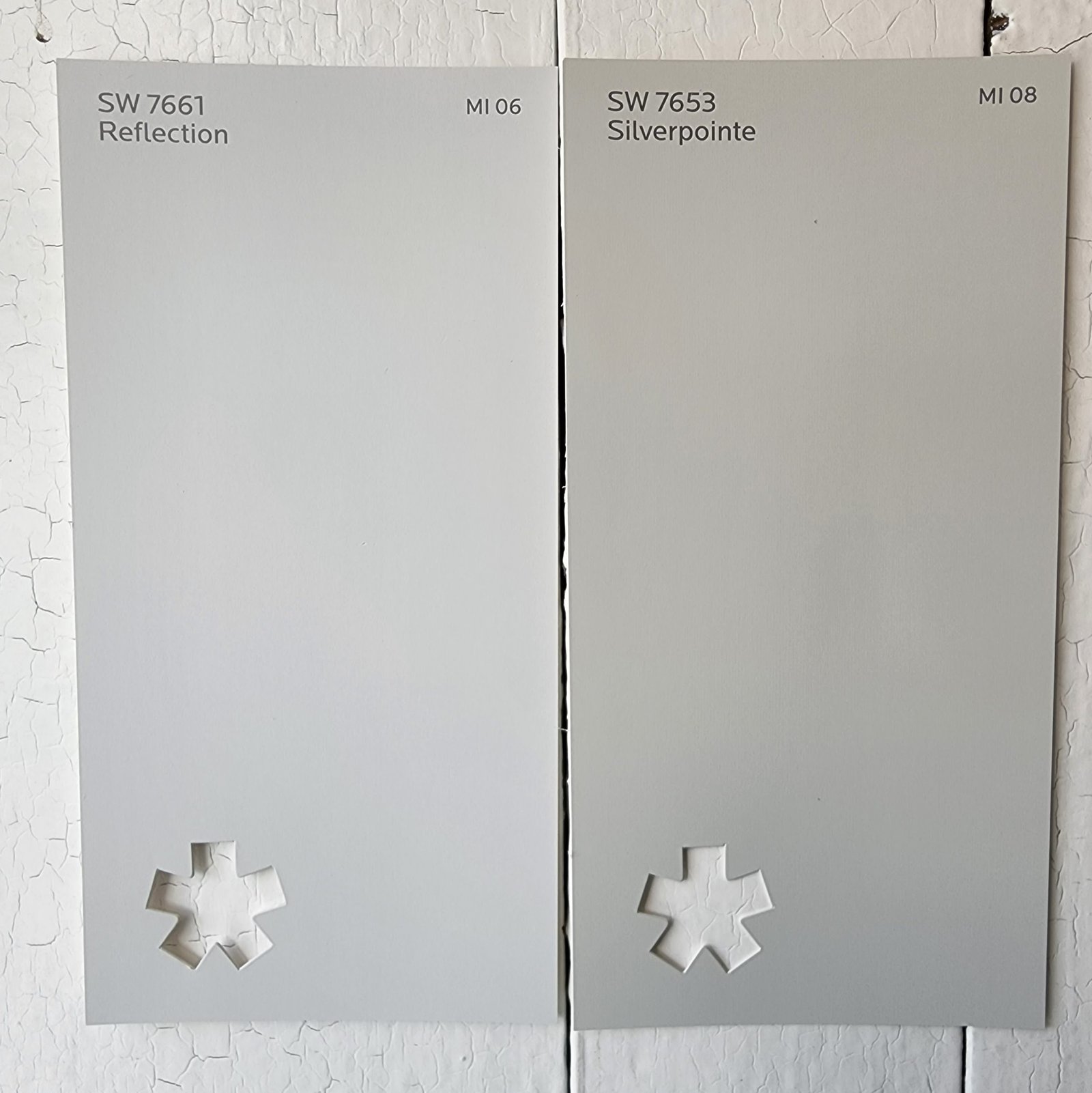
Silverpointe is a light gray neutral color that is warmer than Reflection, although it still qualifies as a “cool neutral” overall. Its LRV of 64 makes it comparable in brightness to Reflection.
Final Thoughts
Reflection is pretty much the definition of a user-friendly paint color. This well-balanced neutral gray can go anywhere and pair with anything. Your hardest decision will be narrowing down all the possibilities that Reflection opens you up to. Happy painting!