Sherwin Williams Passive Paint Color Review
Gray is a classic neutral color that is being celebrated in the decorating world for its ability to adapt to any setting with ease.
You’ve probably seen a lot about greige colors. Greiges, the mixture of gray and beige, are popular for their warmth, but sometimes a cool palette is the best choice for a room.
If you’re looking for an easy-to-use gray that’s light and balanced, and won’t overwhelm your surroundings, Passive by Sherwin Williams is a great place to start. This gray color is balanced just right in terms of light and dark, and is cool without being too heavily blue.
Let’s take a look at Passive together and gather some inspiration for using this versatile classic!
What Color is Passive?
Passive is a light gray color, and a cool-toned neutral. Its feel is calm and relaxing, and it’s well-suited to modern and minimalist decor.
LRV of 60
Passive has a LRV (light reflectance value) of 60. This falls within the ideal range of 60-62 preferred by many designers for its ability to work well under different lighting conditions.
What Undertones Does Passive Have?
Passive has blue and purple undertones. This is fairly common for gray colors. Less often, you may see green undertones. That said, the blue isn’t as strong in Passive as it can be in other grays, so it’s a good choice if you want a color that’s going to look truly gray.
Is Passive a Warm or a Cool Color?
Passive is a cool gray color. You can see this readily if you compare it to greige colors, which will look very beige against Passive.
Where Can I Use Passive?
Passive’s ideal 60 LRV makes it suitable for most rooms and lighting situations. You can use it in any room for a cool and relaxed look, or as an all-over color.
As a gray color, Passive will bring out the beauty of appliances and metalwork, so it’s a natural fit for kitchens, bathrooms, and home offices. It’s also a restful color for bedrooms, reading nooks, and other spaces where you want to breathe. Passive can make a surprising but soothing choice for a neutral nursery or children’s room.
Let’s take a look at Passive in different home spaces to glean some inspiration for our own projects!
Kitchen
Passive really brings out the beauty of the lighting fixtures in this kitchen.
The balance between Passive and white in this kitchen keeps the space open but grounded.
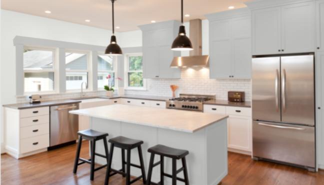
This kitchen flips the usual idea of white cabinets to use Passive as the accent color and Extra White as the wall color.
Dining Room
Passive looks more earthy in this dining room, with low light and neutral decor.
Passive, with white trim and a chandelier, elevates this dining room to something more sophisticated.
Living Room
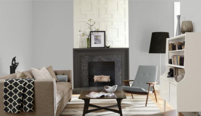
Passive brings instant sophistication to this chic modern living room.
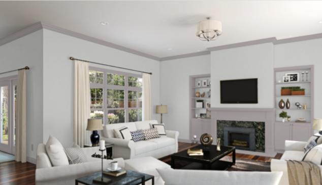
In this living room, Passive works with fellow gray color Quest Gray to create a cool and soothing living room. Pairing these grays brings out Passive’s blue side.
Home Office
This reading nook is cool and modern, partnering Passive with white, gold, and grays.
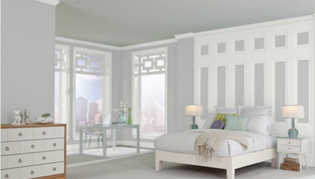
Bedroom
Passive transformed this bedroom from dingy and dated to cool and bright.
Echoes of blue tones are picked up beautifully by Passive, without being overwhelming.
Neutrals like Passive are great company for driftwood furniture and minimalist decor.
Bathroom
Passive with black and white is a classic combination that looks striking in any space.
This elegant and sophisticated bathroom is another take on the black/white/gray combination that works so well with Passive.
Entryway/Stairway
This fresh and bright entryway contrasts Passive with crisp whites that are carried on into the dining room with navy blue. This is a great example of continuing a color palette without making everything monochrome.
A coat of paint can be the easiest way to refresh your space, and Passive really shines in this stairway update.
Passive Coordinating Colors
Passive is a cool gray, and it looks best with colors that are related to it. Fellow members of the neutral family are great companions for passive, especially darker grays, black, and white.
Another close relative of Passive is the blue family, and it’s hard to go wrong pairing Passive with just about any blue. Dark, navy blues offer a traditional look, while deep teal blues are more playful and modern.
Pinks, especially rose tones and corals, are beautiful companions to gray, and can be soft and romantic or bold and lively.
Here are some coordinating colors for Passive to spark your decorating ideas:
- Shell White by Sherwin Williams
- Green Onyx by Sherwin Williams
- Nebulous White by Sherwin Williams
- Gossamer Veil by Sherwin Williams
- Snowbound by Sherwin Williams
- Argos by Sherwin Williams
- Gray Matters by Sherwin Williams
- Peppercorn by Sherwin Williams
- Cityscape by Sherwin Williams
- Hale Navy by Benjamin Moore
- Chelsea Gray by Benjamin Moore
- Modern Romance by Benjamin Moore
- Deep Secret by Benjamin Moore
- Avalon Teal by Benjamin Moore
How Does Passive Compare to Other Colors?
Passive vs Agreeable Gray by Sherwin Williams
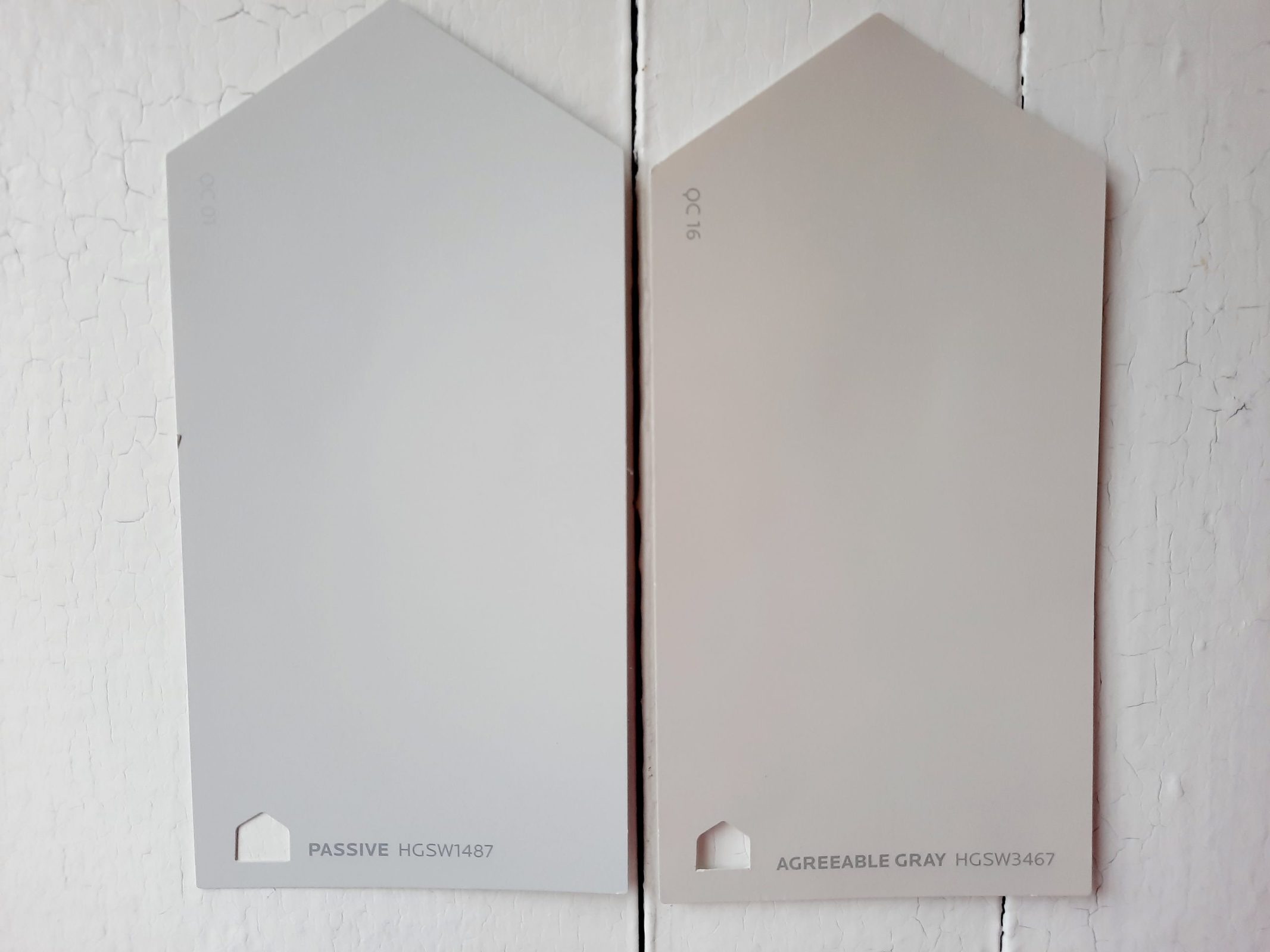
Agreeable Gray is a member of the trendy greige family, rather than a true gray color. Its beige side is easy to see next to Passive’s gray, making Agreeable Gray the warmer of the two. Both colors have the same LRV of 60, so they’re both well-adapted to various lighting conditions.
Passive vs Repose Gray by Sherwin Williams
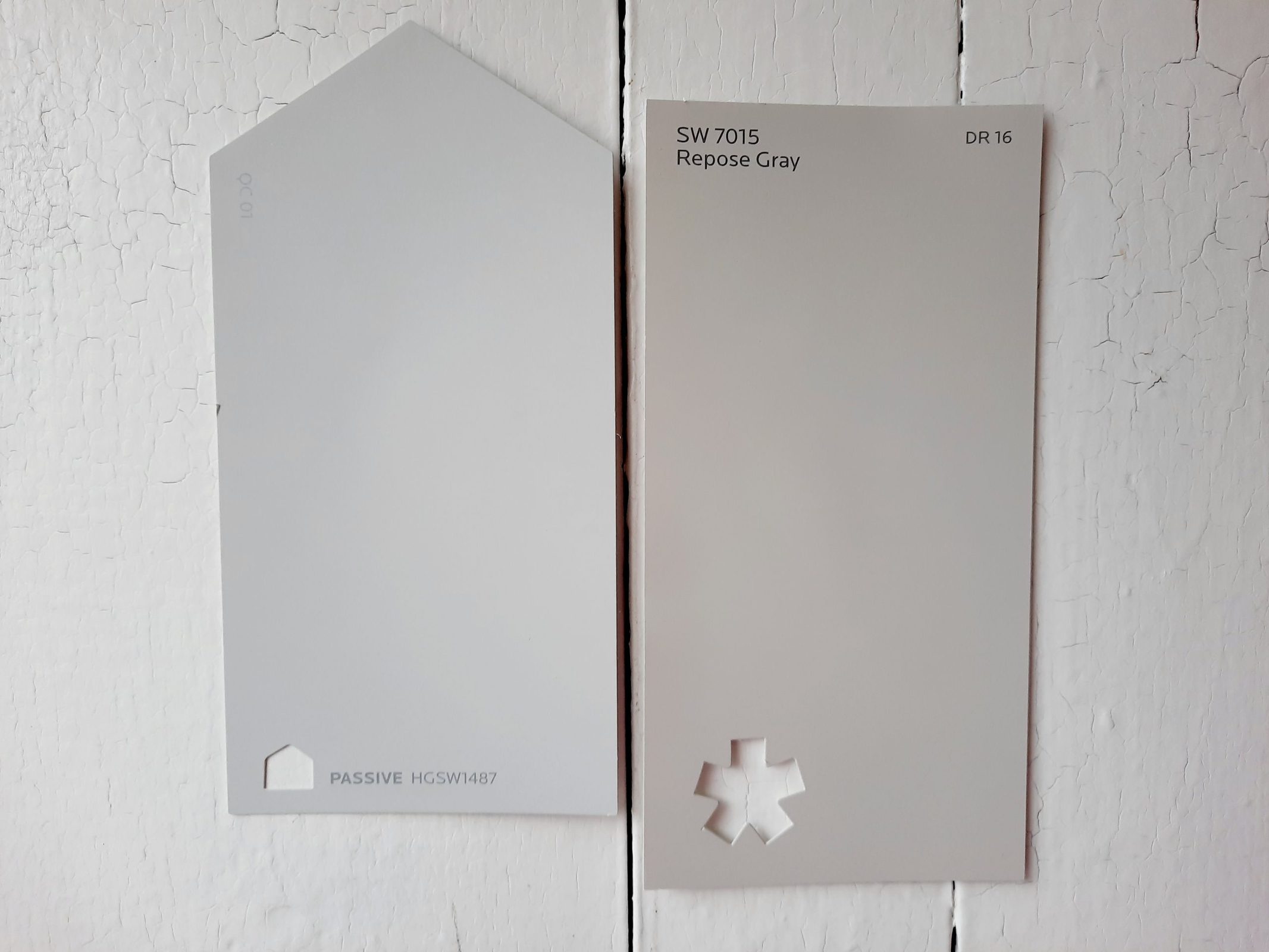
Repose Gray is another popular greige from Sherwin Williams. Putting these two colors side by side, you’ll immediately see that Passive is the more gray of the two, despite the name. Repose Gray has a beige side. Its LRV of 58 is comparable to Passive’s 60. Repose Gray is a little more balanced and neutral, while Passive is cooler and a true gray.
Passive vs Stonington Gray by Benjamin Moore
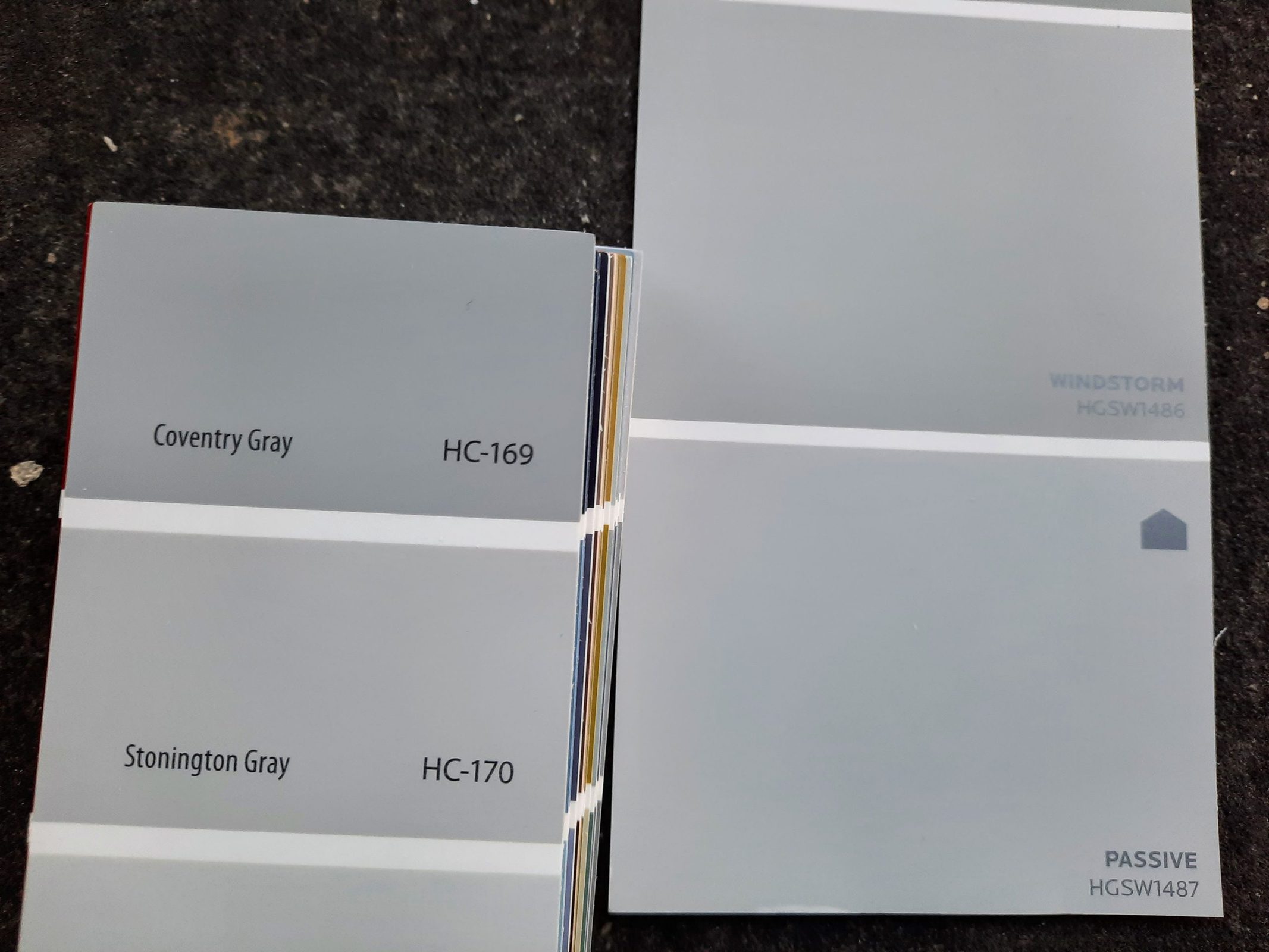
Stonington Gray is a Benjamin Moore color that offers a pretty close equivalent to Passive. Its LRV of 59.75 is essentially identical, so these grays are equally bright. Both are also cool grays. Which one you choose comes down to your personal preference between these brands.
Final Thoughts
Passive is a classic light gray that’s able to be used in a broad range of settings. Equally at home in chic and classy decor, minimalist decor, or as the restful background to a more exuberant style, Passive can be tailored to suit any aesthetic. Use Passive any time you want to bring a cool and restful atmosphere to your space.