Sea Salt by Benjamin Moore
You might be expecting an aqua color of some kind when you hear the words “sea salt”–maybe a seaglass green or a light teal. But in this case, Benjamin Moore has interpreted the “salt” part of the story in a more earthy, mineral way, and given us a cool greige color.
The “color story” Benjamin Moore tells about this paint encourages us to interpret “Sea Salt” as the ultimate spa salt scrub experience. So think refreshing, relaxing, and indulgent!
Let’s slip into this luxurious experience and get to know Sea Salt.
What Color is Sea Salt?
Sea Salt is a light cool greige–that is, a blend of gray and beige. It can also be thought of as a taupe color.
Does Sea Salt Have Any Undertones?
Sea Salt can occasionally flash green undertones, a quirk that many greige colors fall prey to. But it is largely without undertones thanks to its balanced blend.
Is Sea Salt a Warm Color or a Cool Color?
Sea Salt is a well-balanced color, so it’s not notably warm or cool. But compared to other greige colors, Sea Salt leans to the cool side.
LRV of 61.09
Sea Salt has a light reflectance value (LRV) of 61.09, making it a medium-to-light color. Many designers prefer colors in the LRV range of 62-64 for their adaptability to various lighting conditions, and Sea Salt is very close to that range.
Light reflectance value is a scale designed to measure how bright a color is, and ranges from absolute black at 0 to sheer white at 100. The higher the number, the brighter the color.
Where Can You Use Sea Salt?
Sea Salt’s neutral tones and nearly ideal LRV allow you to place it anywhere in the home. This user-friendly color is a refreshing choice for bedrooms and bathrooms.
As a balanced color, Sea Salt can accommodate any room without making it feel too hot or cold, but that little splash of coolness in it makes a room feel renewed.
Sea Salt can help a space feel more relaxing too, so it’s a good choice for a comfortable living room, or for helping to keep stress at bay in your home office.
Let’s catch a cool breeze with Sea Salt in real homes to find out how this color works its magic!
Living Room
Sea Salt and Revere Pewter are brightening up this living room in a transformation that makes the whole space more expansive.
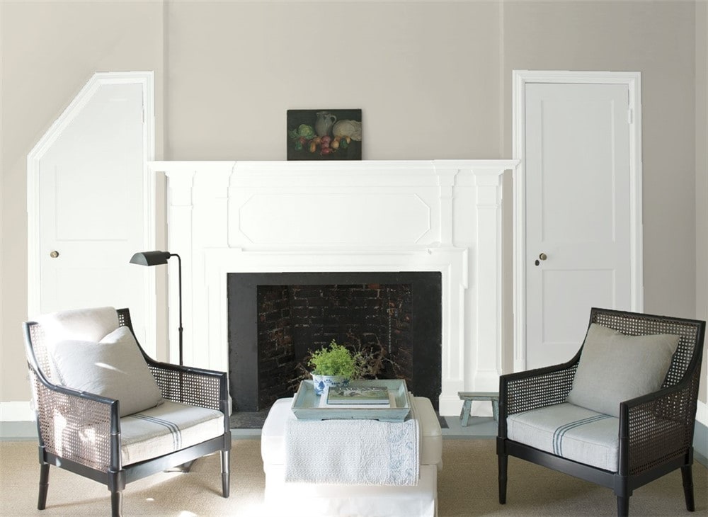
A cool, clean white will set off Sea Salt to distinction.
Kitchen
Sea Salt provides a neutral backdrop for this kitchen that is restful to the eye.
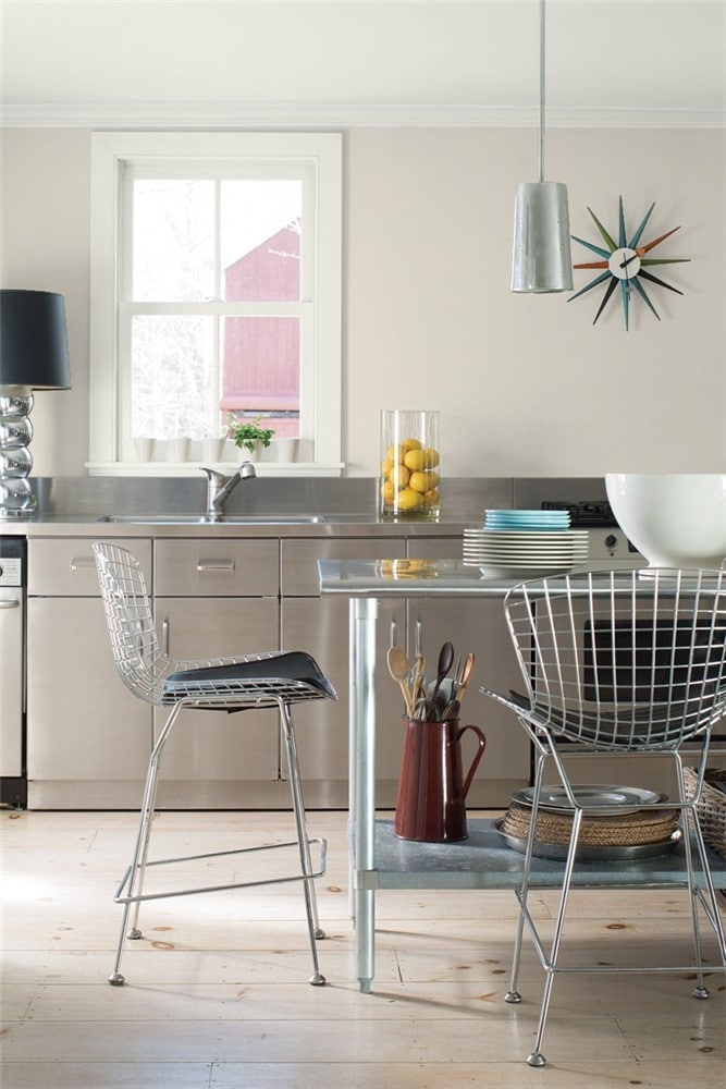
Sea Salt can offer a warm, earthy contrast to the appliances and metalwork in a kitchen.
Dining Room
Sea Salt balanced with careful, minimalist details gives an air of luxury to this dining room.
Warmer furnishings bring out the earthy side of Sea Salt in this dining room.
Home Office
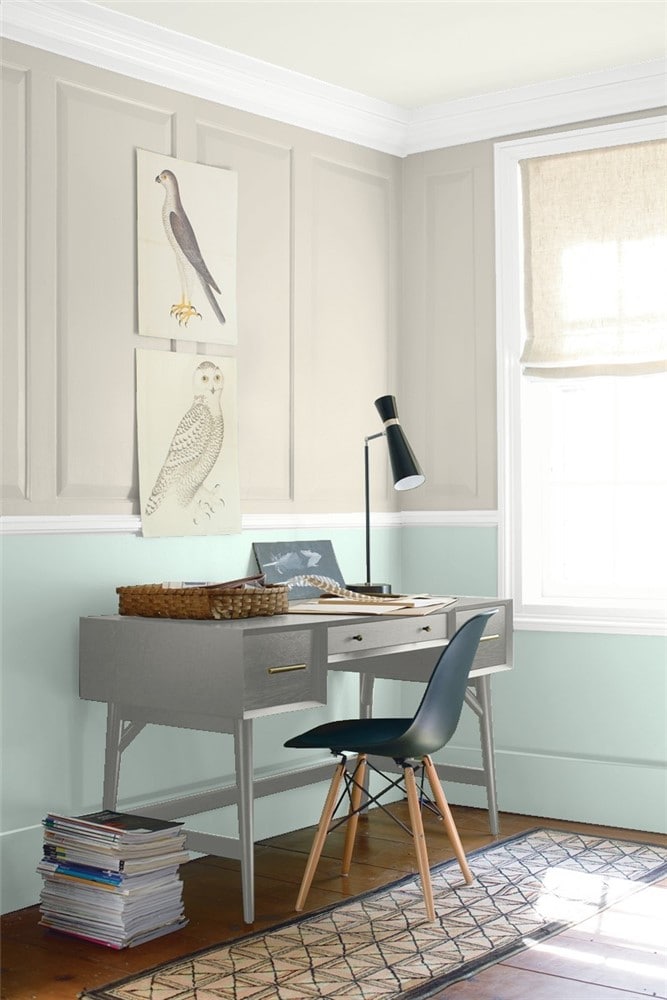
Sea Salt and Palladian Blue create a soothing partnership reminiscent of land and sea in this home office.
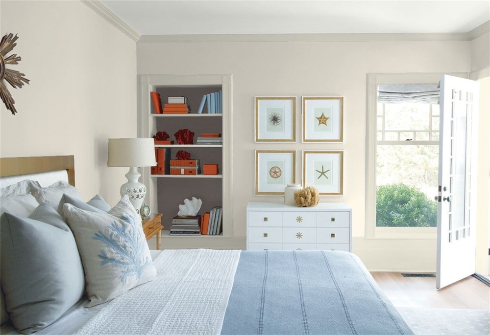
Bedroom
Sea Salt on a shiplap focal wall brings coziness and brightness to this farmhouse bedroom.
Sea Salt and Rockport Gray partner up to bring out the warmth that each has to offer in this bedroom/bathroom suite.
Bathroom
Sea Salt walls and rich chocolate shower tile join forces in this bathroom, where separate shower and bath facilities bring a hotel experience home.
Laundry Room
A subtle coastal theme in this laundry room is built around Sea Salt walls.
Entryway
Sea Salt’s light and warmth make it a natural choice for an inviting entryway.
Crisp whites and rich blues are excellent coordinating color choices for Sea Salt.
Coordinating Colors for Sea Salt
Blues are excellent coordinating colors for Sea Salt, and you can use any of them. Delft and cornflower blues, indigo blues, vivid teals and turquoises; blues and Sea Salt bring out the best in each other.
Sea Salt can be the focus of a subtle coastal palette, using more muted grays and blues, or even mossy greens, rather than, say, a more traditional navy, white, and lighthouse red.
Sea Salt is also a great option for minimalist decor styles. It’s a gray with a little extra personality that can be combined with any neutrals of your choice, such as other grays, beiges, and whites.
Whenever we’re talking about gray family colors, there are two combinations I always like to mention. The first is a classy and sophisticated trio: black, white, and gray.
Sea Salt can serve as the gray, or alongside these three; either way will look great. For a fun variation, try substituting purple for the black.
The other combination I like to mention is gray and pink. It can be soft and romantic, or bright and playful. Sea Salt will look a little warmer and more earthy next to a pink than a classic gray will. Be sure to sample first to make sure you don’t mind the undertones these two bring out in each other.
Here are some coordinating color ideas for Sea Salt to help you get inspired:
- Hale Navy by Benjamin Moore
- Bahaman Sea Blue by Benjamin Moore
- Aberdeen Green by Benjamin Moore
- Aegean Teal by Benjamin Moore
- Jamestown Blue by Benjamin Moore
- Kendall Charcoal by Benjamin Moore
- Chantilly Lace by Benjamin Moore
- Sanctuary by Benjamin Moore
- Tricorn Black by Sherwin Williams
- Snowbound by Sherwin Williams
- Urbane Bronze by Sherwin Williams
- Salty Dog by Sherwin Williams
- Indigo Batik by Sherwin Williams
- Anonymous by Sherwin Williams
- Secret Cove by Sherwin Williams
- Rose Colored by Sherwin Williams
How Does Sea Salt Compare With Other Colors?
Sea Salt by Benjamin Moore vs Sea Salt by Sherwin Williams
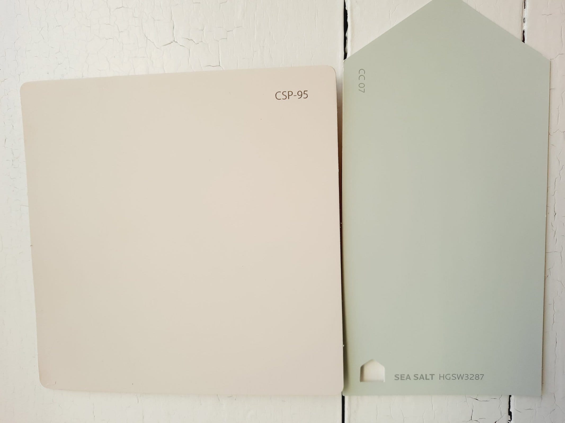
Even though these colors share the same name, they’re definitely different. Sea Salt from Sherwin Williams is a pale green color with a healthy dose of gray. It’s a lot cooler than Benjamin Moore’s taupe, mineral-inspired Sea Salt. Sherwin Williams’ version has a similar LRV of 63.
Sea Salt vs Agreeable Gray by Sherwin Williams
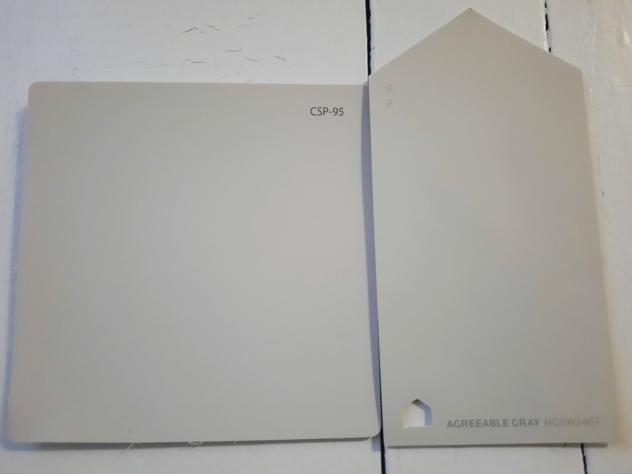
Agreeable Gray is one of Sherwin Williams’ most popular greige colors, and it falls fairly close to Sea Salt. Sea Salt is a little warmer. Their LRVs are comparable; Agreeable Gray is an even 60.
Sea Salt vs Pale Oak by Benjamin Moore
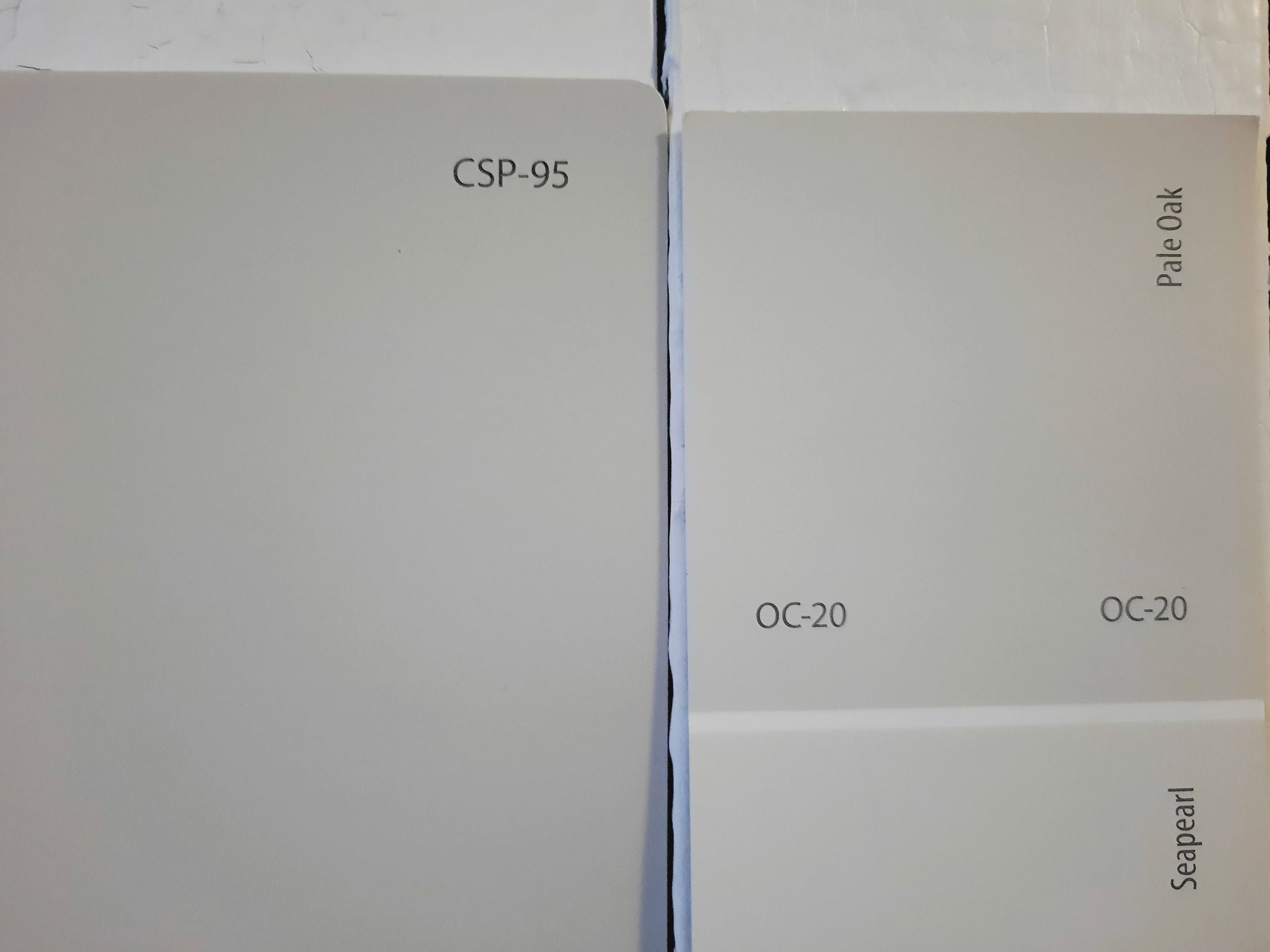
Pale Oak is a super-light greige that has lots of fans and enduring popularity. It’s noticeably lighter than Sea Salt, at 68.64, which is a lot lighter than most greige colors. Benjamin Moore classifies Pale Oak as an off-white.
Sea Salt vs Classic Gray by Benjamin Moore
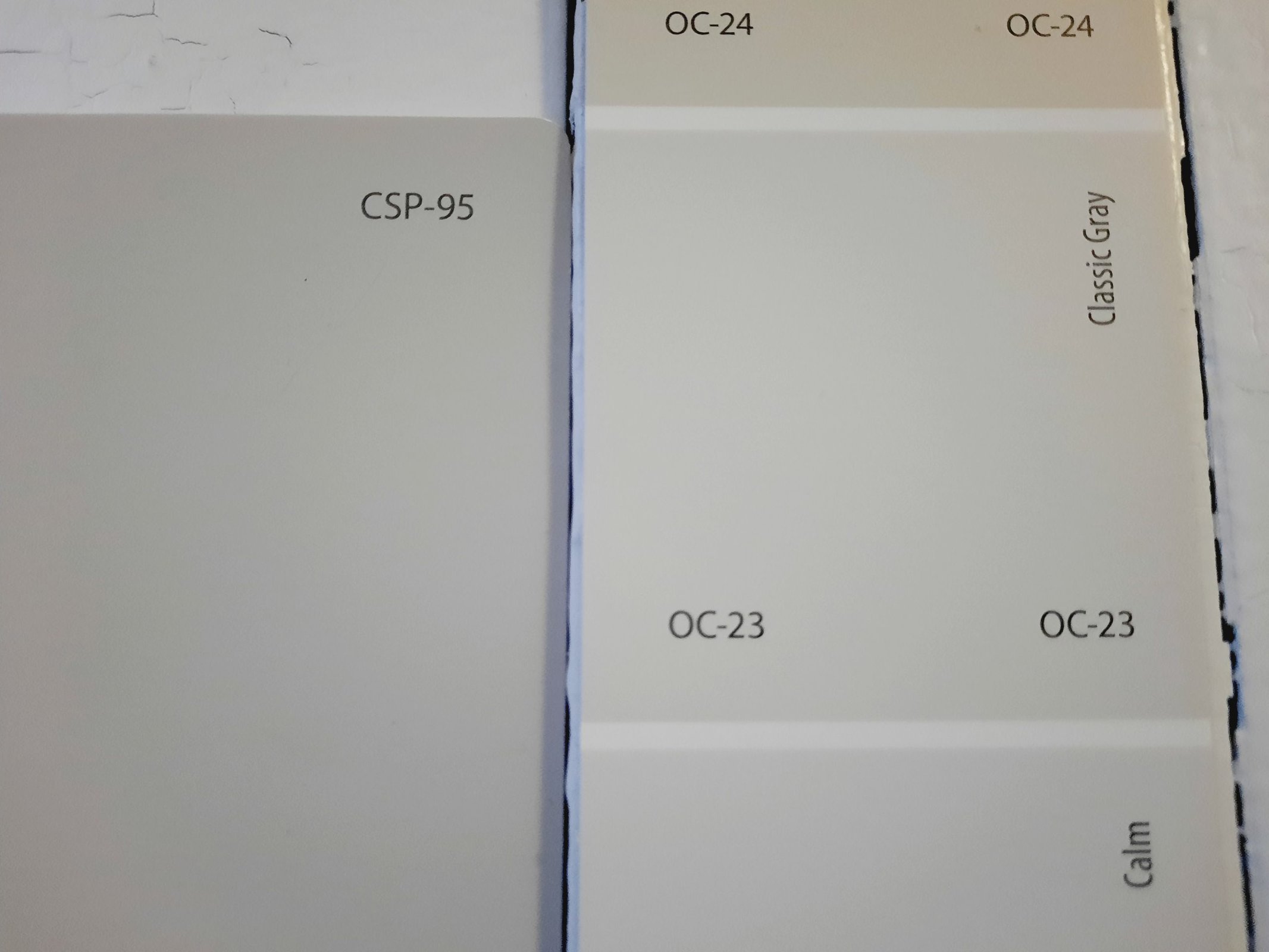
Classic Gray is a pale gray that’s also a member of the off-white family. It’s cooler than Sea Salt, and its LRV of 73.67 makes it a significantly lighter color. But it still has a touch of those taupe mineral tones that puts it in the same family as Sea Salt.
Final Thoughts
Sea Salt is a refreshing, user-friendly neutral that imparts a refreshing and relaxing experience to any room of the home. Its nearly-ideal LRV and lack of distracting undertones suits it to any use you have in mind. It’s a shoe-in for minimalist and coastal decor styles. How will you unwind with Sea Salt?