Sherwin Williams Agreeable Gray Paint Color Review
Out of the more than 1,700 colors offered by Sherwin Williams, do you know which one is the most popular?
Hands-down, it’s Agreeable Gray. A heavyweight of the greige family, Agreeable Gray has found its way into more decor styles and color palettes than you can shake a stir stick at.
This bestseller is quite possibly the most versatile paint color ever created, and it’s a top pick of designers and real estate agents alike for creating irresistible rooms and houses that move.
If your home could use a touch of magic from this chameleon, read on to get inspired!
What Color is Agreeable Gray?
Agreeable Gray is a light-to-medium gray. It’s an incredibly well-balanced neutral color, with virtually no undertones.
Agreeable Gray is a member of the greige family, which means it’s a blend of gray and beige. This blend keeps the gray side of the color from being too cold and industrial, and the beige side of the color from being too yellow and hard to coordinate with other colors.
Does Agreeable Gray Have Any Undertones?
Agreeable Gray doesn’t have strong undertones, but you may notice some slight greens or purples, which are common to gray colors, depending on your lighting situation.
Is Agreeable Gray Warm or Cool?
Agreeable Gray is a slightly warm gray. It comes out that way thanks to its greige pedigree, where its beige side warms up the normally cool color of gray.
LRV of 60
With a light reflectance value (LRV) of 60, Agreeable Gray is on the light side of the spectrum. Many designers cite 60-62 as their ideal LRV for an interior paint color, which helps to explain the popularity of Agreeable Gray!
Where to Use Agreeable Gray
With such a versatile and beloved neutral as Agreeable Gray, there’s no way you can go wrong putting it in any room of your home. It can serve as the primary wall color throughout the entire home, or create a relaxing oasis in a bedroom or living room.
Agreeable Gray is especially popular in kitchens, where it coordinates so well with appliances and hardware. This ability serves well in an office space too.
Read on to take a look at Agreeable Gray in action!
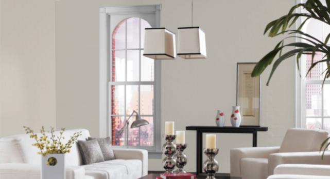
Living Room
The Agreeable Gray walls in this open living room make the light blues in the decor pop. Since grays have blue undertones, blues are a harmonious choice for coordinating colors.
If you love bold colors, you might think you have no need for neutrals. But they’re the perfect complement to the deep jewel blues in this modern living room. Neutrals can let your favorite colors shine without overwhelming a space.
Bedroom
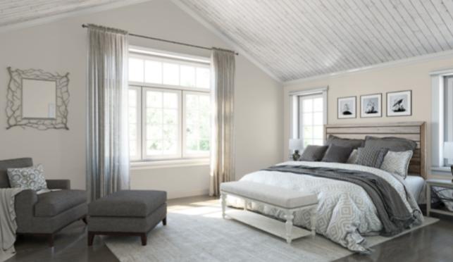
This soothing, neutral bedroom is simple but refined. Agreeable Gray is a good choice for the available natural light.
This bedroom pairs Agreeable Gray with Benjamin Moore’s Dark Olive. Olive tones are warmer greens which are suited to greige colors like Agreeable Gray.
A cool and restful bedroom is grounded and balanced by Agreeable Gray, which keeps the room from being overly bright.
Bathroom
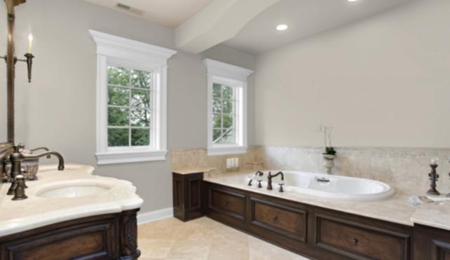
In this classic bathroom, Agreeable Gray offers a nice contrast to white trim and porcelain, while harmonizing with the warmer colors of the wood and tile.
This polished and modern bathroom looks bigger and brighter thanks to the contrast between Agreeable Gray, a darker gray trim, and black metal accents.
Kitchen/Dining Room
Agreeable Gray is a kitchen favorite because of how well it complements appliances and hardware. Pictured here, these Agreeable Gray cabinets are a lovely accent to this farmhouse kitchen.
This farmhouse dining room demonstrates some of Agreeable Gray’s favorite partnerships: black, white, and woodwork.
Entryway
This charming and inviting entryway shows just how well Agreeable Gray can complement white and black as a contrast color, even though it’s not all that dark itself. Everything here looks sharp and put-together!
Coordinating Colors
Try Agreeable Gray against cooler colors like navy blue and stormy grays, or warmer colors like rose pinks and even woodwork. Agreeable Gray is equally at home with either direction.
Agreeable Gray is comfortable as the main color for your entire home, but it can work equally well partnering bolder colors if you’re dreaming of something more exotic.
You can also simply pick your favorite white paint and your favorite black paint and put them with Agreeable Gray for a look that is dramatic and chic.
Here are some ideas to inspire you to coordinate with Agreeable Gray:
- Sherwin Williams Alabaster
- Sherwin Williams Ibis White
- Sherwin Williams Black Magic
- Sherwin Williams Riverway
- Sherwin Williams Van Dyke Brown
- Sherwin Williams Urbane Bronze
- Sherwin Williams Denim
- Sherwin Williams Coral Reef
- Sherwin Williams Iron Ore
- Benjamin Moore Hale Navy
- Benjamin Moore Water’s Edge
- Benjamin Moore Palladian Blue
- Benjamin Moore Kendall Charcoal
- Benjamin Moore White Dove
How Does Agreeable Gray Compare With Other Colors?
Agreeable Gray vs Accessible Beige by Sherwin Williams
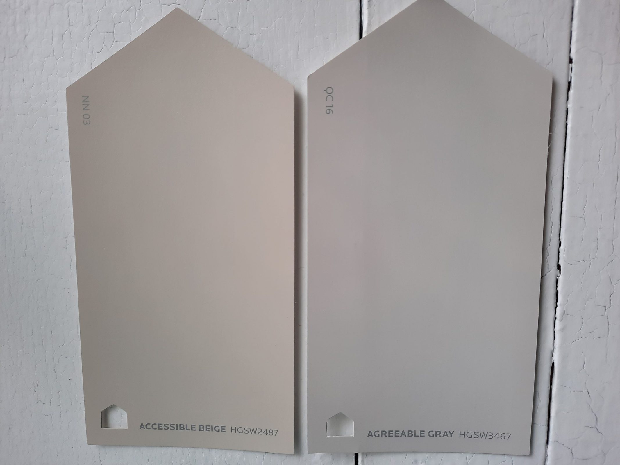
Two of the most popular colors from Sherwin Williams, and top-rated members of the greige family, it’s not surprising that you’d be comparing Accessible Beige and Agreeable Gray.
Taken side-by-side, you can definitely see the cool cast of Agreeable Gray and the warm taupe tones of Accessible Beige. With just the slightest LRV difference–Agreeable Gray’s 60 to Accessible Beige’s 58–you may be able to tell that Agreeable Gray is a touch lighter.
Agreeable Gray vs Repose Gray by Sherwin Williams
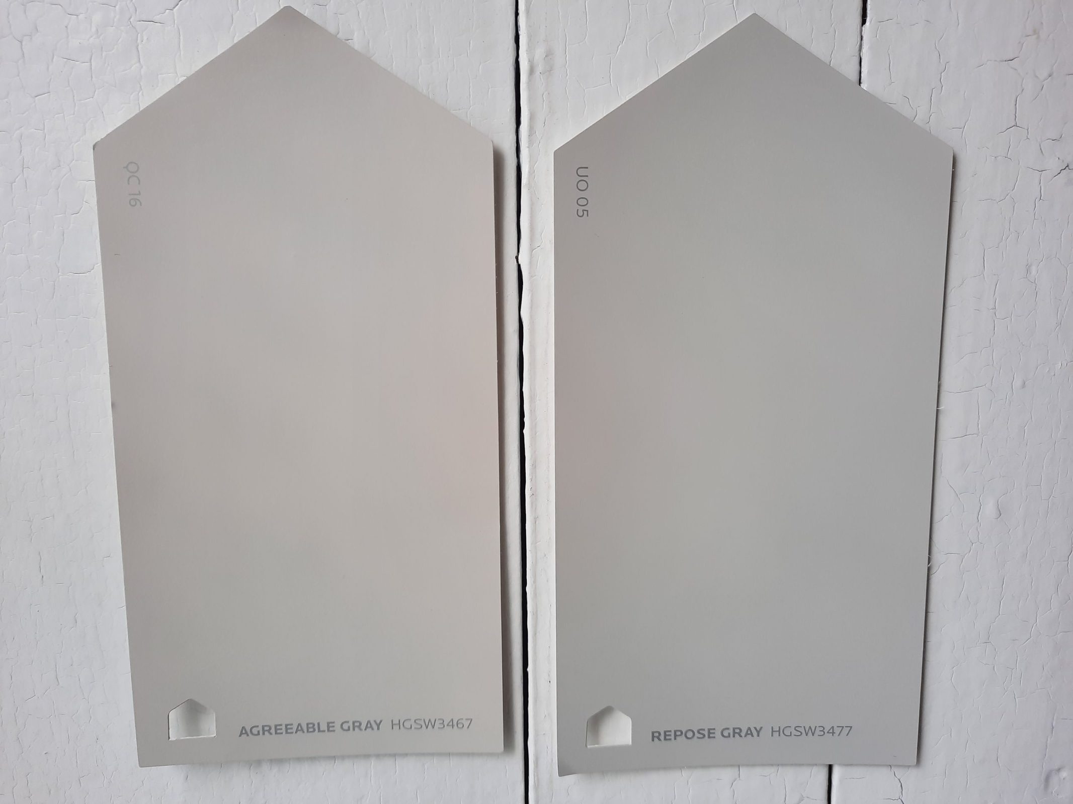
Repose Gray is another popular gray from Sherwin Williams. It has a just-slightly darker LRV of 58, making it a better choice for rooms that receive more light. Repose Gray is significantly cooler than Agreeable Gray.
Agreeable Gray vs Mindful Gray by Sherwin Williams
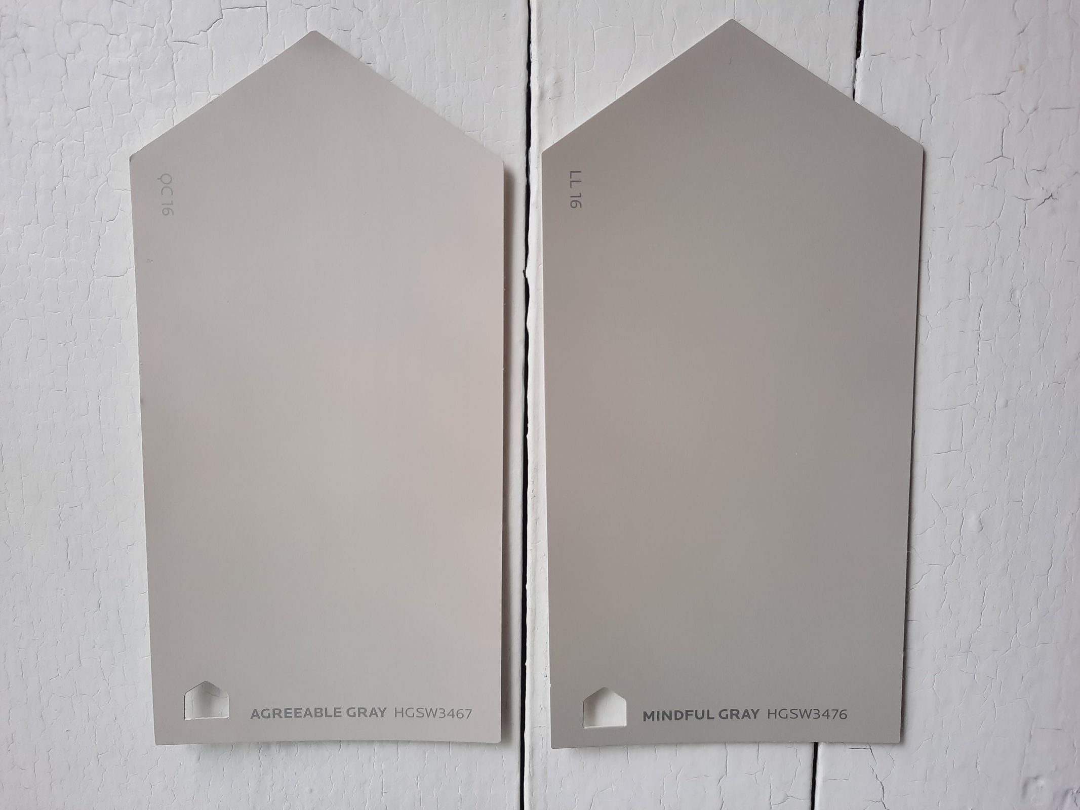
Mindful Gray is a mid-tone gray that is warmer than Agreeable Gray. With an LRV of 48, it’s significantly darker than both Agreeable Gray and Repose Gray. You may see more of the cool undertones with Agreeable Gray. Mindful Gray could provide a bit more contrast to lighter colors.
Agreeable Gray vs Revere Pewter by Benjamin Moore
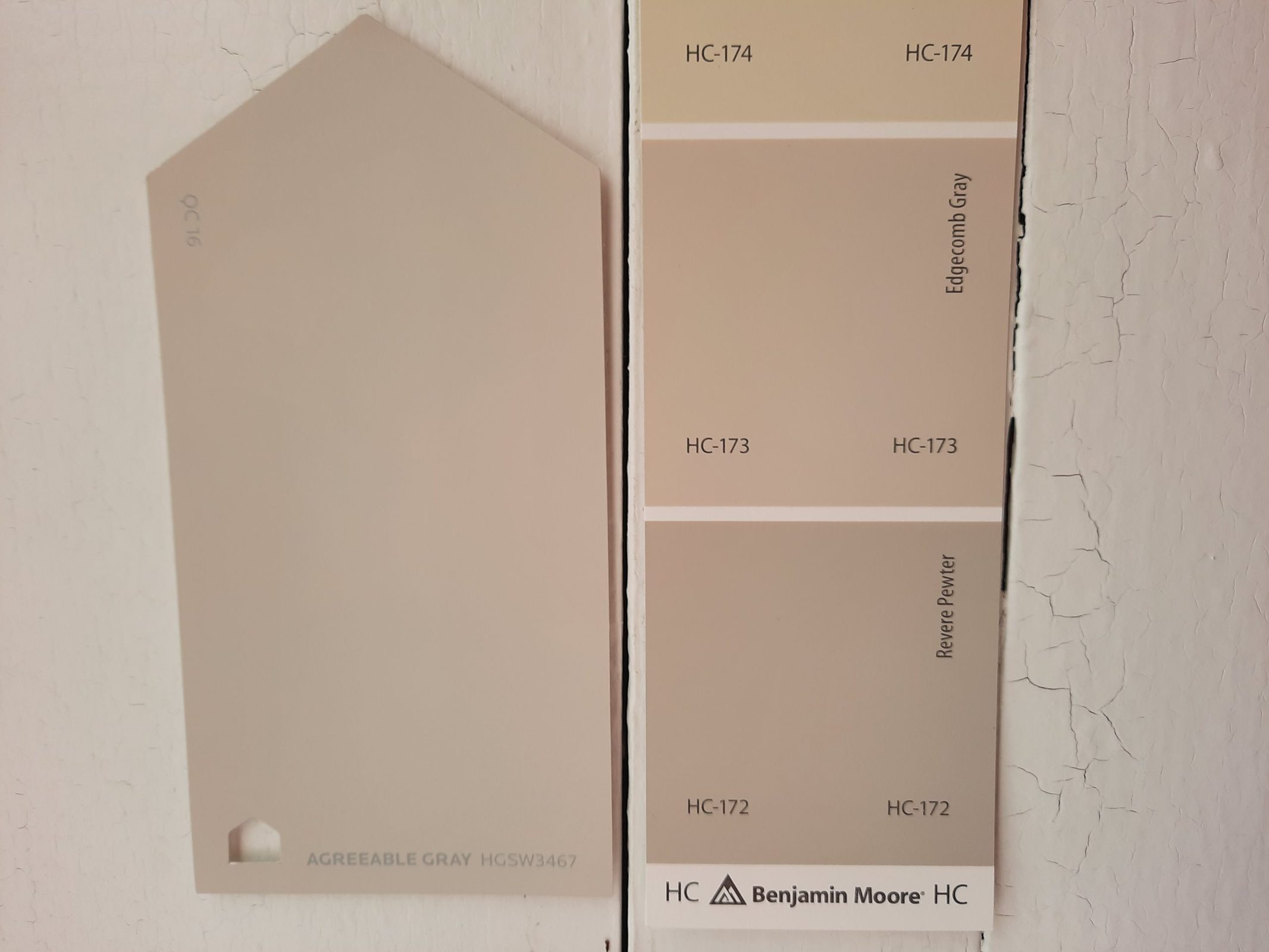
Revere Pewter is one of Benjamin Moore’s best-selling colors, and a strong contender from the greige family. Its LRV is 55, making it a touch darker than Agreeable Gray. While undertones will vary under different lighting conditions, the general consensus is that Agreeable Gray has more of a blue-ish cast than Revere Pewter, which has slight green undertones. Despite all that, these colors are incredibly similar.
Agreeable Gray vs Edgecomb Gray by Benjamin Moore
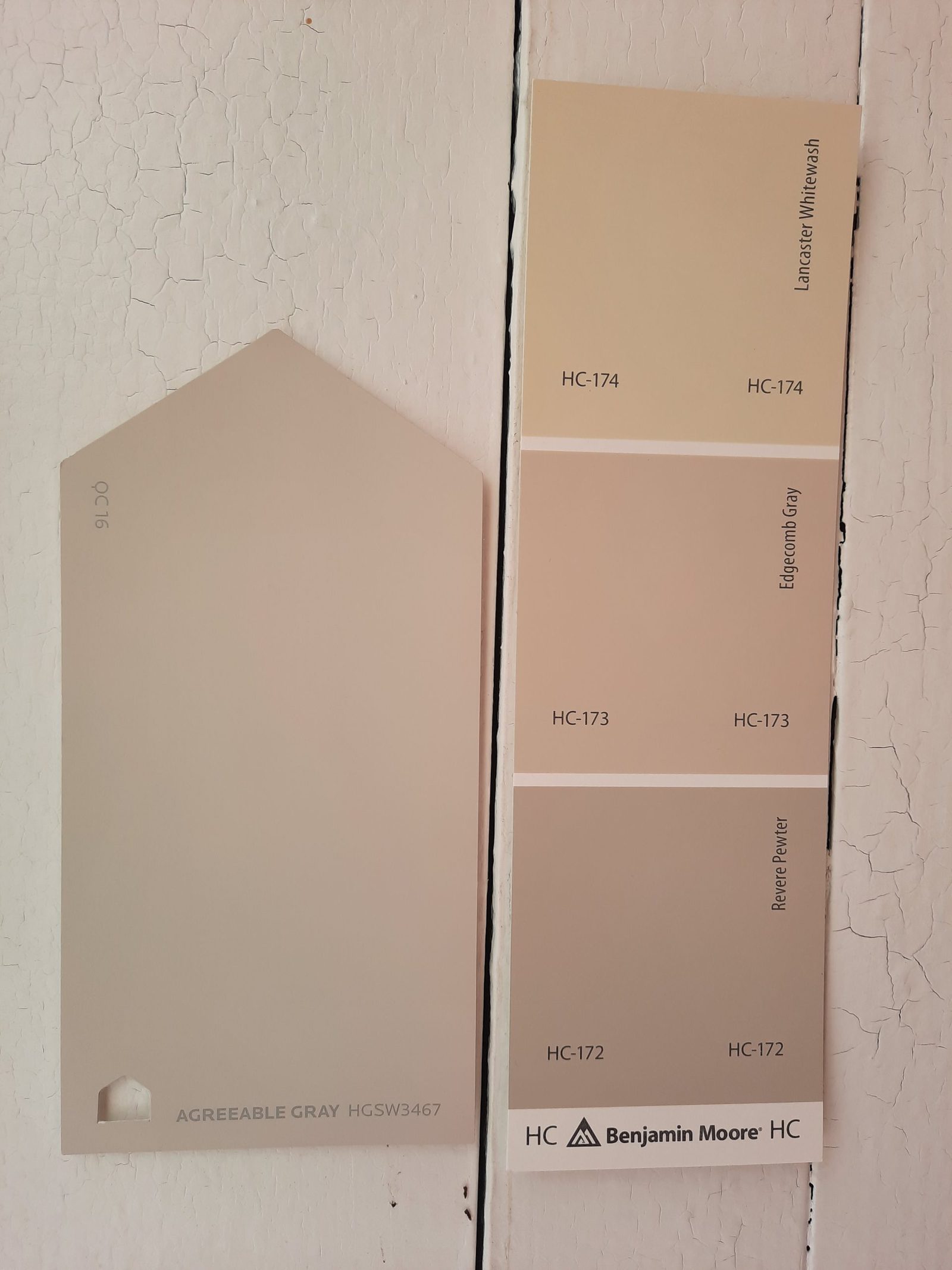
Edgecomb Gray, a popular greige color from Benjamin Moore, is a warmer choice than Agreeable Gray. It has a tawny, earthy feel. With an LRV of 63, it’s a little lighter too.
Final Thoughts
Agreeable Gray is an enduring favorite for its amazing ability to coordinate with any color palette. It’s also well-loved for its ability to look right under any lighting conditions, with its highly-desirable LRV of 60. This beloved warm gray is going to rule the roost among greige colors for a long time to come, and it’s a can’t-miss choice whether you’re selling a home or just looking to fall in love with yours.