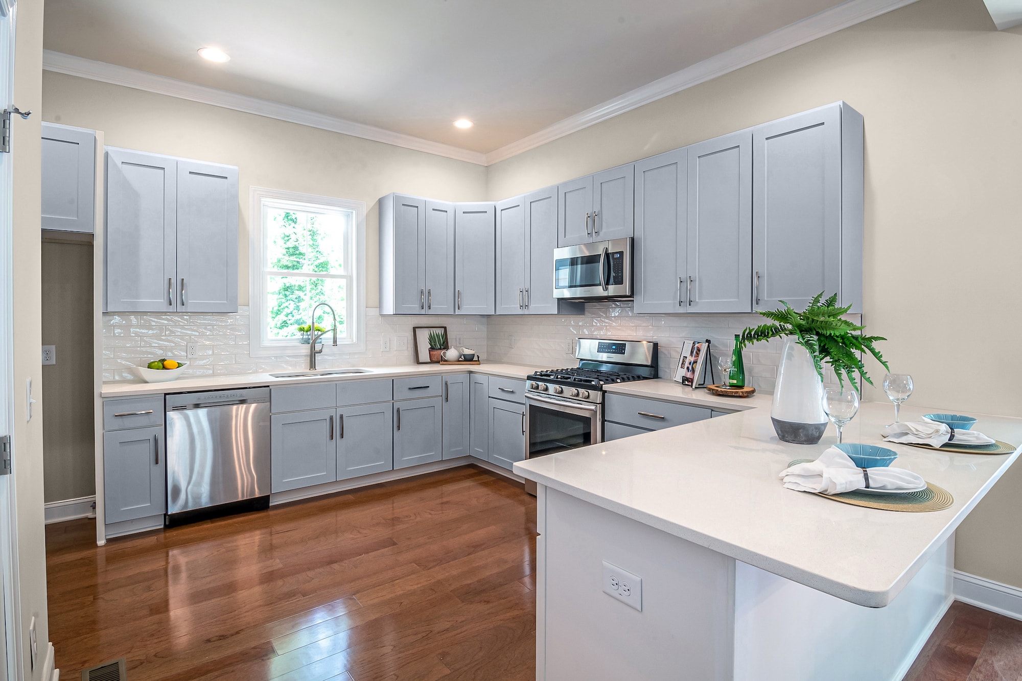
What Color Cabinets Go with Agreeable Gray Walls?
We’ve got you covered if you’re looking for decorating advice on what color cabinets go with agreeable gray walls. We’ve found 15 fabulous shades to paint your cabinets to accent the greige characteristics of Agreeable Gray.
Daydream by Sherwin Williams
Daydream is a cool temperature, darkly shadowed shade of gray with lavender and mauve hints that gives your cabinets a refined personality.
This darker pigmented neutral complements the lighter notes of Agreeable Gray to accent the tints for a richer wall color. You can use this smoky saturated gray for any theme and decor kitchens.
Pediment by Sherwin Williams

Pediment is a glorious neutral shade of off-white that will give your kitchen a monochromatic look. In addition, this shade of greige has interesting shadows that can make it look darker with faint brown influences.
The brown pigments give Pediment a cool, earthy tone that can make the tints in Agreeable turn into a lighter warm greige with yellow nuances.
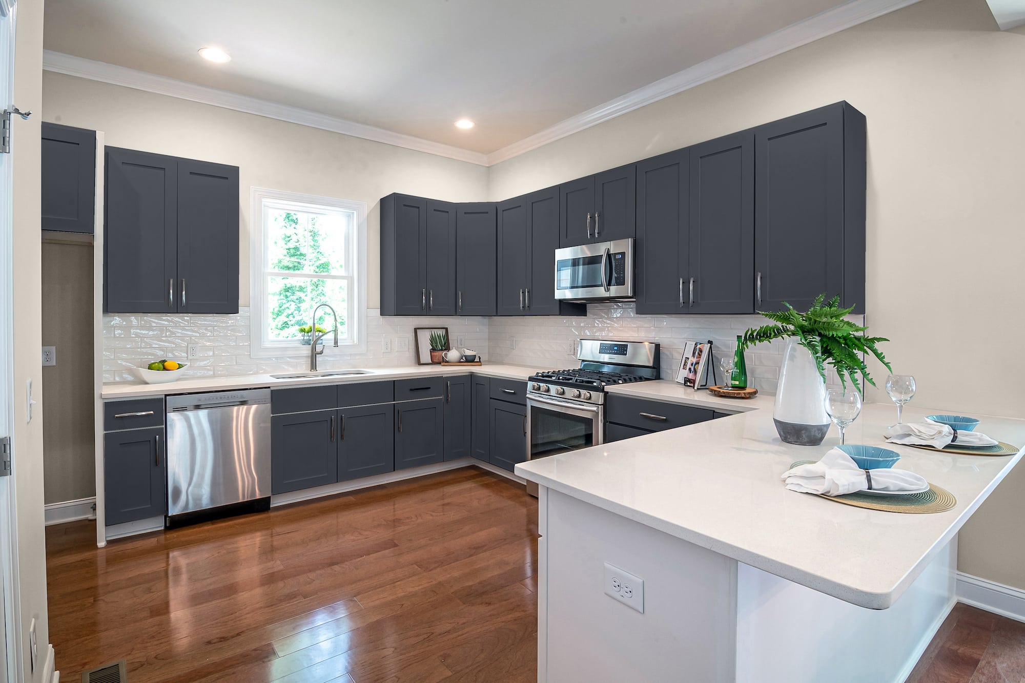
Wall Street by Sherwin Williams
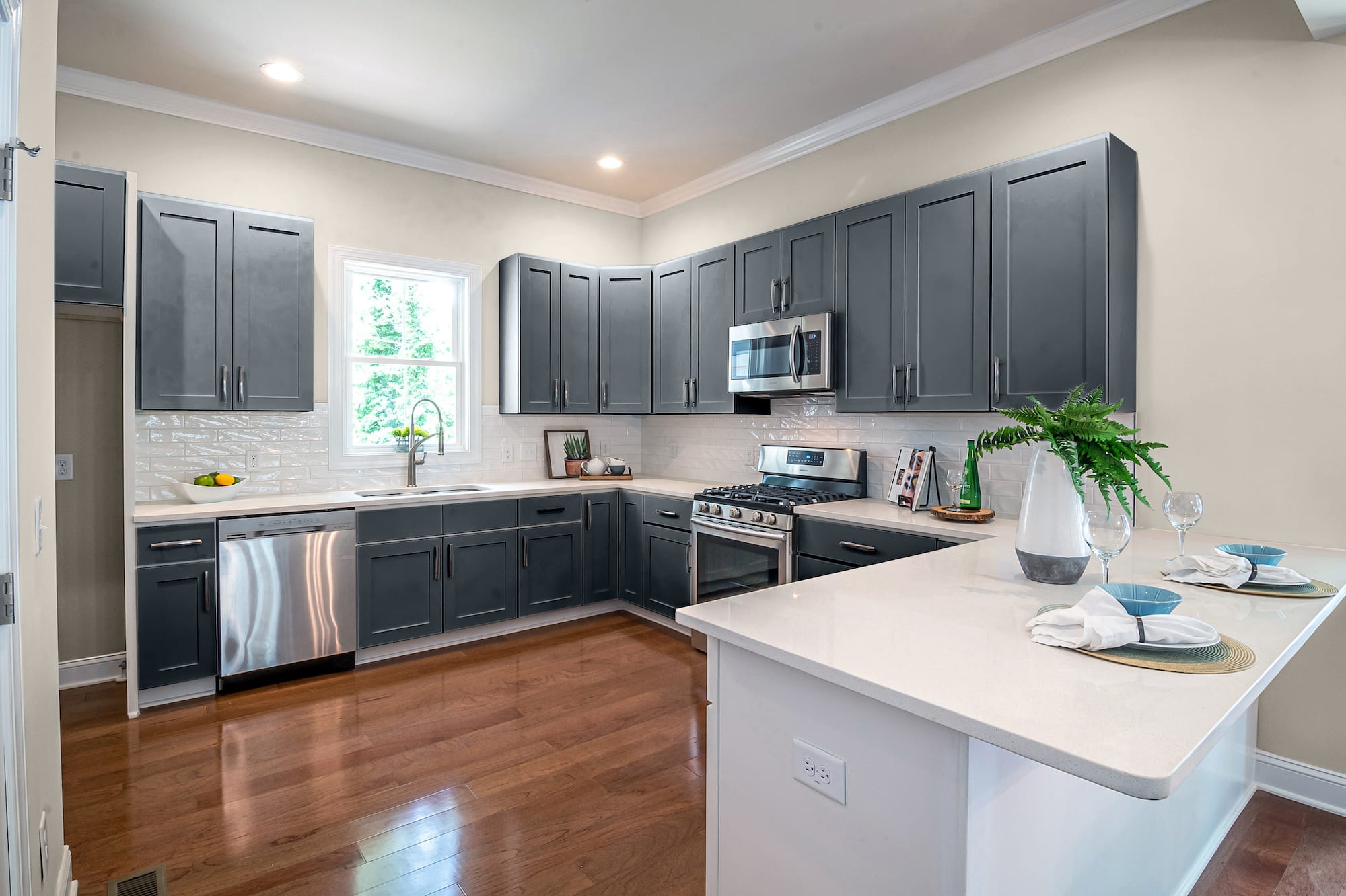
The lightness of Agreeable Gray walls can be the perfect opportunity to go for a bold, modern, or vintage look by painting your cabinets a dark color like Wall Street.
This deeply pigmented neutral gray has a low LRV and faint exotic notes of purple and blue that pull the tint away from being black. Use this color for all of the cabinets or limit it to one-half – like the lowers – and paint the other half white for contrast.
Mariner by Sherwin Williams
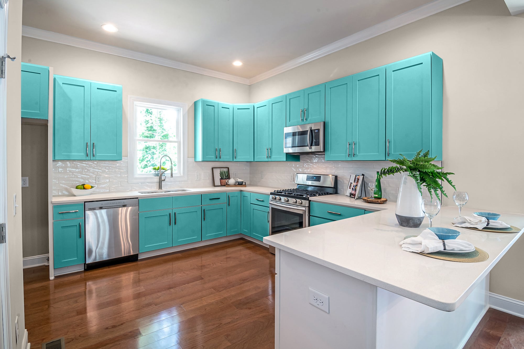
If you like bright, tropical colors, Agreeable gray walls make the perfect backdrop for painting your cabinets a crisp, cool color like Mariner.
This water-inspired blue gets its name for the sparkling beachy blue of the ocean. However, when paired with Agreeable Gray walls, Mariner exposes dull yellow and gray undertones. Shades like this are the perfect color to distress for rustic, shabby-chic, farmhouse, coastal, and country kitchens.
City Loft by Sherwin Williams

City Loft is a warm-toned neutral shade of greige that can add the slightest amount of contrast to Agreeable Gray walls. Unfortunately, this beige has heavy gray pigments that darken the base with shadows.
The yellow tints of this gray play off the similar hues in Agreeable to bask your room in a warm, relaxing tone that goes for any design.
Greek Villa by Sherwin Williams
Greek Villa is a cool neutral shade of white that can make for elegant kitchen cabinets. However, the faint brown pigments give this white a shadowed, aged approach.
You’ll feel soothed and rejuvenated by the exotic nuance of Agreeable gray walls and Greek Villa cabinets. The yellow notes in the walls will enhance the aged look of your cabinets for a luscious old-world royalty feel.
Clary Sage by Sherwin Williams
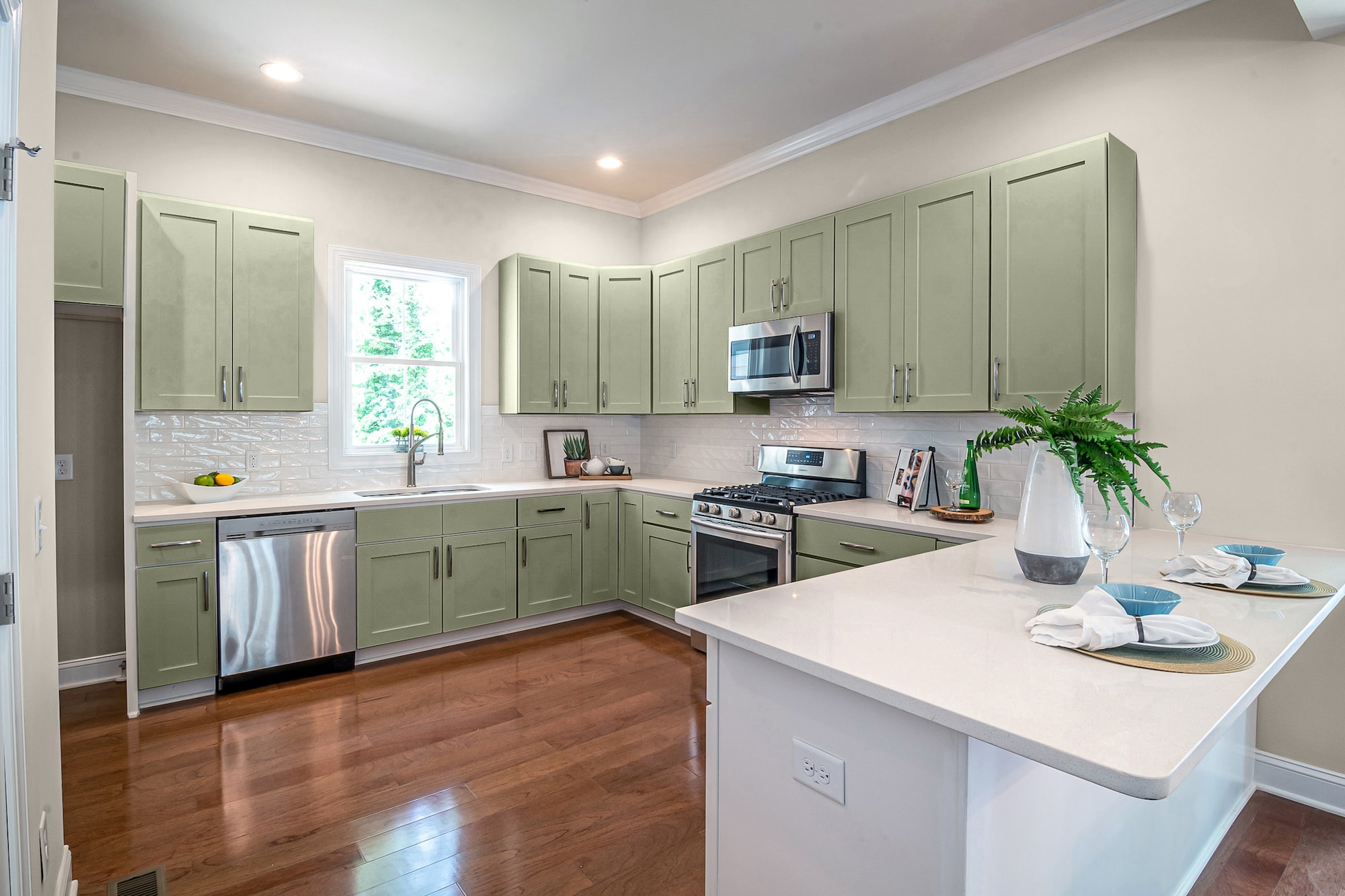
For an earthy, nature-themed kitchen, choose a neutral inspired by nature, like Clary Sage. This light-toned green has heavy brown influences and a low LRV.
The greige pigments of Agreeable can activate tan and yellow tints buried in this color to give a warmer texture and depth.
Museum Piece by Benjamin Moore
Museum Piece is a mid-toned shade of gray with major brown relations. When you use this dark gray for your cabinet color against the lighter yellowish notes of Agreeable, you get an earthy blended color transition.
This neutral has enough pigments to spice up any kitchen design to give it a serious attitude. And because you’re working with neutrals, you have free reign on accent colors without fear of design clashes.
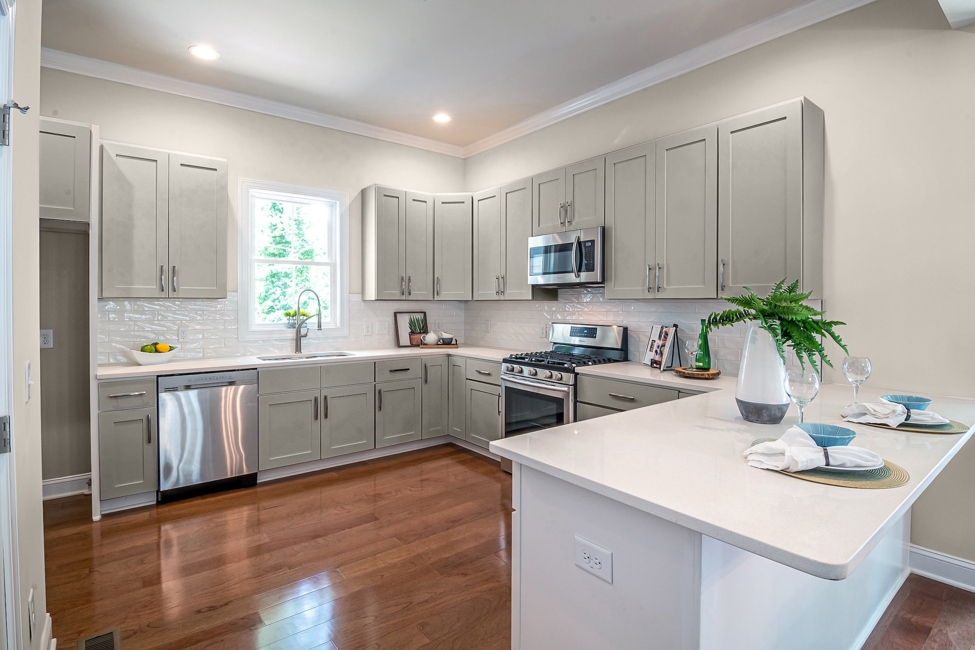
Penthouse by Benjamin Moore

Penthouse is a soothing, sophisticated color that is right at home on your cabinets next to walls in Agreeable Gray. This neutral shade of tan has subtle gray shadows that give warm brown accents.
The darker nuances of the walls play off the lighter aesthetic of the cabinets to make them have lovely yellow highlights that brighten your space up.
Lilac Hush by Benjamin Moore
If you’re looking for a way to give your kitchen a unique wow factor not done by many others, think in terms of purple-violet, to be exact.
Lilac Hush is the faintest shade of violet you can get, with barely a trace of purple buried in the warm gray depths. The dark notes can trigger the soft lilac hues to create magic when used next to Agreeable Gray.
Budding Green by Benjamin Moore
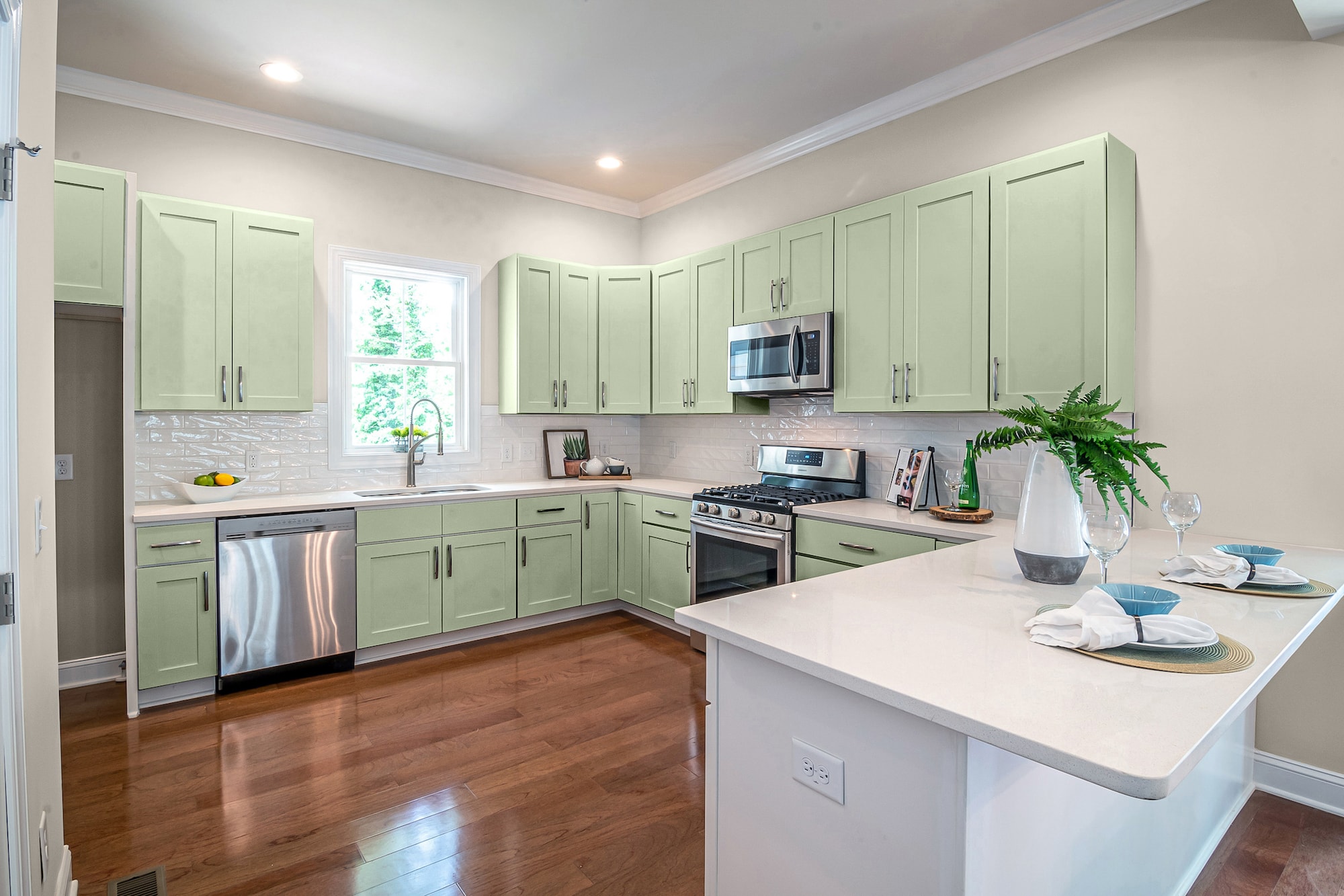
Give your kitchen the bright, refreshing feel of spring by painting your cabinets a delicate, soft shade like Budding Green.
This light, pale neutral green will give your cabinets a neutral gray-pigmented nuance that surprisingly works with many themes and accents.
Poppy Seed by Behr
If you’re looking for a bold way to make your kitchen cabinets stand out against the easy neutral look of Agreeable Gray walls, skip color altogether by picking cabinets in a dominant black.
Poppy Seed is a densely saturated black with amazing blue, and violet notes that give this color texture and dimension. The greige characteristics in the gray walls brighten up the dark, but you can still go overboard with too much. Use this color sparingly, such as for two-tone cabinets or the island color.
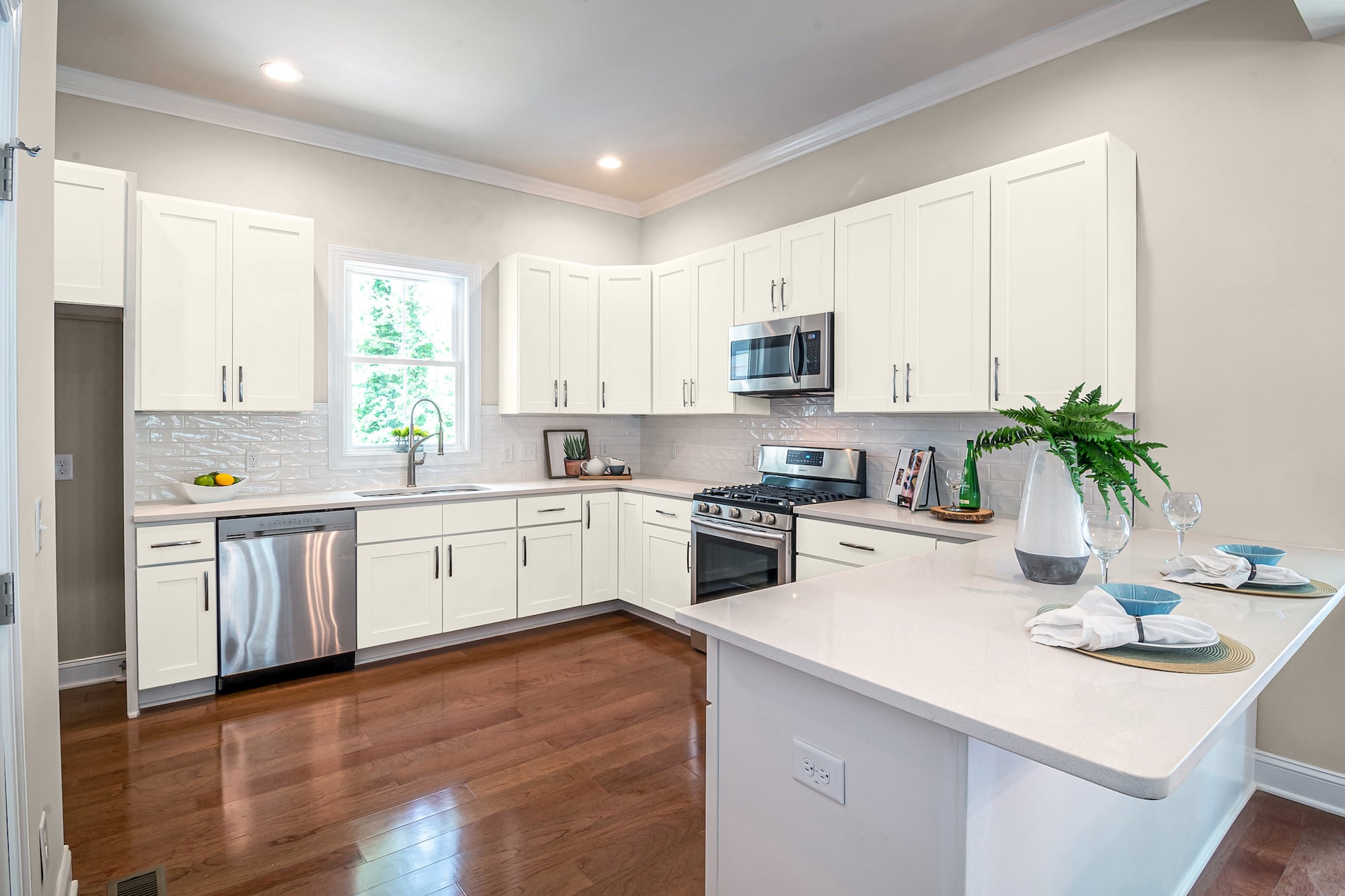
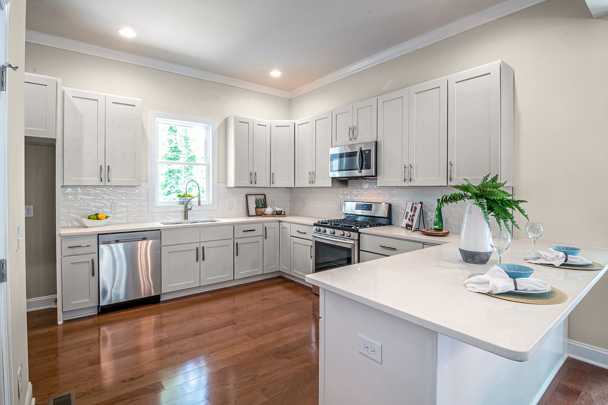
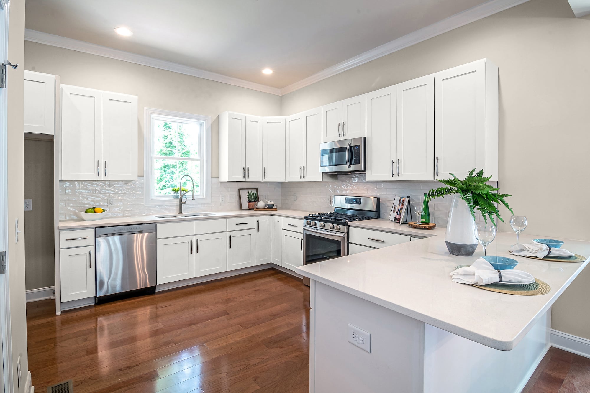
Dove by Behr

Dove is a versatile popular color choice for nearly any situation. This shade of neutral white is soft and creamy, with warm nuances enhanced by the yellow and gray pigments in the gray walls.
If you’re selling your home or have a rental property to decorate, choosing a neutral color scheme like Agreeable Gray for the walls and Dove for the kitchen cabinets can be the perfect palette for a welcoming kitchen.
Salt by Farrow & Ball
You can use Salt for a crisp, refreshing pure white to make small kitchens feel larger. This bright blank slate is the perfect color for galley-style kitchens or rooms with no windows to let in natural light.
Besides being a clean canvas for you to decorate as you please with any accents or themes – repeatedly – Salt can also have depth and dimension from the shadowed tints of the gray walls.
Pavilion Gray by Farrow & Ball

Pavilion Gray is a mid-range, cool-toned timeless shade of gray reminiscent of 18th-century Swedish designs. You’ll spot blue and lavender undertones in the right lighting that can give your kitchen a modern nuance.
Pairing the greige gray of Agreeable with the blue-violet gray of Pavilion gives you a transitional palette that feels elegant and trendy.
Final Words
When you have Agreeable Gray on the walls in your kitchen, you can choose from multiple color families for your kitchen cabinets. Of course, you’ll get the best look using neutrals, but that doesn’t mean you can’t use color. We’ve provided examples of neutral shades of greens, blues, blacks, whites, and grays.