White Heron by Sherwin Williams Paint Color Review
White paints are really having a heyday lately. They’re popular in lots of different decor styles, and even when a white isn’t your main color, it’s often used as a trim.
But maybe you’re looking for something more interesting than a white paint. You don’t want to sacrifice all that versatility, but you want a splash of color too.
White Heron is a color of mystery. Despite its name, this color isn’t white at all. It’s a category-crossing neutral that’s open to a lot of possibilities.
If you want to dip your toe into the possibilities beyond white and off-white, then let’s pop open that paint can and take a look at White Heron.
What Color is White Heron?

White Heron is a light greige color. It could even be described as a pastel greige. This is a very interesting color that can play different roles. It technically qualifies as an off-white, although you might find it has too much depth of color to really look like a white.
LRV of 76
White Heron has a light reflectance value, or LRV, of 76. Light reflectance value is a scale designed to measure how bright a color is, and ranges from absolute black at 0 to sheer white at 100. The higher the number, the lighter the color.
Off-white colors typically range from about 73 to 82, with numbers above 82 being true whites. White Heron is light enough to qualify as an off-white. However, you’re going to find that White Heron has a good bit of color to it, and will really only look white in very brightly lit rooms.
What Undertones Does White Heron Have?
White Heron has pink and purple undertones, as many greige colors do. However, it is a light enough color that the undertones are not overpowering.
Is White Heron a Warm Color or a Cool Color?
White Heron is a neutral color that can read a little warm. As a greige, you might expect it to be cool, and compared to clean whites, it does look cool. That’s just part of the chameleon-like quality of this very light neutral color.
Where Can You Use White Heron?
White Heron has those two great qualities you’re looking for when you’re checking a color for versatility: it’s light and it’s neutral.
A color that’s as light as White Heron can be used even in dark and small rooms to brighten them up and make them have a more expansive feeling.
Neutral colors can be used without fears about lighting and clashing with other colors in the home.
White Heron has a softness that makes it pleasant in brightly lit rooms. This includes the brightest of lighting, the home exterior. Less of its greige color will come through in these situations, however.
If you’re looking for something calm and balanced, White Heron will do the trick. Consider it for rooms where you want to relax, like the bedroom. It’s a popular choice for the nursery, a room where soothing is very welcome!
You can also use White Heron as the backdrop for more colorful decor. Consider using it to highlight an art wall, or display a collection.
Let’s take a look at White Heron in home spaces and get a feel for how it works.
Exterior
Gray trimmings bring out White Heron’s depth on this home exterior.

This exterior pairs White Heron with Halcyon Green for a nature inspired look.
Living Room
White Heron opens up this living room while coordinating well with the deep red brick of the fireplace.

The cool gray side of White Heron sets off an accent wall with In the Navy.
Kitchen

A blush of Comical Coral is a playful companion for White Heron in this farmhouse style kitchen.
Bedroom
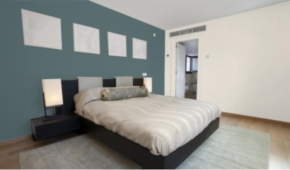
This modern and soothing bedroom pairs White Heron with an accent wall of Riverway.
Bathroom
White Heron and Oyster Bay pair up in this simple but effective bathroom.
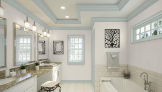
The cool and refreshing tones of White Heron and Rainwashed work together to create this bathroom retreat.
Nursery
White Heron creates a light and peaceful atmosphere in this gender-neutral nursery.
White Heron Coordinating Colors
The same lightness and neutral balance that make White Heron versatile in the home also make it easy to pair with coordinating colors.
That’s the fun of working with neutrals: they go with your favorite colors!
Like other greiges, White Heron works exceptionally well with any kind of blue–navy blue, powder blue, even green-blues and teals.
Another can’t-miss companion for greiges is darker grays, especially charcoal grays, ranging all the way to black.
If you want to pair a white with White Heron, you can–go for a clean white that’s as bright as possible, to offer a good contrast.
Here are some coordinating color ideas for White Heron to help inspire you:
- Analytical Gray by Sherwin Williams
- Adaptive Shade by Sherwin Williams
- Perfect Greige by Sherwin Williams
- Naval by Sherwin Williams
- Rainwashed by Sherwin Williams
- Sea Salt by Sherwin Williams
- Topsail by Sherwin Williams
- Dovetail by Sherwin Williams
- Tricorn Black by Sherwin Williams
- Woodlawn Blue by Benjamin Moore
- Hale Navy by Benjamin Moore
- Coventry Gray by Benjamin Moore
- Edgecomb Gray by Benjamin Moore
- Sea Haze by Benjamin Moore
- Kendall Charcoal by Benjamin Moore
- Chantilly Lace by Benjamin Moore
How Does White Heron Compare with Other Colors?
White Heron vs Agreeable Gray by Sherwin Williams
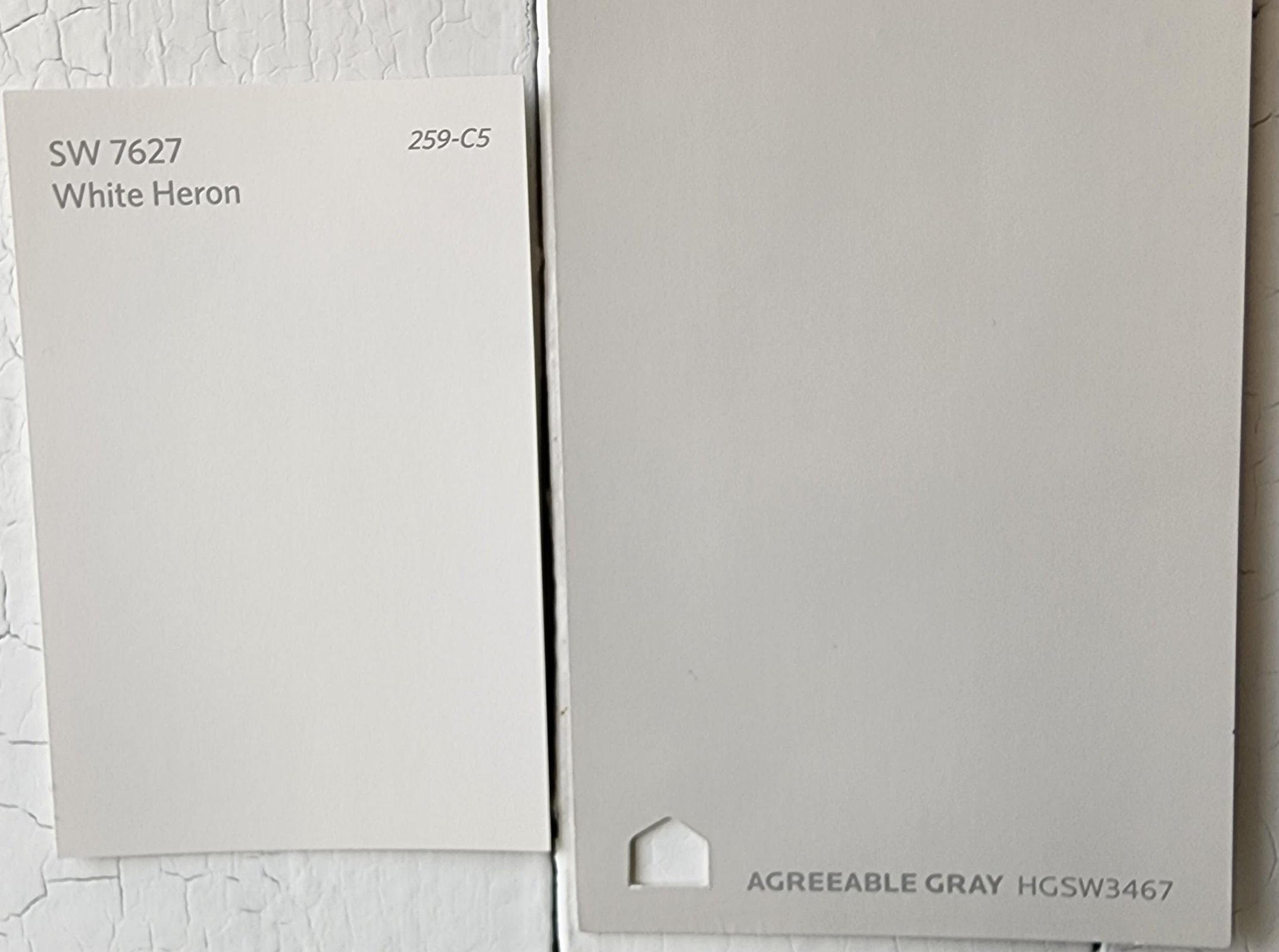
White Heron belongs to the same family as Agreeable Gray, but is substantially lighter. Agreeable Gray is a light-to-medium greige. It has too much of a color presence to be mistaken for an off-white, and it’s much grayer, cooler, and darker than White Heron. Agreeable Gray has a LRV of 60.
White Heron vs Egret White by Sherwin Williams
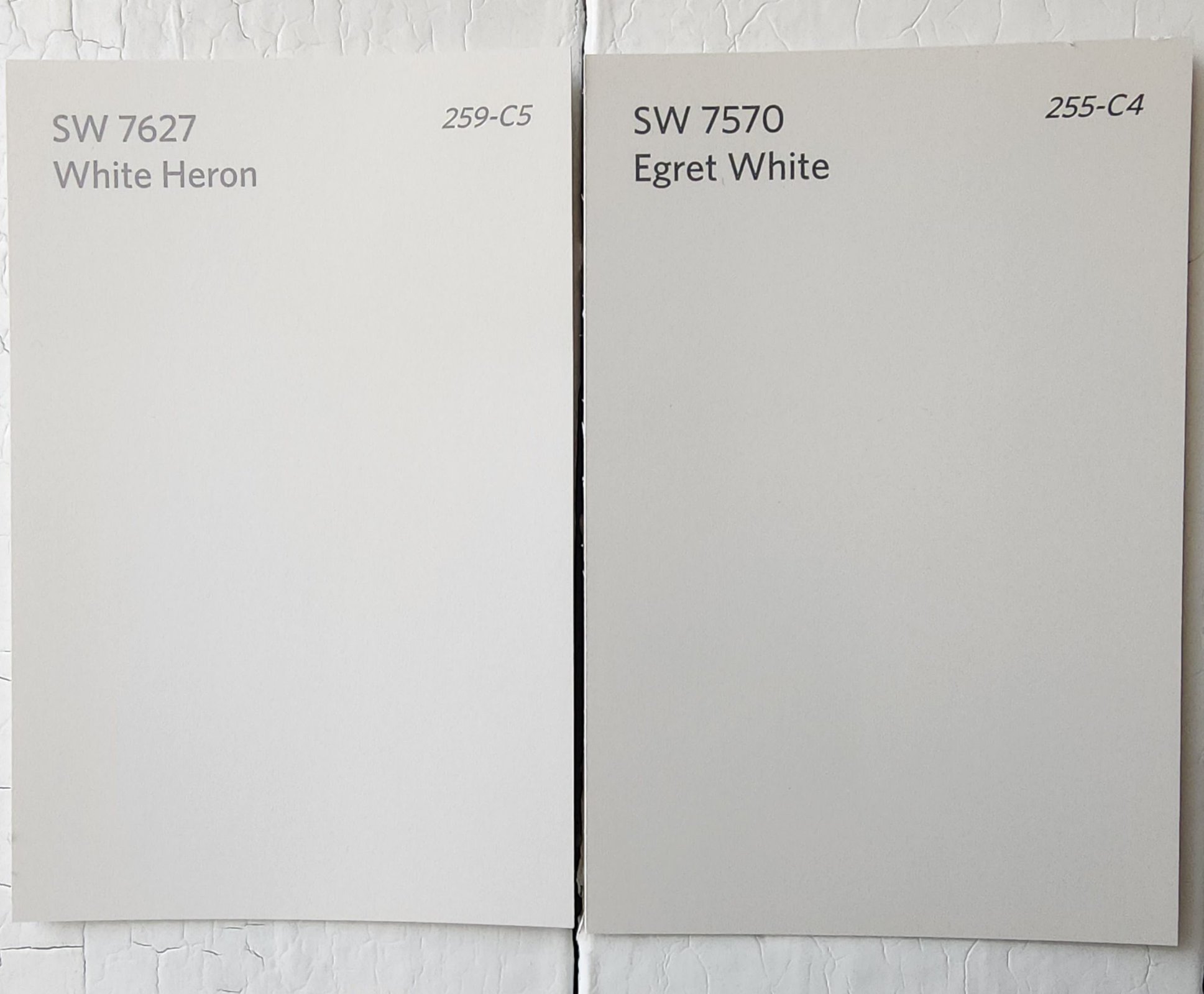
Egret White is a light, cool greige color that Sherwin Williams lists among its off-whites, although by LRV alone, it’s not quite light enough to hit the mark. It’s both cooler and darker than White Heron, but both colors share a cream, rather than beige, base. Egret White has a LRV of 70.
White Heron vs Simply White by Benjamin Moore
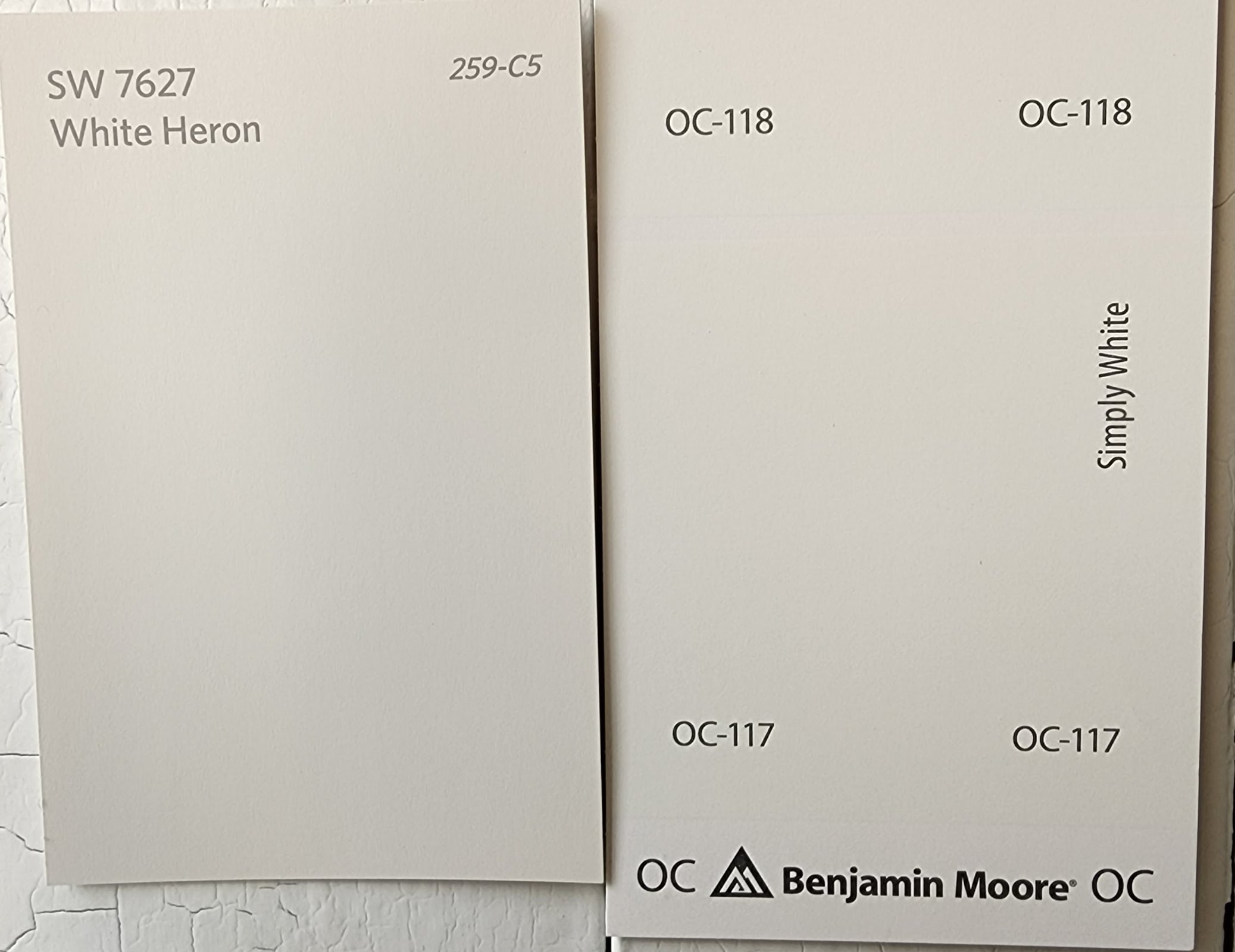
Simply White is a slightly warm, bright white that doesn’t have significant undertones. It’s substantially brighter than White Heron, and a bit warmer. Simply White has a LRV of 89.52.
White Heron by Sherwin Williams vs White Heron by Benjamin Moore
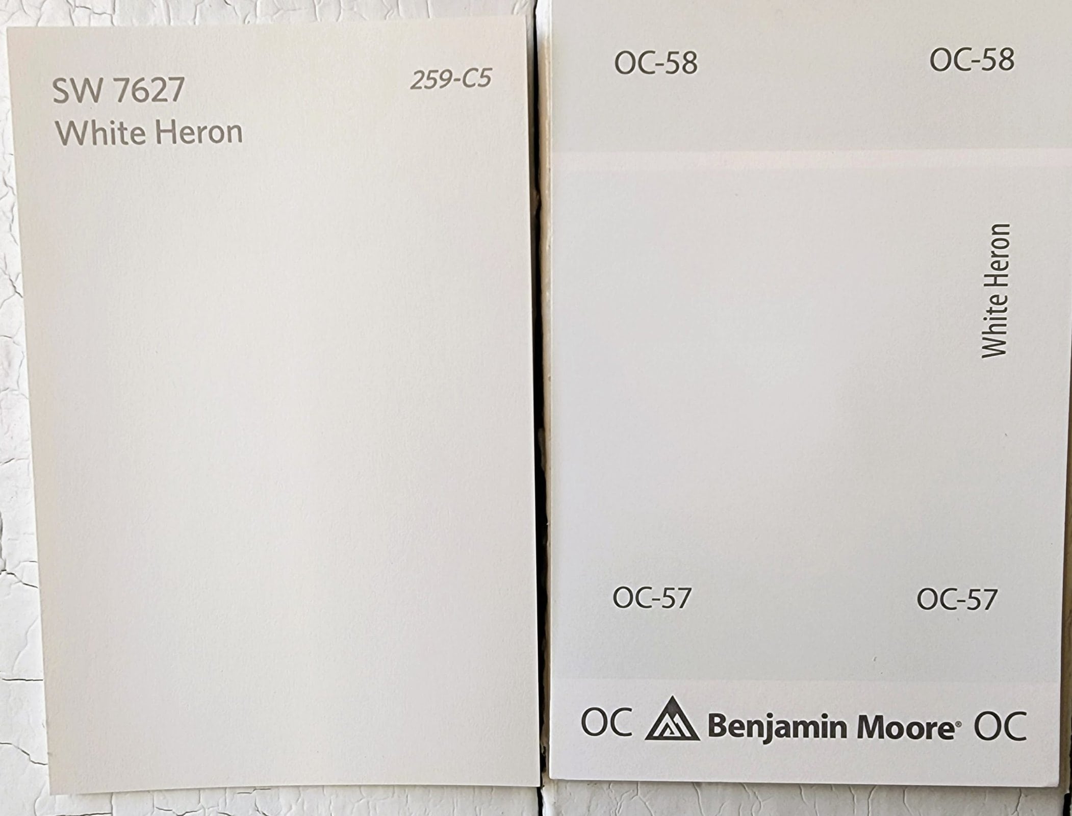
Sherwin Williams and Benjamin Moore both have paint colors named White Heron, but the two don’t have a lot in common. Benjamin Moore’s version is very slightly cool, and significantly brighter. The Sherwin Williams version is more greige, and reads as a color, especially compared side-by-side. Benjamin Moore’s White Heron has a LRV of 86.69.
Final Thoughts
Light, neutral, flexible: White Heron is everything you could ask from an alternative to white. This gentle greige will show a touch of color in all but the brightest lighting situations, and will look softer than a clean white. There’s a lot of possibilities for this unusual and mysterious color. What space will you create with White Heron?