The 13 Best Farmhouse Paint Colors of 2026
When debating paint colors for the home, many people tend to limit their choices based on a design style, such as modern farmhouse, industrial farmhouse, or farmhouse chic.
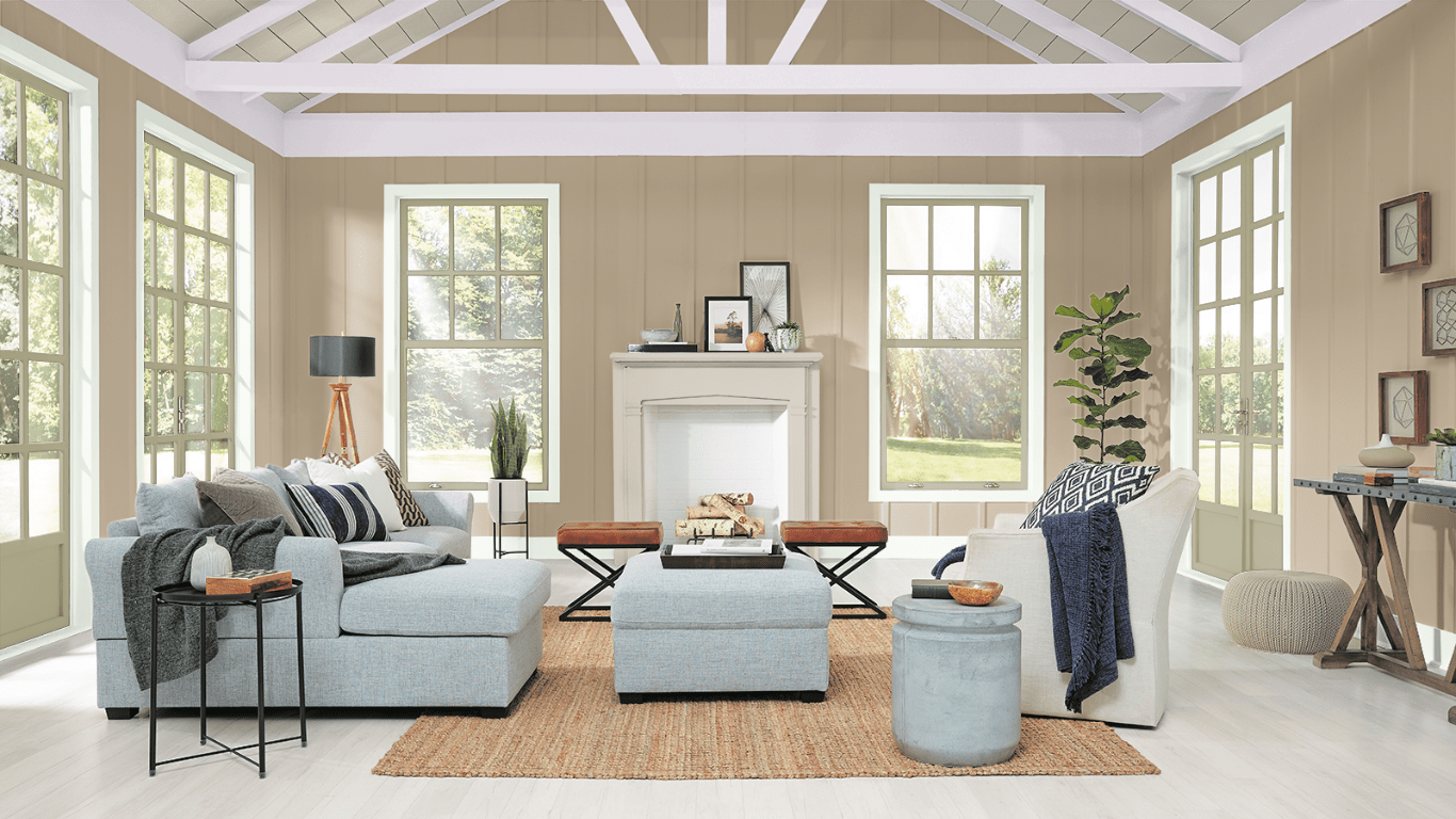
The farmhouse style is heavily based on neutral shades of white, beige, gray, greige (gray and beige), and sometimes a few pops of dynamic color like reds, greens, or blues. These country paint colors create a comforting, family-friendly nuance that feels inviting and lived-in.
Farmhouse Paint Colors
The best thing about farmhouse-style is that the trend relies on simplistic and practical rustic charm. It’s the perfect choice for families since the more scuffed and worn out your stuff looks, the more it fits the farmhouse definition.
This list will look at 13 farmhouse interior paint colors you can use around your home, including warm (red, yellow, or cream undertones) and cool (green, blue, gray undertones) shades by top brands like Sherwin Williams, Benjamin Moore, and Behr.
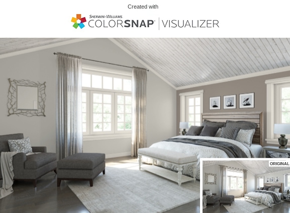
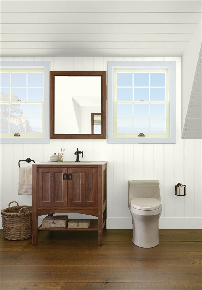
Sherwin Williams Alabaster White
Perhaps the most popular farmhouse white paint color is Alabaster (SW 7008) by Sherwin Williams. This neutral white has a creamy soft base with faint yellow undertones that look more off-white in some lighting.
An LRV (light reflective value) of 82 means that Alabaster has a higher reflectivity, making spaces look more open and bright. It’s the perfect choice for making smaller living rooms look bigger or creating a calming aura in the bedroom. You can even use this color for rustic kitchen cabinets.
Give your space more dimension to prevent the room from feeling stark and unwelcoming with a soft darker gray for the ceiling, such as Quest Gray (SW 7080). Then use a warm gray with subtle undertones of lavender and blue for the window trim, like Tinsmith (SW 7657).
Silverplate by Sherwin Williams
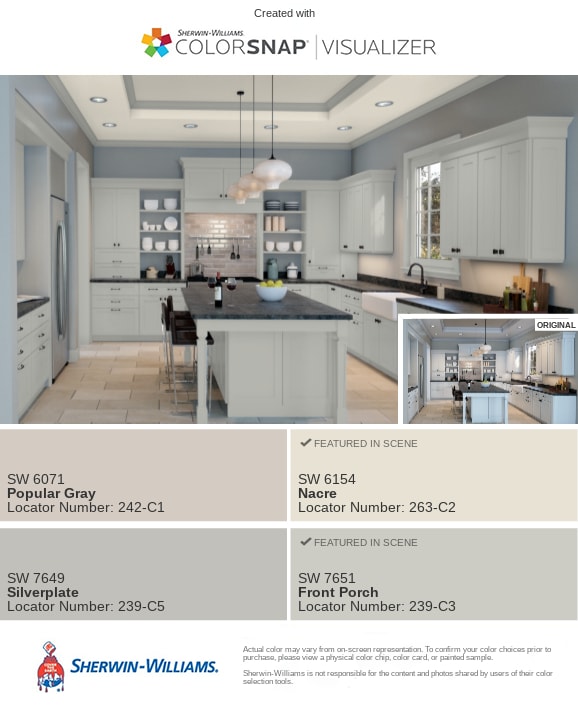
You can use farmhouse kitchen paint colors like a soft, cool, stormy gray for the walls. We love Sherwin Williams’ Silverplate (SW 7649) for its visual temperature – the color can look different in various lighting exposures.
This shade can look a stormy gray in southern light, while in northern lighting, it can have heavy blue undertones. A 53 LRV puts this color as a light-medium gray with blue-green undertones.
Finish the look with light-colored cabinets in a pale off-white like Nacre (SW 6154) and a lighter shade for the trim like Front Porch (SWA 7651), a soft gray with faint blue-purple undertones.
Sea Salt by Sherwin Williams
Sea Salt (SW 6204) by Sherwin Williams is the perfect shade for creating a soothing, relaxing bathroom retreat. But this gorgeous chameleon color can also look fabulous in bedrooms, laundry rooms, and mudrooms.
This soft, blue-green color is perfect for a beach-like, tranquil ambiance. Sea Salt can look gray in some lighting or around blues; when used around gray, it will look green. Or it can look blue next to a green. A 63 LRV gives this color some brightness without being too light.
Sea Salt makes an excellent pairing when combined with bright whites, like Extra White (SW 7006) – slight blue undertones – or High Reflective White (SW 7757), which is cleaner. But you could also go with off-whites like Greek Villa (SW 7551) or Alabaster (SW 7008).
Sherwin Williams Waterloo
Waterloo (SW 9141) is an earthy, neutral dark farmhouse blue paint with soft gray undertones that makes it versatile for multiple uses. This natural shade is cool with a subtle, soothing nuance and a low LRV of 13.
It looks fabulous for exterior use, paired with Alabaster trim and a lovely Mountain Air (SW 6224) door and shutters. But it might not be right to use in rooms with low lighting since it can cause your walls to look more closed off. This might be perfect for large rooms but not for small spaces.
Use coordinating colors like Warming Peach – (SW 6338), Rhinestone – (SWV 7656), or Malted Milk (SW 6057), or contrasting colors like Debonair – (SW 9139), Blustery Sky – (SW 9140), and Moscow Midnight – (SW 9142). Stark whites like Extra White or Pure White are perfect for trim.
Repose Gray by Sherwin Williams
Nothing screams farmhouse like a greige. We love Repose Gray (SW 7015) for its rich gray base with faint beige undertones. This neutral warm shade is the perfect color if you’re looking for one shade to use throughout the whole house.
We especially love the relaxing, romantic shade used in a farmhouse bedroom. The undernotes of blue and light violet become more prominent in rooms with a lot of natural or northern light and can turn this warm color cool.
With a 58 LRV, Repose Gray is a lighter color that pairs well with Pearly White (SW 7009) for the trim and beadboard ceiling and an accent wall in Elephant Ear (SW 9168).
Puritan Gray by Benjamin Moore
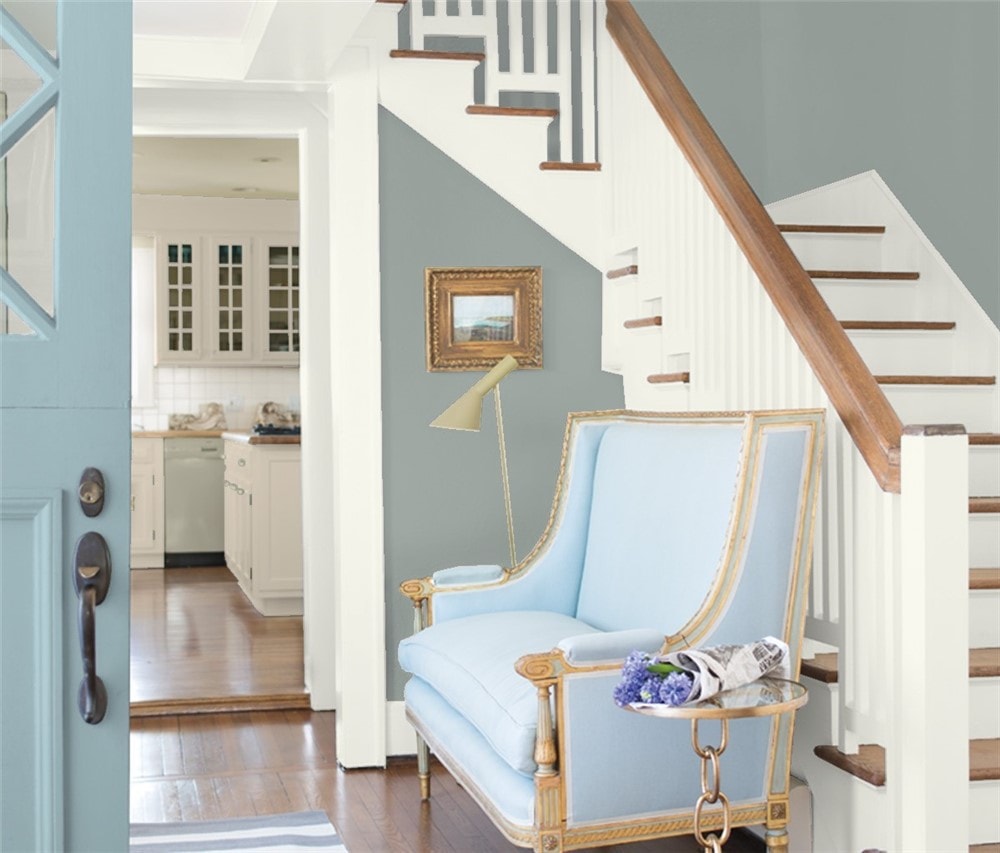
Benjamin Moore offers a gorgeous farmhouse gray – Puritan Gray – that can look smokey blue in some lighting due to the lustrous darker hues and lower 33.71 LRV.
This shade falls into the trend for modern farmhouse paint colors consisting of stormy hues of gray with undertones of blues, greiges, greens, and purples.
It looks fantastic for entryways, paired with a blue door (try Cape Blue – 1642) and trim in an off-white with cool gray undertones (we love Steam – AF-15). Or you can use it for dramatic yet soothing bedrooms or bathrooms. It’s genuinely a shade you can use anywhere!
Wythe Blue by Benjamin Moore
For a farmhouse green paint with a light-medium gray base and blue undertones, we turn to BM’s Wythe Blue. This exotic chameleon color has a strong visual temperature (with a low LRV of 48), allowing it to change its look based on lighting.
When there’s low lighting, this shade becomes more gray dominant with muted green and blue undertones – perfect for bathrooms. But in bright spaces with lots of natural light like family rooms or living rooms, this color can look more tropical with citrusy blue and green highlights.
Or you can give your kitchen a modern farmhouse feel by using this versatile color for cabinetry and the island with cool gray walls (Athena 858), light trim (White Dove – OC-17), and dark wood floors. It can also look incredible for the cabinets in the mudroom or laundry room.
Kendall Charcoal by Benjamin Moore
Another modern farmhouse color that can make a major statement is Kendall Charcoal (HC-166). This rich, luscious dark neutral has a greenish-grey tint that pops with color while keeping a dark, moody nuance due to a 12 LRV.
This color can stand out as your home’s exterior color or for interior use, as the color choice for your walls in the bedroom, office, or cabinetry in the kitchen, bathrooms, or laundry room.
Plus, it can work for the wall color for small rooms or as a focal piece for an accent wall with light neutral trim (try White Diamond OC-61 or Metallic Silver 2132-60) and accents.
Benjamin Moore White Dove
For a soft, lightly-toned farmhouse white, try Benjamin Moore’s White Dove (OC-17). This bright white – LRV of 85 – color is a popular choice for trim, moldings, and cabinetry.
It can also work for walls, showing off a slight bit of gray undertones without looking like too much of a cream. Although if there’s too much light in a room, the color can look washed out.
Use White Dove for the trim throughout your home or for giving your kitchen a brighter, open feel. It’s also a soothing shade to use for bathrooms with a bluish-gray (Bunny Gray 2124-50) trim and a cool Winter Orchard (1555) for shiplapped ceilings.
Million Dollar Red by Benjamin Moore
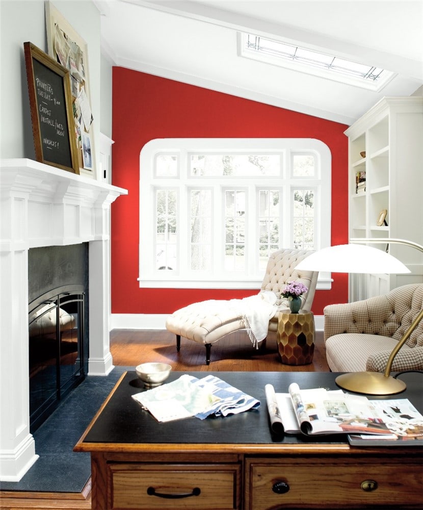
Farmhouse colors don’t have to be light neutrals like grays, whites, and creams. You can also go with something dramatic and country, such as Million Dollar Red.
Now, this color isn’t something you’ll want to use in large commodities, and it won’t be suitable for all areas of the home. But it can make a fantastic accent wall or a stylish exterior door. And it can make for a bright pop of color in a home office to help energize and focus your mind.
This color’s low LRV of 10 means it’s a duller shade that absorbs light, so it probably won’t look right in small dark spaces. Pair with neutrals like Pure White (OC-64), Gray Cashmere (2138-60), or Distant Gray (2124-70).
Behr Sunken Pool
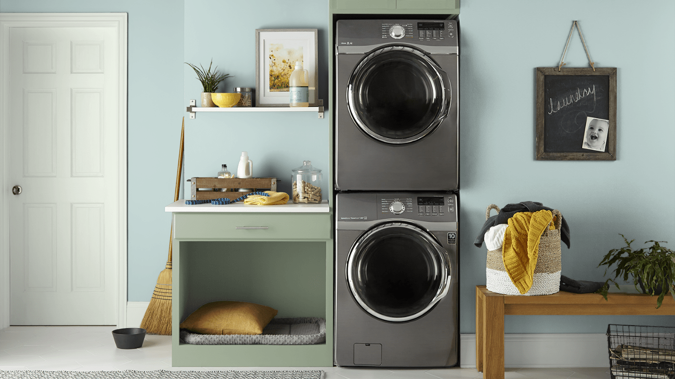
If you’re looking for a cool, icy blue with faint traces of gray with a higher LRV of 69, you’ll fall in love with Sunken Pool (S440-1) by Behr.
You can use this cheerful blue on your ceiling, for shiplap color, or as an accent color. We love it as the wall color for a classy laundry room.
Add some Roof Top Garden (S390-4) blueish-green cabinetry, Mayfair White (M390-1) for the trim, and paint the door Unwind White (GR-WO5) and you’ve got a farmhouse color palette sure to be the envy of everyone.
Behr Compass Blue
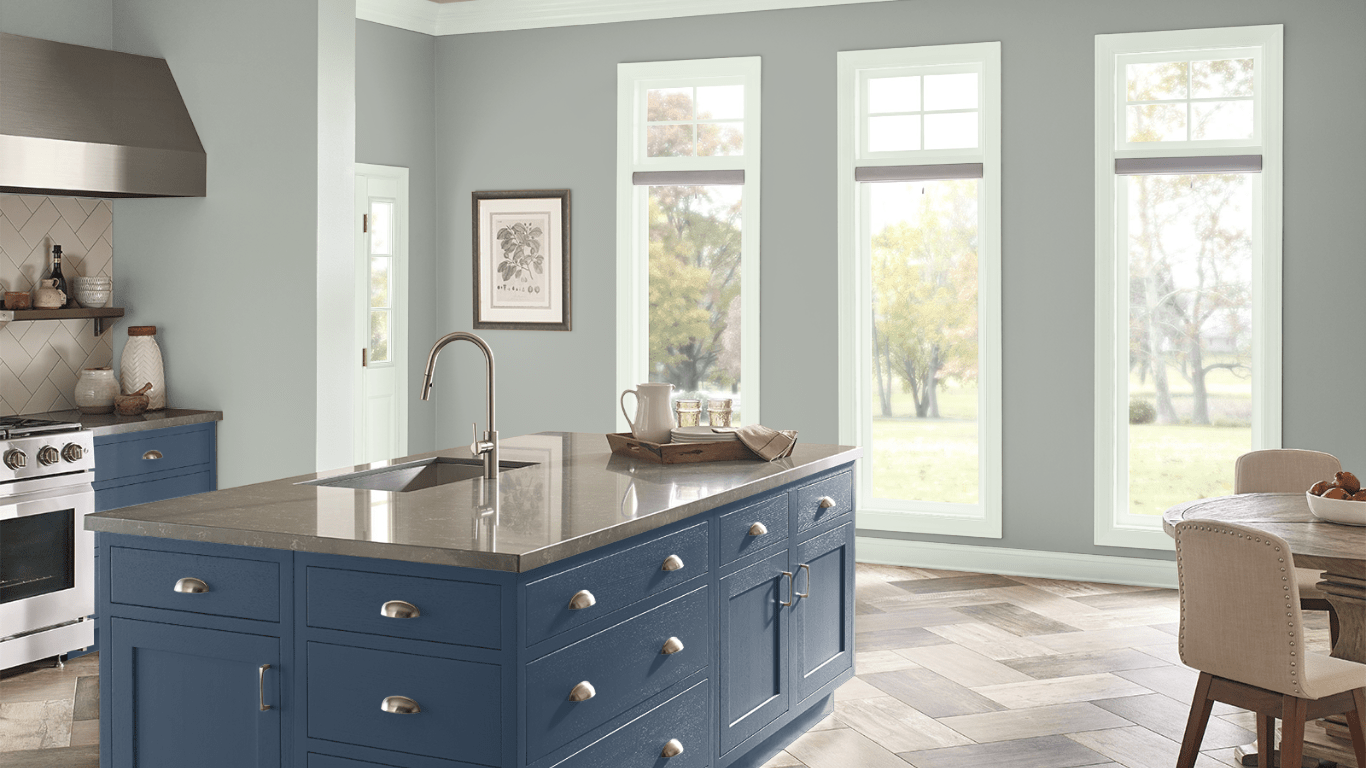
You can create a drop-dead-gorgeous farmhouse kitchen using neutral colors combined with one dominant bold shade, like Behr’s Compass Blue (MQ5-54), a darker blue with an LRV of 6. This shade looks fantastic for a kitchen island and lower cabinetry.
Then use a light neutral gray for your uppers – preferably open shelving – like Riverdale (N410-3), which can show lavender undertones in some lighting. Behr’s Flipper (another gray – PPU25-15) is a slightly darker shade.
You can use a lighter color for the trim, such as In the Spotlight (M570-1) or Unwind (GR-W05), two shades of off-white.
Behr Weathered Moss
Behr’s Weathered Moss (N380-3) is a soft, cool, medium-light shade of gray with green, blue, and yellow undertones.
This color looks fantastic in bright living rooms and blends well with complementary colors like Wheat Bread (720C-3), Riverdale (N410-3), or In the Spotlight (M570-1) for the trim and fireplace mantle.
It’s also a soothing color for bedrooms, kitchens, or offices.
Farmhouse Color Pairings
- Muted Navy
- Blush Pink
- Washed Taupe
- Mauve
- Creamy White
- Charcoal
- Butter Yellow
- Soft Wheat
- Subtle Silver
- Mink
- Matte Gold
- Distressed Beige
- Owl Grey
- Midnight Black
- Sage Green
Farmhouse Colors LRV – What is It and Why It Matters
One of the biggest things to consider when picking the right farmhouse paint colors for your home is the shade’s LRV.
LRV stands for Light Reflective Value and refers to how well the color reflects the light out to make a space look brighter rather than absorbing it.
Paint colors can have an LRV ranging from 0 to 100, where the higher the color’s value, the more reflective the paint. Conversely, the lower an LRV, the darker the color will look and the darker the space will seem.
To put this value range in perspective, a standard black has an LRV of zero, meaning it absorbs light and looks very dark. On the other hand, standard white has a value of 100, which means it reflects light into the environment, making the room look brighter and more open.
Use Samples to Narrow Down Your Color Choice
Picking the right color combination for your space can be a tricky task. Rather than make a quick decision on which color you want to use, it’s always recommended to take the time to see how multiple colors look side-by-side.
Give yourself a few days to live with the different shades, seeing how each color looks in various types of lighting, including little to no light and heavily lit with natural and artificial light sources.
One way to test your different colors is to paint test strips on your wall. But an easier and more convenient method is to use shades purchased from Samplize.
These 12” x 12” patches of paint peel and stick to the wall, making it easy to relocate them to different wall locations or examine various lighting scenarios.
Final Words
The Farmhouse trend can be modern, traditional, chic, or industrial, giving you a wide range of style choices. As this list shows, you can choose from many colors, from neutrals, grays, whites, and greiges to bolds like red, blue, green, and charcoal.