Breezeway by Behr Paint Color Review
Imagine a sense of calm that is so restorative, so infused with refreshing energy, that it is actually in motion. Something that travels with you and enlivens you as you make your way through your day.
That is what Behr had in mind when they created their 2022 Color of the Year: Breezeway. Come explore this color with me, and find out the secrets of its active calm.
What Color is Breezeway?
Breezeway is a very light green-blue color, with a slight silver shading to it. As suggested by its name, this is a light and airy color, reminiscent of tumbled seaglass.
LRV of 66
Breezeway has a light reflectance value (LRV) of 66. LRV is designed to measure how bright a color is and runs on a scale from absolute black at 0 to pure white at 100. At 66, Breezeway is close to what many designers consider the ideal range for the widest variety of lighting conditions, which is 60-62.
What Undertones Does Breezeway Have?
Breezeway has slight silvery gray undertones. In action, you’re really only going to notice its component colors of green and blue.
Is Breezeway a Cool Color or a Warm Color?
As a green-blue, Breezeway is definitely a cool color, bringing to mind bubbling water and fresh air. Its silver undertones add to this cool slant.
Where Can You Use Breezeway?
Breezeway is light enough to be used as a main wall color anywhere in the home. Its cool, refreshing tones make it a natural pick for places we associate with water, like the kitchen and bathroom.
This color will open up spaces that are dark or small, using the magic of light colors to make the space larger. If your space is already open enough, or if you’re looking for a cozier feeling, anchor Breezeway with darker colors for the ceiling and floor, or use neutrals in your decor and furnishing to balance the space.
Breezeway can create a serene, meditative haven away from the world, or bring in that touch of nature where it can soothe you best. That makes it an excellent choice for bedrooms, living rooms, reading nooks, or anywhere else that you like to relax.
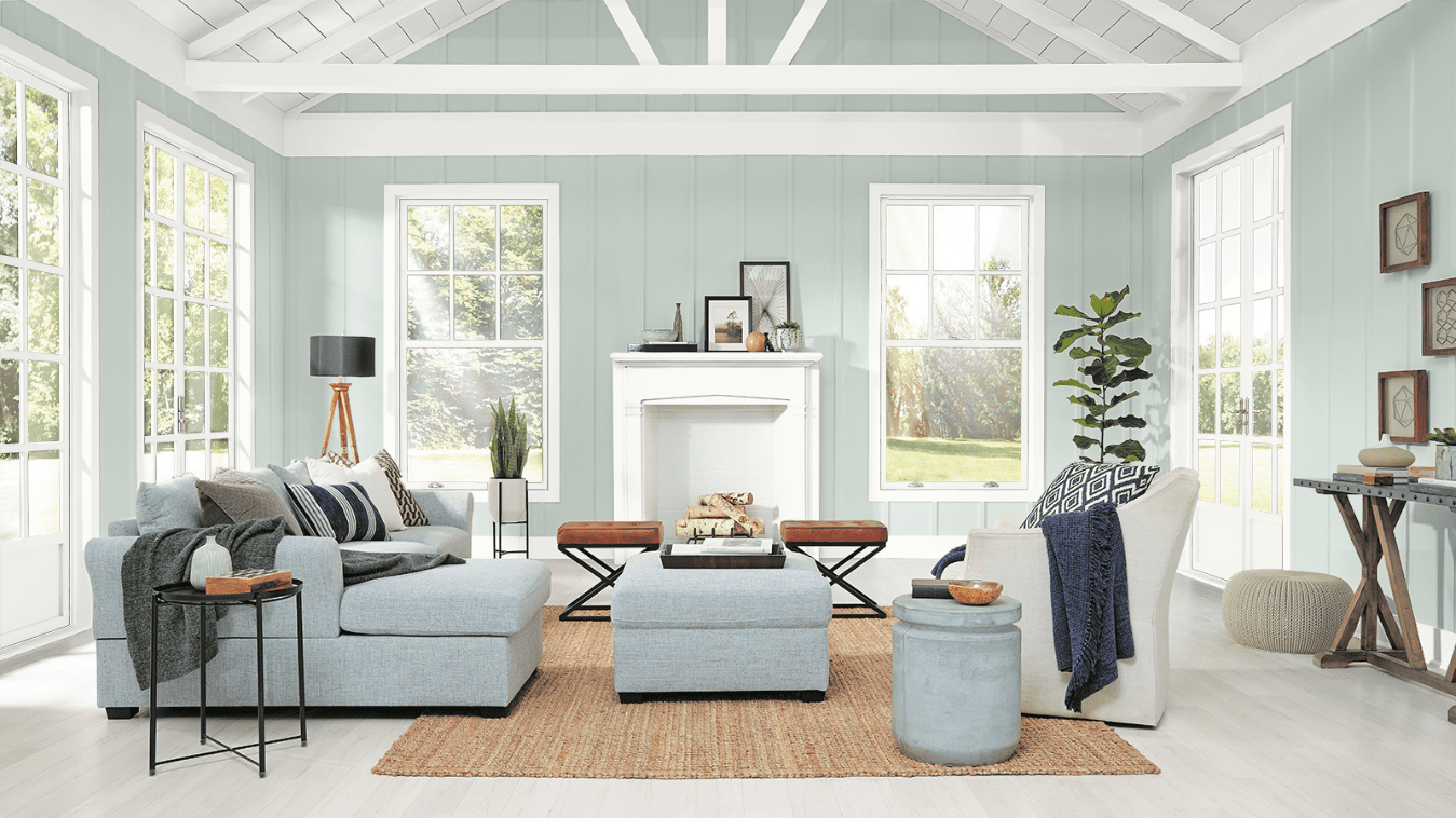
Let’s take a look at Breezeway in action, and get inspiration for our own projects!
Entryway
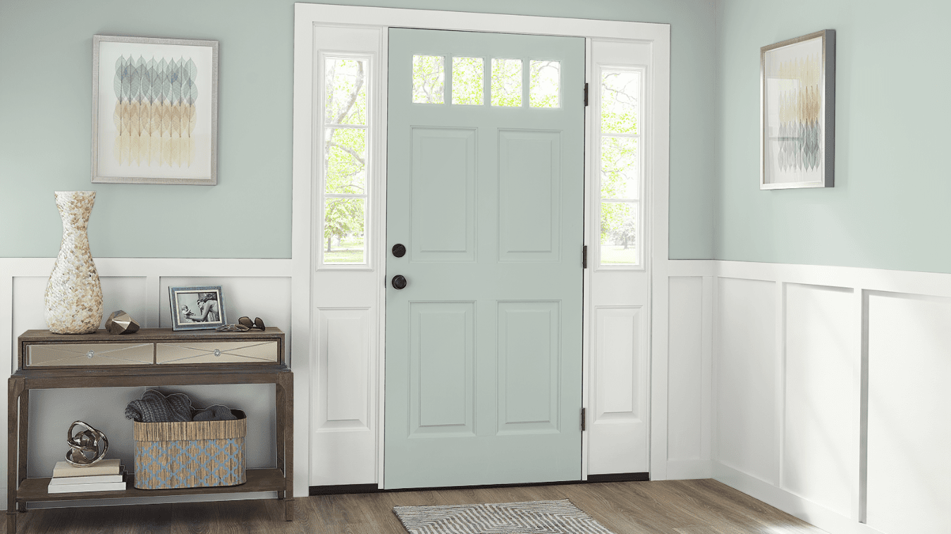
Turquoise and teal are on-trend colors for front doors, and Breezeway is an eye-catcher.
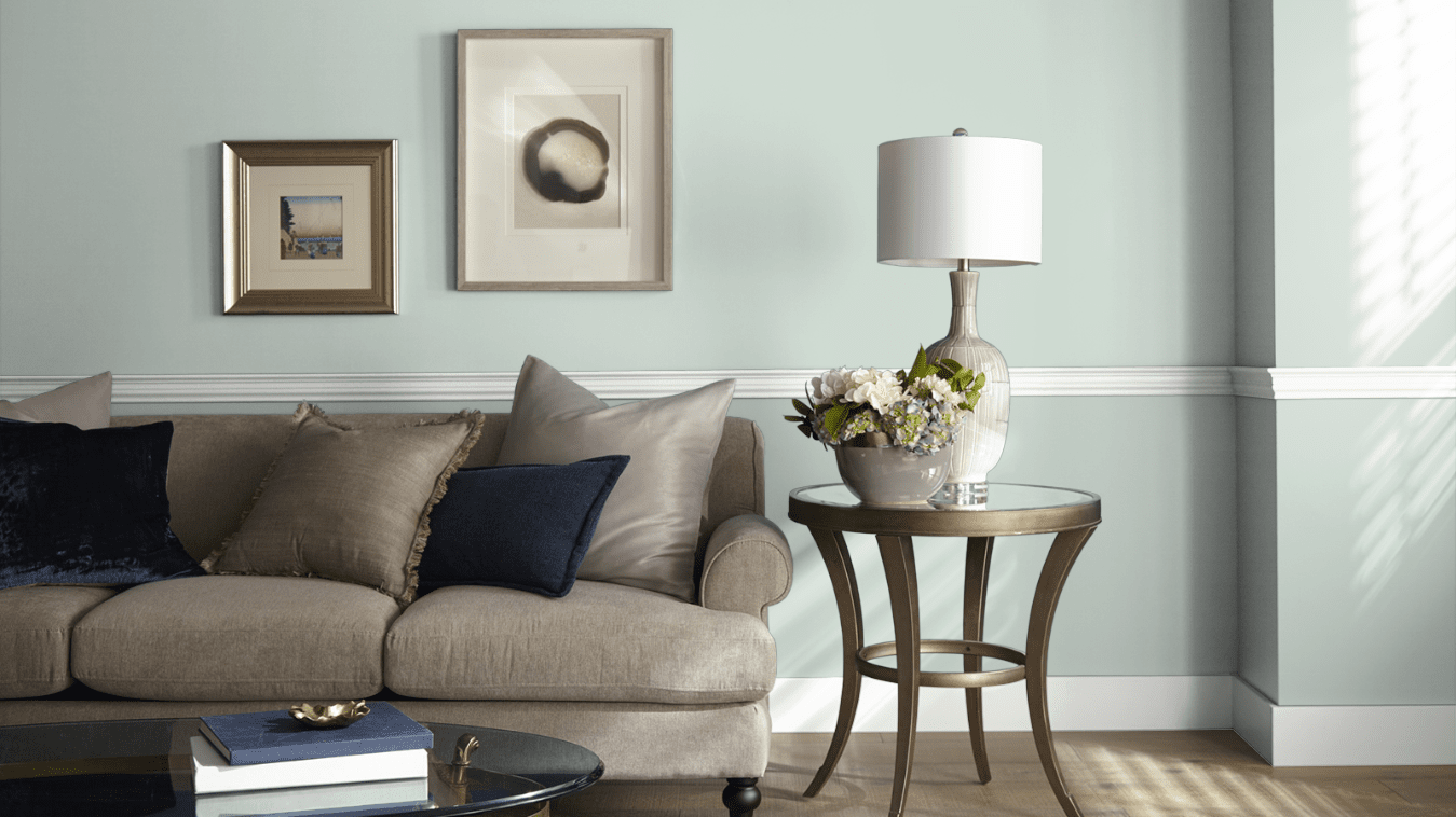
Living Room
Breezeway is a light and refreshing counterpoint to the neutral furnishings in this living room.
Blues are fantastic coordinating colors for Breezeway, and both colors will look more vibrant next to each other.
Kitchen
As a subtle color for cabinets and islands, Breezeway is the perfect complement to white kitchens.
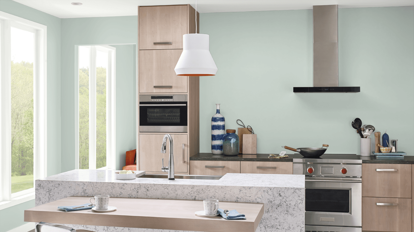
The subtle silver shading in Breezeway picks up the gleam of metalwork and appliances, making it a natural fit for kitchens and bathrooms.
Home Office
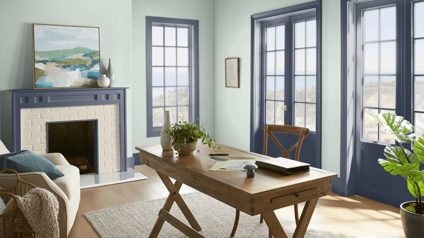
Breezeway and Dark Navy pair up in this home office for an extra visual punch.
Bedroom
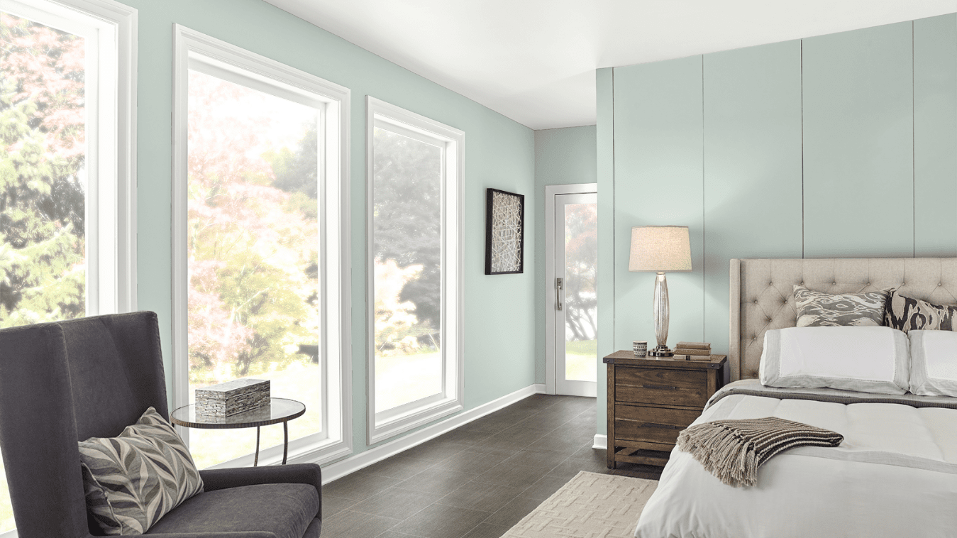
Breezeway creates a serene and inviting retreat in this bedroom.
Bathroom
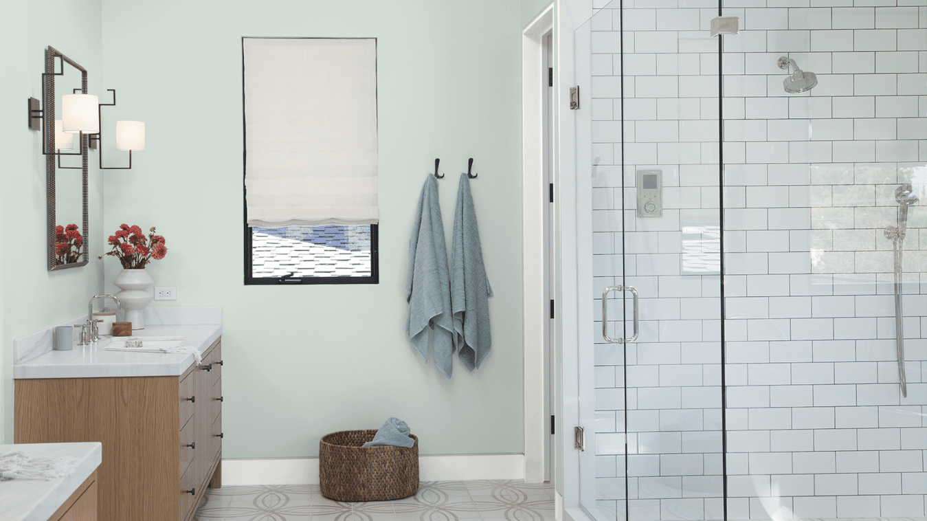
Sometimes all it takes is a fresh coat of paint to bring some serious spa vibes, and Breezeway is up to the task!
Coordinating Colors for Breezeway
Breezeway is a light and cool color that looks best with other cool colors, like blues, greens, and grays. Dark charcoal grays are particularly striking contrast colors for Breezeway.
Darker teals and turquoises can be accent and trim colors for Breezeway. You’ll notice more green or blue out of Breezeway depending on what it’s next to.
Whites will amplify Breezeway’s cool and refreshing energy. I recommend high-LRV cool whites or neutral whites for Breezeway, rather than warm whites or off-whites.
Navy blue is a handsome companion for Breezeway, and both colors will bring out the best in each other. Consider a trio of Breezeway, navy blue, and white.
Here are some coordinating color ideas for Breezeway to help inspire your palette:
- Zen by Behr
- Wave Top by Behr
- Explorer Blue by Behr
- Cracked Pepper by Behr
- Whisper White by Behr
- English Channel by Behr
- Pure White by Sherwin Williams
- Dress Blues by Sherwin Williams
- Kendall Charcoal by Benjamin Moore
- Chelsea Gray by Benjamin Moore
- Chantilly Lace by Benjamin Moore
- Aegean Teal by Benjamin Moore
- Atmospheric by Benjamin Moore
- Azure Water by Benjamin Moore
How Does Breezeway Compare to Other Colors?
Breezeway vs Frosted Jade by Behr
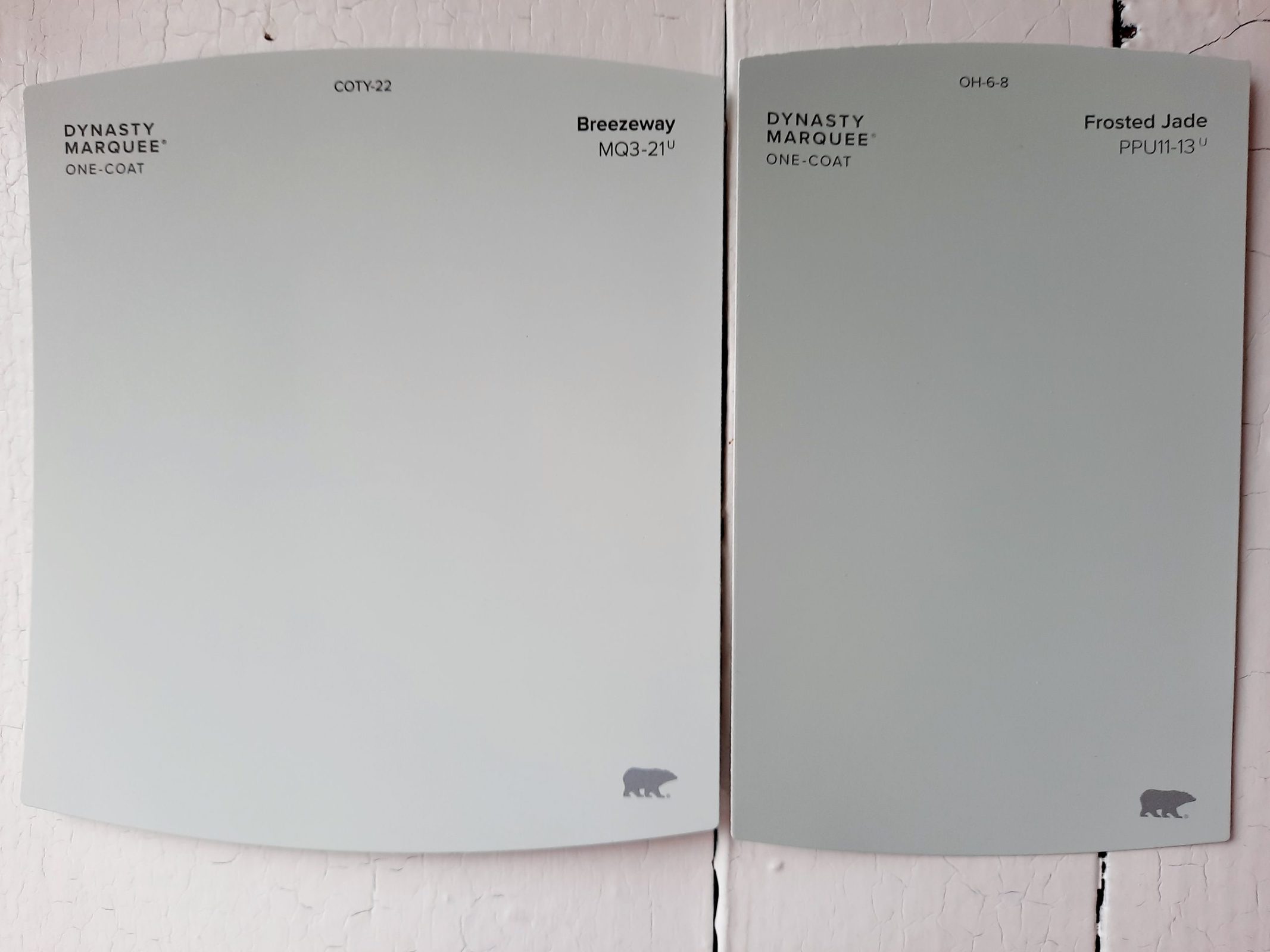
Frosted Jade might be the Behr color that comes closest to Breezeway. It’s a touch darker than Breezeway, with a LRV of 61 to Breezeway’s 66. It’s also greener than Breezeway.
Breezeway vs Seaglass by Behr
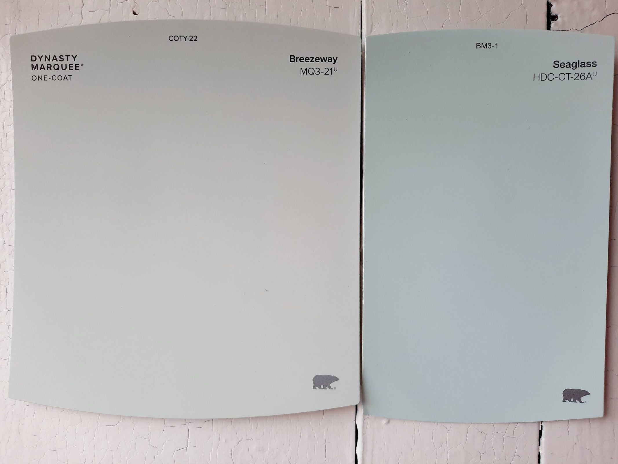
Breezeway gets referred to as a “seaglass green” so often, you might think that Seaglass is a related color. It’s not as close as you might expect. This paint color is more of a turquoise, both brighter and more blue than Breezeway. Its LRV is a super-light 75.
Breezeway vs Rainwashed by Sherwin Williams
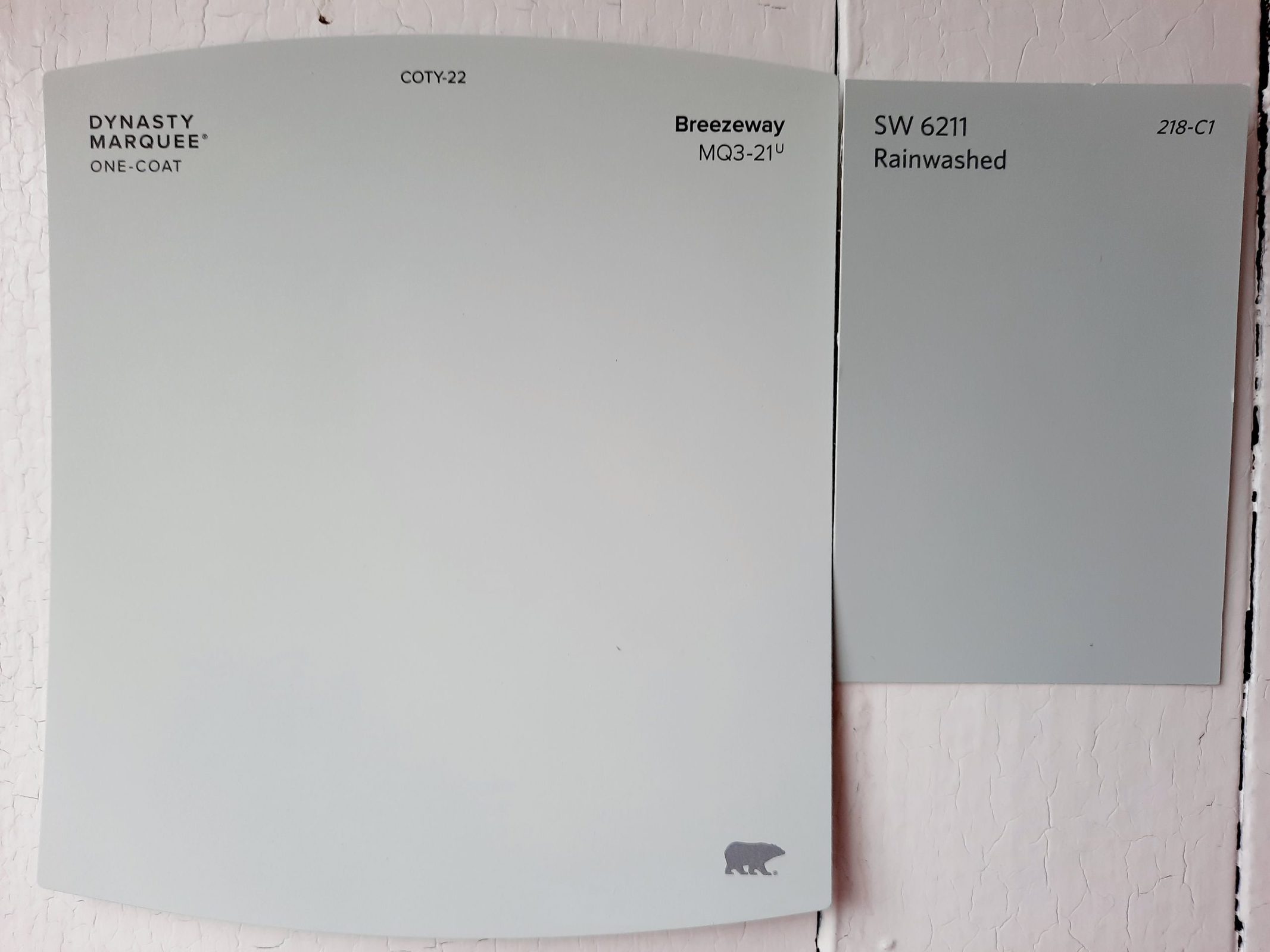
If you’re looking for a Sherwin Williams match to Breezeway, Rainwashed is just about perfect. It’s a little darker, with a LRV of 59 versus Breezeway’s 66, but otherwise, it’s as close as you can get.
Breezeway vs Serene Breeze by Benjamin Moore
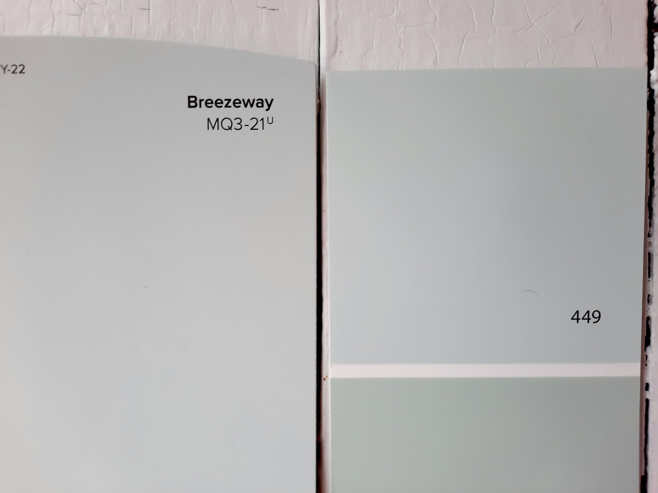
Similarly, Serene Breeze is just about a perfect match to Breezeway from Benjamin Moore’s catalog. Its LRV of 69.3 is a closer match than Rainwashed, making these two colors look nearly like twins.
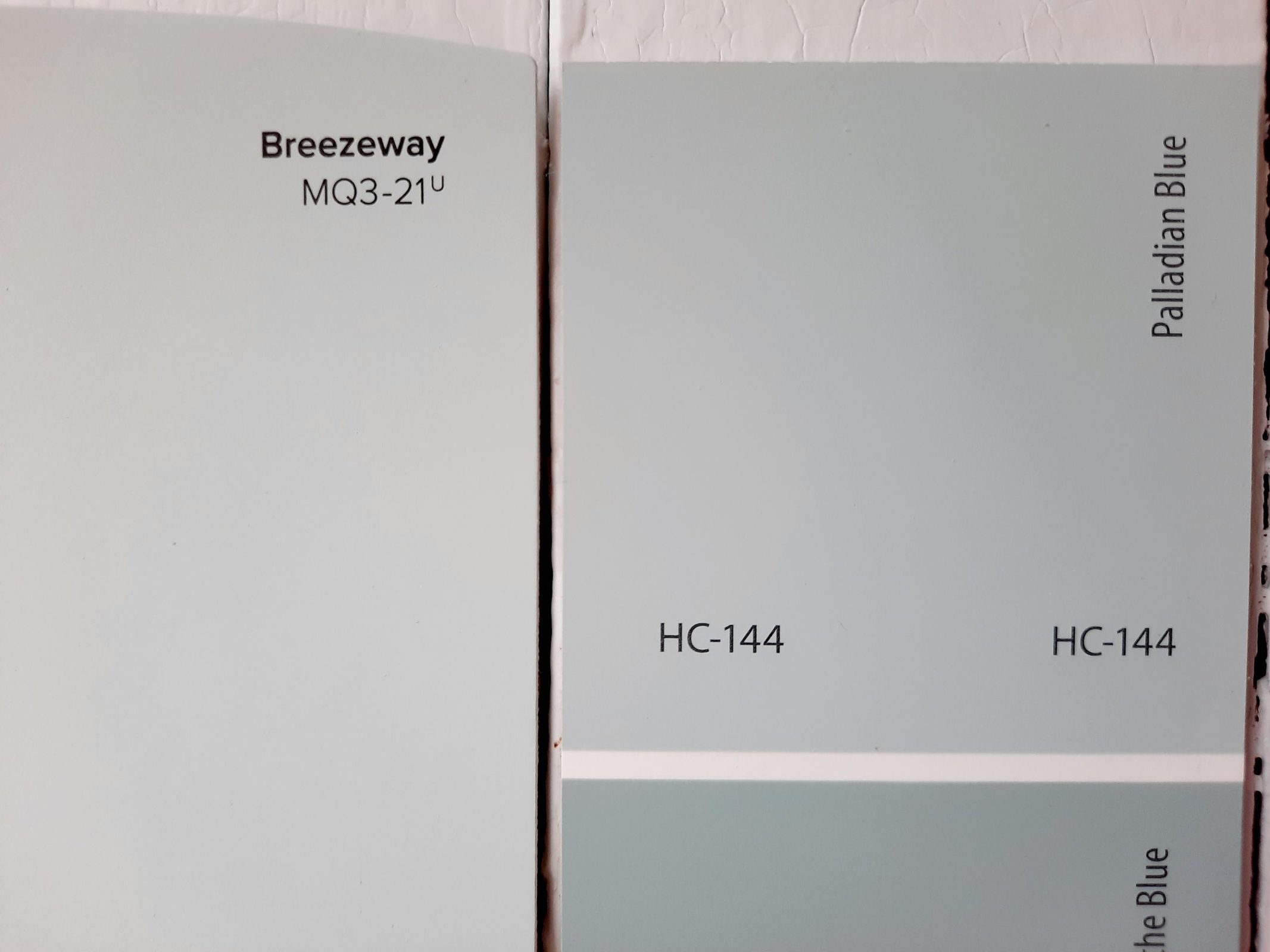
Breezeway vs Palladian Blue by Benjamin Moore
Final Thoughts
Breezeway is a fantastic combination of calm and liveliness that can bring a very welcome freshness to any space. This light and airy color is suitable for spaces with any lighting conditions, and unobtrusive enough to suit a wide variety of decor styles.
If your house could really use some waking up, Breezeway might be exactly what you’re looking for.