Pashmina by Benjamin Moore
As we spend more and more time inside our homes, it’s become popular to bring more of the outdoors in to our personal environments.
The colors of the natural world bring us refreshing calm in the midst of our hectic lives. While blues and greens are well known for this soothing effect, there’s another group of colors we can look to for nature’s comforts: earthy neutrals.
Browns, tans, taupes, and greiges can evoke natural elements like soil, sand, wood, and stone. The influence they create is grounding and balancing.
An excellent example of these natural neutrals is Pashmina, from Benjamin Moore.
What Color is Pashmina?
Pashmina is an earthy, neutral greige color. A greige is a blend of gray and beige that creates a balanced and versatile neutral.
Pashmina leans towards its beige side, making it a more taupe-toned color than most greiges.
LRV of 44.2
Pashmina has a light reflectance value (LRV) of 44.2. Light reflectance value is a scale designed to measure how bright a color is, and ranges from absolute black at 0 to sheer white at 100. The lower the number, the darker the color.
What Undertones Does Pashmina Have?
Pashmina has notable green undertones that you’re likely to see under late afternoon sunlight. This is similar to the green flash in Revere Pewter, a fellow greige color.
Next to purples or pinks, you may notice that the green undertones are stronger, thanks to the effect of these complementary colors.
But in some lighting situations, you may not see any green in Pashmina at all.
Also, it’s worth noting that Pashmina does not have the purple undertones greige colors often share.
Is Pashmina a Warm Color or a Cool Color?
While Pashmina carries the balance of a greige color, it is a warm greige, and significantly warmer than most greiges out there. These warm tones make Pashmina feel earthy and organic.
Where Can You Use Pashmina?
Pashmina is a color with body to it, which helps it withstand bright lighting. This makes it an excellent choice for an exterior color.
Pashmina is also great for kitchen cabinets, islands, and bathroom vanities. You’re most likely to pair it with a lighter wall color, but you could also go in for a distinguished-looking darker color, such as a navy blue or charcoal gray.
Since Pashmina is itself a darker color, you may find that it’s not the best wall color choice for smaller rooms or those that don’t receive as much light. But its earthy warmth can definitely make a room feel more comforting and cozy.
Let’s get down to earth with Pashmina, and see how its cozy and cool combination works in real rooms.
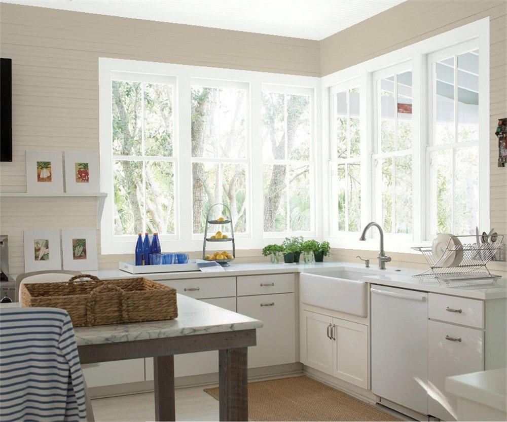
Kitchen
White countertops and kitchen cabinets will really pop against Pashmina walls.
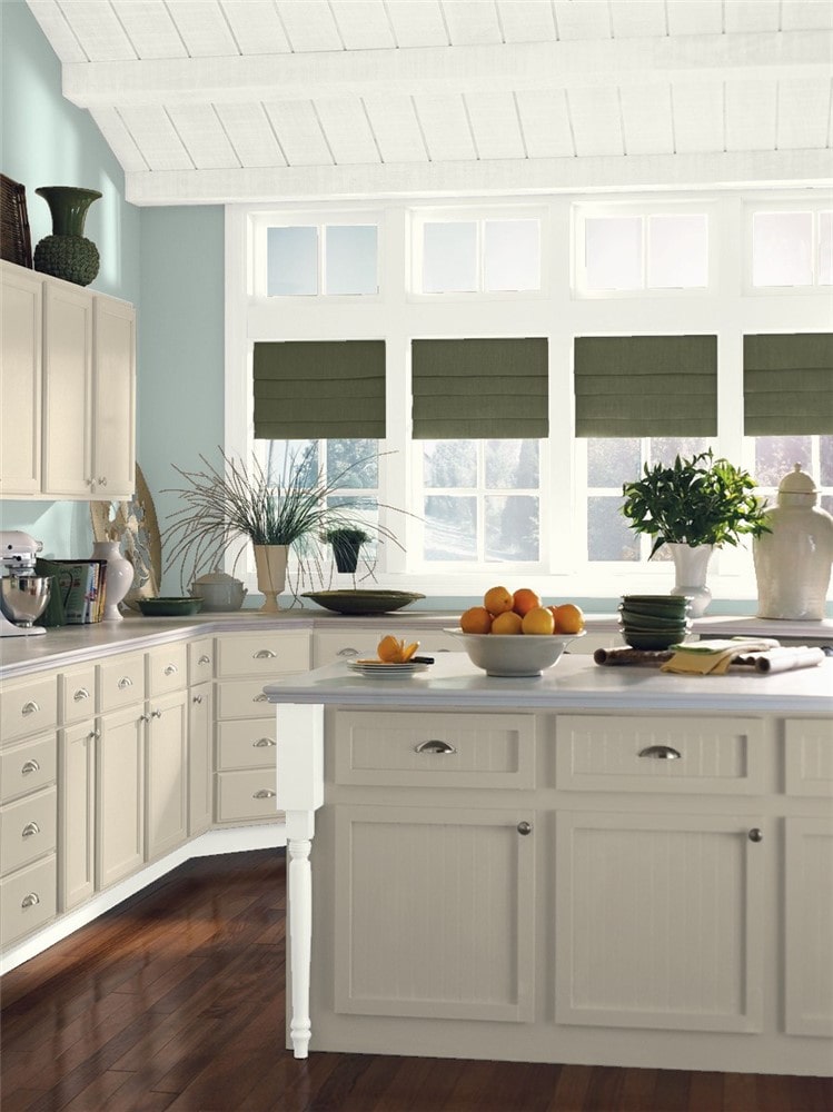
Pashmina cabinets give an organic, cozy feeling to this kitchen while Palladian Blue walls create a refreshing balance.
Dining Room
Breaking up a darker color like Pashmina with a lighter coordinating color can create interest and keep a room from getting too cave-like.
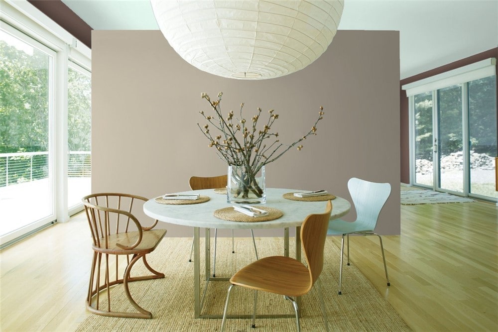
Pashmina creates a neutral backdrop to tie together this elegantly minimalist dining room.
Living Room
Pashmina calls out the natural tones of the stone hearth in this comfortable modern living room.
Bathroom
This bathroom transformation uses Pashmina and Sherwin Williams’ Evergreen Fog to create a cottage forest, calling out the colors in the charming animal-themed wallpaper.
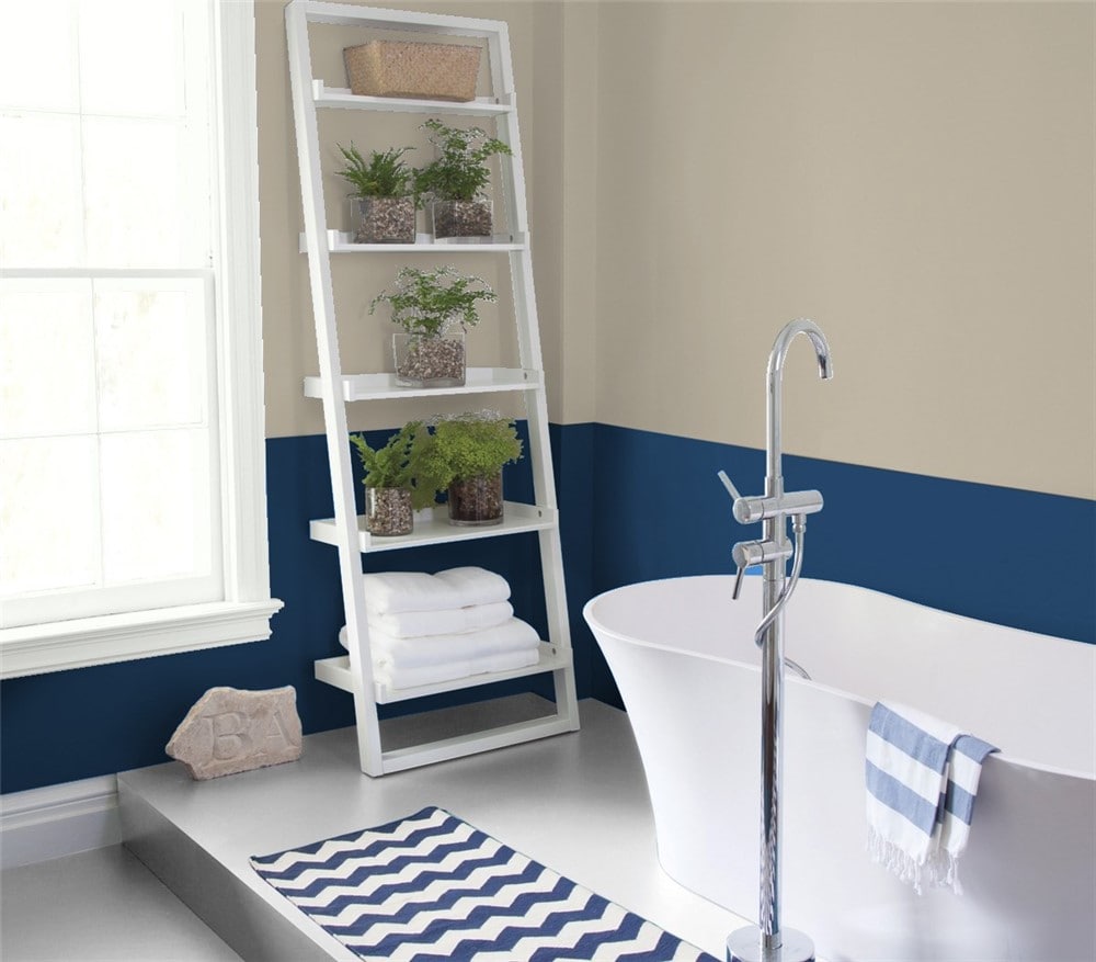
The cool tones of Downpour Blue contrast with the earthy warmth in Pashmina to make a bathroom that feels refreshing and relaxing.
Bedroom
Pashmina walls in this bedroom draw the eye and give it a formal feel.
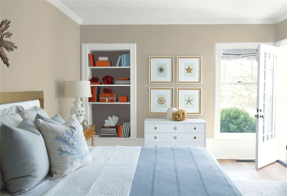
Pashmina can work in coastal decor styles as a sand-inspired color.
Home Office
Eclectic modern decor jazzes up this home office, while Pashmina keeps everything coordinated.
Entryway
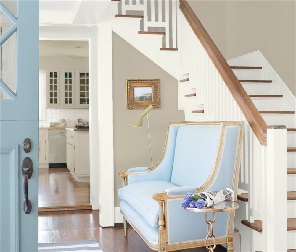
Pashmina in this sunlit entryway is warm and inviting.
Exterior
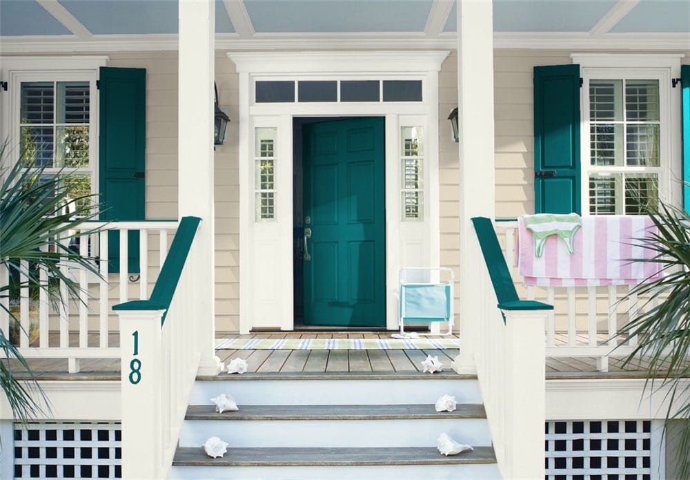
Pashmina and Beau Green team up to create an eye-catching exterior with lots of curb-appeal.
Pashmina Coordinating Colors
Pashmina is a neutral with lots of versatility. You have plenty of options when it comes to coordinating colors for this toasty greige.
Blues give a refreshing, cool contrast to Pashmina’s earthy warmth, and pick up on its gray tones. You can get a more formal, traditional look with a navy blue, or something lighter and more contemporary with a light blue or blue-green.
Off-whites and creams are luscious against Pashmina, where they have the chance to really glow. Consider them for trim options against a Pashmina wall.
Darker browns and grays are nice neutral options that will work especially well with Pashmina in minimalist decor styles.
Not sure where to begin with coordinating colors for Pashmina? Here’s some inspiration for you to play with.
- Deep in Thought by Benjamin Moore
- Cinder by Benjamin Moore
- White Dove by Benjamin Moore
- Providence Blue by Benjamin Moore
- Rockport Gray by Benjamin Moore
- Gray Cashmere by Benjamin Moore
- Palladian Blue by Benjamin Moore
- Cinnamon Slate by Benjamin Moore
- Putnam Ivory by Benjamin Moore
- Smoke by Benjamin Moore
- Beau Green by Benjamin Moore
- Hale Navy by Benjamin Moore
- Deep Sea Dive by Sherwin Williams
- Naval by Sherwin Williams
- Sea Salt by Sherwin Williams
- Creamy by Sherwin Williams
How Does Pashmina Compare with Other Colors?
Pashmina vs Revere Pewter by Benjamin Moore
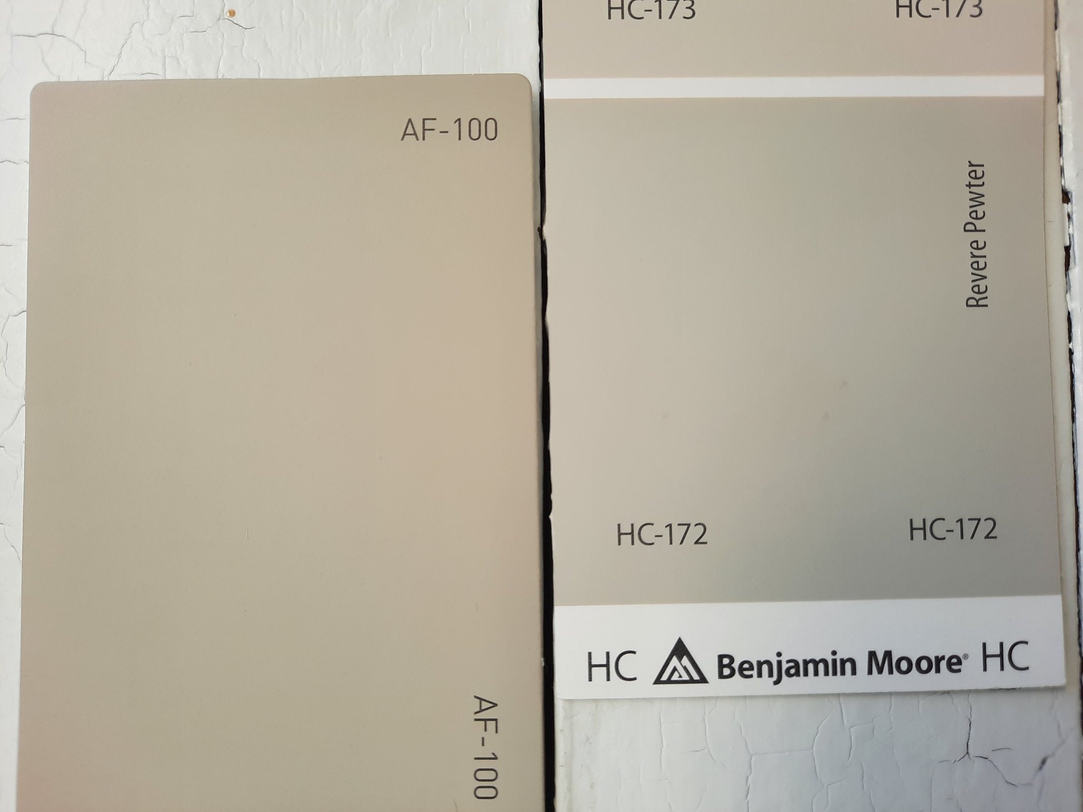
Revere Pewter is the king of Benjamin Moore’s greige lineup, with a devoted fanbase and enduring popularity.
It’s cooler than Pashmina, and has more gray, whereas Pashmina leans into its beige side. Both colors share a notable green undertone. Revere Pewter is also lighter than Pashmina, with a LRV of 55.05.
Pashmina vs Rockport Gray by Benjamin Moore
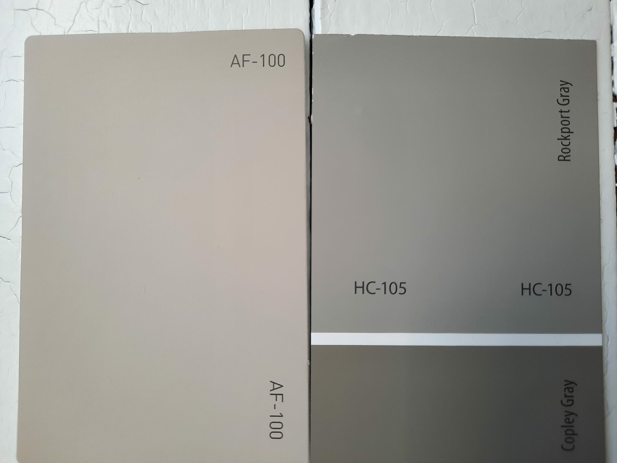
Rockport Gray is a gray-leaning greige in the same tonal range as Pashmina. It’s a cooler color than Pashmina, owing to that gray side. It’s also darker, with a LRV of 36.61. Rockport Gray makes a nice coordinating color for Pashmina.
Pashmina vs Perfect Greige by Sherwin Williams
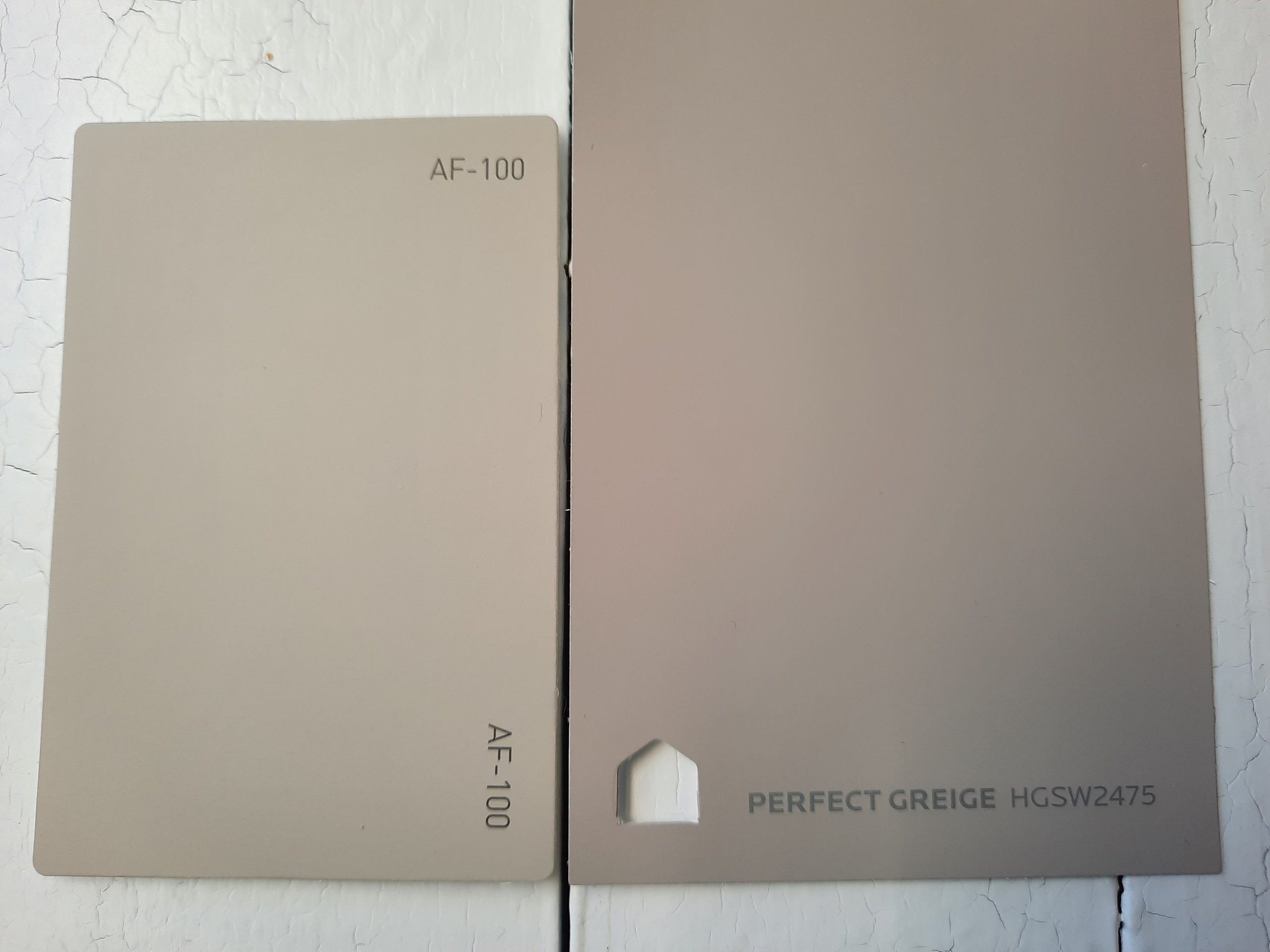
Sherwin Williams doesn’t really have a direct equivalent to Pashmina, but Perfect Greige is a close color. As far as differences between these two, Perfect Greige is warmer and a smidge darker than Pashmina. Perfect Greige has a LRV of 42.
Pashmina vs Anew Gray by Sherwin Williams
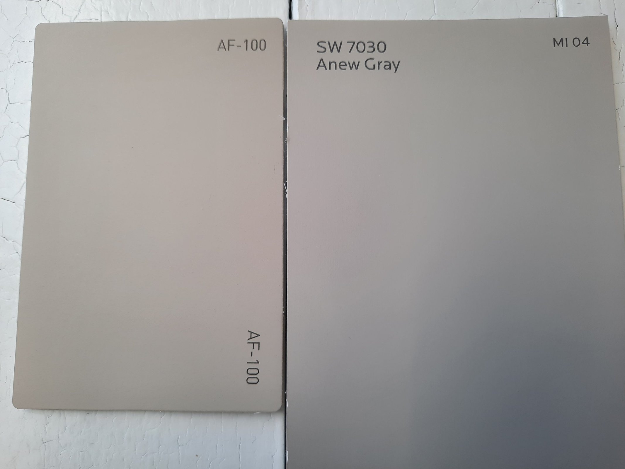
Anew Gray is a popular, easy-to-use greige from Sherwin Williams with a lot of versatility. As is the case with most greiges, Anew Gray is cooler and grayer than Pashmina. It’s a little bit lighter, with a LRV of 47.
Final Thoughts
Pashmina is an earthy neutral that brings warmth and grounding into any space. Its greige balance makes it user-friendly and versatile, open to a wide range of coordinating colors and decor styles. Bring some balance and calm into your next home refresh with Pashmina.