Sherwin Williams On the Rocks Paint Color Review
On the Rocks is a little bit earthy and a little bit dreamy; a little bit warm and a little bit cool; a little bit business and a little bit casual. It’s a nice relaxed color choice for your home to find a peaceful balance.
What makes On the Rocks such a balanced and versatile paint color? Let’s find a moment of zen while we explore On the Rocks and its decor possibilities together.
What Color is On the Rocks?
On the Rocks is a medium-to-light gray. It’s a part of the Sherwin Williams Living Well: Reflect collection, and is described as a soft, gauzy gray or a pastel gray.
LRV of 62
On the Rocks has a light reflective value, or LRV, of 62, making it a mid-to-light gray. Light reflective values of 60-62 are the favorites of many designers because they are adaptable to a wide variety of lighting situations.
On the Rocks Undertones
On the Rocks is a fairly balanced neutral gray, so you won’t notice a lot of strong undertones. It is a member of the gray family, so purple undertones are possible depending on your lighting conditions. It doesn’t really have the blues and greens that gray colors can be prone to.
Is On the Rocks a Warm or a Cool Color?
On the Rocks is a warm gray, but it’s cooler than a greige color would be. Overall, it doesn’t strongly lean towards either the warm or cool side, so once again I’d call it a balanced color.
Where Can You Use On the Rocks?
On the Rocks is a neutral color that you can put in any room of your home. It’s also great for home exteriors.
Its ideal LRV of 62 makes it widely adaptable to lighting conditions, so you don’t need to worry about this color getting washed out, or making your home too dark.
Let’s take a look at On the Rocks in different spaces and get inspired!
Exterior

Bright, direct sun will make On the Rocks look very light, but you can still see its contrast with the white trim, doors, and windows of this house exterior.
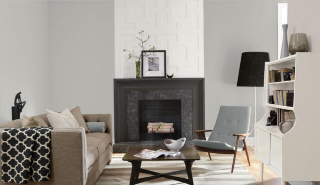
Living Room
On the Rocks draws together this casual living room. Subtle touches, like seagrass, coral, and striped seating, add a fresh-from-the-beach vibe.
This urban apartment has an open living room coordinated around On the Rocks. The contrast color above the fireplace is Let it Rain, a lovely cool blue gray that partners well with On the Rocks.
Office
This classic modern office pairs On the Rocks walls with Extra White trim, a color combo that Sherwin Williams recommends.
This home office uses On the Rocks as a canvas for soft pink flowers, warm wood, and antiqued white accents, to create a romantic, timeless feeling.
Kitchen/Dining Room
The cheerful lemon yellows in this farmhouse dining room’s decor are a lovely complement to On the Rocks.
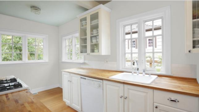
On the Rocks is a cool counterpoint to the warm woods in this kitchen. Its ability to flip from warm to cool is part of this color’s chameleon-like qualities.
Bedroom
This modern coastal bedroom is designed around peaceful, rocky grays. Can’t you just smell the sea salt and pine trees?
This den-to-guest-bedroom transformation was built by On the Rocks. Spectacular!
Bathroom
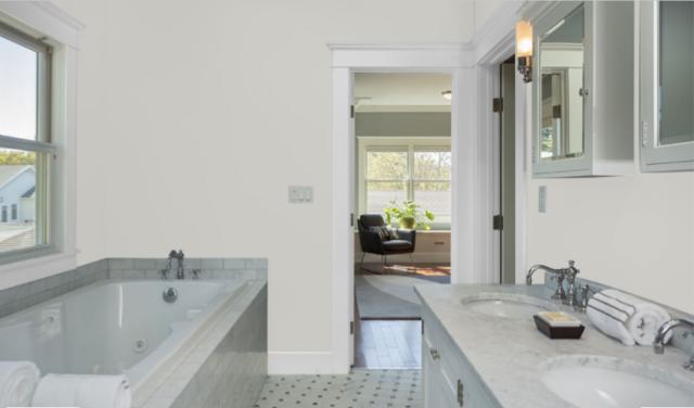
On the Rocks is a counterpoint to the other grays in this bathroom and warms up the whole room without wandering into yellow undertones. You wouldn’t likely notice this nifty effect if you weren’t pairing up On the Rocks with colors cooler than itself.
On the Rocks Coordinating Colors
Lots of decorating sites refer to paint colors as chameleons, but I feel that On the Rocks is a color that truly earns that name. Literally every time you hold its paint chip next to another chip, its entire look changes!
That means that On the Rocks is very adaptable, but it also means you’re likely to have a very personal response to how this color looks in your home, and with the coordinating colors you’ve chosen.
To get you started with a color palette for On the Rocks, Sherwin Williams recommends Greek Villa, Almond Roca, and Extra White. Brighter whites help On the Rocks to show off; stay away from creamy, yellowy off-whites.
For a nice contrast, you can put On the Rocks next to a darker gray, such as a charcoal, or a black. Black, white, and gray together makes for a sophisticated and dramatic look.
On the Rocks also works well with blues, especially darker ones, such as navy blue.
If you’re feeling adventurous, you can even take On the Rocks in a pink direction. Softer pinks will look romantic and feminine, while brighter pinks will look modern and lively.
What coordinating colors do you use with On the Rocks? Here are some ideas to inspire you:
- Sherwin Williams Slate Violet
- Sherwin Williams Mink
- Sherwin Williams Aleutian
- Sherwin Williams Loveable
- Sherwin Williams Marshmallow
- Sherwin Williams Snowbound
- Sherwin Williams Searching Blue
- Sherwin Williams Quaint Peche
- Benjamin Moore Kendall Charcoal
- Benjamin Moore Puritan Gray
- Benjamin Moore Cloud Cover
- Benjamin Moore Ashley Gray
How Does On the Rocks Compare With Other Colors?
On the Rocks vs Repose Gray by Sherwin Williams
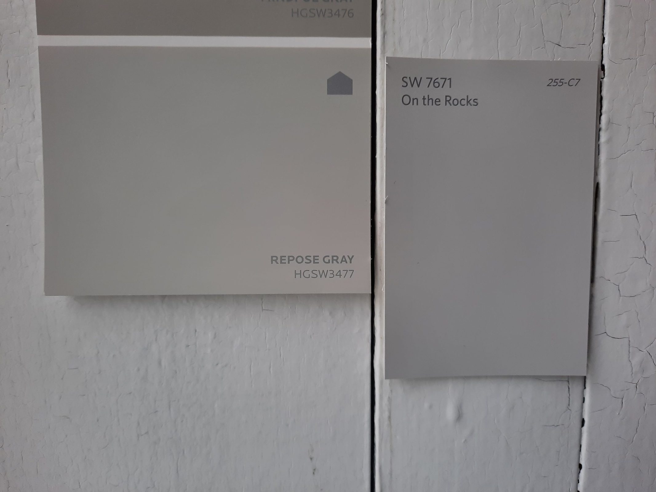
On the Rocks has a lot in common with another popular color from Sherwin Williams: Repose Gray. Checking them out side by side, you’ll notice that Repose Gray is a little warmer. It’s a greige color, so it’s got more of that beige mixed in. Repose Gray has a LRV of 58, which is a touch darker than On the Rocks (62).
On the Rocks vs Gray Owl by Benjamin Moore
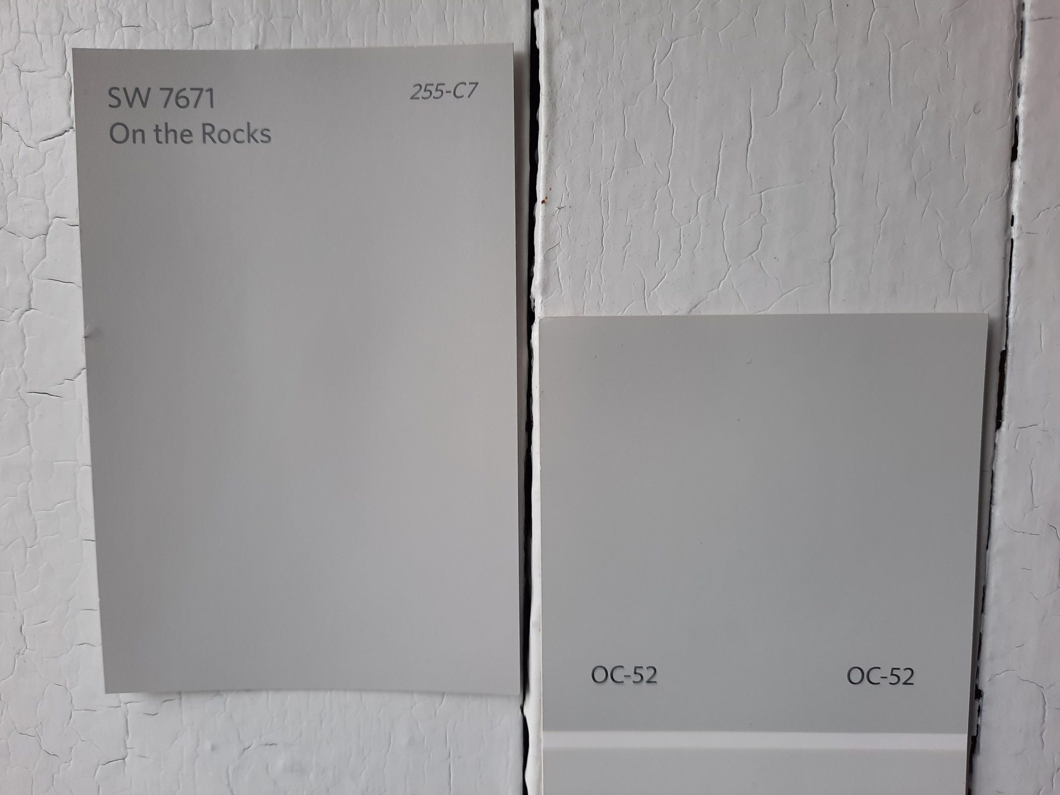
Gray Owl is one of Benjamin Moore’s most popular grays, and it’s also a member of the greige family that runs a little to the cool side. It’s slightly brighter with a LRV of 65.77.
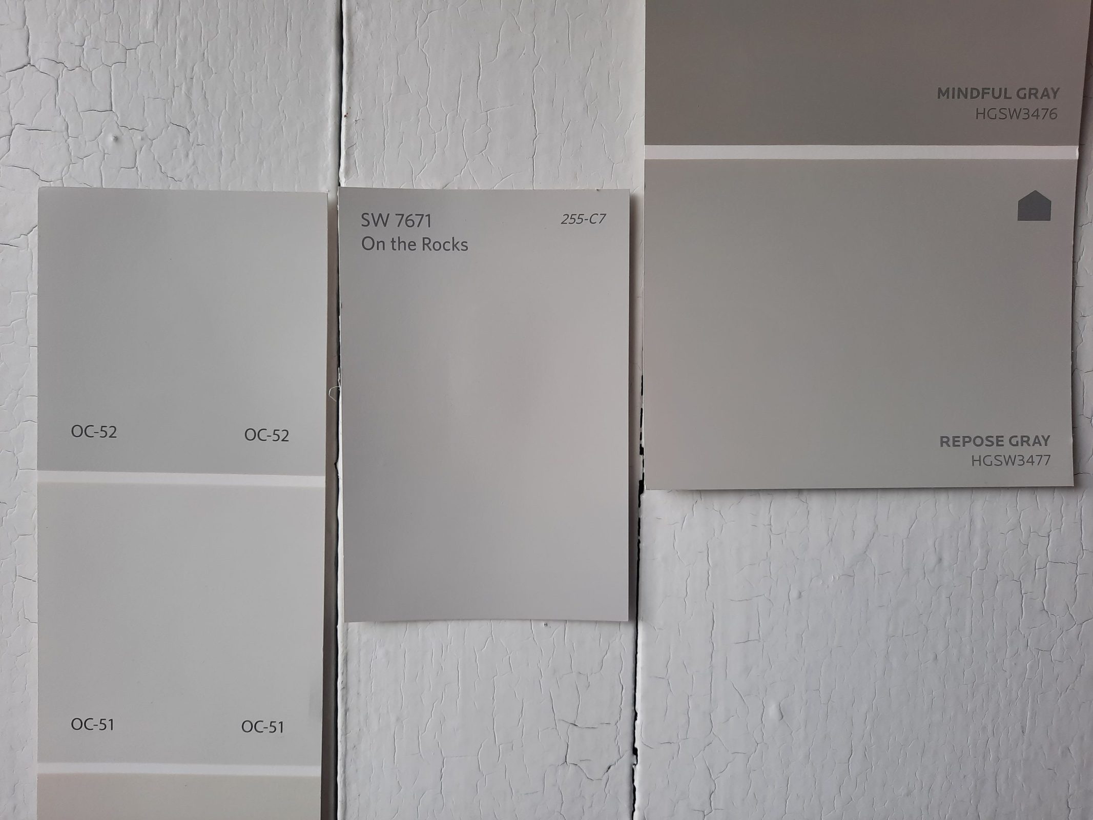
It’s interesting to compare these three colors side-by-side. In this photo, we have Gray Owl on the left, On the Rocks in the center, and Repose Gray on the right.
It’s easy to see that these colors are very closely related. Gray Owl is the coolest and lightest; Repose Gray is the warmest and darkest. On the Rocks splits the difference between the two. If you’re having trouble deciding whether you like Gray Owl or Repose Gray better, On the Rocks is a great answer to your dilemma!
On the Rocks vs Wish by Benjamin Moore
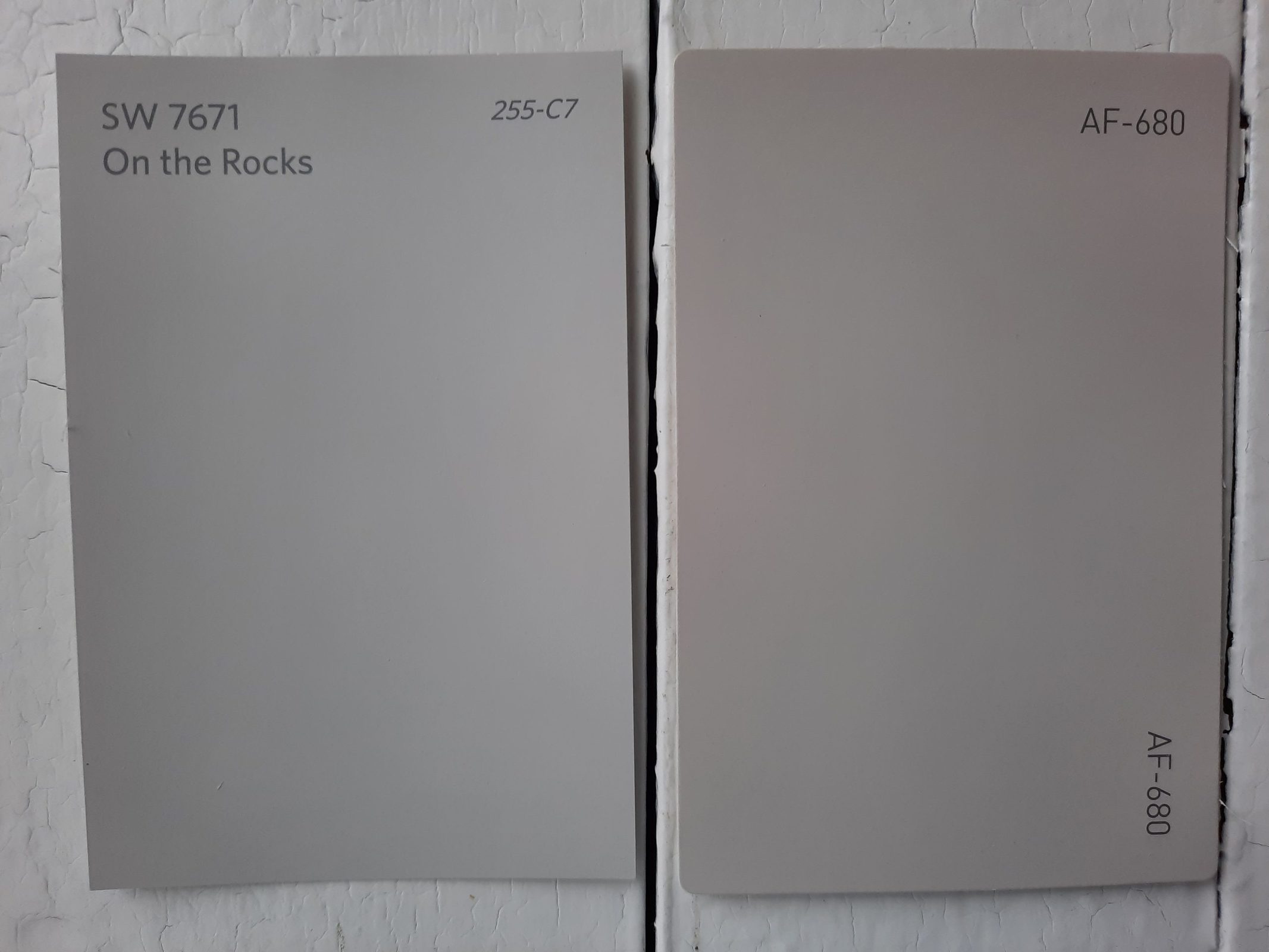
Wish is a warm gray and part of the popular greige lineup. It’s light-to-medium, with a LRV of 59.7, very close to On the Rocks. Wish is warmer than On the Rocks as well, but as you can see, it takes a careful eye to tell the differences. Ultimately a choice between these two colors would simply come down to your personal preference; they’ll both work well in similar situations.
Final Thoughts
For a nicely-balanced neutral gray that’s like that bowl of porridge Goldilocks was looking for, you can turn to On the Rocks. This comfortable gray is warm–but not too warm–and it suits a variety of coordinating colors and decor styles. With an ideal LRV of 62, On the Rocks is ready for any lighting situation too. For a dreamy feeling without getting too far off the ground, this pastel gray is an interesting addition to your palette.