Repose Gray from Sherwin Williams Review
Trying to pick the perfect paint color for your room can lead to hours of anguish and stress. Before you start shopping for a new wig to cover all the hair you’ve pulled out, take some time to learn about an interesting and versatile color – Repose Gray from Sherwin Williams.
Sherwin Williams is a well-known brand for superior colors and exceptional performance. SW Repose Gray is a lovely greige (gray with beige undertones) that can class up any space in your home. Although this color is gray, it has multiple color undertones that give this shade different looks. It’s a truly stunning color that you’re sure to love.
We’re going to look at all the great places you can use Sherwin Williams Repose Gray and complementary colors that you can use to complete your room design. We’ll also look at this color’s LRV.
What Color is Repose Gray?
Repose Gray is a warmer gray, light to medium in shade, with beige undertones. While you may notice light hues of lavender while the paint is wet, once dry, this color is a true warm gray.
In some lighting, Repose Gray can show taupe undertones, which do look slightly purple. But in other lighting situations, you may notice hints of green or blue. Then you might also notice a slight trace of brown, enhancing the warmth of the gray, preventing it from being a true neutral.
All in all, Repose Gray is a warm gray that can change colors in appearance based on the type of lighting and the other colors in the room. If you’re looking for a color that changes in appearance throughout the day, Repose Gray could be perfect for you.
But if you’re looking for a gray that doesn’t have various color undertones, this shade wouldn’t be right. The multiple undertones in Repose Gray can cause your space to constantly look different.
The benefit of a paint color that changes is that the color looks soft in north-facing or dark rooms, which often look flat in low lighting. Although Repose Gray classifies as warm, it can look cool in some situations.
Repose Gray truly is an exceptional paint color that you can use anywhere in your home when you want your walls to change in appearance throughout the day. But beware, each wall in your room can look different at the same time of day.
Sherwin Williams Repose Gray LRV
Repose Gray SW 7015 has an LRV (Light Reflective Value) of 60, meaning it’s not heavy but it won’t make a darker room look brighter.
LRV is an important factor to consider in relation to your room’s layout. On the LRV scale, true black has a rating of 0 while standard white classify as 100. The higher an LRV, the more the color will bounce off light, causing the space to look brighter.
Where Can You Use Sherwin Williams Repose Gray
The changing appearance of Sherwin Williams Repose Gray makes it an amazing color to add anywhere in your home. Check out these ideas to get inspired on where you want to use SW 7015 – Repose Gray.
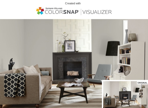
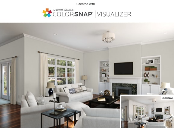
Makeover Your Walls – The Perfect Color When Selling Your Home
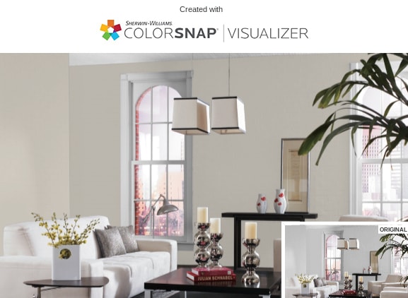
This lovely shade of gray makes a fantastic covering for walls in any room in your house. And because of the many different Repose Gray undertones, this color goes fantastic with many other colors. Because of its neutrality, you can add some bold colors to make the room pop.
Pro tip: Many real estate agents recommend a neutral color like Repose Gray for whole-house coloring if you plan to sell your home. Homes with wild wall colors can often scare buyers away.
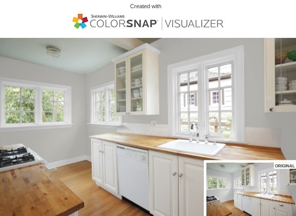
Create a Cozy Kitchen
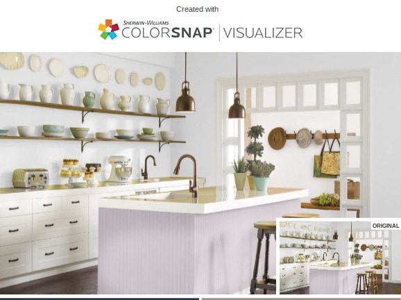
You can also paint your kitchen in Repose Gray to create an elegant clean environment that gives you a warm, cozy feeling. White cabinetry and counters with open shelving uppers and aged bronzed fixtures pull out the subtle undertones for a pleasing change of colors throughout the day.
Color Your Cabinets
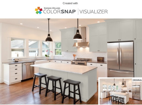
Painting your kitchen cabinets Repose Gray can give your kitchen modern, country, farmhouse, or minimalist themes. Going with a subtle neutral over white means that your kitchen has a warm nuance rather than feeling washed out and stark the way white can do.
Turn Your Bathroom into a Sanctuary
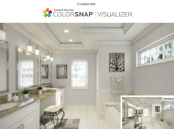
Many people like to use soft neutral colors like gray in the bathroom to create the soothing, warm tranquility expected of your bathroom sanctuary. Make all of your walls the same color or paint an accent wall for a focal piece that oozes relaxation and elegance.
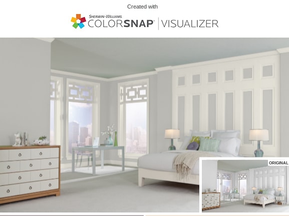
Add Tranquility to Your Bedroom
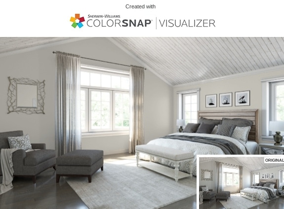
Your bedroom is the perfect canvas to add Repose Gray. This soft gray color can create a serene backdrop that inspires restful sleep while also making the perfect setting for a romantic aura. Your bedroom should be a relaxing escape from the world and painting your walls 7015 is an easy way to achieve it.
Add Curb Appeal to Your Exterior
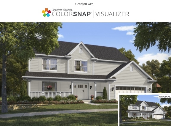
Repose Gray is a fantastic shade to use for the exterior of your home, especially for coastal, farmhouse, traditional, and southern-influenced architectures. Accent your house with soft white trim, a light-colored roof, and bright shutters to get a home with max curb appeal. Or use 7015 for the trim outdoors instead.
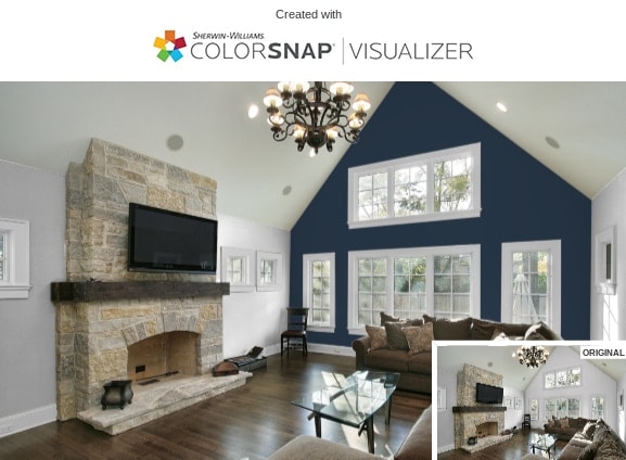
Repose Gray Complementary Colors
Most grays go with many different colors, allowing you a huge playground of complementary colors. Some Shermin Williams colors that go with Repose Gray include:
- Koral Kicks
- Dovetail
- Snowbound
- Copen Blue
- Mint Condition
- Cadet
- Urbane Bronze
- Naval
- Tidewater
- Alabaster White
- Dorian Gray
- Eider White
- Pure White
- Pavestone
- Coral Clay
Repose Gray Comparison with Other Colors
Repose Gray is a fabulous shade to use. But if you’re not a fan of the light to medium shade with slight lavender undertones, there are other shades of Sherwin Williams gray to consider.
Sherwin Williams – Repose Gray vs. Agreeable Gray
If Repose 7015 isn’t the right color for you, consider another greige – Agreeable Gray. This SW color has more warmth with stronger taupe (purple) and beige undertones. Both shades of gray have an LRV of 60, so neither reflects or absorbs light more than the other. But the undertones of Agreeable are green with a lighter look than Repose’s blue and purple darker undertones.
Sherwin Williams – Repose Gray vs. On the Rocks
Another gray alternative to Repose Gray is On the Rocks – SW 7671. This shade of gray has muted undertones that make it just shy of being a true gray. On the Rocks is also not warm or cool with an LRV of 62. You’ll notice slight undertones of purple or blue in some lighting.
Sherwin William – Repose Gray vs. Light French Gray
Comparing Repose Gray with Light French Gray – SW 0055 – LF is more of a light to medium pure gray with no hard undertones. While Repose changes colors based on the lighting, Light French has slight blue hints in Northern rooms. But most of the time, it has more of a pure gray look, not really warm or cool, although it is cooler than Repose. LF has a lower LRV of 53.
Final Words
The color gray is always a popular choice to use for interior and exterior parts of your home, from the siding or trim to the walls outside to the walls in your bathrooms, living rooms, or kitchens. A lot of people choose Repose Gray to paint the entire house when they’re planning to sell.
We hope we’ve inspired you for exciting ways that you can redecorate your home using Repose Gray by Sherwin Williams.