Benjamin Moore Pale Oak Paint Color Review
If you’ve been scoping out design blogs, or scrolling Instagram looking for color inspiration, chances are you’ve come across greige, that trendy blend of gray and beige. Most greige colors are smack in the middle when it comes to light and dark.
If you’re interested in trying this color, but you really prefer a light room, or you don’t want to commit too strongly to the greige tones, then Pale Oak just might be the color for you. Let’s take a peek into the paint can and see what Pale Oak is all about.
What Color is Pale Oak?
Pale Oak is an off-white that belongs to the popular greige family. Greige is the harmonious blending of gray and beige to create a neutral that’s warm without being yellow, and cool without being sterile. Like the gray oak wood that inspires it, Pale Oak leans a little towards its gray side too.
LRV of 69.89
Pale Oak has a light reflectance value (LRV) of 69.89. LRV runs on a scale from absolute black at 0 to sheer white at 100. Pale Oak is rather light for a greige, and bright enough to be used in most spaces.
What Undertones Does Pale Oak Have?
Like many greige colors, Pale Oak can appear to have purple undertones in certain lighting conditions. Some people also see a peach or pink undertone. Be sure to sample under the lighting conditions in your home before committing to this color.
Is Pale Oak a Warm Color or a Cool Color?
Pale Oak is a slightly warm greige color. Most greiges are fairly balanced in tone, because that’s one of the advantages of combining gray and beige. Despite this warmth, you’ll notice more gray from Pale Oak than beige.
Where Can You Use Pale Oak?
Pale Oak is a color that’s light enough to be used in any setting without dragging it down. This color is great for making smaller spaces look bigger, such as entryways, hallways, guest rooms, or bathrooms.
Pale Oak offers just enough color to contrast with a sheer white, which will give you this airy, open effect.
Greiges like Pale Oak are valued as neutrals that are great for staging homes, or incorporating into popular styles such as farmhouse, minimalist, and Scandinavian decor. Pale Oak is an unobtrusive color that is going to let your design choices shine.
Let’s take a look at Pale Oak out in the woods. Maybe we’ll find that inspiration grows on trees!
Entryway
Pale Oak is light enough for this small entryway, but has enough depth of color to contrast with the white trim.
Black, white, and Pale Oak are an eye-catching combination in this entryway.
Living Room
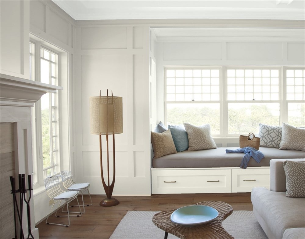
Pale Oak can bring a sense of the natural world indoors, especially when it draws on sunlight.
The neutral palette in this living room keeps the space balanced.
Kitchen
Pale Oak helps this galley kitchen look more spacious.
Brass hardware brings out Pale Oak’s warm side.
Home Office
Pale Oak is the star of a bright and inviting home office retreat.
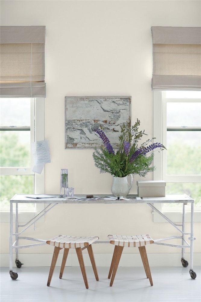
Pale Oak warms up this industrial office space.
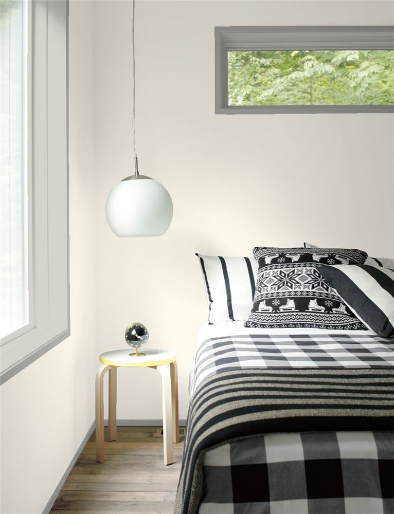
Bedroom
Pale Oak partners with Simply White in this modern minimalist bedroom.
This enchanting child’s room uses Pale Oak to tie its color elements together.
Bathroom
Black, white, and gray is a classic combo, and Pale Oak can serve as your gray.
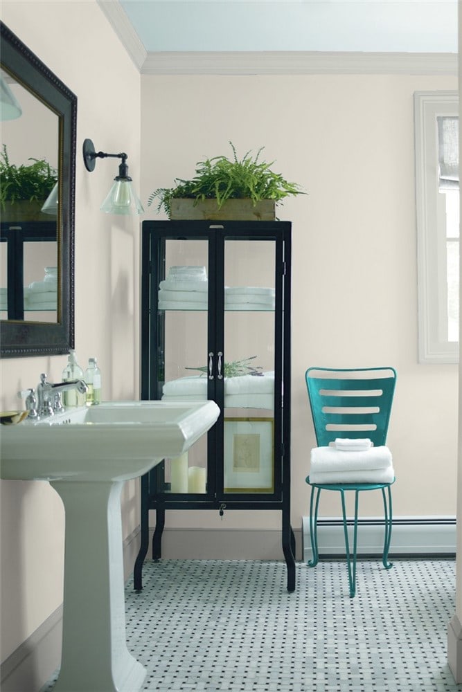
Gray Owl and Teal Ocean are cool complements that bring out Pale Oak’s earthy warmth in this bathroom.
Coordinating Colors for Pale Oak
In most cases, you’ll likely be selecting darker contrast colors for Pale Oak. This neutral can go with any color you like, so the possibilities are pretty wide open. You’ll achieve stunning results with deep blues, charcoal grays, and dark greens.
On the flip side, Pale Oak is light, but it will still give contrast to a white that’s bright enough. Look for clean whites that have a higher LRV than Pale Oak does to get the best contrast. Light silvery grays are also a good option.
Here are some coordinating color ideas for Pale Oak to help inspire you:
- Newburg Green by Benjamin Moore
- White Heron by Benjamin Moore
- Simply White by Benjamin Moore
- Revere Pewter by Benjamin Moore
- Chelsea Gray by Benjamin Moore
- Kendall Charcoal by Benjamin Moore
- Hale Navy by Benjamin Moore
- Gray Owl by Benjamin Moore
- Aegean Teal by Benjamin Moore
- Tricorn Black by Sherwin Williams
- Salty Dog by Sherwin Williams
- Hunt Club by Sherwin Williams
- Pure White by Sherwin Williams
How Does Pale Oak Compare With Other Colors?
Pale Oak vs Dove Wing by Benjamin Moore
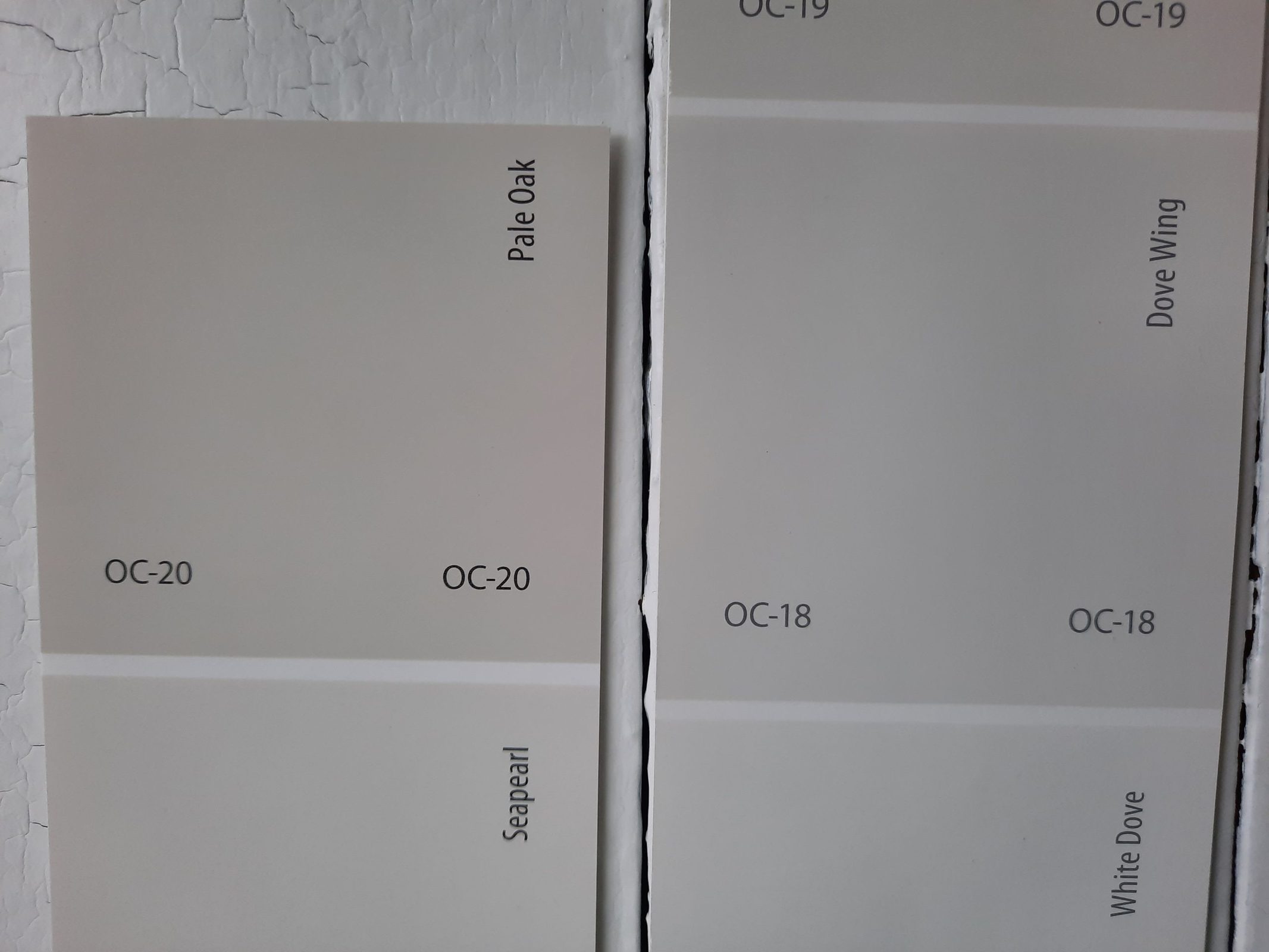
Dove Wing is an off-white color, just two spots away from Pale Oak on the same paint card. Their biggest difference is in their LRV; Dove Wing sits at 79.2 to Pale Oak’s 69.89. Dove Wing is truly an off-white rather than a greige.
Pale Oak vs Halo by Benjamin Moore
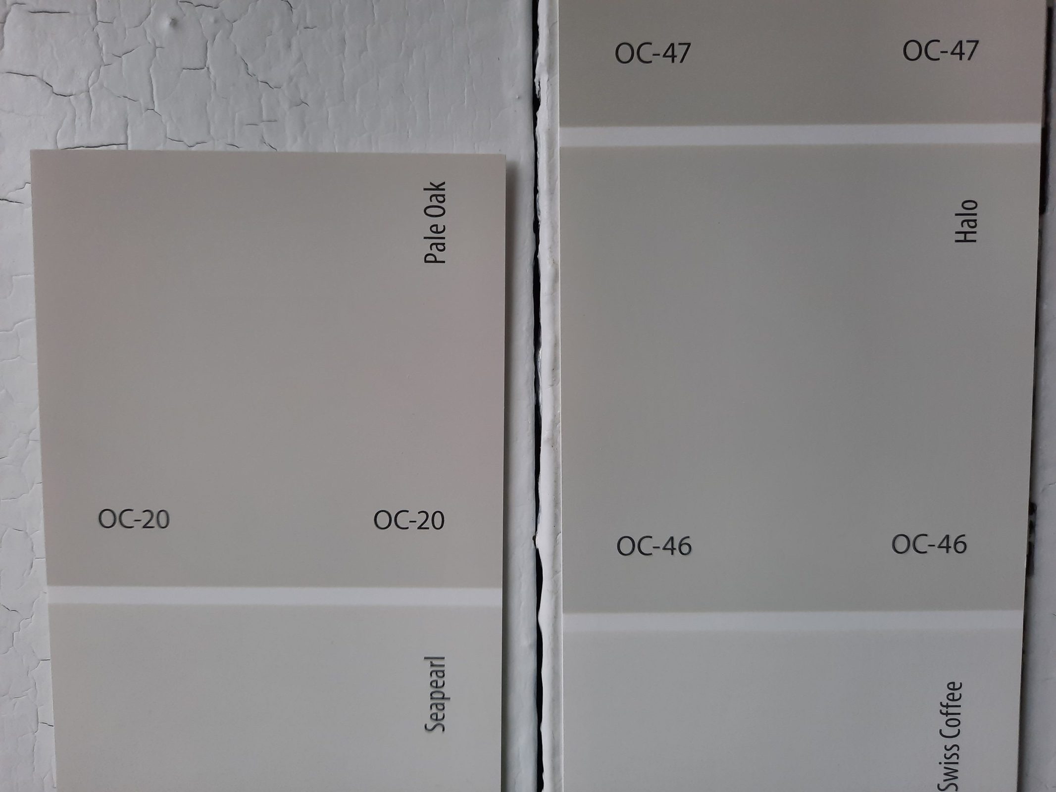
Halo is another off-white, and it’s got more of a gray side to it than Pale Oak. So it follows that Pale Oak is the warmer color of the two. Halo is a bit lighter with a LRV of 73.1.
Pale Oak vs Edgecomb Gray by Benjamin Moore
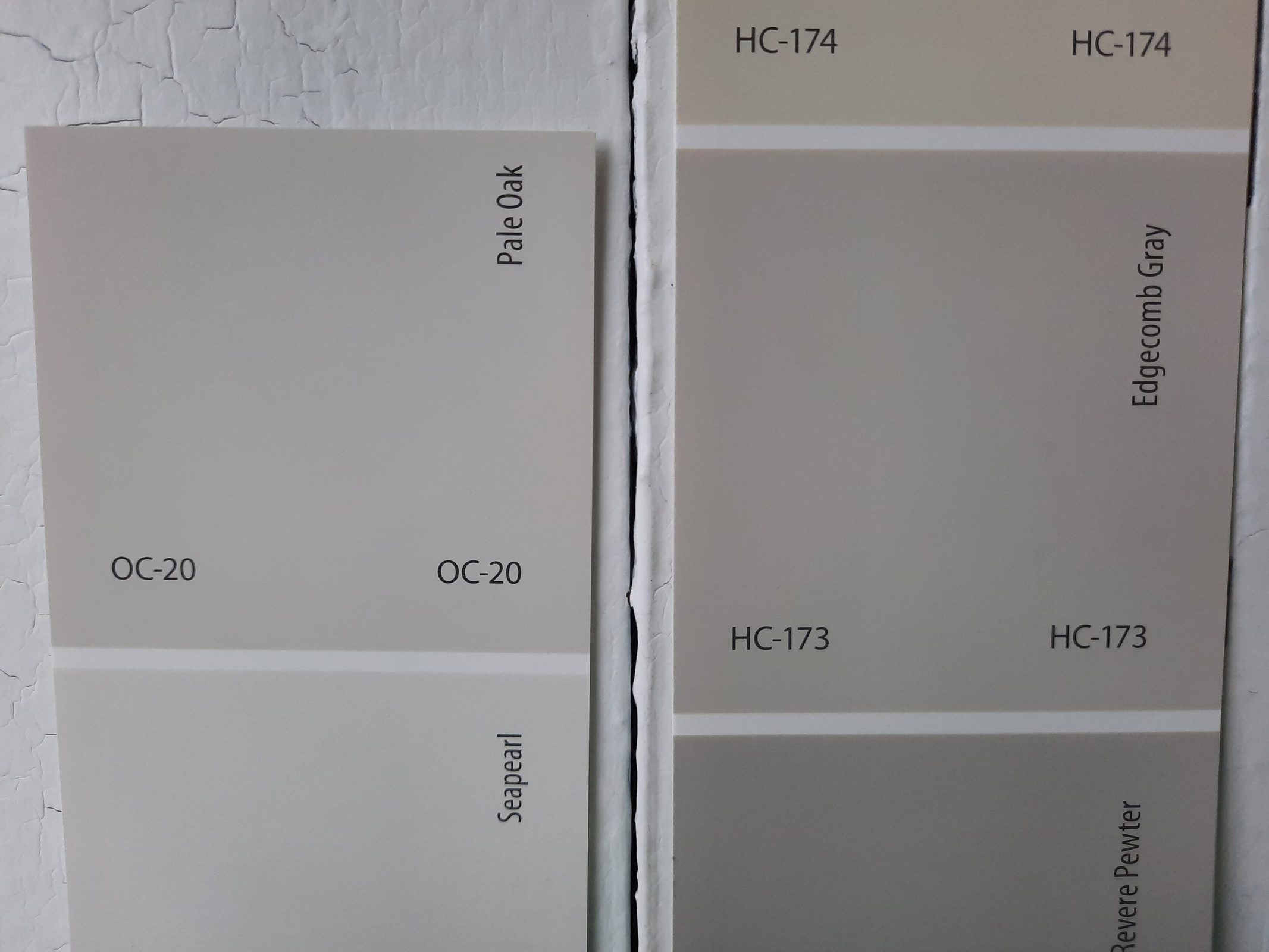
Edgecomb Gray is a popular greige color that’s slightly darker than Pale Oak, and has a stronger beige side. Its LRV is 63.88, putting it a little lower on the scale than Pale Oak’s 69.89.
Pale Oak vs Accessible Beige by Sherwin Williams
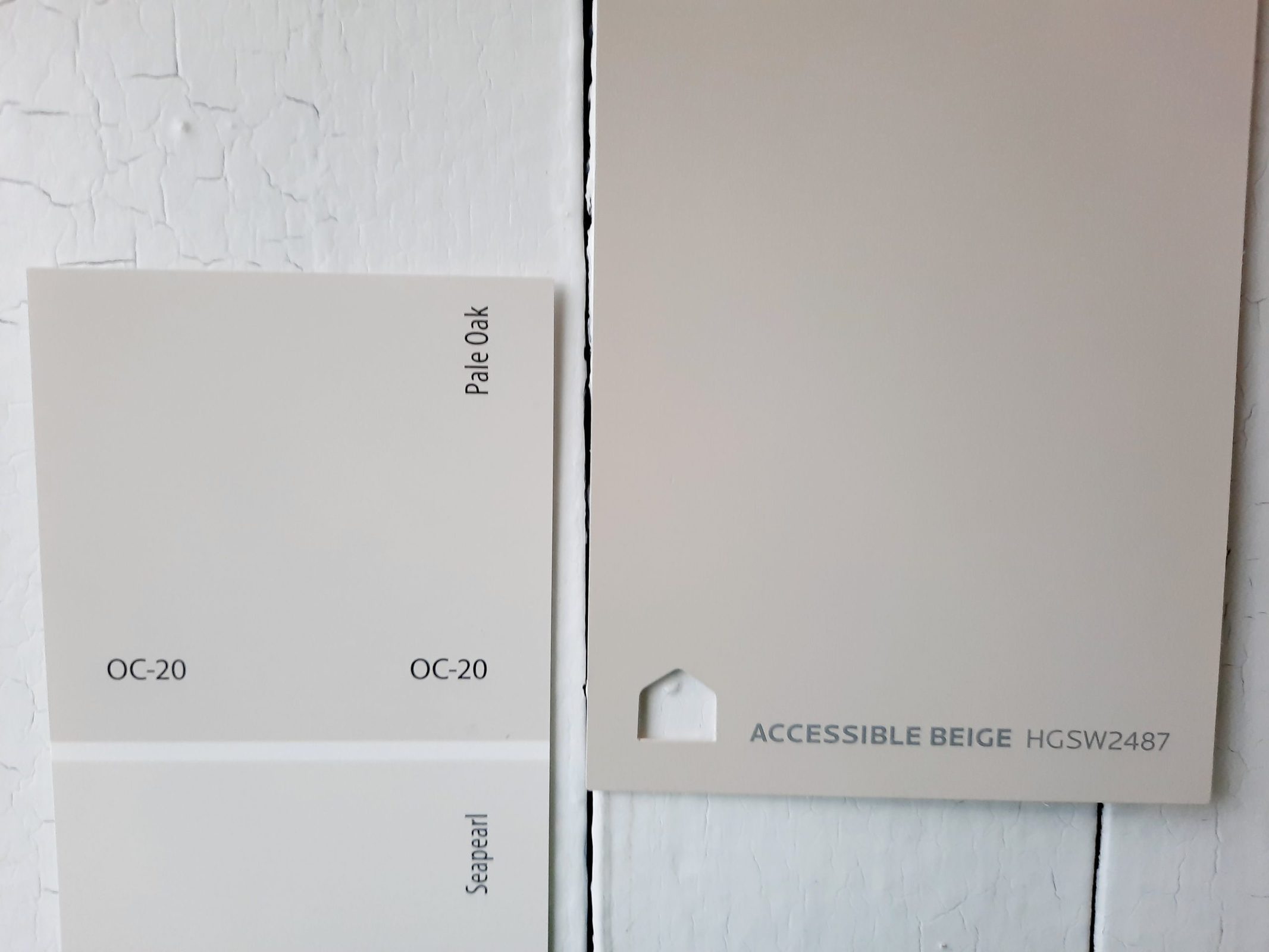
Accessible Beige is a well-known ambassador greige color from Sherwin Williams. It has a LRV of 58, which is in the more typical range for greiges than Pale Oak’s rather light rendition. Also, Accessible Beige is, as you might expect, more beige than Pale Oak.
Final Thoughts
For a gentle neutral that offers a hint of color, Pale Oak is the ticket. This light greige goes with anything, and promotes a relaxed, natural atmosphere that’s suitable for many styles of decor. Pale Oak can contrast with pure whites, but its strongest talent is allowing other colors and decor choices to shine. With these thoughts in mind, Pale Oak can be the color that ties your space together.