Sherwin Williams Accessible Beige Paint Color Review
What’s one of the top-recommended colors for staging and selling any house? It’s perennial favorite, Accessible Beige, by Sherwin Williams.
Described as “a true diplomat” by Sherwin Williams, Accessible Beige is a beloved neutral that can become the centerpiece of any palette, or let your favorite colors stand in the spotlight.
Let’s take a look at Accessible Beige and find out why it makes friends with all its neighbors!
What Color is Accessible Beige?
Accessible Beige is a warm, medium-to-light greige, that is, a mixture of beige and gray. That mixture is what works the magic in this color, muting out difficult-to-match yellow undertones of beige while warming up the otherwise-chilly gray.
Accessible Beige, though, as you might gather from its name, favors its beige side. Depending on your lighting conditions, you might not be able to see as much of its gray. This color could also be described as a taupe.
Does Accessible Beige Have Any Undertones?
Thanks to the magical combination of greige, you’re not going to see the yellow undertones in Accessible Beige that make most beige colors so difficult to coordinate with other colors.
You may notice some of its gray undertones, particularly a hint of warm green or purple, under the right light. For the most part, though, Accessible Beige is a very balanced color.
Is Accessible Beige Warm or Cool?
Accessible Beige is a warm neutral color. It is definitely on the beige side of the greige fence, but keeping that in mind, it’s cooler than you’d expect it to be, thanks to the gray in its mix.
LRV of 58
Accessible Beige has a light reflectance value (LRV) of 58, which puts it just slightly past the middle of the scale. Many designers like to target 60-62 as a color that brightens a room; Accessible Beige is just a touch below that mark.
Where to Use Accessible Beige
As its name implies, Accessible Beige is a chameleon-like color that can truly be used anywhere. It can pull a room together all on its own, or form a backdrop for more dramatic colors. It’s an earthy and relaxing color, and extremely popular with fans of farmhouse decor.
Let’s take a look at Accessible Beige in real homes to get some inspiration!
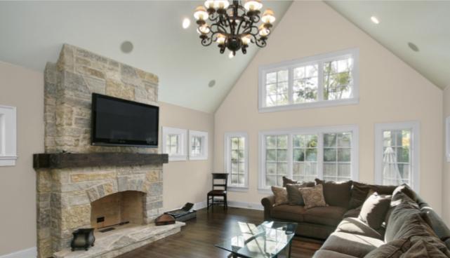
Living Room
In this modern living room, Accessible Beige partners with Alabaster to play with the ample natural light. There’s this cool, calm glow everywhere you look.
Kitchen/Dining Room
Accessible Beige is an accent color in this old-fashioned kitchen.
Accessible Beige is a staple of farmhouse style, as this kitchen demonstrates.
This dining room gets an air of sophistication from Accessible Beige drawing the decor together. Notice the colors from the rug, table runner, and planter all being highlighted by the Accessible Beige.
Bedroom
Accessible Beige sets the stage for this relaxing neutral bedroom. See how the beige and grays each make the other stand out more?
This bedroom gets an organic, grounded vibe from Accessible Beige.
Bathroom
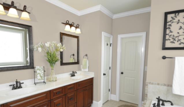
The white counters and trim in this bathroom make a nice contrast with the Accessible Beige walls, for an overall air of simple elegance.
Accessible Beige is a nice complement to granite countertops in this bathroom remodel.
Entryway
A cool and organized mud hall. Accessible Beige is a great partner to your favorite white paint; together they brighten up small spaces.
Accessible Beige Coordinating Colors
One of the most fun things about working with neutral colors like Accessible Beige is that you can use them to play with any palette you want. Warm or cool, bold or understated, you just can’t go wrong.
Play up the beige side of Accessible Beige with warm choices like coral pinks and rich browns, or take it to the gray side with cool blues and greens. Warmer greens, such as olive or fern, will bring out its earthiness.
For high drama contrasts, set Accessible Beige against blacks, whites, and metalwork.
Here are some coordinating color ideas for you to explore:
- Sherwin Williams Georgian Bay
- Sherwin Williams Capri
- Sherwin Williams Amaryllis
- Sherwin Williams Privilege Green
- Sherwin Williams Cobble Brown
- Sherwin Williams Pure White
- Sherwin Williams Tricorn Black
- Sherwin Williams Sea Salt
- Sherwin Williams Cadet
- Sherwin Williams Jasper
- Benjamin Moore Smoke
- Benjamin Moore Hale Navy
- Benjamin Moore White Dove
How Does Accessible Beige Compare With Other Colors?
Accessible Beige vs Agreeable Gray by Sherwin Williams
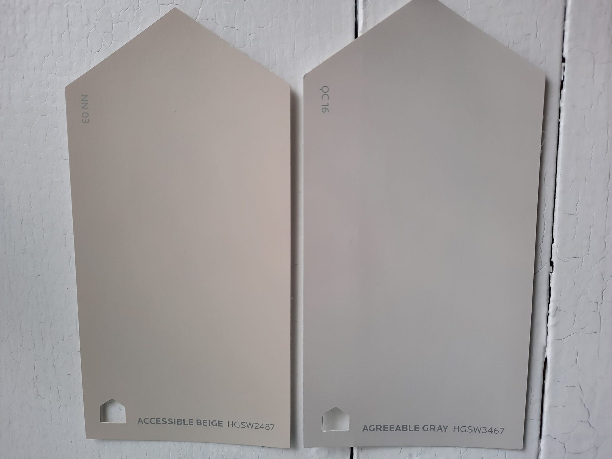
Two of the most popular colors from Sherwin Williams, and top-rated members of the greige family, it’s not surprising that you’d be comparing Accessible Beige and Agreeable Gray.
Taken side-by-side, you can definitely see the cool cast of Agreeable Gray and the warm taupe tones of Accessible Beige. With just the slightest LRV difference–Agreeable Gray’s 60 to Accessible Beige’s 58–you may be able to tell that Agreeable Gray is a touch lighter. Pick Accessible Beige if you want a more natural, earthy feel.
Accessible Beige vs Kilim Beige by Sherwin Williams
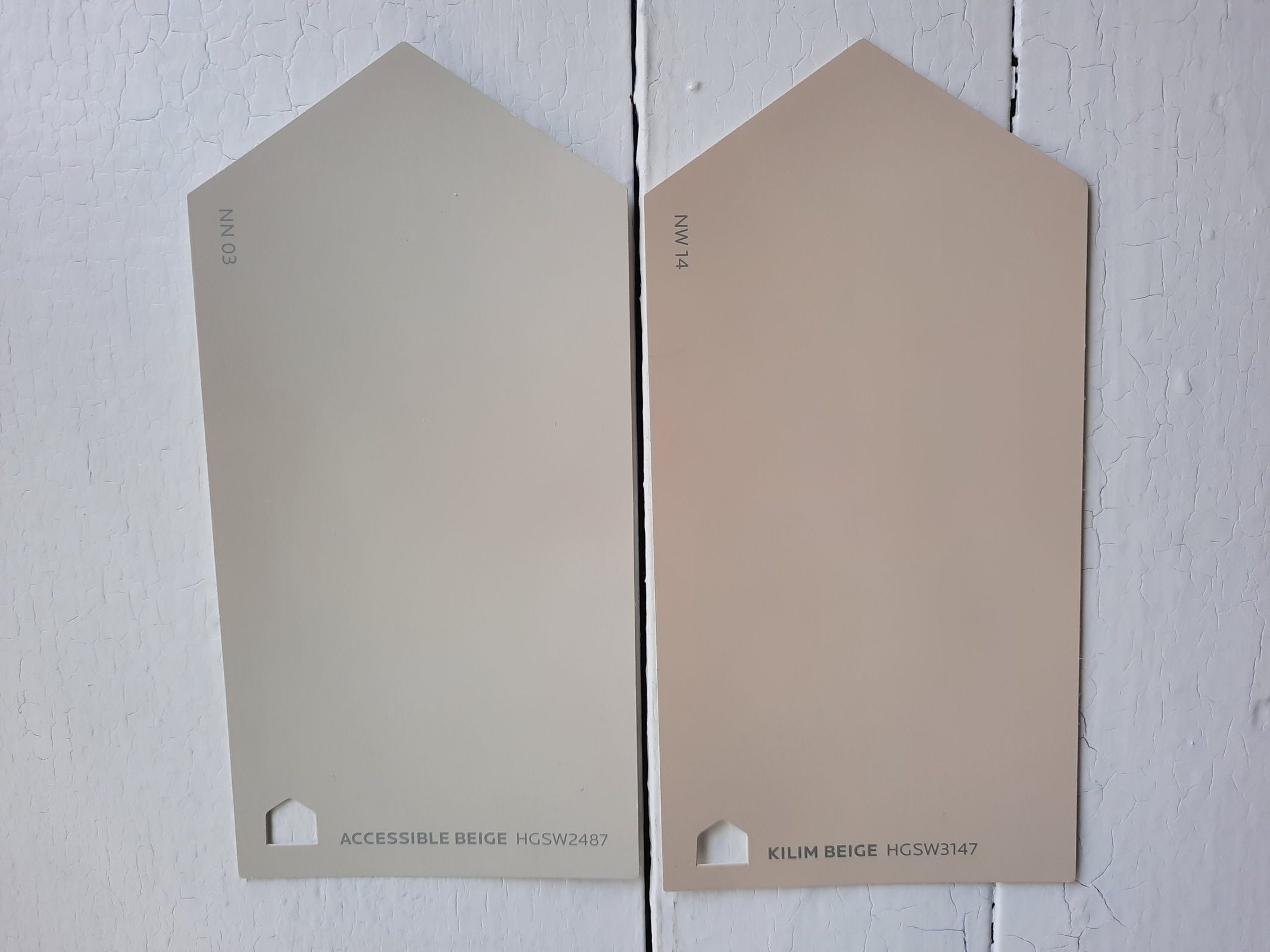
Kilim Beige is definitely a beige and not a greige. It looks tan when compared with Accessible Beige, almost a light terra cotta color. It’s warmer than Accessible Beige and has orange-to-pink undertones, but it’s still a neutral color. With an LRV of 57, it’s comparable in brightness to Accessible Beige.
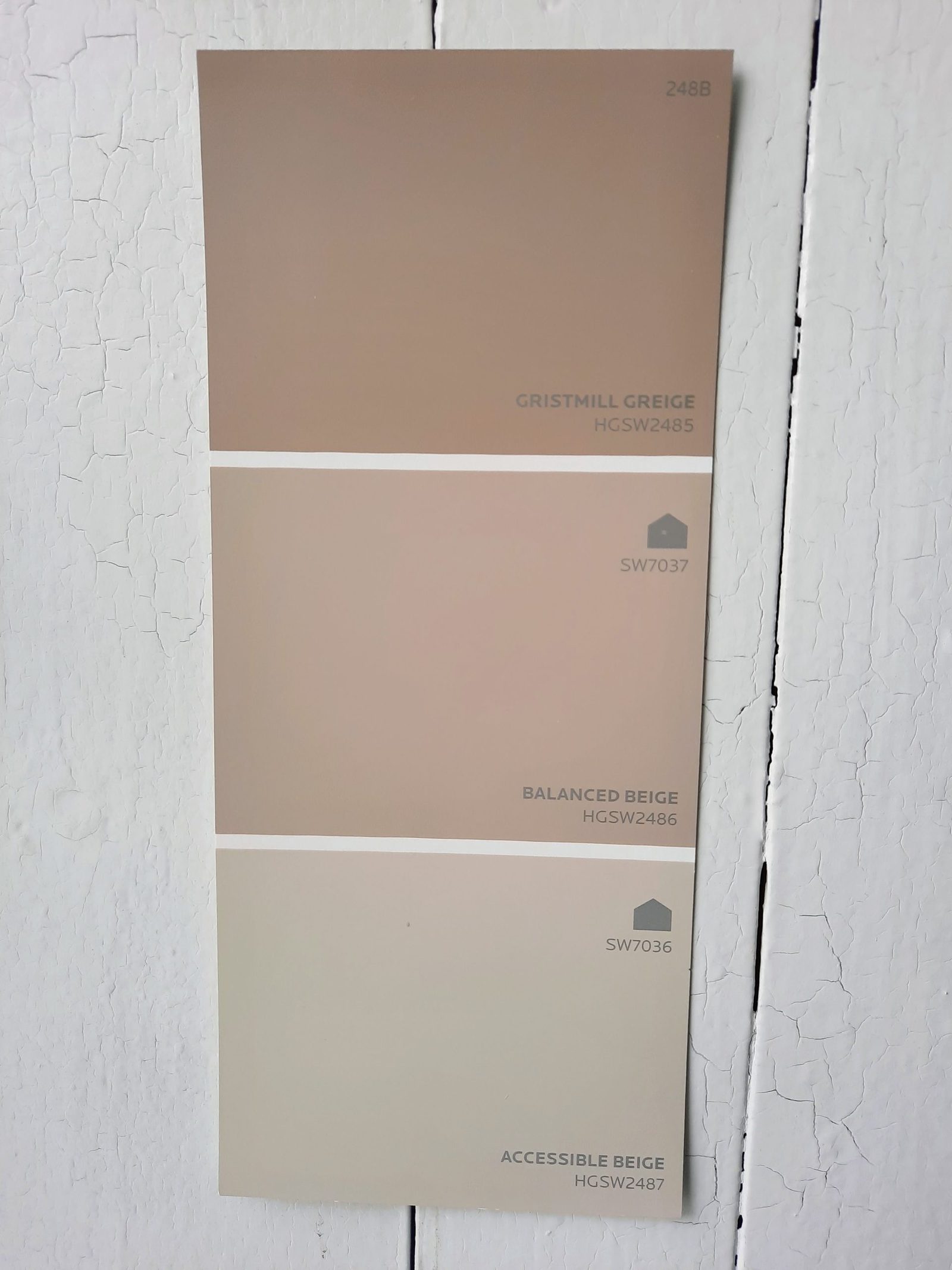
Accessible Beige vs Balanced Beige by Sherwin Williams
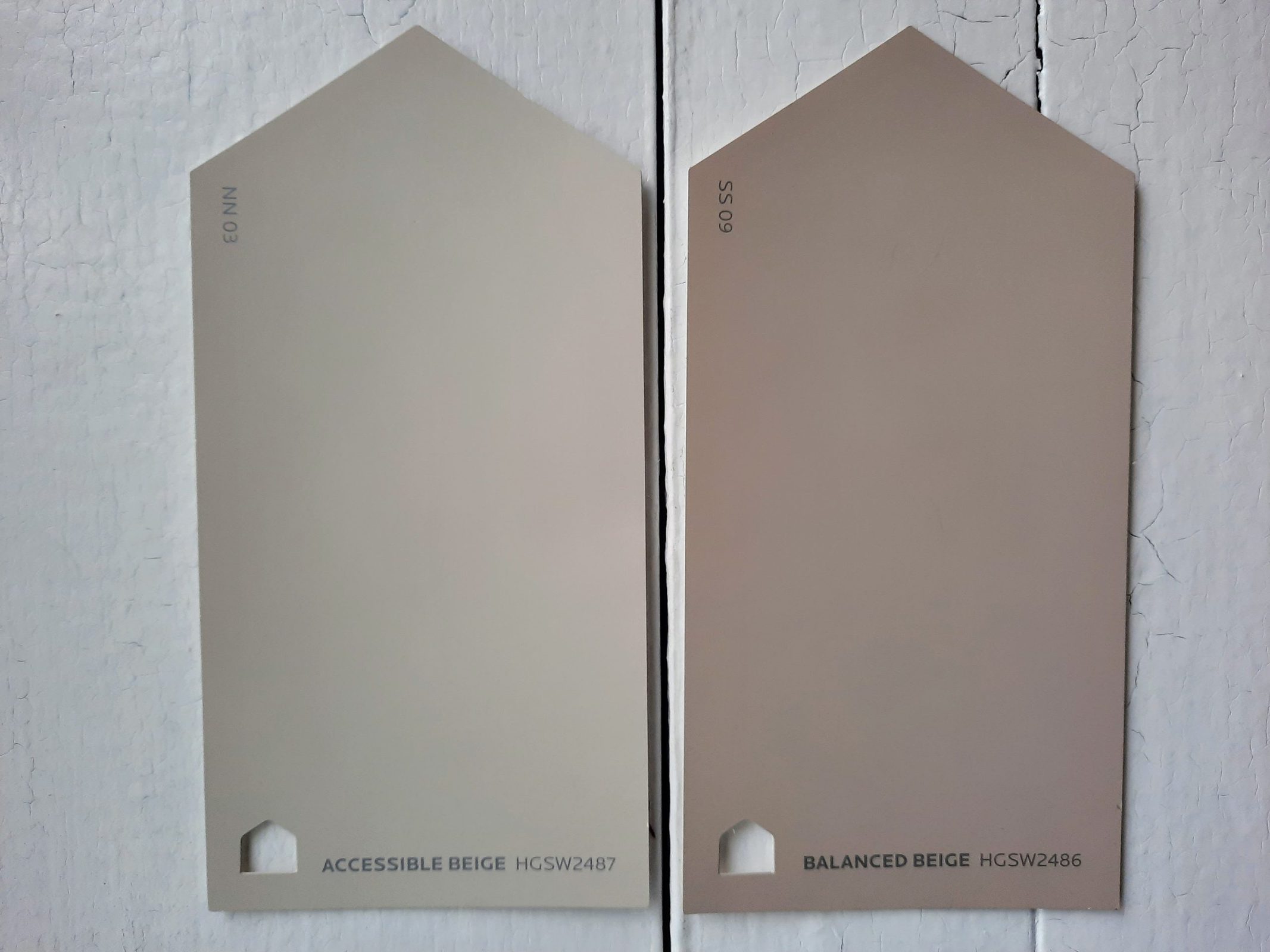
A neighbor to Accessible Beige on the color strip, Balanced Beige has a lot in common with its family member.
Both are greige colors that tend towards the beige side, and both are warm neutral colors without significant undertones. Balanced Beige, however, with its LRV of 46, is noticeably darker than Accessible Beige. Balanced Beige is also warmer and earthier than Accessible Beige.
Accessible Beige vs Edgecomb Gray by Benjamin Moore
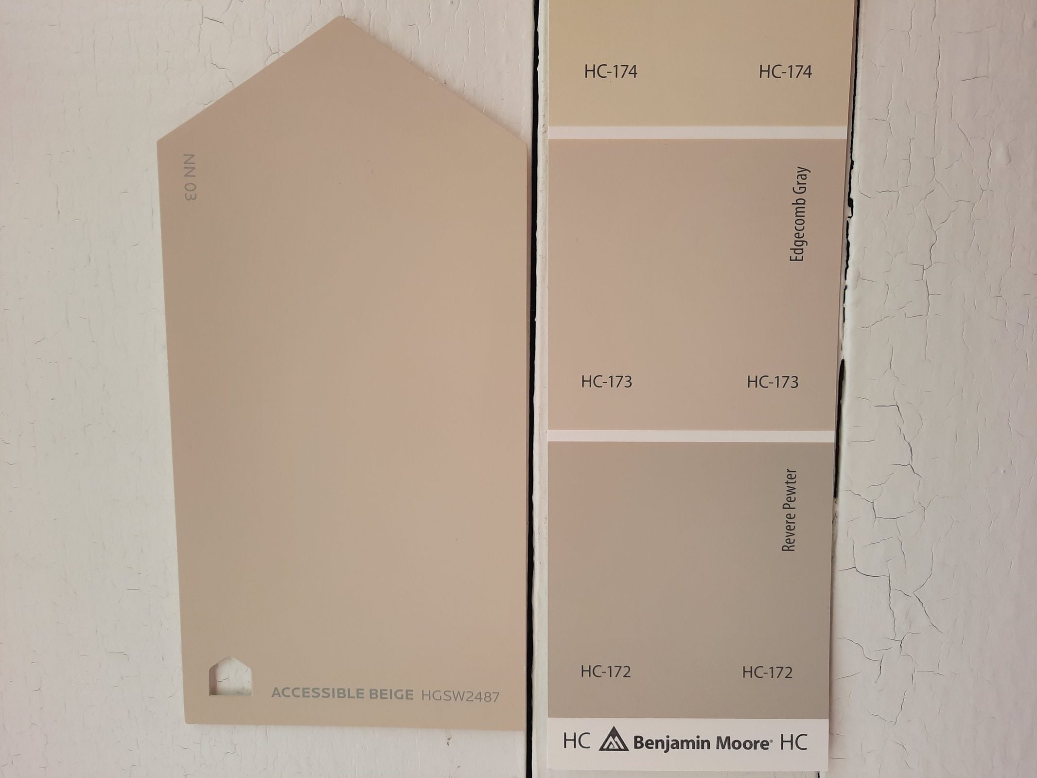
Accessible Beige and Edgecomb Gray are similar balanced greige colors. Both are warm neutrals. The biggest difference you’ll likely notice is their brightness; Edgecomb Gray is the lighter of the two, with an LRV of 63.
Final Thoughts
A top-notch neutral, Accessible Beige is just always going to be that color that everyone can relate to. Sorry, I couldn’t resist! But truly, this greige makes friends in every segment of the color wheel, and that’s what makes it a perennial favorite with designers, real-estate agents, and homeowners. If you don’t know where to start your color palette, you can’t go wrong with Accessible Beige.