Sherwin Williams Oyster White Paint Color Review
If you’re new to choosing paint colors, it might surprise you to learn that there isn’t just one kind of white paint out there. Actually there’s a whole wide range of whites, including warm whites, cool whites, off-whites, and pastels.
All of these different white colors serve different purposes. For example, warm and cool whites each look better with their respective color palettes. Off-whites and pastels have bits of color in their makeup that keep them from looking washed out under bright lighting situations, and coordinate well with different colors.
In this review, I’m going to introduce an interesting color that stands at the borderlines of several of these categories: Oyster White by Sherwin Williams.
What Color is Oyster White?
Oyster White is an off-white color softly shaded with beige and gray. You could also consider it a very light greige color. A pastel greige, if you will. Greige is the combination of gray and beige. However, this color is so light that under most lighting conditions, it is going to appear off-white, not greige. Compared with most greige colors, it will look creamy or very light beige. See why Oyster White ends up in so many categories?
LRV of 72
Oyster White has a light reflective value (LRV) of 72. This makes it a fairly light color and puts it just on the borderline of off-white colors, which generally run from a LRV of 73 to 82. This value is close enough for me to consider Oyster White to be an off-white color.
Oyster White Undertones
Oyster White has beige and gray undertones that look soft and creamy. The undertones are just enough to keep Oyster White from looking stark or glaring.
Is Oyster White a Warm Color or a Cool Color?
Oyster White is a cool color, looking ever-so-slightly gray, while being balanced enough to work as a neutral. Once again, it sits on the fence!
Where Can You Use Oyster White?
Oyster White is an exceptionally light greige that’s neutral enough to use in any room of the home. You can also use it as an exterior color, or an all-over indoor color.
A stroll through Instagram reveals that Oyster White is very popular for exteriors. Under bright natural light it will look light beige, with just a slight depth that keeps it from being washed out.
Oyster White is very neutral and has few undertones, making it easy to coordinate with different color palettes and style choices. There’s really no limits on how you can use it.
Let’s take a look at Oyster White in action to gather inspiration for our own projects!
Exterior
Oyster White is paired with the soft green of Jojoba from Benjamin Moore for this natural, understated exterior.
Tricorn Black is a lovely traditional partner for Oyster White on this porch.
Black Fox trim brings out Oyster White’s earthy side
Oyster White looks creamy next to this handsome navy blue door.
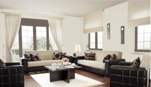
Living Room
Black and white is a classic because it works!
You can always paint furniture and shelving to suit your tastes. This wall features Oyster White with shelves in Skyline Steel.
Oyster White is a great neutral canvas for this modern chic living room.
Kitchen

This kitchen uses Oyster White for the cabinets and the soft violet tones of Exclusive Plum for the walls, in a pairing that’s peaceful and feminine.
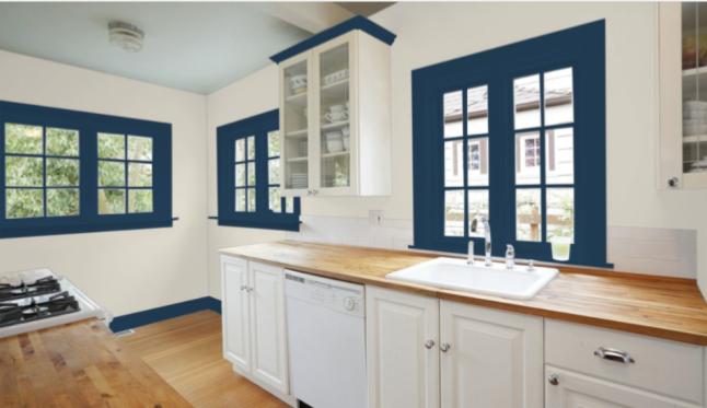
Salty Dog is a handsome trim color for this Oyster White kitchen. Both colors highlight the natural beauty of the wood countertops and flooring.
Bedroom
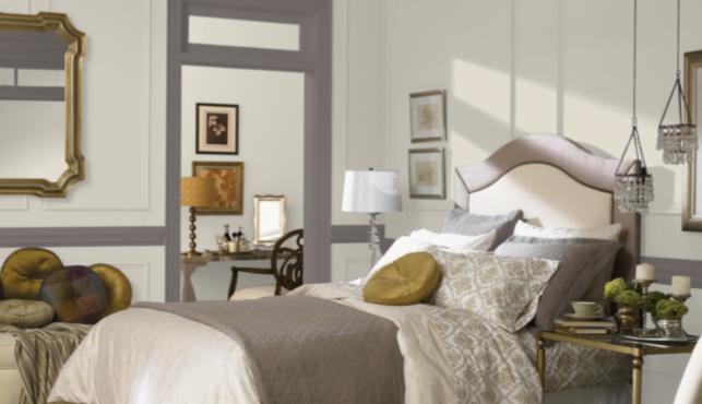
Oyster White lends a luminous softness to this bedroom, paired with a Mink trim.
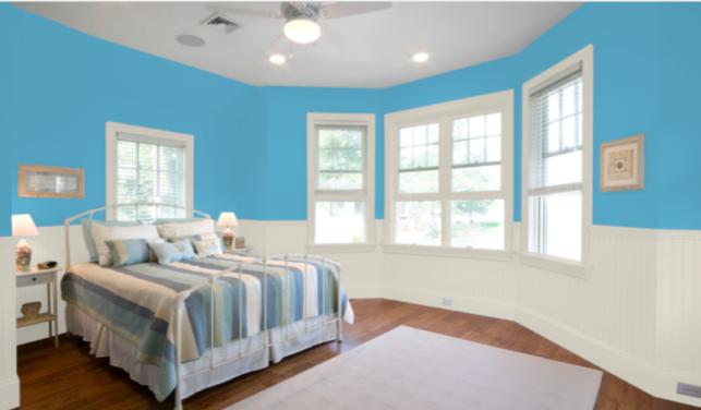
This bedroom takes Oyster White in a playful direction with bright and fun Flyway.
Bathroom
Oyster White lends a glow to this shiplap while still subtly contrasting the white trim.
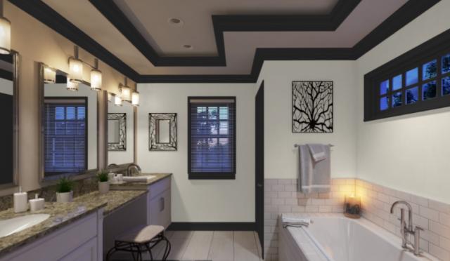
Oyster White and Tricorn Black make for a dramatic and chic look in this bathroom.
Whole Home
This home uses Oyster White and Coastal Plain to accent the natural beauty of hardwood floors and a stone fireplace.
Oyster White Coordinating Colors
Whether you think of Oyster White as a greige or as an off-white, it’s so neutral that you really can’t go wrong choosing coordinating colors for it. What kind of feeling do you want from your space? Are you looking for relaxing neutrals? Classy black and gray? Do you want to cool down with blues and greens, or heat things up with reds and oranges?
Oyster White can go in a lot of directions. It looks great with other grays, especially darker and cooler grays than itself. Add your favorite black for a dramatic and sophisticated look. This palette works well with metal appliances and decor.
The off-white component of Oyster White gives it a natural feel that looks lovely with other nature-inspired colors. Consider soft, muted greens, golden yellows, browns, and blues as part of a meadow or forest palette.
Here are some coordinating color ideas for Oyster White to give you a starting point:
- Analytical Gray by Sherwin Williams
- Brassy by Sherwin Williams
- Coastal Plain by Sherwin Williams
- Mindful Gray by Sherwin Williams
- Tricorn Black by Sherwin Williams
- Urbane Bronze by Sherwin Williams
- Antler Velvet by Sherwin Williams
- Red Barn by Sherwin Williams
- Salty Dog by Sherwin Williams
- Naval by Sherwin Williams
- Exclusive Plum by Sherwin Williams
- Chelsea Gray by Benjamin Moore
- Admiral Blue by Benjamin Moore
- Van Courtland Blue by Benjamin Moore
- Sanctuary by Benjamin Moore
- Caliente by Benjamin Moore
- Croquet by Benjamin Moore
How Does Oyster White Compare to Other Colors?
Oyster White vs City Loft by Sherwin Williams
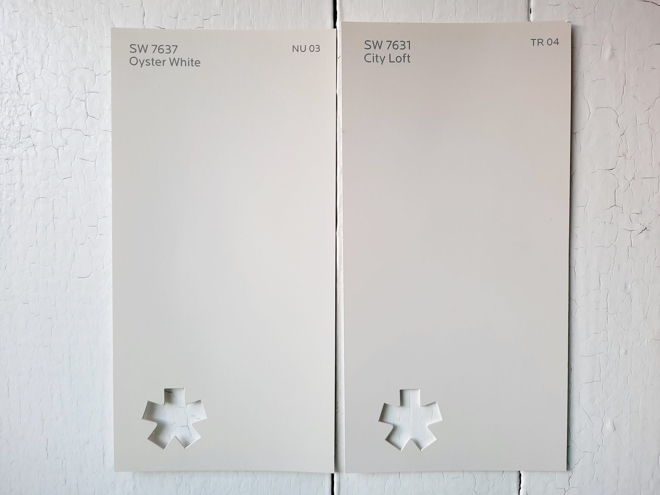
City Loft is a light greige color that helps demonstrate that Oyster White is much more of an off-white than a greige. You can see here that even though these colors are only two points apart on the LRV scale, with City Loft at 70 and Oyster White at 72, they are definitely different colors.
Oyster White vs White Duck by Sherwin Williams
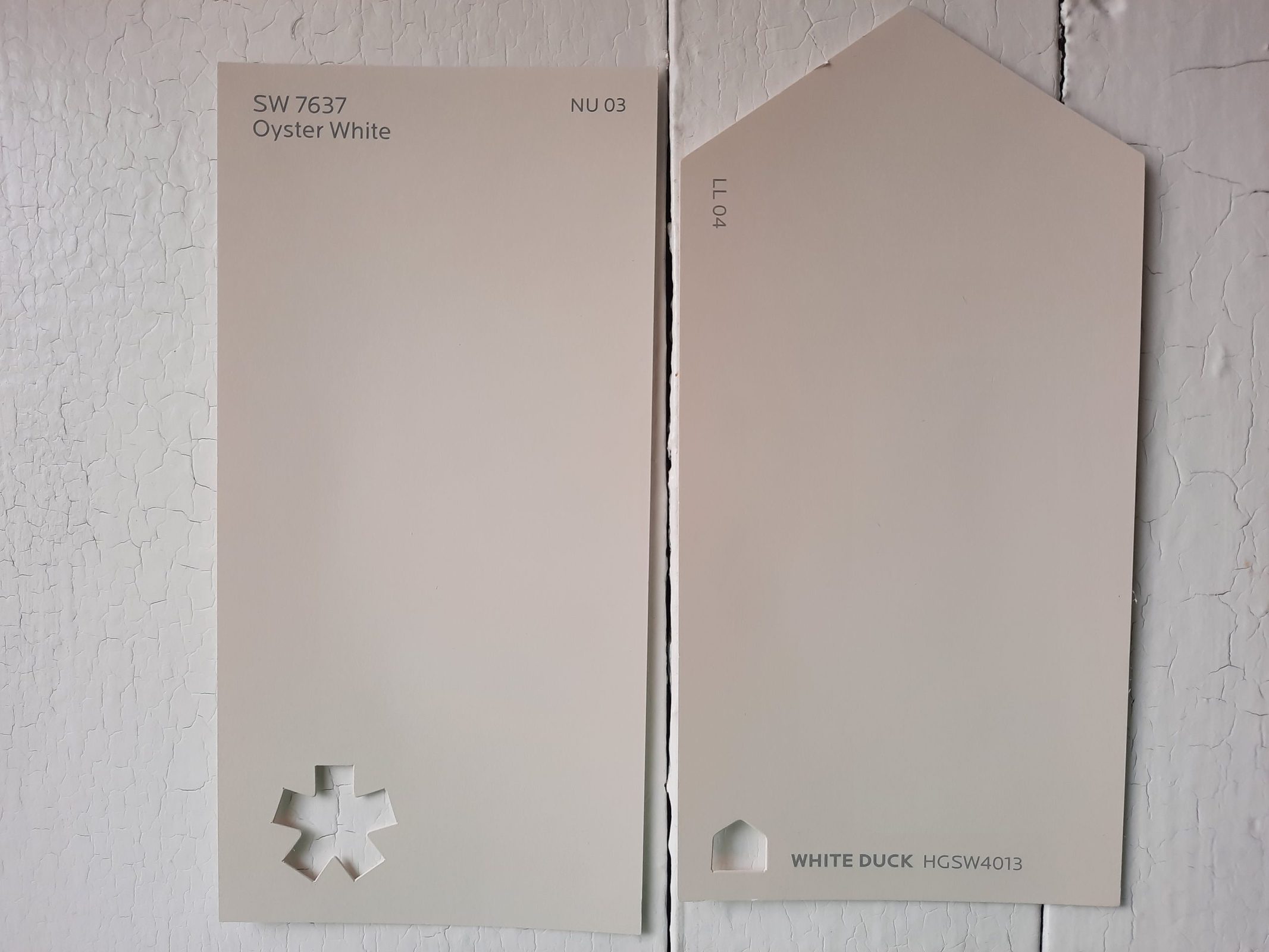
White Duck is another creamy off-white that’s very similar to Oyster White. With a LRV of 74, White Duck is firmly in the off-white range, and a touch brighter than Oyster White. Side-by-side, Oyster White looks a smidge more gray than White Duck.
Oyster White vs Alabaster by Sherwin Williams
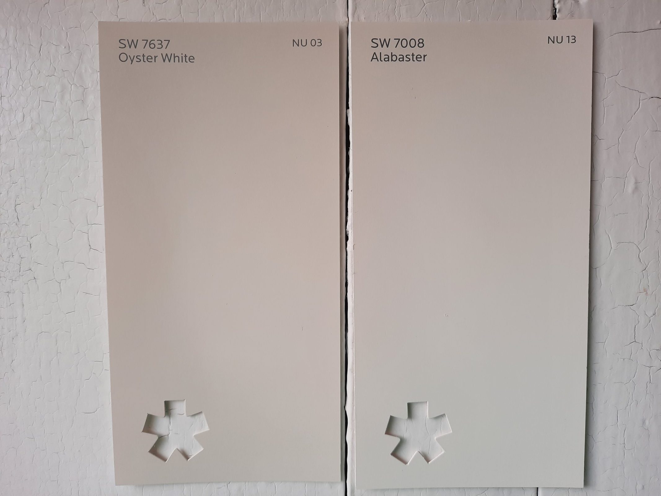
Alabaster is a popular white paint from Sherwin Williams and it’s in the Color ID: Nurturer collection with Oyster White. It’s much more of a true white than Oyster White is. Alabaster is also much brighter than Oyster White, with a LRV of 82 that sits on the borderline between off-white and true white. Alabaster is itself a nice coordinating color for Oyster White if you’d like to pair them up.
Oyster White vs Pale Oak by Benjamin Moore
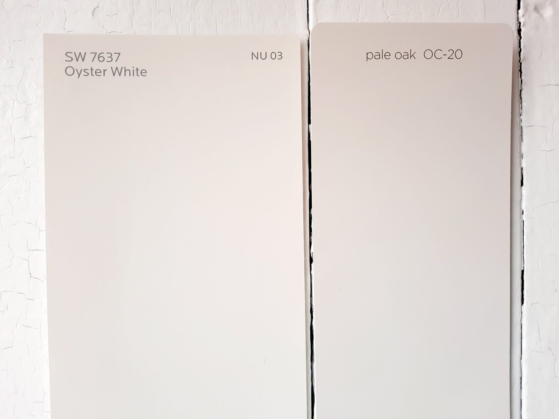
Pale Oak is a popular light greige color from Benjamin Moore. It’s a little darker than Oyster White, with a LRV of 69.89. Both are balanced, light neutrals that can serve in a lot of the same decor situations. You might choose Oyster White if you need more brightness, or Pale Oak if you want more of a definite greige color.
Final Thoughts
Oyster White is a versatile neutral that straddles the fence between off-white and very light greige. As such, it can serve in situations designed for either type of color. This cool creamy off-white can be used in any room of the home and is suitable for any style of decor. It’s good for situations where you want a white that doesn’t look too stark or glaring.
As a greige color, Oyster White offers the most subtle hint of this shade possible, if you don’t want to commit too heavily to that direction. Since Oyster White is easy to coordinate with other colors, you’re sure to be able to find a place for it in your next project’s color palette.