What Color Cabinets Go with Repose Gray Walls? 15 Ideas
Repose Gray is a warm-toned neutral gray with taupe, beige, blue, and purple hints.
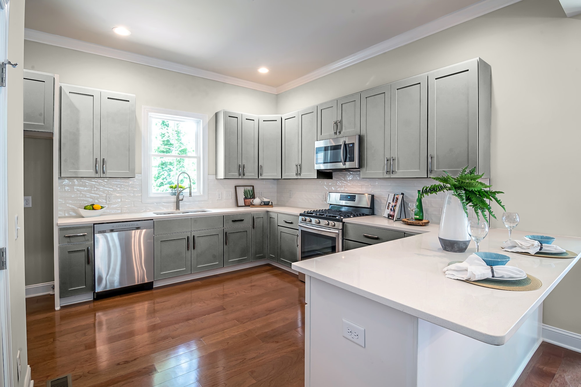
This timeless greige will never go out of style and can look fabulous with any cabinet color. Check out these 15 options for what color cabinets go with repose gray walls.
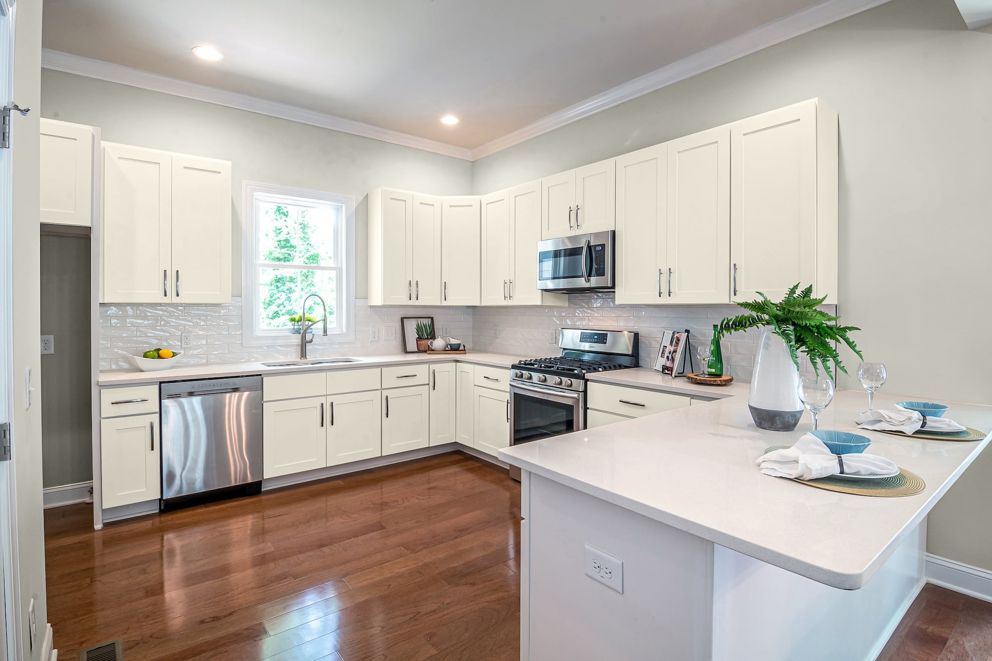
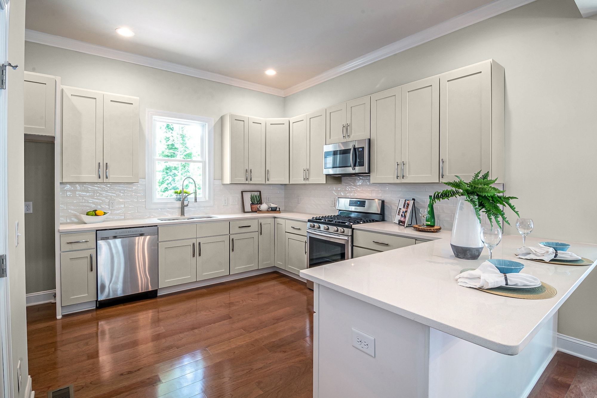
Creamy by Sherwin Williams
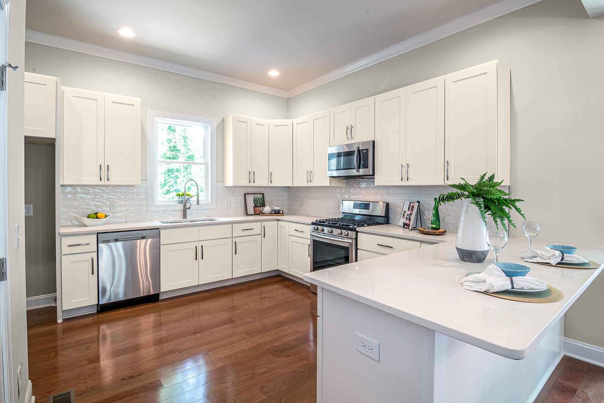
Creamy is an excellent light-based neutral for kitchen cabinets against repose gray walls. In addition, the greige notes of the wall color can activate the yellow tints in Creamy for a richer texture.
When you choose off-whites like this for cabinets, you get the visual effect of brightening a space up by reflecting more light. This superb color can work for any design theme or accent.
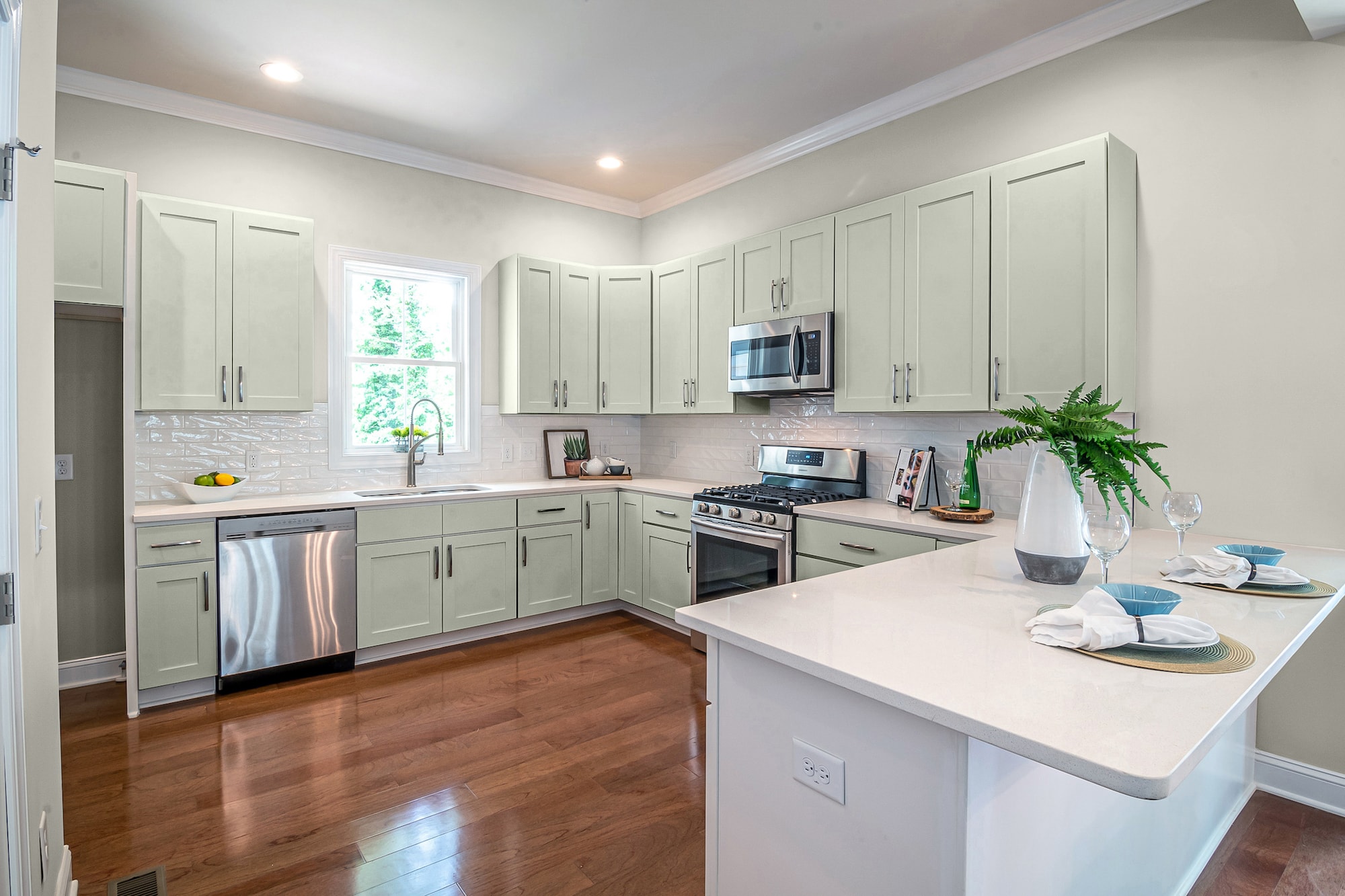
Roycroft Mist by Sherwin Williams
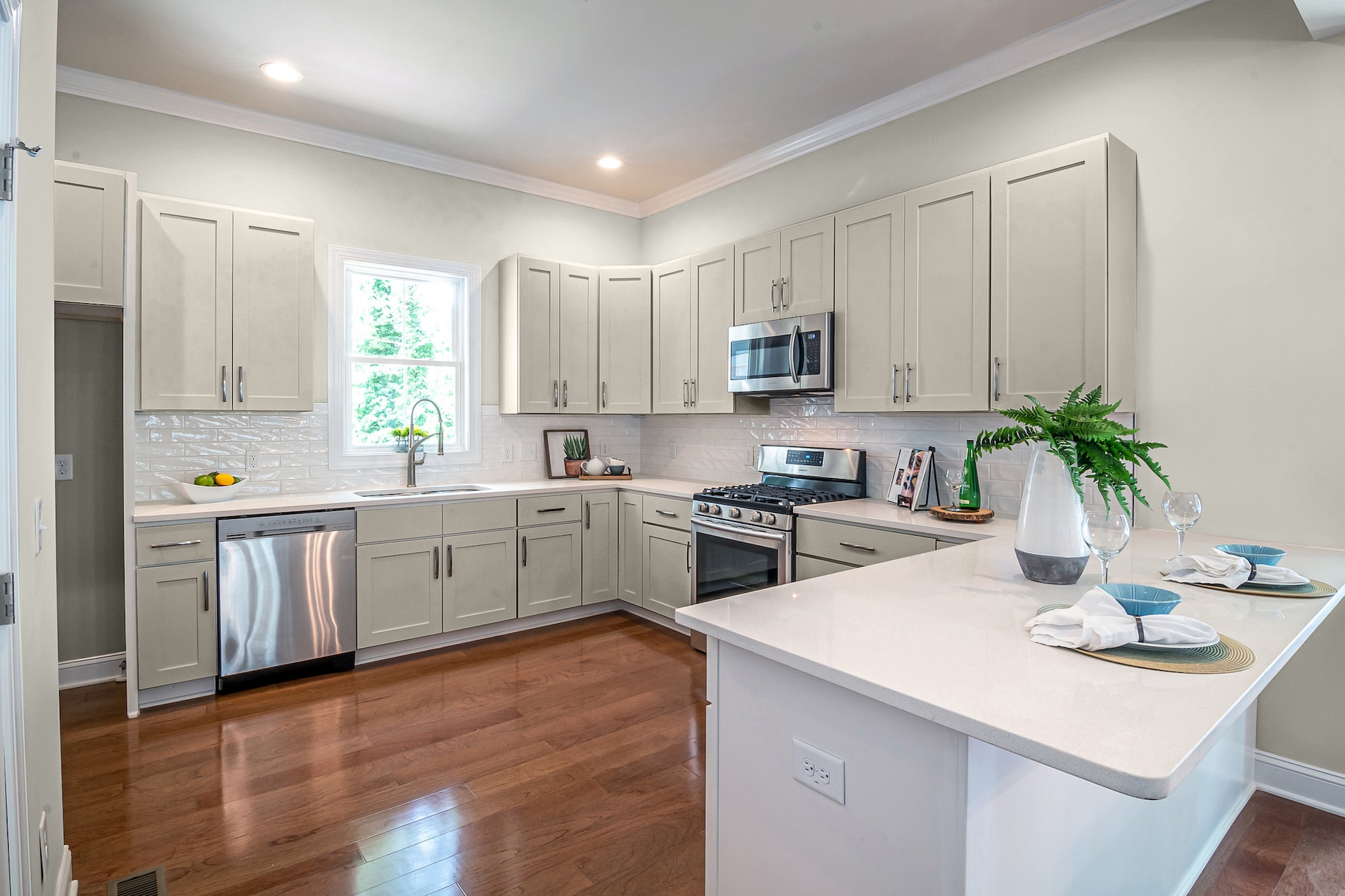
Roycroft Mist is a dark-tinted lighter neutral tan that can give your kitchen major appeal. In addition, the gray in the Repose walls can boost the gray notes in Roycroft for more dimension.
This shade of greige features beautiful brown and yellow tints that give cabinets depth that makes them stand out against the lighter nuances of Repose Gray.
Chelsea Gray by Sherwin Williams
To contrast colors, use Repose Gray for the walls and a classy Chelsea Gray for the cabinets. Chelsea Gray is a full-bodied brown-gray with elegant greenish vibes.
Pairing this darker-toned shade with the lighter nuance of Repose gives you a contrast of neutral tones that will never go out of style.
Bunglehouse Blue by Sherwin Williams
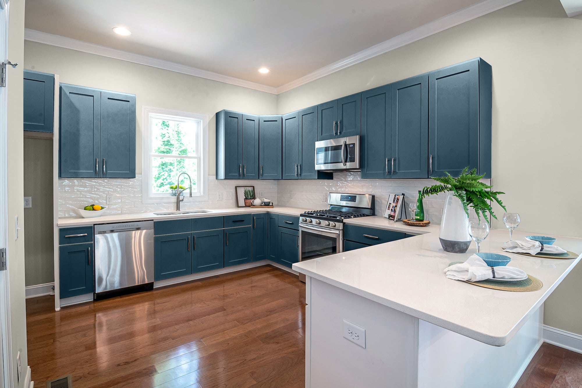
When you have a light neutral color on the walls like Repose Gray, you have the perfect setting to go bold and dark with your cabinet colors.
Bunglehouse Blue is a rich, saturated blue with deep, dark pigmentation of gray and black. Using this color for your cabinets gives you a stylish kitchen that can appeal to any design.
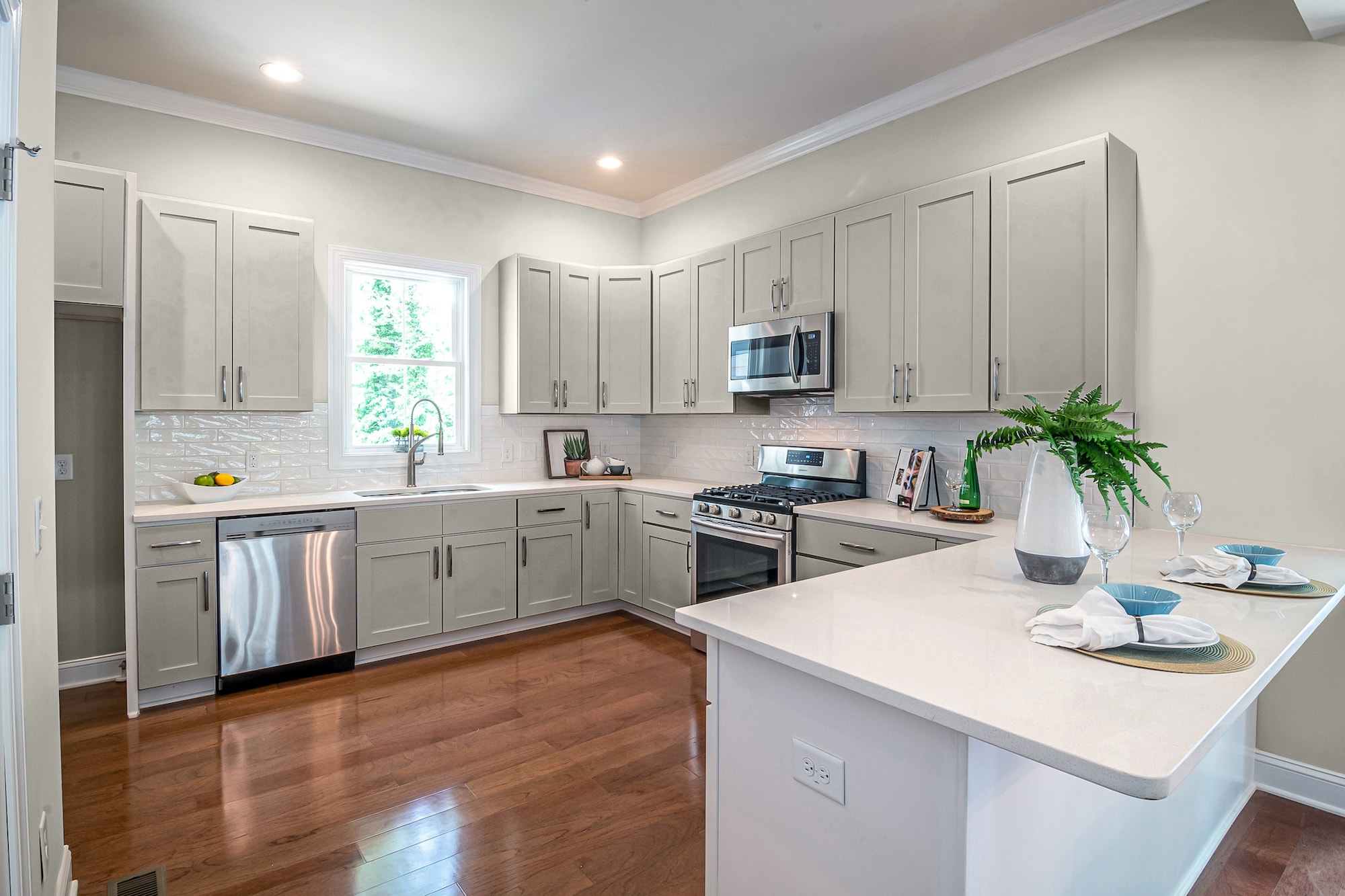
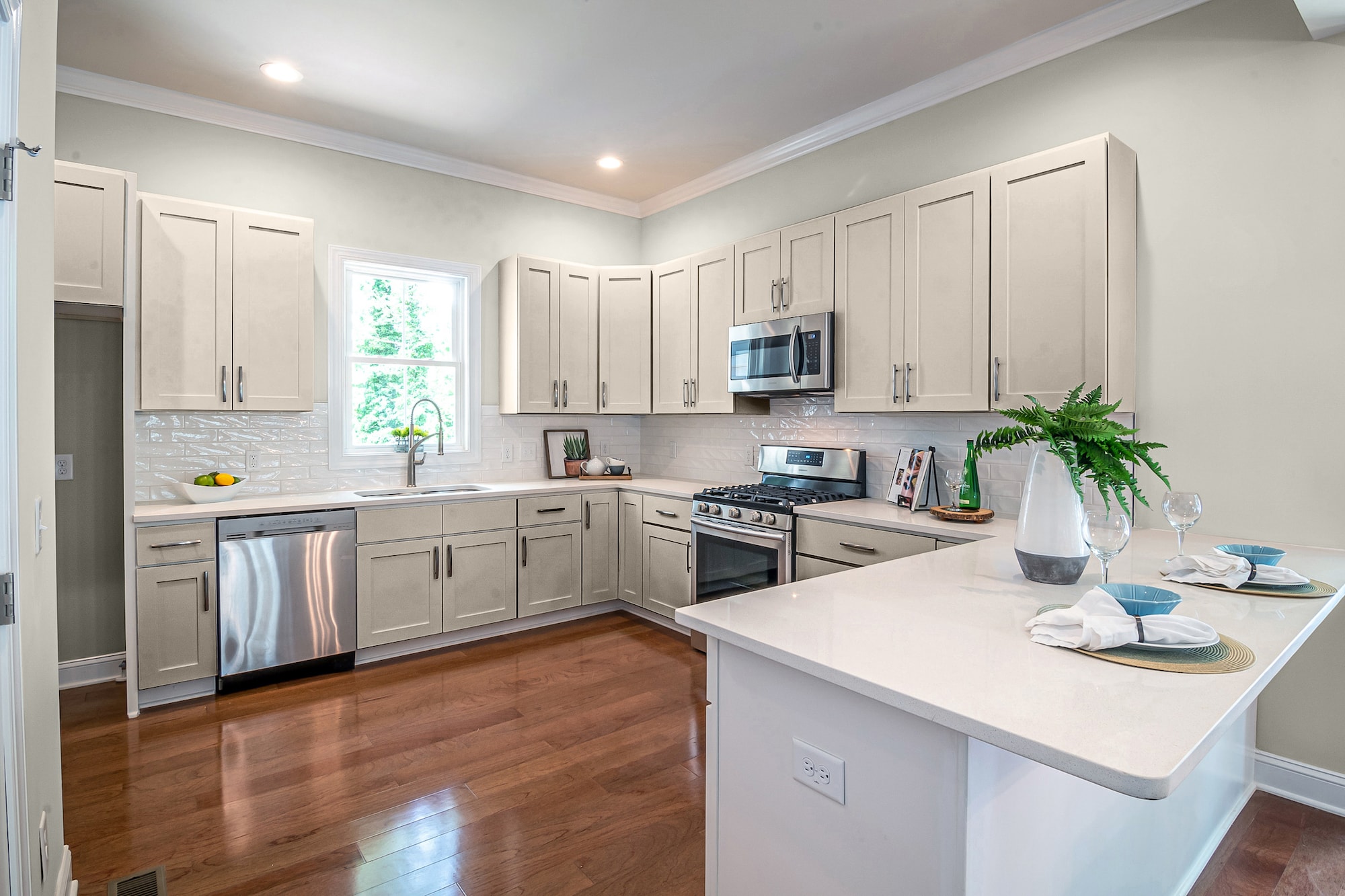
Classic Light Buff by Sherwin Williams
Make your kitchen feel bright and airy with a dull Repose Gray for the walls and a subtle tinted Classic Light Buff for the cabinet color.
This shade of white has light brown and gray pigmentations that add body and depth. The slight hints of yellow activate the faint traces of green buried in the Repose Gray walls.
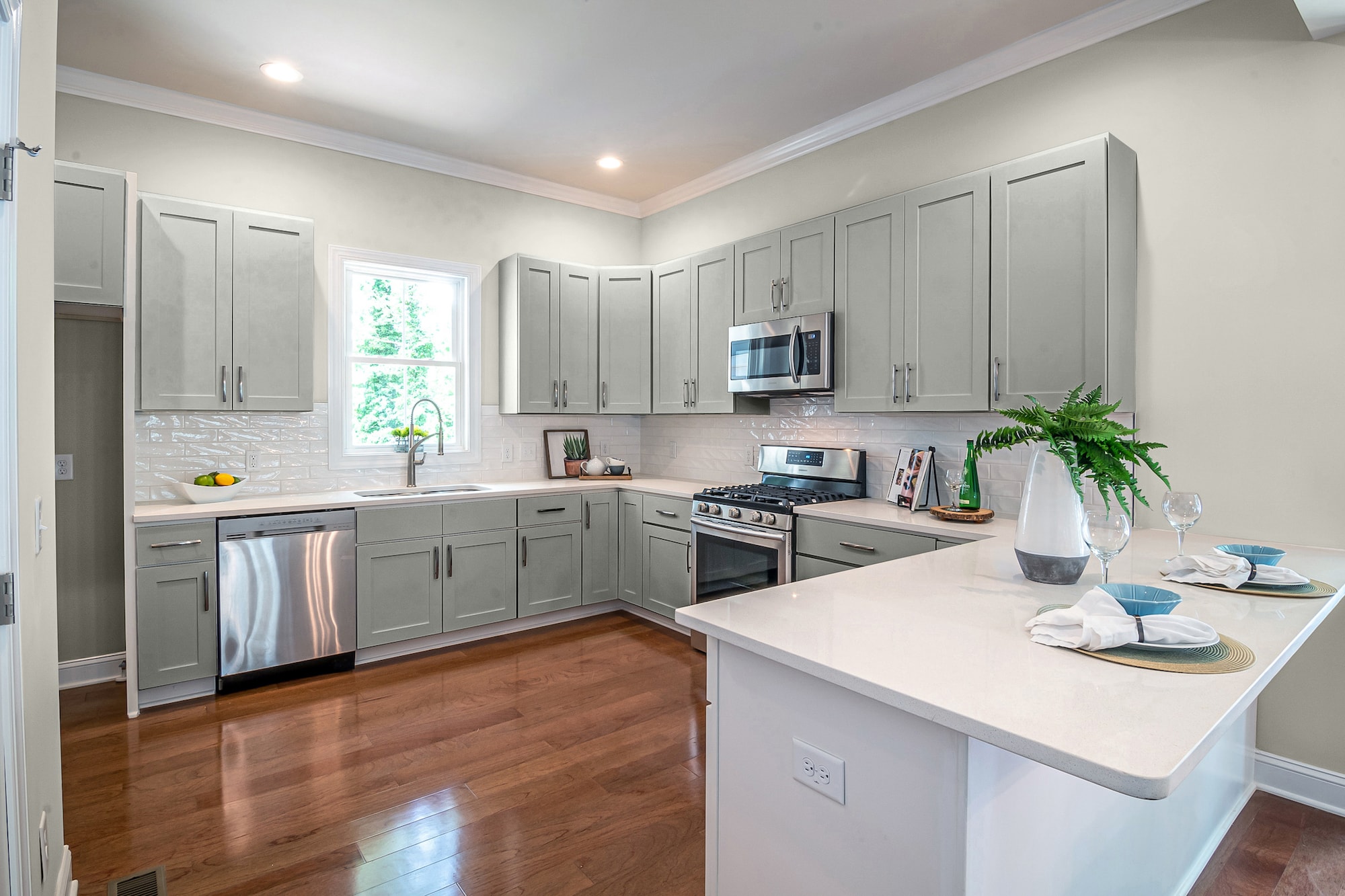
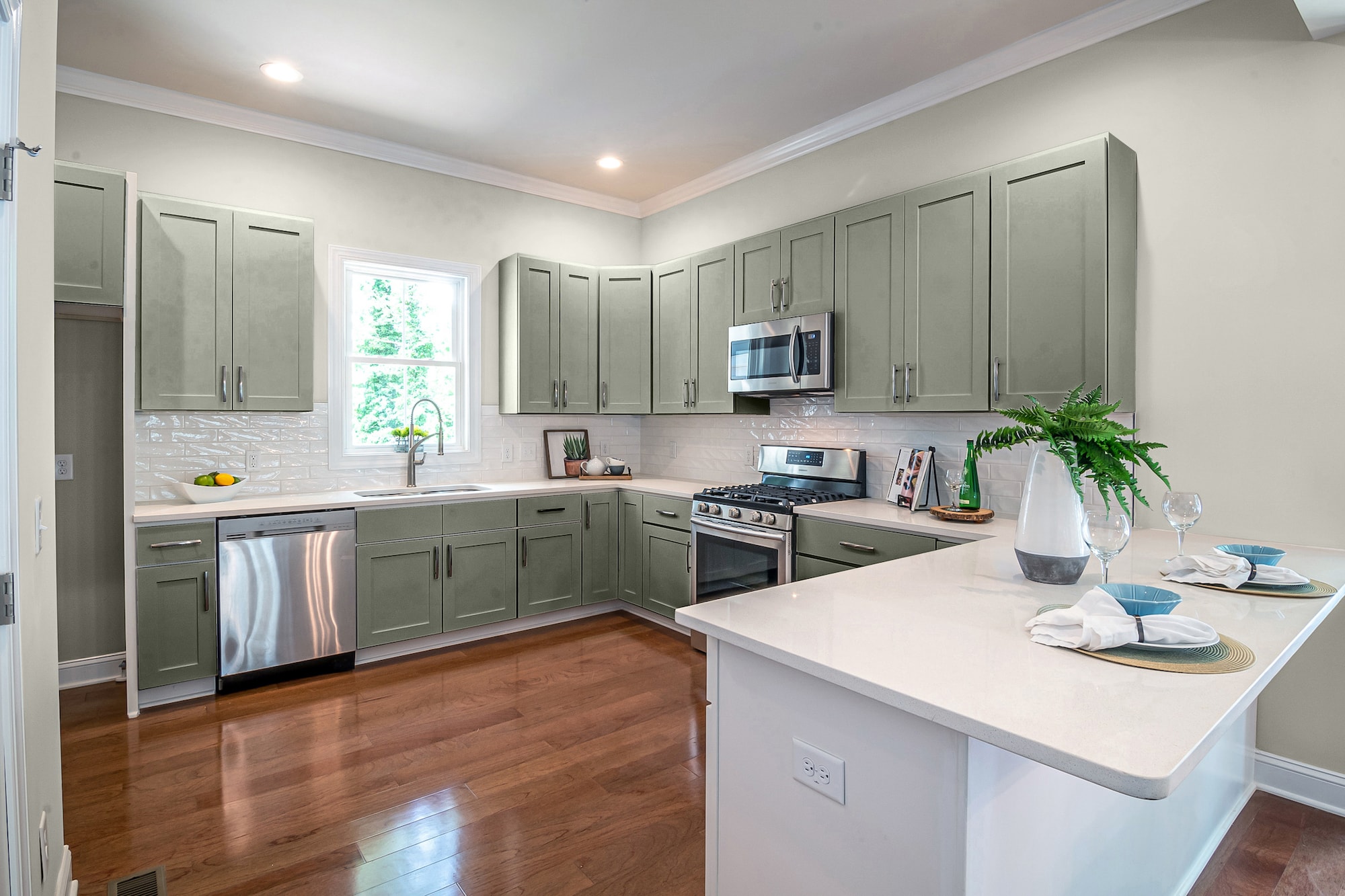
Contented by Sherwin Williams
You can use a powerful color like Contented for the cabinet color to go with Repose gray walls. Contented is a blended gray with saturated green pigments that give this major color power.
The mid-tone richness means that your cabinets have saturated tinting. However, it gives your kitchen a soothing, earthy nuance that affects the undernotes in Repose for walls that look slightly yellow or yellow-green.
Museum Piece by Benjamin Moore
Museum Piece is a versatile neutral shade of gray with rich brown pigments that give this color a darker earthy nuance.
A few shades darker than Repose Gray, Museum Piece can give your walls a cool, yellow tone that offsets the denseness of the cabinets.
Arctic Seal by Benjamin Moore
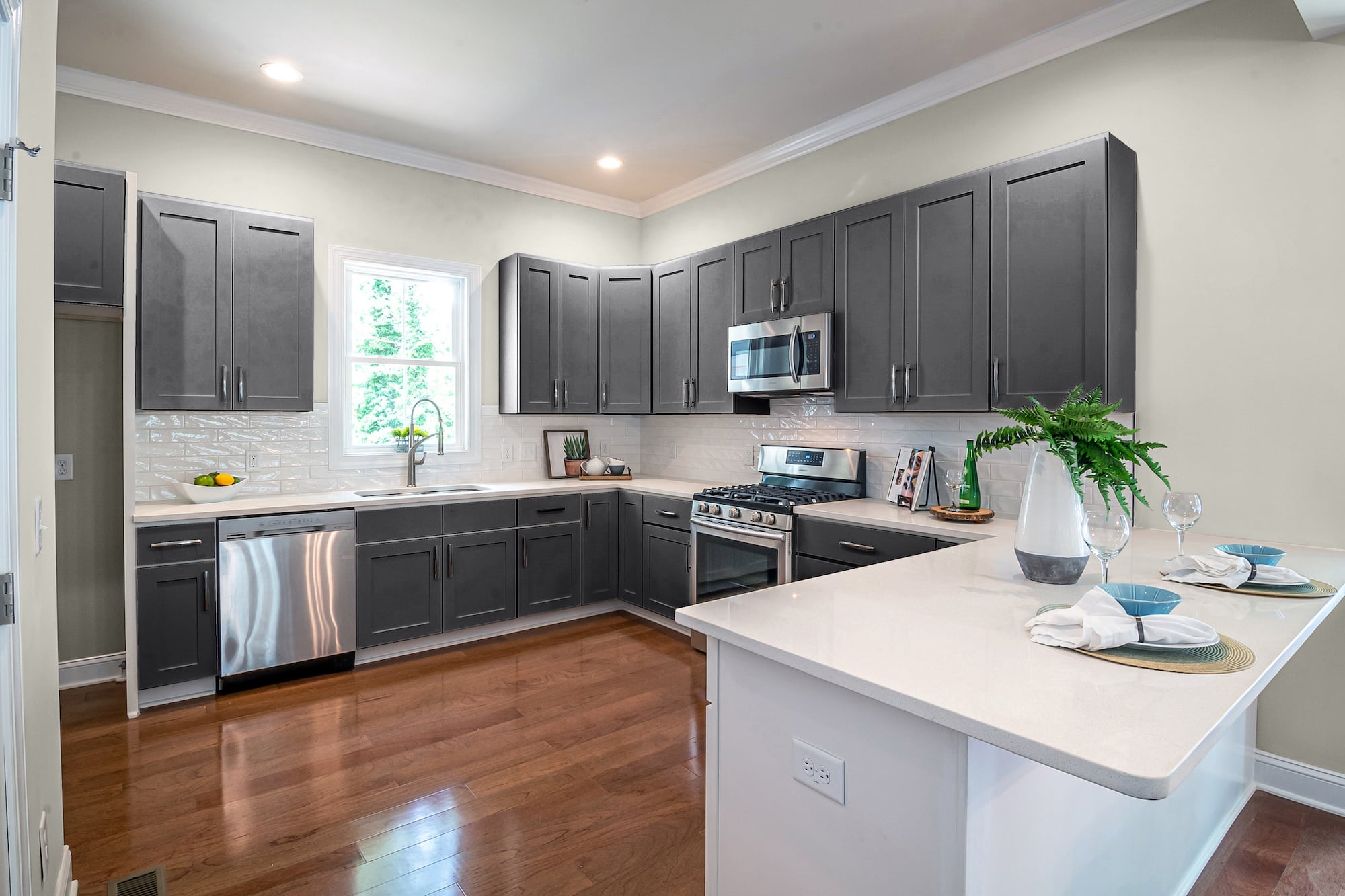
If you’re looking for a bold, modern way to decorate a kitchen with Repose gray walls, choose a dark cabinet color like Arctic Seal.
Arctic Seal is a dark saturated shade of gray with black and blue undernotes. This gray won’t overpower your kitchen or make your space too dark despite the rich saturated pigmentation.
Sea Salt by Benjamin Moore
For a light, bright kitchen, pair Repose gray walls with a neutral like Sea Salt. This faintly tinted off-white has subtle brown highlights that make the color look like a creamy tan.
This cabinet color is slightly lighter in pigment than the greige tones of Repose, creating a slight contrast that adds dimension.
Oil Cloth by Benjamin Moore
Oil Cloth is a sophisticated shade of gray-green that you can use for a refined, subtle tinted cabinet color that pairs seamlessly with Repose gray walls.
The darker pigmented hues of green and brown in the cabinets pull out faint brown and yellow hints in the walls for a subtle yet elegant transitional contrast.
Lavender Wash by Benjamin Moore
For contrast against Repose gray walls, choose a cabinet color like Lavender Wash. This cool, faintly pigmented tone of gray has traces of silver and lavender.
When used against the warm, darker pigmented greige walls, you get a drastic yet classy color transition that can brighten up small spaces and look timeless.
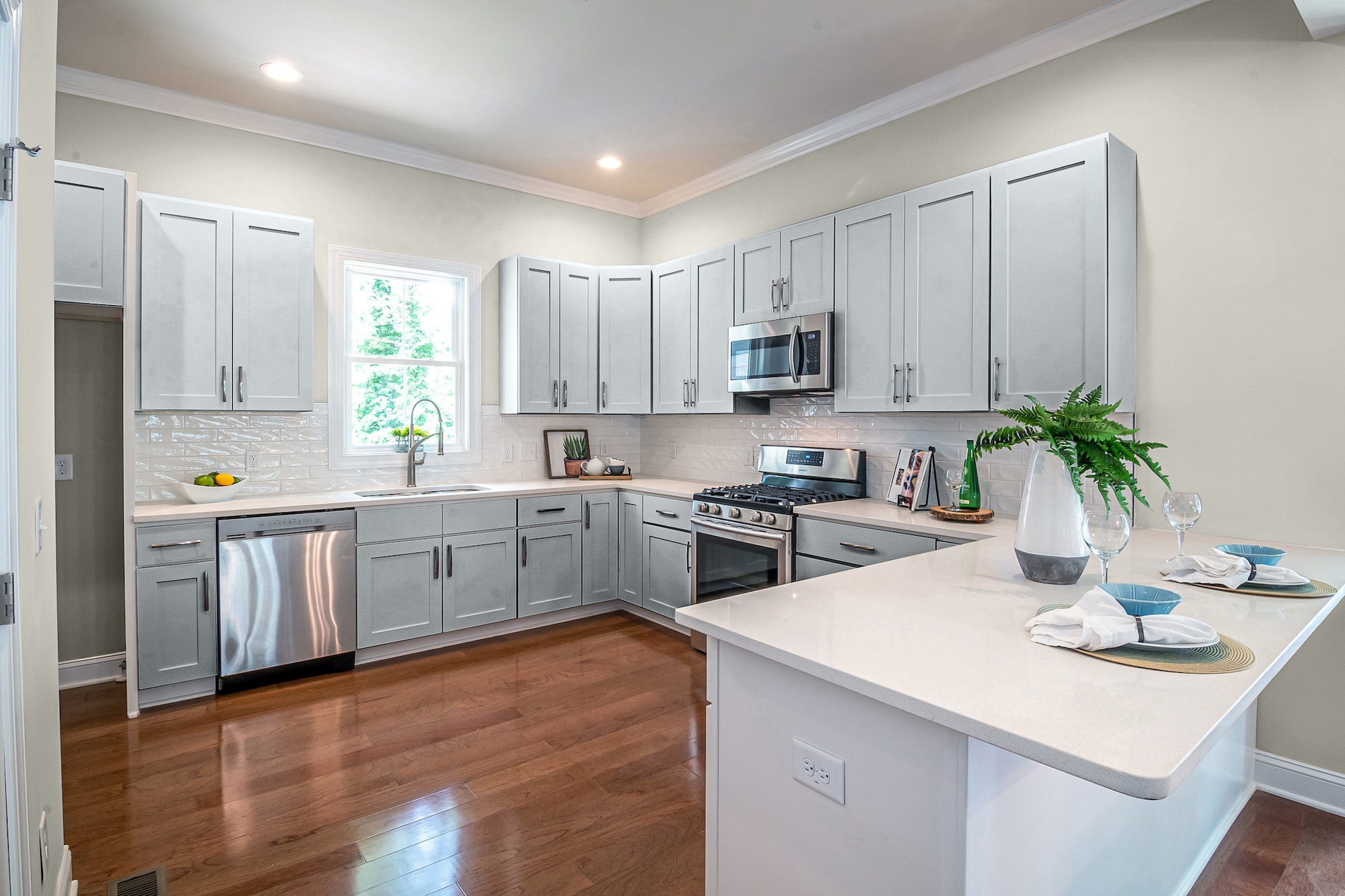
Platinum by Behr

Go for a monochromatic (different hues of the same color) vibe by pairing Repose Gray walls with Platinum gray cabinets.
Platinum is a cool, lightly pigmented gray shade that is perfect for windowless or small kitchens. The high LRV and low tints make this color excellent for making your space feel bright and spacious.
Wheat Bread by Behr
To get an earthy, understated aesthetic, you can use a mid-toned warm neutral like Wheat Bread. This tan with faint brown and taupe notes can make your cabinets stand out against the greige notes of Repose.
Wheat Bread is a slightly darker neutral than Repose and creates a smooth transition between the two colors. As two neutrals, these timeless colors can go with any design and color accents.
Dimpse by Farrow & Ball

Dimpse is an energetic, cool-temperature light-gray with sophisticated lavender and blue hues that can spice up the warm greige notes of Repose.
This neutral gray gives your kitchen a crisp, clean, versatile nuance that can work for any design. Use it for a modern aesthetic, minimalistic approach, country chic, earthy nature-inspired, or traditional style.
Manor House Gray by Farrow & Ball
Manor House Gray is a mid to dark-toned shade of gray with rich brown, mauve, and green hues. When you use this darker color against the lighter notes of Repose, it can make your walls look more yellow.
Darker cabinets are a great way to give your space a modern feel. But when you’re working with neutrals, you can achieve many different designs with the same colors.
Final Words
When you use a greige like Repose gray for your kitchen wall color, you can go light or dark with your cabinet colors. Neutrals are great choices because you can retheme with ease. However, white can be a tricky color to use without looking washed out. So, if you’re going this approach, choose a tinted white. Or use one of these 15 cabinet colors to go with Repose gray walls.