Best Sherwin Williams Neutral Colors
Neutral paints are always on top of the bestselling color lists. Time and again you’ll see grays and blacks, greiges and taupes, whites, creams, and off-whites, popping up in homes everywhere. What makes neutrals so popular?
Designers love neutrals because they offer the maximum flexibility when it comes to coordinating colors and adding decor. Realtors love neutrals because they have a broad appeal and make a home move-in ready. Homeowners love neutrals because they’re easy to use and allow you to update your decor without having to change your paint colors. It’s a win-win-win combination!
Neutrals are easy to use, but there’s so many out there, you might have a hard time knowing where to start with them. Never fear! I have narrowed down the best neutral colors from Sherwin Williams for you to begin your next project.
What do I mean by the best? All of these colors are wildly popular. You’ll find thousands of photos of them tagged on Instagram. Many of them are on the Top 50 Colors list.
These are the neutral paint colors that homeowners, designers, and realtors have turned to again and again to create stunning, photo-worthy houses.
And now you can use their favorite colors to create a space you’ll love. Let’s get started!
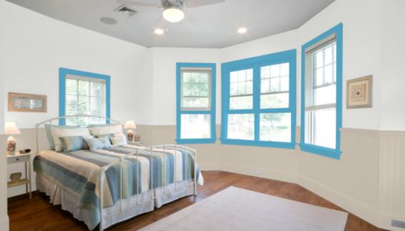
Naval
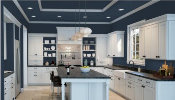
It might surprise you to see a list of neutrals headlined by a blue color like Naval. But navy blues are gaining attention as the “new neutral”.
Just like you can wear your favorite jeans with anything, you can use Naval with any colors you fancy too. This is a traditional dark navy blue with gray undertones, and a low LRV of 4.
Naval Makes Colors Pop
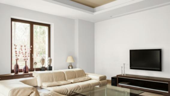
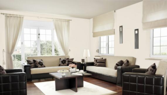
Alabaster
Alabaster is a versatile color that straddles the divide between off-white and white, offering the benefits of a warm white without distracting yellow undertones.
This allows it to work with a wider range of colors. Alabaster is a good choice for brightening a room, with a LRV of 82.
Alabaster Brightens Without Yellowing
Mindful Gray
Mindful Gray is a medium-to-dark toned warm greige with a wonderful earthy quality to it.
That earthiness works well with refreshing blues or botanical greens, if you’re looking for a nature-based palette that soothes the spirit. Mindful Gray has a LRV of 48.
Mindful Gray is Great for Cabinets
Light French Gray
Light French Gray is a well-balanced, mid-tone gray that pretty much epitomizes what usually comes to mind when someone says “gray”.
This color isn’t actually too light, despite the name–its LRV of 53 ensures that it has some depth. A touch more red in its makeup ensures that Light French Gray isn’t overly cold, and adds to its versatility.
Light French Gray is the Epitome of Gray
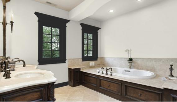
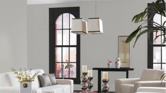
Tricorn Black
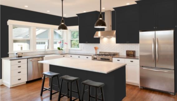
When only the darkest black will do, Tricorn Black is the best. This black has an astonishingly low LRV of 3, and is so dark that it has no visible undertones.
That means it’s completely neutral as well. Tricorn Black is equally at home on historic buildings and in bold modern settings.
Tricorn Black Adds Sophistication and Drama
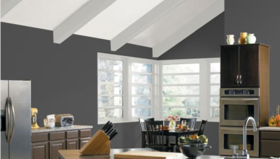
Iron Ore
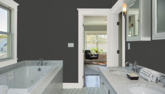
Iron Ore is an intense and moody charcoal gray that has this air of mystery about it. It’s in the depths that aren’t quite black, but something other, that draws you in and makes you keep looking.
Iron Ore is still dark enough to look black, with a LRV of 6.
Iron Ore Partners Well with Metals
Snowbound
Snowbound is an extremely light pastel gray. Under most conditions, it will look white. Its LRV of 83 puts it just over the borderline from off-whites into whites.
Snowbound is Great for Transitional Design
Agreeable Gray
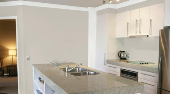
Agreeable Gray is an evenly-balanced greige color with a decorator’s ideal LRV of 60. This is one of those colors that’s just right: not too warm or cool, not too dark or light. That’s what makes it so…agreeable!
Agreeable Gray is Perfectly Balanced
Dovetail
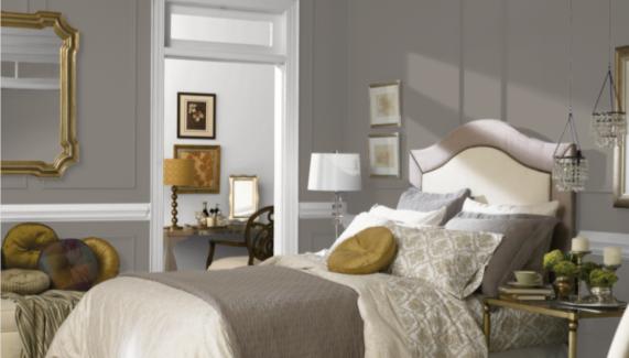
Dovetail is a dark greige that leans towards its warm and earthy beige side. It has a chocolate brown appearance, and occasionally flashes purple undertones. Dovetail has a LRV of 26.
Dovetail is Excellent for Accents
Peppercorn
Peppercorn is a deep charcoal gray with an exact balance between its red, green, and blue values. This dramatic gray looks spectacular next to vivid jewel tones or sparkling metals. Peppercorn has a LRV of 10.
Peppercorn Partners Well With Modern Decor Styles
City Loft
City Loft is a light, warm greige that’s easy to incorporate into many different color palettes and decor styles. This color will offer an unobtrusive backdrop for a room while making it brighter and cozier. City Loft has a LRV of 70.
City Loft is a Great All-Over Color
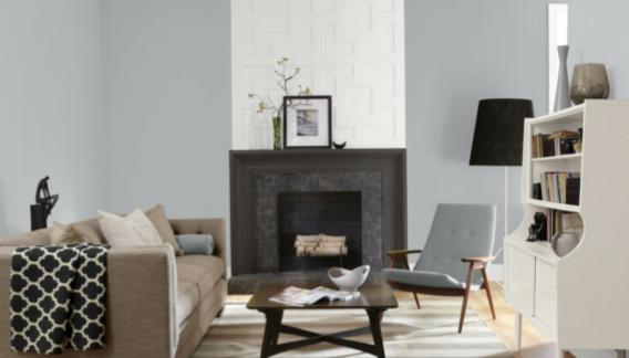
Passive
Passive is a light, cool gray with blue undertones. Its LRV of 60 hits that decorator’s ideal range that’s prepared to tackle all sorts of lighting conditions. Passive is a relaxing color that can bring a calm and meditative quality to a space.
Passive is Suited to Minimalist Decor Styles
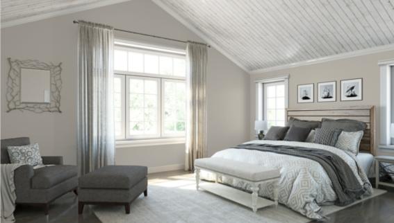
Accessible Beige
Accessible Beige is a mid-tone greige that favors its beige side. It’s one of the top-recommended colors for staging and selling a home. Accessible Beige has a natural balance that enables it to make friends with any other colors you’d like to add to its palette. Its LRV is 58.
Accessible Beige is Lovely Next to Red Brick
Creamy
Creamy is an off-white with a warm glow that’s fantastic for brightening up rooms or pairing with gold. It’s also a favorite next to Tricorn Black. Creamy is a favorite choice for cabinets, or for filling kitchens with light. Its LRV is 81.
Creamy Glows Up a Room
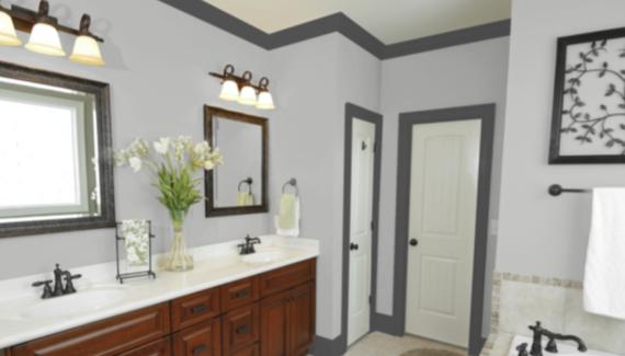
Gray Screen
Gray Screen is a light gray with a close-to-ideal LRV of 59, making it suitable for most lighting situations. This is a cool-toned gray that works beautifully with other shades of gray as accent colors.
Gray Screen is Stunning in Monochrome Palettes
Wait, So What is LRV?
LRV stands for Light Reflectance Value. It’s a way of measuring how light or dark a color is. The scale runs from absolute black, which is 0, to sheer white, which is 100. The LRV numbers are provided in this article so that you can easily compare the colors on the list to each other.
Final Thoughts
Neutrals are the most user-friendly colors of the paint world. You don’t have to worry about neutrals clashing or bringing unruly undertones to the party. These colors get along with everybody, and they love your taste in art and furniture too! Pick some of your favorites from this list and you’ll be heading in the right direction for your next house refresh. Happy painting!