Boothbay Gray by Benjamin Moore
Lots of popular gray paint colors these days aren’t really gray at all. They’re blended with beige to become greige colors, or tinted brown to become taupes.
The idea is that these blends make gray more interesting.
What if you actually like gray? Are you doomed to boring flat grays, or else “gray-posters” that are hard to even pin down as gray?
Yes I made up the word gray-poster, just now. Look, if we can combine gray and beige, then we can combine gray and imposter, right? ….right?
Good news! It turns out that there are actual gray colors out there with depth and interest, and you don’t even have to make up words for them. (Although you totally could…)
Let me introduce you to a gray with substance: Boothbay Gray.
What Color is Boothbay Gray?
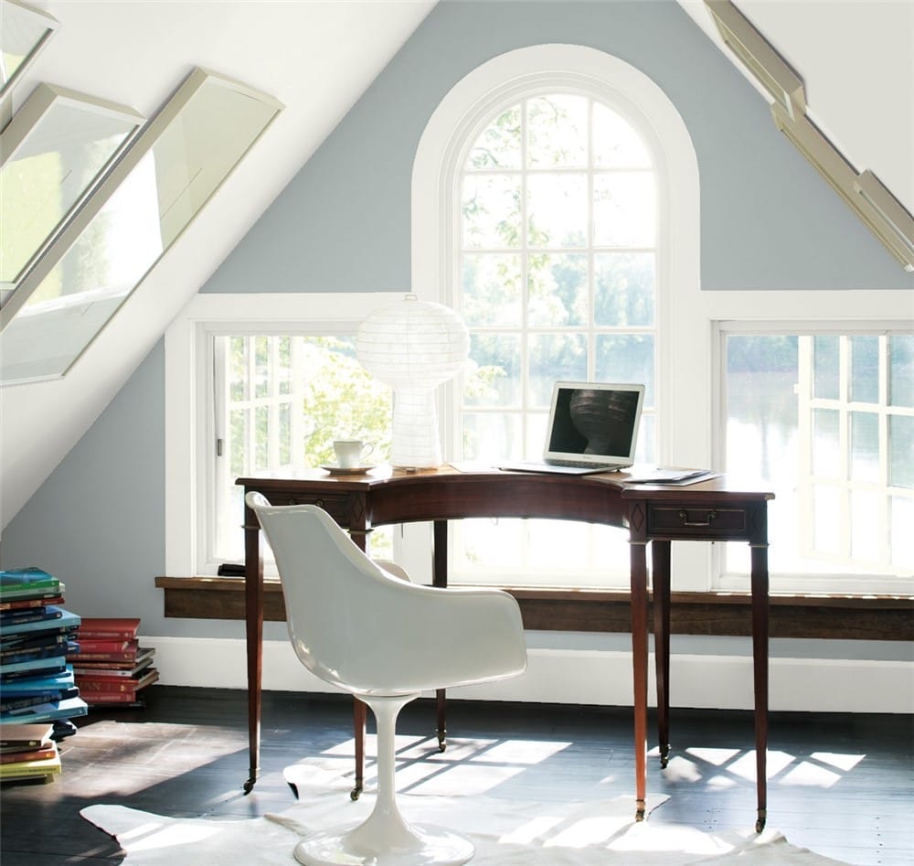
Boothbay Gray is a medium-toned gray, blended with blue. A great way to describe it is as a steel gray.
LRV of 43.26
Boothbay Gray has a light reflectance value (LRV) of 43.26. Light reflectance value is a scale designed to measure how bright a color is, and ranges from absolute black at 0 to sheer white at 100. The higher the number, the brighter the color.
What Undertones Does Boothbay Gray Have?
Boothbay Gray has stormy blue undertones that add depth, and give it a moody look. This is where the magic happens for Boothbay Gray, because it makes this color more interesting than just a flat wash of warehouse gray.
Is Boothbay Gray a Warm Color or a Cool Color?
Boothbay Gray is a cool color. Its gray and blue components are both also cool colors, and it doesn’t contain any of those beige or taupe tones that create a greige or warm gray.
Where Can You Use Boothbay Gray?
Boothbay Gray is a medium-to-dark gray. As a main color, it can have a tendency to make a room feel darker and smaller.
Also, as a cool gray with blue undertones, Boothbay Gray on the walls can make a room feel colder.
If you’re dealing with a room that doesn’t get a ton of light, or a smaller space, Boothbay Gray as the main wall color could cause a cavern effect.
However, you can work with Boothbay Gray to take advantage of its best traits and balance out its dark and cool tendencies.
Consider white or light colors as a counterpoint to Boothbay Gray on ceilings or floors. You can also limit Boothbay Gray to accent areas, or break it up with decor placement.
Boothbay Gray is a great choice for areas where you want more depth, such as exteriors or rooms with a lot of natural light.
It’s also a great option for cabinets, kitchen islands, and bathroom vanities.
Let’s take a look at Boothbay Gray in home spaces to see how it does its thing!
Living Room
Boothbay Gray bookshelves give this living room cool balance to its warm neutral color scheme.
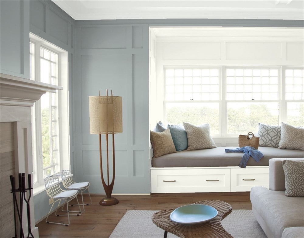
Boothbay Gray and White Dove create a soothing and balanced reading corner in this living room.
Kitchen
Boothbay Gray is an elegant paint color for kitchen cabinets that coordinates beautifully with silver metalwork.
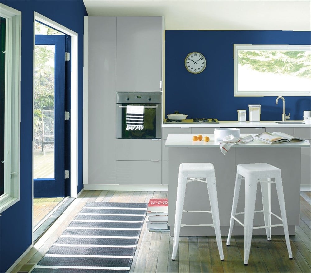
Boothbay Gray partners with Symphony Blue for a bold, clean, minimalist style in this kitchen.
Dining Room
A focal wall in Boothbay Gray pulls together the elements of this centered and balanced dining room.
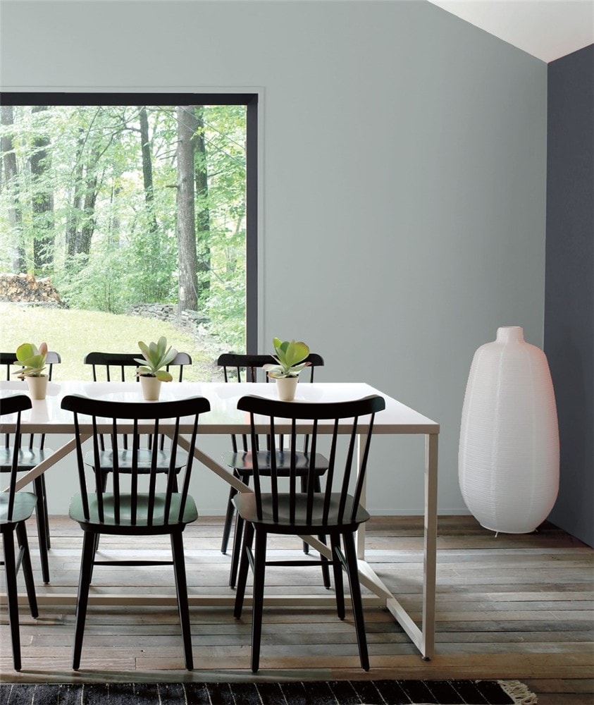
Witching Hour and Boothbay Gray make a bold and stylish statement in this dining room.
Home Office
On a budget? Get a custom-built look by painting your furniture to match your focal wall, like the Boothbay Gray Ikea hack in this home office.
Bedroom
Boothbay Gray is a cool and relaxing bedroom color that looks elegant when balanced with light neutrals.
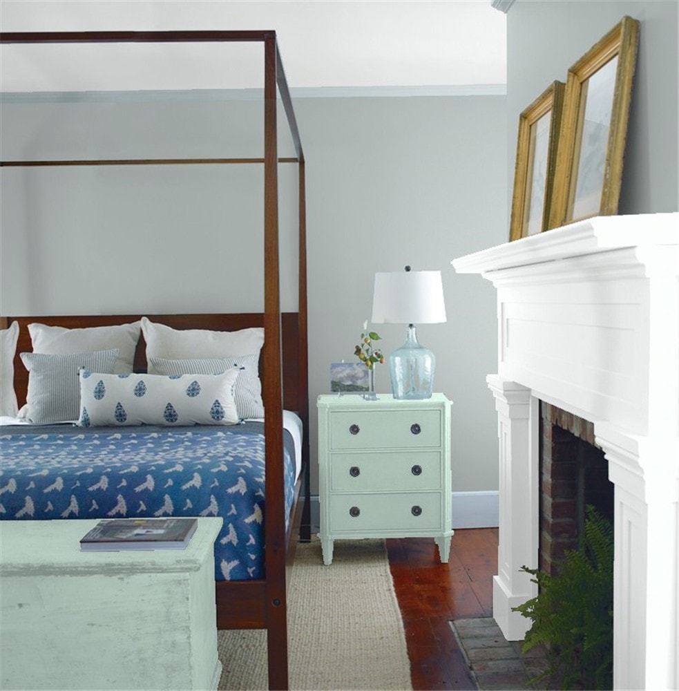
Boothbay Gray’s blue undertones come out to play with the blues in this bedroom’s decor.
Bathroom
Boothbay Gray on the vanity adds depth to this white and gold bathroom.
Boothbay Gray on these bathroom walls picks up the gray tones in the marble counters.
Laundry Room
Boothbay Gray cabinets set off the gold and silver in this surprisingly luxe laundry room.
Front Door
The range of greens in your favorite potted plants and floral swag can complement the cool tones in Boothbay Gray.
Exterior
Black, white, and Boothbay Gray make this exterior look stylish and sophisticated.
Boothbay Gray sets off a crisp white trim on this traditional exterior.
Boothbay Gray Coordinating Colors
Grays are neutrals, which is great news for color lovers, because they’re easy to coordinate with all kinds of colors. Boothbay Gray is a cool gray, but it will still partner a wide range of colors.
You can partner any of your cool family favorites with grays, such as blues, greens, purples, and of course other grays. Boothbay Gray’s blue undertones mean that other blues are going to be especially lovely coordinating colors.
I can hardly talk about pair-ups for gray without bringing up the timeless combination of black, white, and gray. These three together instantly add drama and sophistication to any space, and are easy to dress up with gold or silver.
Another fun combination to try is gray and pink. A light, rosy pink might do well with Boothbay Gray as an accent.
Need some coordinating color inspiration for Boothbay Gray? I’ve got you covered:
- White Wisp by Benjamin Moore
- Chantilly Lace by Benjamin Moore
- Frosted Petal by Benjamin Moore
- Palladian Blue by Benjamin Moore
- Wythe Blue by Benjamin Moore
- Jamestown Blue by Benjamin Moore
- Hale Navy by Benjamin Moore
- Witching Hour by Benjamin Moore
- Gray Owl by Benjamin Moore
- Urbane Bronze by Sherwin Williams
- Sea Salt by Sherwin Williams
- Naval by Sherwin Williams
- Extra White by Sherwin Williams
- Topsail by Sherwin Williams
- Drizzle by Sherwin Williams
How Does Boothbay Gray Compare With Other Colors?
Boothbay Gray vs Stonington Gray by Benjamin Moore
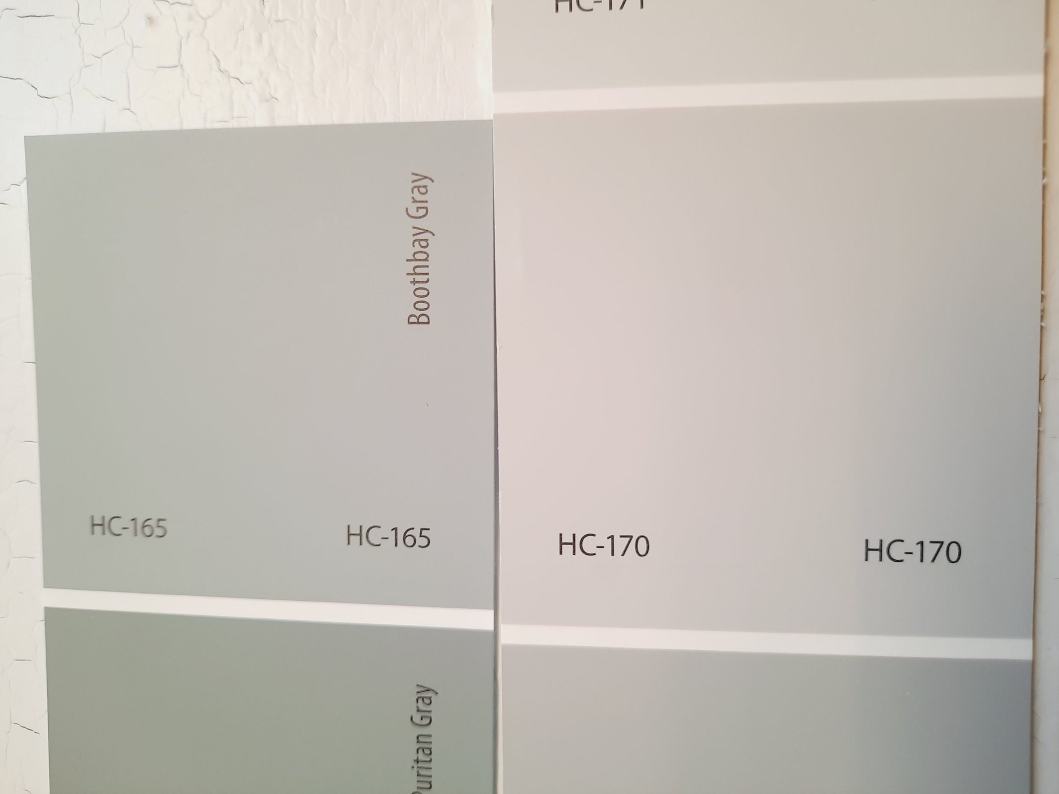
Stonington Gray is a mid-tone neutral gray. It’s warmer than Boothbay Gray, and doesn’t have the same blue undertones. Stonington Gray is significantly lighter than Boothbay Gray, with a LRV of 59.36.
Boothbay Gray vs Coventry Gray by Benjamin Moore
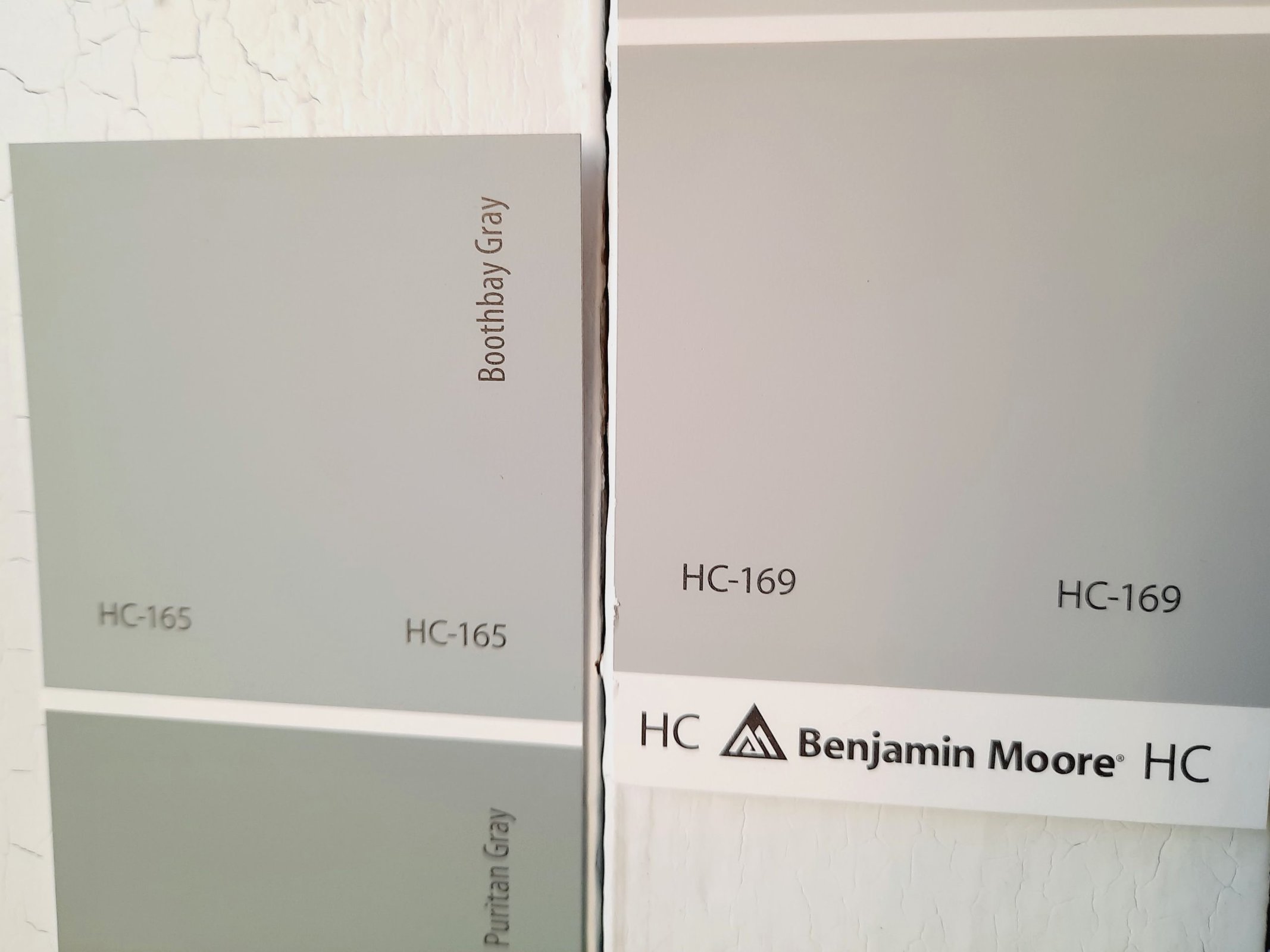
Just one spot down on the same paint chip as Stonington Gray, we find Coventry Gray, which is another medium-toned neutral gray. As expected, it’s also warmer than Boothbay Gray, and lacking in those cool blue undertones. Coventry Gray is closer to Boothbay Gray’s LRV, sitting at 48.18.
Boothbay Gray vs Gray Owl by Benjamin Moore
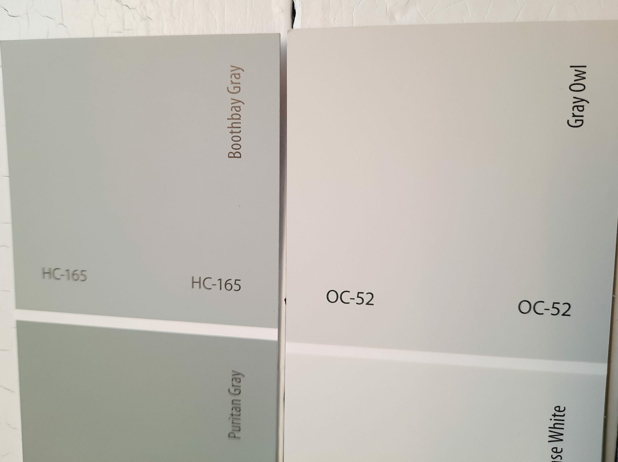
Gray Owl is a light, cool gray that’s very popular with Benjamin Moore fans for its versatility. Despite its cool cast, Boothbay Gray is still the cooler of the two. Gray Owl is significantly lighter, with a LRV of 64.51. These two make good coordinating colors.
Final Thoughts
Boothbay Gray is a medium-dark steel gray for people who like their neutrals to be more interesting. It will also appeal to you if you love blue–and really, who doesn’t?
Boothbay Gray is dark and cool enough that you’ll want to place it thoughtfully, with lighter coordinating colors or decor elements to tame any cavernous vibes. But it’s just the thing for a room that needs to cool down, and it’s an essential for minimalist styles.