Abalone by Benjamin Moore
Usually when we talk neutral colors, I’m trying to bring attention to just how neutral that color is. After all, neutral colors blend in, which makes them super-versatile and easy-to-use.
Today I’m going to talk to you about a neutral color behaving badly. If there’s one thing neutrals aren’t supposed to do, it’s undertones. But this color really does them, and you’ll either love it–or hate it.
The color in question is Abalone, and it’s one of those “complex neutrals” that’s hard to describe, but easy to understand once you’ve seen it.
Have you ever seen the inside of a pearly seashell, where there are iridescent flashes of color? Just like the shells it’s named for, Abalone is a neutral paint color that flashes purple and pink.
Do you love purple? Then Abalone might just be your new best friend!
What Color is Abalone?
Abalone is a blend of gray and mauve. It’s one of the greige colors, which is a combination of gray and beige to create a more balanced neutral. Abalone can also be considered a taupe color, although it’s more gray than brown.
LRV of 61.99
Abalone has a light reflectance value, or LRV, of 61.99. Light reflectance value is a scale designed to measure how bright a color is, and ranges from absolute black at 0 to sheer white at 100. The higher the number, the brighter the color.
Many designers favor an LRV range of 60-62 as their ideal. This is because paints in this range are adaptable to a wide variety of lighting situations. Abalone is solidly in this ideal LRV range.
What Undertones Does Abalone Have?
Abalone has purple undertones, but they’re stronger than the usual purple undertones that come with the greige family’s territory. Abalone also sometimes flashes pink.
All gray colors have the potential for purple, blue, and green undertones, but Abalone has a purple component to its makeup that’s pretty noticeable. It’s pretty much a love-it or hate-it component of this color.
Is Abalone a Warm Color or a Cool Color?
Abalone is a warm gray color, thanks to its greige makeup and its purple-pink undertones. While grays are normally cool, you’re not going to see the blues and greens in Abalone that would ordinarily cool it down.
Where Can You Use Abalone?
For all the fuss about Abalone’s undertones, it actually looks great under lighting from any direction. Also, its LRV of 61.99 is absolutely the bees’ knees as far as most designers are concerned.
That means that Abalone is able to work well under a wide range of lighting conditions, which means both your dark and bright rooms are covered.
Abalone’s gray and purple give it depth, and when it’s on the walls, you’ve got a hint of color that’s more than your average neutral.
That makes it easy to use Abalone as a main color, or for things like cabinets, shelves, and vanities.
If you love bright colors in your decor, Abalone can still create a neutral backdrop to let them shine. Or, it can set the stage for a softer and more subdued look.
Let’s watch this interesting color at work and get some ideas for how to use it.
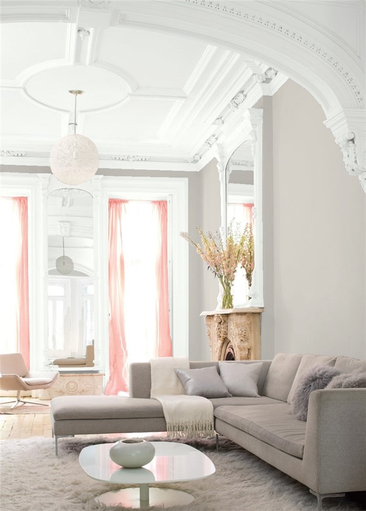
Living Room
Abalone forms a neutral backdrop for the brightly colored decor in this living room.
Kitchen
Abalone cabinets offer a warmer alternative for an all-white kitchen.
Dining Room
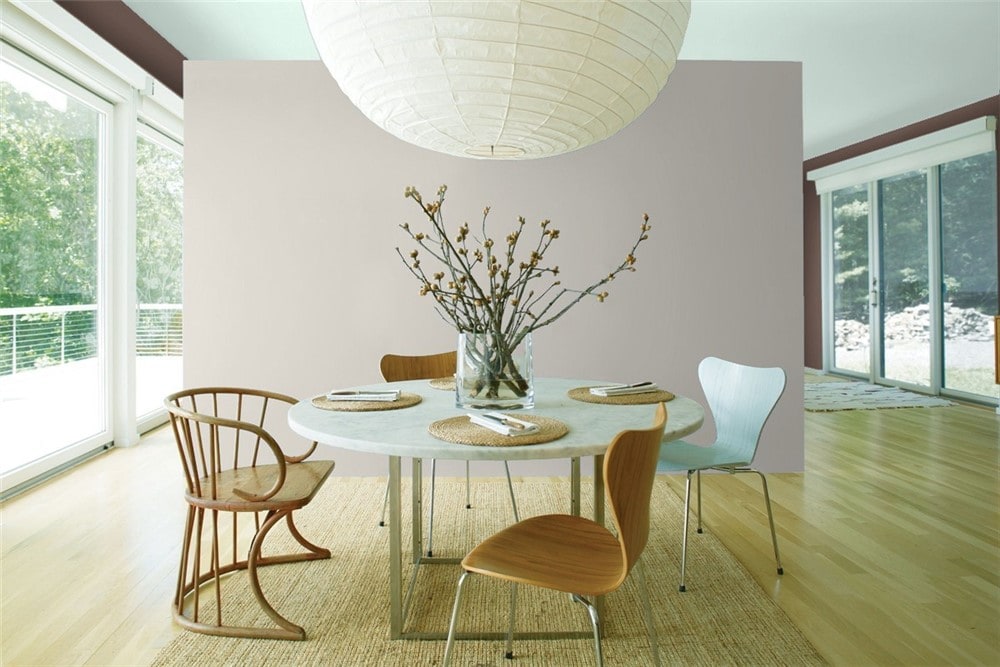
Abalone’s soft violet side is magnetic on the focal wall of this dining room.
Home Office
Abalone walls are stylish but calm enough to allow for focus in this cute study space.
Bedroom
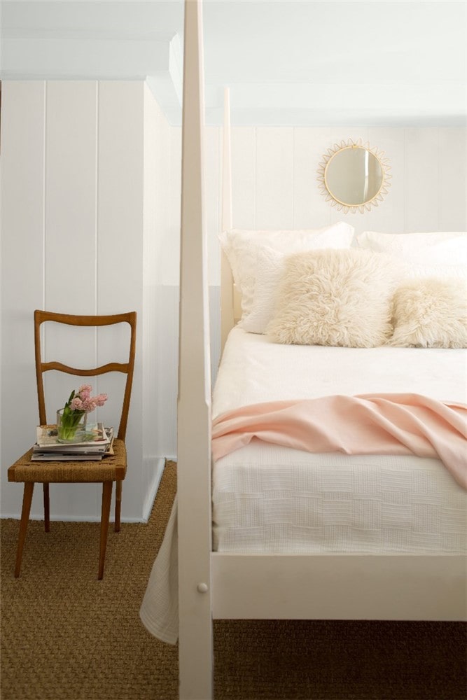
Thanks to the lighting and the decor, Abalone is showing its pink undertones in this bedroom.
Bathroom
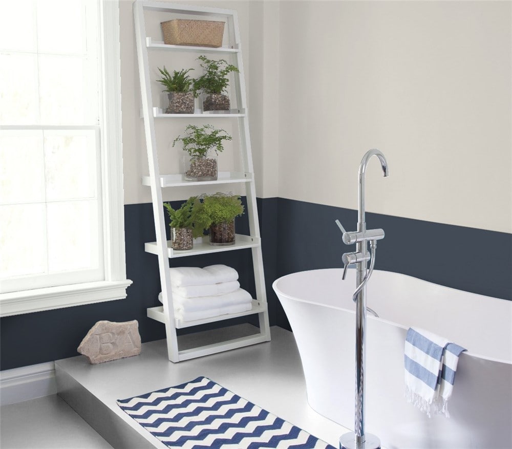
Abalone and Hale Navy lend a subtle coastal feel to this bathroom.
Entryway
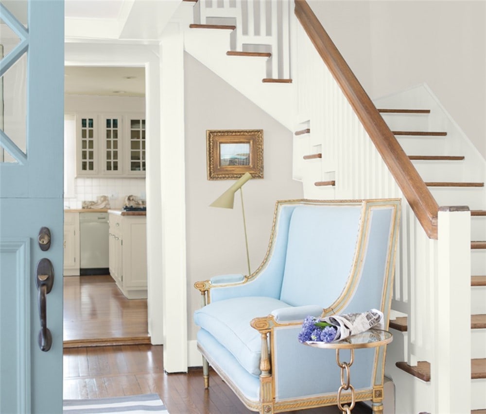
Abalone and soft blues create an entryway that invites you to come in and relax.
Abalone Coordinating Colors
Abalone’s tricky position as a rebellious neutral really comes into play when you’re choosing coordinating colors. Those warm purple undertones are going to make themselves heard, and you want to make sure the other colors in your palette are cool with that.
That said, Abalone is still a greige, and that means you have a lot of coordinating color options. Chances are, if you’re choosing Abalone to begin with, it’s because you see that purple undertone as a positive, so don’t be afraid to work with it.
Have fun and go for pinks! Soft rose pinks can bring out Abalone’s personality.
Colors that look good with grays will work with Abalone. Other grays are an easy place to look, and darker grays like slates and charcoals will create a pleasing contrast.
Blues are another great combination with grays. Light, watery blues can give a modern, creative look, while navy or indigo might give you something more traditional.
When choosing a white paint to go with Abalone, look for a simple white without undertones, rather than a warm white or an off-white. This will help you avoid clashing with the undertones Abalone is already bringing to the party.
If you need some coordinating color inspiration for Abalone, here are some ideas to get you started:
- Vanilla Milkshake by Benjamin Moore
- Titanic Rose by Benjamin Moore
- Beach Glass by Benjamin Moore
- First Light by Benjamin Moore
- Chelsea Gray by Benjamin Moore
- Simply White by Benjamin Moore
- Palladian Blue by Benjamin Moore
- Driftwood by Benjamin Moore
- High Park by Benjamin Moore
- Sea Salt by Sherwin Williams
- Naval by Sherwin Williams
- Smoky Blue by Sherwin Williams
- Basil by Sherwin Williams
- Slate Violet by Sherwin Williams
- Iron Ore by Sherwin Williams
How Does Abalone Compare With Other Colors?
Abalone vs Balboa Mist by Benjamin Moore
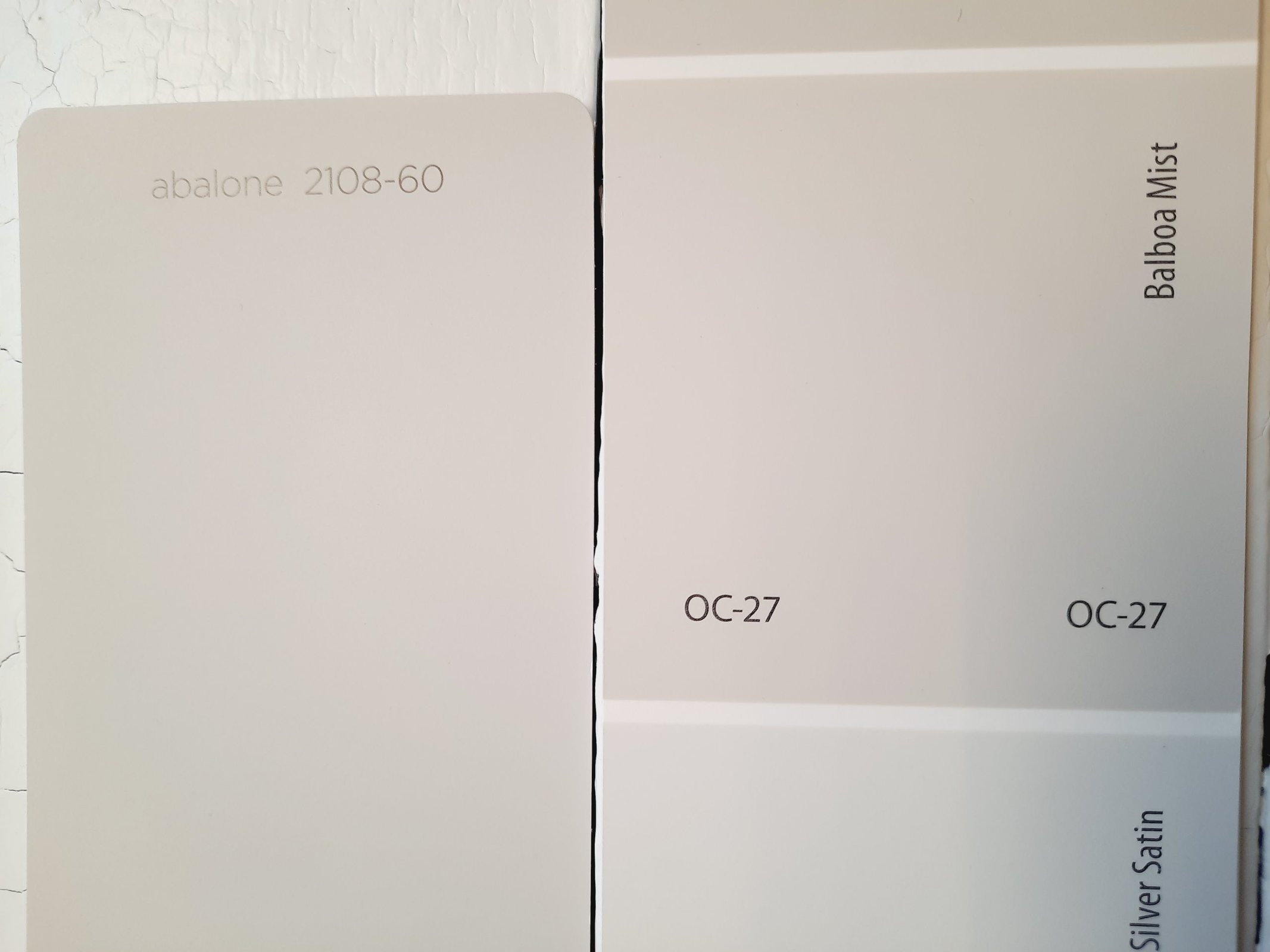
Balboa Mist is a light neutral from the greige family–lighter than the average greige and a touch lighter than Abalone, with a LRV of 65.53. Abalone’s distinctive purple undertones are the big differentiator between these two colors.
Abalone vs Revere Pewter by Benjamin Moore
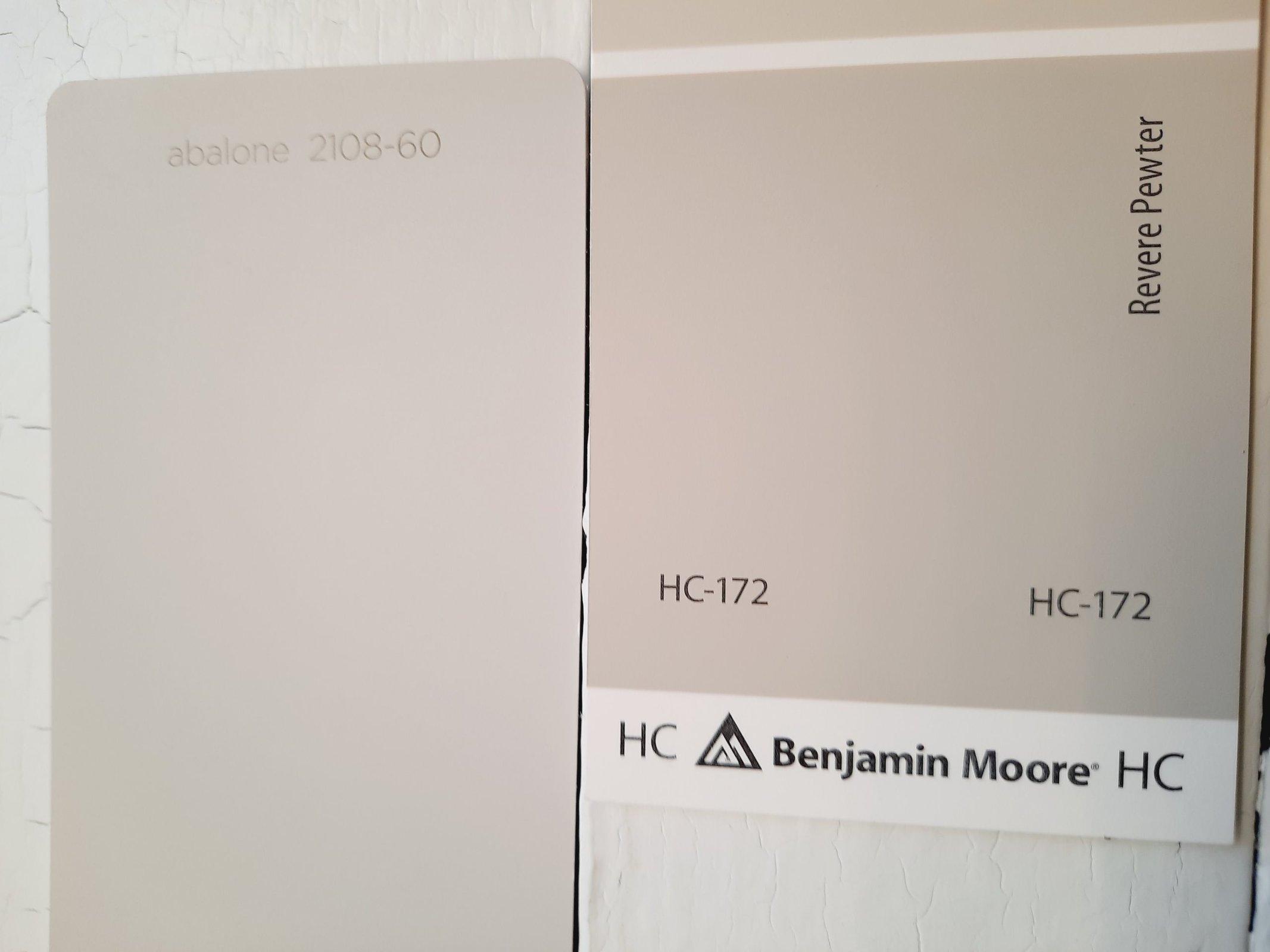
Revere Pewter, Benjamin Moore’s gold standard of the greiges, has some common ground with Abalone. But it’s got a stronger beige side than Abalone. Revere Pewter is also darker, with a LRV of 55.05.
Abalone vs Agreeable Gray by Sherwin Williams
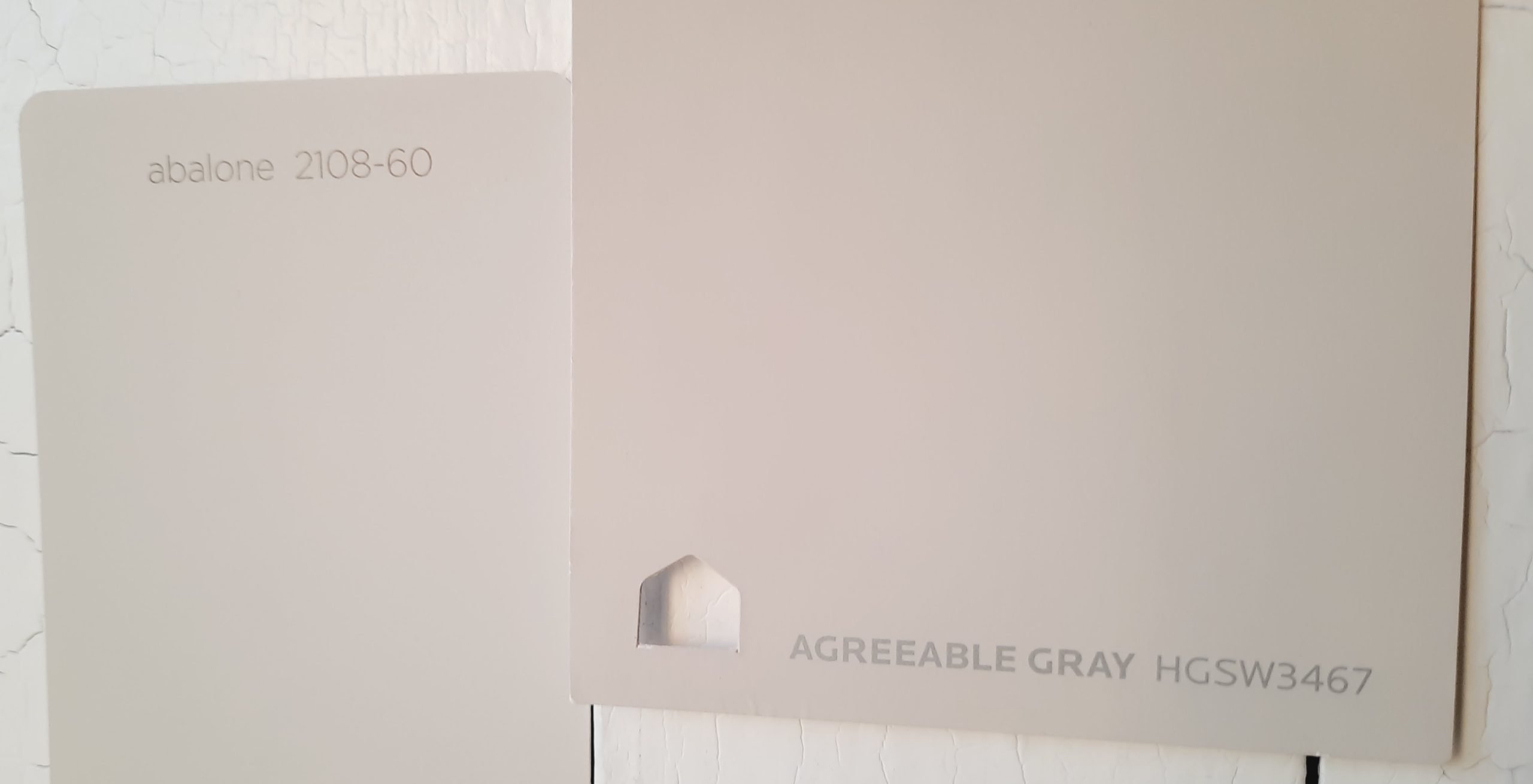
Agreeable Gray sets its own standard as one of Sherwin Williams’ most popular greige colors. Where Abalone is more purple, Agreeable Gray is more beige, helping it lean more neutral. Agreeable Gray is about equal to Abalone in terms of LRV, with a rating of 60.
Final Thoughts
Abalone is a complex neutral, and the opinions people have about it can be surprisingly polarizing. Its purple and pink undertones are a love-it-or-leave-it aspect of this color’s personality. For the person seeking a neutral that offers color and interest without overpowering, Abalone is a great choice.