Alpaca by Sherwin Williams
We love talking complex neutrals, and today we’ve got one for you that’s toasty and cozy. Alpaca heats things up with rosy beige undertones that set it apart from many other greiges and taupes.
Complex neutrals add interest to your color palette, but without completely sacrificing that versatility you want from a neutral. Like many complex neutrals, Alpaca won’t suit everyone’s taste, but if you’re looking for something different, it won’t disappoint.
What Color is Alpaca?
Alpaca is a toasty greige color. Greige is a combination of gray and beige that brings the best of both worlds to the table, creating a harmonious neutral. Alpaca has more beige than your average greige color, and can be thought of as a taupe too.
LRV of 57
Alpaca has a light reflectance value (LRV) of 57. Light reflectance value is a scale designed to measure how bright a color is, and ranges from absolute black at 0 to sheer white at 100. The higher the number, the lighter the color.
What Undertones Does Alpaca Have?
Alpaca is a greige color already, so you might think of its gray or beige components as undertones. But Alpaca also has strong undertones of rosy pink and violet. These undertones are the biggest difference between Alpaca and many other greige colors.
Is Alpaca a Warm Color or a Cool Color?
Alpaca is a warm color. It has more beige than most greige colors, and those rosy pink undertones warm it up too.
Where Can You Use Alpaca?
When we talk about where to use a color, we’re usually covering two important areas: how dark or light is the color, and how neutral is the color?
Alpaca is a little darker than the ideal “use everywhere” LRV range of 60-62. This means you may find it a bit too dark as the primary wall color in some rooms, especially smaller spaces.
Alpaca’s undertones come into play when it comes to room placement. Rooms that get early morning and late afternoon light have the warmest light, which will bring out the pink in Alpaca. North-facing rooms, or rooms with cool lighting, will minimize it.
Alpaca can make a great companion color for a soft white, serving as an accent wall or board and batten. You can use light colors to break up larger areas of Alpaca too.
Alpaca is extremely popular as a cabinet color for kitchens or bathrooms, since its depth offers a handsome contrast to white or light walls.
It’s a great color for any room that you’d like to have feel warm and cozy. A living room is a great example–many living rooms are large and open; Alpaca can make them more inviting and comfortable.
Let’s take a look at Alpaca in different home spaces and get inspired for future projects!
Exterior
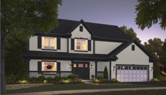
Alpaca has a light touch on this exterior, framed by handsome Tricorn Black.
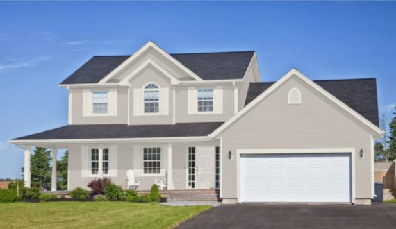
Creamy Alabaster offers a gentle contrast to warm Alpaca on this home exterior.
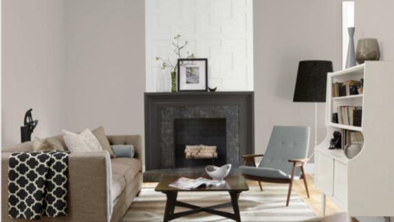
Living Room
An art wall adds interest to this living room, while matching frames and Alpaca walls keep everything cohesive.
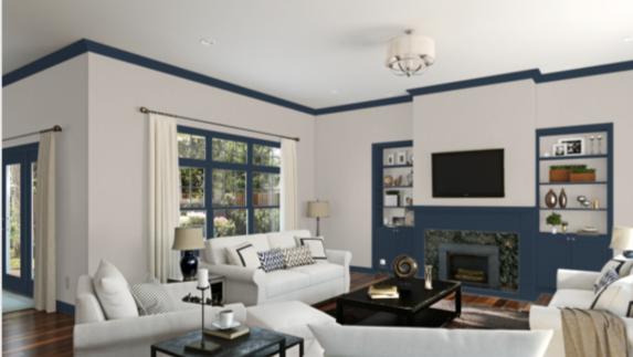
Naval and Alpaca bring out the best in each other in this comfortable living room.
Kitchen
A new coat of Alpaca on the cabinets was all it took to breathe new life into this kitchen.
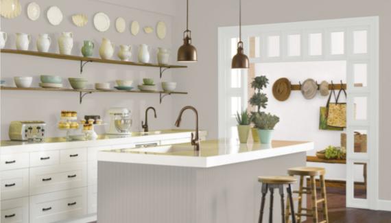
Alpaca walls provide a neutral backdrop for vintage decor in this country kitchen.
Dining Room
Alpaca brings warmth and coziness to this casual dining room.
Bedroom
Alpaca takes on a light and toasty character in this soft and brightly-lit bedroom.
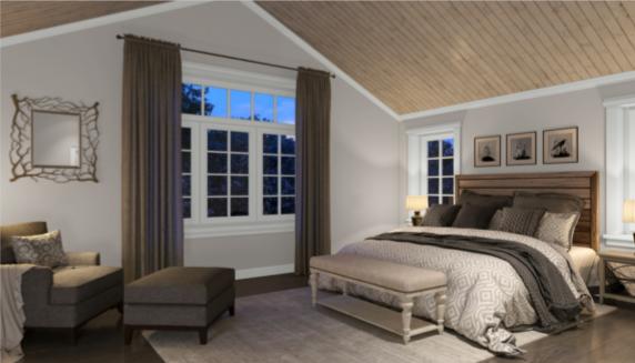
We see Alpaca’s cooler gray side in this neutral bedroom.
Bathroom
Alpaca gives this bathroom a romantic appeal.
This bathroom uses Alpaca’s neutral tones in a minimalist decor scheme.
Lower lighting in this bathroom brings out Alpaca’s cooler side, while highlighting the view out the windows.
Craft Room
Alpaca provides a neutral backdrop for this craft room to use the craft supplies themselves as the colorful decor elements.
Alpaca Coordinating Colors
Alpaca isn’t as wide open for coordinating colors as some greiges are, but it’s far from difficult to partner up. You just have to keep in mind those pink and purple undertones, which will be played up or down by whichever color companions you choose.
Other neutrals are always a safe avenue to take. Black or dark charcoal, brown and tan, and that popular “new neutral”, navy blue, will all work with Alpaca.
Lighter blue colors will work with Alpaca as well, and can give a cool and refreshing contrast to this earthy clay color. For a stronger contrast, consider teals.
Whites with a little glow or shimmer like Alabaster and White Dove are pretty next to Alpaca. You can also choose cool whites or clean whites. More yellow or cream colors won’t be as appealing.
If you enjoy Alpaca’s pink and purple undertones, which, if you’re choosing it, you probably do, then consider playing them up with colors like Sanctuary.
If you’re looking for some coordinating color inspiration for Alpaca, check out these ideas:
- Iron Ore by Sherwin Williams
- Alabaster by Sherwin Williams
- Thunder Gray by Sherwin Williams
- Sea Salt by Sherwin Williams
- Rainwashed by Sherwin Williams
- Sea Serpent by Sherwin Williams
- Copen Blue by Sherwin Williams
- Requisite Gray by Sherwin Williams
- Hickory Smoke by Sherwin Williams
- Marshmallow by Sherwin Williams
- Domino by Sherwin Williams
- Hale Navy by Benjamin Moore
- Aegean Teal by Benjamin Moore
- Kendall Charcoal by Benjamin Moore
- White Dove by Benjamin Moore
- Palladian Blue by Benjamin Moore
- Tempest by Benjamin Moore
- Sanctuary by Benjamin Moore
How Does Alpaca Compare With Other Colors?
Alpaca vs Agreeable Gray by Sherwin Williams
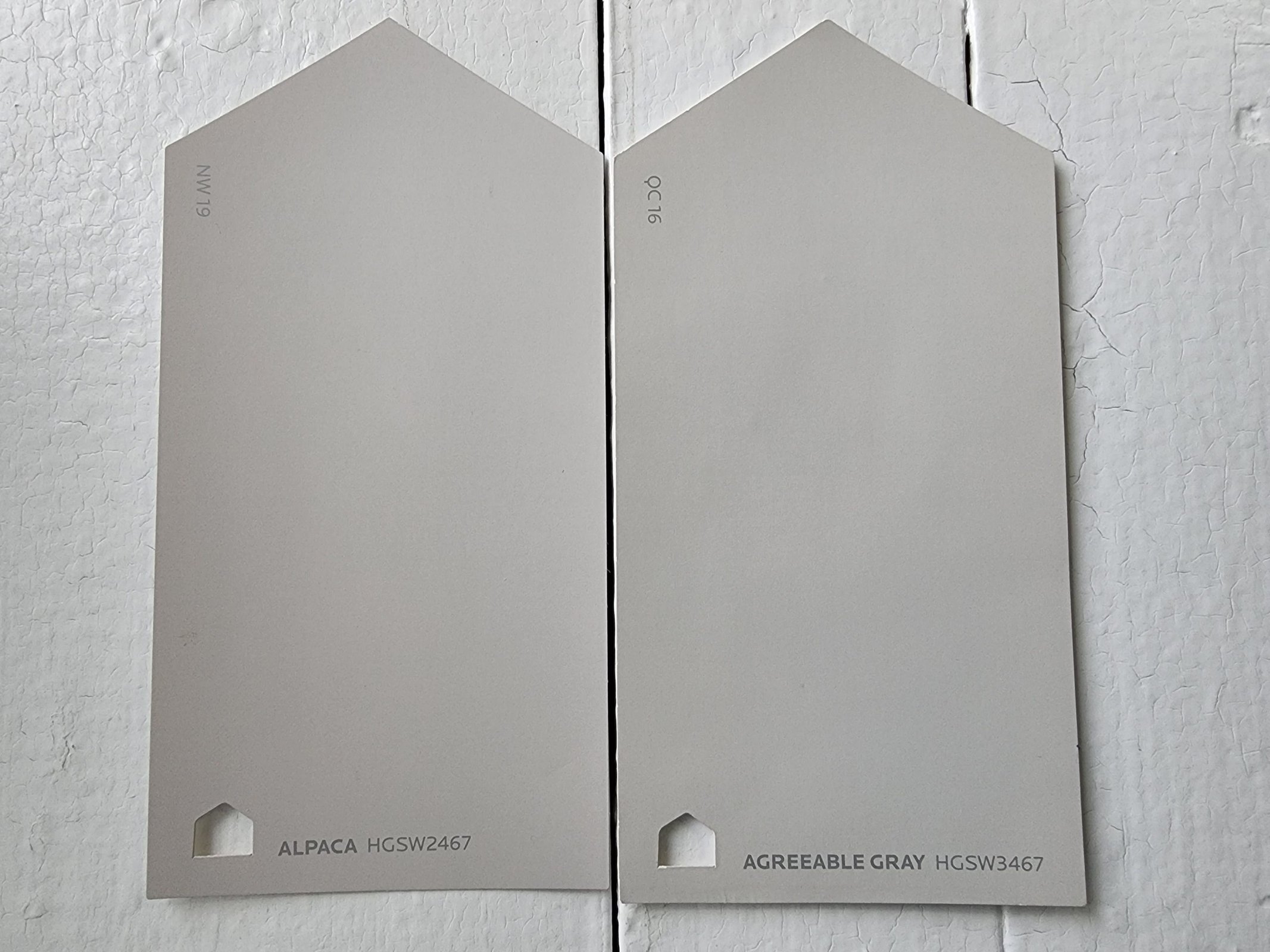
Agreeable Gray is an incredibly popular greige color from Sherwin Williams. It ticks all the boxes for the expectations of a greige, including being well-balanced but leaning cool, hitting that ideal LRV of 60, and being both neutral and light enough to put in any room of the home. Alpaca actually has a lot in common with this greige powerhouse, but it’s a little darker, and warmer, with almost a rosy beige look when they’re side-by-side.
Alpaca vs Repose Gray by Sherwin Williams
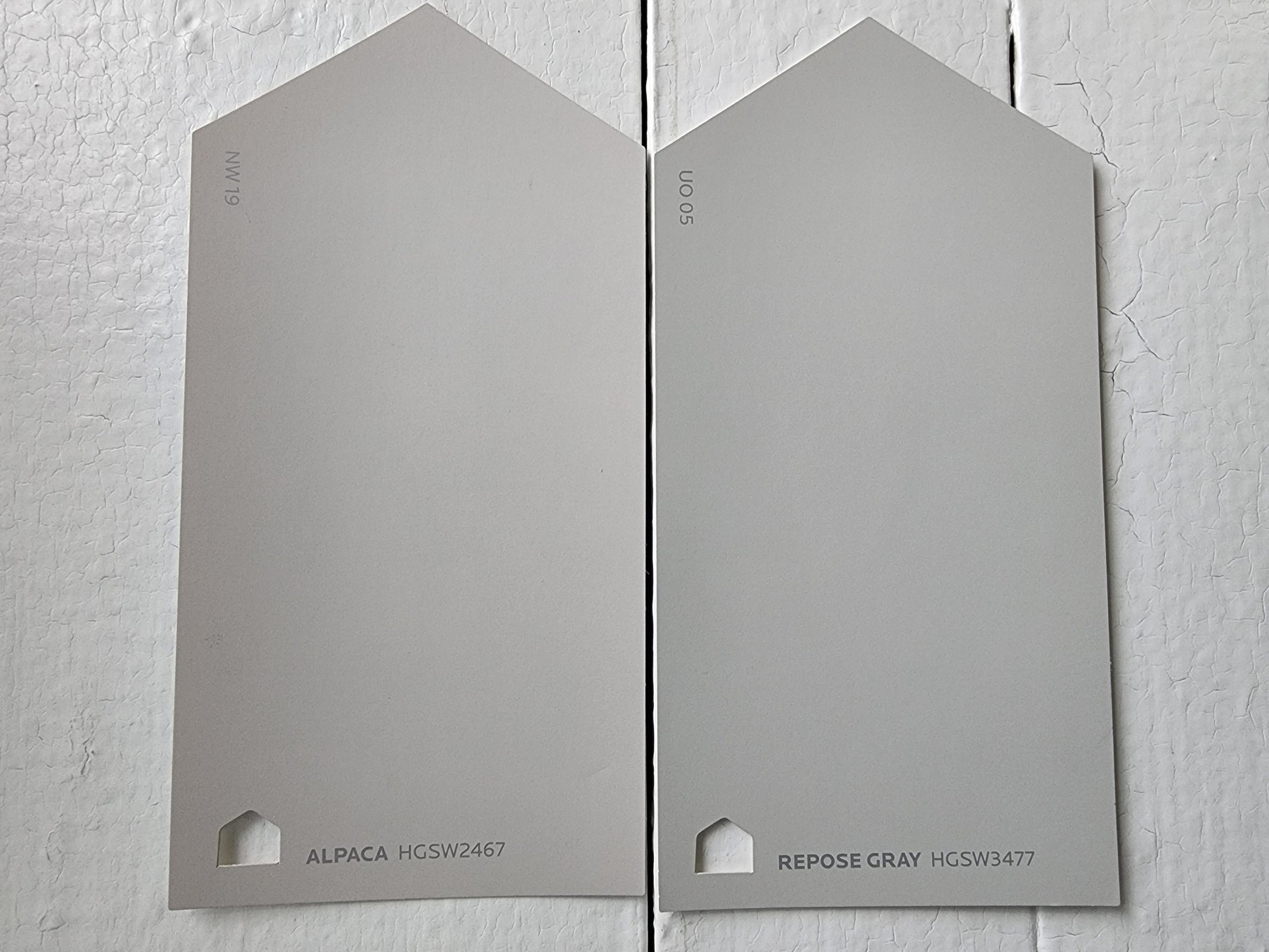
Repose Gray is another classic, beloved greige in the Sherwin Williams line. It’s cooler and grayer than Alpaca, and lacks that rosy beige we were discussing above. They’re about the same on LRV; Repose Gray has a LRV of 58.
Alpaca vs Revere Pewter by Benjamin Moore
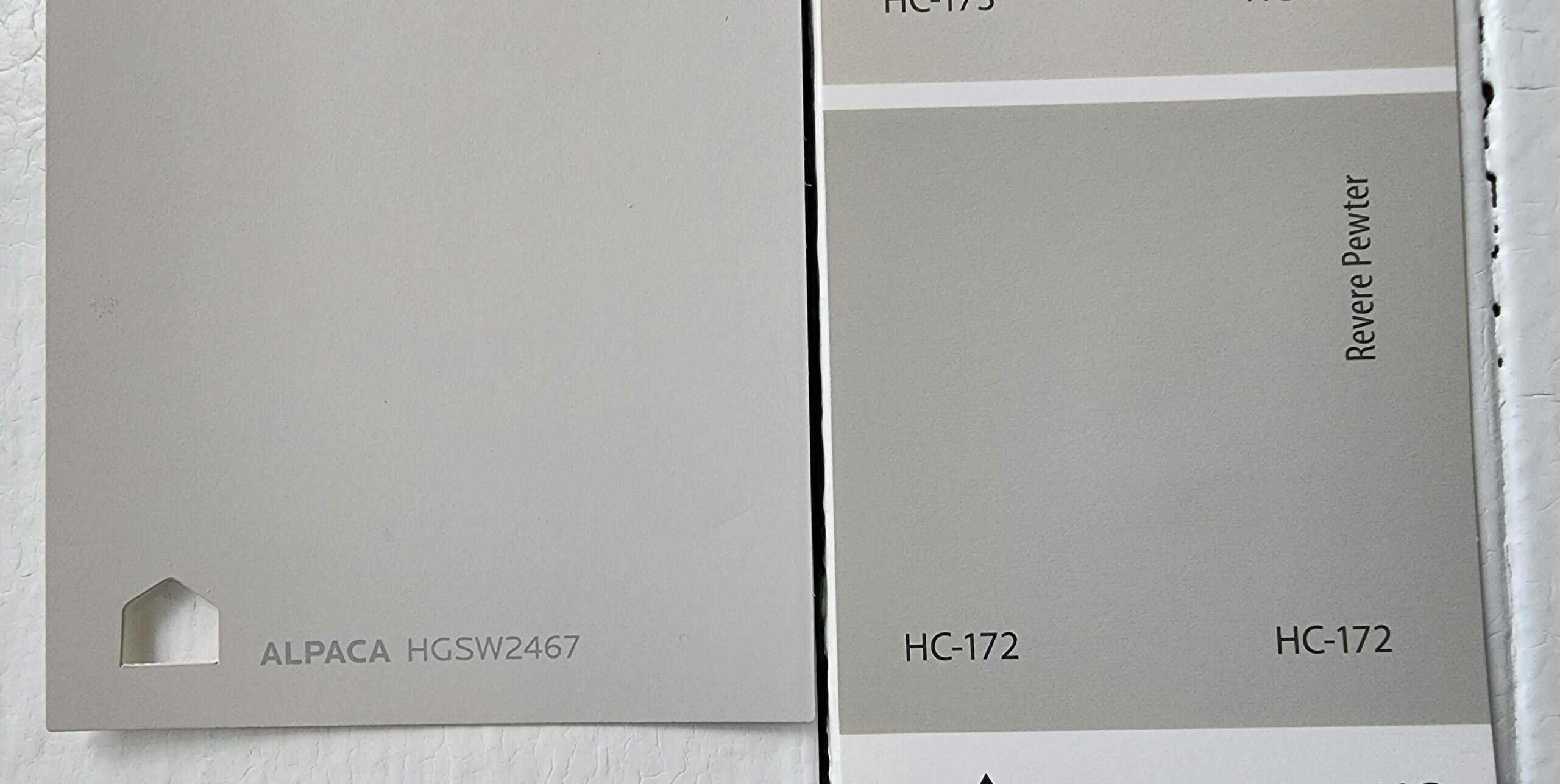
Revere Pewter is Benjamin Moore’s king of the greiges–a color that simply cannot be overlooked when you’re talking greige. It’s not as gray as the two colors we were comparing above, but it still comes out cooler than Alpaca. It’s also noticeably darker than Alpaca. But it’s only two points away on the LRV scale, at 55.
Alpaca vs Collingwood by Benjamin Moore
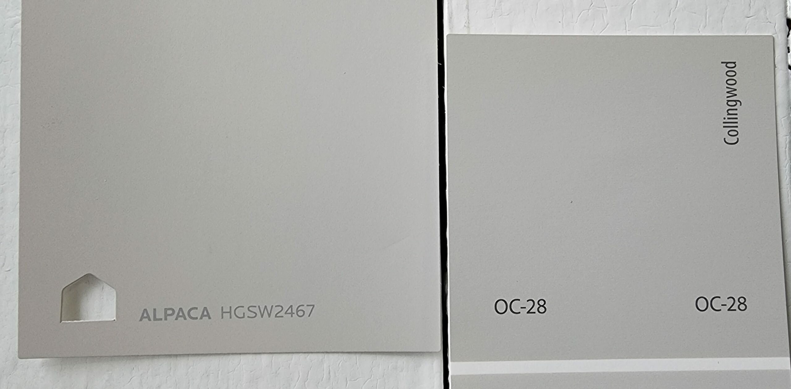
Collingwood is a light, modern-feeling greige that’s well-balanced. Alpaca still has that hint of rose to it that is the strongest differentiator between these two colors. Collingwood is noticeably lighter, with that coveted ideal LRV of 61.52.
Final Thoughts
Alpaca is a complex neutral that works as a greige or a taupe, and brings a little extra pink and purple to the party. Don’t pick this color if you’re fussy about undertones, because you’ll just keep fighting them. But do pick Alpaca if you’d like a color that’s a little more interesting than your average neutral. Happy painting!