Sherwin Williams Mindful Gray Paint Color Review
There are so many paint colors out there, even beginning to choose from them can be overwhelming. There’s finding paint colors you like, ones that suit your home itself, and paints that work with your lighting conditions.
But you also need colors that suit your taste in decor, colors that coordinate with each other, and colors that will make your home stylish and inviting.
Then after you’ve figured all of that out, and gotten your home painted, you have to have colors you can actually live with and won’t want to paint over again in a month!
Ever wish there was an easy solution to this dilemma? A color that you just can’t possibly go wrong with? Neutrals are your friend! In this article, get ready to make friends with a neutral that can take lots of work off your hands: Mindful Gray.
What Color is Mindful Gray?
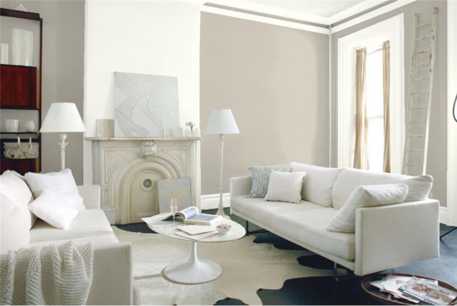
Sherwin Williams’ Mindful Gray is a top-notch neutral gray, with no distracting undertones to interfere with your decorating dreams.
Mindful Gray has a light-to-medium tone. It’s a warm gray and a bona-fide member of the on-trend greige family.
It’s the perfect base color for building a palette in any direction you want to go: warm, cool, or other neutrals. Mindful Gray plays well with all the other color families.
Does Mindful Gray have any undertones?
Mindful Gray is a very neutral color, so its undertones are slight. That means coordinating with other colors is a breeze!
Mindful Gray is a greige color, but it’s more on the gray side, so you’ll more likely notice undertones of blue, green, or purple if you notice any at all. You’re less likely to see any beige or taupe undertones.
Is Mindful Gray warm or cool?
Mindful Gray is a well-saturated warm gray. As a greige color, it has a beige side to liven up its gray for a more balanced feel.
If your room is too yellow or has lots of woodwork, Mindful Gray can cool down that influence without making the room feel like a warehouse.
LRV of 48
Mindful Gray is a true neutral, so it can really go anywhere you want to put it. Its light reflectance value (LRV) is 48, almost perfectly in the middle of the scale, so you don’t have to worry too much about whether it’s going to make a room too dark or light.
Where to Use Mindful Gray
You can truly take Mindful Gray anywhere you’d like to put it. It’s too versatile to steer you wrong. Try Mindful Gray where you’d like a clean palette to change up your decorating style.
Mindful Gray is a calming color that’s great for a soothing bedroom retreat. It also coordinates with modern appliances, so it would be excellent in kitchens and home office spaces.
Let’s take a look at Mindful Gray in action to give you some inspiration!
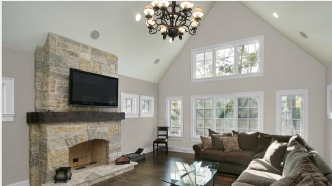
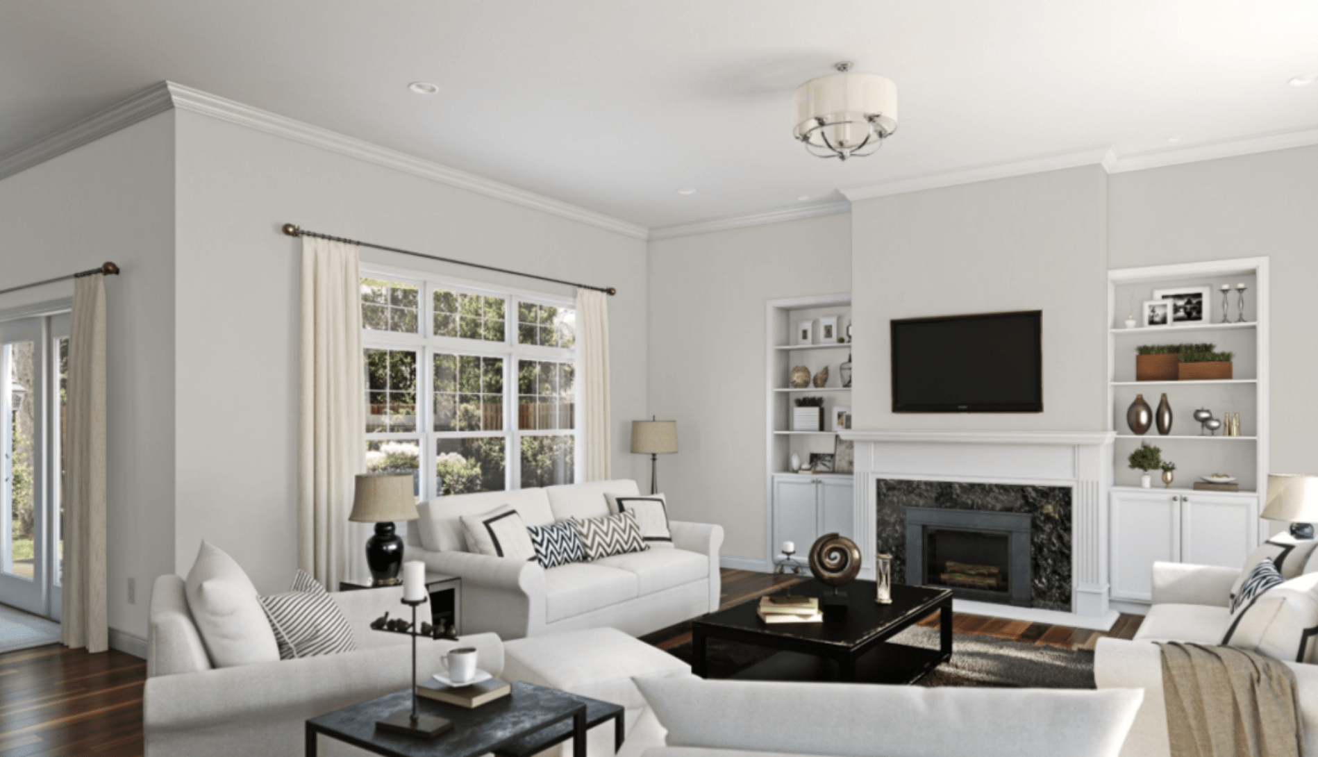
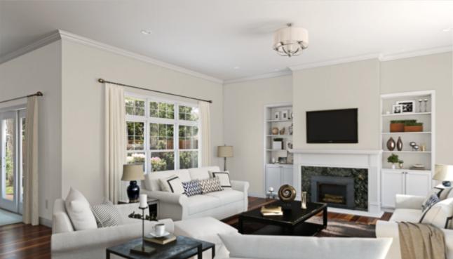
Living Room
Mindful Gray is a subdued presence in this well-lit living room. It particularly highlights the points of silver in the decor.
Kitchen/Dining Room
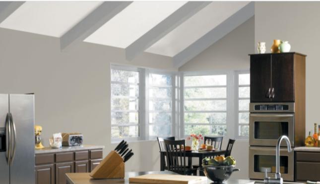
The dark woodwork in this modern kitchen brings out Mindful Gray’s beige side.
Mindful Gray has a modernizing influence on the farmhouse decor in this dining room. It can help you update a space.
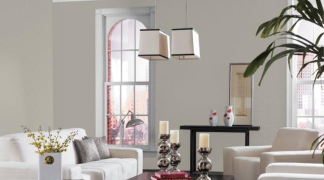
Bedroom
In this bedroom, Mindful Gray tames the yellows in the wooden furniture and stone to balance the room and tie it together.
Mindful Gray is the backdrop for this inviting bedroom that looks like it came right out of a cozy bed and breakfast.
Bathroom
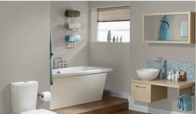
This bathroom really exhibits some of the possibilities for combining Mindful Grey with other colors. See how well it complements the blues, beiges, and whites in this inviting room? It just makes you want to stay in your bath for five more minutes.
Exterior
Don’t forget the outside of your home. The contrast between Mindful Gray and Dove Wing brightens and lifts up this exterior, making the stonework pop!
Whole Home
Mindful Gray is the centerpiece of this complete house transformation! See how it coordinates the look of the house without making it monochromatic? It’s a great complement to all that wood and the modern appliances.
Mindful Gray Coordinating Colors
When you start searching for coordinating colors for Mindful Gray, you can never go wrong with the rest of the neutral family. Lighter and darker grays are one place to start. You could pair one of these with Mindful Gray as an accent, or combine them in a room for a monochromatic look.
Whites will look fresh and bright against Mindful Gray and are a relaxing choice for a room. Since Mindful Gray is a greige color, you can always play it against beiges too.
For other neutral options, Mindful Gray works well with browns, which also makes it a nice complement to woodwork. Sherwin Williams Hickory Smoke is a lovely example. When you place it next to Mindful Gray, both colors feel warm and cozy, like hot cocoa in an earthenware mug.
Another direction to take with Mindful Gray coordinating colors is blues. Go nautical with a blue like Sherwin Williams Salty Dog or Sherwin Williams Dress Blues, a soft beige or white, and Mindful Gray.
Here are some colors you can try with Mindful Gray:
- Sherwin Williams Pearly White
- Sherwin Williams Homburg Gray
- Sherwin Williams Eider White
- Sherwin Williams Hickory Smoke
- Sherwin Williams Silverpointe
- Sherwin Williams Alpaca
- Sherwin Williams Accessible Beige
- Sherwin Williams Salty Dog
- Sherwin Williams Dress Blues
How Does Mindful Gray Compare with Other Colors?
Mindful Gray vs Repose Gray by Sherwin Williams
Repose Gray is another popular gray from Sherwin Williams. Mindful Gray is just a tad darker than its neighbor, Repose. Both are warm grays, both are members of the greige family, and both are excellent neutrals. Go with Repose Gray if you’ve got a darker space to work with.
Mindful Gray vs Agreeable Gray by Sherwin Williams
Agreeable Gray is Sherwin Williams’ most popular color. It has an LRV of 60, and it’s brighter than Mindful Gray. Agreeable Gray is slightly warm, but not as warm as Mindful Gray. You may see more of the cool undertones with Agreeable Gray. Mindful Gray could provide a bit more contrast to lighter colors.
Mindful Gray vs Gray Owl by Benjamin Moore
Gray Owl is a popular color from Benjamin Moore with an LRV of 65.77, making it brighter than Mindful Gray’s LRV of 48. It’s still a greige but it’s much more squarely on the gray side of the spectrum than Mindful Gray is. Gray Owl is a cool gray with blue and green undertones.
Mindful Gray vs Revere Pewter by Benjamin Moore
Revere Pewter is one of Benjamin Moore’s best-selling colors, and a strong contender from the greige family. Its LRV is 55 which means it’s brighter than Mindful Gray, although both are close to the center of the scale. Revere Pewter is warmer than Mindful Gray.
Final Thoughts
Mindful Gray by Sherwin Williams is a workhorse color that can serve as the backbone to any color palette. This versatile neutral is a mid-tone greige that will play well with many different decor styles. It’s a great choice for your next home update.