Iron Ore by Sherwin Williams Paint Color Review
Picture a black paint. Chances are, you’re imagining what’s known as a flat black: a completely neutral black color with no undertones in it–that is, no other visible colors inside it.
If you want a black paint, a flat black might be exactly what you’re looking for. But in some cases, you might want something that’s more interesting.
One of those more interesting options is what’s known as a soft black. Deep charcoal grays fall into this category. They’re dark enough to work as black, but that grayness softens the color, and makes it gentler than a regular black paint would be.
Today we’re going to take a look at a wildly popular and widely beloved soft black: Iron Ore, from Sherwin Williams.
This color can act like a black paint, like a very dark gray paint, or like a neutral. It’s dark enough and balanced enough to be both incredibly versatile and easy-to-use. That might be one explanation for why it has so many fans!
What Color is Iron Ore?
Iron Ore is a deep charcoal gray that has a slate gray highlight to it. It’s a color dark enough to use as a black paint, but its depths add interest beyond a flat black. You’ll sometimes hear Iron Ore referred to as a soft black.
LRV of 6
Iron Ore has a light reflectance value, or LRV, of 6. Light reflectance value is a scale designed to measure how bright a color is, and ranges from absolute black at 0 to sheer white at 100.
The lower the number, the darker the color. Iron Ore has a low enough LRV to compare with black paint colors.
What Undertones Does Iron Ore Have?
Iron Ore has slate gray undertones that give it a frosted look. It may have touches of green undertones in certain lighting conditions.
Is Iron Ore a Warm Color or a Cool Color?
Iron Ore is a neutral color that leans a little cool. Its gray undertones are cool, but overall this color is so dark that it can be treated like a neutral the way black colors can.
Where Can You Use Iron Ore?
Iron Ore is very dark, so using it as a wall color or primary color will make a bold statement in any room.
Rooms that are smaller or don’t receive much natural light will look smaller, darker, and cooler with Iron Ore on the walls. You can change up this effect by using light colors to break up and balance Iron Ore.
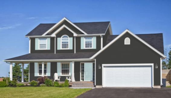
Iron Ore is extremely popular as an exterior color. It makes a big statement as an all-over exterior color, but those moody depths add interest. It’s also a pleasing trim and accent color that offers a crisp contrast for lighter colors.
Neutrals like Iron Ore can be used in any room of the home, and Instagram posts prove Iron Ore to be a wildly popular color that’s used everywhere. Let’s dive into the eye candy and get inspired!
Exterior
You can see Iron Ore’s unexpected green undertones in this forested exterior.
Iron Ore offers a handsome contrast to the stonework of this exterior.
An Iron Ore exterior makes a dramatic statement on this home.
Eider White partners with Iron Ore trim on this charming exterior, making the perfect complement to the charcoal gray roof.
Front Door
Iron Ore is an eye-catching front door color on this white modern farmhouse.
Greige siding pairs with an Iron Ore front door and white trim on this country cottage.
Mudroom
Iron Ore makes this charming mudroom coat organizer stand out.
Iron Ore partners well with naturally colored woods.
Living Room
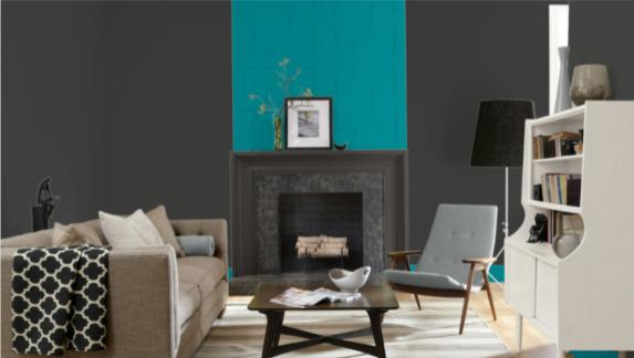
Tempo Teal really pops as an accent color for bold Iron Ore walls in this chic modern living room.
An Iron Ore accent wall makes a dramatic statement in this room, balanced with light gray walls to keep the room light.
Iron Ore trim is handsome in this living room against greige walls.
Kitchen
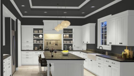
Black and white is a classic combination for a reason, and in this kitchen, Iron Ore pairs with Extra White to pull it off.
An Iron Ore island stands out in this white modern farmhouse kitchen.
Iron Ore cabinets coordinate handsomely with marble countertops in this kitchen.
Dining Room
An Iron Ore accent wall with wooden slats is a stunner in this modern dining room.
Bar
Gold hardware is a knockout in this Iron Ore butler’s pantry converted into a bar.
Bedroom
Iron Ore is the backdrop for an art wall in this fun rustic bedroom.
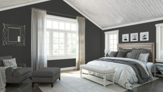
Iron Ore is a grounding and calming influence in this neutral bedroom.
Bathroom
This bathroom uses Iron Ore on the vanity and board and batten, and completes the neutral look with greige walls and white trim.
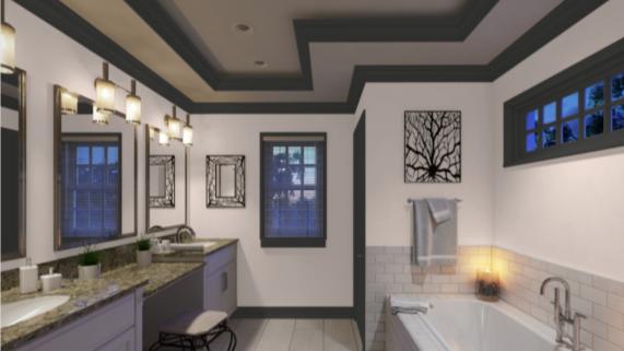
In this bathroom, soft and romantic Faint Coral plays with bold and defined Iron Ore trim to create a fun and unique look.
Iron Ore Coordinating Colors
Iron Ore is a neutral that lets you run wild with coordinating colors. While you’ll most likely be choosing light colors for your palette, other dark colors and jewel tones have their place next to Iron Ore and will deliver a color punch.
Iron Ore can be the star of the show, giving a lot of intensity when it covers large areas, but you can also use it as an accent or trim for lighter colors that provide a milder touch.
As a gray, Iron Ore still coordinates with many of the colors that you’d expect–cool favorites like blue and green, and fellow neutrals like greige, beige, and brown.
Fun colors to pair with gray include pinks, teals, and purples. Iron Ore will look excellent with a bubblegum pink, a light silver gray, and a clean white.
Don’t be afraid to go warm with Iron Ore either. It can take the heat from the red side of the color wheel just as if it were a black paint.
If you’re not sure where to start with your Iron Ore coordinating colors, here’s some inspiration for you:
- Evergreen Fog by Sherwin Williams
- Cityscape by Sherwin Williams
- Camelback by Sherwin Williams
- Still Water by Sherwin Williams
- Sea Salt by Sherwin Williams
- Smoky Salmon by Sherwin Williams
- Aqua Sphere by Sherwin Williams
- Repose Gray by Sherwin Williams
- Alpaca by Sherwin Williams
- Eider White by Sherwin Williams
- Snowbound by Sherwin Williams
- Gray Owl by Benjamin Moore
- Edgecomb Gray by Benjamin Moore
- Palladian Blue by Benjamin Moore
- Aegean Teal by Benjamin Moore
- Hale Navy by Benjamin Moore
- Chantilly Lace by Benjamin Moore
- Silken Pine by Benjamin Moore
- Healing Aloe by Benjamin Moore
How Does Iron Ore Compare With Other Colors?
Iron Ore vs Peppercorn by Sherwin Williams
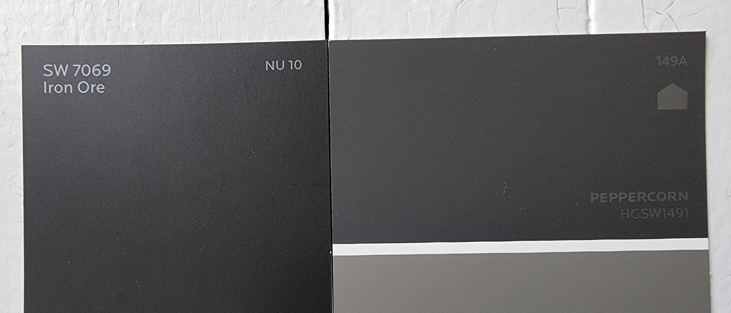
Peppercorn is another slate gray color in a similar vein to Iron Ore. It’s a little warmer than Iron Ore, which gives it a chocolate brown cast when the two colors are side-by-side.
Although these two colors are only a few notches apart on the LRV scale, those notches make a difference when the numbers are so low. Peppercorn has a LRV of 10 to Iron Ore’s 6.
Iron Ore vs Tricorn Black by Sherwin Williams
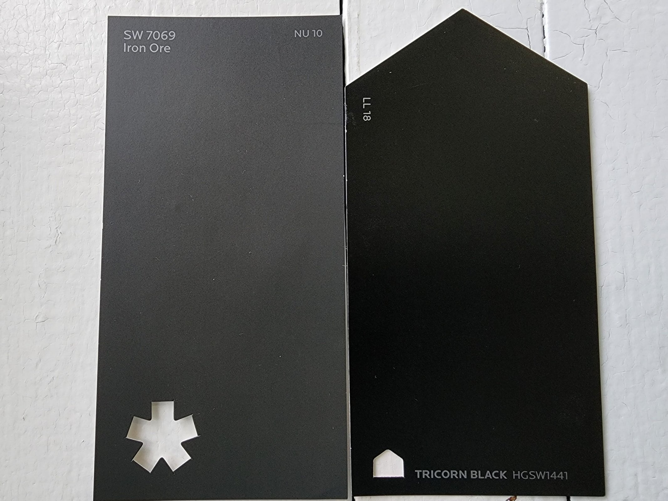
Tricorn Black is a flat black color without undertones. Although its LRV of 3 is just three points darker than Iron Ore’s 6, that’s enough to make Tricorn Black look much darker. In fact, Tricorn Black is just about as dark as black paints get.
Iron Ore’s cool gray side sticks out next to Tricorn Black.
Iron Ore vs Urbane Bronze by Sherwin Williams
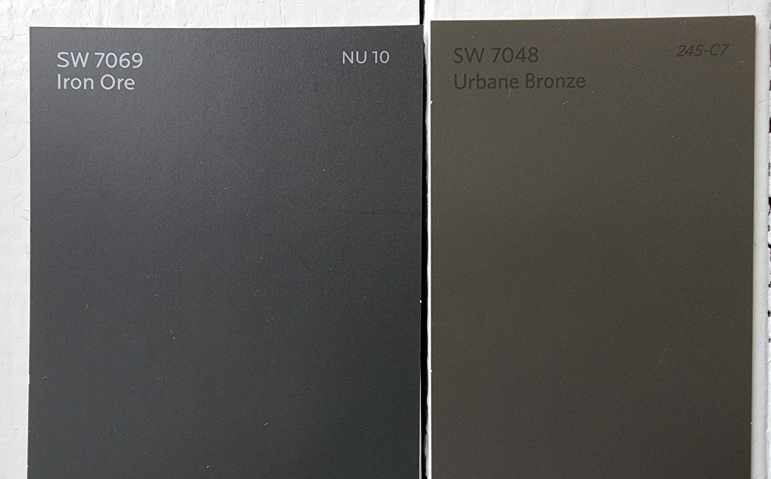
Urbane Bronze is a deep, rich gray-brown color that can serve as a near-black. It was Sherwin Williams’ Color of the Year for 2021. Iron Ore is grayer and cooler than Urbane Bronze and doesn’t have the same brown undertones. Urbane Bronze has a LRV of 8.
Iron Ore vs Black Fox by Sherwin Williams
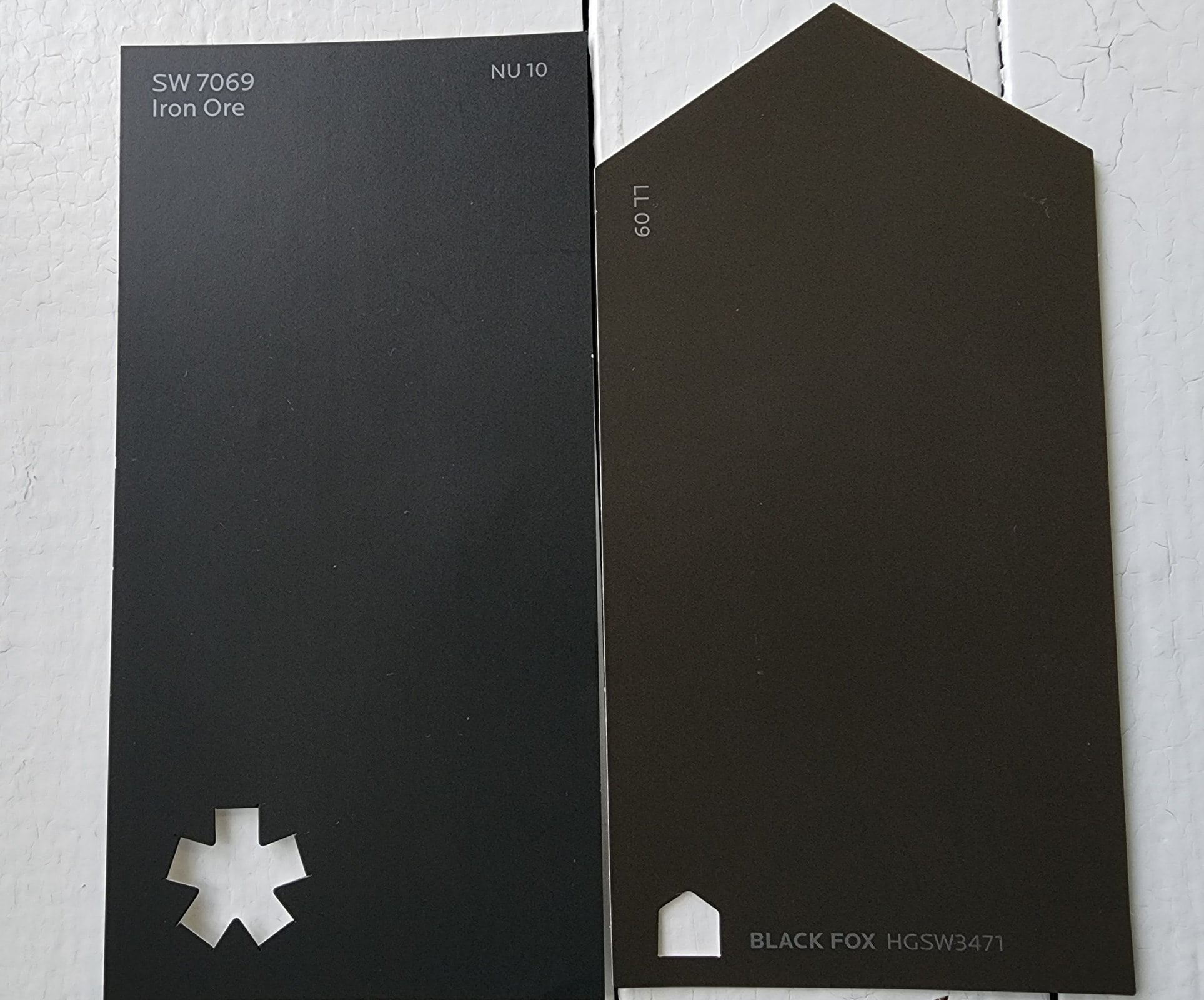
Black Fox is a deep chocolate brown blended with slate gray. It’s warmer than Iron Ore and has a lot more brown to it. These two colors are almost identically dark. Black Fox has a LRV of 7.
Final Thoughts
Iron Ore is a top-notch user-friendly neutral. It’s got great balance and lots of versatility. While it’s easy for such a dark color to overpower a room, you won’t have to worry about Iron Ore clashing with anything. There’s hardly a decor style that can’t make use of this color either. Years of sales and thousands of devoted social media followers prove that this beloved color will be on-trend for a long time to come. Where will you use Iron Ore?