What Wall Color Goes with Mindful Gray Cabinets? 15 Ideas
Painting your kitchen cabinets a pigmented color versus traditional white or leaving them in a natural wood color is a major trend.
Shades like Sherwin Williams’ Mindful Gray have become popular for kitchen cabinets. But once you’ve got your cabinet color, you’re now wondering, what wall color goes with mindful gray cabinets? This list covers fifteen color options that go with the greige notes of cabinets painted Mindful Gray.
Chopsticks by Sherwin Williams
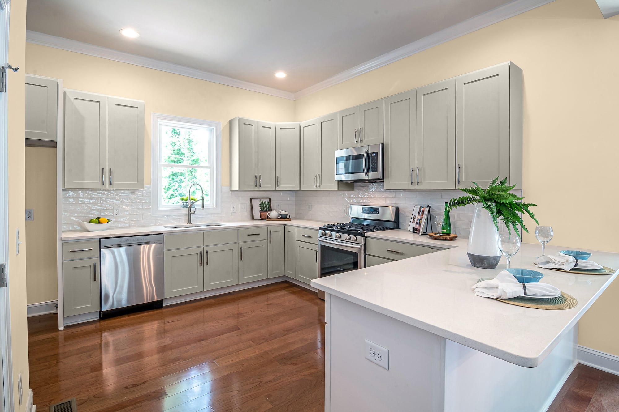
Chopsticks is a warm-tinted tan that can contrast with the greige tones in Mindful Gray to create a soothing honeyed effect. In addition, the tones of the brownish-tan can darken the shadows in the gray cabinets.
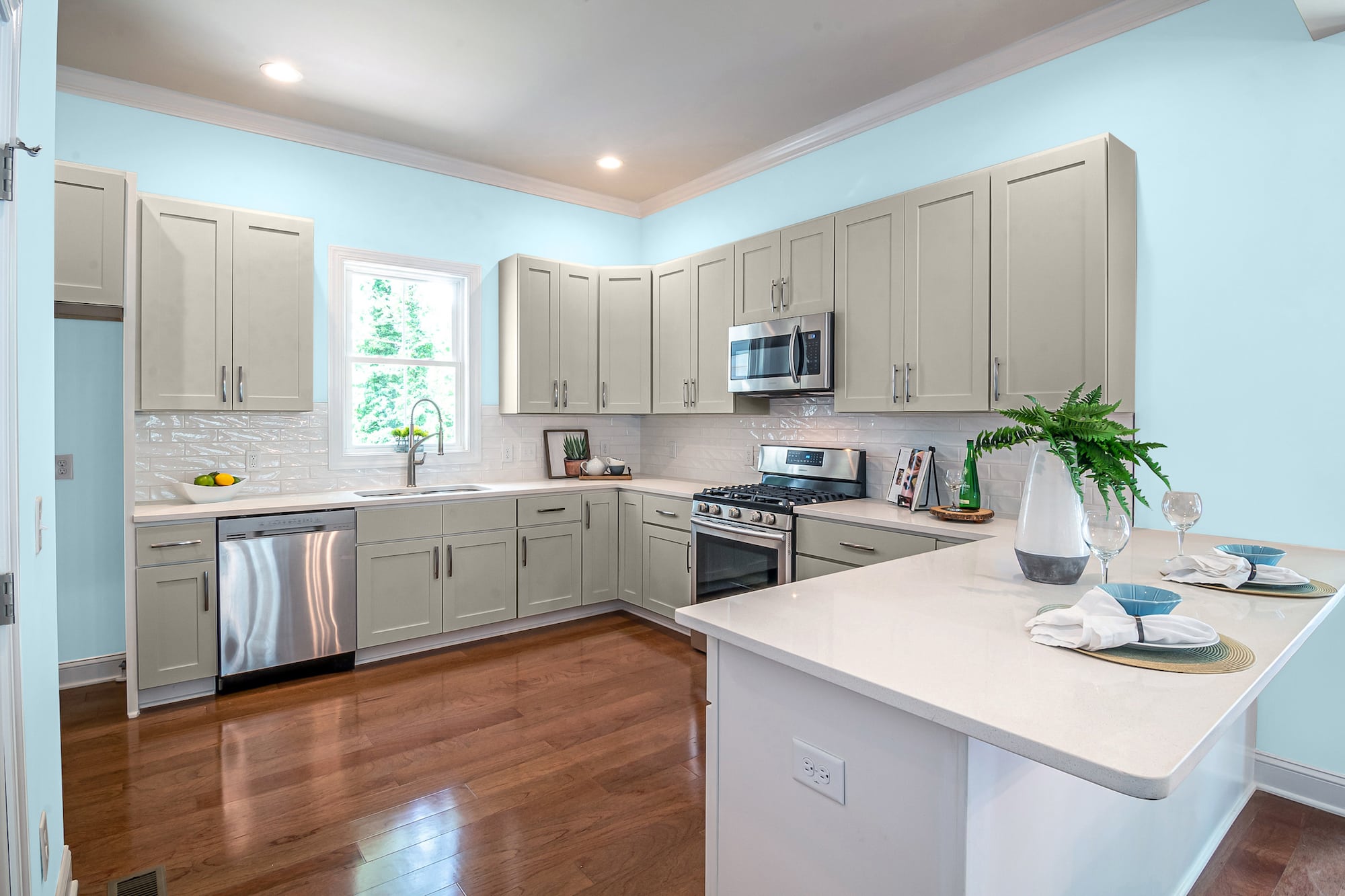
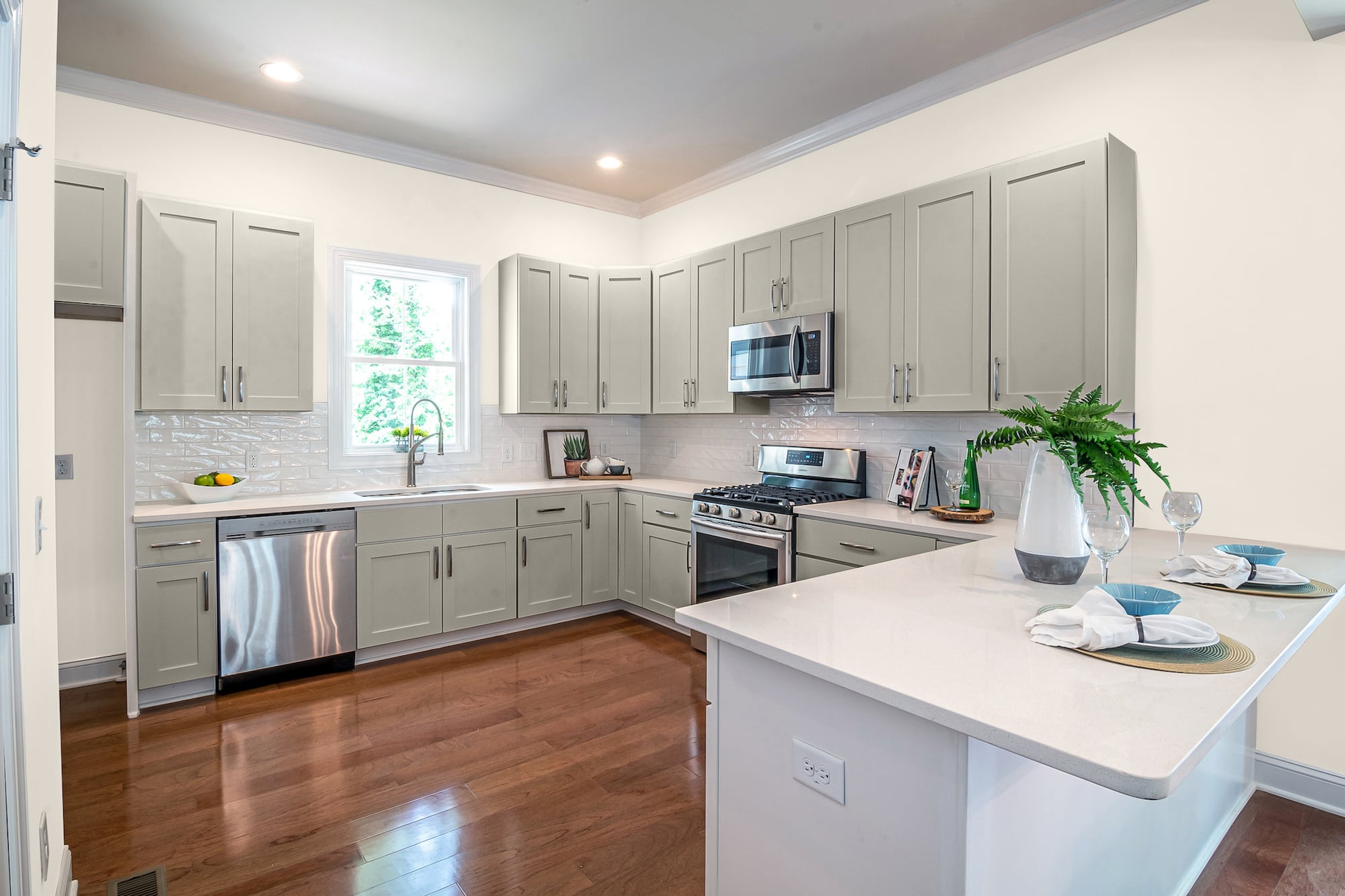
Daylight glow recessed lighting, stainless steel appliances, and an open window to let in natural light gives your kitchen a dreamy, relaxed vibe.
Lazy Gray by Sherwin Williams
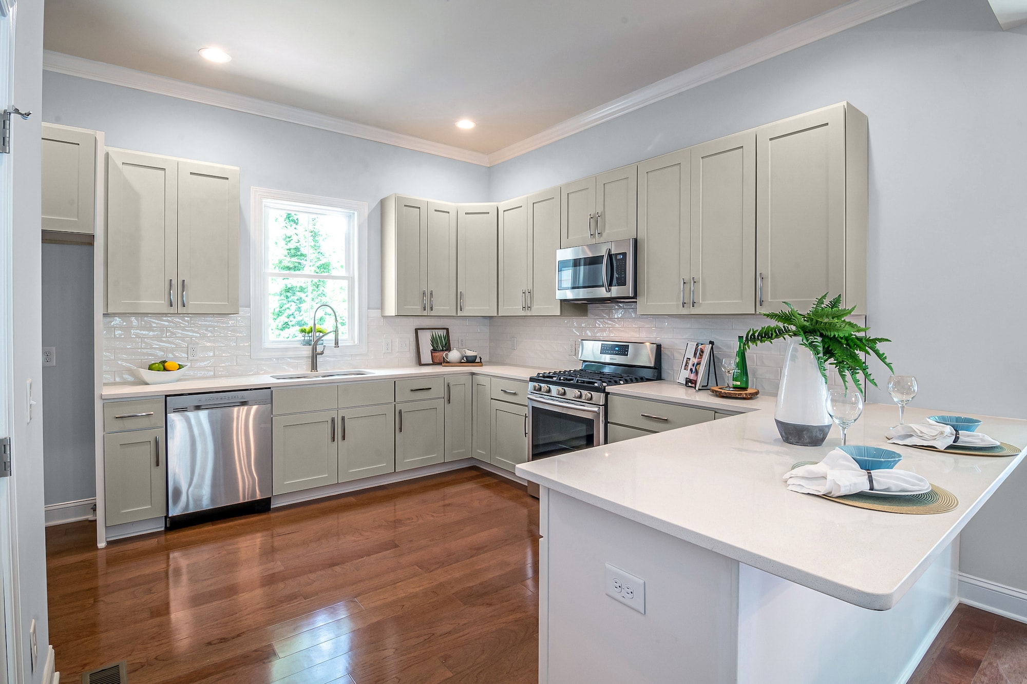
Despite the name, there’s nothing lazy about the powerful punch this cool-toned gray does with the lighter notes of Mindful Gray.
While Mindful lends towards a paler, more earthy tan, Lazy Gray jumped ship for a different path. This stormy-pigmented color has influences of blue and mauve that both darken the shade and give it more dimension.
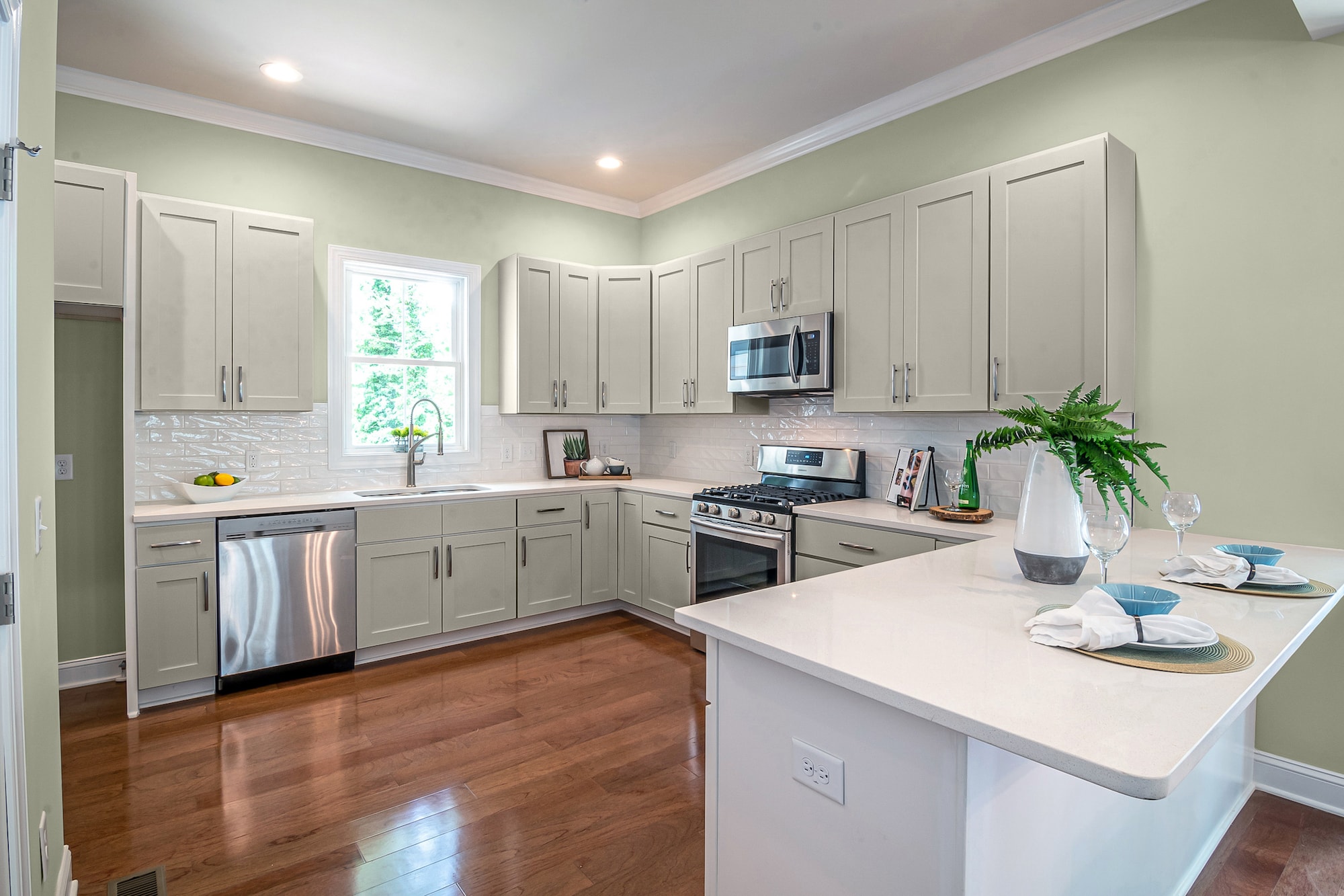
Gratifying Green by Sherwin Williams
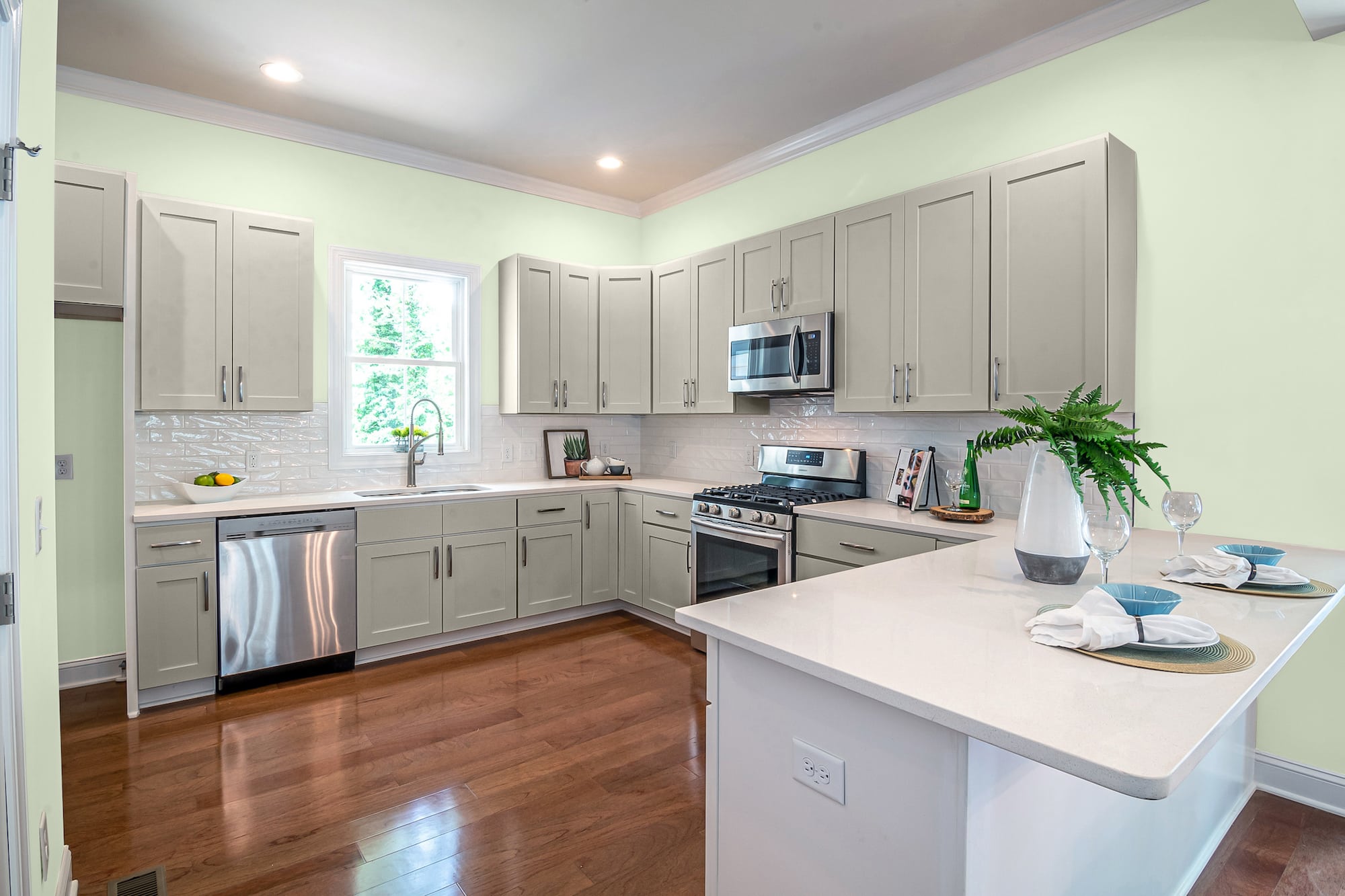
Gratifying Green is a pale, cool-toned shade of green that can pull out the greige in Mindful Gray. Decorating with greiges gives you a lot of chances to have fun with paint colors, like pairing them with an unexpected color to form a neutral balance.
You’ll notice brown, gray, and mint notes buried in the mystery that is Gratifying Green. It can give your kitchen a country cottage, vintage retro, traditional or modern flair, and an energizing buzz.
Toile Red by Sherwin Williams
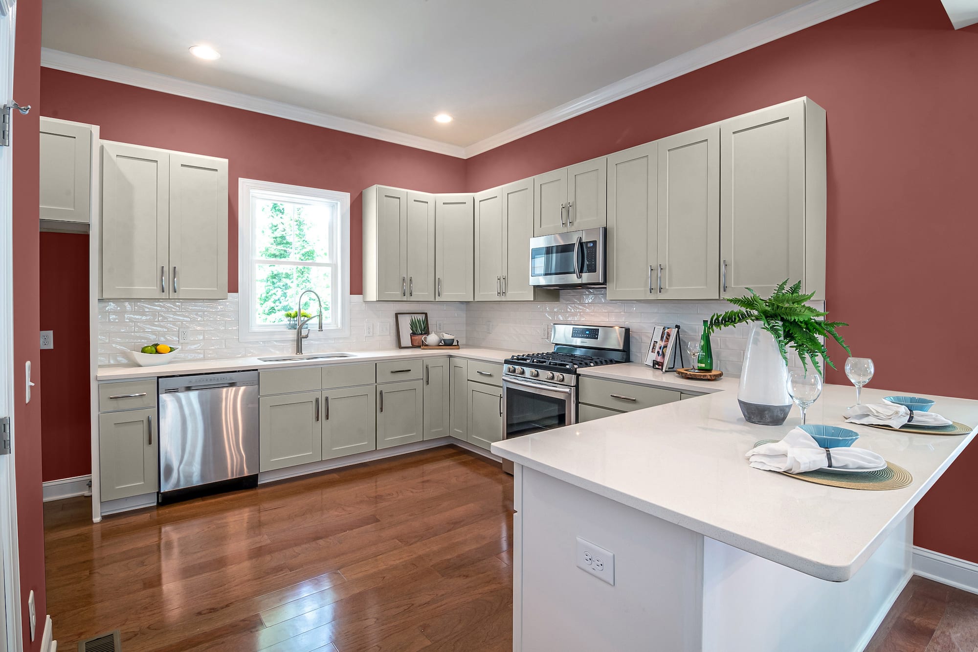
If you’re looking for something more bold and traditional, try a rich maroon-based color like Toile Red for the wall color to go with Mindful Gray cabinets and white countertops.
This darker red has thick brown influences, taking away the vivid fire engine flashiness frequently associated with red and replacing it with a vintage, refined grown-up wine red.
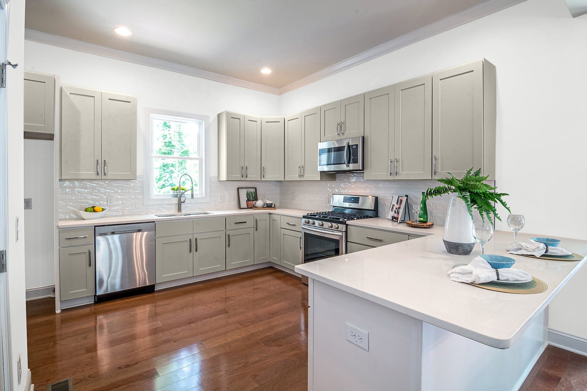
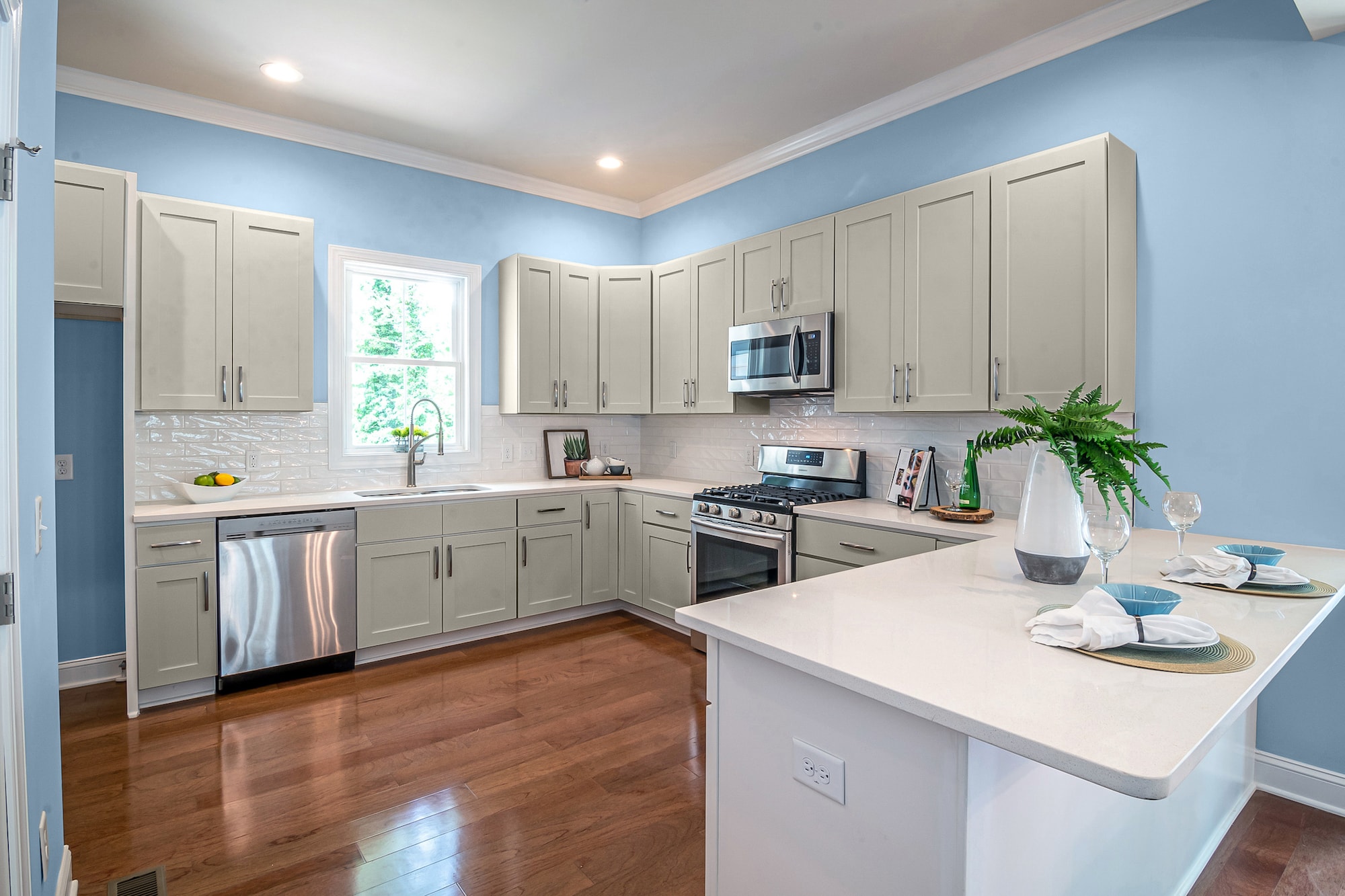
Soar by Sherwin Williams
Soar is a mildly gray-tinged light blue that can look quaint and fresh in a kitchen with Mindful Gray cabinets and refreshing white counters.
This medium-saturated color can reflect in the various tones of the gray cabinets to make both the blue and the gray look like different colors based on lighting. It’s a purely delightful compilation that never ceases to impress.
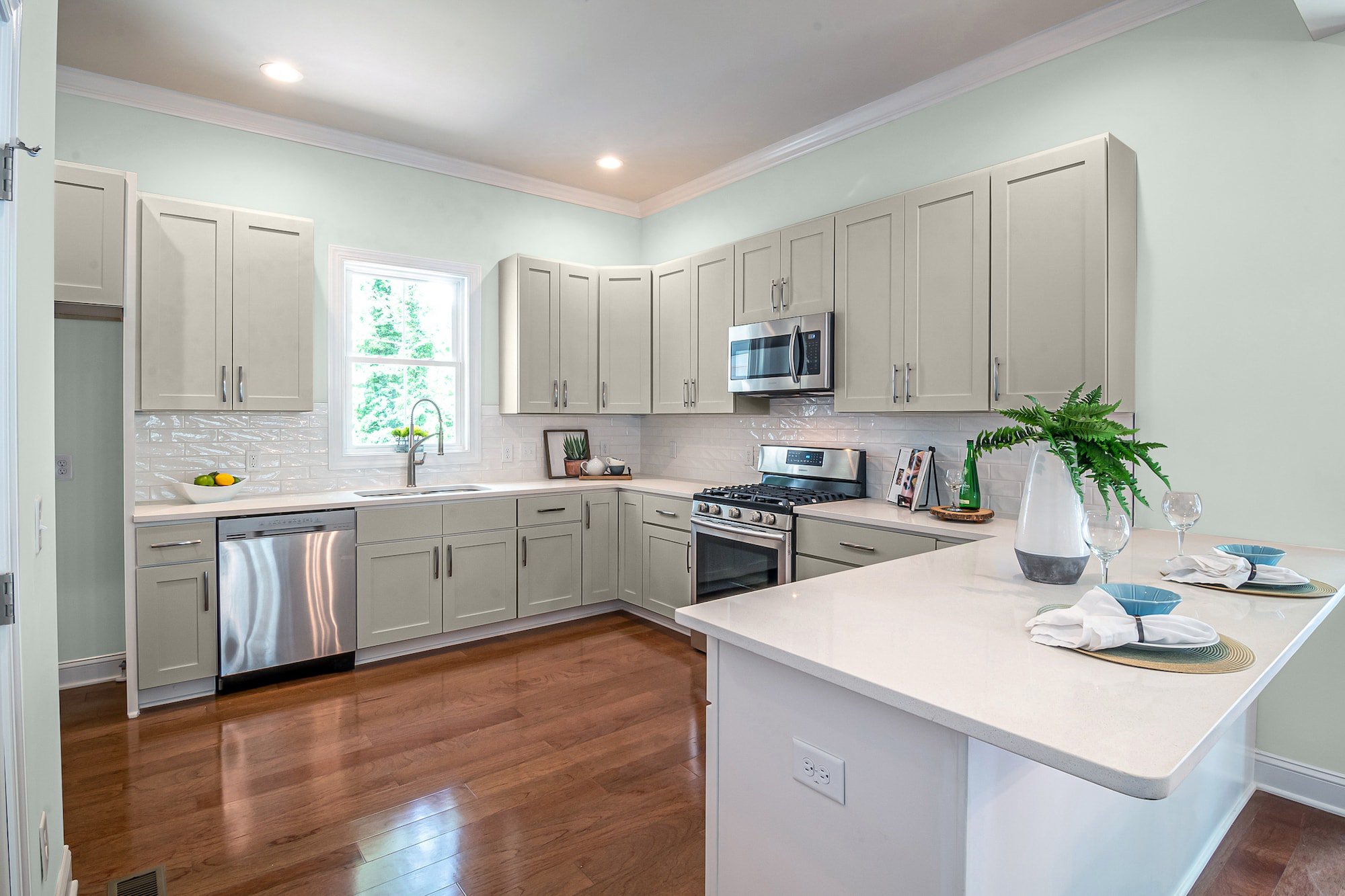
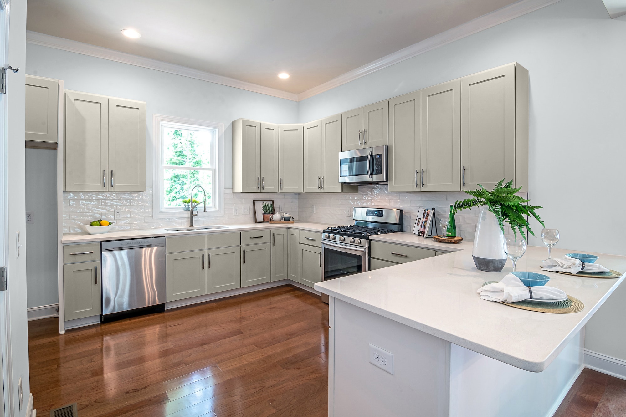
Ice Cube by Sherwin Williams
For a bright, light monochromatic look, match your Mindful Gray cabinets with walls painted in a chilly blank white like Ice Cube.
When painting your walls a similar neutral like white, lend towards whites with gray pigments. The hues in your cabinets will reflect off the white walls, making your cabinets pop and giving your walls delightful shadows.
October Mist by Benjamin Moore
October Mist is a Color Trends 2022 color that can give your kitchen a swift personality upgrade. This gray-green-brown combination can give your walls definition and depth.
And because it’s heavy on gray and brown hues, it’s the perfect complement to the greige notes in your Mindful Gray cabinets to create a subtle contrast of pigmented neutrals.
Quiet Moments by Benjamin Moore
You’re sure to feel inspired to bask in the quiet before the chaos when you paint your kitchen walls this green-tinted gray.
The cooler tones of Quiet Moments can blend with the warmer tones of Mindful Gray to create a blissful transition between colors. Then go with white counters, backsplash, and trim to add some bright reflectiveness.
Sheer Romance by Benjamin Moore
Sheer Romance is a rich saturated blue that may not appeal to all users. But if you love a bold, traditional use of color, you may fall for the aesthetic of this stormy gray-blue with Mindful Gray.
Faint black pigments give this low-LRV, mid-toned blue serious, edgy attitude. In addition, this blue can make your gray cabinets look more warm and brown for an interesting contrast of colors.
Pebble Beach by Benjamin Moore
Pebble Beach is a low-toned gray that you can use with Mindful Gray cabinets for a modern monochromatic vibe.
Embrace the look and feel of sun-warmed rocks pebbling a soft sandy beach with water gently lapping away. The darker tones in Mindful can influence the density of Pebble Beach for a smoky appeal.
After the Rain by Benjamin Moore
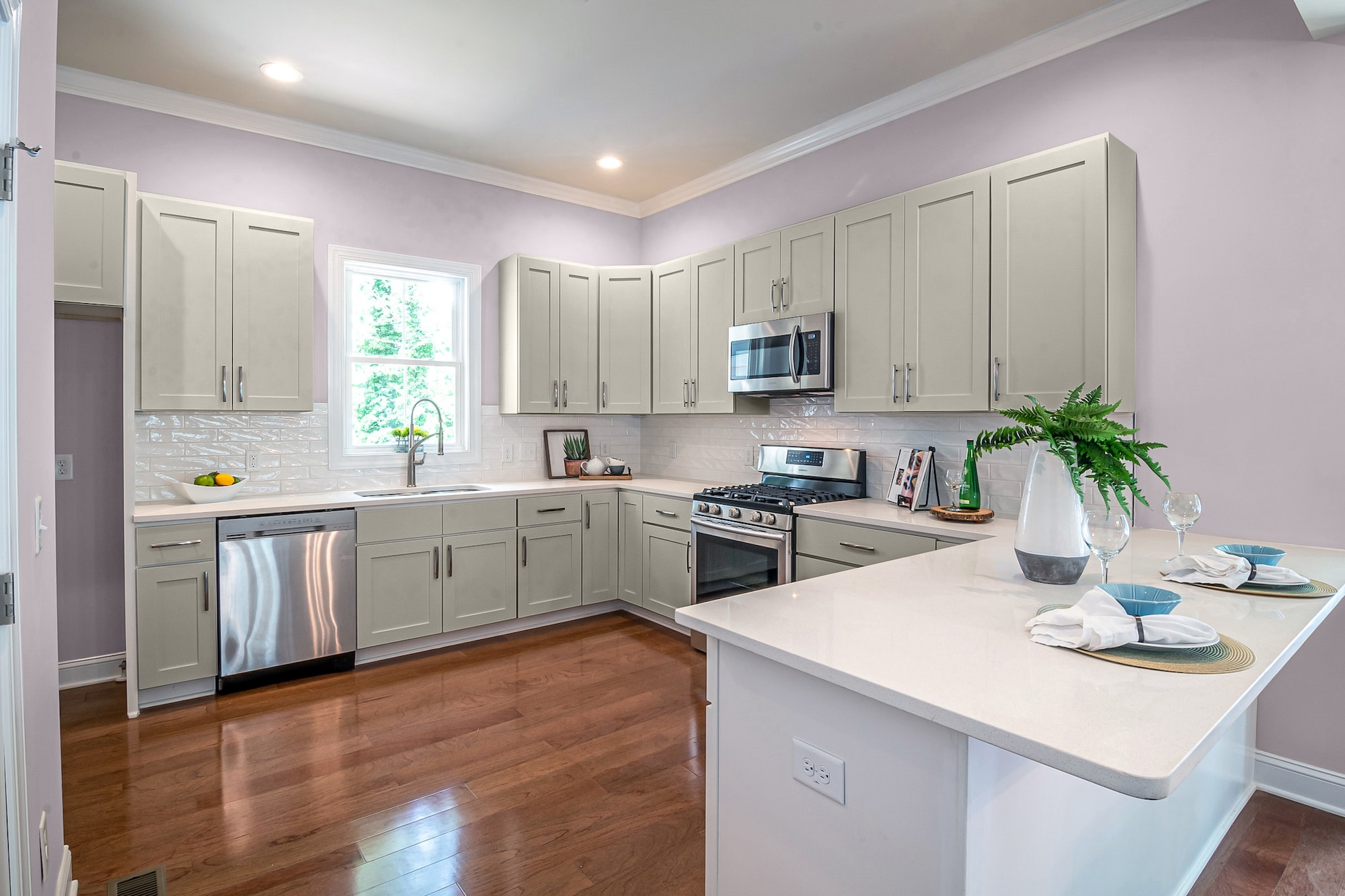
After the Rain is a rich mauve with gray influences that looks like a night sky after the rain is gone, and the clouds are trying to push away to reveal the stars.
Using this darker gray with lavender next to the greige tones of Mindful Gray gives your walls a warm blush of complementing colors.
Cappuccino Froth by Behr
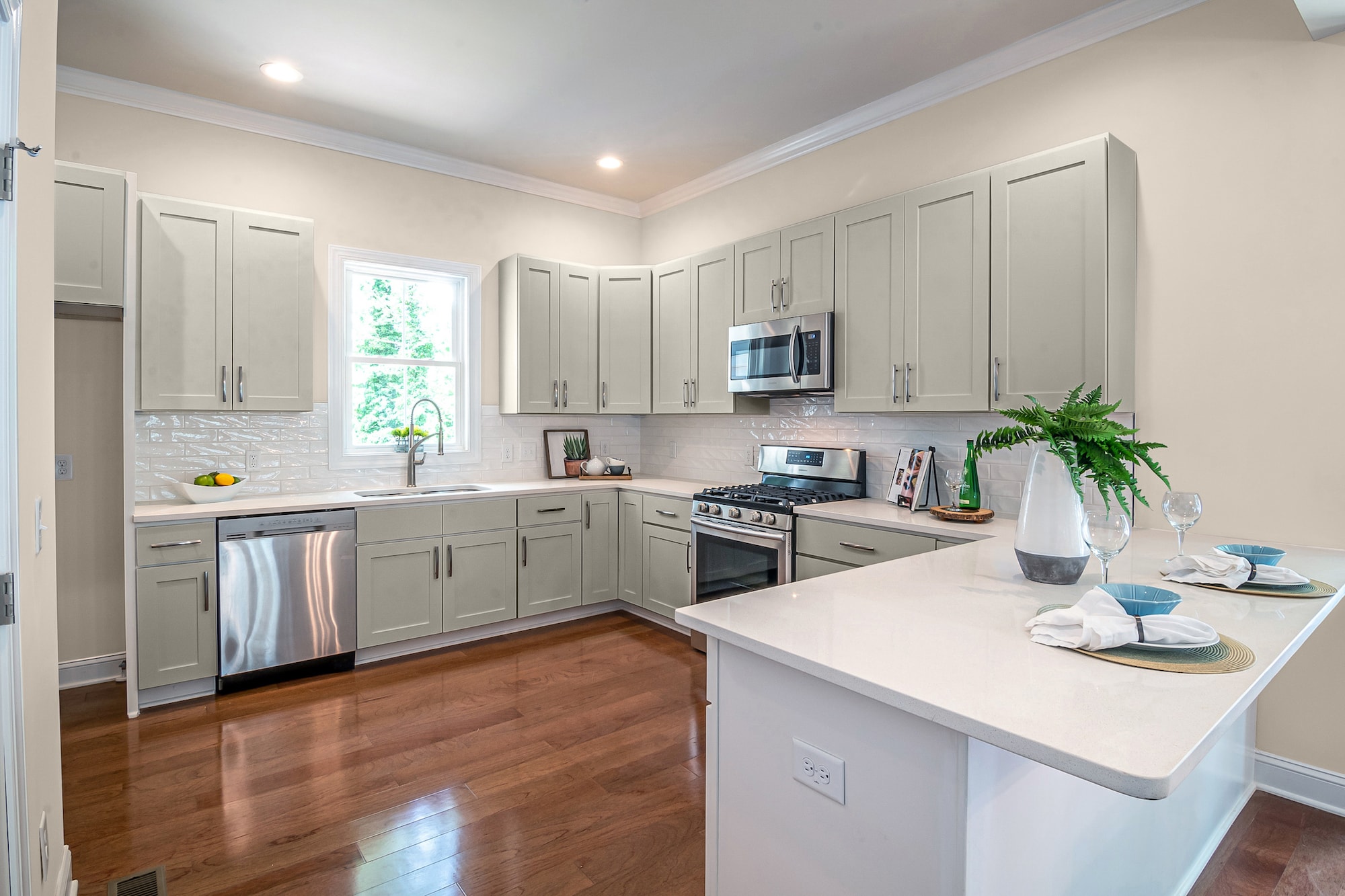
Cappuccino Froth is an oatmeal-tinted gray that can look faintly tan at some angles. However, when you put this lighter brown-based neutral next to greige gray, both colors start to take on new elements from each other.
Your Mindful Gray cabinets may start to take on slight mauve notes from the faint lavender pigments of the Cappuccino. And your walls can develop interesting shadows from the tints of your cabinets.
Shoelace by Behr
Shoelace is a smoky-tinted cream that can give your walls brief color without making your room feel dark and oppresssive.
The natural honey tones in this light-based neutral can darken from the influence of Mindful gray, giving you a detectable yet pleasing contrast of hues.
Salt by Farrow & Ball

Inspired by the salty environment of maritime and coastal beaches, this white has a dollop of tint to make this crisp color feel timeless and versatile.
We love using bright whites with traces of color already in them, as the undertones become more pronounced when used with similar shades.
Pavilion Gray by Farrow & Ball
This shade of gray contains blended pigments of mauve, brown, and red that give it a dense earthy look that can give your walls a much-needed dose of color.
When you use a mixed gray like this with Mindful Gray, you get a collaboration of tones that play off each other to create varying colored effects.
Final Words
Mindful Gray is a fantastic shade of gray to use for your kitchen cabinet color. This greige has enough pigmentation to have a pleasing color. But it’s not so dominant that it sticks out and is difficult to decorate. These 15 ideas for what wall color goes with Mindful Gray cabinets should help start you on your journey to picking the perfect combination.